5,422 search results
(0.019 seconds)
- FS Meridian Variable by Fontsmith,
$199.99Timeless imperfection FS Meridian is a rhythmic geometric grotesque which takes inspiration from the precise yet imperfect nature of time. There are 24 hours in a day. 60 minutes in an hour. 60 seconds in a minute. Well, almost. The Earth’s orbit isn’t a perfect circle – and nor is the Earth itself. Each day varies a few dozen seconds and up to 16 minutes each year. Look closer and time is more flexible than we think. Geometry with a twist From a geometric base, FS Meridian’s rounded forms veer and extend, creating unexpected humanistic shapes – while the straight terminals remain reliably rigid. This combination of forms gives this grotesque sans serif a pleasingly dynamic rhythm, every time it’s read. Added quirks The unconventional character of rigid terminals and ink traps are balanced with emphasized extended forms to develop visual differentiation. Designed by Kristina Jandová, the complete family has been carefully crafted with distinguishing marks. Take a look at the cap ‘Q’ which comes with three alternative options. Deliciously loopy FS Meridian has a wide geometric, mono-liner appearance with humanistic elements. Quirky individual touches like the loopy expressive pound sign help the typeface to stand out. Available in five weights, FS Meridian is both timeless and timely, a distinctive font for all screens and surfaces. - FS Meridian by Fontsmith,
$80.00 Timeless imperfection FS Meridian is a rhythmic geometric grotesque which takes inspiration from the precise yet imperfect nature of time. There are 24 hours in a day. 60 minutes in an hour. 60 seconds in a minute. Well, almost. The Earth’s orbit isn’t a perfect circle – and nor is the Earth itself. Each day varies a few dozen seconds and up to 16 minutes each year. Look closer and time is more flexible than we think. Geometry with a twist From a geometric base, FS Meridian’s rounded forms veer and extend, creating unexpected humanistic shapes – while the straight terminals remain reliably rigid. This combination of forms gives this grotesque sans serif a pleasingly dynamic rhythm, every time it’s read. Added quirks The unconventional character of rigid terminals and ink traps are balanced with emphasized extended forms to develop visual differentiation. Designed by Kristina Jandová, the complete family has been carefully crafted with distinguishing marks. Take a look at the cap ‘Q’ which comes with three alternative options. Deliciously loopy FS Meridian has a wide geometric, mono-liner appearance with humanistic elements. Quirky individual touches like the loopy expressive pound sign help the typeface to stand out. Available in five weights, FS Meridian is both timeless and timely, a distinctive font for all screens and surfaces.
 - BrotherMan - Unknown license

- fabianestem - Unknown license

- Elita by Wiescher Design,
$14.00 »Elita« is a 100% geometric font designed on a 3 by 16 grid that makes it very slim. There are no optical tricks employed, it is purely geometric. The extreme narrow font design gives it high black and white contrast. The font is not made to write long copy, but it is perfect if you want to employ that magic between pure geometric and almost impossible to read. Just look at the samples and enjoy!
 - BR Segma by Brink,
$30.00 BR Segma is a geometric sans-serif type family of 8 weights plus matching italics. Geometric precision and modern utility create a contemporary modern aesthetic, while open apertures, and low contrast strokes provide a comfortable reading experience. Segma builds upon geometric traditions but remains firmly in the present. BR Segma provides advanced typographic support with features such as case sensitive forms, fractions, slashed zeros and multiple figure sets. For custom enquiries please contact: mail@brinktype.com
 - Recht by Mint Type,
$32.00 Recht is a geometric sans with much attention to curvature compensations, classifying between classic geometric sans-serif typefaces and neo-grotesques. The family contains 10 weights with corresponding italics, Cyrillic script with inclusion of Ukrainian Cyrillic, and a bunch of OpenType features. Recht has a closed aperture and is extremely versatile, working exceptionally well in both headlines and long text paragraphs. You can use stylistic sets for added geometric or humanist flavour.
 - Galleria by Device,
$39.00 A geometric sans with chiselled terminals and alternate forms.
 - K haus 105 by Talbot Type,
$19.50 K-haus 105 is inspired by the work of graphic designer and typographer, Herbert Bayer, during his time at the Bauhaus around 100 years ago — work that kick-started graphic design as we know it, to this day. It owes something to the simple geometry of Bayer’s hand-drawn, ‘universal typeface’, updated and expanded to deliver a clean, balanced, geometric sans for today. Also available as K-haus 205 , featuring a few, more 'daring' characters here and there, chiefly in the lower case set. Both variations include an extended character set, featuring accented characters for Central European languages.
 - K haus 205 by Talbot Type,
$19.50 K-haus 205 is inspired by the work of graphic designer and typographer, Herbert Bayer, during his time at the Bauhaus around 100 years ago — work that kick-started graphic design as we know it, to this day. It owes something to the simple geometry of Bayer’s hand-drawn, ‘universal typeface’, updated and expanded to deliver a clean, balanced, geometric sans for today. Also available as K-haus 105 , featuring a few different characters here and there, chiefly in the lower case set. Both variations include an extended character set, featuring accented characters for Central European languages.
 - EmBauhaus by Emboss,
$25.00 EmBauhaus is a display typeface, geometric in style, inspired by the face named after the world changing Bauhaus School. To aid readability I rethought the original typeface and closed all of the voids cut out of the strokes. We also modified the upper case to make it a more traditional design. An example of this is the upper case L, where a 90 degree angle was added. This typeface was designed to be used judiciously in a layout, to draw focus to words and headlines, using stark angles, radii and geometry to create visual rhythm and gestalt.
 - Merel by Inhouse Type,
$33.78 Merel is a modern geometric typeface with humanist attributes. Geometry and logic are at the heart of this 6 weight font family. Humanist touches give it a number of distinctive characteristics, as well as aid legibility. Despite being rational and function driven in its nature, Merel has a soft and gentle touch. It was designed to tackle both print and onscreen challenges of the modern environment. Details include reduced x-height, mild stroke contrast and vertically sheared terminals with cushioned finish across the typeface. Merel features a number of alternative characters, manually edited kerning and Opentype features.
 - Malmo Sans Pro by Martin Lexelius Core,
$33.00 Malmö Sans was born from the preconception that geometry is neutral, and neutral fonts have a wide application window. No ornaments, no quirks – just clean. Design process: establishing the main proportions, grids and library of geometric shapes. However, people are not math, people are not built from grids. We are irregular, not always logical, and, foremost, we are human. So: humanisation – define parts and areas, and make the needed adjustments to shapes and forms, although being mathematically correct. Basically, changing it into something that pleases the eye. Much effort has been made to achieve equal parts minimalism, aesthetics and legibility.
 - Bageo by 160 Std,
$20.00 Bageo is a versatile font with it's clean and sleek build. geometric lowercase emphasize the modern and clean feel. The overall typeface is geometric to bring order and alignment in between the letters It is best used as logo, headline, and title.
 - Betm by Typesketchbook,
$39.00 Betm is a geometric sans-serif font family created by Chatnarong Jingsuphatada (a Thai type designer) and published by Typesketchbook. Inspired by clean modern and, somewhat, mild geometric lines, Betm comes in 10 very useful weights along with complementary italics. You’ll love Betm!
 - Epsum by Sebastian Cabaj,
$5.00 Strong and modern geometric font, perfect for posters and branding.
 - Berona Stripes by Alex Camacho Studio,
$18.00 Berona Stripes font family is a variable geometric sans serif based on the solid version of Berona family. A variable geometric sans serif with a modern display purpose. The dynamic sharp edges makes it ideal to be used in a medium and big scale.
 - Monica by FSD,
$39.00Geometric stencil font completely based on curved lines. Soft techno style. - Kilshon MF by Masterfont,
$59.00 A 3 weights family, round geometric forms - ideal for headlines, signage.
 - Bursa MF by Masterfont,
$59.00 Geometric shapes are the building blocks the construct these 2 fonts.
 - Mediafont by La Boîte Graphique,
$25.00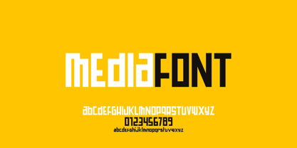 Mediafont is a modern geometric font ideal for titration, branding, poster.
 - Hausbau by FaceType,
$8.00 Hausbau is a radical geometric font, inspired by the German Bauhaus.
 - Wilke Kursiv by Canada Type,
$24.95 Martin Wilke’s underrated yet influential deco classic from 1932 has both feet firmly planted in the high traditions of Western European calligraphy while carefully and subtly introducing some traits from the sweeping geometric/minimalist vision of the time. In a way, it was one of the representatives of the European anti-type typefaces of that era, when print media was searching for the elusive aesthetic balance between humanism and geometry. This typeface enjoyed some popularity in Germany for a few years, and went on to influence further type designs in Holland and Italy. After the second World War, the black hole that swallowed a big chunk of Europe’s print culture, new influences and technologies overtook the scene, and selective historical emphasis ensued, highlighting some of the era’s designs and overlooking others. Further selective picking in the digital era all but buried Wilke’s body of work - unfairly so, because he was just as important in German type history as Bernhard, Post, Schneidler, Tiemann and Trump. The original metal Wilke Kursiv came in one weight. This digital version goes a long way in expanding on that original offering. Now Wilke’s masterpiece comes in three weights, and with a full Pro treatment including swash caps, small capitals, five types of figures, automatic fractions, and plenty of other OpenType niceties. Each of the Wilke Kursiv Pro fonts comes with over 700 characters, and contains support for most Latin-based languages. Also available are three non-Pro fonts in each weight.
 - Trenda by Latinotype,
$29.00 Designed by Daniel Hernández and Paula Nazal. Corrections and review by Alfonso García and Rodrigo Fuenzalida. Trenda is a geometric sans-serif typeface based on the uppercase of Trend —a Latinotype font, released in 2013, that was very well received. This new typeface comes with a wider character set that offers a complete family of uppercase and lowercase in different weights. Trenda is a versatile easy-to-use functional display font with a strong personality, especially its uppercase, which makes the designer’s work easier. Trenda’s lightest and heaviest variants are ideal for display use while its middle weights work well with short and mid-length texts. This typeface has been designed especially for corporate projects, logotypes and publishing. Trenda comes in 8 weights, ranging from Thin to Heavy, and includes matching italics as well as small caps and alternates. The family contains a 634-character set that supports 206 different languages.
 - Quatre by Blank Is The New Black,
$15.00 Quatre is a clean, friendly, monoline display script with a number of subtle but significant features. Originally based on the style of cursive you may or may not have been taught in middle school, Quatre has a clean geometric flow to it while containing a robust set of OpenType features such as ligatures, swash capitals, and stylistic alternates that give it a unique look. With over 700 glyphs, coverage for over 30 languages, arbitrary fractions, contextual alternates and more, Quatre will have you covered for whatever situation you may run into. I mean, probably. I can’t know every single weird way you might be trying to use it. The point is, it’s got all of the bells and whistles you could reasonably hope for. Make sure you open up the OpenType panel in Illustrator, Photoshop, and InDesign to make use of all of those features.
 - Hauslan by Álvaro Thomáz Fonts,
$15.00 Hauslan is a simple, minimal and geometric type family inspired by the rationality presented by Bauhaus in 1920 which affected many areas such as architecture and graphic design. Following the concept of basic geometric shapes, Hauslan focuses on readability and versatility, either for small texts or headlines.
 - Athan by Thinkdust,
$10.00 Athan is an uppercase geometric sans-serif typeface designed by Dani Montesinos in 2009. Inspired by one piece of lettering from the 1970s, Athan offers something a little different in terms of typography. With strong geometric forms, and highly distinctive characters, it's sure to catch your eye.
 - Concord by Soneri Type,
$39.00 Yet another typeface with simplicity as its core element. Concord is derived from a successful type family ‘Accord Alternate’ with an added geometric touch. Concord is a geometric sans serif. It has large counters which enhance readability. It is available in seven different weights for emphasis.
 - Ronduit Capitals Light - Personal use only

- Nitaka - Personal use only

- Adlanta - Unknown license

- Grotesque - 100% free

- Commander Edge - Personal use only

- Aukim ExtraBold - Personal use only

- groutpix - Personal use only

- Media Gothic - Unknown license

- DNNR - Personal use only

- disc - Unknown license

- Blix Black - Personal use only

- Pricedown - Unknown license


