10,000 search results (0.054 seconds)
  1. Easy Eights NF by Nick's Fonts, $10.00
    Here's a faithful rendering of a typeface originally named Octic, from the 1884 specimen book of the Palmer & Rey Type Foundry of San Francisco. Its geometric severity is softened by the gently scalloped "bites" taken out of the corner. Sets tight to make attention-getting headlines. Both versions contain the complete Latin 1252, Central European 1250 and Turkish 1254 character sets.
  2. Carlos by CastleType, $59.00
    Carlos was inspired by a Spanish typeface designed by Carlos Winkow called 'Elektra' (c. 1940), available elsewhere as Casablanca. Carlos is an exceptionally graceful, condensed art deco sans serif design that supports all European languages that use the Latin alphabet as well as those that use the Cyrillic alphabet, and includes OpenType features, arbitrary fractions, and a collection of geometrics, dingbats & fleurons.
  3. Liquorstore by Chank, $99.00
    Inspired by hand-painted liquor store signage in Minneapolis, as well as constructivist propaganda posters and old magazine logos, Chank created Liquorstore as a simple yet elegant exercise in font creation based on basic geometric forms with subtle, humanist sensibilities. Works great for display usage for headlines, labels and prohibitive signage. A simple and versatile, must-have display poster font!
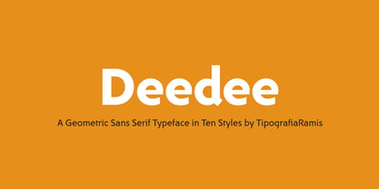
  4. Dee Dee by TipografiaRamis, $39.00
    This is a second edition of Deedee type family, originally designed in 2011. Deedee is a geometric sans serif typeface family of ten styles with extended support for most Latin languages plus Cyrillic. Revisions in this edition included minor adjustments to glyph shapes and improved kerning tables. The typeface is ideal for use in display sizes and is quite legible in the text.
  5. Gilmore Fahrenheit by Red Rooster Collection, $45.00
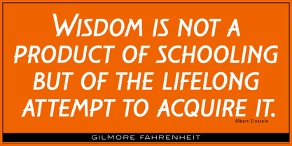
    Gilmore Fahrenheit is a glyphic, sans serif typeface that was inspired from early designs by the renowned English typographer Eric Gill. It was designed in 1992 by A. Pat Hickson (P&P Hickson) and Steve Jackaman (ITF) exclusively for the Red Rooster Collection. It was designed with true small caps, has an italicized geometric look, and possesses legibility reminiscent of Swiss typefaces.
  6. Dont Walk Run - Unknown license
  7. Smart Cookie by PizzaDude.dk, $15.00
    Smart Cookie is a happy and handmade font, ideal for packaging, posters or books (especially children's books!) It's highly legible and comes int 3 versions: Regular, Shine and Layer. Mix the Regular and Shine layer (using different colours) to make a cool shiny effect, or use the Shine version where the colours rely on the fore- and background colours...also a nice way of making your text stand out!
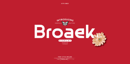
  8. Broaek by Linecreative, $10.00
    Broaek is a display typeface with a modern impression. This font consists of 3 types of styles, namely regular, thin, and outline. This font is perfect for use in headlines, posters, branding, titles, and other graphic designs. What you get dear, you will get : 1. Broaek- A clean San serif font including Upper & Lowercase characters(Regular,thin,Outline) 2. Numbers and Pointing 3. Supports Multi linguage (Latin Western Europe)
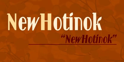
  9. New Hotinok 2D by 2D Typo, $36.00
    The type family New Hotinok 2D continues Ukrainian tradition and in the same time connects it with Art Deco style. It is good for presentation, literary, arts and foods, especially sweets and coffee. Connection of geometry and ornamental effect can help in logo design. Includes four styles, Latin diacritics for many languages.
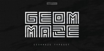
  10. Geommaze by Artyway, $14.00
    If you like minimalism and geometry, symmetrical and line design, I suggest you get acquainted with the Geommaze font. I created it with love and attention to detail. It was inspired by computer chip, architectural shapes, maze of road junctions. Try "Geommaze" in these topics and the result will be really awesome!
  11. Paranoid - 100% free
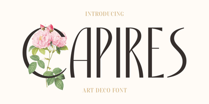
  12. Capires by Craft Supply Co, $20.00
    Capires - Art Deco Font is a captivating fusion of two iconic art movements, Art Deco and Art Nouveau, blended into a contemporary typeface that pays homage to the rich artistic heritage of both styles. This font beautifully combines the geometric precision of Art Deco with the intricate, organic motifs of Art Nouveau, resulting in a harmonious masterpiece of design. Capires is the perfect choice for projects that demand a unique and mesmerizing synthesis of these two influential art movements. Whether you're working on branding, packaging, or editorial design, Capires brings a sense of timeless elegance and artistic richness to your work. With Capires, your designs seamlessly bridge the gap between past and present, making it an exceptional choice for projects that seek to capture the essence of both Art Deco's geometric refinement and Art Nouveau's flowing, ornamental beauty. This font transforms your creations into an elegant and visually captivating experience, where tradition meets modernity in a harmonious embrace.
  13. Divan Arabic by Naghi Naghachian, $64.00
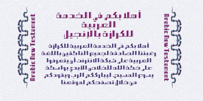
    Divan Arabic is a new creation of Naghi Naghashian. Divan Arabic is a modern Sans Serif Headline font. This innovation is a contribution to modernisation of Arabic typography, gives the font design of Arabic letters real typographic arrangement und provides more typographic flexibility. Divan Arabic supports Arabic, Persian and Urdu. The highest degree of calligraphic grace and the clarity of geometric typography. This typeface offers a fine balance between calligraphic tradition and the Sans Serif aesthetic common in Latin typography. Divan Arabic design fulfills the following needs: A. Explicitly crafted for use in electronic media fulfills the demands of electronic communication. B. Suitability for multiple applications. Gives the widest potential acceptability. C. An attractive typographic image. Divan Arabic was developed for multiple languages and writing conventions. Divan Arabic supports Arabic, Persian and Urdu. D. The highest degree of calligraphic grace and the clarity of geometric typography. This typeface offers a fine balance between calligraphic tradition and the Sans Serif common in Latin typography.
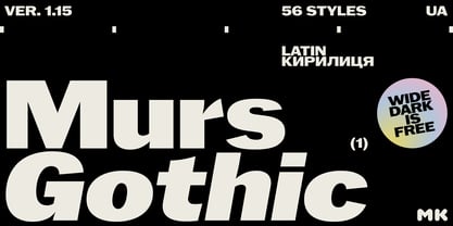
  14. Murs Gothic by Kobuzan, $-
    Murs Gothic is a bold sans serif with sharp dynamic forms. It is a collective image of American Gothics from the 19th and early 20th centuries. It is quite massive, has tight letter spacing and increased contrast. Somewhere elongated, as well as asymmetric details give it a characteristic emotionality and playfulness. Especially against the backdrop of neutral geometric sans-serifs. The set comes with 694 glyphs. Among which are Latin and Cyrillic characters, a couple of ligatures, alternatives, geometric symbols, arrows and much more! Murs Gothic consists of 56 styles that are adjustable in weight and width + italics. Or one variable font with 3 axes. This allows it to be very flexible and adapt to many different designs. All styles include an extended set of Latin characters and a basic Cyrillic. A font style Murs Gothic Wide Dark is free for unlimited use. Murs Gothic was designed by Maksym Kobuzan in 2023.
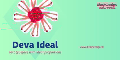
  15. Deva Ideal by DizajnDesign, $49.95
    Deva Ideal was inspired by women’s beauty. It didn’t come only from the desire to create a new typeface. It also seeks to materialize beauty in a visual form. Instead of imitating the shapes of the female body or other formal attributes, Deva Ideal is an abstract expression of the women’s beauty. The unique character of the typeface is achieved by the use of soft, almost invisibly bent strokes, since one of the priorities of the typeface is not to disturb the eye of the reader with odd design details. Deva Ideal excels in her cold beauty and shows her sex appeal. The soft curves present in Deva Ideal differ from the masculine and technical shapes used in most contemporary typefaces. Deva Ideal has ideal proportions (90 / 60 / 90) and its shapes are essential and simple. Because of this, it is ideal for setting text in all kinds of printed matter: catalogues, books and magazines. The letter forms are wide and open, so text can be set in small sizes and thus space can be saved, while keeping the same degree of readability. The author wishes to acknowledge František Štorm for his invaluable opinions. Also to Palo Bálik and Peter Bilak for their contributions. I am specially grateful to all the devas (archaic expression for beautiful young girl), who inspired me to design this typeface. This is dedicated to Janka Ráczová, Jarka Krajčiová, Mariana Felgueiras and obviously to Martinka Filípková! Every use of Deva Ideal is a little homage to these interesting women.
  16. Funky - Unknown license
  17. Athletic - Unknown license
  18. Storybook - Unknown license
  19. Astigma - Unknown license
  20. Trekbats - Unknown license
  21. Stonehenge - Unknown license
  22. Singothic - Unknown license
  23. Signboard - Unknown license
  24. Mariah - Unknown license
  25. Stage - Unknown license
  26. Caesar - Unknown license
  27. Notepad - Unknown license
  28. Clockwork - Unknown license
  29. Cuckoo - Unknown license
  30. Diploma - Unknown license
  31. Karloff - Unknown license
  32. Virgin - Unknown license
  33. Looper - Unknown license
  34. Nauert - Unknown license
  35. Tristan - Unknown license
  36. RusskijModern - Unknown license
  37. Kroeburn - Unknown license
  38. KurtRussell - Unknown license
  39. Ten - Unknown license
  40. Patrick - Unknown license
Looking for more fonts? Check out our New, Sans, Script, Handwriting fonts or Categories
abstract fontscontact usprivacy policyweb font generator
Processing