10,000 search results
(0.051 seconds)
- Mono Polz by Four Lines Std,
$15.00 "Mono Polz" takes its inspiration from the zany and eccentric world of cartoons. Every letter is an explosion of creativity, with bold lines and playful shapes that'll make your designs pop right off the page. It's the perfect font to add a touch of comic mischief to your projects. - Uppercase
 - Nsai Regular - Personal use only

- GOBAH by Product Type,
$15.00 Welcome to Gobah, a font that presents the future atmosphere in an amazingly modern and futuristic style. Are you looking for the perfect solution for modern, futuristic, sci-fi, and future-themed projects? Gobah is the right choice. Gobah is a font that transports you to an extraordinary world with a unique look that reflects a sophisticated future feel. Each letter is uniquely designed, giving your project a modern, innovative, and charming look. With Gobah, you can steal the show and create an unforgettable impression. The main benefit of Gobah is its ability to deliver stunning styles. Each letter has an exclusive design, creating an eye-catching futuristic look. This font will give your projects a strong visual appeal, reinforcing the message you want to convey. Gobah also supports multilingualism, allowing you to display text in multiple languages without a hitch. This flexibility ensures that you can easily reach a global audience and convey your message with consistent clarity across cultural contexts. Take a step forward in your design with Gobah. This font will give a stunning modern and futuristic twist, creating a memorable impression on your logos, posters, and web presence. Let Gobah be the right choice for your vibrant, modern, futuristic, sci-fi, and future projects.
 - Eclipse is not a font that is widely recognized or standardized across design platforms as of my last update in April 2023. However, the naming suggests connotations of creativity, modernity, and per...
- As an imaginative exploration of the font named "End of Path," let's embark on a journey into its design and character attributes. Although it's essential to acknowledge that this specific font might...
- As of my last update in April 2023, the font named Ocean View may not be a widely recognized standard typeface included in major font libraries or collections, such as those from Adobe Fonts, Google ...
- Bodoni by Linotype,
$29.99 Giambattista Bodoni (1740–1813) was called the King of Printers and the Bodoni font owes its creation in 1767 to his masterful cutting techniques. Predecessors in a similar style were the typefaces of Pierre Simon Fournier (1712–1768) and the Didot family (1689-1836). The Bodoni font distinguishes itself through the strength of its characters and embodies the rational thinking of the Enlightenment. The new typefaces displaced the Old Face and Transitional styles and was the most popular typeface until the mid-19th century. Bodoni’s influence on typography was dominant until the end of the 19th century and, even today, inspires new creations. Working with this font requires care, as the strong emphasis of the vertical strokes and the marked contrast between the fine and thick lines lessens Bodoni’s legibility, and the font is therefore better in larger print with generous spacing. The Bodoni of Morris F. Benton appeared in 1911 with American Type Founders.
 - Soprani Variable by insigne,
$129.99 "Step into a world where the 1920s meet the future with Soprani—a typeface that seamlessly blends vintage charm and modern sophistication. Drawing inspiration from a distinctive plaque unearthed in New Zealand, Soprani showcases serifs that flare and shimmer, capturing the essence of art nouveau and arts & crafts in a contemporary light. Dive into its rich OpenType features, granting designers unparalleled flexibility to bring their visions to life. Its condensed yet elegant letterforms are the perfect fit for everything from artful table books and stylish menus to dynamic media showcases in TV and film. Spanning from the graceful subtlety of its thin variant to the undeniable boldness of the black, Soprani is diverse and dynamic. Soprani isn't just a typeface—it's a revolution in design. Production assistance by Lucas Azevedo and ikern.
 - VLNL Bleek by VetteLetters,
$35.00 Bleek started its life as a logo for a rock band with the same name. This makes sense as it has distinct roots in classic rock logo design. Any rock band name set in VLNL Bleek looks instantly cool – profi logo quality! Of coarse Bleek will serve an awesome purpose as a headline font as well. Or gig flyers and posters. Or band backdrops. Just turn it up to 11! DBXL expanded the original logo into the full Heavy weight and added Light and Medium cuts. VLNL Bleek is an all caps font with uppercase and lowercase variations for maximum effect. It has a number of Open type features, like and alternate F, mirrored A and O and a TT ligature to spice up your designs. VetteLetters says: Rock on!
 - ITC Cinderella by ITC,
$29.99Some typefaces are staid, somber design tools. Then again, there's ITC Cinderella from Patricia Lillie: a typeface that's light-footed as a ballerina and joyful as a child at play. “There is a group of display faces that I simply love. Type that just seems to dance, type that makes me smile, designs that, when I see them, I say, "Boy, do I wish that was one of mine" says Lillie. “Although I never wanted to imitate these designs, when Cinderella started to emerge, I felt like it was the closest I've come to that quality.” ITC Cinderella projects gaiety and freedom. Capitals harmonize with a lowercase that bounces along with a lively, carefree attitude. Stroke weight stress is, well, all over the place. Curlicues abound. This delightful design is just that: brimming with delight. - Boos by Fontex,
$29.00 A lot of time and effort has been put into the process of creation the Boos Font. A careful analysis of the current font market and overly increasing customer needs have shaped Boos' final appearance and content. We don't have a precise target audience for Boos, since the amazing amount and structure of the chosen characters enables a very wide utilization. It will be best suited for headlines for classy magazines. It's look and feel came from a different designing approach, so that it can successfully satisfy the needs of even the neediest. Shining with calm and dignity, while in the roots being aggressive, it has successfully connected classic and modern styles - representing it's largest value. Medium, bold, black and light versions are included in the complete package, at a discounted price!
 - Moon Swing by IKIIKOWRK,
$17.00 Proudly present Moon Swing - Futuristic Type, created by ikiiko. Moon Swing is a thin-minimalist style typography that embodies both modernism and futurism. The simplicity and clean forms combined with the decorative curves convey a futuristic aspect that represents the future. The sans-serif styling and the font's light strokes and gentle curves give this font a clean and elegant look. The corners of the letterforms are rounded to provide a precise geometric feel, making it perfect for applications where a contemporary look is required. This typeface is perfect for an elegant logo, branding, fashion brand, luxury brand, layout magazine, beauty product, packaging product, quotes, or simply as a stylish text overlay to any background image. What's Included? Uppercase & Lowercase Numbers & Punctuation Ligature (Bonus) Multilingual Support Works on PC & Mac
 - Shorelines Script Bold - Personal use only

- Fatso - Unknown license

- As of my last update, the font "Aircloud" by Fontone may not have been widely recognized or described in sources accessible to me, so I can't give a specific description of "Aircloud." However, I can...
- Floral Decay by Mircea Boboc,
$22.00 This is Floral Decay, your seasonal autumn font with jaded, weathered, and earthy contours of rustic lettering. As they blend into words, the characters evoke floral arrangements of a decaying beauty. It is versatile, playful, and perfect for Graphic Design decorations! This font is unique because, in order to create it, I had to answer some tricky questions: What makes autumn… autumn? Capturing the essence of the other seasons into your letters comes easier. For instance, in order to suggest summer, you only need to draw a few flowers. How about autumn? You could garnish your letters with a few grapes, you might think, but it would only result in a grape-themed font. The notion that is more directly associated with autumn is the image of falling and withering leaves, which brought me to the second question. How exactly are you going to create something beautiful out of a somewhat morbid premise, like wilted leaves? Well, I soon realized that by creating a handwritten font and preserving the right imperfections, you can actually portray collateral beauty. In this context, asymmetry is important because it suggests decay. Further on, the design concept required the letters to come very close together, so that every typed word can be regarded as a floral arrangement. How close together, though? As much as possible without confusing one with the other, risking a lack of legibility. Therefore, in contrast with the demo version of this font, this actual version provides the ideal kerning.
 - Galeb by Tour De Force,
$25.00 Galeb is simple geometric sans font family in 4 weights - Light, Regular, Bold and Black, ideal for corporate and editorial projects. With angled stem endings, Galeb gives enough impression to be used as display font as well.
 - FF Dax Compact by FontFont,
$59.99 German type designer Hans Reichel created this sans FontFont in 2004. The family has 6 weights, ranging from Light to Black and is ideally suited for editorial and publishing and small text. FF Dax Compact provides advanced typographical support with features such as ligatures, alternate characters, case-sensitive forms, fractions, super- and subscript characters, and stylistic alternates. It comes with a complete range of figure set options – oldstyle and lining figures, each in tabular and proportional widths. This FontFont is a member of the FF Dax super family, which also includes FF Dax and FF Daxline.
 - ITC Holistics by ITC,
$29.99Some words from the designer... Like a tree rooted in ancient philosophy with branches reaching into the new age, ITC Holistics encompasses 82 pictographs of astrology, healing, magic, nature and spirituality. In an illustration style that originates from hand-carved rubber stamps, west coast designer Teri Kahan shines new light on these timeless symbols. ITC Holistics is functional collectively and individually for graphics and logos. As with Teri's companion font ITC Connectivities, ITC Holistics can also be used as a divining tool. Just type your name in caps and lower case and see what the images tell you! - Olivia Sans by Stabenfonts,
$45.00 The rounded Sans with edges. Olivia Sans got curves on the outlines and edges on the inlines. So it can be very legible and space efficient at the same time: the curves keep the distinctions between the letters, the corners keep the influences from broadnibbed pens with a subtle horizontal stress for great legibility. Olivia has personality without being obtrusive. Three weights (light, regular, bold) are equipped with real italics, SmallCaps, different sets of figures, accents for almost every latin script, arrows, symbols. A fourth weight (black) comes without italics or SmallCaps, but all the other features. Olivia: with or without.
 - Frutiger Arabic by Linotype,
$149.00 Neue Frutiger Arabic was created by Nadine Chahine and a team of designers and font engineers from the Monotype Studio, under the direction of Monotype type director Akira Kobayashi. The family is available in 10 weights from Ultra Light to Extra Black. Neue Frutiger Arabic embodies the same warmth and clarity as Adrian Frutiger's original design, but allows brands to maintain their visual identity, and communicate with a consistent tone of voice, regardless of the language. It is part of the Neue Frutiger World collection, offering linguistic versatility across environments – suited to branding and corporate identity, advertising, signage, wayfinding, print, and digital environments.
 - Westiva by Asenbayu,
$15.00 Westiva is a serif font family with an elegant and classy look. Each Westiva glyph font is designed with natural and beautiful curves. Westiva Typography can help you complete various projects such as luxury brand logos, journals, business cards, titles, products, social media posts, web and much more. If you're involved in a project that requires beautiful and professional writing, the Westiva font is perfect to help you get it done. Westiva fonts feature opentype, kerning, ligatures and alternates packed in 4 fonts: Light, Regular, Medium and Bold. Westiva fonts include uppercase letters, lowercase letters, numeral, punctuation and multilingual support.
 - NorB Pen Cased by NorFonts,
$28.00 This is the Cased version of my NorB Pen fonts are being inspired from Arial Round font, I use this font regularly in my jazz lead-sheets. It's a handwritten text font emulating marker permanent pen. You can use this font with any word processing program for text and display use, print and web projects, apps and comic books, graphic identities, branding, editorial, advertising, scrapbooking, cards and invitations and any casual lettering purpose… or even just for fun! Pen cased font8 weights, each with their matching italics and in a Light, Normal, Bold and Heavy version.
 - Olivia Serif by Stabenfonts,
$45.00 The rounded Serif with edges. Olivia Serif got curves on the outlines and edges on the inlines. So it can be very legible and space efficient at the same time: the curves keep the distinctions between the letters, the corners keep the influences from broadnibbed pens with a subtle horizontal stress for great legibility. Olivia has personality without being obtrusive. Three weights (light, regular, bold) are equipped with real italics, SmallCaps, different sets of figures, accents for almost every latin script, arrows, symbols. A fourth weight (black) comes without italics or SmallCaps, but all the other features. Olivia: with or without.
 - UT Laurelle by Uniontype,
$20.00 Laurelle is a polished and smooth script family. The family consists of light, regular, bold and press styles. Laurelle provides advanced typographical support with contextual alternates, final forms, ligatures and swashes. This font also includes Cyrillic, with all OpenType features. It is most suitable for the headlines of all sizes, as well as for the text blocks. Laurelle is versatile and can be used on cards, posters, merchandise, book covers, websites, packaging, and basically anywhere you like. The overall feel of the font is warm, elegant and informal and it is perfect if you want to convey a sense of friendliness and style.
 - Chekos by Authentype,
$11.00 Chekos is a feminine type face designed to be elegant and modern. Its clean, simple style makes it perfect for any project. Chekos comes in 9 weights: Light, Regular, and Bold. Each weight has five different styles. Chekos was created by designer Ekayasa. She wanted to create something that would be both beautiful and functional. Her goal was to make a typeface that could be used for everything from headlines to logos. Chekos is available in OpenType format and includes stylistic alternates, ligatures, and swashes. It is free for personal use and commercial licensing options are available upon request.
 - Maracatu by Bruno de Aviz,
$5.00 The family of Tipografia Maracatu was born in 2020 when we could not leave the house because of the coronavirus epidemic. I had no idea how it would turn out. I just wanted to draw letters. When I finished the regular version, I thought it looked a lot like the art and music from the Northeast of Brazil, and that is why I came up with the name Maracatu. Maracatu is a musical-style original from the Northeast of Brazil. After I had the font style and the Regular version, I thought it would be nice to have Bold and Light.
 - Neue Frutiger Vietnamese by Linotype,
$29.00 Neue Frutiger Vietnamese''' was developed by a team of designers and font engineers from the Monotype Studio under the direction of Monotype type director Akira Kobayashi. The family is available in 10 weights from Ultra Light to Extra Black, with matching italics. Neue Frutiger Vietnamese embodies the same warmth and clarity as Adrian Frutiger's original design, but allows brands to maintain their visual identity, and communicate with a consistent tone of voice, regardless of the language. It is part of the Neue Frutiger World collection, offering linguistic versatility across environments – suited to branding and corporate identity, advertising, signage, wayfinding, print, and digital environments.
 - Circe Slab by ParaType,
$40.00 Circe Slab is a slab version of the popular geometric sans serif Circe . It contains variations in weight and contrast, including three regular styles that range from non-contrasting geometric to almost typical book serif contrast ones. In addition, all text styles have narrowed versions. The character set of the font includes small caps, minuscule figures and a wide variety of alternative capitals and small caps. Regular styles of Circe Slab are suitable for long texts and the light and bold ones for headlines. The font was designed by Alexandra Korolkova with the assistance of Olexa Volochay and released by Paratype in 2018.
 - Kopitha by Ekahermawan,
$15.00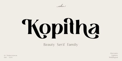 Kopitha is a beauty serif family with 5 weights from Light to ExtraBold. Kopitha also includes alternate characters (PUA Encoded) and ligatures to give you a wide range for create an unique typographic design results. Kopitha is suitable font for many different projects such as logo, branding, poster, magazines, label, merchandise, invitation, presentation, advertising, quotes and so much more! FEATURES: OpenType support Playfull to use (with ligatures and alternates options) Multilingual support PUA Encoded If you need support or more information about this item please kindly contact me : ekahermawanputu@gmail.com Thank you so much I really hope you enjoy when using it!
 - Monotype Clearface Gothic by Monotype,
$29.99Clearface Gothic first appeared in 1910, designed by Morris Fuller Benton, the world-famously prolific typeface artist. In addition to Clearface Gothic, Benton also designed classics like Franklin Gothic, Century Expanded, and many other types. Clearface Gothic is a sans serif face with light forms displaying the Zeitgeist of the turn of the 20th century. Distinguishing characteristics are the open forms of the a" and "c," the arched "k," and the upward-tilting horizontal stroke of the "e." The relatively narrow typeface, with its open inner white spaces, is extremely legible even in small point sizes. There is no accompanying italic." - Syabil by Eko Bimantara,
$16.00 Syabil is a sans serif font family designed by Eko Bimantara. This font crafted with the intention to present a clean, legible, multipurpose that easy to read wether it on screen or print. Fit for all purposes; Text, display, headline, print, corporate identity, logo, branding, product, infographic, photography and other application and medium. This font consist of 9 weight; Thin, Light, Book, Regular, Medium, SemiBold, Bold, ExtraBold and Heavy with each weight paired by italic. Also including Latin Plus language support with more than 11.700 glyphs in all weight which make this font contain broad language support.
 - Meguro Sans by GT&CANARY,
$27.00 Meguro Sans has a modern-styled boxy shape that achieves clean, industrial yet friendly style lends itself well to brand building. Its mono-line oriented and very high X-height ensure that it is extremely legible and creates a strong impression. Meguro Sans is Sans serif version of Meguro Serif. The Meguro sans font family is comprised of 10 styles with 5 different weights from light to black, along with matching italics offering possibilities for use in web, print, package and sign design, all with the goal of building an established look for brands in wide range of industries.
 - Alda by Emigre,
$59.00 The original idea for Alda came from exploring an alternative approach to generating different typeface weights by adapting the characteristics of physical objects. I was interested to find out how far this could be pushed before the letters became a parody of what they referenced. Initially I took this treatment very literally, with the boldest weight expressing the tension of bent steel, and the lightest being as spineless as a rubber band. This allowed me to infuse each weight with unique characteristics, where the bold is robust and angular, and the light is delicate and soft.
 - Burlesk Queen JNL by Jeff Levine,
$29.00 Burlesk Queen JNL was inspired by the hand lettered title “Gypsy” on the sheet music for "Everything's Coming Up Roses" from the movie musical based on the autobiography of famed stripper Gypsy Rose Lee. With just four basic letters to work with [G,Y,P and S], a full character set was drawn from scratch. The design features bold spur serif characters on individual ‘marquees’ bordered with lights. Burlesk Queen One JNL is the original version with white characters on black panels, while Burlesk Queen Two JNL has those panels stripped away to provide black letters on a white background.
 - Diskanila by Ekahermawan,
$12.00 Diskanila is a romantic swirly script font. This beautiful script including with more than 300+ alternative characters (PUA Encoded) that gives you a wide variety of romantic typography design results. Diskanila comes with bold and light swirly alternatives to make your many different projects such as logo, feminine branding, poster, magazine, label, merchandise, presentation, advertising, and invitation card more beautiful ! FEATURES: OpenType support Playful to use (with ligatures options and alternatives options) Multilingual support PUA Encoded If you need support or more information about this item please kindly contact me : ekahermawanputu@gmail.com Thank you so much I really hope you enjoy using it!
 - Neue Frutiger Arabic by Linotype,
$79.00 Neue Frutiger Arabic was created by Nadine Chahine and a team of designers and font engineers from the Monotype Studio, under the direction of Monotype type director Akira Kobayashi. The family is available in 10 weights from Ultra Light to Extra Black. Neue Frutiger Arabic embodies the same warmth and clarity as Adrian Frutiger's original design, but allows brands to maintain their visual identity, and communicate with a consistent tone of voice, regardless of the language. It is part of the Neue Frutiger World collection, offering linguistic versatility across environments – suited to branding and corporate identity, advertising, signage, wayfinding, print, and digital environments.
 - FF Letter Gothic Slang by FontFont,
$41.99 American type designer Susanna Dulkinys created this display and sans FontFont in 1999. The family has 6 weights, ranging from Light to Bold and is ideally suited for festive occasions and music and nightlife. FF Letter Gothic Slang provides advanced typographical support with features such as ligatures, alternate characters, case-sensitive forms, and stylistic alternates. It comes with a complete range of figure set options – oldstyle and lining figures, each in tabular and proportional widths. This FontFont is a member of the FF Letter Gothic super family, which also includes FF Letter Gothic Mono and FF Letter Gothic Text.
 - Manhattan Midnight by Scholtz Fonts,
$19.95 Manhattan Midnight owes its style to Art Deco fonts of the early 20th century. It has the opulence of New York City in the 20s and 30s, the glitter of city lights, the glamour of movie stars, the razzmatazz of Manhattan in the bad old days. You can use Manhattan Midnight for all advertising with an art deco flavor, for music media needing a bluesy, retro look, for movie posters reminiscent of the era, and so many more applications. The font has all the features usually included in a fully professional font. Language support includes all European character sets.
 - VLNL Brokken by VetteLetters,
$35.00 'Brokken’ is the Dutch word for ‘chunks’. They are the hearty specialty of the house, prepared by the ship’s cook Donald DBXL Beekman. Nice'n'greasy and monospaced, you'll always find a decent way to cram the letters in. Brokken is straightforward, straight-lined with beveled corners, and all caps. For the ones who have to watch their weight, or who simple don’t like their fonts to be too fatty, DBXL designed a diet version called Brokken Light. With their big contrast, both weights combine very well and are great for making ultra-compact ribbon headlines or stacking vertically.


