6,962 search results
(0.893 seconds)
- Futura Paneuropean by Linotype,
$65.00First presented by the Bauer Type Foundry in 1928, Futura is commonly considered the major typeface development to come out of the Constructivist orientation of the Bauhaus movement in Germany. Paul Renner (type designer, painter, author and teacher) sketched the original drawings and based them loosely on the simple forms of circle, triangle and square. The design office at Bauer assisted him in turning these geometric forms into a sturdy, functioning type family, and over time, Renner made changes to make the Futura fonts even more legible. Futura’s long ascenders and descenders benefit from generous line spacing. The range of weights and styles make it a versatile family. Futura is timelessly modern; in 1928 it was striking, tasteful, radical — and today it continues to be a popular typographic choice to express strength, elegance, and conceptual clarity. NEW: the new Futura W1G versions features a Pan-European character set for international communications. The W1G character set supports almost all the popular languages/writing systems in western, eastern, and central Europe based on the Latin alphabet including Vietnamese, and also several based on Cyrillic and Greek alphabets. - Paint Boy - Unknown license

- Dodgenburn - Unknown license

- Jet Plane - Unknown license

- verrutscht - Unknown license

- Shoika by Tropical Type Foundry,
$29.99 Shoika is a celebration of geometry. It’s a typographic quest for purity with a touch of hidden gems in the form of unique details and characters. Shoika is perfect for the modern designer who needs a solid, refined and versatile font family for branding, UX, web, packaging and editorial jobs. Shoika presents a wide range of weights (18 fonts), supports an extensive variety of Latin alphabet-based languages (over 200), and it has been manually kerned and auto-hinted for enhanced performance on screen. It includes several OpenType features like case diacritics, tabular figures, arrows, ordinals, inferior and superior figures, numerator and denominator figures, fractions, circled figures, black circled figures, outline dingbats and solid dingbats. All typefaces from Tropical Type Foundry include free updates and free technical support. For custom enquiries don’t hesitate to get in touch: tropicaltypefoundry@gmail.com Imagery credits: Unsplash (Photo), DrawKit and RawPixel (Illustrations).
 - Core Deco by S-Core,
$20.00 Core Deco is font family inspired by Art Deco posters from 1920s, '30s, and '40s. The font family is anchored by two fonts: Core Deco, an elegant monolinear update of Art Deco lettering, and Core Deco C1, a vivacious weighted counterpart. Both channel the era's affinity for geometry and are accompanied by a host of alternate styles. Three variants of Core Deco (A1–A3) offer drop-shadow options on the monolinear style. Eight variants of C1 (B1–B6 and C2–C3) offer contemporary takes on Art Deco outlining and shading of weighted strokes. One variant (C4) offers a drop-shadow only option that may be layered with any of the weighted fonts. The Core Deco family supports complete Latin 1252, Central European 1250, and Turkish 1254 character sets. If you are looking for an Art Deco–style style font which is modern and immediately usable in various artworks, get this family!
 - Gracious Bowing by Nathatype,
$29.00 Gracious Bowing is a meticulously designed display serif font to meet your design needs. It expresses formal yet simple nuances in modern, elegant designs. Its main characteristic is the consistent geometry, proportion, and line thickness on each letter to be legible. For this reason, you can use this font for any text sizes. In addition, you can improve your designs with the available features. Features: Stylistic Sets Ligatures Multilingual Supports PUA Encoded Numerals and Punctuations Gracious Bowing fits for various design projects, such as posters, banners, logos, magazine covers, quotes, headings, printed products, invitations, merchandise, social media, etc. Find out more ways to use this font by taking a look at the font preview. Thanks for purchasing our fonts. Hopefully, you have a great experience using our font. Feel free to contact us for further information when you have a problem using the font. Thank you. Happy designing.
 - Indecise by Tipo Pèpel,
$22.00 Even though the name seems not to tell much, Indecise shows a clean and coherent design. The shapes of the characters reference the Latin typefaces that were promoted by great figures like Enric Crous-Vidal and José Mendoza y Almeida in the 50s. Indecise uses the body of incise typefaces and gets rid of the subtle terminals for the strokes. It is a high-contrast sans divided into 5 elegant subfamilies, which use different widths. From the condensed version to the extended one, the family includes 50 fonts counting upright and italic. This collection of widths make for many possible combinations of styles. Indecise is a humanist typeface, it puts geometry apart and embraces the calligraphic gesture. This helps to suggest the movement of the strokes while avoiding to create text with a static appearance. Thin and thick strokes come together and define a smooth rhythm for reading.
 - Scribal by Loaded Fonts,
$15.00Designed with help and inspiration from legendary tattoo artist Dustin Horan. This beautiful time saver was designed specifically for skin application. Short words and initials can instantly be turned into seamless tribal style tattoos. Each glyph links with the next allowing letters to flow endlessly around limbs and in circles. Respecting the rhythm and geometry principles laid forth by American pioneering tribal artist Leo Zulueta, Scribal makes flowing text shapes that disguise themselves as design. When mirrored back to back and rotated vertically, Scribal becomes well-crafted tribal pattern. Typeface wise, Scribal breaks the mold. While a script font, Scribal was designed to be written in all capitals. Each capital is a mono-spaced glyph, providing even spacing. The shape influences are also vast, ranging from scripts, to blackletters, to romans. Making Scribal a very "Americanized" font, reflective of this "Americanized" style of Tribal Tattooing. - Pekin by HiH,
$15.00 Pekin is an unusual design with an oriental flavor. It was originally designed by Ernst Lauschke and released by The Great Western Type Foundry of Chicago as “Dormer,” which is similar to the French verb ‘to sleep,’ not exactly a marketing triumph. Barnhart Bros. And Spindler (independently-operated subsidiary of ATF since 1911) bought Great Western in 1918. According to McGrew, AMERICAN METAL TYPEFACES of the TWENTIETH CENTURY, BB&S renamed the typeface prior printing their 1925 specimen book — guess they wanted something just a tad more exciting. Quirky, distinctive and fun. Pekin ML represents a major extension of the original release, with the following changes: 1. Added glyphs for the 1250 Central Europe, the 1252 Turkish and the 1257 Baltic Code Pages. Added glyphs to complete standard 1252 Western Europe Code Page. Special glyphs relocated and assigned Unicode codepoints, some in Private Use area. Total of 415 glyphs (compared to 218 glyphs in the original release). 2. 652 Kerning Pairs. Note: Ag, Aj and gj will cross unless kerned. Alternative A may also be used. 3. Added OpenType GSUB layout features: onum, salt, liga, dlig, hist, ornm and kern. 4. Revised vertical metrics for improved cross-platform line spacing. 5. Refined various glyph outlines, based on improved scans. 6. Added set of Tabular Numbers at cap height, based on original design; added Old-Style Numbers based on default design. 7. Added a bunch of alternative characters: 18 upper case letters, 10 lower case letters, 1 ampersand and 1 bullet. The alternate c is actually the original design, but I don't like it - easily confused with e. Alt E H M h m n r t are from the original design. I added the rest. 8. 7 Ligatures, 4 Ornaments, 18 Geometric Shapes, 6 Arrows and 12 Misc. Symbols. The zip package includes two versions of the font at no extra charge. There is an OTF version which is in Open PS (Post Script Type 1) format and a TTF version which is in Open TT (True Type)format. Use whichever works best for your applications.
 - Troy3 - Unknown license

- Pale Ale Purveyor - Unknown license

- Cristal Ttris by Johannes Krenner,
$7.00 This Font is inspired by the Nintendo game: Tetris® It has 2 styles: BOLD and THIN. They both have simulated greyscale and can be used out of the box like you see them on the pictures. It comes with more than 450 glyphs per style. More than capable of supporting all european languages, small caps and different numeral figures.
 - One angrila by Sulthan Studio,
$12.00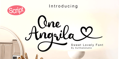 One angrila is a Lovely script font that is very charming and beautiful with its unique handwriting style. Equipped with 457 glyphs. One angrila is perfect for branding projects, stickers, crafts, cutting, handwork, homeware design, product packaging, use in business cards, invitation cards, etc. Simply as a stylish text overlay on a background image or anything that needs a little elegance.
 - Soundfest by Namara Creative Studio,
$20.00 modern marker script font, carefully crafted letters / alphabet in a completely natural hand-drawn look. Perfect for logo, branding projects, wedding designs, product packaging or simply as a stylish text overlay to any background image. Features : Full Set of standard characters and punctuations. Over 450+ characters (include : alternate sets, ligatures and multilingual support) PUA Encoded | no special software needed to access extra characters.
 - Alpine 7558S - Unknown license

- Silkscreen Expanded - Unknown license

- Wavy - Unknown license

- Feathery by kapitza,
$49.00 Feathery is a collection of 45 cute and fantastical bird illustrations. All illustrations are drawn by hand and of the highest quality.
 - Stefan Budde-Siegel - Personal use only

- King Arthur - Unknown license

- Toit - Unknown license

- NewForum - Personal use only

- Bitwise Alpha - Unknown license

- Milden by Youthlabs,
$21.00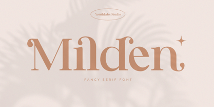 Introducing MILDEN fancy serif font. MILDEN is a serif font that gives fancy touch on your design. It looks so good for fashion brand logo. With many alternative fonts, MILDEN will make it easier for you to use various design functions, be it for logos, typography, magazine, fashion, branding, advertising, and more. What's the Feature ? Uppercase and Lowercase Alternate Ligatures Multilinguals Support Up to 450 Glyphs
 - Basel Stadt by QUADRAAT,
$25.00 Basel-Stadt is a typeface strongly contrasted by long and wide curves and angular shapes in 6 weights from Thin to Bold. The character set contains 401 playfull glyphs and support all latin languages. Basel-Stadt is deeply graphical and looks like dancing, it is a perfect choice for titling, posters, music, magazine, etc… Basel-Stadt is definitely a typeface you will have fun to play with.
 - P22 Barabajagal by IHOF,
$29.95 P22 Barabajagal is a unique take on the display fat face by way of doodling fun. Somewhat informed by the shapes of an early 1970s film type called Kap Antiqua Bold, this font’s aesthetic is the stuff of boundless energy and light humour, where an uncommon “peak” angle drawing perspective results in sturdy trunks, fat bottom curls, and active ascenders eager for mobility in space. This is the kind of font that makes you wonder whether it was drawn with rulers, protractors and compasses, or just by a mad doodler’s crazy-good free hand. Regardless, Barabajagal easily turns the geometry of modern forms into an exercise in sugar-loaded fun. It’s a very good tool to use in design geared at kids and young adults, such as food and toy packaging, books, animation, cartoons and games. Barabajagal comes with over 550 glyphs, lots of alternates, and a few ligatures and swash caps. It also contains extended support for Latin languages.
 - Imperio by Juan I. Siwak,
$40.00 Imperio is a font inspired by old posters, especially those related to constructivism and futurism. It reflects both the rationalism of Bauhaus as a propagandist and revolutionary spirit of an era. On the other hand it is not nostalgic, but instead looks for its own way to get diagonals where there was rigidity. The poster itself is the language of graphic design, and geometry is its ally. This font aims for that goal. It has two variants that derive from its source. Imperio Giga Black attempts to be a negative typography, starting with the black and then searching for small windows in which they begin to uncover the morph. This is an extreme and modern font. Imperio West is a metamorphosis of the original one, with decorative details which transform it into a typeface of wood and saloon font. In all cases we recommend its use in large sizes (up to 20pt) and main titles. Imperio UltraBlack can work in smaller sizes than Imperio Regular.
 - Monograf by Milan Pleva,
$10.00 Monograf was originally designed as fixed-width monospaced font which has 2 weights (Regular and Bold). Monograf Text is a derived style of Monograf with proportional spacing and well-balanced kerning to make the text easier to read and look optically balanced. So in the total bundle you get 4 pieces of this font: Monograf Regular, Monograf Bold, Monograf Text Regular and Monograf Text Bold. This versatile font with clean geometry and slightly rounded corner elements works great in digital space, as well in print. It also retains its legibility at smaller sizes. Typographic features include old-style figures, directional arrows and four types of asterisks. The entire font is suitable for purposes such as tabular layout, coding, website, but also for magazines, logos, signs, products, and others. Features: Basic latin alphabet A-Z 116 Accented characters Numbers, Punctuation, Currency, Symbols, Math symbols & Diacritics Old style figures, Directional arrows and 4 asterisks
 - Floki by LetterMaker,
$39.90 Floki is a contemporary condensed sans serif with sixteen styles ranging from extralight to extrabold and accompanying italics. The amount of styles, condensed proportions and large character set make Floki suitable for various uses such as infographics, packaging, branding, advertising and editorial design. Floki’s aesthetics are distinctly modern and they have a hint of softness which comes from sublty curving the diagonal strokes in letters such as A and V. This feature really shines when you set text in tightly set caps as big as possible. Stylistically Floki leans more to the humanist sans serif but it has a flavour of geometry in its shapes as well. The result of this combination of features is a highly usable typeface with a clear voice of it's own. All styles feature small caps and multiple sets on numerals including lining figures, old style figures, tabular figures, small cap figures, numerators, denominators, superiors, inferiors and fractions. Floki has latin extended character set making it well suited for multilingual typography.
 - P22 Wedge by IHOF,
$24.95 Wedge’ is the outcome of a search for the essence of a formal alphabet for text — for 26 letters of the simplest form consistent with ease of reading.. Noted New Zealand architect Bruce Rotherham (1926–2004) was inspired by Herbert Bayer’s ‘universal alphabet’ created at the Bauhaus in 1927. While he admired Bayer’s pure geometry, Rotherham felt it was ‘virtually unreadable’. The Bauhaus-inspired inclination for architectural publications to use sans serif faces provoked Rotherham to consider how a readable Roman book face might be approached using some of Bayer’s same principles of simplification, but also retracing the evolution and use of the Roman form in an analytic manner. The Wedge alphabet was started in 1947 when Rotherham was an architecture student at the University of Auckland. It was worked on and refined over several decades but never commercially released, until now. Over sixty years after it was first conceived, Wedge is available from P22.
 - Jeanne Moderno by steve mehallo,
$32.00Jeanne Moderno is a revisionary type family. A synthesis of Bodoni Italic and 19th Century Ultra-Bold "Fat Faces"—distilled with personality taken from early 20th Century Modernists; the Futurists, Dadaists, Suprematists, Constructivists. Historically, Jeanne Moderno could have appeared on the scene around 1918—after the First World War—when new cultural movements, manifestos, theories and countertheories shaped art, industry and society. Spatter in a few later influences—from De Stijl, the Bauhaus, the types of Herbert Bayer, Josef Albers, Paul Renner—plus a twist of Art Deco and High Fashion—Jeanne Moderno is a remanifestation of 19th + 20th Century Modernist thinking; traditional + revisionist, raw and elegant! Jeanne Moderno can best be used for magazines, advertising, posters, flyers, fashion reports, letterpress experiments, silkscreen endeavors, exhibitions, DMV signage, paper money, revolutionary political statements as well as formal declarations of peace or war. Jeanne Moderno is about the future, the past. The Avant-Garde. Humanist geometry + vintage footwear. Form, function, style, art and life. - Selectric Melt by Indian Summer Studio,
$45.00 A classical 20-th century's (1900s to 1980s) typewriter font for both text and large display usage, titles, signage... A new thicker version of Selectric (2016), as if typed using not a thin carbon ribbon but a coarse fabric one. Both are available on a different models of Selectrics. Made after rare enough samples of the same style used during 1980s in the USSR. Based on the actual letter proportions of the original typewriter Selectric (2016) (Cyrillic ball). This time not monospaced as before, but proportional. The single known so far previous typewriter vector typeface with this 'ink blotting' effect (similarly expanded serifs) as in Dodo (2008) is ITC American Typewriter (1974; by Joel Kaden and Tony Stan) and all its hand drawn analogs from 1980s (and perhaps before). Which, in turn, is resembling ATF Bulletin Typewriter's (1925, 1933; by Morris Fuller Benton) overall proportions, geometry, and even had some natural ink expands in its paper sample (but not by design, as I see it).
 - Neue Reman Sans by Propertype,
$45.00 Neue Reman Sans 1.0 --- New Update! CONDENSED - SEMI CONDENSED - SEMI EXPANDED - EXPANDED It has 70 fonts style in total family + 2 Variable Style. --- It is a Roman, Humanist, Grotesk and Geometri sans serif family. The family comes in 7 weights with matching italics + Variable Font File and includes multilingual latin characters. Neue Reman Sans contains 306 glyphs - this is the first version of Neue Reman Family with standard ligatures and a variety of figures and fractions. We create Neue Reman typeface to use in multipurpose project such as on website, systems, printing, embedding, servers, screens, display, digital-ads, branding, logos, titles, headlines, teks, and everything else. This font is a project that we are working on for the long term. We has updating the Condensed and Expanded versions. Then we plan to continue working on Latin Pro, Greek and Cyrillic. It all will be updated gradually. So, hope you would like the first version of Neue Reman Sans Serif Typeface. Thank you very much.
 - Knocked Around - Unknown license

- BudHand - Unknown license

- Roller - Unknown license

- PT Banana Split - Unknown license

- Architec by Monotype,
$29.99This caps only hand lettering could have come from an architect. Speedy written on a 45 degree slope with a bold felt pen or brush.


