6,653 search results
(0.019 seconds)
- Masiva by Graviton,
$24.00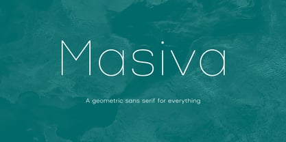 Masiva font family has been designed for Graviton Font Foundry by Pablo Balcells in 2018. It is a geometric sans serif typeface with carefully crafted curves that provide a soft and pleasant appearance. Its universal shapes make it suitable for any kind of project, text length and size. It can be used as a powerful display typeface in big sizes. Also, thanks to its legibility, it can be used in long body texts in very small sizes and everything in between. It performs just as well in classic style projects as in contemporary or modern ones. Masiva consists of 12 styles, each containing small caps and glyph coverage for several languages.
 - Milliard by René Bieder,
$39.00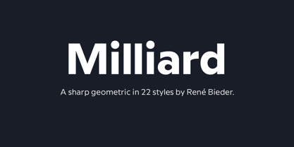 Milliard is a sharp and contemporary family of 22 fonts, taking inspiration from grotesk typefaces developed in the early twentieth century. Its open counters on lowercase "a", "c" or "e" allow for great legibility in small text sizes, supporting an unobtrusive, clear and modern appearance. When set in headlines, Milliard reveals a part humanistic, part geometric voice ranging from elegant and open thin weights to athletic and powerful heavy weights. Milliard comes with many opentype features including stylistic sets, old style numbers, arrows and many more making it a perfect choice for professional type setting in any digital or analog surrounding that requires a clear and modern voice.
 - Hazelnut Pro by Eimantas Paškonis,
$-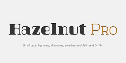 This small family can be counted as 4 fonts in 2. Because both weights contain small caps, 12 sets of stylistic alternates, and a decorative swashed form. That’s not counting dozens of ligatures in both multilingual latin and Cyrillic scripts. Plus ordinals, case-sensitive forms, and manual hinting. Due to its geometric nature, designers can manipulate vectors to change letters' dimensions for logotypes. They may seem modular, but every glyph was shaped individually to give handmade imperfections, reminiscent of wood type press. This allows for plenty of details at large sizes. Regular versions are multilingual but include only standard ligatures and case-sensitive forms.
 - Medallion Ornaments by Gerald Gallo,
$20.00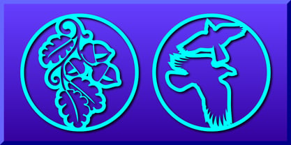 Medallion Ornaments is a collection of 185 circular ornaments based on plants, creatures, flourishes, geometric shapes, and ornate designs from historical sources.
 - Geoblox by Warnetype,
$8.00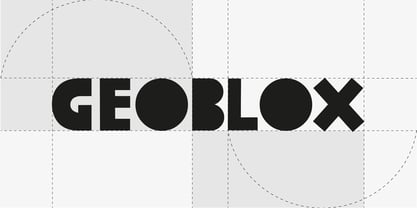 A geometric display font contains upper & lowercase characters, all punctuation and numerals. Fun and blocky, it has a contemporary but playful feel.
 - Jubilant by Gerald Gallo,
$20.00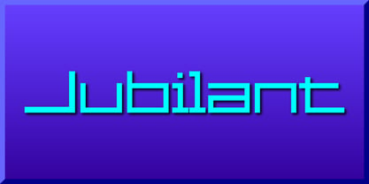 Jubilant is an extended, geometric, curveless sans serif font. The font is ideal for headlines, titles, branding or small blocks of text.
 - Meso America by Intellecta Design,
$9.00Meso America is a native dingbat face inspired in meso-american culture containing funny characters and flowers created starting a geometric forms. - Chassis by Device,
$39.00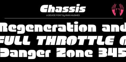 A hefty, powerful geometric sans with weight and presence. The unusual counters are defined by lines which cut into the letter shapes.
 - Slab Four Rounded Bold by Wooden Type Fonts,
$15.00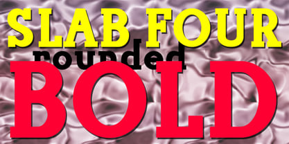 An original slab serif design inspired by the slab serif designs of the 19th century, with a modern geometric look, bold version.
 - Slab Four Rounded Super by Wooden Type Fonts,
$15.00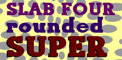 An original slab serif design inspired by the slab serif designs of the 19th century, with a modern geometric look, extra bold.
 - BR Nebula by Brink,
$30.00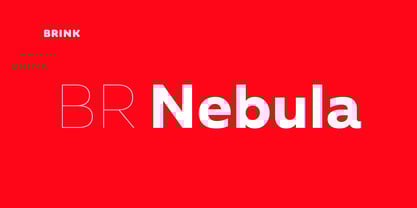 BR Nebula is a geometric sans serif that builds on the foundations of early geometric designs such as Paul Renner’s Futura, and later works such as Avant Guarde. BR Nebula takes inspiration from these early explorations in sans serif design and re-imagines them for the modern age. Distinctive geometric letterforms have been refined and simplified with opened terminals to achieve a clear, legible and modern aesthetic. BR Nebula is available in 20 contemporary styles, with weights ranging from Hairline to Super. The fonts also provide advanced typographic support with OpenType features such as case sensitive forms, stylistic alternates, slashed zeros and multiple figure sets. Also containing advanced language support as standard. For custom enquiries please contact: mail@brinktype.com
 - dT Jakob by dooType,
$30.00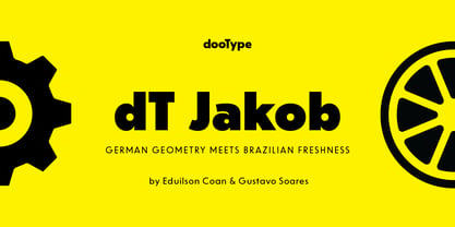 dT Jakob started as a revival by Gustavo Soares for Paul van der Laan’s class at the Type and Media Masters, in The Hague, NL – back in 2007. There are quite a few excellent geometric sans typefaces available, but we did want to make our contribution and have a fine geometric face to offer. dT Jakob was born out of Erbar, by Jakob Erbar, one of the very first geometric sans, released in metal around 1926. Our goal was to make a versatile typeface, that handles display and text typography beautifully. To achieve that we designed a complete range of weights, matching italics and lots of OpenType Features. Hope you enjoy it :D
 - Lohengrin - Personal use only

- Cinematica by Underground,
$14.90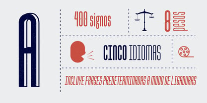 Cinematica was specially designed for film credits in communication pieces. Due to its space saving qualities, geometric elegance of its shapes, and eight wights; it allows a wide range of uses. Its geometry makes Cinematica able to harmonize and unify any text, incorporating the necessary signs for composition in English, Spanish, Italian, French, German and Portuguese. The Regular weight also incorporates statements that usually appear in film credits (such as "directed by", "produced by", etc.) that have been programmed as predetermined ligatures and can be accessed by typing a short sequence of signs to avoid typing the full phrase. To make the most of the alternatives proposed, use applications that support Open Type. Take a look at the User Guide.
 - Circus Didot by ParaType,
$25.00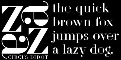 Circus Didot typeface presents a rework of a typical neoclassical serif type in a constructivist style. Analyzing the shapes of characters author placed basic geometric figures — triangles, rectangles, circles… above the contours of letters. Resulting constructions staying recognizable letters at the same time bore a resemblance to pictures of Russian avant-garde artists from 20th century. This discovery has brought an idea to design a typeface where the tendency of a modern serif type to rationalism and geometry is realized in maximum possible extent. The prototypes for the project were taken from the works of Didot, lettering experiments of Russian constructivists and art deco artworks. The technique of juggling with shapes and overall grotesque approach to the design explains the selection of the name for the font.
 - Leonardian by Cubo Fonts,
$25.00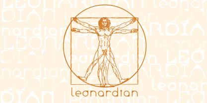 The Vitruvian Man is a world-renowned drawing created by Leonardo da Vinci circa 1487. The drawing depicts a male figure in two superimposed positions with his arms and legs apart and simultaneously inscribed in a circle and square. The drawing and text are sometimes called the Canon of Proportions or, less often, Proportions of Man.The drawing is based on the correlations of ideal human proportions with geometry described by the ancient Roman architect Vitruvius in Book III of his treatise De Architectura. Vitruvius described the human figure as being the principal source of proportion among the Classical orders of architecture. That's how "Leonardian" was buid as well: a quest for ideal proportions, a harmonious design springing up from a geometric "collision", circle and square's intersections.
 - Bron by Jeremia Adatte,
$49.00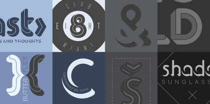 Bron is based on Zelek, designed in the 70s by Polish type designer Bronisław Zelek. This typeface was originally made for dry transfer lettering sheets. It has been drawn following the principles of impossible geometry and is derived from simple geometric forms (perfect circles, triangles and squares). It has been carefully redrawn and updated and is now available for contemporary technology and design. Use Bron’s rounded and smooth optical shapes in your headlines, logos, packagings, posters to instantly attract attention. This style offers two separate layered fonts to make your own awesome two color compositions. These can be used separately to create even more subtle effects. Bron is packed with an extended character set, supporting Central, Western and Eastern European languages. Check its semi-outline version here!
 - Sanity by Popkern,
$-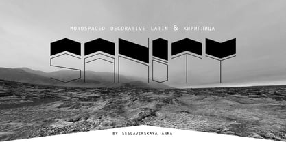 The design of Sanity typeface is modernized by abandoning any characteristics associated with hand writing, such as curved lines or elaborate corner details. The design is based on a rigid geometric grid and radiates confidence with its daring contrasts and provocative style. In large amounts of text the font “Sanity” can be hard to read due to a «dazzle» effect caused by alternating thick and thin strokes, particularly as the thin strokes are hardly visible at small point si es. Due to this quality, the “Sanity” font-family is best suitable for titles or large print advertisements. There are five key stylistic principles taken as a main framework for the creation of the “Sanity”: symmetry, contrast, geometry, artificiality and monospacing.
 - FF Bauer Grotesk by FontFont,
$50.99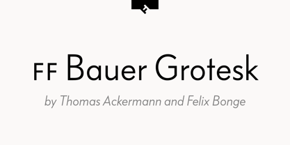 FF Bauer Grotesk is a revival of the metal type Friedrich Bauer Grotesk, released between 1933 and 1934 by the foundry Trennert & Sohn in Hamburg Altona, Germany. The geometric construction of the typeface, infused with the art déco zeitgeist of that era, is closely related to such famous German designs as Futura, Erbar, Kabel and Super Grotesk that debuted a few years earlier. However, Bauer Grotesk stands out for not being so dogmatic with the geometry, lending the design a warmer, more homogenous feeling. The oval “O” is a good example of that, as well as characteristic shapes like the capital M or the unconventionally differing endings of “c” and “s” which make for a less constructed look. Watch the FF Bauer Grotesk introduction video on Vimeo
 - Camber by Emtype Foundry,
$69.00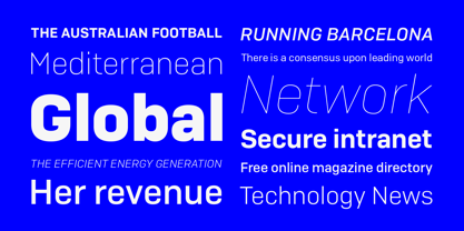 Camber is the last in a personal series of squarish sans. It is a noiseless typeface with a geometric base, it has a synthetic and clean design, but with a human sensitivity where the geometry fails. It tries to be more versatile and simpler than its predecessors, with a pragmatic approach, having less visual noise and virtually removing the disturbing elements. The family is generous in width meeting a certain shortage of wider fonts. Camber works well in both display and text, it is a multipurpose font suited for magazine, branding and web. The type family consists of 14 styles, 7 weights (Thin, UltraLight, Light, Regular, Medium, SemiBold and Bold) plus italics and it’s available in Open Type format. For more details please see the Camber PDF.
 - Lucifer Sans by Daniel Brokstad,
$29.00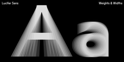 Lucifer Sans is a modern sans serif font rooted in Scandinavian geometry and minimalism, mixed with a healthy dose of black metal and irreverent attitude. Harsh vertical cuts and angles throughout the font creates a very strict and hard look, that can either be amplified or loosened up through its stylistic sets. Lucifer Sans family contains 162 font, 9 different weights and width, plus italics. In addition there are 3 different stylistic sets. This creates substantially diverse set of characters for contrasting against another and makes it a versatile font for different formats. Style 01 takes on an almost hand drawn style, while Style 02 enhances the geometric aspects of the font further. Style 03 uses only the rounded letter 01 without the hand drawn variations.
 - Cyntho Pro by Mint Type,
$-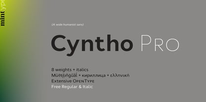 Cyntho Pro is a modern geometric sans with eight weights varying from Thin to Black and featuring Cyrillic and Greek scripts. Unlike most geometric sans faces, it offers optional upright and real italics, wrapped in OpenType ‘stylistic alternates’ features, or stylistic set #02, where sets can be applied separately. Small caps are included as well. This typeface can be used in magazines, posters, advertising, corporate identity, and more.
 - Vitage by Fractal Font Factory,
$10.00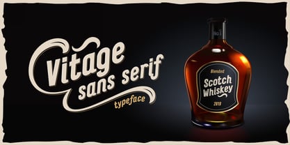 This sans-serif type family of two weights plus matching italics. Influenced by the geometric-style sans serif faces that were popular during the 1920s and 30s, the fonts are based on geometric forms that have been optically corrected for better legibility. Vitage has a functional look with a warm touch. It is manually hinted and optimized for screens, so it will be a good choice for Websites, eBooks or Apps.
 - Superpop by Resistenza,
$39.00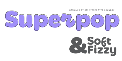 Superpop is sweet and gentle, a rounded geometric sans with a brushy script twist. Soft and refreshing like a soda, this font gets fizzy when geometric letterforms get mixed with script shapes you wouldn’t expect in a Sans Serif. A display family with two styles ( regular and italic ), 5 weights and an outline version for each style. Opentype Features: https://www.rsztype.com/article/how-to-use-opentype-features-adobe-microsoft-pages
 - Famous Cars - Personal use only

- Vanilla by Device,
$29.00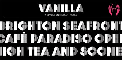 Two-flavour stripes feature in this geometric font that is reminiscent of the Deco styles that adorn seaside ice-cream parlours and arcades.
 - Rectilinear Ornaments by Gerald Gallo,
$20.00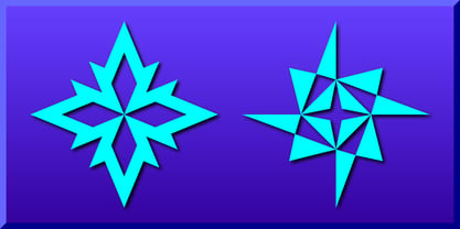 Rectilinear Ornaments are radiating geometric shapes composed of straight lines. There is an assortment of 47 ornaments located under the character set keys.
 - Carpenteria by studiocharlie,
$24.00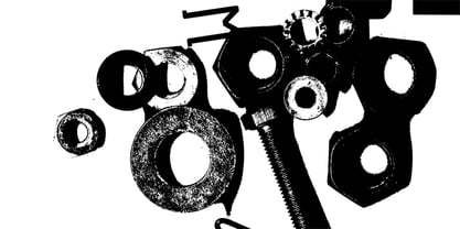 In Carpenteria each letter is hand-designed based on a geometrical old mechanical style. You can use it for posters or impact graphics.
 - Cabriolet V8 by JVB Fonts,
$35.50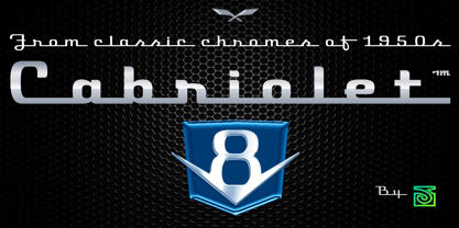 Cabriolet V8 is a vertical version of the Cabriolet family, a geometric script fontface re-interpretation inspired by old chromed emblems of 1950s.
 - Tmura MF by Masterfont,
$59.00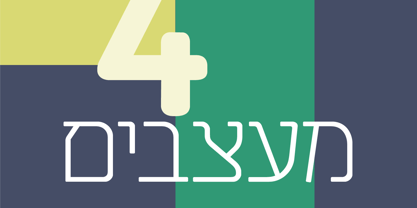 This square and elegant typeface has unique round stems that makes the geometric look of Tmura MF work well in any point size.
 - Merrant by Max Prive,
$28.00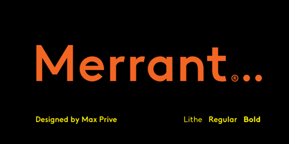 Merrant® is a lithe geometric display typeface designed by Max Prive. The Merrant® family has 3 weights – Lithe, Regular, and Bold.
 - Skaklia by Stefan Stoychev,
$39.99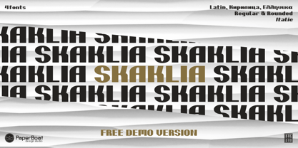 Skaklia is a modern sans serif font with a geometric touch. It comes in 2 shapes regular and rounded and its matching italics.
 - Slab Four Rounded Ext by Wooden Type Fonts,
$15.00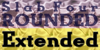 An original slab serif design inspired by the slab serif designs of the 19th century, with a modern geometric look, bold version, extended.
 - Ayalon MF by Masterfont,
$59.00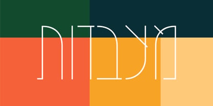 Geometric forms make this elegant font family a great companion for invitations and signs, indoor and outdoor. Proportional figures added, perfect for signage.
 - Jacoby Modular by Jacoby Type Co,
$12.00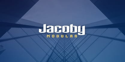 Jacoby Modular is a geometric sans serif display typeface with six styles. Jacoby Modular is a dynamic, bold typeface with a sculptural feel.
 - Gravitica Slab by Ckhans Fonts,
$34.00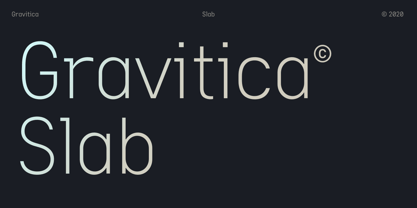 Features: • Support for 28 languages: Afrikaans Albanian Catalan Croatian Czech Danish Dutch English Estonian Finnish French German Hungarian Icelandic Italian Latvian Lithuanian Maltese Norwegian Polish Portugese Romanian SlovakSlovenian Spanisch Swedish Turkish Zulu Swedish Turkish Zulu • Contains OpenType features with alternates or substitutes • Tabular Figures • Ordinal numbers • 74 icons (It will keep updating.) • 72 graphic patterns for designer (It will keep updating.) • 28 brand symbols (It will keep updating.) • 27 arrows glyphs • 0-99 line circled glyphs • 0-99 solid circled glyphs • A-Z line circled glyphs • A-Z solid circled glyphs Gravitica Slab is a modern serif with a geometric touch. It comes in 6 weights, 12 uprights and its matching italics, so you can use them to your heart’s content. Designed with powerful opentype features in mind. Each weight includes extended language support, fractions, tabular figures, arrows, ligatures, icons and patterned. Gravitica Slab family consists of 12 styles (12 weights, 12 Italics), in each of which there are more than 940+ glyphs. In the typeface, each weight includes extended language support, fractions, tabular figures, arrows, ligatures and more. Perfectly suited for graphic design and any display use. It could easily work for web, signage, corporate as well as for editorial design. documents and folders, mobile interface. Useful links: Gravitica PDF Type Guide and Specimen (You can know how to use icons and arrows, other glyphs.)
 - Gabardina - Personal use only

- Quebrada - 100% free

- Cranked Pipe 2D by 2D Typo,
$24.00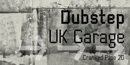 Font has Industrial motifs and simple geometric shapes. Best suited for large lettering. Font contains characters for all occasions, many ligatures, alternatives and exotic.
 - Oldsman No. 1 by Serebryakov,
$49.00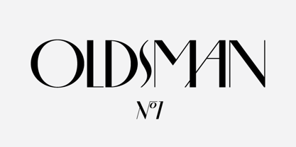 Oldsman No. 1 is an uppercase font family. It was specially designed for logotypes and experimental editorial design projects. Geometric, rhythmic, modern... Try it!


