8,611 search results
(0.031 seconds)
- As of my last update in April 2023, "Shot" is a font created by The Type Fetish, a foundry known for its collection of unique and eclectic typefaces. The Type Fetish, founded by Michael Wallner, prid...
- Vendetta by Emigre,
$69.00 The famous roman type cut in Venice by Nicolas Jenson, and used in 1470 for his printing of the tract, De Evangelica Praeparatione, Eusebius, has usually been declared the seminal and definitive representative of a class of types known as Venetian Old Style. The Jenson type is thought to have been the primary model for types that immediately followed. Subsequent 15th-century Venetian Old Style types, cut by other punchcutters in Venice and elsewhere in Italy, are also worthy of study, but have been largely neglected by 20th-century type designers. There were many versions of Venetian Old Style types produced in the final quarter of the quattrocento. The exact number is unknown, but numerous printed examples survive, though the actual types, matrices, and punches are long gone. All these types are not, however, conspicuously Jensonian in character. Each shows a liberal amount of individuality, inconsistency, and eccentricity. My fascination with these historical types began in the 1970s and eventually led to the production of my first text typeface, Iowan Old Style (Bitstream, 1991). Sometime in the early 1990s, I started doodling letters for another Venetian typeface. The letters were pieced together from sections of circles and squares. The n, a standard lowercase control character in a text typeface, came first. Its most unusual feature was its head serif, a bisected quadrant of a circle. My aim was to see if its sharp beak would work with blunt, rectangular, foot serifs. Next, I wanted to see if I could construct a set of capital letters by following a similar design system. Rectangular serifs, or what we today call "slab serifs," were common in early roman printing types, particularly text types cut in Italy before 1500. Slab serifs are evident on both lowercase and uppercase characters in roman types of the Incunabula period, but they are seen mainly at the feet of the lowercase letters. The head serifs on lowercase letters of early roman types were usually angled. They were not arched, like mine. Oddly, there seems to be no actual historical precedent for my approach. Another characteristic of my arched serif is that the side opposite the arch is flat, not concave. Arched, concave serifs were used extensively in early italic types, a genre which first appeared more than a quarter century after roman types. Their forms followed humanistic cursive writing, common in Italy since before movable type was used there. Initially, italic characters were all lowercase, set with upright capitals (a practice I much admire and would like to see revived). Sloped italic capitals were not introduced until the middle of the sixteenth century, and they have very little to do with the evolution of humanist scripts. In contrast to the cursive writing on which italic types were based, formal book hands used by humanist scholars to transcribe classical texts served as a source of inspiration for the lowercase letters of the first roman types cut in Italy. While book hands were not as informal as cursive scripts, they still had features which could be said to be more calligraphic than geometric in detail. Over time, though, the copied vestiges of calligraphy virtually disappeared from roman fonts, and type became more rational. This profound change in the way type developed was also due in part to popular interest in the classical inscriptions of Roman antiquity. Imperial Roman letters, or majuscules, became models for the capital letters in nearly all early roman printing types. So it was, that the first letters in my typeface arose from pondering how shapes of lowercase letters and capital letters relate to one another in terms of classical ideals and geometric proportions, two pinnacles in a range of artistic notions which emerged during the Italian Renaissance. Indeed, such ideas are interesting to explore, but in the field of type design they often lead to dead ends. It is generally acknowledged, for instance, that pure geometry, as a strict approach to type design, has limitations. No roman alphabet, based solely on the circle and square, has ever been ideal for continuous reading. This much, I knew from the start. In the course of developing my typeface for text, innumerable compromises were made. Even though the finished letterforms retain a measure of geometric structure, they were modified again and again to improve their performance en masse. Each modification caused further deviation from my original scheme, and gave every font a slightly different direction. In the lower case letters especially, I made countless variations, and diverged significantly from my original plan. For example, not all the arcs remained radial, and they were designed to vary from font to font. Such variety added to the individuality of each style. The counters of many letters are described by intersecting arcs or angled facets, and the bowls are not round. In the capitals, angular bracketing was used practically everywhere stems and serifs meet, accentuating the terseness of the characters. As a result of all my tinkering, the entire family took on a kind of rich, familiar, coarseness - akin to roman types of the late 1400s. In his book, Printing Types D. B. Updike wrote: "Almost all Italian roman fonts in the last half of the fifteenth century had an air of "security" and generous ease extremely agreeable to the eye. Indeed, there is nothing better than fine Italian roman type in the whole history of typography." It does seem a shame that only in the 20th century have revivals of these beautiful types found acceptance in the English language. For four centuries (circa 1500 - circa 1900) Venetian Old Style faces were definitely not in favor in any living language. Recently, though, reinterpretations of early Italian printing types have been returning with a vengeance. The name Vendetta, which as an Italian sound I like, struck me as being a word that could be taken to signifiy a comeback of types designed in the Venetian style. In closing, I should add that a large measure of Vendetta's overall character comes from a synthesis of ideas, old and new. Hallmarks of roman type design from the Incunabula period are blended with contemporary concerns for the optimal display of letterforms on computer screens. Vendetta is thus not a historical revival. It is instead an indirect but personal digital homage to the roman types of punchcutters whose work was influenced by the example Jenson set in 1470. John Downer.
 - Alexon by Red Rooster Collection,
$45.00 Designed by Les Usherwood. Digitally engineered by Steve Jackaman. Originally in one weight, Steve designed and produced three additional weights.
 - Dancing in the Minefields - Personal use only

- The Only Exception - Personal use only

- The Great Escape - Personal use only

- BOSS M - 100% free

- KG Mercy in the Morning - Personal use only

- Tucker Handwritten - Unknown license

- Flak Jacket - Unknown license

- Anatolian by Artegra,
$29.00 Anatolian typeface was designed with inspiration from the traditional Anatolian kilim motifs and symbols that characterize Turkish culture. Motifs and design elements that has been used for centuries on carpets now found place in a typeface as serifs. It was exciting to see how these old design elements would turn into a modern font that would be applicable for modern designs.
 - Rummy by Bunny Dojo,
$23.00 Rummy is powerful, precise, and packed with personality. Simple and initially unassuming, Rummy may seem a reluctant hero. But, when called upon, Rummy will lend you all of its considerable strength and versatility in order to win the day. Influenced by sports branding and 1940s film, Rummy is an underdog that won't let you down. Need more height? Try Rummy Tall!
 - Black Catty by Skiiller Studio,
$20.00 Black catty is a font that is designed for commercial purposes such as, covers, films, logos, business cards, t shirts, weddings, and many more What's include: Ligature Stylistic set for lowercase PUA Encoded Characters - Fully accessible without additional design software. Basic Latin Language Support (AÀÁÂÃÄÅCÇDÐEÈÉÊËIÌÍÎÏÑOØÒÓÔÕÖUÙÜÚÛWYÝŸÆß ) How to access alternate glyphs? you can see it on this link ( http://goo.gl/1vy2fv )
 - Lumine Vellas by Lone Army,
$12.00Embrace the aqua-infused elegance of our modern serif font. With fluid, graceful strokes, it captivates with its contemporary charm and timeless sophistication. Let the cascading aqua serifs dance across your designs, creating a harmonious symphony of visual delight. Elevate your typography and unleash its captivating power. Experience the fluidity and immerse your audience in its mesmerizing beauty, leaving a lasting impression. - CA Sensuell by Cape Arcona Type Foundry,
$37.00 Stefan Claudius developed this font while he was sitting in a small chalet in Denmark with a hot wood-oven and nothing but snow outside. Probably the amount of white led him to make it so thin and to have as much space between the lines as possible. If you have that in mind, it looks best in large sizes.
 - Merilland by Prioritype,
$15.00 Hello everyone, here is a font that comes with a beautiful impression and is equipped with alternative characters that can be processed at will. You can apply this font in various print and digital media such as logos, wedding invitations, craft products, promotions on social media and many more. Lots. For reference, see preview. Features: -Uppercase -Lowercase -Numeral -Punctuation -Multilingual -Alternate -Ligature -Swash
 - Kuranji by Mevstory Studio,
$20.00 Kuranji, a brand new display font. It’s quirky letterforms make this font perfect for branding, headlines, logotype, stickers, editorial design, and more. Features : Regular Italic We highly recommend using a program that supports OpenType features and Glyphs panels like many of Adobe apps and Corel Draw, so you can see and access all Glyph variations. Contact us if you need something! Happy Designing!
 - Eccentric by Monotype,
$29.99Eccentric was designed in 1881 by Gustav F. Schroeder. It is an all-capital, narrow-bodied, monoline display face that could be described as high waisted. With cross-bars and main junctures more than halfway up the letterforms, every letter - except the W - has a long-legged appearance. Eccentric has a wide range of display uses, from playbills to fashion advertisements. - Quick by Pen Culture,
$15.00 Quick is modern elegant serif typeface. this font perfect for branding, logo design, product packaging, magazine headers, and so much more. I really hope you enjoy it - please do let me know what you think, comments & likes are always hugely welcomed and appreciated. More importantly, please don't hesitate to drop me a message if you have any issues or queries. Thank you
 - Helsing by Great Lakes Lettering,
$30.00 Helsing is a serif style font inspired by Bram Stoker’s 1897 Dracula as well as Edward Gorey’s rendition of the story. Helsing is characterized by his slighting skewed baseline, subtle texture, thick and thin contrasts, and decorative legs. Made as a graphic style font, Helsing is perfect for illustrative titles, small bodies of text, and pairing with contrasting lettering style fonts like Asterism.
 - Eastgood by Wacaksara co,
$12.00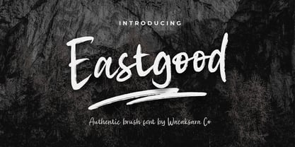 Eastgood Font is a hand brush script font and dramatic movement. This font is great for your next creative project such as Logotype, printed quotes, invitations, cards, product packaging, headers, Letterhead, Poster, Apparel Design, Label, and etc. Eastgood comes with uppercase, lowercase, numerals, punctuations and so many variations on each character include OpenType alternates, and common ligatures to let you customize your designs.
 - Panelope sugar by Cocodesign,
$10.00 Panelope is a handwriting design font duo, including Regular. This font is casual and beautiful with swash. Can be used for various purposes. such as logos, product packaging, wedding invitations, branding, headlines, signage, labels, signatures, book covers, posters, quotes, and more. If you need help or have questions, please let me know. I am happy to help :) Thank you & Congratulations on Designing!
 - Discolicious by Hanoded,
$15.00 Put the needle in the groove and jive baby! Discolicious brings back the golden age of moustaches and sideburns, psychedelic tie-dyes and bell bottoms. Use this ‘bubblegum’ disco font for your product packaging, magazines and party posters and they’ll look off the hook! Comes with a primo amount of diacritics, so you can let it all hang out! Word!
 - Spacy Avocado by PizzaDude.dk,
$15.00 Due to some grease on a menu, I misread "Spicy Avocado" as "Spacy Avocado" which led me to the name of this font. I love Avocados and I love things that are a bit spacy, and I love the combination of these two! Space Avocado is my handdrawn, layered headline font. Mix the layers or use them as a single font - you choose!
 - Barrowboy by Studio K,
$45.00 Barrowboy was inspired by the handwritten sales tickets that are still to be found on market stalls and fruit barrows, and are as familiar as the street cries that accompany them. The signage is mostly confined to numerals, so translating it into a font is pretty much a work of imagination. See also my other fun fonts Bebopalula, Calypso and Pier Arcade.
 - Beautiful Place by Jehansyah,
$12.00 This Beautiful Place Font is a font with a very cute and unique look, there are several alternates to find its signature touch, make sure you don't miss this font design, add it to your project and see how it will change your inspiration to be more perfect. Include : Beautiful Place font Numeric Punctuation Alternate Latin and Thank you Very Much
 - Courtroom JNL by Jeff Levine,
$29.00 Erle Stanley Gardner’s beloved lawyer “Perry Mason” first appeared on screen in a series of six films with Warren Williams starring in four of them. The hand lettered opening title for 1935’s “The Case of the Lucky Legs” is a classic Art Deco sans serif design, and is now available as Courtroom JNL in both regular and oblique versions.
 - Basketto by Mike Zuidgeest,
$12.50 Basketto is a carefully crafted, handmade sans serif font. Completely built from scratch in Adobe Illustrator. The glyphs are nice and bold, with sharp corners. Use Basketto for your product packaging, out of home adverting, food truck posters, festivals or the travel industry. This is my official font debut, I would love to hear from you to see my font on your product!
 - Busstan by YonTypeStudio Co,
$10.00 A dapper, rustic, handwritten font with a personal charm. With quick-drying strokes and distinctive styles, Busstan is perfect for branding projects, household appliance designs, product packaging - or just as a style text overlay for any background image. That's it! I really hope you enjoy it - please do let me know what you think, comments & likes are always hugely welcomed and appreciated.
 - Cristal Ttris by Johannes Krenner,
$7.00 This Font is inspired by the Nintendo game: Tetris® It has 2 styles: BOLD and THIN. They both have simulated greyscale and can be used out of the box like you see them on the pictures. It comes with more than 450 glyphs per style. More than capable of supporting all european languages, small caps and different numeral figures.
 - Stardelle by Letterhanna Studio,
$19.00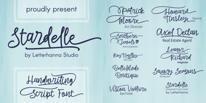 "Introducing 'Stardelle,' a bold and beautifully handcrafted font that adds a touch of elegance to your designs. With its flowing lines and abundant swashes, 'Stardelle' exudes charm and sophistication. This handwritten font is perfect for adding a personal and artistic flair to invitations, posters, branding, and more. Let 'Stardelle' illuminate your creativity and bring a touch of magic to your projects."
 - Tarot by Great Lakes Lettering,
$25.00 Let Tarot wisp you away onto an enchanted journey. This whimsical serif typeface is perfect for headlines, small bodies of text, and feels like magic when paired with scripted type. Inspired partly by Helsing, Tarot features a similar essence, along with an alluring and spontaneous handwritten presence. Tarot is a charming font used to make anything created feel bewitched. Presto!
 - Gonk Droid by Edd's Aurebesh Fontworks,
$5.00 Making some Star Wars stuff? This Aurebesh font is designed to look like something you would see on a piece of quick and dirty graphic design in the Star Wars universe, like a wanted poster or a warning sign. The font includes the additional Aurebesh glyphs beyond the 26 basic characters (all in lowercase & uppercase) as well as numbers and symbols.
 - F line by alphabeet.at,
$30.00 f-line is a special handwriting monoline font face, with one constant line from glyph to glyph and variable width. It was drawn for the designer’s thesis in 2010 and expanded until 2021 with a lot of open type features. It’s built up with three glyph sets to let the glyphs rotate automatically, and amongst other type features initial forms are available.
 - PM Outpost by Paper Moon Type & Graphic Supply,
$17.00 Part pirate, part BBQ, all fun. Our new adventure inspired retro showcard font. Outpost was inspired by retro hand-lettered type used on vintage movie tiles, midnight movie posters, and pulp adventure magazines. But don't let that limit your creativity. Part pirate, part BBQ, all fun. Outpost is perfect for gaming titles, casual food packaging, and of course, Halloween projects.
 - Inferno Dingbats by Just in Type,
$20.00Nobody knows what God looks like but we know that the Devil has a thousand different faces. Samuel Casal sees the demon everywhere. In the streets, the movies, rock music, books, gambling, other things and even in Hell. Devilishly, he captures it all with his magical design. Purchase the font Inferno Dingbats now and take control of the forces of Evil. - Logica Sans by Alexander Sharkov,
$3.00 Let me introduce our cool new sans serif font Logica Sans! It is a versatile font. Great for logo design, mobile apps, online and print use, and a wide variety of projects. We will be constantly updating our font. Add new languages, glyphs, font styles. Follow the updates! We will be glad if our font helps in the development of your project!
 - Tenterhooks by Hanoded,
$15.00 I like the expression ‘being on tenterhooks’. Not that I’m on tenterhooks very often! Tenterhooks was made with a broken satay skewer (see poster 2 for the actual thing) and Chinese ink. It came out rather rough, but it does have a nice flow and a certain ‘wild elegance’. Comes with double letter ligatures and a whole bunch of diacritics.
 - Arnette by Letterhend,
$19.00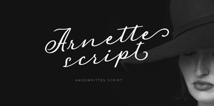 Introducing, Arnette handwritten script. Arnette is a script font that is perfect for quotes, branding, invitation, packaging, headline, logotype, etc. Features : uppercase & lowercase numbers and punctuation multilingual alternates and ligatures PUA encoded We highly recommend using a program that supports OpenType features and Glyphs panels like many of Adobe apps and Corel Draw, so you can see and access all Glyph variations.
 - Moonthyu by Skiiller Studio,
$20.00 Moonthy is a beautiful type of script font, There are more than 150 alternate encoded PUAs suitable for graphic design and other needs What's include: Ligature Stylistic set for lowercase Stylistic set for Ending\ PUA Encoded Characters - Fully accessible without additional design software. Basic Latin Language Support (AÀÁÂÃÄÅCÇDÐEÈÉÊËIÌÍÎÏÑOØÒÓÔÕÖUÙÜÚÛWYÝŸÆß ) How to access alternate glyphs? you can see it on this link ( http://goo.gl/1vy2fv )


