10,000 search results
(0.033 seconds)
- Autumn Voyage by Hanoded,
$15.00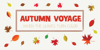 Autumn is my favourite time of the year: I love the colors in the forest, the colder temperature and the stormy winds. Autumn Voyage is a very nice set of hand made fonts: a fat one, a thin one and a lovely autumn leaves doodle pack. Comes with a heap of diacritics as well.
 - Hyggebukser by Bogstav,
$17.00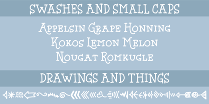 Hyggebukser are very comfortable trousers in danish. Trousers you'd wear after a long days work, when you just need to relax. The same goes for this font - it has something very comfortable to it! Also, don't forget to enjoy the 5 (!) different versions of each letter, along with the drawings, swashes and small caps!
 - Vivian Script by Vástago Studio,
$19.95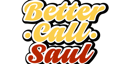 Vivian Script was designed from the study of typeface references like Doyald Young. It has optical adjustment in the details and funny contrasts to get an amazing result. It can used to be applied on different commercial topics like street wear, food and traveling for tourism. This is Vivian Script, the love of my life.
 - P22 Gothic Gothic by IHOF,
$24.95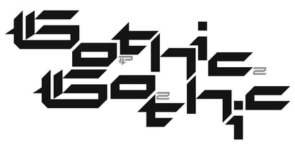 The name says it all. Gothic from the old literary style and/or current subculture genre. And Gothic meaning a block or sans serif style of lettering. The concept was to take the classic German style lettering and create a contemporary extended block letter typeface. The result is a fusion of old and new.
 - Freich Monsta by Nasir Udin,
$15.00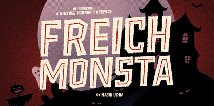 Trick or treat! The spookiest time of the year will be here soon! Spread the Halloween spirit with this chilling, creepy, and scary typeface, Freich Monsta! Freich Monsta is an evolution of my previous font - Freich. It's mutated from a clean, strong, and bold font to a spooky display font with a vintage horror twist.
 - Hilde Sharp by Chank,
$59.00OMG it's got a smiley face underscoring the exclamation point! What a sweet, charming handwriting font from the wrist of an 18-year-old Norwegian girl. A sassy skip and a flowery flair lift this particular marker font up a notch above the rest. Now available in OpenType format for your Personal or Commercial Use. - Indie by Lián Types,
$37.00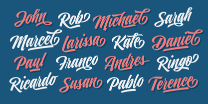 A FEW THOUGHTS Indie is a trendy script, result of the wide range of possibilities that can be achieved using a pointed brush. (1) “You Only Live Once” say The Strokes, (to me, symbols of indie music) so, what would represent that sensation of volatility better than a brush? As you may already know, this time inspiration came from hipsters and indies around us: We may sometimes criticise them, we may sometimes want to be like them, but the truth is that the universo gráfico they generated these past years is gigantic, full of colour and variations. (2) Brush lettering and Sign painting are fields I've been fond of since I started as a designer. Nowadays, these styles are getting a lot of attention and maybe it’s due to the undeniable mark of life that is materialised when using a brush. This tool is so expressive that shows the passions and fears of the artist, and materialises that idea of “living the present”, so popular in this era. When you see Indie, you think of skaters, rollers, surfers, hiphop dancers, street artists, summer, and why not? California beaches. So if you feel life is only one, it’s high time you got Indie into your fonts' collection! STYLES Indie comes in 4 styles plus another one which consists only in capitals. Indie; Indie Shade; Indie Shade Solo; Indie Inline are all open-type programmed and have exactly the same glyphs and metrics, so you can combine them without probem. (I.E. You may use Indie Inline, then write the same word using Indie Shade Solo, and finally put them together). In applications such as Adobe Illustrator, the font has nice results when fi ligatures is activated. However, if you want a more casual look, activate the contextual and the decorative ligatures. NOTES 1. After several years of practicing calligraphy I can say that to me, there’s nothing more satisfying than being able to create fonts out of your own handlettering. I owe a lot of this brush-style to Carl Rohrs. He was the very first calligrapher who taught it to me. His style is unique and what he can do with a brush is truly marvelous. I'm serious. 2. In spite of some particular cases, I can say I'm happy to live in a present in which Typography is living a kind of Renaissance along with Lettering. Like it happened with W. Morris a hundred years ago, handcrafts are being revalued/reborn, and some of this may be happening thanks to these indie designers that, trying to be unique, gave new/fresh air to different areas of graphic design.
 - Steak by Sudtipos,
$59.00 Here I am, once again digging up 60-year sign lettering and trying to reconcile it with the typography of my own time. The truth is I've had this particular Alf Becker alphabet in my sights for a few years now. But in the typical way chaos shuffles the days, Buffet Script and Whomp won the battle for my attentions way back when, then Storefront beat the odds by a nose a couple of years ago. Nevertheless, revisiting Alf Becker’s work is always a breath of fresh air for me, not to mention the ego boost I get from confirming that I can still hack my way through the challenges, which is something I think people ask themselves about more often as they get older. You can never tell what may influence your work, or in this case remind you to dig it out of dust drawers and finally mould it into one of your own experiences. On my recent visits to the States and Canada, I noticed that quite a few high-end steak houses try their best to recreate an urban American 1930s atmosphere. This is quite evident in their menus, wall art, lighting, music, and so on. The ambience says your money is well spent here, because your food was originally choice-cut by a butcher who wears a suit, cooked by a chef who may be your neighbour 20 minutes from downtown, and delivered by a waitress who can do the Charleston when the lights dim and who just wouldn't mind laughing with you over drinks at the bar later. So Steak is just that, a face for menus and wall art in those places that see themselves in the kind of jazzy, noirish world where one-liners rule and exclamation points are part of a foreign language. As is usual with my lettering-inspired faces, there is very little left of the original Alf Becker alphabet. Of course, the challenges present in bringing typographic functionality to what is essentially pure hand lettering gives the spirit of the original art a hell of a rollercoaster ride. But I think that spirit survived the adventure, and may in fact be even somewhat magnified here. This font is over 850 glyphs. It’s loaded with ligatures, swashes, ending forms, alternates, ascender and descender variations, and extended Latin language support. Steak comes in 3 versions. According to your taste you can choose Barbecue, Braised or Smoked. It’s up to you!
 - Bradrock by Arterfak Project,
$19.00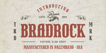 Introducing Bradrock, a vintage slab serif typeface. Inspired by old-school cowboy design, and circus-style. Bradrock has a more decorative typeface by adding bold bifurcated serif on the letterforms. This font is a perfect choice for vintage or old-school themes. Bradrock is an all-caps font, which represented strength, confidence, and an old-school aesthetic. You can use this font for many purposes such as vintage logos, mugs, embroidery, prints, display, short text, packaging, cards, emblem, signage, and many more! Equipped with special characters to get your design more powerful. TTF & OTF in a zip file including : Uppercase Small-caps Numbers & punctuation Accented characters Stylistic alternates Stylistic set 01-03 That's all, folks! Thank you for visiting.
 - FF Karbid Display by FontFont,
$58.99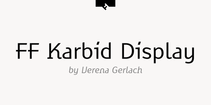 German type designer Verena Gerlach created this display and sans FontFont between 1999 and 2011. The family has 10 weights, ranging from Light to Black (including italics) and is ideally suited for advertising and packaging, editorial and publishing as well as logo, branding and creative industries. FF Karbid Display provides advanced typographical support with features such as ligatures, alternate characters, case-sensitive forms, fractions, super- and subscript characters, and stylistic alternates. It comes with a complete range of figure set options – oldstyle and lining figures, each in tabular and proportional widths. This FontFont is a member of the FF Karbid super family, which also includes FF Karbid, FF Karbid Slab, and FF Karbid Text.
 - Marseilazi by Putracetol,
$16.00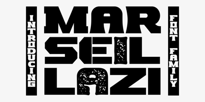 Marseilazi – 9 Strong Bold Style Font is an imposing and robust typeface with nine additional versions, all sharing the same bold and powerful character. This font's thickness and strength make it incredibly versatile, as it can be seamlessly integrated into a wide range of designs, alongside various other fonts and themes. The nine available versions include serif, sans-serif, sport, grunge, slab, stencil, display, and more, providing ample choices for your creative needs. Whether you're working on logos, titles, headlines, posters, films, magazines, business materials, personal names, and more, Marseilazi delivers an impactful visual presence. With its versatility and commanding presence, this font is an excellent choice for making a statement in your designs and leaving a lasting impression.
 - Blackoak by Adobe,
$29.00Joy Redick designed Blackoak, a big and heavy Egyptienne-sytle titling slab serif face, in 1990. The extremely robust style of the characters in this typeface was consciously distorted; creating letterforms that appear flattened and stretched, like a rubber band. Blackoak is drawn in the style of old wood tpes, just like those that one envisions when one thinks of the large, decorative posters that once filled Wild West America. The wood type collection of the Smithsonian Institute in Washington, DC acted as a primary source of inspiration for this design. True to its rooks, Blackoak is meant for use exclusively in headlines in very large point sizes, or for logos and other corporate advertising purposes. - Kairos Variable by Monotype,
$314.99Kairos is equal parts traditional and digital. Inspired by 19th century wood type fonts called Grecians, it’s an octagonal slab serif at its core. The serif detailing makes it radiate in headlines, with the square serifs driving its performance in text. The 51 weights and widths—all with small caps—offer a flexible and usable contemporary palette of styles perfect for branding, advertising and packaging. Kairos is stout, but has energy. It often looks athletic, industrial, and stern, while the subtle rounded features can also give it a gentlemanly and gracious demeanor. Kairos Variables are font files which are featuring two axis and have a preset instance from Thin to Black and Condensed to Extended. - LCT Sbire by LCT,
$49.00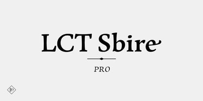 This Font is born basing itself on several standard typographic models. Inspired by our calligraphic drawings, the idea was to synthesize these many shapes into a unique font that can be used commonly. The slab base has been gradually humanized. The serifs have been carved, refined, rounded off, in order to galvanize the font and ease the task of reading in lower case. The angle of attack of the round letters is an echo of the 15 Century typographic heritage. It was important for us to create an expressive and humanized font, which could also be used for edition. The purpose was to confront the Ancient typographic canon of beauty with some funny and fancyful elements.
 - Core Circus Rough by S-Core,
$20.00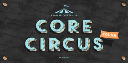 Core Circus Rough is a textured version of Core Circus which is a layered type family consisting of seven 3D effect layers, eight 2D effect layers and one shadow effect layer. Uppercase and lowercase letters are separated by such features that counters are opened or closed. Core Circus provides other closed counter styles such as numbers with opentype feature (Stylistic Alternatives). Also available Core Magic Rough (Slab-Serif version of Core Circus Rough) The shape of Core Circus is simple but the combinations of effect fonts are impressive. Core Circus makes your works charming and special with endless combinations (at least 262,551 kinds). This family is really nice for book titles, headlines, logotypes and any artworks.
 - Jeunesse Sans by Monotype,
$29.99The design of the Jeunesse font family derives from a study of primers which the designer undertook earlier in his career. Jeunesse was designed with the intention of combining excellent legibility and character recognition with the ability to create compact, distinctive words and lines while maintaining basic flourishless letterforms. The sans serif style is pre-dominant in this design, but serifs or rather parts have been added where necessary, mostly at the top left hand parts of the characters, to aid readability. Use Jeunesse as a text and display face. There are also fully sans serif and slab serif versions available which can be used on their own or mixed with each other and the parent fonts. - Dix by Just My Type,
$20.00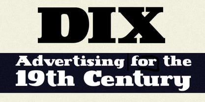 An offbeat not-quite-slab, not-quite-bracketed serif. And its extreme weight and width. Richard Dix started as a surgeon and turned out an actor, one of the lucky few who made a successful transition from silent film to talkies. In 1929 he made the movie western, “Redskins,” and his name appeared on a brilliant poster promoting the film. “Richard DIX”; four upper case and six lower case letters. The font Dix is derived and extrapolated from impressions of those 10 letters. Inspired by the poster for the 1929 film, “Redskin,” and a desire to create a black Edwardian font with an offbeat serif. Usage recommendations Western movie or 19th century-style advertising posters.
 - Tea Chest by Linotype,
$29.99The English typographer Robert Harling created Tea Chest in 1939 with the Stephenson Blake foundry. Today, this classic design is available in digital format from Linotype GmbH. Tea Chest is a bold stencil face. The font's narrow letters are all caps, and they sport small, slab serifs. Harling's design was most likely reminiscent of the old industrial lettering painted onto boxes and wooden crates that used to be shipped all over the world on the high seas. These letters had to be simple to reproduce, easy to read, and not take up too much space! Try out Tea Chest for large signage displays, on exotic product packaging, or in magazine or newsletter headlines. - FF Unit Rounded by FontFont,
$104.99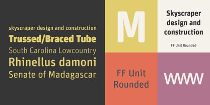 German type designer Erik Spiekermann and American type designer Christian Schwartz created this display and sans FontFont in 2008. The family has 6 weights, ranging from Light to Ultra and is ideally suited for advertising and packaging, editorial and publishing, logo, branding and creative industries, poster and billboards as well as wayfinding and signage. FF Unit Rounded provides advanced typographical support with features such as ligatures, small capitals, alternate characters, case-sensitive forms, fractions, and super- and subscript characters. It comes with a complete range of figure set options – oldstyle and lining figures, each in tabular and proportional widths. This FontFont is a member of the FF Unit super family, which also includes FF Unit and FF Unit Slab.
 - Magistech by Mokatype Studio,
$20.00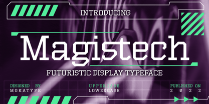 Magistech is a display font inspired by technology and future design. Designed with modern sensibility build based on slab serif with square letterform, consist in any character either uppercase or lowercase. This font is fit for any design like headline, video, or social media, particularly for future or modern nuances design. What's you get : Standard glyphs Ligatures (Opentype features) Web Font International Accent Works on PC & Mac Simple installations Accessible in Adobe Illustrator, Adobe Photoshop, Adobe InDesign, and even work on Microsoft Word. PUA Encoded Characters - Fully accessible without additional design software. Fonts include multilingual support Image used: All photographs/pictures/vectors used in the preview are not included, they are intended for illustration only. Thank You
 - Slope Sans Pro by URW Type Foundry,
$39.99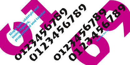 Slope Sans is an original design that combines a technological shape model borrowed from the early Macintosh system fonts with organic, open elements looking futuristic in a retrospective manner. Designed as part of a font family without different weights, Slope Sans Pro provides OpenType features for alternate letter forms in two stylistic sets. The basic version works similar to a stencil font, an alternative set has consistently closed shapes and a more rigid appearance, while the second stylistic set offers some alternative letter forms. Headlines and shorter texts set in Slope Sans provide a variable, modern appearance. Slope Slab Pro goes very well with Slope Sans Pro and can be used as style variant or display.
 - Jeunesse by Monotype,
$29.99The design of the Jeunesse font family derives from a study of primers which the designer undertook earlier in his career. Jeunesse was designed with the intention of combining excellent legibility and character recognition with the ability to create compact, distinctive words and lines while maintaining basic flourishless letterforms. The sans serif style is pre-dominant in this design, but serifs or rather parts have been added where necessary, mostly at the top left hand parts of the characters, to aid readability. Use Jeunesse as a text and display face. There are also fully sans serif and slab serif versions available which can be used on their own or mixed with each other and the parent fonts. - Rieux by Tetradtype,
$50.00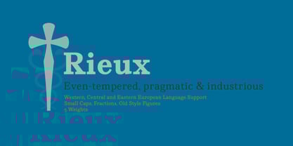 Named after the steadfast doctor from Albert Camus’ The Plague, Rieux is an even-tempered slab-serif that is confident without being cocky and approachable without being casual. The aesthetic of Rieux is inspired by the industrial age. While the design is not directly derived from typefaces of that era, the shapes of letter-forms are informed by images of over-sized steel machines and the monolithic brick buildings that housed them. Rieux is available in 5 weights and is ideal for uncatalogued, magazines, short publications and company collateral. In addition to supporting Western, Central and Eastern European languages, Rieux includes an array of OpenType features to provide a range of typographic options.
 - The font style known as "Metal," often associated with the heavy metal genre, embodies the raw energy, rebellious spirit, and distinctive intensity of the music it represents. This typographic style ...
- ChrisMaster - Personal use only

- Macklin by Monotype,
$50.99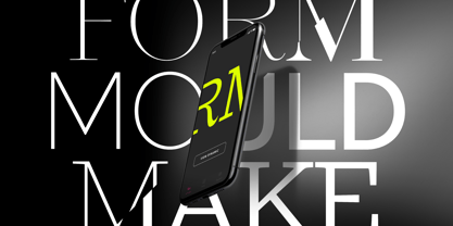 Designed by Malou Verlomme of the Monotype Studio, Macklin is a superfamily, which brings together several attention-grabbing styles. Macklin is an elegant, high contrast typeface that demands its own attention and has been designed purposely to enable brands to appeal more emotionally to modern consumers. Macklin comprises four sub-families —Sans, Slab, Text and Display— as well as a variable. The full superfamily includes 54 fonts with 9 weights ranging from hairline to black. The concept for Macklin began with research on historical material from Britain and Europe in the beginning of the 19th century, specifically the work of Vincent Figgins. This was a period of intense social change--the beginning of the industrial revolution. A time when manufacturers and advertisers were suddenly replacing traditional handwriting or calligraphy models and demanding bold, attention-grabbing typography. Typographers experimented with innovative new styles, like fat faces and Italians, and developed many styles that brands and designers continue to use today, such as slabs, serifs, and sans serifs. Verlomme pays respect to Figgins’s work with Macklin, but pushes the family to a more contemporary place. Each sub family has been designed from the same skeleton, giving designers a broad palette for visual representation and the ability to create with contrast without worrying about awkward pairings. With Macklin, Verlomme shows us it’s possible to create a superfamily that allows for complete visual expression without compromising fluidity. Macklin™ font field guide including best practices, font pairings and alternatives. Featured in: Best Fonts for Websites
 - Tuffy - 100% free

- Tuffy - 100% free

- The Sherloks by Dikas Studio,
$15.00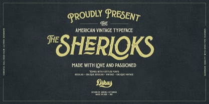 Sherlock have 4 Style : Regular, Oblique Regular, Vintage and Oblique Vintage with hand drawn character and opentype feature its very helpfull to get Vintage design. Suitable and applicable to create vintage design, branding, logos, product packaging, invitation, quotes, t-shirt, label poster etc. Caps Only Fonts.
 - Pixeloza 01 by Fontsphere,
$12.00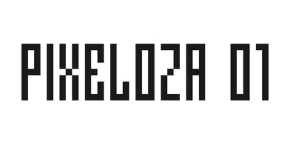 Pixeloza 01 is a pixel-style, grid-based, display typeface. Pixeloza 01 is available in two complementary options: Pixeloza 01 Regular and Pizeloza 01 Skewo Regular. It is distinguished by its simplicity and original form. It gives a lot of possibilities in creating unconventional, creative, unique projects.
 - Jatayu by Khurasan,
$10.00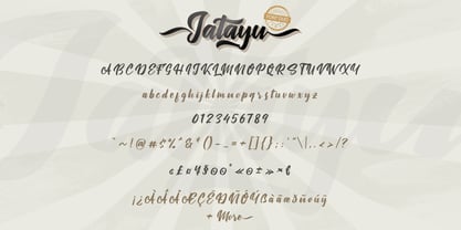 Jatayu is a fun bold script font, with a fresh and modern style. Jatayu has two different styles, regular and extrude. You can combine regular and extrude to get amazing results. Jatayu is suitable for logos, branding, greeting cards, posters and any design that you create.
 - Heavy Boxing by Vozzy,
$10.00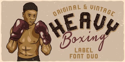 Introducing a vintage look label duo font named "Heavy Boxing". This family includes regular bold and strong font and cute handwritten script font. Regular font have different small and capitali letters. This font will good viewed on any retro design like poster, t-shirt, label, logo etc.
 - MuX1ne by Machine Cult,
$14.00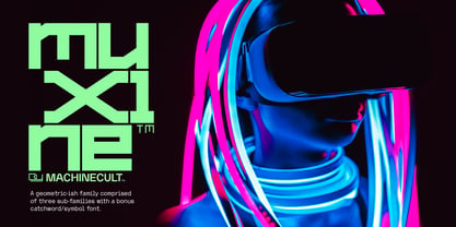 A geometric-ish font family that's a bit off-kilter, offering three families: Regular, Rounded and Hatch as well as the bonus Noise, catchwords and dingbats for some occasions. Each font comes in Light, Regular and Bold styles. Complete latin character set with a range of ligatures.
 - As of my last update in early 2023, Gear by BRIDGEco represents a distinctive font carefully designed to encapsulate a blend of mechanical robustness and sleek, modern aesthetics. Gear stands out for...
- Vicky by Letritas,
$30.00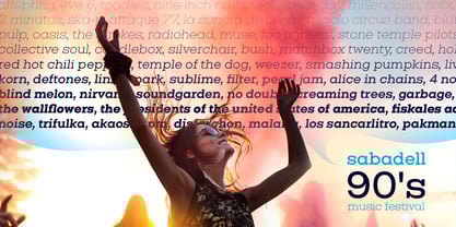 Vicky is a slab serif typeface for headlines designed with geometric proportions. Like all slab serif typographies, it has a very particular strength and robustness. The peculiarity of its forms, as it was born from geometrical figures, creates a cascade of delicate details and inner analogies that make it unique. Vicky is a joyful, happy and shiny typography marked by delicate forms, but with a very strong character. It was born to be soulmate of Liliana, another geometric typeface by Juan Pablo De Gregorio. When working with Liliana and Vicky, together with a compatible chromatic work, you can quickly generate very showy results especially when working on short texts. Vicky is optimal for being used in marketing assets, packaging design, magazines, branding, film captions, headlines, editorial, quotes, logos, corporate identity, and motion graphics. The italic version has a 8-degree slant. This feature is intended to convey a gorgeous feeling of tension, power, and agility. It’s very interesting to realize how the dynamism in the italic characters works when combined with the regular ones. The typeface has 9 weights, ranging from “thin” to “heavy”, and two versions: "regular" and "italic". Its 18 files contain 707 characters with ligatures, alternates, and swashes. It supports 219 Latin-based languages, spanning through 212 different countries. Vicky supports this languages: Abenaki, Afaan Oromo, Afar, Afrikaans, Albanian, Alsatian, Amis, Anuta, Aragonese, Aranese, Aromanian, Arrernte, Arvanitic (Latin), Asturian, Atayal, Aymara, Bashkir (Latin), Basque, Bemba, Bikol, Bislama, Bosnian, Breton, Cape Verdean Creole, Catalan, Cebuano, Chamorro, Chavacano, Chichewa, Chickasaw, Cimbrian, Cofán, Corsican Creek,Crimean Tatar (Latin),Croatian, Czech, Dawan, Delaware, Dholuo, Drehu, Dutch, English, Estonian, Faroese, Fijian Filipino, Finnish, Folkspraak, French, Frisian, Friulian, Gagauz (Latin), Galician, Ganda, Genoese, German, Gikuyu, Gooniyandi, Greenlandic (Kalaallisut)Guadeloupean, Creole, Gwich’in, Haitian, Creole, Hän, Hawaiian, Hiligaynon, Hopi, Hotc?k (Latin), Hungarian, Icelandic, Ido, IgboI, locano, Indonesian, Interglossa, Interlingua, Irish, Istro-Romanian, Italian, Jamaican, Javanese (Latin), Jèrriais, Kala Lagaw Ya, Kapampangan (Latin), Kaqchikel, Karakalpak (Latin), Karelian (Latin), Kashubian, Kikongo, Kinyarwanda, Kiribati, Kirundi, Klingon, Ladin, Latin, Latino sine Flexione, Latvian, Lithuanian, Lojban, Lombard, Low Saxon, Luxembourgish, Maasai, Makhuwa, Malay, Maltese, Manx, M?ori, Marquesan, Megleno-Romanian, Meriam Mir, Mirandese, Mohawk, Moldovan, Montagnais, Montenegrin, Murrinh-Patha, Nagamese Creole, Ndebele, Neapolitan, Ngiyambaa, Niuean, Noongar, Norwegian, Novial, Occidental, Occitan, Old Icelandic, Old Norse, Oshiwambo, Ossetian (Latin), Palauan, Papiamento, Piedmontese, Polish, Portuguese, Potawatomi, Q’eqchi’, Quechua, Rarotongan, Romanian, Romansh, Rotokas, Sami (Inari Sami), Sami (Lule Sami), Sami (Northern Sami), Sami (Southern Sami), Samoan, Sango, Saramaccan, Sardinian, Scottish Gaelic, Serbian (Latin), Seri, Seychellois Creole, Shawnee, Shona, Sicilian, Silesian, Slovak, Slovenian, Slovio (Latin), Somali, Sorbian (Lower Sorbian), Sorbian (Upper Sorbian), Sotho (Northern), Sotho (Southern), Spanish, Sranan, Sundanese (Latin), Swahili, Swazi, Swedish, Tagalog, Tahitian, Tetum, Tok Pisin, Tokelauan, Tongan, Tshiluba, Tsonga, Tswana, Tumbuka, Turkish, Turkmen (Latin), Tuvaluan, Tzotzil, Uzbek (Latin), Venetian, Vepsian, Volapük, Võro, Wallisian, Walloon, Waray-Waray, Warlpiri, Wayuu, Welsh, Wik-Mungkan, Wiradjuri, Wolof, Xavante, Xhosa, Yapese, Yindjibarndi, Zapotec, Zulu, Zuni.
 - Oblygasi by Wildan Type,
$14.00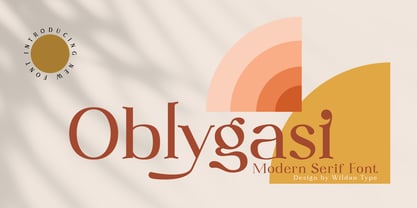 Oblygasi is a modern serif font with a unique ligature and aletrnate style. A simple serif with a touch of curves on the top and bottom of the stemp gives a special impression. Combaine with high contrast and slat style perfect for feminine logo signs, fashion heads & editorial designs, branding projects, Clothing Branding, packaging, magazine headings, advertising, T-shirts, postcards and much more.
 - walker free style - Unknown license

- somalove - Personal use only

- Killigrew - Unknown license

- Kelan - Unknown license


