10,000 search results
(0.078 seconds)
- Fifty Famous Fairy Tales by Funk King,
$20.00 Fifty Famous Fairy Tales was inspired by lettering on the cover of a children’s book of the same name published by Whitman Publishers back in the 50s or 60s.
 - Art Nouveau Ornaments by Gerald Gallo,
$20.00 Art Nouveau Ornaments was inspired by designs from historic sources drawn in the Art Nouveau style. There is an assortment of 47 ornaments located under the character set keys.
 - Surface Stencil JNL by Jeff Levine,
$29.00 A hand-cut antique brass stencil for marking barrel tops of dill pickles was the source of inspiration for Surface Stencil JNL, available in both regular and oblique versions.
 - Art Nouveau Flowers by Gerald Gallo,
$20.00 Art Nouveau Flowers was inspired by flowers from historic sources drawn in the Art Nouveau style. There is an assortment of 47 flowers located under the character set keys.
 - Swing Band JNL by Jeff Levine,
$29.00 Swing Band JNL is a casual, playful type design inspired by the title lettering from "Hi-De-Ho", a 1930s all-black cast film starring legendary bandleader Cab Calloway.
 - Victorian Ornaments by Gerald Gallo,
$20.00 Victorian Ornaments was inspired by the decorative borders and panels produced during the Victorian era. There is an assortment of 47 ornaments all located under the character set keys.
 - Kiner by Yock Mercado,
$12.00 Kiner is a typeface designed by Jorge Mercado, inspired in old western letters used in many industries. Kiner support most latin languages, and the set includes uppercase and lowercase.
 - Late Hours JNL by Jeff Levine,
$29.00 The free form hand lettered titles for the 1961 film “The Children's Hour” inspired the digital typeface Late Hours JNL, which is available in both regular and oblique versions.
 - Convicted JNL by Jeff Levine,
$29.00 Convicted JNL is a condensed, chamfered sans serif type design inspired by opening credits from the 1940 film of the same name – available in both regular and oblique versions.
 - Case Lot JNL by Jeff Levine,
$29.00 A style example found within the pages of a vintage type foundry catalog inspired Case Lot JNL. The design is a classic early 20th Century sans with chamfered corners.
 - Beat by MADType,
$21.00 Beat is a quirky OCR-inspired face with a rounded, retro-electronic feel. All of the stem weights were drawn at random, but the ensuing chaos works amazingly well.
 - Metal Gothic by Nirmana Visual,
$22.00 Metal Gothic Inspired by art nouveau Design Era. Metal Gothic offers beautiful typographic harmony for a diversity of design projects, including logos & branding, social media posts, advertisements & product designs.
 - Retro Volt by Nirmana Visual,
$24.00 Retro Volt Inspired by 70s-80s Design Era. Retro Volt offers beautiful typographic harmony for a diversity of design projects, including logos & branding, social media posts, advertisements & product designs.
 - Retro Cool by Nirmana Visual,
$22.00 Retro Cool , Inspired by 60s - 70s Design Era. Retro Cool offers beautiful typographic harmony for a diversity of design projects, including logos & branding, social media posts, advertisements & product designs.
 - Cartelle Inline by Stereo Type Haus,
$30.00 Cartelle is a sexy small caps bitmap design characterized by it's whimsical curls and ornate flourishes. It's inspiration came from a French poster design from the early 1900's.
 - Atyp BL by Suitcase Type Foundry,
$39.00 The sources of inspiration for the Atyp typeface are spread out widely both stylistically and chronologically. The basic proportions of the uppercase refer to the elementary geometric constructions of the Bauhaus. The subtle details in the drawing of the characters and the microscopic adjustments, which evoke the illusion of uniformity and mechanical purity, pay homage to the rationalism of the typefaces popular in the International Style. The increased contrast of the joints of the bowls and shoulders in the Display weight, which in certain diagonal curves transition into almost deconstructive permutations. For a change these take delight in doing things on purpose, teasing readability and breaking the rules of the new millennium's typography. Atyp was created by adapting a typeface originally made for a commercial television station. The potential of the neutral grotesque, proven by its excellent readability on screens, gave the impetus for its preparation into an extremely wide character set. Coherence across all eight key masters lays the groundwork ideally for using the variable font format. The key benefits of this technology are a significant reduction in data consumption in the case of web fonts, as well as an unlimited access to the full range of styles, which in turn is a significant benefit in the area of responsive design.
 - Baudi by MKGD,
$13.00 Bauhaus is a style of art that was born in Weimar Germany in the early part of the 20th century. The font that bears the bauhaus name was constructed in accordance with this style by making use of spheres and squares with little or no added flourishes. Since this typeface was already minimalistic in appearance, it was difficult to produce a similarly styled font. So I went back to bauhaus’ architectural roots for inspiration. The result contains a more detailed composition, but is still focused on the basic aesthetics that continue to make bauhaus a popular art form. Baudi has a glyph count of 388 and supports the following languages Afrikaans, Albanian, Asu, Basque, Bemba, Bena, Bosnian, Catalan, Chiga, Colognian, Cornish, Croatian, Czech, Danish, Embu, English, Esperanto, Estonian, Faroese, Filipino, Finnish, French, Friulian, Galician, German, Gusii, Hungarian, Icelandic, Indonesian, Irish, Italian, Kabuverdianu, Kalaallisut, Kalenjin, Kamba, Kikuyu, Kinyarwanda, Latvian, Lithuanian, Low German, Lower Sorbian, Luo, Luxembourgish, Luyia, Machame, Makhuwa-Meetto, Makonde, Malagasy, Malay, Maltese, Manx, Meru, Morisyen, North Ndebele, Norwegian Bokmål, Norwegian Nynorsk, Nyankole, Oromo, Polish, Portuguese, Romanian, Romansh, Rombo, Rundi, Rwa, Samburu, Sango, Sangu, Scottish Gaelic, Sena, Shambala, Shona, Slovak, Slovenian, Soga, Somali, Spanish, Swahili, Swedish, Swiss German, Taita, Teso, Turkmen, Upper Sorbian, Vunjo, Walser, Zulu
 - Katlynne by Ryan Williamson,
$5.00 Katlynne is unpredictable. Katlynne is erratic. Katlynne is beautiful. Katlynne is an alternating contrast, sans serif type family. Arbitrarily separating the characters into ‘rounder’ and ‘straighter’ letterforms to determine what contrast each glyph will take. Katlynne is inspired by the observations made while watching the inexperienced use of broad tip pens. I found how and when individuals rotated their pen gave a visually intrusive, if not also pleasantly conspicuous effect. Often, the pen would naturally rotate horizontally (vertical contrast) on the rounder letterforms, and vertically (reverse contrast) on the straighter ones. This is more or less the formula Katlynne adopts as the contrast changes throughout the styles. Katlynne’s severity of contrast varies from ‘Negative Three’ to ‘Positive Three’ in four weights. With a central style ‘Book’ being the sensible, low contrast font in the family. Within the family there are four weights with 7 contrast styles, with complimenting true italics. Giving a total of 56 fonts! Katlynne's array of options works for creating stylistic similitude within layouts, where conspicuous title faces are needed with a cohesive text face to compliment. Alone, the ends of the contrast spectrum (Negative and Positive Three) create striking word forms for advertising, packaging and anywhere else a loud voice is needed.
 - Atocha by Sudtipos,
$49.00 It was expected that Joluvian’s third type font would be inspired by the city where he currently resides: Madrid, Spain. His previous creations had originated in Venezuela (Zulia) and The Philippines (Salamat), both, places where he had once lived. Joluvian believes “now is the time to pay tribute and show gratitude towards a city that has bestowed me with so many fortunes.” He considers that Madrid’s people, streets, scents, flavor and sounds are gift enough to awaken the creative urgency in any artist. This time around, it is being expressed through the crafts of the Typographic industry. Since his arrival in Spain, Joluvian has been attached to the city’s central area, specifically to the renowned Atocha Street and its railroad station. It was precisely on that street that Joluvian and Mauco Sosa, his friend and partner, decided to establish the Patera Studio: a charming creative space that birthed the concept for this new font which they proudly named Atocha Script. The artists where still in the final phases of their previous script, Salamat, when the idea for Atocha came about. This dynamic is actually very typical of the artistic process, in which every finished product spawns the need to create its next level offspring. “Working on Atocha and Atocha Caps has been a very pleasant journey. We have given our best efforts, for we wanted to offer a typeface that was both versatile and user-friendly on a number of applications, showing a wide scope of alternatives in our glyphs,” says the artist. The illustrations were created by Mauco, to ensure visual integration that would showcase the work of both members of the Patera Studio and their complementing aesthetic voices. Atocha, as Salamat and Zulia before, was digitized by Alejandro Paul.
 - Kake by Eclectotype,
$30.00 Kake’s upper case letters are inspired by a hand-painted sign outside a temple in Ubud, Bali. The rest of the font is made to fit the style. The hand-made aesthetic is increased by the implementation of contextual alternates, which automatically swap glyphs to alternate forms to avoid the monotony of repeating letters. The amount of variations for each glyph is dependent on letter frequency in English; there are more a’s and e’s than q’s and j’s. Even with only two variations of some glyphs, the programming makes sure that no two matching glyphs are ever next to eachother, and for the most part they will rarely be even two letters apart. This all makes for type that looks like it isn't type. The glyphs bounce and subtly change weight with willful abandon. Some of the letters on that original sign are somewhat quirky. If you're not a fan you can engage stylistic alternates or stylistic sets to change the C, G, S, Y, c, s and y glyphs to a less idiosyncratic form. These variations still have variations themselves, so with contextual alternates on, they will look as random as all the rest. Case sensitive forms and automatic fractions are included, as are 98 ornaments, ranging from the useful to the (let’s just say) esoteric. These can be accessed from the glyph palette. I know you've probably never realized you need an anchor, a fuel pump, skull and crossbones and chess symbols in the same font before, but that doesn't mean you don't! Kake is full on display typography. It’s legible for small blocks of copy but don't go setting essays in it. Unless you really want to... in which case, go for it.
 - Cabrito Sans by insigne,
$24.99 It's time to kick off your shoes and feel the "sans" between your toes. Like Cabrito Inverto , its stress-reversing cousin, the new Cabrito Sans serves up something nice and cool in the heat of the project. A quick recap: the original Cabrito is an insigne Design slab serif produced for the kid's book The Clothes Letters Wear. It's been pretty well-received--even more than I expected. I promised to grow the family with a free-standing inverted style that could pair well with Cabrito. (See Cabrito Inverto.) Now, I'm rounding out the family with this well-crafted sans. And so now, Sans is where it's at. Strip away the serifs of Cabrito, and you have a laid back, rounded sans serif alternative served up over easy. This handwriting-inspired creation--like its relatives--is definitely not uptight about its forms (though not afraid to show them off a little). Cabrito Sans' whole pack of alternates is accessible in any OpenType-enabled program. This kiddo consists of a workforce of alternates, swashes, and alternate titling caps to give the font a little extra sweetener to its flavor. Also bundled are swash alternates, old style figures, and compact caps. Check out the interactive PDF brochure to test out each these options. This font family members also consists of the glyphs for 72 various languages. Cabrito Inverto and Cabrito do pair nicely with Cabrito Sans (in case you doubted). Use Sans--or all three of these amigos--to express friendliness on just about anything: food, candy, toys, cars (if you're feeling bold). Don't wait, though. Purchase Cabrito Sans today, and bring a one-of-a-kind look to whatever your computer's next design party is.
 - Riclane by suhadidesign,
$15.00 Riclane elegant serif font Hi Ladies and Gentlemen! According to the market demand for fonts that tend to be more modern, then I decided to make a serif font that is in your view. The Riclane font is a serif font with very beautiful, comes with a modern style hoping to become a market favorite. We keep this font looking elegant, classy, easy to read, stylish, attractive and easy to use. Riclane Font is a great choice for magazines, retro designs, newspapers, books, brand names, branding, and other projects. The Riclane font is here to take the quality of your designs to a higher level. Riclane Font is my thirty first Font created in 2023 The Riclane font style will make you love designing and taking advantage of the cool design results for this font. Continue to follow us for updates on making further fonts :) Font Features: • Standard uppercase and lowercase letters • Multilingual Support • Numeral and punctuation • Elegant style
 - Brays by suhadidesign,
$16.00 According to the market demand, fonts tend to be unique fonts, so I decided to make a unique display serif font that is in your view. The Brays font is a font with many ligatures that is very unique and sought after, comes with a stylish style to become a market favorite. We keep this font looking elegant, classy, easy to read, stylish, attractive and easy to use. Brays Font is a great choice for beauty brands, magazines, travel, newspapers, books, brand names, branding, branding, quotes, album covers, and other projects. The Brays font is here to take the quality of your designs to a higher level. Brays Font is my Twenty ninth Font created in 2022 The Brays font style will make you love designing and taking advantage of the cool design results for this font. Continue to follow us for updates on making further fonts :) Font Features: • All capital letters • Stylistic ligatures • Stylistic alternate • Multilingual Support • Numeral and punctuation
 - Becky by W Type Foundry,
$22.00 Becky is a versatile display type designed to appeal to to a young audience of creative, up-to-date people. Geared towards the world of advertising and retail. It is well-suited for large headlines, branding, logos, publishing and short texts. With a modern look inspired by such geometric classics as Futura and an overall edgy, informal quality (seen in details like the subtle curve of its verticals), Becky stands out as a fun, unique type. Becky is a 10-variant type family that comes in 5 weights: light, regular, medium, bold and extra bold. It features 445 characters in total. Becky features 2 alternative stylistic sets: SS1 in which the diagonals in the letters X, Y, V, W, R, K, y,x,v,w and k shift from curved to straight in order to achieve a more formal look, especially useful for smaller texts. SS2 offers alternate glyphs for I, E, J, e, j and t, further expanding the possibilities of the typography. Learn about upcoming releases, work in progress and get to know us better! On Instagram W Foundry On facebook W Foundry wtypefoundry.com
 - Bu Global by Butlerfontforge,
$18.00 While throned before your keys, under your drumming fingers awaits the most astounding standard computer typeface ever devised: BuGlobal. In addition to all the usual alphanumeric characters and symbols, this lone font lets you type more than 400 accented letters appearing in more than 80 English-variant languages worldwide, 70 common math and science symbols, and dozens of other useful characters —more than half a thousand all told— all within the digital parameters of one standard computer typeface, without needing any alternate keyboards or other clumsy digital luggage. Here is a sample: You can add any accent appearing in more than 80 English-variant languages used around the world to any letter appearing in all these languages simply by typing ANY letter then the accent. This includes more than 400 diacritic-laden letters in all —without needing to remember several keystrokes to type any of these letters as a few of them appear in standard computer typefaces. You can type more than 50 math/science symbols that do not appear in standard computer typefaces. These new symbols include several kinds of arrows plus constants, centerlines, dimensions, and graphs and scales that when retyped create continuous scales and graphs. Common symbols such as ballot boxes, rating stars, checkboxes, hearts, fancy fleurons, and similar motifs that do not appear in standard computer typefaces. Dozens of flashy arabesques like ========= [in BuGlobal these equal signs are kerned together so when you type them you create a continuous double line]. In this typeface more than 30 symbols that never appear twice in a row are kerned together so when you continuously type them you create all kinds of flashy arabesques that will make your typing more attractive. No other standard compute typeface allows you to do this. As for Beauty, BuGlobal’s characters are designed according to several axioms of ocular perception until each profile is as iconically simple as Shaker furniture. These axioms make BuGlobal’s letters easier to read compared to other typefaces, and a few of them are: Each letter should look much like the others but for one defining detail. The letters should be as similarly wide as possible. The letters’ midbars should be the same height and thickness. The higher the lowercase letters are compared to capital letters, the more legible and easily readable are their texts. BuGlobal has a typeface user’s guide, titled A Lovely Face, in which a description of each ocular axiom compares BuGlobal with Baskerville, Georgia, Palatino, and other commonly-used standard computer typefaces so you can quickly see why the other typefaces are inferior. You can download a pdf file of this typeface user’s guide, for free, at BuGlobal’s website, butlerfontforge.com, at any time so you can learn all about BuGlobal’s many amazingly new features before possibly buying it. BuGlobal’s plain letters are perfect for texts, its italics are gracefully emphatic, its bolds are ideal for titles and headers, and its arabesques are a fancy way to make your texts look dressy —all of which will add more shimmer to your semantic plumage. One good typeface is more useful than an infinity of poor ones. Robert Bringhurst
 - Brattleboro Stencil JNL by Jeff Levine,
$29.00 The inspiration for Brattleboro Stencil JNL was found within a reproduction of a sales catalog for stencil punch dies manufactured by S.M. Spencer & Co. (originally of Brattleboro, VT), circa 1868. Basically a sans serif letter, the font's unusual feature is its "split tail" design where the letters take on a bit of a "Western" look in appearance.
 - Prospect Park JNL by Jeff Levine,
$29.00 Prospect Park JNL was inspired by inline lettering found on some vintage sheet music from the Art Deco era entitled "By My Side". The font's namesake is located in the Crown Heights section of Brooklyn, NY. Prospect Park is famous for its zoo as well as its tree lined paths, historic carousel and the expansive park area.
 - JT Olifer by Jolicia Type,
$17.00 JT Olifer is family font of Jolicia Type designed by Laire Banyu Sandi Pawenang in October 2021, JT Olifer inspired by Modern Typography developed by us in our perspective, with a typeface detail in every corner we make more rounded, and give an inktrap accent to make unique impression special in every glyph, we really consider about aspect legibility, therefore we make family font amount 40 to assist the selection according to visual needs. Font type of JT Olifer contains several nuances that combain aesthetic, contemporary and modern, furthermore we make some alternates glyph that have a friendly and subtle impression, for example ‘f’ the alternate of this name our font we designed is more circular and smooth. JT Olifer has a total of 465 letters with regular, slanted and condensed styles support in 90 languages : Afrikaans Albanian Asu Basque Bemba Bena Breton Catalan Chiga Colognian Cornish Croatian Czech Danish Dutch Embu English Esperanto Estonian Faroese Filipino Finnish French Friulian GalicianGanda German Gusii Hungarian Inari Sami Indonesian Irish Italian Jola-Fonyi Kabuverdianu Kalaallisut Kalenjin Kamba Kikuyu Kinyarwanda Latvian Lithuanian Lower Sorbian Luo Luxembourgish Luyia Machame Makhuwa-Meetto Makonde Malagasy Maltese Manx Meru Morisyen Northern Sami North Ndebele Norwegian Bokmål Norwegian Nynorsk Nyankole Oromo Polish Portuguese Quechua Romanian Romansh Rombo Rundi Rwa Samburu Sango Sangu Scottish Gaelic Sena Serbian Shambala Shona Slovak Soga Somali Spanish Swahili Swedish Swiss German Taita Teso Turkish Upper Sorbian Uzbek (Latin) Volapük Vunjo Walser Zulu
 - PR Viking by PR Fonts,
$20.00 This typeface is inspired by the angular shapes of runes; the early writing of Northern European peoples. The letters have been given an eroded finish, as though they were carefully carved a thousand years ago, and weathered over time. This font includes at least two versions of every letter one simple, one more ornate, with all alternate characters for other European languages. The Alternates Font includes additional variations of some characters as well as Ligatures, astrological and elemental symbols. More Nordic symbols are available in the Valknut font.
 - Hensoca by Keristyper Studio,
$12.00 Hensoca is a typeface that is inspired by vintage victorian signs and letterhead. This font is good for logo design, Social media, Movie Titles, Books Titles, short text even long text letters, and good for your secondary text font with sans or serif. **Featured:** * Standard Uppercase & Lowercase * Numeral & Punctuation * Multilingual : ä ö ü Ä Ö Ü ß ¿ ¡ * Alternate & Ligature * PUA encoded We recommend programs that support the OpenType feature and the Glyphs panel such as Adobe applications or Corel Draw. so you can use all the variations of the glyphs. Hope you enjoy our fonts!
 - Geroska by Keristyper Studio,
$14.00 Geroska Is a serif contemporary inspired by combining Mid-Century, Modern & Aesthetics styles. This font is good for logo design, Social media, Movie Titles, Books Titles, short text even long text letters, and good for your secondary text font with sans or serif. **Featured:** * Standard Uppercase & Lowercase * Numeral & Punctuation * Multilingual : ä ö ü Ä Ö Ü ß ¿ ¡ * Alternate & Ligature * PUA encoded We recommend programs that support the OpenType feature and the Glyphs panel such as Adobe applications or Corel Draw. so you can use all the variations of the glyphs. Hope you enjoy our fonts!
 - Neugen by Minor Praxis,
$20.00 Inspired by retro movies and theatre display design. A very condensed font made by Minor Praxis. Perfect for headlines, tall-format prints, posters, and displays which can utilize space of a medium. Neugen is a condensed type of font with a very dense kern. Give a strong impression which can be matched with basic sans serif fonts as a body copy that can make it more casual and modern looks. Available in medium and medium-rounded style with multi languages support. Ligatures, alternates, and stuff like icons and symbols.
 - Gardariki by Sergio Storm,
$16.00 "Gardariki" font is geometric sans-serif, straight, bold, extra condensed, monoweight font, accidental with sharp corners and closed aperture. Typeface is great for headlines, text logos and posters. Primarily font is inspired by Constructivism. It has laconic forms, geometricity and solidity and a tight inter-letter space. - Uppercase and lowercase letters - Kerning - Numbers and punctuation - Multilingual support (Latin, Latin Extended, Cyrillic) - Support for more than 20 languages: Albanian, Belarusian, Bulgarian, Croatian, Danish (Norwegian), Estonian, Finnish, German, Hungarian, Icelandic, Italian, Latvian, Lithuanian, Moldovan, Portuguese, Russian, Slovak, Slovenian, Spanish, Swedish, Turkish and others
 - Halloween Secret by Pixesia Studio,
$12.00 Introducing Halloween Secret - A Spooky Display Font Halloween Secret is a display font inspired by twig of the halloween tree. This font has strong character with fantasy, scream, mystical feel. It will work great with your halloween design project such book/novel or movie title, logos & branding, social media posts, advertisements & product designs, etc. FEATURES - Stylistic Alternates - Ligatures - PUA Encoded - Uppercase and Lowercase letters - Numbering and Punctuations - Multilingual Support - Works on PC or Mac - Simple Installation - Support Adobe Illustrator, Adobe Photoshop, Adobe InDesign, also works on Microsoft Word Hope you Like it. Thanks.
 - Doskyball by Keristyper Studio,
$14.00 Introducing a new retro pop script called Doskyball Inspired by '70s script letters. This font is good for logo design, Social media, Movie Titles, Books Titles, short text even long text letters, and good for your secondary text font with sans or serif. Featured: Standard Uppercase & Lowercase Numeral & Punctuation Multilingual : ä ö ü Ä Ö Ü ß ¿ ¡ Alternate & Ligature PUA encoded We recommend programs that support the OpenType feature and the Glyphs panel such as Adobe applications or Corel Draw. so you can use all the variations of the glyphs. Hope you enjoy our fonts!
 - Squabslab by Gassstype,
$23.00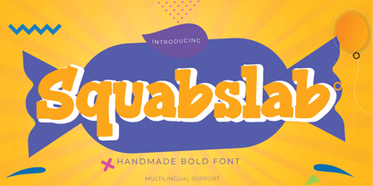 Hello Everyone, introduce our new product Squabslab - Handmade Bold Font Display, inspired by the title of the sports poster and We make it very energetically. Squabslab font with strong and challenging nuances. very suitable for the title, typography, Poster, magazines, brochures, packaging,Websites and much more for your design needs, making your designs more modern and professional This handmade font will make your design has a beautiful natural touch for each details. It is perfect for any design project as Invitation,logo, book cover, craft or any design purposes.
 - Boo Meringue NF by Nick's Fonts,
$10.00The inspiration for this font made its first appearance in the 1897 American Type Founders specimen book, under the name "Lithotint". As the name suggests, the original was tinted gray (diagonal lines formed the body); this version is solid and spooky, too. The font contains a few ghostly graphics, including ghosts at the bracket positions, a haunted house at the backslash position, and a scary backdrop at the ASCII tilde and ASCII circumflex positions. Both versions of the font include 1252 Latin, 1250 CE (with localization for Romanian and Moldovan). - Gekomach by Keristyper Studio,
$14.00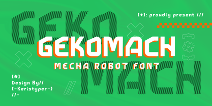 Gecomach robotic mecha typeface is inspired by a modern futuristic. This font is good for logo design, Social media, Movie Titles, Books Titles, short text even long text letters, and good for your secondary text font with sans or serif. **Featured:** * Standard Uppercase & Lowercase * Numeral & Punctuation * Multilingual : ä ö ü Ä Ö Ü ß ¿ ¡ * Alternate & Ligature * PUA encoded We recommend programs that support the OpenType feature and the Glyphs panel such as Adobe applications or Corel Draw. so you can use all the variations of the glyphs. Hope you enjoy our fonts!
 - Retroma Vibes by Arterfak Project,
$24.00 Try something different, we proudly present our new exploration named "Retroma Vibes" a mixed font inspired by retro collage art and clipping of old newspapers. Feel the old school taste with this block font mixed of sans serif, condensed serif, blackletter, handwriting, and old typewriter style, combined into a chaotic collage style. You can also mix and match the letter by using the alternates characters or switching with the lowercase which gives you a more attractive design. What you'll get : Uppercase Lowercase Numbers & punctuation Stylistic alternates Multilingual support Hope you enjoy this font!
 - Lettichossa by Keristyper Studio,
$14.00 Lettichossa is an old-fashioned typeface, inspired by victorian and ornamental typography styles. This font is good for logo design, Social media, Movie Titles, Books Titles, short text even long text letters, and good for your secondary text font with sans or serif. **Featured:** * Standard Uppercase & Lowercase * Numeral & Punctuation * Multilingual : ä ö ü Ä Ö Ü ß ¿ ¡ * Alternate & Ligature * PUA encoded We recommend programs that support the OpenType feature and the Glyphs panel such as Adobe applications or Corel Draw. so you can use all the variations of the glyphs. Hope you enjoy our fonts!