10,000 search results
(0.075 seconds)
- Oceanwide Pro by California Type Foundry,
$47.00 A font perfect for not just one, but many projects! Introducing Oceanwide Pro, a sans that loves to be used in just about any situation! Designed with ultra clean lines and versatility in mind, Oceanwide wants to be your new favorite sans! Oceanwide’s ultra clean letters work anywhere you want to communicate orderliness and competence, and designed to build trust and rapport with your audience. Its wide proportions make it ideal for display and logo use. Oceanwide especially shines for white/bright letters on black/dark backgrounds! That’s because the inside shapes are nearly perfect circles in many weights. Here's a quick video tour of Oceanwide Pro by Dave Lawrence, including all the great things Oceanwide can be used for! We've tested Oceanwide for these industries, with stunning results!: Tech Arts Fashion & Style Business & Branding Corporations Logistics Architecture Food and many more... Oceanwide can be used for: Headers Subheadlines Logos Even body text, if tracked. Print & Screen The styles it can take are also many. It's great for: Modern/minimalist design Flat design Cut out design User Interface (UI) Technical designs In combination with text effects, even for grunge and other situations. And many others... DESIGN FEATURES Simplicity Tall x-height Hand-sloped obliques (italics) Narrow spacing Semi-wide proportions Expert kerning Well proportioned, usable lights & extra lights Large caps Great ALL CAPS MODE Uppercase punctuation Uppercase spacing with California Type Foundry’s Smart Tracking™ Advanced fraction support Proportional lining figures Thick joins Smooth curves Sturdy—great for textures and effects Variable font available Latin Pro character set for Central European languages. That's the writing for over 782 languages and transliterations worldwide! DESIGN STORY—THE FORGOTTEN SANS by Dave Lawrence, Lead Designer, California Type Foundry Adrian Frutiger was the 20th century master of sans, but I didn't realize he had made—not one—but TWO geometric sans! It wasn't until I had purchased the book “Adrian Frutiger: Typefaces”. I had hoped to someday meet Adrian Frutiger, but he passed away that very same year. Here is the story of Frutiger's forgotten sans. Back in 1968, Frutiger was approached by Pentagram to make a design for British Petroleum. They wanted a "new version of Futura". However, they wanted him to make a couple adjustments. First, they felt that Futura was "too fiddly." By this, they meant that it narrowed too much at the joins. (Joins are for example where the round and straight parts of the 'd' meet.) This is something that is necessary for small print text (to prevent ink clogging), but is not necessary at large sizes. Second, they wanted it to be entirely geometric, using the circular shape with minimal optical corrections. Unfortunately this font was not even used very consistently in the BP brand. A haphazard mix of Futura and Frutiger's BP font ensued. It was then replaced by another font design very soon after. My design is different in several ways. First, the commas and quotes are a more modern style. I tried his original commas, but these just didn’t work to 21st century eyes. Second, in his drawings, Frutiger went for a more standard u with a downstroke on the right. However, Oceanwide has a simpler u. Third, I made more optical adjustments. At the direction of his employer, Frutiger reluctantly put no font optical corrections into the letters. So I think my optical adjustments are similar to what Frutiger would have wanted. Fourth, I extended the weight into the light and extra light ranges. Fifth, the rest of the font I created according to the principles of Adrian Frutiger, but with no sources for inspiration. Here is Frutiger’s design philosophy, in his own words: “If you remember the shape of your spoon at lunch, it has to be the wrong shape. The spoon and the letter are tools; one to take food from the bowl, the other to take information off the page... When it is a good design, the reader has to feel comfortable because the letter is both banal and beautiful.” The words about the spoon were the ones I kept in my mind as I tried to make the curves ultra smooth, and the shapes ultra simple. Hopefully this font is a worthy successor to the font that inspired it. Released on the 93rd birthday of Adrian Frutiger, to celebrate the life and achievements of this amazing designer. ——————— Simplicity. Versatility. Oceanwide.
 - Red Klin by ParaType,
$25.00 A decorative сaps-only typeface designed for ParaType in 2004 by Gayaneh Bagdasaryan. Inspired by Russian fine art from the beginning of the 20th century - lettering by Sergey Chekhonin (1878-1936), graphic design by El Lissitzky (1890-1941) and the Suprematism painting. Sketch design of the font (under the name Klin) was awarded a TDC2 2000 diploma. For use in advertising and display typography.
 - Cloudbuster by K-Type,
$20.00 Cloudbuster is K-Type’s take on the mid twentieth century style of extra condensed slabs/moderns inspired by Imre Reiner’s Corvinus Skyline of 1934. Unusually, Cloudbuster has a printed-look softness, courtesy of very slightly rounded corners throughout, so it looks a little less harsh than similar typefaces. The font is an imposing display face with elegant, unfussy letterforms and a generous x-height.
 - Ticketrick by Patria Ari,
$15.00 Ticketrick is a display font with hand-drawn serifs and an unbalanced yet fun position. Crafted from hand-drawn lettering, its uppercase and lowercase height make it perfect for displays. Inspired by Halloween, Ticketrick combines serifs, hand-drawn style, and varied letter heights, making it ideal for spooky-themed products. Elevate your Halloween designs with Ticketrick, which perfect for spooky invitations, eerie banners, and chilling merchandise.
 - HT Osteria by Dharma Type,
$19.99 HT Osteria is a monoline script, but you don’t feel it monotonous because of distinctive shapes of the characters. HT Osteria is suitable for signage, package, and posters or any other kind of display use. Holiday Type Project offers retro hand drawing scripts. Inspired by retro script on shopfront lettering, wall paint advertisements in Italy around 1950s. Check out the script fonts from Holiday Type!
 - Mistoni by Gatype,
$15.00 Mistoni An elegant font designed when in a creative mood and perfect shape, inspired by the bold, natural look of serifs so beautiful for today's fashion. bold, balanced and varied, born for luxury and beauty. including uppercase letters, numbers, and various kinds of punctuation Mistoni is perfect for invitations, logos & branding, photography, advertising, watermarks, social media posts, product packaging, product designs, labels, wedding designs, stationery.
 - Seaside Resort NF by Nick's Fonts,
$10.00Lettering on a 1933 booklet about certain facilities in Italy -- can you guess what they might be? -- by the Bertarelli Design Studio of Milan inspired this decidedly different and engaging monocase face. If you're looking for something that says "casual elegance," this is it. This font contains the complete Latin language character set (Unicode 1252) plus support for Central European (Unicode 1250) languages as well. - Sidemore by Ironbird Creative,
$15.00 Sidemore is a organic sans serif inspired by vintage type with handdrawn feel. This typefaces is perfect for people looking for vintage aesthetic and suitable for any graphic designs such as branding materials, t-shirt, print, logo, poster, quotes. Also support multilingual, number and symbol, and already PUA Encoded. We hope you enjoy the font. Thanks for purchasing and happy creating! Regards, Ironbird Creative
 - Board Deluxe by Katatrad,
$29.00Display block letters inspired by train station LED board. Board Deluxe is a humanist version of previously release Board based on bitmap diamond cells pixel font. Original Board (released by T.26) provided rounded corners diamond shape cells deliver surprisingly nice texture when use in extra large size. Board Deluxe gives you solid headline letters that spell out the midpoint between Digital and OldStyle. - Surakarta by Parquillian Design,
$39.00 Surakarta is a display face of western characters with numerous optional ligatures modeled after the graceful Javanese alphabet still taught in many schools on the island of Java in Indonesia, though it has been replaced by the latin alphabet for most everyday purposes. This is the second in Parquillian Design’s series of fonts inspired by some of the beautiful lesser-known native scripts of Southeast Asia.
 - Lizie Slab by Poul Allan Studio,
$26.00 Lizie Slab is a slab serif, where the geometric construction is inspired by the 1930s design icons De Stijl, Gerrit Rietveld and others. Lizie Slab is designed for both print and digital use, and you will find it ideal for packaging, poster design, catalogs and exhibition design. The font supports a wide range of languages. This OpenType contains features such as fractions, proportional and tabular shapes.
 - Chocoladine by Sign Studio,
$12.00 Chocoladine is inspired by the fern leaves that curl and grow at the tips. In capital letters the shape will appear. This font is also in the retro category which is still popular today. Casual, warm, sweet that's about it. It is suitable for printing t-shirts, mugs, book covers, invitation, product branding, packaging, advertising, retro logos and many more. Thank you, I hope you enjoy it.
 - P22 Foxtrot Pro by IHOF,
$39.95 The design of P22 Foxtrot is inspired by the lively ballroom dance of the same name. Foxtrot is a transitional antiqua with rounded serifs that features ligatures, small caps, oldstyle numerals and full Central European support for those with applications that support OpenType features. The companion, Foxtrot Sans, is a sans serif version with a little more jazzy expression. Both fonts are great for text and display.
 - Djibouti NF by Nick's Fonts,
$10.00An exuberant typeface named "African Queen", designed by Dave West for Photolettering in the 1960s, provided the inspiration for this exercise in typographic minimalism. The result is stark and somewhat raw, with a unique muscular energy...a natural choice for headlines that will attract attention. Both versions of the font include 1252 Latin and 1250 CE (with localization for Romanian and Moldovan) character sets. - Renard Moderne NF by Nick's Fonts,
$10.00Twentieth Century Poster, designed by Sol Hess for Lanston Monotype in the 1940s, provided the inspiration for this family of faces. Although, historically, the design falls outside the time period normally considered the Art Deco era, its sensibilities are pure Art Moderne. Both versions of this font contain the Unicode 1252 (Latin) and Unicode 1250 (Central European) character sets, with localization for Romanian and Moldovan. - LC Merkén by Compañía Tipográfica de Chile,
$30.00 Merkén is a typeface inspired in the Slab Serif fonts designed by Vincent Figgins in the early 20th century: his famous designs; Antique and Egiziano, were the main references when developing this project. The typeface is perfect for headlines, medium length texts, branding and advertising. His original set is strong and spicy but it also has an alternative set which is cursive and kind.
 - Kg Stuttgart 1930 by Martin L'Allier,
$10.00KgStuttgart1930 -- Kunstgewerbeschule Stuttgart 1930 -- is based on a printed sample of a font designed in 1930 at the Stuttgart School of Applied Arts. Found in the book ABZ, more alphabets and other signs by J. Rothenstein and M. Goodings. I recreated the grid and kept some awkward letters of this bauhaus-era inspired design. I created the missing glyphs and added alternate versions of already existing ones. - 1540 Mercator Script by GLC,
$38.00 This font was inspired by the so-called Litterarum latinarum, quas italicas, cursoriasque vocant, scribendum Ratio (Louvain 1540), a manual intended for calligraphers by the well known scientist Gerhard Mercator. It was a magnificent “Cancellaresca corsiva” design, enriched with many alternates, final loops and ligatures. We have added a lot of accented and other characters required for modern use that did not exist in the original.
 - TG Praktikal by Tegami Type,
$30.00 TG Praktikal is new modern geometrics sans with 8 styles & 1 variable font. Inspired by geometrics and gothic typefaces like Bell Centinel, Whitney and Metric, with an additional touch of monospace characters. That makes that TG Praktikal has a unique character set and fit perfectly for body text. Coupled with 3 flavors that can provide different impressions, including approximately 90 multilingual with various OpenType features.
 - Seattle Weather by Arendxstudio,
$16.00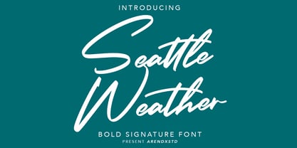 Seattle Weather was inspired by urban script fonts. The sharp and beautiful letter forms create glyphs that are modern, trendy and elegant. Seattle Weather comes with OpenType features such stylistic alternates, stylistic sets and ligatures and is great for logotypes, posters, badges, book covers, tshirt design, packaging and many more. Features : • Character Set A-Z • Numerals & Punctuations (OpenType Standard) • Accents (Multilingual characters) • Ligatures • Alternates
 - Linsingen by Jean Wojciechowski,
$20.00 Linsingen is a font family inspired by Brazilian tea barrel labels printed with lithography in the beginning of the 20th century. The family consists of three styles - Linsingen Vintage, which preserves the shapes found in the original prints; Linsingen Moderna, a contemporary interpretation of the original shapes, with increased contrast and sharper lines; and Linsingen Stencil. All of the three styles are suited for titles and headlines.
 - Magalith by Samtype,
$39.95 This hebrew typeface is inspired in prayer books from the beginning of the XX century. Even in this Std version You can apply modern hebrew marks like Kamats Katan, Sheva Na, Dagesh Chazak and Cholam Chaser. It's a classic style with the most modern of a digital font technology and a easy lecture. The Caption versions is ideal for small size of texts and footnotes.
 - Squirrely Shirley NF by Nick's Fonts,
$10.00Another entry in the trusty old "Schriftatlas" named Phoenix—original source and designer unknown—provided the inspiration for this bouncy bit of alphabetical tomfoolery. Its animated typeforms, definitely retro chic, will put some bounce in the step of any headline it graces. Both versions of the font include complete Latin 1252, Central European 1250 and Turkish 1524 character sets, with localization for Moldovan, Romanian and Turkish - Fenton by Fatih Güneş,
$19.00 Fenton Font family comes with 6 weights. The design was inspired by (convex) camber. It has a higher lowercase structure than the normal ones. It has a modern, rounded and squared character. Each weight contains 364 glyph. It is a type family which you can use in brand and model names of technological devices, newspaper and magazine ads, jerseys, logos, posters, apps, banners and promo images.
 - Cracks by Grewfont Studio,
$13.00 Cracks is a display font inspired for fun image and playful taste. Although initially made for comical use, this fantastic typeface is also best suited for headlines of all sizes, as well as for blocks of text that have both maximum and minimum variations. Whether it’s for web, digital crafts, logotype, wordmark, print, moving images or anything else, it fits for every young and playful design.
 - Piersob by Almarkha Type,
$25.00 Hello Everyone, Introduce our new collection, Piersob - Extended Display Sans Serif inspired by famous logos of Technology and brands that have very strong characteristics, very suitable for posters, packaging, branding, logotype and more. Piersob font with strong and challenging nuances. very suitable for the title, typography, Poster, magazines, brochures, packaging,Websites and much more for your design needs, making your designs more modern and professional.
 - Thematheka by Almarkha Type,
$29.00 Hello Everyone, Introduce our new collection, Thematheka - Bold Display Sans With 29 Ligatures, Inspired from famous logos of Technology and brands that have very strong characteristics, very suitable for posters, packaging, branding, logotype and more. Thematheka font with strong and challenging nuances. very suitable for the title, typography, Poster, magazines, brochures, packaging,Websites and much more for your design needs, making your designs more modern and professional.
 - Bad Dookie NF by Nick's Fonts,
$10.00The inspiration for this typeface was found tucked away in what is arguably the worst book of advertising clip art ever published (cleverly entitled The Advertising Cartoon Clip Art Book from 1971). It’s so bad, it’s good—at least at getting your attention. Both versions of this font include the complete Latin 1252 and CE 1250 character sets, with localization for Romanian and Moldovan. - Artistic Venture by Storictype,
$19.00 Artistic Venture Typeface, Inspirated those bold wide letters you see on. computer screen, movie futureistic with combine classic , Well, some of them have these strong or hooks on the ends of the letters. But, there's also this new style of font that's super cool and futuristic. It's called a Artistic Venture Typeface. There Include : All Caps Opentype Feature Alternate Character Ligature Multilanguage Thank You
 - Hob Gob NF by Nick's Fonts,
$10.00Although not credited, the inspiration for this typeface, originally called "Dancer", has all the earmarks of the work of legendary lettering artist Alf Becker. Creepy and kooky, mysterious and spooky, but not in the least ooky, this monocase face is just what the doctor ordered; Dr Frankenstein, that is. Both versions of this font include the complete Unicode Latin 1252 and Central European 1250 character sets. - Moku Brush by Deltatype,
$49.00 Moku Brush is a structural brush script inspired from handwriting with brush, with straight letterform you will get less formal but more sweet! Moku Brush come with nine weights, so you can use as body text or even better with headline. With nine variations, you can use this font in different sizes with different weights, you will get better balance when do type setup.
 - ITC Kristen by ITC,
$29.99ITC Kristen is the work of American designer George Ryan. He describes it as not your average text or display font." The inspiration for the design came from the handwritten menu at a neighborhood restaurant. With time, the forms moved away from the originals and towards something more like a child's scrawl. The result is singularly unique. ITC Kristen remains legible without losing any charm. - Minou by Hanoded,
$15.00 Minou is a French cat’s name. There are more: you could name your cat Léo, Fripouille, Orion, Orphée or Tigrou, but I kind of like Minou. Minou font is a very cute, handmade affair, that started from some doodles I had drawn. Use it for children’s book covers, pyjama party posters, toy packaging and inspirational quotes. I am sure it’ll do the job purrfectly!
 - As of my last update in April 2023, there isn't a widely recognized font specifically named "Free." The term "free" in relation to fonts, however, plays a significant role in typography and design. I...
- Killegar by Tony Fahy Font Foundry,
$20.00 The Killegar family is inspired by one of the great houses of Ireland...Killegar—which is on the grand Estate of Killegar. I lived there for many years. It is a quiet and peaceful place surrounded by lakes and trees and is inspirational in so many ways. All of my creative talents were boosted by this amazing two hundred year old building with all of it's secrets and heritage. Time stood still in Killegar....except for me and my modern day computers, cell phones and fax machines. This twist of fate, with me living both a rural and hi-tech life, living in an environment of the early 18th century, with the friendliest local people on the Earth, played it's part in the origin of the Killegar family of fonts. Tony Fahy
 - Steed by Device,
$29.00 A condensed and bold obround sans inspired by 60s condensed inserat faces, with a more pronounced thick/thin stress as seen on the titles of the Avengers TV show.
 - Show Tune JNL by Jeff Levine,
$29.00 Hand lettering used in the trailer for the 1943 movie musical “Broadway Rhythm” was the inspiration for Show Tune JNL, which is available in both regular and oblique versions.
 - Poster Gothic by GroupType,
$19.00 Poster Gothic was inspired by showcard lettering samples featured in the book,""Commercial Art of Show Card Lettering"" by James Eisenberg, published by D. Van Nostrand Company in 1945.
 - Meeneralca 4F by 4th february,
$25.00 The design of type Meeneralca 4F was inspired by the logo of the mineral water Borjomi from Georgia. The word "Meeneralca" is the short (slang) version for "mineral water".
 - Floral Ornaments by Gerald Gallo,
$20.00 For many centuries, Chinese cut paper designs have been in common use. Floral Ornaments was inspired by these floral cut paper designs and contains a selection of 114 ornaments.