3,000 search results (0.085 seconds)
  1. Claude Garamond (ca. 1480-1561) cut types for the Parisian scholar-printer Robert Estienne in the first part of the sixteenth century, basing his romans on the types cut by Francesco Griffo for Venetian printer Aldus Manutius in 1495. Garamond refined his romans in later versions, adding his own concepts as he developed his skills as a punchcutter. After his death in 1561, the Garamond punches made their way to the printing office of Christoph Plantin in Antwerp, where they were used by Plantin for many decades, and still exist in the Plantin-Moretus museum. Other Garamond punches went to the Frankfurt foundry of Egenolff-Berner, who issued a specimen in 1592 that became an important source of information about the Garamond types for later scholars and designers. In 1621, sixty years after Garamond's death, the French printer Jean Jannon (1580-1635) issued a specimen of typefaces that had some characteristics similar to the Garamond designs, though his letters were more asymmetrical and irregular in slope and axis. Jannon's types disappeared from use for about two hundred years, but were re-discovered in the French national printing office in 1825, when they were wrongly attributed to Claude Garamond. Their true origin was not to be revealed until the 1927 research of Beatrice Warde. In the early 1900s, Jannon's types were used to print a history of printing in France, which brought new attention to French typography and the Garamond" types. This sparked the beginning of modern revivals; some based on the mistaken model from Jannon's types, and others on the original Garamond types. Italics for Garamond fonts have sometimes been based on those cut by Robert Granjon (1513-1589), who worked for Plantin and whose types are also on the Egenolff-Berner specimen. Linotype has several versions of the Garamond typefaces. Though they vary in design and model of origin, they are all considered to be distinctive representations of French Renaissance style; easily recognizable by their elegance and readability. ITC Garamond? was designed in 1977 by Tony Stan. Loosely based on the forms of the original sixteenth-century Garamond, this version has a taller x-height and tighter letterspacing. These modern characteristics make it very suitable for advertising or packaging, and it also works well for manuals and handbooks. Legible and versatile, ITC Garamond? has eight regular weights from light to ultra, plus eight condensed weights. Ed Benguiat designed the four stylish handtooled weights in 1992." In 1993 Ed Benguiat has designed Handtooled versions.
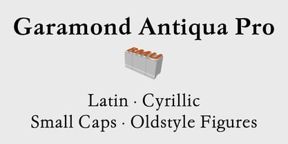
  2. Garamond Antiqua Pro by RMU, $50.00
    A font classic as a RMU redesign - a small yet mighty family with a West and Central European character set plus Cyrillic. All three styles include small caps and oldstyle figures.
  3. Garamont Amsterdam SB by Scangraphic Digital Type Collection, $26.00
    Since the release of these fonts most typefaces in the Scangraphic Type Collection appear in two versions. One is designed specifically for headline typesetting (SH: Scangraphic Headline Types) and one specifically for text typesetting (SB Scangraphic Bodytypes). The most obvious differentiation can be found in the spacing. That of the Bodytypes is adjusted for readability. That of the Headline Types is decidedly more narrow in order to do justice to the requirements of headline typesetting. The kerning tables, as well, have been individualized for each of these type varieties. In addition to the adjustment of spacing, there are also adjustments in the design. For the Bodytypes, fine spaces were created which prevented the smear effect on acute angles in small typesizes. For a number of Bodytypes, hairlines and serifs were thickened or the whole typeface was adjusted to meet the optical requirements for setting type in small sizes. For the German lower-case diacritical marks, all Headline Types complements contain alternative integrated accents which allow the compact setting of lower-case headlines.
  4. Garamont Amsterdam EF by Elsner+Flake, $35.00
  5. Garamont Amsterdam SH by Scangraphic Digital Type Collection, $26.00
    Since the release of these fonts most typefaces in the Scangraphic Type Collection appear in two versions. One is designed specifically for headline typesetting (SH: Scangraphic Headline Types) and one specifically for text typesetting (SB Scangraphic Bodytypes). The most obvious differentiation can be found in the spacing. That of the Bodytypes is adjusted for readability. That of the Headline Types is decidedly more narrow in order to do justice to the requirements of headline typesetting. The kerning tables, as well, have been individualized for each of these type varieties. In addition to the adjustment of spacing, there are also adjustments in the design. For the Bodytypes, fine spaces were created which prevented the smear effect on acute angles in small typesizes. For a number of Bodytypes, hairlines and serifs were thickened or the whole typeface was adjusted to meet the optical requirements for setting type in small sizes. For the German lower-case diacritical marks, all Headline Types complements contain alternative integrated accents which allow the compact setting of lower-case headlines.
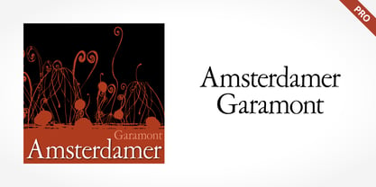
  6. Amsterdamer Garamont Pro by SoftMaker, $14.99
    Amsterdamer Garamont Pro is one of the fonts of the SoftMaker font library.
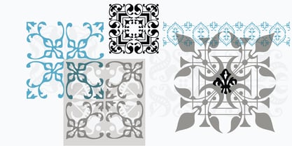
  7. LTC Fleurons Garamont by Lanston Type Co., $24.95
  8. Mouser Outline - Unknown license
  9. Goffik-Outline - Unknown license
  10. Halo Outline - Unknown license
  11. Savia Outline - Personal use only
  12. Quarx Outline - 100% free
  13. Dearest Outline - Unknown license
  14. Bamf Outline - Unknown license
  15. Stitched Outline - Personal use only
  16. Feuerfeste Outline - Unknown license
  17. Boneribbon Outline - Unknown license
  18. Clink Outlined - Personal use only
  19. Plasmatica Outline - Unknown license
  20. Jumbo Outline - 100% free
  21. Uberhölme Outline - Personal use only
  22. Jumbo Outline - 100% free
  23. Dot.com Outline - Unknown license
  24. Quarx Outline - 100% free
  25. Regulators Outline - Unknown license
  26. Quark Outline - 100% free
  27. Avondale Outline - Unknown license
  28. Plasmatica Outline - Unknown license
  29. Quark Outline - 100% free
  30. Helena-Outline - Unknown license
  31. Hungover Outline - Personal use only
  32. Perdition Outline - Unknown license
  33. Vitamin outlined - Unknown license
  34. Pecot Outline - Personal use only
  35. FortuneCity Outline - Unknown license
  36. Roughhewn Outline - Personal use only
  37. Walshes Outline - Unknown license
  38. Spinach Outline - Unknown license
  39. Chizzler Outline - Unknown license
  40. Wazoo Outline - Unknown license
Looking for more fonts? Check out our New, Sans, Script, Handwriting fonts or Categories
abstract fontscontact usprivacy policyweb font generator
Processing