10,000 search results
(0.017 seconds)
- PykesPeakZero - 100% free

- Patron - Personal Use - Personal use only

- Gibbard_erc_01 - Unknown license

- Winky Milky by Graphicxell,
$19.00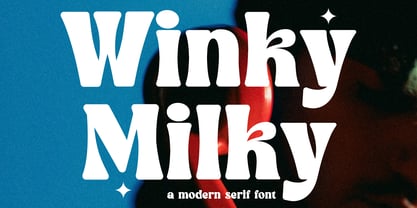 Winky Milky is a unique and very elegant font for branding and logo designs Elegant serif typeface combined with a classy and modern style. This type of font is very suitable for your various needs such as branding projects, logos, wedding designs, social media posts, advertisements, product packaging, product designs, labels, photography, watermarks, invitations, stationery, and any project, created with high level of readability. you will not be disappointed if you buy this font!!
 - Camiro by Graphicxell,
$19.00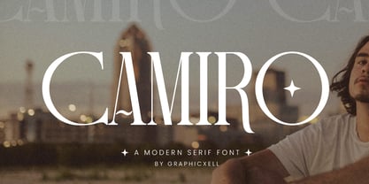 Camiro is a unique and very elegant font for branding and logo designs Elegant serif typeface combined with a classy and modern style. This type of font is very suitable for your various needs such as branding projects, logos, wedding designs, social media posts, advertisements, product packaging, product designs, labels, photography, watermarks, invitations, stationery, and any project, created with high level of readability. you will not be disappointed if you buy this font!!
 - Deco Multiline JNL by Jeff Levine,
$29.00 The 1934 Dick Powell-Ruby Keeler-Joan Blondell movie musical "Dames" gave us the classic song "I Only Have Eyes for You", but the sheet music for the song had the movie title hand lettered in a multi-line Art Deco sans serif design that just begged to be turned into a type font. From these few letters now comes Deco Multiline JNL, which is available in both regular and oblique versions.
 - Misky by Graphicxell,
$19.00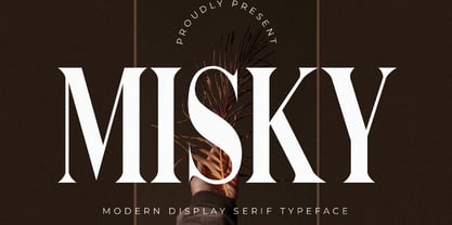 is a unique and very elegant font for branding and logo designs Elegant serif typeface combined with a classy and modern style. This type of font is very suitable for your various needs such as branding projects, logos, wedding designs, social media posts, advertisements, product packaging, product designs, labels, photography, watermarks, invitations, stationery, and any project, created with high level of readability. you will not be disappointed if you buy this font!!
 - Hollywood Hills by Studio K,
$45.00 Inspired by that iconic sign in the Hollywood Hills, this font is a must for film buffs, movie lovers and designers who want to bring a bit of big screen glamour to their projects. It’s a caps only face, but by using the upper and lower case keys type can be set above or below the base line, thus creating the signature stagger effect. See also Jazz Age and Tea Dance by Studio K
 - Masky by Graphicxell,
$19.00 Masky is a unique and very elegant font for branding and logo designs Elegant serif typeface combined with a classy and modern style. This type of font is very suitable for your various needs such as branding projects, logos, wedding designs, social media posts, advertisements, product packaging, product designs, labels, photography, watermarks, invitations, stationery, and any project, created with high level of readability. you will not be disappointed if you buy this font!!
 - LFT Iro Sans by TypeTogether,
$49.00 Milan-based Leftloft studio developed LFT Iro Sans, an expansive family that solves the significant, wide-ranging challenges of branding, wayfinding, pictographic language, and complex editorial use. LFT Iro Sans began as the clear and welcoming wayfinding project of San Siro stadium in Milan. Over time many other styles and weights have been added. LFT Iro Sans never finds itself outmatched by the task at hand. The primary aim was to design a technical typeface that was readable in any low visibility condition, for instance in a poorly lit area with awkward wall shapes and overhangs. This worked well for stadium and large lettering use, but other problems also needed to be addressed, such as complementary iconography. A location developer was left mixing — clashing, really — one type family with a different family of icons, resulting in a cobbled-together look which diluted the brand and the experience. They set out to radically simplify and clarify each shape and its meaning, accepting uniqueness as part of the final visual language. LFT Iro Sans pictograms answers the need for having a consistent and large group of icons, perfectly suited to the text typeface. As it concerns public spaces, this didn’t exist before. LFT Iro Sans incorporated a branding project too, so they decided to let LFT Iro Sans go out on a limb and created a unicase style that demands attention. Each unicase letter is a combination of the lowercase and capital form, quite noticeable in the ‘i’, ‘m’, ‘t’, and unique ‘d’ and ‘b’, balanced by more restrained forms of ‘a’, ‘s’, ‘c’, and ‘e’. LFT Iro Sans is not only a technical typeface, but, thanks to letters’ proportions, can also be used for editorial purposes. Assertive and economical in stature, the text weights are clear and assured. And a display version for headlines in Ultralight and Heavy (with italics) was developed for stunning headlines. For enthusiasts of every stripe, LFT Iro Sans can be a brand’s rallying cry with its arresting unicase, be a developer’s go-to pictogram choice, or set the most demanding editorial text in digital or print. With its many OpenType features, simplified pictogram commands (even available in Apple’s Pages and Microsoft Word), and a total of 30 targeted family members, LFT Iro Sans is a brilliant, easy choice. As with the rest of the TypeTogether catalogue, the complete LFT Iro Sans family, designed by Lefloft and developed by Octavio Pardo, has been optimised for today’s varied screen uses.
 - Medieval Borders by Aah Yes,
$5.00 This is a large group of typefaces inspired by those borders and patterns you see going across documents from the Middle Ages and Medieval times, eventually becoming this collection of fonts where you can scroll various repeating patterns across a page, for example. You can get a repeating pattern that scrolls seamlessly by repeating the same letter. The default text displaying on the web-page is bbbbbbbb, for example. There's over 2 dozen basic styles, and each style has 52 designs within it, using the characters Upper Case A - Z and lower case a - z, with the lower case being the negative/reverse colour of the Upper Case version, it will be the corresponding design just reverse coloured and with an edging strip. There's also a space - but nothing else. The styles in these fonts usually have groups of six characters (A to F, G to L, M to R, S to X), and where the second group is a variation on the first - usually thicker lines - and the third grouping is another variation on that, usually thicker lines again, making the first 24 letters. (Sometimes there's three groups of eight characters). The pattern within a group normally starts off plain then gets busier as it progresses - such as there'd be a more complex pattern of circles and diamonds as you go through the letters. Then the letters Y & Z are somewhat different to the rest. There's four versions starting with Z, and they're a little bit different, and they're grouped in fives - getting bolder as you progress through the letters, but with similar patterns within each group of 5, and that makes the first 25 characters. The letter Z character is extra busy. Again, lower case is the reverse colour of the Upper Case. Mostly you can get patterns and borders that combine seamlessly by using letters within the same group of 6 or 8 (like maybe abdcedcb). There are a few occasions when that doesn't work out, because there may be circles or diamonds at the sides of the letters that don't match up with another letter that has a different pattern at the side. But you can create a pattern with the exact level of complexity you want perfectly easily. You can see examples of this in the poster images. Neighbouring letters without embellishments at the sides of the letters will usually fit together. Have fun with it, that's what it's there for. aah yes fonts
 - Air Superfamily by Positype,
$29.00 In B-movie awesomeness, Air began as Grotesk vs. Grotesque. I was trying to unify the prevailing traits of German and English Grotes(que/k)s in order to make something different but familiar. I am NOT trying to reinvent Helvetica (snore), so get that out of your system. From the onset, I intended this typeface to be a true workhorse that offers infinite options and flexibility for the user. At its core, it is the maturation of the Aaux Next skeleton I developed years ago. I worked out Aaux Next to settle my issues and love for Akzidenz. With Aaux Next, I strove to be mechanical, cold and unforgiving with it. I was single, young, cocky and it fit. Now I'm married, kids, dog and have found that I've turned into a big softy. When I look at Aaux Next (and have for the past few years) I see another typeface trying to eek out. I wanted it to avoid the trappings of robotic sans, quick tricks and compromises. The typeface’s DNA needed to be drawn and not just generated on a screen — so I set aside a year. I love type. I love working with type. I hate when my options for a slanted complement is only oblique or italic. I set out to produce both to balance usage — there are more than enough reasons to prepare both and I want the user to feel free to consciously choose (and have the option to choose) the appropriate typeface for print, web, etc. That flexibility was central to my decision-making process. The Oblique is immediate and aggressive. The Italic was redrawn at a less severe angle with far more movement and, as a result, is far more congenial when paired with the Uprights. Condensed and Compressed. Yep, why not? I know I would use them. There are nine weights currently available. The logical progression of weights and the intended flexibility demanded I explore a number of light weights and their potential uses — this has produced a number of ‘light without being too light’ options that really work based on the size. The result is a robust 81-font superfamily that is functional, professional, and highly legible without compromising its personality. Pair that with over 900 characters per font that includes ligatures, discretionary ligatures, stylistic alternates, fractions, proportional/tabular lining and proportional/tabular oldstyle figures, numerators, denominators, ordinals, superiors, inferiors, small caps, case-sensitive functionality and extensive language support and you have a versatile superfamily well-suited for any project.
 - Arise by Monotype,
$30.00 Arise is a humanist typeface designed for both text and display purposes. Its an understated type family with enough subtle nuances and personality to add distinction to your own typographic compositions. As can be seen in the /a/c/f/g/r/y/ glyphs, hooked terminals are a key feature of this typeface. These terminals are blade-like in appearance, defining a distinctive character that is unusual, yet balanced and refined. Practical features include 38 capital swash alternates for intial and final forms that can be particularly effective when used in titling and branding situations. Small caps are also included (along with matching diacritics) – these are designed to harmonise with regular lowercase forms so that you may easily achieve unicase-style typography. There are 18 fonts altogether, with 9 weights from ExtraLight to Ultra in both roman and italic. Arise has an extensive character set that covers all Latin European languages. Key features: 9 Weights Roman & Italic Small Caps 38 Alternates Old Style Figures European Language Support (Latin) 700+ Glyphs per font.
 - Fashion Experiment by PeachCreme,
$21.00 "Fashion Experiment" is an all-caps handwritten display font featuring a funky and expressive gel pen-style that is perfect for creating impactful header text, poster designs, album covers, product designs, and merchandise. The font's unique and playful appearance is crafted to maintain an authentic look, with alternative letters and ligatures adding to its creative potential. The font includes alternative letters and ligatures coded for uppercase letters. The font also features more than 100k kerning pairs, ensuring optimal precision and readability. To maintain the authentic appearance of ligatures, this font was crafted from the handwritten text. However, as ligatures that complement one combination of letters may not work for another, it is essential to have the option of switching to alternate letters or avoiding the use of ligatures altogether. The frequency of use for certain letters varies, resulting in some letters having more alternates than others. For example, letters such as A, E, L, M, S, and T are more commonly used than letters like X, Z, and Q, which explains the difference in alternate options. We recommend using programs that support OpenType features to fully access the font's features. This will allow you to access glyphs directly on the same panel without copying/pasting each glyph. Additionally, the OpenType panel allows you to turn on standard ligatures, which can automatically change letters for available ligatures. Even if you are using a program that does not support OpenType, you can still access the alternates and ligatures of this font through Fontbook or Character Map, as the glyphs are PUA-encoded. However, please note that you will have to copy and paste each ligature or alternate individually, which can be time-consuming and require extra effort. Happy designing, Gulya
 - Quirky by Scholtz Fonts,
$19.95 The idea for Quirky was born while I was looking at a book of etchings by British artist Graham Clarke. His signature, crawling spider-like across the page, fascinated me with its casual, almost messy, inky dark and light drama. I started scribbling the alphabet as I imagined he would write it, based on his signature, then continued, adding curls, making the characters more angular, and refining the dramatic play between dark and light. Finally, Quirky appeared. Apparently casual, Quirky is, in fact, a true connected script. Quirky is characteristic of contemporary handwriting: It appears loose, angular, unstructured, and free, while maintaining good form and legibility. Its baseline is varied, creating an impression of impatient handwriting, without losing legibility. Quirky comes in five styles: condensed -- the most dramatic form, with great drama between thick and thin condensed black -- as with condensed but allows the user to provide exceptional emphasis wide -- increased readability wide black -- increased readability and emphasis splat -- messy and ink-blotted -- a hint of grunge Use Quirky for advertising, for humorous greeting cards, for a funky fashion look or tongue-in-cheek spooky media. Quirky is a fully professional font with extensive use of OpenType Ligatures. For example: most common double letter combinations such as "ee" are rendered as two, slightly different shaped "e"s. This variation in letter shapes removes the cues by which the reader identifies that he is viewing a FONT and thus conveys a strong sense of hand-lettered text. Language support includes all European character sets and has been designed to be used with the following languages: Afrikaans, Albanian, Basque, Bemba, Cornish, Danish, Dutch, English, Estonian, Faroese, Filipino, Finnish, French, Galician, Ganda, German, Icelandic, Indonesian, Irish, Italian, Kinyarwanda, Luo, Malagasy, Malay, Manx, Morisyen, North Ndebele, Norwegian Bokmål, Norwegian Nynorsk, Nyankole, Oromo, Portuguese, Romansh, Sango, Shona, Somali, Spanish, Swahili, Swedish, Swiss German and Zulu.
 - Mellow Morning by Set Sail Studios,
$18.00 Inject some irresistible fun into your designs with the Mellow Morning Font Duo! This playful font duo consists of a fast flowing signature script, and a charming small caps font as the perfect companion. But that's not all - also included is a bonus doodle font containing 45 hand-drawn doodles - designed to add an eye catching, hand-made appeal to your Mellow Morning fonts. The Mellow Morning Family includes; Mellow Morning Script • A clean, free-flowing handwritten signature font containing upper & lowercase characters, numerals, and a large range of punctuation. Mellow Morning Script Alt • This is a second version of Mellow Morning Script, with a completely new set of both upper and lowercase characters. If you wanted to avoid letters looking the same each time to recreate a custom-made style, or try a different word shape, simply switch to this font for an additional layout option. Mellow Morning Small Caps • A clean, charming handwritten all-caps font. Contains 2 sets of a-z letters, simply switch between upper and lowercase to toggle between both sets. Also includes 8 stylised letters for extra flair, accessible via a Glyphs panel or by switching on Stylistic Alternates. Mellow Morning Small Caps Italic • An italicised version of Mellow Morning Small Caps, which can be used for a more fast-hand flow to your text. Mellow Morning Doodles • A set of 45 doodles designed to pair with the Script & Small Caps fonts. Simply install this as it's own font, and type any A-Z or a-s character to generate each doodle. Language Support • All Mellow Morning fonts support the following languages; English, French, Italian, Spanish, Portuguese, German, Swedish, Norwegian, Danish, Dutch, Finnish, Indonesian, Malay, Hungarian, Polish, Croatian, Turkish, Romanian, Czech, Latvian, Lithuanian, Slovak, Slovenian
 - Milio by Tipo Pèpel,
$22.00 Any typeface has two intrinsic elements that does´t work at the same levels, form and appearance. These peculiar visual behavior generate a wide range of graphics games. At reading level, we observe a uniform gray spot, but large bodies allows us to appreciate their shapes and counterforms. Milio takes this duality to offer unparalleled service in newsprint and magazine publishing, specially in small bodies but hard and formal cogency in titling. Its wide variety of weights, 10 in total, together with a slight condensation allows us to save space without losing legibility, even under poor printing conditions. Its basic quasi humanistic forms include support for a wide range of details that give great originality and strength. A friendly appearance, but a strong, all-road typeface with internal forms that reinforced visibility in small sizes thanks to its high average eye and the contrast that generates its soft curved external and internal squared angles. The nuances here are fundamental and explain its powerful large sizes, where you can see these contrasts between the curved, organic, humanistic, and straight, angled, almost mechanical shapes. Milio has the bonus of a large multilingual support for all alphabets based on the Latin and Cyrillic, as well as large Opentype features for expert users, among which we have true small caps, ligatures and automatic contextual alternates. Several sets of numerals for use on tables and other “delicatessen” as fractions are also included. Having in mind the daily struggle in newspaper and magazines´ edition, Milio has been designed with the idea of being Cinta´s perfect couple, a similar contrast and proportion typographic san serif family produced by the same Foundry as Milio, to cover almost all the graphic needs in actual DTP.
 - Olymp80 by Konst.ru,
$10.00 Dedicated to the XXII summer Olympic Games. I was inspired by the icons of these games when creating font Olymp80. This is an excerpt from the official report of the Moscow Olympics: "Sports pictographs, as we know, are pictographic drawings symbolising sports. They serve as points of reference and help overcome language barrier. Over the past few years, they have been integrated into the decoration of Olympic cities, and have been depicted in Olympic posters, commemorative medals, postage stamps, tickets, souvenirs, etc. On the OCOG-80’s request, graduates from several art colleges took up the design of the pictographs of the insignia as the theme of their dissertations. With the help of the research institute of industrial aesthetics, the Organising Committee chose the work submitted by Nikolai Belkov, Mukhina Art School graduate from Leningrad. The State Committee for Inventions and Discoveries under the USSR Council of Ministers recognised the new design as a production pattern. Though highly stylised, the new signs are easily comprehensible. They are smoother in outline because they are constructed at an angle of 30-60 (previously the angle was 45-90). Another merit of the new system is that the designs can be adapted for use in four representations: direct (solid, black against a white background), reverse (solid, white against a black background), contour (black contour against a white background), and reverse-contour (white contour against a black background), and permit several colour and shade and size variations." All text and pictures you may see on 1980 Moscow, Volume 2, Part 2, Page 420. Monospaced font for names, logotypes, titles, headers, topics etc. Font includes only uppercase letters with two alternative designs for each letter.
 - Wood Type Calendar JNL by Jeff Levine,
$29.00 Wood Type Calendar JNL is a set of components for making monthly calendar pages. Based on a set of vintage wood type numbers, the dates 1 through 31 are found on the "A-Z" and "a-e" keys; the 23/30 and 24/31 ligatures are on the "f" and "g" keys. On the "h" and "i" keys are blank outline and solid blocks for balancing the calendar layout. The "j" through "u" keys have the names of the months, and the "1" through "7" keys contain the days of the week.
 - Reverse Calendar Blocks JNL by Jeff Levine,
$29.00 Reverse Calendar Blocks JNL is the third typeface from Jeff Levine that allows the user to create a vintage-style calendar. Other versions available are Calendar Blocks JNL and Monthly Calendar JNL. The layout for the font is as follows: Numerals for displaying a year are on the 0-9 keys The 1-31 dates are located on the A-Z and a-e keys The combination dates of 23/30 and 24/31 are located on the f and g keys Days of the week (Sunday through Saturday) are on the keys h though n Months are found on the o through z keys A blank box (for balancing out layouts) is on the period key
 - Breathe by Lián Types,
$20.00 ATTENTION COSTUMERS! A new version of this font was released in 2019. Take a look: Breathe Neue Reaching a total of more than 1000 glyphs, Breathe Pro is Maximiliano R. Sproviero’s gift of the year. The aim of the designer was once more to give the user the chance to play and travel from very formal and conservative letterforms to the amazing world of swashes and flourishes. Possibilities of alternating and ligating characters in this font are absolutely fantastic. After his last creation, Parfait Script, Lián wanted to make a more universal font. Delighted by typographic works of Didot and his followers of the beginnings of 1800, Maximiliano R. Sproviero started what became another obsessive project, which is now named Breathe, “cuando las letras respiran...” what could be translated as “when letters breathe”, due to the feeling that you are reading letters that are alive. Breathe comes in two styles which have a significant difference as regards to the quantity of glyphs available inside. If you want to get the most complete style, with over 1000 glyphs, (including contextual alternates, stylistic alternates, swashes, terminal forms, titling alternates, historical forms, stylistic sets, standard ligatures, stylistic ligatures, decorative ligatures and frames) then your choice should be Breathe Pro. On the other hand, if you are interested in having a less decorative font with the nice touch of Lián’s style, then your choice should be Breathe Standard, a more limited version of Breathe, including terminal forms (leaves) and frames. With Breathe Pro you will surely have fun at the same time you are designing and that is not an unimportant thing. The world of type-designers is growing each year, and the features of Open-Type are letting them think their creations as if they were truly pieces of art. At least, Breathe Pro is inspired in the Art of our predecessors, those who with a pen loaded of ink would decorate each letter, each page in such a lovely way. Yes, -lovely- is the word. We would not have the amazing lettering artists, calligraphers, typographers of nowadays if that -love for letters- had not traveled from generation to generation. Breathe Pro is an example of this love. An example of what Maximiliano R. Sproviero feels about typography and letters. Pssst... Look for more images and the User’s Guide at the gallery section to see it in use! http://origin.myfonts.com/s/aw/original/89/0/46067.pdf
 - Schism One by Alias,
$55.00 Schism is a modulated sans-serif, originally developed from our Alias Didot typeface, as a serif-less version of the same design. It was expanded to three sub-families, with the thin stroke getting progressively heavier from Schism One to Schism Three. The different versions explore how this change in contrast between thick and thin strokes changes the character of the letterforms. The shape is maintained, but the emphasis shifts from rounded to angular, elegant to incised. Schism One has high contrast, and the same weight of thin stroke from Light to Black. Letter endings are at horizontal or vertical, giving a pinched, constricted shape for characters such as a, c, e and s. The h, m, n and u have a sharp connection between curve and vertical, and are high shouldered, giving a slightly square shape. The r and y have a thick stress at their horizontal endings, which makes them impactful and striking at bolder weights. Though derived from an elegant, classic form, Schism feels austere rather than flowery. It doesn’t have the flourishes of other modulated sans typefaces, its aesthetic more a kind of graphic-tinged utility. While in Schism Two and Three the thin stroke gets progressively heavier, the connections between vertical and curves — in a, b, n etc — remain cut to an incised point throughout. The effect is that Schism looks chiselled and textural across all weights. Forms maintain a clear, defined shape even in Bold and Black, and don’t have the bloated, wide and heavy appearance heavy weights can have. The change in the thickness of the thin stroke in different versions of the same weight of a typeface is called grading. This is often used when the types are to used in problematic print surfaces such as newsprint, or at small sizes — where thin strokes might bleed, and counters fill in and lose clarity, or detail might be lost or be too thin to register. The different gradings are incremental and can be quite subtle. In Schism it is extreme, and used as a design device, giving three connected but separate styles, from Sans-Didot to almost-Grotesk. The name Schism suggests the differences in shape and style in Schism One, Two and Three. Three styles with distinct differences, from the same start point.
 - Schism Three by Alias,
$55.00 Schism is a modulated sans-serif, originally developed from our Alias Didot typeface, as a serif-less version of the same design. It was expanded to three sub-families, with the thin stroke getting progressively heavier from Schism One to Schism Three. The different versions explore how this change in contrast between thick and thin strokes changes the character of the letterforms. The shape is maintained, but the emphasis shifts from rounded to angular, elegant to incised. Schism One has high contrast, and the same weight of thin stroke from Light to Black. Letter endings are at horizontal or vertical, giving a pinched, constricted shape for characters such as a, c, e and s. The h, m, n and u have a sharp connection between curve and vertical, and are high shouldered, giving a slightly square shape. The r and y have a thick stress at their horizontal endings, which makes them impactful and striking at bolder weights. Though derived from an elegant, classic form, Schism feels austere rather than flowery. It doesn’t have the flourishes of other modulated sans typefaces, its aesthetic more a kind of graphic-tinged utility. While in Schism Two and Three the thin stroke gets progressively heavier, the connections between vertical and curves — in a, b, n etc — remain cut to an incised point throughout. The effect is that Schism looks chiselled and textural across all weights. Forms maintain a clear, defined shape even in Bold and Black, and don’t have the bloated, wide and heavy appearance heavy weights can have. The change in the thickness of the thin stroke in different versions of the same weight of a typeface is called grading. This is often used when the types are to used in problematic print surfaces such as newsprint, or at small sizes — where thin strokes might bleed, and counters fill in and lose clarity, or detail might be lost or be too thin to register. The different gradings are incremental and can be quite subtle. In Schism it is extreme, and used as a design device, giving three connected but separate styles, from Sans-Didot to almost-Grotesk. The name Schism suggests the differences in shape and style in Schism One, Two and Three. Three styles with distinct differences, from the same start point.
 - Schism Two by Alias,
$55.00 Schism is a modulated sans-serif, originally developed from our Alias Didot typeface, as a serif-less version of the same design. It was expanded to three sub-families, with the thin stroke getting progressively heavier from Schism One to Schism Three. The different versions explore how this change in contrast between thick and thin strokes changes the character of the letterforms. The shape is maintained, but the emphasis shifts from rounded to angular, elegant to incised. Schism One has high contrast, and the same weight of thin stroke from Light to Black. Letter endings are at horizontal or vertical, giving a pinched, constricted shape for characters such as a, c, e and s. The h, m, n and u have a sharp connection between curve and vertical, and are high shouldered, giving a slightly square shape. The r and y have a thick stress at their horizontal endings, which makes them impactful and striking at bolder weights. Though derived from an elegant, classic form, Schism feels austere rather than flowery. It doesn’t have the flourishes of other modulated sans typefaces, its aesthetic more a kind of graphic-tinged utility. While in Schism Two and Three the thin stroke gets progressively heavier, the connections between vertical and curves — in a, b, n etc — remain cut to an incised point throughout. The effect is that Schism looks chiselled and textural across all weights. Forms maintain a clear, defined shape even in Bold and Black, and don’t have the bloated, wide and heavy appearance heavy weights can have. The change in the thickness of the thin stroke in different versions of the same weight of a typeface is called grading. This is often used when the types are to used in problematic print surfaces such as newsprint, or at small sizes — where thin strokes might bleed, and counters fill in and lose clarity, or detail might be lost or be too thin to register. The different gradings are incremental and can be quite subtle. In Schism it is extreme, and used as a design device, giving three connected but separate styles, from Sans-Didot to almost-Grotesk. The name Schism suggests the differences in shape and style in Schism One, Two and Three. Three styles with distinct differences, from the same start point.
 - Shelf Tags JNL by Jeff Levine,
$29.00 Before the mid-to-late 1970s, when retailers started to embrace UPC (universal price code) technology on a grand scale, pricing merchandise took on many forms. One method especially popular with variety stores (such as Woolworth's, McCrory's, Kress, etc.) were pre-printed price tags that came in small pads and were inserted into metal holders. Shelf Tags JNL recreates a vintage price tag based on examples seen online, and allows the user different ways to create their own vintage-style price tags. You can either utilize the round pen nib style numbers and price marks to place on any size or type tag, or type out prices using the reversed characters (white on black) along with the two end caps provided to form a complete tag unit. For the more adventurous, a complete blank tag is also provided in case the desire is to print a solid color tag background and [using the regular numbers] crate prices in custom colors. Two sets of smaller number (for "floating" cents prices) are also provided in regular numbers and reverse panels. As an extra bonus, there is a set of 1 through zero, dollar sign, cents sign and decimal point individual black-on-white outlined panels for making individual pricing numbers. The keyboard layout for the various characters is as follows: asterisk key - regular cents sign (no panel) dollar sign key - regular dollar sign (no panel) period key - regular decimal point (no panel) left and right parenthesis keys - panel end caps (to form price tags) colon key - reverse decimal point on black panel 1 thru 0 keys - regular numbers (no panels) A through J keys - small regular numbers (no panels) K and L keys - truncated [shorter width] end caps M through Y keys - individual price numbers (black on white with black border a through j keys - reverse numbers on black panels k key - reverse dollar sign on black panel l key - reverse cents sign on black panel m through v keys - reverse small numbers on black panels w through z keys - blank rectangular panels of varying widths equal sign key - full black panel price tag hyphen key - blank rectangular black panel based on the width of most number panels
 - Bozue by Lithographe,
$30.00 Bozue is an alternate between textual simplicity and display complexity. It is a Slab-Serif typeface meant for versatility and differentiation. It can be used as a title case it can be used as a text font. Its readability does not compromise its display ability. It's both bold enough to effect the tone of the message yet sensual enough to carry it through. The bi-linear efficiency of this tonal-mapping through visual comprehension make it a "must have" font for any designer.
 - Hickertown by Konstantine Studio,
$21.00 Hey there, cats and kittens! Are you tired of the same old fonts cramping your style? Well, look no further than Hickertown - The Cat's Pajamas of Retro Comical Fonts! Hickertown will transport you straight to the Roaring Twenties, where flappers and dapper gents ruled the scene! 🍸✨ It's the bee's knees for all your design needs! These fonts are the real McCoy, capturing the essence of the speakeasy era. Your designs will be the talk of the town! Whether you're jazzing up your posters, covers, websites, social media, logo, branding, or invitations, Hickertown Fonts will add that authentic touch of yesteryear. Your projects will be the duckiest thing since sliced bread! Packed up with many Ligatures and Stylistic Alternates to elevate your design experience furthermore. Don't be a flat tire. Get Hickertown now and let the good times roll!
 - Abeille by Hanoded,
$15.00 Abeille means bee in French. I am a little worried about the world's bee populations, as whole colonies collapse due to monoculture and pesticides. I have planted many bee-attracting plants in my garden and even put up a 'bee hotel' (which is full of tenants right now). Abeille is a hand drawn didone-ish font, kind of cute and happy, very legible and full of character. Abeille comes with a swarm of diacritics.
 - San Jose by Graffiti Fonts,
$19.99 The San Jose type family provides an array of variants representing a simplified, bay area slant on traditional Chicano American street scripts. The styles in this set can be used in all caps for the most authentic appearance or in a more typographically traditional small caps format. This set also includes latin supplement support and a robust character set in six styles. 3 Stroke variants: Regular, Rough & Bold each have a leaned back, traditional slant variant.
 - Physe by Typotheticals,
$5.00 Physe. Physe is a basic set of fonts, designed for scrapbooking and general use. It comes in a variety of versions, with a light version, expanding up to bold. Many hurdles were taken to finalize this version, both physical and electronic. Like all of us, as I grow older, my glaucoma keeps pace with my arthritis, while I look on in amusement, hedging my bets on which will be the one to finally complete my retirement.
 - Momotaro by Hanoded,
$20.00 Momotarō is a Japanese legend about a boy who came to earth inside a giant peach. He was found by a childless woman and grew up to be a hero. I'm in a Japanese mood - mainly because lately I have been working with brushes and ink a lot. Momotaro font is a very detailed brush font. It doesn't come with a hero inside a giant peach, but it does give your design work that extra oomph, ahh and wow.
 - Hotel Suite JNL by Jeff Levine,
$29.00 This is a digital reinterpretation of Walter Huxley's 1935 evergreen "Huxley Vertical", which was originally cast for American Type Founders. A timeless classic which has been in use since the Art Deco era, this version is known as Hotel Suite JNL. As in the original metal type, alternates for A,K,M,R,W and Y are available and can be found on their respective lower case keys. Hotel Suite JNL is available in both regular and oblique versions.
 - Salve by Ahmet Altun,
$9.00 Salve is a monoline font family with scripts, sans and serif versions that work great together or alone. Salve Fonts would be a perfect choice to create wonderful designs in your works such as textile, signboards, posters, invitation cards, logos and more. Extras include very stylish and useful ornaments which are eye-pleasing when used together with the fonts, and you can easily reach them with the basic keys on your keyboard. Enjoy Salve Font Family!
 - Pricing Labels JNL by Jeff Levine,
$29.00Pricing Labels JNL gives you a set of digital price gun labels in fifty-one of the most common store departments, plus an untitled title label on the lower case ‘z’ key. Additionally, numbers for creating prices are on the standard keystrokes (for dollar amounts), and smaller numbers/underscores (for cents amounts) are on the shift key groupings for the number keys. The dollar and cents sign are on the left and right brackets, the decimal point is on the period key and the words “each” and “for” [set sideways] are on the greater and lesser keys. - Elisetta by Sudtipos,
$39.00 Musical notes and letterforms, silences and white spaces, pentagrams and lines, music and writing have much in common and go beyond time, cultures, styles and locations. This new typeface emerges from the blend between the lyrics and the harmony, rhythm, femininity and luminosity of the traditional musical forms. It`s not about blues or rock, tango or salsa, instead it recovers the neoclassical characteristics of the current musical notation system and revitalize the essence of its signs. Taking care of both the function and the form, Elisetta has been specially designed for the writing of texts and musical sheets considering all its elements and communication needs. This source of inspiration also makes the font really good for extensive texts, since its design is based on situations that require high line performance, great readability and high aesthetic coherence. With 5 variables that vary in weight and style, the typography gathers asymmetry and organic nature in vertical structure, narrow horizontal proportions, high x height and extreme contrast between black and white. Elisetta Book has been created for the writing of clear texts and long lines composed in small sizes inside and outside the pentagram; Elisetta Italic intensifies the organic nature of the musical keys by offering softer signs, contextual alternates and initial caps; finally, Elisetta Display increase and emphasize the contrast between vertical stems and horizontal lines to highlight short texts and titles. For those who love music and for those who like romantic forms, this typography has a lot to offer: Elisetta is the best option to write light words with style, compose clear and rhythmic lines and read comfortable paragraphs with high performance. You can tell everybody this is your font, how wonderful life is while you're in the world! * This typeface was originally designed and supervised as «Elisa», the main project of the Master in Typography at University of Buenos Aires, Argentina.
 - Gameness by Typodermic,
$11.95 Step back into the 1990s with Gameness, the font that embodies the spirit of the era’s gaming culture. Inspired by the Game Boy box art for Final Fantasy Adventure, Gameness evokes a sense of nostalgia while still looking fresh and modern. But this isn’t just any retro font. Gameness is sleek and sophisticated, with a narrow elegance that sets it apart from other throwback designs. Its tall letters are perfect for headlines, logos, and branding materials, giving your projects a bold, confident look. For clients who demand only the best, Gameness comes with an alternate barred “A”, adding even more versatility to your designs. And in OpenType-enabled applications, the “S” shape subtly alters to match the adjacent letters, ensuring a smooth, harmonious look every time. So why settle for ordinary fonts when you can make a statement with Gameness? Download it now and bring a touch of retro cool to your next project. Most Latin-based European writing systems are supported, including the following languages. Afaan Oromo, Afar, Afrikaans, Albanian, Alsatian, Aromanian, Aymara, Bashkir (Latin), Basque, Belarusian (Latin), Bemba, Bikol, Bosnian, Breton, Cape Verdean, Creole, Catalan, Cebuano, Chamorro, Chavacano, Chichewa, Crimean Tatar (Latin), Croatian, Czech, Danish, Dawan, Dholuo, Dutch, English, Estonian, Faroese, Fijian, Filipino, Finnish, French, Frisian, Friulian, Gagauz (Latin), Galician, Ganda, Genoese, German, Greenlandic, Guadeloupean Creole, Haitian Creole, Hawaiian, Hiligaynon, Hungarian, Icelandic, Ilocano, Indonesian, Irish, Italian, Jamaican, Kaqchikel, Karakalpak (Latin), Kashubian, Kikongo, Kinyarwanda, Kirundi, Kurdish (Latin), Latvian, Lithuanian, Lombard, Low Saxon, Luxembourgish, Maasai, Makhuwa, Malay, Maltese, Māori, Moldovan, Montenegrin, Ndebele, Neapolitan, Norwegian, Novial, Occitan, Ossetian (Latin), Papiamento, Piedmontese, Polish, Portuguese, Quechua, Rarotongan, Romanian, Romansh, Sami, Sango, Saramaccan, Sardinian, Scottish Gaelic, Serbian (Latin), Shona, Sicilian, Silesian, Slovak, Slovenian, Somali, Sorbian, Sotho, Spanish, Swahili, Swazi, Swedish, Tagalog, Tahitian, Tetum, Tongan, Tshiluba, Tsonga, Tswana, Tumbuka, Turkish, Turkmen (Latin), Tuvaluan, Uzbek (Latin), Venetian, Vepsian, Võro, Walloon, Waray-Waray, Wayuu, Welsh, Wolof, Xhosa, Yapese, Zapotec Zulu and Zuni.
 - Guilloche A by Wiescher Design,
$80.00 Guilloches were – in the old days – used to make the falsification of banknotes more difficult. The engraving of these intricate lines was done by a highly specialized mechanical machine, which was operated by an equally highly specialized engraving artist. Once the settings for a specific curve were changed back to zero it was very difficult, if not impossible to set them back to the old design. I have designed a useful set of Guilloches that join to form ribbons that create a kind of op-art 3d effect. Under the keys A-U and a-u you find joining pieces. Under the keys V-Z and v-z I placed start- and endpieces. 0-4 are different lenght straight extensions and 5-9 are not quite so straight extensions. All other keys are corner pieces that can be used as stand-alones or put in rows to make for superb decoration. With a little bit of experimentation and maybe colored overlays you can achieve super-phantastic designs. Your elegant type designer Gert Wiescher.
 - Valet by Canada Type,
$29.95 Valet is deco moderne the way it was meant to be: Big, bold, classy, flashy, and clean at the seams. Its message is rich, strong, confident and reliable. Valet tells you that it’s used to thorns being part of every rose, that it can handle sharp objects just fine, and that it'd much prefer buying the tuxedo rather than renting it. This font grew out of an uncredited early 1970s all-cap film type called Expression. An appropriate deco lowercase was added, along with small caps, zippy titling caps, and Pan-European language support. With over 9250 glyphs, we bow our heads with the admission that we kind of got carried away with it.
 - Straits Light by AdultHumanMale,
$12.00 Straits is an oddball fun ALL-CAPS font, a modern take / re-imagining of some old Art Deco signage and a sister to my other font Penang. The font is available in 2 weights for now, a light and a medium. In general I think ALL-CAPS steal 26 characters from you, so each letter in each case is a little different, however subtly. This being an ALL-CAPS font I imagine it will work best in Headlines and other bold statements, but buy it and find out. The font is loaded with plenty of extras and glyphs. This was designed to be fun, so I hope you can have some with it.
 - XChessterton by Ingrimayne Type,
$5.00 XChessterton has two whimsical chess fonts. The key layout is a bit complicated; see the key guide for detailed information on how to position pieces correctly.


