9,862 search results
(0.019 seconds)
- FS Siena by Fontsmith,
$80.00 Eclectic FS Siena is a typeface with history, and not just in the sense of having its origins in classical Roman lettering. Fontsmith founder Jason Smith first committed it to tracing paper while still at college, instinctively redrawing letterforms based on Hermann Zapf’s Optima according to ‘what felt right’. When Krista Radoeva took up the challenge to edit and extend the typeface, she and Jason were determined to preserve its subtly nonconformist and eclectic spirit. Like a great dish, there are individual components throughout the character set that all add flavour, and need to be balanced in order to work together. The smooth connection of the ‘h’ ‘m’ ‘n’ and ‘r’ contrasts with the corners of the ‘b’ and ‘p’. The instantly recognisable double-storey ‘a’ – the starting point of the design – contrasts with the single-storey ‘g’ and the more cursive ‘y’. And only certain characters – ‘k’, ‘w’, ‘v’ and ‘x’ in the lowercase and ‘K’, ‘V’, ‘W’, ‘X’ and ‘Y’ in the caps – have curved strokes. Transitional FS Siena is a contrasted sans-serif typeface, blending classical elegance and modern simplicity. Its construction and proportions are descended from classical broad-nib calligraphy and humanist typefaces, with a high contrast between the thick and thin strokes. The angle of the contrast, though, is vertical, more in the character of pointed-nib calligraphy and modernist typefaces. This vertical stress helps to give FS Siena a strong, cultured presence on the page. Idiosyncratic italics The italics for FS Siena were developed by Krista to complement the roman upper and lower-case alphabets first drawn by Jason. Many of the letterforms are built differently to their roman counterparts: there’s a single-tier ‘a’, a looped ‘k’ and connections more towards the middle of stems, such as in the ‘m’, ‘n’ and ‘u’. These distinctions, along with generally much narrower forms than the roman, give the italics extra emphasis within body copy, where the two are side-by-side. In editorial, especially, the combination can be powerful. To cap it all… In his original draft of the typeface, Jason found inspiration in Roman square capitals of the kind most famously found on Trajan’s Column in Rome. In keeping with those ancient inscriptions, he intended the capitals of FS Siena to also work in all-upper-case text, in logotypes for luxury consumer brands and property developments, for example. A little added space between the upper-case letters lets the capitals maintain their poise in a caps-only setting, while still allowing them to work alongside the lower-case letterforms. The caps-only setting also triggers a feature called case punctuation, which adapts hyphens, brackets and other punctuation to complement the all-caps text.
 - FS Millbank by Fontsmith,
$80.00 A sign of something better When designer Stuart de Rozario surveyed the fonts used in signage on London’s public transport systems, he reached a dead end. They seemed staid, sterile, lacking in personality, and ill-suited to use by modern brands. He was pointed in another direction entirely. ‘The driving force behind my thoughts was to design something more current and fresh without compromising legibility and clarity. A font with both personality and function, that’s versatile and large and small sizes, and effortless to read, but which also says something new.’ Speed reading Late for a meeting and can’t find your way? Trying to catch a flight? Lost in a hospital? Reading signs is a different business to reading a book or a newspaper. Text on signs needs to be deciphered quickly and effortlessly. So the legibility criteria for signage letterforms are different to those for normal reading, too. Throughout FS Millbank’s uppercase and lowercase alphabets, characters have been given features for extra definition, including: wide ink traps on the A, K, M, V, W, X and Y; a serifed i, accentuated spurs on the a, d, l u; and different x-height shapes on the b, g, p and q. Distinctive forms and generous, open internal shapes all help the quick reading of sign text, and wide, open terminals and counters allow similar letter shapes to be distinguished easily when viewed at different angles. Running down a corridor, maybe... Positive/negative Standard type tends to glow on the kind of dark backgrounds often used for signage, and look heavier than its true weight. To correct the imbalance caused by this optical trick, special weights of the typeface have to be drawn for these ‘negative’, light-on-dark applications. These are lighter than their comparable positive weights to overcome the ‘glow’ effect. After extensive tests of the negative weights, at all sizes, we achieved the right optical balance. Glowing, glowing, gone. Icons This wouldn’t be a signage typeface without its own set of icons, or symbols, to help people find what they’re looking for. So, to sit alongside the positive and negative fonts, we’ve created a comprehensive set of 172 icons, covering a wide range of applications from transport and user interface to information and directional. Designed within the typeface capital height, they sit on the baseline and are spaced centrally.
 - FS Pele by Fontsmith,
$50.00 Iconic Conjuring memories of chunky typefaces from the late-60s and early-70s, and named after the world’s greatest footballer of that and probably any other era, FS Pele is one of a set of Fontsmith fonts designed specifically for headlines and other prominent applications. “We wanted to create fonts that could be integral to the design of posters, album covers and magazines,” says Jason Smith. Welcome to FS Pele, iconic, like its namesake (though, perhaps, a little less nimble). Big Pele, little Pele There was only one Pele. But there are two sizes of FS Pele. FS Pele One, with the finer counters and details, adds considerable weight and style at large sizes, especially in big block headlines on posters. FS Pele Two’s thicker “slots” make it a better choice for smaller-sized text. A load of blocks FS Pele began as an exercise by Phil Garnham in turning squares into legible letters, via the least means necessary. The idea extended his ideas about logo-making, and the search for a stamp-like brand mark that lends authority, stability and instant identification. “The thought that the type was a 2D/3D jigsaw of slotted, architectural pieces was almost an after-thought. I wanted to create a strong, stacking, block aesthetic for the most contemporary poster design. “At the time there were a lot of designers creating their own versions of the same thing but I wanted to take the blocker forms to the next step, and infer a more legible text without sacrificing the idea.”
 - FS Meridian by Fontsmith,
$80.00 Timeless imperfection FS Meridian is a rhythmic geometric grotesque which takes inspiration from the precise yet imperfect nature of time. There are 24 hours in a day. 60 minutes in an hour. 60 seconds in a minute. Well, almost. The Earth’s orbit isn’t a perfect circle – and nor is the Earth itself. Each day varies a few dozen seconds and up to 16 minutes each year. Look closer and time is more flexible than we think. Geometry with a twist From a geometric base, FS Meridian’s rounded forms veer and extend, creating unexpected humanistic shapes – while the straight terminals remain reliably rigid. This combination of forms gives this grotesque sans serif a pleasingly dynamic rhythm, every time it’s read. Added quirks The unconventional character of rigid terminals and ink traps are balanced with emphasized extended forms to develop visual differentiation. Designed by Kristina Jandová, the complete family has been carefully crafted with distinguishing marks. Take a look at the cap ‘Q’ which comes with three alternative options. Deliciously loopy FS Meridian has a wide geometric, mono-liner appearance with humanistic elements. Quirky individual touches like the loopy expressive pound sign help the typeface to stand out. Available in five weights, FS Meridian is both timeless and timely, a distinctive font for all screens and surfaces.
 - FS Untitled by Fontsmith,
$80.00 Developer-friendly The studio has developed a wide array of weights for FS Untitled – 12 in all, in roman and italic – with the intention of meeting every on-screen need. All recognisably part of a family, each weight brings a different edge or personality to headline or body copy. There’s more. Type on screen has a tendency to fill in or blow so for each weight, there’s the choice of two marginally different versions, allowing designers and developers to go up or down a touch in weight. They’re free to use the font at any size on any background colour without fear of causing optical obstacles. And to make life even easier for developers, the 12 weight pairs have each been designated with a number from 100 (Thin) to 750 (Bold), corresponding to the system used to denote font weight in CSS code. Selecting a weight is always light work. Easy on the pixels ‘It’s a digital-first world,’ says Jason Smith, ‘and I wanted to make something that was really functional for digital brands’. FS Untitled was made for modern screens. Its shapes and proportions, x-height and cap height were modelled around the pixel grids of even low-resolution displays. So there are no angles in the A, V and W, just gently curving strokes that fit, not fight, with the pixels, and reduce the dependency on font hinting. Forms are simplified and modular – there are no spurs on the r or d, for example – and the space between the dot of the i and its stem is larger than usual. The result is a clearer, more legible typeface – functional but with bags of character. Screen beginnings FS Untitled got its start on the box. Its roots lie in Fontsmith’s creation of the typeface for Channel 4’s rebrand in 2005: the classic, quirky, edgy C4 headline font, with its rounded square shapes (inspired by the classic cartoon TV shape of a squidgy rectangle), and a toned-down version for use in text, captions and content graphics. The studio has built on the characteristics that made the original face so pixel-friendly: its blend of almost-flat horizontals and verticals with just enough openness and curve at the corners to keep the font looking friendly. The curves of the o, c and e are classic Fontsmith – typical of the dedication its designers puts into sculpting letterforms. Look out for… FS Untitled wouldn’t be a Fontsmith typeface if it didn’t have its quirks, some warranted, some wanton. There’s the rounded junction at the base of the E, for example, and the strong, solid contours of the punctuation marks and numerals. Notice, too, the distinctive, open shape of the A, V, W, X and Y, created by strokes that start off straight before curving into their diagonal path. Some would call the look bow-legged; we’d call it big-hearted.
 - FS Neruda by Fontsmith,
$80.00 A literary font FS Neruda takes its name from Chilean poet Pablo Neruda, described as “the greatest poet of the 20th century in any language”. As such, it’s a font that references the very best literary typeface traditions. Smart, sharp and classical, FS Neruda bridges the gap between the classical and the offbeat. This font started life in the world of newspapers and books and is the perfect storytelling typeface for savvy, inquiring readers whether in printed journals, hard news, short online missives or poetry. Idiosyncratic precision FS Neruda is clear and legible in body text, while also being a space-saver fitting in more characters on each line than the typefaces that inspired it. In larger sizes it becomes a different beast – livelier, quirkier, but no less sharp. This is a truly classic typeface designed with long text setting in mind, thanks to its large x-heights, and short ascenders and descenders. FS Neruda mixes suave, sharp confidence with a sense of fragility and quirkiness. It’s knowledgeable, informative and idiosyncratic; one for readers and enquiring minds. Subtle weight modifications The construction and details of the letterforms differ across each of the five weights, with each cut separately to evoke different flavours: Thin is typewriter-like, Light is classy, Regular is canonical, Bold is robust, Black is magazine-esque. FS Neruda also boasts a radiant italic companion, a wide set of small caps, lower and uppercase ligatures, case punctuation and spacing, four sets of figures, and some ageless typographic symbols such as manicules, fleurons and teardrop crosses. Suggestive simplicity “The key to success in the current type design landscape is to design a typeface which looks conventional at text sizes but has a few small, suggestive touches visible at bigger sizes that make it distinct,” says designer Pedro Arilla. “Another thing we wanted to achieve with this typeface is simplicity.” FS Neruda is available in ten carefully crafted styles: it’s designed to work perfectly at text sizes, but still glows as a display typeface.
 - FS Emeric by Fontsmith,
$60.00 Right now! FS Emeric reconciles a pair of seemingly opposing approaches: the systematic but chilly functionalism of early modernist typography, trapped in time, and a warmer, more emotional, more optimistic spirit. What Fontsmith created was something that marries precision with expression, geometry with movement, functionality with humanity. FS Emeric has a sharp, kinetic edge that cuts across design disciplines – graphic, fashion, product, automotive. It’s about what’s happening right now. Contemporary, optimistic, distinctive – a classic working sans serif. Appetite Discussions with some of Fontsmith’s design studio clients had revealed an appetite for a new kind of typeface that could express mid-century modernist principles in a fresh, contemporary voice. As he crafted the letterforms that would form FS Emeric, Phil Garnham was guided by two central ideas. First, there was Jan Tschichold’s contention that a good letter is “one that expresses itself, speaking with the utmost distinctiveness and clarity”. Second was a belief that a font can be personally expressive without compromising its functionality. These provided the fuel that drove the project to its conclusion. Posters To mark the launch of FS Emeric, Fontsmith asked 11 eminent design studios from around the world – the likes of Pentagram, Studio Dumbar, Bibliotheque, Non-Format and Build – to create a limited edition A1 poster. Each poster celebrated a different weight of FS Emeric, and just 50 of each were screen-printed by Dan Mather onto 175gsm Colorplan stock. “We gave away a randomly selected poster every time two or more weights of the FS Emeric were purchased,” says Phil Garnham. “They’ve now become somewhat of a collector’s item in their own right.” Superfamily In the spirit of Univers, the original font superfamily, FS Emeric now comprises 22 Roman and italic typefaces overall, making it one of the most versatile and functional modern fonts across all kinds of media, as well as one of the most distinctive.
 - Fs Ornaments by Cuda Wianki,
$20.00 Fs ornaments are unique modular sets of ornaments that are based on ancient patterns and medieval woodcuts. They work very well on modern layouts as well. What is more You can use them not only as ornaments but also as borders. This complexity gives you a carefully planned tool with high decorative qualities. All this depends only on your imagination! With it you can add a genuine touch of distinction to every sophisticated layout but use them carefully. The basic set is Fs ornament 1 while Fs ornament 2 is a distorted version of it. Fs ornament 3 is a woodcut underlying that could be applied underneath ornaments or without them. The usage is very simple-You type them as you normally type letters but instead you get those great decoration! Easy isn't it?
 - FS Sophie by Fontsmith,
$50.00 Slinky Chic, svelte and slinky, FS Sophie was inspired by and designed in partnership with ATTIK UK. With clean lines, simple, elegant curves and dynamic forms, it brings a feminine sophistication to text and headlines in publishing and advertising. Kinky FS Sophie’s engaging simplicity arises from its construction, using a modular set of core, rounded shapes and straight strokes, drawn and then repeated to create letterforms. An extra technical detail of occasional, short 45-degree diagonals adds a distinctive little kink to Sophie’s cool exterior. Alchemy By some kind of typographic alchemy, the combination of simple curves and lines with unexpected twists to the shapes of characters creates an unusually spirited and lively design in all three weights and their italic sets. Born for the spotlight, FS Sophie is a natural for big headlines, pull quotes and other high-profile text elements.
 - FS Hackney by Fontsmith,
$80.00 Elliptical The squareness of curves. That was the elliptical – in more than one sense – notion being explored in the making of FS Hackney. The squareness of curves and vertical terminals to create a gentle, soft sans serif, with a little bit of magic. A momentary thought – “It doesn’t have to be like this” – provided the spur to explore the verticals and skeletons of letterforms beyond conventional type design limits. A 12-month gestation period gave rise to a font with a larger-than-usual character set, including non-lining figures, small caps and superior and inferior numbers. It’s a collection that speaks confidently for itself. Assertive It was the Hackney carriage – the black London cab – that gave this font its name, not the north London neighbourhood. Solid, dependable, effective and built to last, FS Hackney was honed to perform in all conditions. Cool, compelling lines and a satisfying overall simplicity lend FS Hackney its assertive air. Assured, versatile and effective; just like a black cab (but without the grumbling). Machined Over a string of meetings, Jason Smith and FS Hackney designer Nick Job worked out how to infuse Nick’s sketched letterforms with Fontsmith’s familiar geniality. “Nick is very meticulous and produces very clean design work,” says Jason. “Hackney is ideal for branding as it’s very clear and its quirks are sensible ones, not odd ones, that don’t distract from the message.”
 - FS Rome by Fontsmith,
$50.00 Trajan The original template for this one-weight, all-caps font was the inscription on Trajan’s Column, carved in AD 113 to celebrate the emperor Trajan’s victory in the Dacian Wars. College student Jason Smith copied the stone lettering from the cast on display in London’s Victoria & Albert Museum. In Roman times, the signmaker would paint letters onto stone with a wide brush for the stone mason to chisel out later. The signwriter would end each stroke with a flick of his brush, which the mason would also carve into the stone. Ecce (as they would have said in Rome): the serif was born. Hand-crafted “I first drew this typeface when I was 17,” says Jason. “I drew it with a very sharp 9H pencil on polydraw film. “Then, using a Rotring pen, I inked the letters in and scraped back the serifs so they were perfectly sharp. These letters were then reduced on a PMT camera. I’d designed my first typeface, although it wasn’t digitised till much later.” Digitised Years after Jason had drawn the original typeface, its transfer into digital form made further refinements necessary. The serifs and weights needed thickening slightly, creating a crisp, new version whose delicate elegance is best appreciated in larger sizes. A classically-inspired font, timeless and perfectly-proportioned, to reflect the refinement of premium brands.
 - Varsity Regular - Unknown license

- Ingleby Regular - Personal use only

- MADFONT Regular - Unknown license

- CalliPsoGrafia Regular - 100% free

- Azertype-Regular - Personal use only

- Aracne Regular - Personal use only

- junction regular - 100% free

- Belta Regular - Personal use only

- Lacuna Regular - Unknown license

- Share-Regular - Unknown license

- Capital regular - Personal use only

- Conman Regular - Unknown license

- Savia Regular - Personal use only

- Older Regular - Unknown license

- 7inch Regular - Unknown license

- Salmiak Regular - Unknown license

- Myosotis Regular by La Boîte Graphique,
$30.00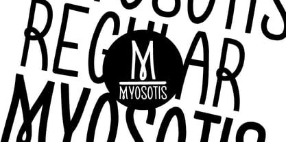 handwriting font
 - OBO Regular by Wilton Foundry,
$29.00 OBO is a modern interpretation of the classical Italian letterforms with the readability of contemporary sans typefaces. OBO is ideally suited for creating identities for branding, posters, book covers, headlines, logotypes, restaurant menus, beer labels.
 - Context Regular by Wilton Foundry,
$19.00 Context Regular is a condensed inline font with a stencil inline glyph - this makes for a smoother visual join of the stems. Context is also mono-case with the most interesting case selected for a pleasing end result. Applications are numerous: Display, Branding, Advertising, Logos, Publications, etc.
 - Mergian Regular by Tebaltipis Studio,
$15.00 Mergian - Modern Ligature Font by Tebaltipisstudio introducing our new "Mergian" Modern Ligature with Elegant Style this is perfect for branding, logos, invitation, masterheads and more. Mergian Features : -Multilanguange -Alternates -PUA Encoded -Ligatures Files Includes : -Mergian Regular.otf -Mergian Regular.ttf -Mergian Slant.otf -Mergian Slantttf If you have any questions, before or after purchase, please feel free to get in touch. Thank you
 - Vinchenso Regular by BA Graphics,
$45.00A strong powerful face that really works well for any application requiring a distinguished, clean look. Headlines, subheads, and text; anything goes. Vinchenso also has a matching Bold weight. - Krifon Regular by Tebaltipis Studio,
$15.00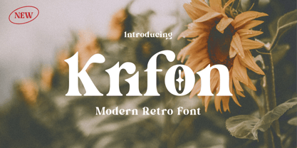 Krifon - Modern Bold Serif Font is a stylish font It has both modern and retro look. Comes with alternatives and ligatures, helps to create stunning logos, quotes, posts, blog posts. branding projects, magazine imagery, wedding invitations, and much more. WHAT'S YOU GET ? Unique Letterforms Works on PC & Mac Simple Installations Accessible in the Adobe Illustrator, Adobe Photoshop, Microsoft Word Fully accessible without additional design software. I really hope you'll get pleasure using Krifon Font and it will be perfect addition to your font collection! Contact me with an inbox message If you have any question. Thank you! Happy Creating.
 - Bondan Regular by Great Studio,
$13.00 Bondan is a family of Sans Serif fonts designed with a modern and vintage feel. Strong and dynamic. We set individual letters of medium with medium spacing for perfect typography. Bondan is very versatile. Perfect for brands, magazines, posters, logos, logotype stickers, website titles, packaging, branding, quotes, business cards and more. Bondan is equipped with a full set of uppercase letters, numbers, punctuation and multilingual support. Each font family version is available in the OTF formats for a total of 5 font files. What is included? • Bondan Light • Bondan Regular • Bondan Bold • Bondan Regular Outline • Bondan Bold Outline
 - Regular Brush by Din Studio,
$29.00 Regular Brush is a elegant brush font. The handwritten combined with brush font will make your design project more attractive. Made for any professional project branding. It is the best for logos, branding and quotes. Includes: Regular Brush (OTF) Features: Stylistic Set Beautiful Ligatures Multilingual Support PUA Encoded Numerals and Punctuation Thank you for downloading premium fonts from Din Studio
 - Troback regular by Alit Design,
$20.00 Introducing Troback - A Vintage Display Font Step into a realm of timeless elegance with Troback, a meticulously crafted vintage display font that pays homage to the design aesthetics of the past. With its distinctive retro charm, Troback encapsulates the spirit of a bygone era, where every letter tells a story. Inspired by the ornate typography of vintage signage, Troback is a masterful blend of boldness and sophistication. Its characters are imbued with intricate details, from the delicate serifs that harken back to a more refined age, to the captivating curves that dance along the baseline with a sense of purpose. This font conjures nostalgia with every stroke, summoning memories of old cigar box labels, antique shop signage, and classic posters that once adorned bustling city streets. Troback isn't just a font; it's a journey through history, a bridge between the craftsmanship of yesterday and the creativity of today. Ideal for branding that craves a touch of vintage authenticity, for designs seeking to recapture the allure of a vintage era, Troback stands as a testament to the enduring power of timeless typography. Let your words resonate with the elegance of a bygone time - let them speak through Troback.
 - Grendel Regular by Robert Petrick,
$19.95 “Grendel Regular” Evolved out of a hand lettering piece I designed for a record album (Royal Crescent Mob). Inspired by old gothic forms, my intention was to create a playful letter form that could be used in an antique as well as a modern context such as food product packaging or fun video projects, etc.
 - Regular Joe by GroupType,
$21.00 Regular Joe was first delivered to the font world by Ron and Joe. Yes, the same Ron and Joe of the ArtParts fame. A few years of being so regular, Regular Joe became, well, just bored. Regular Joe needed company. He wished for a family. After all, most of his font friends had big families. His wishes were granted by FontHaus. So Skinny and Husky were created to be with Regular and all together, they became Family Joe. All is well.
 - Humilde Regular by MrLetters,
$15.00 Introducing Humilde Script a new fresh & modern script with a handmade calligraphy style, decorative characters So beautiful on invitation like greeting cards, branding materials, business cards, quotes, posters, and more!! If you have any question, don't hesitate to contact me by email hello.mrletters@gmail.com Thanks and happy designing :-) Thank You for purchase!
 - Honeypirls Regular by Tebaltipis Studio,
$20.00 I'm present to you, new retro serif called Honeypirls! Honeypirls is a stylish font that is both retro and bold font. It's thick curves give a 70s groovy vibe with the serifs bringing it slightly back to traditional Honeypirls fits perfectly into those nostalgic moodboards and vintage logos. It come with a unique lower and uppercase plus numbers, punctuation & multilingual letters. What you get Letters, numbers, punctuation, multilingual support, alternate and ligature Regular and Italic version Follow my shop for upcoming updates including additional glyphs and language support. And Please message me if you want your language included or If there are any features or glyph requests, feel free to send me a message, I would like to update it. Enjoy!


