2,930 search results
(0.02 seconds)
- Fancy Roman JNL by Jeff Levine,
$29.00 A 1925 edition for an orchestral arrangements catalog entitled “Carl Fischer Progressive Orchestra Edition” has the title hand lettered in a bold, stylized Roman type design. This has now become the digital font Fancy Roman JNL; available in both regular and oblique versions.
 - The Roman Historia by Mega Type,
$20.00 The Roman Historia is a stylish serif font that will make your design projects stand out and be stylish! The Roman Historia is crafted with care to ensure premium quality and a luxurious feel. Ligatures and alternatives make this typeface unique and stand out from typical serif fonts. The Roman Historia is perfect for branding, logo designs, headlines, titles, magazines, name card, labels, product packaging, book titles, movie titles, fashions magazines or any other type of design. Contains full set: -The Roman Historia Regular and Condensed -Uppercase -Lowercase -Alternative -Ligatures -PUA encoded -Punctuation -Number -Multilingual support. Have fun using The Roman Historia!! Feel free to follow, like and share. Thank you very much for checking my store!
 - Romance Roman JNL by Jeff Levine,
$29.00 The antique sheet music for the 1915 song "A Girl in Your Arms is Worth Two in Your Dreams" had its title hand lettered in a Roman typeface that reflected ever so slightly the Art Nouveau influences of the time. This design is now available as Romance Roman JNL, in both regular and oblique versions.
 - Home To Rome by Typefactory,
$14.00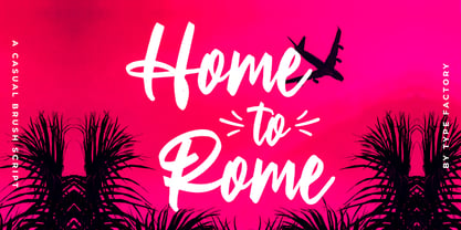 Home to Rome is a classy and lovely script font. It has a elegant style and is perfect for creating original designs. This lovely casual brush font is really great for a logo, clothing, quotes, headings, wedding invitations, posters, and many others.
 - Greko Roman Oldstyle by Intellecta Design,
$27.90 - Engravers' Roman BT by Bitstream,
$29.99A set of capitals popular with American engravers and typefounders through the last third of the nineteenth century, shown under this name by ATF in 1903. - LD Roman Sketch by Illustration Ink,
$3.00 - FHA Tuscan Roman by Fontry West,
$20.00 The first Tuscan lettering was penned in the mid-fourth century by the calligrapher Furius Dionysius Filocalus. The style was still in common usage as calligraphy when Vincent Figgins designed the first Antique Tuscan for print in 1817. Antique and Gothic Tuscan woodtype fonts appeared in the 1830’s. By the 1850’s, Tuscan fonts had become popular in America. These styles continued in print use into the twentieth century. Tuscan Antique and Gothic styles, borrowed from print and calligraphy, were perfect for signs, posters, handbills and other large format advertising. Sign painter, Frank Atkinson demonstrated several Tuscan forms in his book Sign Painting, A Complete Manual. Modified & Spurred Tuscan Romans were inspired by this and other works of the same period.
 - Roman Stencil JNL by Jeff Levine,
$29.00 Roman Stencil JNL is a condensed version of the classic Roman typeface found on many vintage hand-punched brass stencils made for packing and shipping merchandise. This digital interpretation is available in both regular and oblique styles.
 - Bonnie Bay Roman by Jonahfonts,
$30.00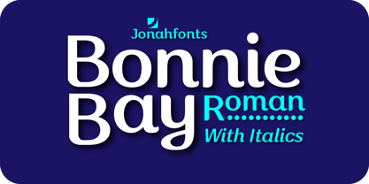
- P22 Alpha Roman by IHOF,
$39.95 This font is a slightly calligraphic roman font with one major difference. In place of the upper case characters, there are decorative lower case “Drop Caps” accentuated by a decorative rendering of the alphabet in script form. As enlarged decorative caps—great for beginning paragraphs set in any number of fonts including the lower case included in the font itself.
 - Aldo New Roman by Indian Summer Studio,
$45.00 Aldo New Roman (1000+ glyphs, incl. medieval Latin, Cyrillic, some Greek, ornaments, small capitals, nut fractions...) Renaissance antiqua · Venetian types · Venetian serif · Humanist serif · Old style antiqua A modern version of the typeface cut by Francesco Griffo for Venetian printer Aldus Manutius around 1490 AD. Intentionally not the original Griffo / Aldus / Bembo — but the part of the large project on revival and further development (by drawing many additional glyphs, sometimes over 1000) of the 20th century's typewriters’ fonts. Triple pun here :: :: #1 Aldine Roman type; #2 Since it is equalized, modernized version — the parallel to the Times New Roman; #3 He called himself Aldus Pius Manutius Romanus — he was a new Roman during his Renaissance times.
 - P22 Basel Roman by P22 Type Foundry,
$24.95 In mid 2001, P22 was approached by a Daniel Garrison, a Classics scholar at Northwestern University about possibly digitizing a long lost "Garamond" typeface. This font was used by Johannes Herbst (a.k.a. Ioannes Oporinus) in 1543 to publish Andreas Vesalius' "On the Fabric of the Human Body" (De humani corporis fabrica) in Basel. The story of the development of this font takes a few twists and almost becomes forgotten itself over time.Forteen years later it is available to the public.
 - Headstone Roman JNL by Jeff Levine,
$29.00 Despite its macabre-sounding name, Headstone Roman JNL is not a novelty font for Halloween or horror movies. Instead, it's an attractive Roman typeface based on an example provided of a guide for stonecutters to use when cutting epitaphs into tombstones. Headstone Roman JNL is available in regular, oblique, condensed and condensed oblique versions.
 - Halpin Roman Round by Halpin Hand,
$30.00
- Pind-O-Rama by PintassilgoPrints,
$24.00 Pind-O-Rama is quite an unconventional font, with strange counters and shapes and choices and interlocks that just stand out. For sometimes fitting in is absolutely not wanted. Pindorama is how the native Tupi people originally called Brazil before colonization by the Portuguese. This font draws inspiration from a book on Brazil colonial background, precisely from a 1961 edition - the book was first published in 1943. Unfortunately the cover design is uncredited. Why fit in? Let's stand out!
 - Cal Roman Modern by Posterizer KG,
$19.00 Cal Roman Modern is one more font from PKG “Cal” (Calligraphic) group. This time for calligraphic sketches we used a wide brush instead of the iron pen. Instead of minuscule letters, there are Small Caps (which are the same weight as capitals). Because there is no difference in the stroke thickness of capital letters and lowercase capital letters the difference in height is only one pen width, because of that, it is possible to use small capitals together with capital letters without noticing a difference in the thickness of the letters. Cal Roman Modern font is rhythmic, informal elegant, bright and light. As such, this font is widely used in the typographic creation of shorter text forms: magazine, catalogs and book titles, logos, posters, movie spots, banners...
 - DB Roman Philosophy by Illustration Ink,
$3.00Ancient Rome boasted some of the most gifted Philosophers and Roman Philosophy puts those ideas to words in this fun and very wise DoodleBat! - ITC Mendoza Roman by ITC,
$29.99 ITC Mendoza is a serif typeface with old style characteristics. A generous x-height and a lack of contrast between thick and thin strokes, gives the ITC Mendoza Roman font family good legibility and provides a sturdiness which enables the face to withstand low resolution output and less than ideal printing conditions. It is ideal for continuous text use, particularly in small point sizes.
 - Bewick Roman NF by Nick's Fonts,
$10.00 In 1905, artist and illustrator Will Bradley devised the pattern for this charming face. A little bit quirky and a whole lot of fun. Both versions support the Latin 1252, Central European 1250, Turkish 1254 and Baltic 1257 codepages.
 - Roman Cyrillic Three by MacCampus,
$20.00This font offers the images of a used stamp. There are a wide variety of numbers, months, and years. Just that what you might have in your office to stamp your incoming mail. Tagesstempel is part of the TakeType library. - Averes Title Roman by Reserves,
$49.00 Averes Title Roman is a high contrast sans titling typeface available in three weights. It features an array of stylistic discretionary ligatures with corresponding accented variants supporting numerous languages. Features include: Discretionary ligature feature Romanian s accent language feature Dutch IJ language feature Polish kreska language feature Slashed zero Ordinals feature Language: Afrikaans, Albanian, Asu, Basque, Bemba, Bena, Catalan, Chiga, Congo Swahili, Cornish, Danish, Embu, English, Esperanto, Faroese, Filipino, French, Galician, Ganda, German, Gusii, Hungarian, Icelandic, Indonesian, Irish, Italian, Jola-Fonyi, Kabuverdianu, Kalaallisut, Kalenjin, Kamba, Kikuyu, Kinyarwanda, Luo, Luyia, Machame, Makhuwa-Meetto, Makonde, Malagasy, Malay, Maltese, Manx, Meru, Morisyen, North Ndebele, Norwegian Bokmål, Norwegian Nynorsk, Nyankole, Oromo, Polish, Portuguese, Romanian, Romansh, Rombo, Rundi, Rwa, Samburu, Sango, Sangu, Sena, Shambala, Shona, Soga, Somali, Spanish, Swahili, Swedish, Swiss German, Taita, Teso, Turkmen, Vunjo, Welsh, Zulu *Requires an application with OpenType and/or Unicode support.
 - Mikeys Roman NF by Nick's Fonts,
$10.00Here's an amalgam of letterforms from two giants of the handlettering pantheon: an uppercase based on the work of Mike Stevens, and a lowercase based on the work of Alf Becker. The two work in perfect harmony to create warm, friendly and engaging headlines. Both versions contain the complete Latin 1252, Central European 1250 and Turkish 1254 character sets. - Sackers Classic Roman by Monotype,
$29.99Sackers Roman is an engraver, all-capitals family for invitations and stationery. The letters have strong contrast between thin and thick strokes. See also Sackers Gothic, Sackers Square Gothic, Sackers Script, and Sackers Classic Roman. - Trooper Roman Black by Wooden Type Fonts,
$15.00 Serif wide thin lines
 - View Roman Black - Personal use only

- Odds n Sods - Unknown license

- Ste-ani Font - Unknown license

- STP Display Cyrillic by Sete Std,
$30.00 Its inspiration comes from the types without serifs, with features ranging from architecture to modernist design products. With generous shapes and counterforms, the type becomes showy wherever it is, masterfully fulfilling the purpose for which it was designed. Initially designed for a signaling project in the Brazilian city of Jaraguá do Sul, Santa Catarina, the STP Display was expanded to include the largest number of characters in the Cyrillic anda Latin alphabet. This helps to find solutions in cases where a large number of languages to communicate something is needed, such as to inform a specific place for a tourist or also a direction to follow for an employee in a company. The STP Display is a modular feature, developed with rounded corners and a design based on geometric elements, ideal for use in large sizes. Forms and counterforms, its main characteristics, bring prominence to any signaling project. The STP Display Cyrillic also has another version, the STP Stencil Cyrillic, and in addition to wayfinding projects, both can be used in architectural projects, advertising, packaging, posters, and others. With a complete Latin alphabet, STP Display Cyrillic covers over 90% of the supported languages, covering the whole American continent, East and West Europe and most of the countries of Africa, Asia and Oceania.
 - STP Stencil Cyrillic by Sete Std,
$30.00 Developed from the STP Display Cyrillic, the STP Stencil Cyrillic Typeface follows the same characteristic premise as its sister, in addition to composing the same number of Cyrillic and Latin characters. What distinguishes them it’s that the STP Stencil Cyrillic can be applied more easily anytime, anywhere, increasing the possibility of being used in a more craft and artistic way. Since it has characteristics of a stencil font, it brings a more urban and contemporary look, which makes ideal to use it in public spaces with large circulation of people. In addition, wayfinding, architectural, advertising, packaging, posters, among others projects, are a good request for STP Stencil Cyrillic show its vigor and all its beauty. The STP Stencil Cyrillic is a modular feature source, perfect to use it in major event signaling projects or similar. It can also be useful in any demands that requires improvisation and quick solutions. The STP Stencil has very expressive forms and counterforms, but still counts with the practicality of a stencil source and its infinite possibilities of use.
 - Studded Leather Jackets by SynFonts,
$39.00 - American Spirit STF by Altered Ego,
$30.00American Spirit STF is a glorious collection of contemporary patriotic symbols: US Flags (traditional and contemporary), a variety of stars, eagles, torches, and combinations of them all. Designed for print and web, this collection is useful for embellishing your designs with a subtle (or not-so-subtle) patriotic touch. The flags have been designed for easy ungrouping in a drawing program, in order to colorize the union and stripes. And as a special feature, American Spirit™ splits the flags into two characters (the union and the stripes) that can be separately colored and will kern together based on the character chosen. Suggestions for doing this are included in every package. This versatile collection also contains a special contemporary version of the US Flag, with rounded corners on the union and stripes, and a five-pointed asterisk-like shape as the stars. (This allows the stars to appear as stars at smaller sizes.) Show your American Spirit! Sign up today for this contemporary collection of patriotic symbols! - M XiangHe Hei SC Std Variable by Monotype,
$1,049.99The M XiangHe Hei Simplified Chinese typeface merges traditional brush strokes with modern letterforms to carefully balance traditional calligraphy with humanist design. Named for the smooth movements of a flying crane, the M XiangHe Hei typeface is designed to glide across the page, and features strokes that are partly derived from the Kaishu calligraphic style – an everyday script which dates back hundreds of years. Seol Sans features Neue Frutiger for its Latin glyphs, and works harmoniously with Neue Frutiger World and Monotype’s CJK typefaces Tazugane Info (Japanese) and Seol Sans (Korean). M XiangHe Hei is a great choice for global brands using sans serif Latin typefaces looking to maintain their visual identity, and communicate with a consistent tone of voice with Simplified Chinese. - Z001-ROM™ - Unknown license

- Mute Fruit Black Krash - Unknown license

- Mute Fruit White Krash - Unknown license

- Mute Fruit Skimpy Krash - Unknown license

- Fruit And Veggie Doodles by Outside the Line,
$19.00 Fruit and Veggie Doodles is a 33-picture clipart font. Use them as dingbats or enlarge the small pictures and use them as clipart. Lots to choose from potatoes, tomatoes, avocado, eggplant, fig, watermelon, radish, peppers, broccoli, asparagus, corn on the cob, green onions, carrots, peas, lettuce, mushrooms, onion, olives, garlic, okra, beans, lemon, pear, pineapple, grapefruit or orange, pumpkin, apple, strawberry, grapes, cherry and banana. This is the companion font to Food Doodles Too. Also works nicely with Coffee & Tea Doodles. And if you need some fancy cakes check out Party Doodles. All in the same line drawing style to mix and match.
 - Ful • Fruitful & Universal Labels by S P I C I O,
$88.88 What is ful? ful is a useful and universal language of symbols for food products. Why use ful? ful is a simple visual system. With ful, you’ll never have to read the entire label to know the basic information. With ful, you have access to the basic information much faster. Answering the questions: • What kind of diet is it? [Diet] • How to store, prepare, and use? [Use] • Can I eat it? [Warnings] Why create ful? • To have the basic information quickly, anywhere in the world. • To create a more homogeneous design. • To solve some of the basic problems with the old designs. • To accelerate the process of consumer choice. • To provide as much information as possible in the least possible space. http://ful.graphics/
 - Eat More Fruit JNL by Jeff Levine,
$29.00 Eat More Fruit JNL is an odd name for a typeface, but then again the lettering style of the font is just as unusual. Named for a 1940s-era poster espousing "Put more pep in your step... eat more fruit", the lettering (although Art Deco in nature) also evokes images of 1960s and 1970s hippie-era concert posters.


