10,000 search results
(0.063 seconds)
- Asteria by RagamKata,
$12.00 Asteria is Retro Display Font. This typeface is perfect for various purposes such as Magazine Title, Poster, Logo, T-Shirt, Sub Title, Business cards, Magazines, Book Covers, Wedding Invitations,Templates Instagram Story Post, Greeting Cards, Quotes, etc. Asteria Features: • Uppercase & Lowercase • Alternates • Numerals & Punctuation • Accented characters • Multilingual Support • Unicode PUA Encoded Thanks and have a wonderful day .
 - Horsefeathers by Patricia Lillie,
$29.00Play a while with Horsefeathers, and you'll find yourself feeling kind of a combination of giddy and up. a lively, animated font that draws attention in short bursts yet has remarkable balance in longer text blocks, even at smallish point sizes. And that can be said for all three styles: Regular, Bold, and the aptly-named Horsefeathers Buzzsaw. - Quagey by Craft Supply Co,
$20.00 Quagey - Psychedelic Typeface: Where letters dance with vibrant, kaleidoscopic energy. It's not just a font; it's an electrifying visual experience, making your message unmissable, like a psychedelic journey. This typeface is ideal for greeting card, packaging, brand identity, poster, or any purpose to make your design project look eye catching and trendy. Feel free to play with this typeface!
 - Cheap Skit by PizzaDude.dk,
$11.00 It doesn’t take long to see that Cheap Skit is a super legible, easy going font. It is intended to be used where text needs to be clear and legible, but have certain amount of handmade energy. I’d say that products that has something to do with children (toys, clothes, games, posters …) or something organic, recipes, bookcovers …
 - Jackazz by Typogama,
$19.00 Jackass is a wacky four weight display design that plays with a randomization feature to offer a large range of layout solutions for each word. With added ligatures and a selection of number styles, this typeface is a funky solution that will constantly surprise! Included in the family are two complimentary dingbat fonts, Chickenz and Framez.
 - Cookie Powered by PizzaDude.dk,
$15.00 Tall, thin, grid, legible and handmade! What's not to like?! The font was made using a squared paper as a base for the lines. However, I managed to keep the free spirit of the handmade look, despite the guides. Play around with the 4 different versions of each letter and the swashes to make your text stand out!
 - Alchemite by Comicraft,
$19.00 Turn base letters into gold, bring a norse flavor to your dialogue, and may you live happily ever after! Conjured up by John Roshell of Comicraft for Kurt Busiek and David Wenzel's 'Wizard's Tale', this font should be handled with great care, lest it turn you into a toad. Artwork from The Wizard's Tale by Busiek & Wenzel
 - Sadi Sans by Koray Özbey,
$19.00 Sadi Slab is designed to be used on small scales like book texts, newspapers, magazines etc. Also its large counters make the font suitable for digital screens. The anatomy of the typeface gives a formal appearance which is a more fitting choice for subjects like law, finance, medical science etc. Another member of Sadi family is Sadi Slab.
 - RM Elegance by Ray Meadows,
$19.00 With an obvious nod to Art Deco, this font offers a stylish design with distinctively elongated ascenders and descenders. Includes: Western European, Central European, Baltic & Turkish sets. Due to the modular nature of this design there may be a slight lack of smoothness to the curves at very large point sizes (around 100 pt and above).
 - Doorkick by Bogstav,
$16.00 Doorkick is my grungy handmade font with rough lines and a squarish look. Each letter has 5 different versions, which automatically cycles as you type - leaving your text with a super lively and natural/organic look. I'd say that Doorkick is best for short words or shoutouts, but try it out it massive text too! I dare you! :)
 - Campaign by Solotype,
$19.95We saw a zigzag type like this made in the 1860s. We copied the idea, but added stars to make it patriotic. As with many highly specialized fonts, you won't want to use this every day but certainly, like other "stars and stripes" types, it implies something about the message even before one reads the words. - Beaumont by Studio Buchanan,
$12.00 Beaumont is a modern take on classic 1920's type, playing with stroke contrast and art deco forms. The result is a 10 font family, providing options for setting readable body copy or high impact display headings. With full multilingual character support, stylistic alternates and a range of open type features, Beaumont is perfect for a variety of situations.
 - For Real by KA Designs,
$12.00 For Real is a fun mix of bubbly and retro.. you could say it's a little groovy too! Each letter is hand-drawn giving this font a unique and fun look! For Real boasts big bubbly letters that are perfect for all of your retro designs, t-shirt designs, branding, packaging, advertisements, social media, posters and more!
 - Cervo by Typoforge Studio,
$25.00 Font Cervo is the younger sister of Kapra. It is characterized by eight different varieties – lower and uppercase characters and in contrast to Kapra is “slimmed” version (from Medium to Thin). It is inspired by a You And Me Monthly published by National Magazines Publisher RSW „Prasa” that appeared from May 1960 till December 1973 in Poland.
 - RM Hangle by Ray Meadows,
$19.00 This strong angular cousin of RM Hunky offers a bold display face. The distinctive nature of this design will be a welcome addition to any designers collection of useful fonts. Due to the nature of this design there may be a very slight lack of smoothness to the curves at extremely large point sizes (around 200 pt and above).
 - Pumpkins Brush by Inumocca,
$13.00 Pumpkin’s Brush Pumpkin’s Brush Family Font inspiration from Halloween character, scream, wets, dirty and raw. Absolutly modern glyph and great to playing typography, or your logos , signature , signage your shop, Logos, catalog , all about of fashions and arts. Its very easy to use Unique glyphs - Multilingual Characters Support - UPPERCASE - Lowercase - Numeric - Symbol - Punctuation Character Inumocca type Studio
 - Intrigue JNL by Jeff Levine,
$29.00 The hand-lettered movie titles from one of the William Powell-Myrna Loy "Thin Man" series of films was the basis for Intrigue JNL. Although the lettering style is decidedly from the Art Deco era, it also bears a strong resemblance to the 1980s techno movement; this font being adaptable to any era or design theme.
 - Ethnicity by Eurotypo,
$21.00This font is inspired and based on many indigenous geometric shapes (Mapuche and Diaguitas from South America). A collection of more than 50 glyphs that you may combine in different and creative ways, alternating the position of the modules is possible to produced a wide variety of linear strips or closed figures, frames, modular grids, textures, etc. - Reboot by Typelove Fontworks,
$7.00 Born in the lab as a research experiment, Reboot is great for that certain 70’s sci-fi need. It’s filled with the angular curves of the technology of yore, with full diacriticals for Eastern European Cold War era galactic display copy. It’s the first font of a series of research experiments, varying from rectilinear to ovoid.
 - Planscribe NF by Nick's Fonts,
$10.00This family of faces take their inspiration from the standard faces used by the Leroy® Automatic Lettering Machine, a mainstay for architects and draftsmen in Ye Olden Days of t-squares and triangles. Crisp, clean and retro-techno. Both versions of this font include the complete Latin 1252, Central European 1250 and Turkish 1254 character sets. - Impana by Craft Supply Co,
$15.00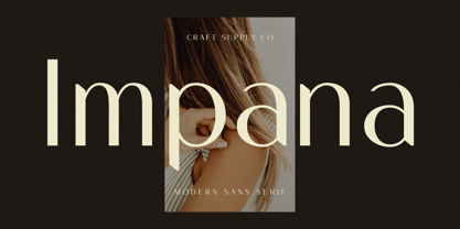 Introducing Impana: A modern sans-serif font that redefines contemporary design. With its sleek lines and versatile style, Impana brings a fresh perspective to modern aesthetics. This typeface is ideal for greeting card, packaging, brand identity, poster, or any purpose to make your design project look eye catching and trendy. Feel free to play with this typeface!
 - Konichiwa by Motokiwo,
$18.00 Brush textured with casual handwritten gesture, say hi to Konichiwa. This is hot and tasty font that very recommended for food branding such as Burger, BBQ, Coffee and Pizza. It's also great for fashion and cosmetic projects that need diversity. Features: Uppercase Lowercase Numbers & Punctuation Standard Latin Multilingual Support Ligatures Easy to use on any devices
 - Dudek PRO by Hotniedog Studio,
$22.00 Dudek is a highly functional font family. Styles from thin to black with italics for each one, allows to create wide and consistent design systems. I wanted Dudek to be soft and simple. Not too much geometrical, but also not calligraphic in detail. Dudek can help in every day jobs and wide multilingual support leaves no one behind.
 - Samira by CastleType,
$29.00 I must admit that I am not a big fan of the Art Nouveau style. However, I found this particularly beautiful alphabet and decided to use it as the basis for this new font. Very graceful, elegant, and dare I say, organic. Includes some intertwined ligatures. Complete uppercase, numerals, basic punctuation. Supports most Western European languages.
 - Over Under by Ingrimayne Type,
$5.00 OverUnder is a two font family that plays with the capabilities of the Opentype feature of Contextual Alternatives to alternate two sets of characters. One set is on tall vertical slabs and the other set is on wide horizontal slabs, and when the sets are alternated, the result is a pattern that has a woven appearance.
 - Agneya by Seventh Imperium,
$37.00 Agneya is calligraphy script font, inspired by urban street art. Equipped with opentype features. Stylistic alternates, swash and more 600 glyph. It is make easily to create such as Signpainter logo and various purposes. Just open the Opentype Alternates and choose The alternates that fit best, and you can play with your creation to make your unique designs.
 - Lautren by Azzam Ridhamalik,
$16.00 Introducing Lautren, a new delightful bold script with reversed contrast typeface. The Ideas of this fonts came from funny summer vibes mood which is made more neater and smoother. Lautren created with a tons of opentype features like contextual alternates, stylistic sets, ligatures, and swashes at the ending of the letters. A fun typeface to play with!
 - Printing Set JNL by Jeff Levine,
$29.00Printing Set JNL by Jeff Levine comes from a toy rubber stamp printing set imported from Japan in the 1950s and 1960s that's been revived, but is now imported from China. The font has a serif letter so typical of import toys of the day, but actually reads quite nicely in short headlines and specialty ad copy. - In the whimsical world of typography, where letters are not just letters but characters bursting with personality, the font Misirlou Day by Ray Larabie performs a vibrant hula dance, beckoning the su...
- Bad Coma - Personal use only

- MarkerFinePoint-Plain - Unknown license

- Amerika - Unknown license

- Komikandy - Unknown license

- NeedlePointSew-Plain - Unknown license

- OregonDry-Plain - Unknown license

- Diogenes - Unknown license

- Sweet and Fresh by Gleb Guralnyk,
$12.00 This smooth, modern typeface named "Sweet & Fresh" has a trendy look with nice rounded shapes and multi-lingual support. Thank you and have a nice day!
 - Hearst Roman by Solotype,
$19.95A product of the Inland Type Foundry, some say stolen from a hand lettering job done by Goudy. (Goudy was one of those who said it!) - Bronco Valley by Variatype,
$12.00 Bronco Valley is designed with vintage style or you can say “American Rodeo” for classic look branding, logotype, poster design, t-shirt design, and much more.
 - Van Alt JNL by Jeff Levine,
$29.00Looking similar to a Deco-era classic typeface, Van Alt JNL has slightly different character shapes, but pays due respect to its inspiration by the original...


