10,000 search results
(0.07 seconds)
- Bodrum Sweet by Bülent Yüksel,
$19.00 Bodrum Collection: 1- Bodrum Sans 2- Bodrum Sweet 3- Bodrum Stencil 4- Bodrum Slab 5- Bodrum Styte 6- Bodrum Soft "Bodrum Sweet" is a sans serif type family. Designed by Bülent Yüksel in 2018/19. The font, influenced by style serifs, popular in the 1920s and 30s, is based on optically corrected geometric forms for better readability. "Bodrum Sweet" is not purely geometric; it has vertical strokes that are thicker than the horizontals, an “o” that is not a perfect circle, and shortened ascenders. "Bodrum Sweet" some corner is rounded. These nuances aid in legibility and give "Bodrum Sweet" a harmonious and sensible appearance for both texts and headlines. Bodrum Sweet provides advanced typographical support for Latin-based languages. An extended character set, supporting Central, Western and Eastern European languages, rounds up the family. The designation “Bodrum Sweet 14 Regular” forms the central point. "Bodrum Sweet" is available in 10 weights (Hair, Thin, Extra-Light, Light, Regular, Meduim, Bold, Extra-Bold, Heavy and Black) and 10 matching italics. The family contains a set of 650+ characters. Case-Sensitive Forms, Classes and Features, Small Caps from Letter Cases, Fractions, Superior, Inferior, Denominator, Numerator, Old Style Figures just one touch easy In all graphic programs. Bodrum Sweet is the perfect font for web use. You can enjoy using it.
 - LC Trinidad by Compañía Tipográfica de Chile,
$34.00 Lc Trinidad is the result of a series of wonderings regarding geometric Sans Serif typography design, in particular; Futura of Paul Renner. A “conversation” arose between me and the designer – actually there was no conversation, it is an euphemism for “I saw his designs, I draw them and discussed with myself some of his decisions – that ended up being the origin of this font firsts glyphs: A, H, N, O, R and S. I started with uppercase letters, and here is when Rudolf Koch with Kabel and his “Das schreibbuchlein” joined the conversation. This is how I could develop some alternative lowercase letters so as to illustrate this imaginary discussion. The result is a sans serif, geometric, modern typeface with classical Roman proportion in the uppercase letters; two stylistic sets for lowercase letters (setKoch and setRenner), rational, open and sharp ends. It is ideal to form titles, medium length texts, branding, exhibitions and animations. The family consists of 9 weight variants and their corresponding oblique versions and small caps. With more than 900 glyphs, it covers more than 190 Latin languages and together with its Opentype functions it creates a modern and versatile family. Besides, it has powerful OpenType features for each style, including stylistic sets, extended language support, ligatures, contextual alternates, lining figures, oldstyle figures, small caps numbers, arrows, fractions, superscripts, subscripts and many more.
 - Signerica Fat - Personal use only

- Ornamental Versals - Personal use only

- Jazm by Arabetics,
$34.00 Jazm is an Arabetic typeface design with connected glyphs. Jazm was the earliest, pre-Islamic, script style of the modern Arabic script, before branching into Kufi and Naskh styles. The initial script had a lot less, position-dependent shapes and ligatures, and was not strictly connected. It occasionally included minuscule dots to distinguish identical shapes. This font family design is a modern visualization by the designer of the historical Jazm letter shapes following the guidelines of the Mutamathil Taqlidi type style with one glyph for every basic Arabic Unicode character or letter, as defined in Unicode Standards, and one additional final form glyph for each Arabic letter that can connect with other letters from both sides in traditional cursive Arabic strings. Jazm employs variable x-height values. It includes all required Lam-Alif ligatures and selected marks. Tatweel (or Kashida) glyph is a zero width space. Keying it before any glyph will display that glyph isolated form, if desired. Keying Tatweel before Alif Lam Lam Ha will display the Allah ligature. Jazm typeface family includes both Arabic and Arabic-Indic numerals; all required diacritic marks, in addition to Standard English keyboard punctuations and major currency symbols. Jazm is available in regular, bold, black, and corresponding italic (slated to the left) styles.
 - Bjorn by Monotype,
$50.99 Meet Bjorn. A super usable, digital-device ready type design, refreshingly unburdened by today’s pre-conceived notions of ‘digital neutrality’. This is a typeface driven by the notion that today’s ‘digital’ shouldn’t automatically mean the devolution of typographic personality, Bjorn brings a softer-side to the idea of pixel perfect brand comms. Solid digital typography can also convey a warm tone of voice, radiate a softness, a human emotive charm whilst still maintaining all of the functional on-screen requirements of crisp easy reading fonts across viewports. Bjorn is a distinctive type design that combines a unique blend of flattened round stems (to take the edge-off), levelled inner terminals (pixel friendly) and pointed ears and feet (creating an distinct rhythm and dynamic with bowled letters). Bjorn is not a typeface following a tried and tested pattern, it’s a typeface designed to make digital brands feel special, enabling speech in a voice that brings viewers closer to their words. Bjorn is warm, yet clinical, flat and curved, elliptical and pointy. The font’s strong sense of ‘straightness’, the letter proportions and features build up its versatility across digital environments, not too wide, not too narrow, not too pointy, not too round — just right. Bjorn is available in 4 Roman styles — Light, Regular, Medium and Bold.
 - Our Pal Hal NF by Nick's Fonts,
$10.00Of the many lettering gurus who published chapbooks on handlettering during its heyday, one of the most prolific was H. C. Martin. This quirky poster face was offered in one of his many Idea Books, and it remains as fresh and frolicsome today, some seventy years later, as when it first appeared. Both versions of this font include the complete Unicode Latin 1252 and Central European 1250 character sets. - Fruge by Grontype,
$12.00 Fruge is a fresh, calm, and charming monoline handwriting font family. This font is a round edge style and equipped with extra ligatures and alternatives. Fruge is Perfect for editorial design, branding, packaging, cards, posters, stickers, quotes, social media posts and more! Features: Regular & Italics Basic Latin Glyphs Uppercase and Lowercase Letters Alternates & Ligatures Numeral and Punctuation Multilingual Support Thankyou for picking up this font, hope you enjoy it. Regard. Grontype
 - Casual Crew by Learning Kiddos,
$18.99 A fresh friendly font with upper and lower cases inspired by the Casual Style of Sign Painters. It features well-designed curves, four versatile styles (including Regular, Bold, Halftones and Outlines), latin language support and sexy built-in signs and catchwords. Suitable for titles, Branding, package design & more. If you are looking for a fine Hand-drawn font Family with great curves, Casual Crew is what you want.
 - Banteng by dotHK Studio,
$27.00 Banteng is a cool brushed handwritten font, organic and interesting looking. Masterfully designed to become a true favorite, this font has the potential to bring each of your creative ideas to the highest level. Include OpenType alternates and common ligatures. Ideal for logos, name tag, handwritten quotes, product packaging, merchandise, social media & greeting cards. Try the alternates and ligatures to give your designs looks good, fresh, casual, stylish, and modern.
 - TD Neuth by Tribox Design,
$9.00 TD Neuth is inspired by Millennial and Gen Z qualities; it is modern, direct, and clear. It has excellent legibility and is ideal for usage in displays, headlines, labels, packaging design, and even long paragraphs on digital collaterals. Each glyph is meant to be balanced: not too light, not too bold, and not too regular. Use TD Neuth if you want your layout and designs to look modern and fresh.
 - Kembara Cinta Outline by Fargun Studio,
$12.00 Kembara Cinta Outline is a new, fresh, and modern hand lettered font, decorative characters and a dancing baseline! So beautiful on handicrafts, greeting cards, branding materials, business cards, quotes, posters, and more. Features: Unique ligatures Stylistic sets Basic Latin A-Z and a-z Numbers International Symbols included Punctuation Need help? If you need help or advice, please contact me by e-mail "fargunstudio@gmail.com" Thank you for your purchase
 - Houseplant by PizzaDude.dk,
$20.00 Houseplants are commonly grown for decorative purposes, positive psychological effects, keeping fresh or health reasons such as indoor air purification. Actually, just like this font has a positive effect on your artwork! This font comes with a heavy load of diacritics! On top of that, it has contextual alternates, which means your text cycles through 6 different versions of each letter! Hard to tell that this is actually a font!
 - Syakira by Sulthan Studio,
$10.00 Syakira Script has a romantic and modern calligraphic style, and is ready to give your design a fresh and fabulous Style. Syakira Script comes as a single font file packed full of great features and cuteness. Perfect for weddings, branding and romantic invitations and also suitable for various purposes such as digital lettering, headings, logos, wedding invitations, t-shirts, letterheads, signage and much more! Thank You, Sulthan Studio
 - Kleide by Nootype,
$40.00 Kleide is an elegant font inspired by handwriting. The Kleide family includes 6 weights, from Thin to Black, with their corresponding italics. This elegant family includes OpenType Features such as Proportional Figure, Tabular Figures, Numerator, Superscript, Denominators, Scientific Inferiors, Subscript, Ordinals, Fractions and a lot of ligatures. The fonts have extended characters set to support Central, Eastern and Western European languages. Kleide is perfectly suitable for cool & fresh work.
 - Millard by Artegra,
$29.00 When you need a classic serif typeface that is up to the modern standards, Millard comes to your rescue with its alluring beauty and legibility. You have a contemporary serif family that offers great variety with regular and bold weights in both normal and condensed widths, along with their true italics. Over 500 glyphs in each font offers you the language support you need for all the Latin languages.
 - Farm Girl by Open Window,
$19.95 From the lab of Open Window comes Farm Girl. Farm Girl was inspired by old Art Nouveau posters from Toulouse Lautrec and others. Farm Girl utilizes the same 'loosey-goosey' quality as those posters. Farm Girl consists of 3 different styles which are designed to be used in combination with each other. Many different variations are possible. It's fresh cut and contemporary. It's ideal use is as a display font.
 - Steady Stream by Akrtype Studio,
$15.00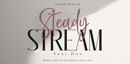 Steady Stream is a fresh modern script and a luxury serif uppercase font. This duo consist of a script font that is truly handmade and featuring ligatures, and of a refined uppercase serif font, allowing you to create unique designs that suit your needs. This font duo is perfect for branding and logo designs, magazine and editorial designs, cards and stationery, and more! The script includes multilingual support. Happy designing.
 - ITC Riptide by ITC,
$29.99ITC Riptide is a work of British designer Timothy Donaldson. Abrupt changes in stroke, pointed stroke ends and changing slant direction characterize this very experimental alphabet. The temperamental figures are irrepressible and aggressive, the forms seem to have been chosen randomly, and these traits lend the font its informality and spontaneity. ITC Riptide is legible in point sizes of 14 and its fresh character is perfect for comics and cartoons. - Blinky Season by Balpirick,
$12.00 Introducing by Balpirick Studio. Proudly Present, BLINKY SEASON Font. BLINKY SEASON is a Monoline Font. Blinky Season is a cute, quirky and fresh handwritten font. It is ideal for holiday-themed greeting cards and for any crafting project that requires a sweet, romantic touch. This font includes TTF and OTF, BLINKY SEASON also multilingual support. Enjoy the font, feel free to comment or feedback, send me PM or email. Thank you!
 - Mabista Script by stiplinestudios,
$15.00 Introducing a dancing calligraphy font, Mabista Script! Simple way to access is just type a number (1-7) after the letters. example : m3ab5ista2 Mabista Script is perfect for wedding stationery, invitations, lovey cards, logos, bussiness cards, branding and other projects that require a touch of casual and feminine. This font was created with multilingual support and over 484 glyph characters, allowing you to create a fresh look to your projects.
 - Kembara Cinta by Fargun Studio,
$12.00 Kembara Cinta - a new fresh & modern hand lettered font, decorative characters and a dancing baseline! So beautiful on invitation like handicraft, greeting cards, branding materials, business cards, quotes, posters, and more design concept! Features : Unique ligatures Stylistic sets Basic Latin A-Z and a-z Numbers International Symbols included Punctuations Need help? If you need help or advice, please contact me by e-mail "fargunstudio@gmail.com" Thank you for purchased
 - Megastina by Aqeela Studio,
$20.00 One of my favorite signature fonts is Megastina. It features a contemporary, natural, and fresh handwritten style that will give your ideal designs a special touch. This typeface is ideal for branding since it has a variety of choices that let you create a logo that is both feminine and masculine. It also includes a few markings that lend stiffness to the signature, emphasizing the organic feel of the handwriting.
 - Dusan Script by Tour De Force,
$15.00 The Dusan Script font family is a wonderful set of handwriting script fonts that captures the graceful flow and idiosyncrasies of Dusan's penmanship. The Dusan Script font family has an airy, natural personality, with open counters and features that make it legible at small and large sizes. Dusan Script Family consists of two fonts, Regular and Bold, and offers a fresh handwriting style to grace invitations, cards, newsletters, advertisements and correspondence.
 - Real Brush by Garisman Studio,
$20.00 Real Brush hand-brush font combines attractive curves with a fresh urban edge; delivering a stylish script which is guaranteed to add an eye-catching appeal to your logo designs, brand imagery, handwritten quotes, product packaging, merchandise and social media posts. - Simple installation - Works for PC and MAC - Multilingual Support (available for 23 Language) - Detailed dry brush - Support for Adobe Illustrator, Photoshop, Corel Draw, or Procreate (New Updated)
 - Schism One by Alias,
$55.00 Schism is a modulated sans-serif, originally developed from our Alias Didot typeface, as a serif-less version of the same design. It was expanded to three sub-families, with the thin stroke getting progressively heavier from Schism One to Schism Three. The different versions explore how this change in contrast between thick and thin strokes changes the character of the letterforms. The shape is maintained, but the emphasis shifts from rounded to angular, elegant to incised. Schism One has high contrast, and the same weight of thin stroke from Light to Black. Letter endings are at horizontal or vertical, giving a pinched, constricted shape for characters such as a, c, e and s. The h, m, n and u have a sharp connection between curve and vertical, and are high shouldered, giving a slightly square shape. The r and y have a thick stress at their horizontal endings, which makes them impactful and striking at bolder weights. Though derived from an elegant, classic form, Schism feels austere rather than flowery. It doesn’t have the flourishes of other modulated sans typefaces, its aesthetic more a kind of graphic-tinged utility. While in Schism Two and Three the thin stroke gets progressively heavier, the connections between vertical and curves — in a, b, n etc — remain cut to an incised point throughout. The effect is that Schism looks chiselled and textural across all weights. Forms maintain a clear, defined shape even in Bold and Black, and don’t have the bloated, wide and heavy appearance heavy weights can have. The change in the thickness of the thin stroke in different versions of the same weight of a typeface is called grading. This is often used when the types are to used in problematic print surfaces such as newsprint, or at small sizes — where thin strokes might bleed, and counters fill in and lose clarity, or detail might be lost or be too thin to register. The different gradings are incremental and can be quite subtle. In Schism it is extreme, and used as a design device, giving three connected but separate styles, from Sans-Didot to almost-Grotesk. The name Schism suggests the differences in shape and style in Schism One, Two and Three. Three styles with distinct differences, from the same start point.
 - Schism Three by Alias,
$55.00 Schism is a modulated sans-serif, originally developed from our Alias Didot typeface, as a serif-less version of the same design. It was expanded to three sub-families, with the thin stroke getting progressively heavier from Schism One to Schism Three. The different versions explore how this change in contrast between thick and thin strokes changes the character of the letterforms. The shape is maintained, but the emphasis shifts from rounded to angular, elegant to incised. Schism One has high contrast, and the same weight of thin stroke from Light to Black. Letter endings are at horizontal or vertical, giving a pinched, constricted shape for characters such as a, c, e and s. The h, m, n and u have a sharp connection between curve and vertical, and are high shouldered, giving a slightly square shape. The r and y have a thick stress at their horizontal endings, which makes them impactful and striking at bolder weights. Though derived from an elegant, classic form, Schism feels austere rather than flowery. It doesn’t have the flourishes of other modulated sans typefaces, its aesthetic more a kind of graphic-tinged utility. While in Schism Two and Three the thin stroke gets progressively heavier, the connections between vertical and curves — in a, b, n etc — remain cut to an incised point throughout. The effect is that Schism looks chiselled and textural across all weights. Forms maintain a clear, defined shape even in Bold and Black, and don’t have the bloated, wide and heavy appearance heavy weights can have. The change in the thickness of the thin stroke in different versions of the same weight of a typeface is called grading. This is often used when the types are to used in problematic print surfaces such as newsprint, or at small sizes — where thin strokes might bleed, and counters fill in and lose clarity, or detail might be lost or be too thin to register. The different gradings are incremental and can be quite subtle. In Schism it is extreme, and used as a design device, giving three connected but separate styles, from Sans-Didot to almost-Grotesk. The name Schism suggests the differences in shape and style in Schism One, Two and Three. Three styles with distinct differences, from the same start point.
 - Schism Two by Alias,
$55.00 Schism is a modulated sans-serif, originally developed from our Alias Didot typeface, as a serif-less version of the same design. It was expanded to three sub-families, with the thin stroke getting progressively heavier from Schism One to Schism Three. The different versions explore how this change in contrast between thick and thin strokes changes the character of the letterforms. The shape is maintained, but the emphasis shifts from rounded to angular, elegant to incised. Schism One has high contrast, and the same weight of thin stroke from Light to Black. Letter endings are at horizontal or vertical, giving a pinched, constricted shape for characters such as a, c, e and s. The h, m, n and u have a sharp connection between curve and vertical, and are high shouldered, giving a slightly square shape. The r and y have a thick stress at their horizontal endings, which makes them impactful and striking at bolder weights. Though derived from an elegant, classic form, Schism feels austere rather than flowery. It doesn’t have the flourishes of other modulated sans typefaces, its aesthetic more a kind of graphic-tinged utility. While in Schism Two and Three the thin stroke gets progressively heavier, the connections between vertical and curves — in a, b, n etc — remain cut to an incised point throughout. The effect is that Schism looks chiselled and textural across all weights. Forms maintain a clear, defined shape even in Bold and Black, and don’t have the bloated, wide and heavy appearance heavy weights can have. The change in the thickness of the thin stroke in different versions of the same weight of a typeface is called grading. This is often used when the types are to used in problematic print surfaces such as newsprint, or at small sizes — where thin strokes might bleed, and counters fill in and lose clarity, or detail might be lost or be too thin to register. The different gradings are incremental and can be quite subtle. In Schism it is extreme, and used as a design device, giving three connected but separate styles, from Sans-Didot to almost-Grotesk. The name Schism suggests the differences in shape and style in Schism One, Two and Three. Three styles with distinct differences, from the same start point.
 - THE BOKRUN by Twinletter,
$17.00 Welcome to the futuristic world with The Bokrun, a future-themed font that will color your design projects! Get a unique experience with a modern, futuristic, and sci-fi touch that radiates from each letter. The Bokrun presents impressive futuristic styling with a sophisticated and dynamic design. This font will give a fresh and innovative look to any project that needs a touch of the future. With The Bokrun, you can easily create modern and evocative designs. Not only that but The Bokrun is also equipped with great features that will give you unlimited creativity. Alternate ligatures and characters allow you to create unique and interesting letter combinations. Also, the different font variations give you the flexibility to express your ideas in greater depth. Another advantage of The Bokrun is its multilingual support, so you can communicate with audiences from different languages without any barriers. This font will take you on an international and worldwide design journey. Explore a futuristic world with The Bokrun, and let your every design be a window into the future. Get a modern, futuristic, and stunning design experience with this font. Don’t miss the chance to own The Bokrun, the perfect solution for your future projects that require a modern and futuristic touch. What’s Included : File font All glyphs Iso Latin 1 Alternate, Ligature Simple installations We highly recommend using a program that supports OpenType features and Glyphs panels like many Adobe apps and Corel Draw so that you can see and access all Glyph variations. PUA Encoded Characters – Fully accessible without additional design software. Fonts include Multilingual support
 - Sapore by Fonderia Serena,
$23.90 Sapore is a script font family, mostly monoline, inspired by the elegant handmade signs in the beautiful city of Venice, Italy, where I work and live. Many of these signs were made at the beginning of the 20th century by skillful craftsmen and artists, carrying that distinct vintage Italian flavour, and this is why I named the font Sapore, which means precisely flavour (also, one of the signs is from a pastry shop that makes the most delicious things). The design takes this retro vibe into the 21st century, making it up-to-date and fresh, while keeping it authentic. It is a script font, but I added some stand alone capitals that you can use in all caps words and texts effortlessly, as the open type code is taking care of using the right set of letters at the right time, I could have made two separate fonts, but I wanted to give you the best value I could and ease of use. Make sure contextual alternates are always on! There are also swashes, alternate styles, stylistic sets, small caps, 2 figure sets and decorative elements, all accessible through open type. I think the font is particularly suited for display use, as in logos, packaging design, branding, but it is readable enough for small text blocks. You can access the non-linking caps by clicking on the discretionary ligatures button. You can access the loopy caps by clicking on the titling alternates button. The main version has straight terminals but I included a round version and a calligraphic one, called “classico”. Hope you like it!
 - Ventography Personal Use Only - Personal use only

- Semilla by Sudtipos,
$79.00 I spend a lot of time following two obsessions: packaging and hand lettering. Alongside a few other minor obsessions, those two have been my major ones for so many years now, I've finally reached the point where I can actually claim them as “obsessions” without getting a dramatic reaction from the little voice in the back of my head. When you spend so much time researching and studying a subject, you become very focused, directionally and objectively. But of course some of the research material you run into turns out to be tangential to whatever your focus happens to be at the time, so you absorb what you can from it, then shelf it — like the celebrity bobblehead that amused you for a while, but is now an almost invisible ornament eating dust and feathers somewhere in your environment. And just like the bobblehead may fall off the shelf one day to remind you of its existence, some of my lettering research material unveiled itself in my head one day for no particular reason. Hand lettering is now mostly perceived as an American art. Someone with my historical knowledge about lettering may be snooty enough to go as far as pointing out the British origins of almost everything American, including lettering — but for the most part, the contemporary perspective associates great lettering with America. The same perspective also associates blackletter, gothics and sans serifs with Germany. So you can imagine my simultaneous surprise and impatience when, in my research for one of my American lettering-based fonts, I ran into a German lettering book from 1953, by an artist called Bentele. It was no use for me because it didn't propel my focus at that particular time, but a few months ago I was marveling at what we take for granted — the sky is blue, blackletter is German, lettering is American — and found myself flipping through the pages of that book again. The lettering in that book is upbeat and casual sign making stuff, but it has a slightly strange and youthful experimentation at its heart. I suppose I find it strange because it deviates a lot from the American stuff I'm used to working with for so long now. To make a long story short, what’s inside that German book served as the semilla, which is Spanish for seed, for the typeface you see all over these pages. With Semilla, my normal routine went out the window. My life for a while was all Bezier all the time. No special analog or digital brushes or pens were used in drawing these forms. They're the product of a true Bezier process, all starting with a point creating a curve to another point, which draws a curve to another point, and so on. It’s a very time-consuming process, but at the end I am satisfied that it can get to pretty much the same results easier and more traditional methods accomplish. And as usual with my fonts, the OpenType is plenty and a lot of fun. Experimenting with substitution and automation is still a great pleasure for me. It is the OpenType that always saves me from the seemingly endless work hours every type designer must inevitably have to face at one point in his career. The artful photos used in this booklet are by French photographer and designer Stéphane Giner. He is very deserving of your patronage, so please keep an eye out for his marvelous work. I hope you like Semilla and enjoy using it. I have a feeling that it marks a transition to a more curious and flexible period in my career, but only time will tell.
 - Vassallo - Unknown license

- Horror - Unknown license

- Damaged - Unknown license

- Leftist Mono Serif - Unknown license

- Shpinoza MF by Masterfont,
$59.00 A practical font family with 5 weights for all your day by day design needs: headlines, body text, signage etc. High legibility at small sizes. An extended sans serif typeface with rounded endings that provides unique softness appearance without losing legibility.
 - Friendly Yellow by PizzaDude.dk,
$16.00 Friendly Yellow is my sketchy/scratchy handmade sans font. I've made several layers for you to play around with, in order to get that feel-good handmade-sketch-font-look! I've also added ligature substitution for the most common double letters
 - Editorial Comment JNL by Jeff Levine,
$29.00Editorial Comment JNL is another wood type in the Grotesk (also spelled Grotesque) style of sans serif faces. Popular in newspaper headlines as well as posters, the slightly irregular stroke widths add an old-fashioned charm to any print project. - Elle by Device,
$39.00 Elle is a geometric sans in three weights with rounded stroke terminals and circular forms. Classy, elegant and modern, with just a hint of the future. Inspired by a single-weight Typositor headline typeface from the early 1970s called Pipeline.


PreviousPage 250 of 250