10,000 search results
(0.059 seconds)
- Othist by Maulana Creative,
$14.00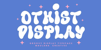 Othist Groovy display typeface. With three weight stroke, fun character with a bit of ligatures. To give you an extra creative work. Othist Groovy display typeface support multilingual more than 100+ language. This font is good for logo design, Social media, Movie Titles, Books Titles, a short text even a long text letter and good for your secondary text font with sans or serif. Make a stunning work with Othist Groovy display typeface. - Uppercase Cheers, Maulana Creative
 - Falena by Typoforge Studio,
$19.00 Falena is a type family designed by Gianluca Boffito. This simple, easy-to-read, geometric-style sans serif family is published by Typoforge Studio and consists of 18 weights (together with italics). It has more than 300 glyphs per style (including special characters). Falena works equally well in long form type settings and for titles, headings, posters. It comes with two sets of original dingbats (set 1 contains 52 ornaments, set 2 contains 52 truly distinctive and stylish icons).
 - Eolia A by Eurotypo,
$24.00 In ancient Greece, the inhabitants of the Aegean islands and the northwest coast of Asia Minor were called "Eolia". Eolia is a family of sans serif fonts that combine grotesque style with certain geometric characteristics. This family composed of six weights harmonically controlled, has blunt strokes, perfectly defined with subtle modulations as a result of careful optical corrections. The control of the counterforms and accurate kerning gives it great readability, personality, aesthetic value and visual impact.
 - Makio by HIRO.std,
$25.00 Makio is San Serif Typeface Makio inspired by modern life, clean, simple life, Japan culture, and minimalist symbols. This font works great in any branding, name card, logos, title, websites, product packaging, flyers, magazines, label, films, stationary, posters, etc. and any design project that requires clean, modern and simple touch. FEATURES - Six Weight - Uppercase and Lowercase letters - Support Opentype Features - Numbering and Punctuations - PUA Encoded Characters - Ligatures - Multilingual Support - Works on PC or Mac Enjoy using! Thanks. HIRO.std
 - SF Pumice by Sultan Fonts,
$10.00 Pumice is a modern sans-serif typeface with characteristic and defined features. This font Name was inspired by the Aden pumice. Its design is composed of diverse 8 styles. Create unique designs by combining any of the upright weights with matching italics. Pumice includes a matching Latin design and support for Arabic, Persian, Kurdish, and Urdu. Pumice was specially designed for branding, advertising, editorial design, Web, and use on Tv and social media. Designers: Sultan Maqtari Publisher: Sultan Fonts
 - Clockwise by Ana's Fonts,
$14.00 Clockwise is a friendly sans serif font with 4 weights and italics. It includes over 315 glyphs, including: Small caps Ligatures And a bonus set of dashes and borders to help accent and decorate your text. Clockwise is perfect for both texts and titles, and pairs beautifully with other fonts already in your library, especially handwritten and serif fonts. Use it in everything from logotypes to social media posts, website and magazine layouts to poster designs.
 - FF Schulbuch by FontFont,
$68.99 Dutch type designer Just van Rossum created this sans FontFont in 1991. The family has 6 weights, ranging from Regular to Bold and is ideally suited for advertising and packaging, book text, film and tv, editorial and publishing as well as logo, branding and creative industries. FF Schulbuch provides advanced typographical support with features such as ligatures, alternate characters, case-sensitive forms, fractions, super- and subscript characters, and stylistic alternates. It comes with tabular lining and proportional lining figures.
 - Glycerin by ROHH,
$39.00 Glycerin™ is a contemporary geo-humanist sans offering excellent legibility and powerful personality. It is a fully equiped text type family, well proportioned, uniform in color, featuring beautiful true italics. It is great for paragraph text, while heavy weights create unique and powerful display scenarios. The upright family has an alternate stylistic set that creates a more geometric and minimalist effect. Glycerin is a text sibling to the very modern, high-contrast display typeface Gigafly™.
 - CUKIER by Borutta Group,
$29.00 After my previous typefaces inspired by the flavour of local typography (Massimo, Picadilly & Zigfrid), I'd like to present new one, called CUKIER. This family was designed mainly for branding purposes - visual identity of CUKIER.WORKS Agency. Cukier is a sans serif, geometric typeface, inspired by the vernacular typography from Zanzibar (Tanzania). A lot of letters have intentionally made mistakes in a drawing, and this it what makes the whole font unusual. Family consist 10 styles – 5 weights with italics.
 - KhaoSans by TypeK,
$35.00 KhaoSans is a Rounded typeface. The latin was inspired from Thai woodtype used as headline in old day Thai newspaper. The refined curve with some sharp end add uniquely beautiful touch to the typeface. In Thai language, ‘Khao’ (ข่าว) means ‘news’ and ‘Sans’ (สาร) means ‘message’. The font comes in 8 weights, ranging from a delicate ExtraLight to Black, with 3 widths (Normal, Wide, and Expanded). Matching italics are provided, resulting in a total of 48 styles family.
 - Flecto by Maulana Creative,
$12.00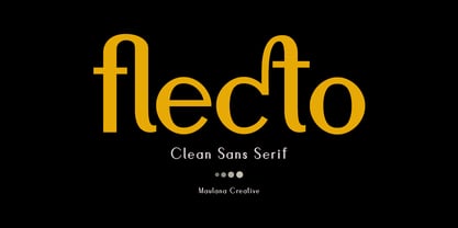 Flecto Clean Sans Serif is an all caps display font. With bold weight, unique and fun character with a bit of ligatures. To give you an extra creative work. Flecto font support multilingual more than 100+ language. This font is good for logo design, Social media, Movie Titles, Books Titles, a short text even a long text letter and good for your secondary text font with script. Make a stunning work with Flecto font. Cheers, Maulana Creative
 - House Soft by TypeUnion,
$30.00 House Soft is the curvy, fun little brother of House Sans. Its exaggerated rounded corners give it a playful feel that will bring happiness and joy wherever it’s used. Like its big brother, House Soft is also made up of 100 weights in 5 useful widths (Compressed to extended) that make it a versatile font. From big bold headlines to playful brands House Soft offers the flexibility and uniqueness you and your project deserve. Go soft or go home.
 - BR Firma by Brink,
$30.00 BR Firma is a geometric sans serif consisting of 8 weights ranging from Thin to Black with matching italics. It supports an ‘Extended Latin’ character set that covers over 200 latin based languages. BR Firma provides advanced typographic support with features such as case sensitive forms, fractions and slashed zeros. It comes with multiple figure sets and is ideal for print, advertising, publishing, branding, software and gaming as well as being optimised for web and screen design.
 - Old Times American by Baseline Fonts,
$29.00The Old Times American Family is derived from several letterpress books from the 1880s in the midwest. The fonts were painstakingly compiled from over 100 pages of text and optically balanced for optimum results. Old Times American is part of the Grit History Series A font set. The set encompasses serif and sans-serif fonts in varying weights to meet the needs of designers. The less-than-perfect letterforms evoke a sense of the non-digital. - MC Minosh by Maulana Creative,
$14.00 Minosh is a vintage display typeface. With three weight stroke, fun character with a bit of ligatures. To give you an extra creative work. Minosh vintage display typeface support multilingual more than 100+ language. This font is good for logo design, Social media, Movie Titles, Books Titles, a short text even a long text letter and good for your secondary text font with sans or serif. Make a stunning work with Minosh vintage display typeface. Cheers, Maulana Creative
 - Astaneh by Si47ash Fonts,
$24.00 Super clean, yet sophisticated! Astaneh with its 2 weights brings a modern and clean sans serif Arabic/Persian typeface to life! Shahab Siavash, the designer has done more than 30 fonts and got featured on Behance, Microsoft, McGill University research website, Hackernoon, Fontself, FontsInUse,... Astaneh text and headline font which is one of his latest designs, already got professional typographers, lay-out and book designers' attention as well as some of the most recognizable publications in Arabic/Persian communities.
 - Shinokai by Lukas Schiltknecht,
$14.00 The Shinokai is a sans serif of two weights that is both dynamic and consequent. Originally concepted as a font for application letters by Lukas Schiltknecht it quickly became a more sophisticated piece of work. This Typeface is inspired by some of his favorite fonts the FF DIN and the ITC Officina. It is made to suit a variety of uses like advertising and packaging, film and tv, editorial and publishing as well as posters and billboards.
 - Kiddo by EPtackArts,
$3.00 Kiddo is a whimsical, handwritten font family created for use along side children's media. It pairs nicely with Monterrat and other neat, rounded sans serif fonts. It looks great with brightly colored, soft illustrations to create lively layouts full of movement. The characters are simple and easy to read as to not compete with the semi-inconsistent baselines and stroke weights. The line variations add a lot of character to the typeface that really compliments a good story.
 - Foundry Sterling by The Foundry,
$90.00 Foundry Sterling is a functional and eloquent typeface family that has its origins in the desire to create a modern sans design with a quintessentially English flavour. The letterforms have been designed with particular attention to classical proportion and purity of form, resulting in the creation of a functional yet graceful typeface with elegant beauty. Foundry Sterling is an eminently versatile font with a carefully chosen weight range equally applicable to identity, editorial and signage use.
 - Lunokhod by ParaType,
$25.00 Lunokhod type family (four weights) was designed by Oleg Karpinsky for ParaType in 2005. Lunokhod is an original wide sans serif with square shapes of oval glyphs. Several Cyrillic glyphs such as Í, Ó, ×, ã, ä, ò have alternate letterforms. For example capital H has two shapes: Latin one with diagonal central stroke and traditional Cyrillic with horisontal bar. Capital Ó and × have symmetrical and asymmetrical shapes. For use in display typography and for short text passages.
 - Grover Slab by Sudtipos,
$35.00 The object of Grover was to join two distinctive typeface designs: the basic European gothic of the late nineteenth century and the ‘rounded’ style found in 1960s America. The result is a clear, friendly face with subtle yet unforgettable features. Named after Grover Washington, Jr., the jazz saxophone player, Grover is geometrically constructed and yet very human in appearance. Sans and slab serif variations, true italic weights, as well as small caps afford Grover versatility and unique display characteristics.
 - Stenka by Katatrad,
$39.00 Stenka is a sans-serif stencil typeface that stand for display typeface to use in any typographic situation. It has his own unique style in expressed perfect condensed forms. Stenka is an ideal font family for display, print, corporate identity, mobile devices, magazine cover, signage, and web design creation, with a set of ligatures and alternative characters for your design in any layout. The family has 4 weights ranging from Light to Black and their italic.
 - Argot by K-Type,
$20.00 Argot is inspired by condensed grotesque letterforms and would be a monolinear sans except for an unorthodox disparity between inner and outer shapes. Elegantly curved outlines contrast starkly with austere rectangular counters, suggesting a no-frills functionality, 20th century modernism, or an unsettling discordance. The squared off inner spaces also add clarity and crispness. Argot is available in three widths — Wide, Normal and Narrow. Each width is supplied in three weights — Regular, Bold and Black — with corresponding italics (obliques).
 - Gunar by The Northern Block,
$39.00 A geometric sans serif with a square chiseled appearance. Precise curves are met with straight lines and tapered angles to produce a fresh, technical typeface. It’s large x-height and neutral width give it good legibility at small point sizes. These refined rectangular features make it ideally suited to a wide range of modern applications. Details include 550 characters with alternative lowercase a, e, g and y. 5 variations of numerals, manually edited kerning and Opentype features.
 - Konstanz by W Type Foundry,
$25.00 Konstanz is a sans serif font family inspired by the design of books and magazines for museums, art galleries, design biennials, architecture, and theater, among others. Its design focuses on a grotesque aesthetic but brings back certain shapes from Bauhaus and Futura. Konstanz includes 8 weights plus its matching italics, besides a stylistic set that increases its use possibilities. Konstanz ensures a graphic with a high impact and is ideal for designing editorial projects, posters, branding, and advertising.
 - Kubera Serif by Gunjan,
$42.00 Kubera was designed to be a display and text face. It has six weights with same height. Kubera Serif is modernized letterform. It has square serif, high contrast stress, with large x height. Serifs are given soft corners, rather than pointy ones. Kubera Serif font family is designed by Gunjan Panchal based in India.
 - Dwight by Groen Studio,
$25.00 Dwight is a Serif font family, which has a strong and bold character with eight variants, Dwight gives a clear and elegant look to logos, quotes, advertisements and more. Dwight is a versatile typography filled with the character you want, Dwight has standard styles, Stylistic Alternates and ligatures. and includes upper and lower case letters, numbers and punctuation marks. Multilingual support for various languages including: French, German, Spanish, Portuguese, Italian, Dutch, Finnish, Swedish, and more. Dwight works great in any branding, logos, magazines, films. The different weights give you full range to explore a whole host of applications, while the outlined fonts give a real modern feel to any project. OpenType features can be accessed by using OpenType smart programs such as Adobe Photo Shop, Adobe Illustrator, Adobe Indesign, Corel Draw and Microsoft Office. can also be accessed through the character map.
 - Serofina by insigne,
$24.99 Serofina is an adaptable and fluid connected script with plenty of alternate flourish options. From clean and flowing to cute and frilly, Serofina can do it. The Serofina family comes with four weights, including a unique hairline, which makes it a versatile investment for a wide range of design possibilities. All weights include the OpenType programming to automatically and seamlessly swap out the default characters for 45 alternate forms and 18 auto-replacing ligatures. These alternates can make the face appear to be more simplified, restrained or frilly. Serofina also includes seven ornaments and old-style numbers. Check out the sample images to see these features in action. Serofina is a highly versatile script family and its range of weights make it perfect for whenever you need an expressive and original typeface.
 - Portada by TypeTogether,
$35.00 For everyone wishing for a modern serif that’s as clear and readable as a sans in restrictive digital environments, meet Portada by Veronika Burian and José Scaglione. Sans serifs are commonly used on small screens to save space and carry a modern tone. Serifs may appear fickle and unsteady, pixel grids change from one product to another, and space is at a premium. Portada now provides a serif option for these restrictive digital environments, putting that old trope to rest. The screen has met its serif match. Portada was created from and for the digital world — from e-ink or harsh grids to Retina capability — making it one of the few serifs of its kind. Portada’s text and titling styles were engineered for superlative performance, making great use of sturdy serifs, wide proportions, ample x-height, clear interior negative space, and its subservient personality. After all, words always take priority in text. It’s not all business, though. Portada’s italics contain an artefact of calligraphy in which the directionality of the instrokes and the returning curves of the outstrokes give the family a little unexpected brio. Yet even the terminals are stopped short of flourished self-absorption to retain their digital clarity. When printed these details are downright comforting. Portada’s titling styles enact slight changes while reducing the individual width of each character and keeping the internal space clear. Titling italics have increased expressiveness across a few characters rather than maxing out the personality in each individual glyph. Digital magazines, newspapers, your favourite novel, and all forms of continuous screen reading benefit from Portada’s features. This family can also cover many of the needs developers have: user interface, showing data intensive apps on screen, even one-word directives and dialogs. And, as a free download, an exhaustive set of dark and light icons is included to maintain Portada’s consistent presence, whether as a word or an image. The complete Portada family (eight text styles, ten titling styles, and one icon set) is designed for extensive, clear screen use — a rare serif on equal footing with a sans.
 - FS Rosa by Monotype,
$52.99 FS Rosa is a free-spirited and optimistic serif typeface – reminiscent of those used on fanzines, film sequences and book covers of the 1970s, such as Cooper and Windsor, it has a laid-back nature with a touch of rebellion. It also reminds of type used in colourful protest graphics by nun-turned-designer Corita Kent, and its personality is akin with brands like Whole Foods - positive rather than preachy. While unconventional, it’s sensible enough to work perfectly for socially conscious brands, magazines, websites and campaigns that want a fairer and more responsible world. Hand-drawn digitally, FS Rosa is warm and open-minded – its irregular letterforms are rounded, with soft terminals, a large x-height and wide apertures. But it is also quirky and eclectic, with irregular shapes – its short ascenders and descenders have slanted serifs, its uppercase forms have unusually low crossbars and the letters are filled with oddities and surprises. The typeface looks to stand out against a sea of homogenous, geometric sans serifs, and celebrates beauty through imperfection. It comes in five weights of Thin, Light, Regular, Bold and Black. The heavier weights make an impact and are great for loud, headline statements. The Regular weight is functional, balanced and robust for text, and the lighter weights have an elegance and contemporary beauty. FS Rosa is eclectic yet with its soft roundness, also positive and progressive. Its name, inspired by the phrase “rose-tinted glasses”, reflects its optimism.
 - Ruthless Drippin ONE - Personal use only

- Ruthless Drippin TWO - Personal use only

- Some Weatz Symbols - Personal use only

- Sculptors Hand - Personal use only

- Blockography - Personal use only

- Ruthless Wreckin TWO - Personal use only

- Let Me Ride - Personal use only

- Rider Wide - Personal use only

- Ruthless Wreckin ONE - Personal use only

- First Lyrics - Personal use only


