7,532 search results
(0.061 seconds)
- Melts Script Rough by Estudio Calderon,
$20.00 Melts Script Rough by Estudio Calderón is the textured version of Melts Script. It has a texture design in high definition that runs very good in any size and concepts. Good news! It includes a free version of “Melts Script Rough Sanscript One”. Specimen
 - Awry by Gholib Tammami,
$15.00 Awry is a cute and quirky handwritten font that elegantly dances on the edges of organized precision and captivating disorder. With its unique design, ‘Awry’ breaks free from the confines of traditional typography, inviting you to explore a world where imperfection becomes an art form.
 - Resotho by Glukfonts,
$10.00 Resotho is a geometric sans serif (uppercase) family. It comes in 18 weights, 9 uprights and 9 italics. Perfect for graphic design, branding, packaging design but very versatile. Language support covering Western, South, and Central Europe. The Extralight & Extralight Italic weights are free of charge.
 - After Dark BB by Blambot,
$20.00All good things happen After Dark! This handwritten font has delicate, long lowercase characters and huge, care-free caps. Both dangerous and feminine, perfect for signing your signature, After Dark has a large assortment of European characters to assist in your late-night adventures. - Hubba by Green Type,
$19.00 Hubba is a modular geometric typeface. Its heavy weight is excellent for headlines and display. There is a plain, oblique, and opposite oblique styles. The variable version will give you the opportunity to be more free in design and not limited to standard styles.
 - Valentine Street by Hatftype,
$15.00 Valentine Street - Graffiti Font is a free style font that has the characteristics of street art that shows freedom and is filled with unique characters. Features : • Character Set A-Z • Numerals & Punctuations (OpenType Standard) • Accents (Multilingual characters) • Ligature • Alternate. I really hope you enjoy it.
 - Soft2911 by Ivan Kostynyk,
$15.00 This font was a product of self-initiated project I started a while back. It started and finished as a project that I was working on while procrastinating at school, for fun; however, I spent enough time to not give it out for free.
 - Designors by Sarid Ezra,
$15.00 Designors is a freestyle font that will make your project more stylish and free! You can use this font for any project. Suitable for quotes and your tees design. This font also support multilingual. With different lowercase and uppercase will make your design more natural!
 - Mysthiqa by Essentials Studio,
$16.00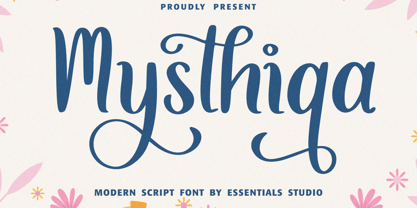 Introducing by Essentials Studio Mysthiqa Is a Modern Script Font Mysthiqa is perfect for product packaging, branding project, megazine, social media, wedding, or just used to express words above the background. Enjoy the font, feel free to comment or feedback, send me PM or email
 - Beautifull Weakness by Sarid Ezra,
$15.00 Beautiful Weakness is a free-styled handwritten font that will make all your project more unique. With brush touch, this font will make your artwork feels more natural. Comes with ligatures and underline that you can access it from opentype feature. Also support multi language!
 - Aminetta by HandletterYean,
$14.00 Aminetta is a beautiful hand-written display font which shows happiness and joy in your heart. This font is most suitable to celebrating your holiday season but also to any occasion you have. Feel free to use it on any creative design you want.
 - Moodystone by Adante Creative,
$23.00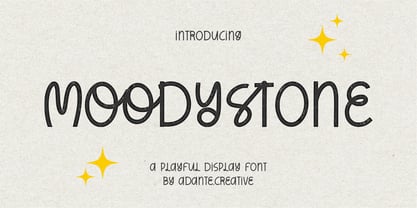 Moodystone A Playful Display Font Moodystone is perfect for product packaging, branding project, magazine, social media, wedding, or just used to express words above the background. Moodystone also multilingual support. Enjoy the font, feel free to comment or feedback, send me PM or email.
 - Horas by Yukita Creative,
$14.00 Horas Sans Serif Geometric is a stunning and modern font, designed with a touch of minimalism and attractive geometrics. This font combines the beauty of serif-free design with the boldness of geometric shapes, creating a fresh, clean look for a variety of design projects.
 - Tripoca by Panatype Studio,
$9.00 TRIPOCA is a Handcraft Vintage inspired typeface with tropical summer vibes, come with 2 family style ( Regular, Slant ) Plus FREE Illustrations & Borders which is perfect for your designs that want a rough style, modern vintage, tropical, summer and carefully crafted for all graphic design needs.
 - Batistar by Allouse Studio,
$16.00 Batistar is perfect for any tittles, logo, product packaging, branding project, magazine, social media, wedding, or just used to express words above the background. Batistar also come with Multi-Lingual Support. Enjoy the font, feel free to comment or feedback, send me PM or email.
 - Signaday by Allouse Studio,
$16.00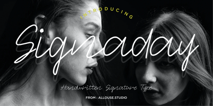 Proudly Present, Signaday a Modern Monoline Handwritten Font. Signaday is perfect for product packaging, branding project, megazine, social media, wedding, or just used to express words above the background. Enjoy the font, feel free to comment or feedback, send me PM or email. Thank You!
 - Sallyna Cattalya by Essentials Studio,
$16.00 Sallyna Cattalya Is a A Monoline Signature Font Sallyna Cattalya is perfect for product packaging, branding project, megazine, social media, wedding, or just used to express words above the background. Enjoy the font, feel free to comment or feedback, send me PM or email.
 - Rexlia Free, designed by the talented Ray Larabie, is a font that manages to balance a robust, industrial aesthetic with an undercurrent of playful quirkiness. This typeface is not your average font;...
- October Crow by Chad Savage is a true embodiment of the haunting charm that one associates with the fall season, particularly with the anticipation of Halloween. This font dives deep into the aesthet...
- gAbAcHiTA FFP - Personal use only

- Bullpen 3D - Unknown license

- Dream Orphans - Unknown license

- Colourbars - Unknown license

- MidnightKernboy - Unknown license

- Kristen Curly - Personal use only

- Cuomotype - Unknown license

- Delta Hey Max Nine - Unknown license

- Departura by Nasir Udin,
$20.00 Departura is a sans-serif family inspired by art deco travel posters in early 20th century, fused with modern & geometric touch. It comes in 18 styles, 9 weights and its matching italics. With those style variatons, Departura offers many possibilities to be applied in many graphic or editorial projects.The modernized retro-look makes this family great to presents any contents related to travel, history & culture in the present/modern way. Also thanks to the extended latin character set so that Departura supports 200+ latin-based languages plus Cyrillic (including the Bulgarian and Serbian characters). P.s.: The Bold Italic & ExtraLight styles are free to download, so you can use them for any projects free of charge.
 - R21 hSq by 103cia,
$10.00 R21-h sq is stand for "Ratio 2:1 in horizontal square"; a comparison in making a glyph typography, horizontally in the form of a square. R21-h sq font consists of bold-retro typeface with its own unique funky style. Suitable for app design, games, toys character face, storybook covers, logos, advertisements, branding, poster, or anything that needs a daring and fresh typography. Font include: R21-hSq-Latin (+extended) font R21-hSq-Cyrillic font R21-hSq-Greek font* * Additional Light font for Greek only. All styles include Latin standards (except for free/demo version). The glyph 6, 8, 9, x, O, Q and X on display are for commercial version (the free/demo version are different).
 - Mak Variable by Tkachenko design,
$211.00 Mak is a display font with a Ukrainian feeling inspired by Ukrainian music. Customize weight and contrast to the smallest value to your needs with a variable version of Mak. This is a big update of the first free two styles of Mak (SemiBold High & Black High) that were created in 2019 and become widespread among free display fonts. The big update wasn't been only adding more weights and contrasts but also changing a lot of glyphs and adding new ones. Now Mak supports all Latin-based languages and European Cyrillic. Experiments with historical forms, contrasts, and daring shapes to create a new image of Ukrainian Cyrillic and Latin based on it.
 - Sassoon Joined ENGLISH by Sassoon-Williams,
$66.00 These fonts will join-as-you-type in your OpenType application as shown in the posters above. Choose Use Contextual Alternates option in your app to get basic recommended baseline joins for teaching. Additionally, use can choose from 7 Stylistic Sets of alternative letterforms that are so important for Teachers. Create ‘pen lifts’ anytime too! Fonts display unjoined by default on this website and are delivered that way - joining is controlled by your application. Free to download resources Stylistic Sets and how to access the alternative letters feature in these OpenType fonts Purchasers of this font package may use their Order Number to receive a free Copybook PDF by Rosemary Sassoon recommended for effective teaching
 - Super Active Matrix by Folding Type,
$9.00 S.A.M (Super Active Matrix) combines the big, bright and bold with the microscopic and mathematically precise. Inspired by old science fiction films and new technologies, S.A.M merges the rigid constraints of display mechanics with the free-flowing curves of neon signs. This font is great for a classic sci-fi look – perfect for headlines/logotype. S.A.M also works for blocks of text, unlike some other display fonts. The matrix exists to bring order to an idea – it tames the free-flowing curves of neon signage into a repeatable structure while maintaining a retro aesthetic. Each character, glyph or symbol is drawn on a bitmap grid, merged with a dot matrix to round off the edges.
 - Spiderpies by Lucky Type,
$14.00 Introducing Spiderpies, a brush script that is modern, free-style, free-flowing, friendly and organic.Can be used for various purposes - Branding, Happy New Year, Logos, Greeting Cards, Wedding Stationery and Quotes. Files included : Spiderpies OTF Spiderpies features : Basic Latin A-Z and a-z Numbers Symbols To enable the OpenType Stylistic alternates, you need a program that supports OpenType features such as Adobe Illustrator CS, Adobe Indesign & CorelDraw X6-X7, Microsoft Word 2010 or later versions And this Font has given PUA unicode. There are additional ways to access alternates/swashes, using Character Map (Windows), Nexus Font (Windows), Font Book (Mac) or a software program such as PopChar (for Windows and Mac).
 - Resist Sans by Groteskly Yours,
$25.00 Resist Sans is a free-spirited neo-grotesque that embodies both the innate desire for revolt and a tendency towards uniformity. While Resist Sans preserves the neat, minimalist look which is associated with neo-grotesques, it also accentuates the tentativeness of each letter form. The name, too, hints at the rebellious character of the typeface. Resist Sans comes in 28 styles (14 uprights and matching obliques). Text vs Display Resist Sans comes in two versions: Display and Text, which serve different purposes but remain interchangeable and even complementary in some cases. Resist Text is equipped with deep ink traps and optical compensators, which really come into play at smaller sizes. The Display version is smoother and more consistent, so better for use in larger sizes and headlines. Styles/Weights Each of the two versions of Resist Sans comes in 7 weights (Thin to Black) and is equipped with matching Obliques, which brings the total number of styles to 28. Two trial styles (Text Light and Display Medium Oblique) can be downloaded free of charge. Each style contains 900+ glyphs, awesome OpenType features, and around 1500 kerning pairs. Language Support Resist Sans is truly multilingual. It supports most European and Latin-languages and features Extended Cyrillic, which gives access to such languages as Ukrainian, Bulgarian, Serbian, Russian, Macedonian and many more. Free Styles Two styles of Resist Sans can be downloaded for free on MyFonts. Type Specimen Resist Sans PDF Type Specimen can be downloaded here: Resist Sans PDF Type Specimen
 - Generis Slab by Linotype,
$29.00The idea for the Generis type system came to Erik Faulhaber while he was traveling in the USA. Seeing typefaces mixed together in a business district motivated him to create a new type system with interrelated forms. The first design scheme came about in 1997, following the space saving model of these American Gothics. Faulhaber then examined the demands of legibility and various communications media before finally developing the plan behind this type system. Generis’s design includes two individually designed styles; each of with is available with and without serifs, giving the type system four separate families. Each includes at least four basic weights: Light, Regular, Medium, and Bold. Further weights, small caps, old style figures, and true italics were added to each family where needed. The Generis type system is designed to meet both optical criteria and the highest possible measure of technical precision. Harmony, rhythm, legibility, and formal restraint make up the foreground. Generis combines aesthetic, technical, and economic advantages, which purposefully and efficiently cover the whole range of corporate communication needs. The unified basic form and the individual peculiarity of the styles lead to Generis’ systematic, total-package concept. The clear formal language of the Generis type system resides beneath the information, bringing appropriate typographic expression to high-level corporate identity systems, both in print and on screen. The condensed and aspiring nature of the letterforms allows for the efficient setting of body copy, and the economic use of the page. A range of accented characters allows text to be set in 48 Latin-based languages, offering maximal typographic free range. This previously unknown level of technical and design execution helps create higher quality typography in all areas of corporate communication. Optimal combinations within the type system: Generis Serif or Generis Slab with Generis Sans or Generis Simple. - Generis Serif by Linotype,
$29.00The idea for the Generis type system came to Erik Faulhaber while he was traveling in the USA. Seeing typefaces mixed together in a business district motivated him to create a new type system with interrelated forms. The first design scheme came about in 1997, following the space saving model of these American Gothics. Faulhaber then examined the demands of legibility and various communications media before finally developing the plan behind this type system. Generis’s design includes two individually designed styles; each of with is available with and without serifs, giving the type system four separate families. Each includes at least four basic weights: Light, Regular, Medium, and Bold. Further weights, small caps, old style figures, and true italics were added to each family where needed. The Generis type system is designed to meet both optical criteria and the highest possible measure of technical precision. Harmony, rhythm, legibility, and formal restraint make up the foreground. Generis combines aesthetic, technical, and economic advantages, which purposefully and efficiently cover the whole range of corporate communication needs. The unified basic form and the individual peculiarity of the styles lead to Generis’ systematic, total-package concept. The clear formal language of the Generis type system resides beneath the information, bringing appropriate typographic expression to high-level corporate identity systems, both in print and on screen. The condensed and aspiring nature of the letterforms allows for the efficient setting of body copy, and the economic use of the page. A range of accented characters allows text to be set in 48 Latin-based languages, offering maximal typographic free range. This previously unknown level of technical and design execution helps create higher quality typography in all areas of corporate communication. Optimal combinations within the type system: Generis Serif or Generis Slab with Generis Sans or Generis Simple. - Generis Simple by Linotype,
$39.00The idea for the Generis type system came to Erik Faulhaber while he was traveling in the USA. Seeing typefaces mixed together in a business district motivated him to create a new type system with interrelated forms. The first design scheme came about in 1997, following the space saving model of these American Gothics. Faulhaber then examined the demands of legibility and various communications media before finally developing the plan behind this type system. Generis’s design includes two individually designed styles; each of with is available with and without serifs, giving the type system four separate families. Each includes at least four basic weights: Light, Regular, Medium, and Bold. Further weights, small caps, old style figures, and true italics were added to each family where needed. The Generis type system is designed to meet both optical criteria and the highest possible measure of technical precision. Harmony, rhythm, legibility, and formal restraint make up the foreground. Generis combines aesthetic, technical, and economic advantages, which purposefully and efficiently cover the whole range of corporate communication needs. The unified basic form and the individual peculiarity of the styles lead to Generis’ systematic, total-package concept. The clear formal language of the Generis type system resides beneath the information, bringing appropriate typographic expression to high-level corporate identity systems, both in print and on screen. The condensed and aspiring nature of the letterforms allows for the efficient setting of body copy, and the economic use of the page. A range of accented characters allows text to be set in 48 Latin-based languages, offering maximal typographic free range. This previously unknown level of technical and design execution helps create higher quality typography in all areas of corporate communication. Optimal combinations within the type system: Generis Serif or Generis Slab with Generis Sans or Generis Simple. - Generis Sans by Linotype,
$29.00The idea for the Generis type system came to Erik Faulhaber while he was traveling in the USA. Seeing typefaces mixed together in a business district motivated him to create a new type system with interrelated forms. The first design scheme came about in 1997, following the space saving model of these American Gothics. Faulhaber then examined the demands of legibility and various communications media before finally developing the plan behind this type system. Generis’s design includes two individually designed styles; each of with is available with and without serifs, giving the type system four separate families. Each includes at least four basic weights: Light, Regular, Medium, and Bold. Further weights, small caps, old style figures, and true italics were added to each family where needed. The Generis type system is designed to meet both optical criteria and the highest possible measure of technical precision. Harmony, rhythm, legibility, and formal restraint make up the foreground. Generis combines aesthetic, technical, and economic advantages, which purposefully and efficiently cover the whole range of corporate communication needs. The unified basic form and the individual peculiarity of the styles lead to Generis’ systematic, total-package concept. The clear formal language of the Generis type system resides beneath the information, bringing appropriate typographic expression to high-level corporate identity systems, both in print and on screen. The condensed and aspiring nature of the letterforms allows for the efficient setting of body copy, and the economic use of the page. A range of accented characters allows text to be set in 48 Latin-based languages, offering maximal typographic free range. This previously unknown level of technical and design execution helps create higher quality typography in all areas of corporate communication. Optimal combinations within the type system: Generis Serif or Generis Slab with Generis Sans or Generis Simple. - Seibi Minato by Nihon Literal,
$169.00 Designed for the covers of children’s literature and picture books, this is a freehand-style, rounded gothic typeface that conveys warmth and softness. It has also been sold as a font for use in game software. 児童書や絵本の表紙向けにデザインされた、あたたかさややわらかさを表現したい場面で使われるフリーハンド(手書き風)書体です。ゲームソフトなどに組み込まれるフォントとしての販売実績もあります。右肩上がりのリズミカルなフリーハンドタッチで、ヨコ組タテ組どちらでも読みやすく組むことができます。
 - Hollywood Deco SG by Spiece Graphics,
$39.00 This is yet another Willard T. Sniffin deco-inspired original. Created for the American Type Foundry, Hollywood Deco remains a classic that is still as contemporary today as when it first appeared in 1932. Use this novelty gothic typeface on announcements and stationery. It is also well-suited for many advertising situations where a stylish retro look is desired. A useful set of alternate characters (including the illustrious “Overlapping O's”) is included with this version. Hollywood Deco Medium with Alternates is also available as an OpenType font. This version now contains small caps, lining and oldstyle figures, prebuilt fractions, stylistic alternates, word buttons and a wide assortment of f-ligatures. These advanced features currently work in Adobe Creative Suite InDesign, Creative Suite Illustrator, and Quark XPress 7. Check for OpenType advanced feature support in other applications as it gradually becomes available with upgrades.


