10,000 search results
(0.039 seconds)
- Novaletra Sans CF by Connary Fagen,
$25.00 Smooth brushstrokes inform the construction of Novaletra Sans. As Novaletra Serif's sister typeface, Novaletra Sans shares its easy readability and excellent performance in a humanist design. Subtle flares and low stroke contrast provide warmth uncommon in sans-serif font families. Novaletra Sans CF pairs well with simple sans-serifs like Articulat® CF, or with detailed and airy display type like Quiverleaf® CF. All typefaces from Connary Fagen include free updates, including new features, and free technical support.
 - Abode - Unknown license

- Childos by NamelaType,
$19.00 Childos is a handwritten font in rounded, rough sans serifs style, as well as the development of free and attractive ligature to fill the space between letters and make playful children feel designs.
 - FS Lucas by Fontsmith,
$80.00 Pure and not-so-simple Maybe it’s the air of purity, openness and transparency that they transmit, but geometric typefaces are more popular than ever among leading brands. Based on near-perfect circles, triangles and squares, geometric letterforms look uncomplicated, even though making them readable is anything but – something the designers of the first wave of geometric fonts discovered nearly a century ago. Many of the world’s most recognisable brands in technology, retail, travel, food, manufacturing and other industries continue to be drawn to the straightforward, honest character that geometric fonts convey. Fontsmith set out in 2015 to develop a typeface in the same tradition, but optimised for the demands of modern brands – online and offline usage, readability and accessibility. And, of course, with the all-important Fontsmith x-factor built in. FS Lucas is the bold and deceptively simple result. Handle with care The letterforms of FS Lucas are round and generous, along the lines of Trajan Column lettering stripped of its serifs. But beware their thorns. Their designer, Stuart de Rozario, who also crafted the award-winning FS Millbank, wanted a contrast between spiky and soft, giving sharp apexes to the more angular letterforms, such as A, M, N, v, w and z. Among his inspirations were the colourful, geometric compositions of Frank Stella, the 1920s art deco poster designs of AM Cassandre, and the triangular cosmic element symbol, which led him to tackle the capital A first, instead of the usual H. The proportions and angles of the triangular form would set the template for many of the other characters. It was this form, and the light-scattering effects of triangular prisms, that lit the path to a name for the typeface: Lucas is derived from lux, the Latin word for light. Recommended reading Early geometric typefaces were accused of putting mathematical integrity before readability. FS Lucas achieves the trick of appearing geometric, while taking the edge off elements that make reading difficult. Perfectly circlular shapes don’t read well. The way around that is to slightly thicken the vertical strokes, and pull out the curves at the corners to compensate; the O and o of FS Lucas are optical illusions. Pointed apexes aren’t as sharp as they look; the flattened tips are an essential design feature. And distinctive details such as the open terminals of the c, e, f, g, j, r and s, and the x-height bar on the i and j, aid legibility, especially on-screen. These and many other features, the product of sketching the letterforms in the first instance by hand rather than mapping them out mechanically by computer, give FS Lucas the built-in humanity and character that make it a better, easier read all-round. Marks of distinction Unlike some of its more buttoned-up geometric bedfellows, FS Lucas can’t contain its natural personality and quirks: the flick of the foot of the l, for example, and the flattish tail on the g and j. The unusual bar on the J improves character recognition, and the G is circular, without a straight stem. There’s a touch of Fontsmith about the t, too, with the curve across the left cross section in the lighter weights, and the ampersand is one of a kind. There’s a lot to like about Lucas. With its 9 weights, perfect proportions and soft but spiky take on the classic geometric font, it’s a typeface that could light up any brand.
 - FS Lucas Paneureopean by Fontsmith,
$90.00Pure and not-so-simple Maybe it’s the air of purity, openness and transparency that they transmit, but geometric typefaces are more popular than ever among leading brands. Based on near-perfect circles, triangles and squares, geometric letterforms look uncomplicated, even though making them readable is anything but – something the designers of the first wave of geometric fonts discovered nearly a century ago. Many of the world’s most recognisable brands in technology, retail, travel, food, manufacturing and other industries continue to be drawn to the straightforward, honest character that geometric fonts convey. Fontsmith set out in 2015 to develop a typeface in the same tradition, but optimised for the demands of modern brands – online and offline usage, readability and accessibility. And, of course, with the all-important Fontsmith x-factor built in. FS Lucas is the bold and deceptively simple result. Handle with care The letterforms of FS Lucas are round and generous, along the lines of Trajan Column lettering stripped of its serifs. But beware their thorns. Their designer, Stuart de Rozario, who also crafted the award-winning FS Millbank, wanted a contrast between spiky and soft, giving sharp apexes to the more angular letterforms, such as A, M, N, v, w and z. Among his inspirations were the colourful, geometric compositions of Frank Stella, the 1920s art deco poster designs of AM Cassandre, and the triangular cosmic element symbol, which led him to tackle the capital A first, instead of the usual H. The proportions and angles of the triangular form would set the template for many of the other characters. It was this form, and the light-scattering effects of triangular prisms, that lit the path to a name for the typeface: Lucas is derived from lux, the Latin word for light. Recommended reading Early geometric typefaces were accused of putting mathematical integrity before readability. FS Lucas achieves the trick of appearing geometric, while taking the edge off elements that make reading difficult. Perfectly circlular shapes don’t read well. The way around that is to slightly thicken the vertical strokes, and pull out the curves at the corners to compensate; the O and o of FS Lucas are optical illusions. Pointed apexes aren’t as sharp as they look; the flattened tips are an essential design feature. And distinctive details such as the open terminals of the c, e, f, g, j, r and s, and the x-height bar on the i and j, aid legibility, especially on-screen. These and many other features, the product of sketching the letterforms in the first instance by hand rather than mapping them out mechanically by computer, give FS Lucas the built-in humanity and character that make it a better, easier read all-round. Marks of distinction Unlike some of its more buttoned-up geometric bedfellows, FS Lucas can’t contain its natural personality and quirks: the flick of the foot of the l, for example, and the flattish tail on the g and j. The unusual bar on the J improves character recognition, and the G is circular, without a straight stem. There’s a touch of Fontsmith about the t, too, with the curve across the left cross section in the lighter weights, and the ampersand is one of a kind. There’s a lot to like about Lucas. With its 9 weights, perfect proportions and soft but spiky take on the classic geometric font, it’s a typeface that could light up any brand. - Zebbadee - Unknown license

- Splinky - Unknown license

- Woolbats - Unknown license

- Avishag MF by Masterfont,
$59.00 So free so fresh, this personal handwriting will always look unique.
 - Gladifilthefte - 100% free

- Brewsky - 100% free

- effortless - 100% free

- Tasmin - Unknown license

- Alpenkreuzer - 100% free

- Ghosttown BC - Personal use only

- Neon Ring by Arendxstudio,
$13.00 Neon Ring - Graffiti Display Font is a free style font that has the characteristics of street art that shows freedom and is filled with unique characters Features : • Character Set A-Z • Numerals & Punctuations (OpenType Standard) • Accents (Multilingual characters) • Ligature • Alternate
 - Hay Scary by HandletterYean,
$13.00 This is a Halloween-themed font. Its style will make your creativity stands out in your designs. Feel free to use it on any kind of creative design, and cherish your Halloween with this font to make it more festive.
 - Easy Style by Arendxstudio,
$13.00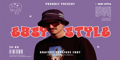 Easy Style - Graffiti Font Style is a free style font that has the characteristics of street art that shows freedom and is filled with unique characters Features : • Character Set A-Z • Numerals & Punctuations (OpenType Standard) • Accents (Multilingual characters) • Ligature • Alternate
 - Texas Walls by Arendxstudio,
$13.00 Texas Walls - Graffiti Font Style is a free style font that has the characteristics of street art that shows freedom and is filled with unique characters Features : • Character Set A-Z • Numerals & Punctuations (OpenType Standard) • Accents (Multilingual characters) • Ligature • Alternate
 - Zombie Sunrise by Fonts of Chaos,
$10.00 Zombie Sunrise is a hand drawn font taking inspiration from the 60's horror zombie movies. When you buy this font you receive for free 6 exclusive patterns that you can use directly in Photoshop or any other graphic software.
 - Bruce 1065 Soft Serifs by Intellecta Design,
$19.90Bruce 1065 is a beautiful victorian font by Chyrllene K, with two styles, a free interpretation off the "1065 font style" of the 1882 George Bruce's New York typefoundry extra-rare catalogue, from Intellecta’s collection of rare books and catalogues. - Fusion Flame by Arendxstudio,
$13.00 Fusion Flame - Graffiti Display Font is a free style font that has the characteristics of street art that shows freedom and is filled with unique characters Features : • Character Set A-Z • Numerals & Punctuations (OpenType Standard) • Accents (Multilingual characters) • Ligature • Alternate
 - Lovely Rose by Namara Creative Studio,
$14.00 Lovely Rose Romantic calligraphy script font inspired by lovely valentines themes. This font is suitable for greeting card, wedding invitation, instagram post, quotes and so on. Feel free to follow, like and share. Thanks so much for checking out my shop!
 - Styling Zero by Arendxstudio,
$13.00 Styling Zero - Graffiti Display Font is a free style font that has the characteristics of street art that shows freedom and is filled with unique characters Features : • Character Set A-Z • Numerals & Punctuations (OpenType Standard) • Accents (Multilingual characters) • Ligature • Alternate
 - Phoenix Midnight by Arendxstudio,
$13.00 Phoenix Midnight - Graffiti Display Font is a free style font that has the characteristics of street art that shows freedom and is filled with unique characters Features : • Character Set A-Z • Numerals & Punctuations (OpenType Standard) • Accents (Multilingual characters) • Ligature • Alternate
 - Regal box - Unknown license

- North point - Unknown license

- West point - Unknown license

- Hooper dooper - Unknown license

- Royal box - Unknown license

- Christmas Doodles Too by Outside the Line,
$19.00 Christmas Doodles Too is the follow up font to Christmas Doodles. More Christmas icons including a tree, fun new ornaments, a dove, gifts, pine trees, a church, drinks, sleigh, tree lights, drum, horn, Santa hat, holly, snowflakes, stockings, candy, and mistletoe. This font works well with Holiday Doodles and Holiday Doodles Too which also have Christmas icons in them.
 - Designors by Sarid Ezra,
$15.00 Designors is a freestyle font that will make your project more stylish and free! You can use this font for any project. Suitable for quotes and your tees design. This font also support multilingual. With different lowercase and uppercase will make your design more natural!
 - Budmo Jiggler - Unknown license

- Jellyka, End_less Voyage - Personal use only

- Degrassi - 100% free

- Contour Generator - Unknown license

- Carbon Block - Unknown license

- Crystal Radio Kit - Unknown license

- Dyspepsia - Unknown license

- DirtyBakersDozen - Unknown license


