6,918 search results (0.029 seconds)
  1. CopaBanana - Unknown license
  2. Teddybers Too - Personal use only
  3. Maincode Mono by Par Défaut, $9.00
    Maincode Mono is a Monospaced Family declined in 7 weights, 7 widths and oblique. There is also a variable version. The family was composed of 511 glyphs, Latin & Cyrillic alphabets and 9 OpenType Features (numerator, denominator, superscript, subscript, fraction, case sensitive form, discretionary ligatures, contextual alternate, all access alternate).
  4. Altum Sans by Erik Seitz, $9.99
    Altum Sans is a new clean and contemporary typeface. The geometric and condensed letterforms are designed for use in larger texts and display applications. With over 500 glyphs Altum Sans supports many languages as well as two different figure styles, interpolation breakpoints, subscript, superscript, contextual alternatives, ordinal indicators, fractions,...
  5. Studio Grotesk by Jetsmax Studio, $10.00
    Studio Grotesk is a modern sans typeface with a futuristic touch. This multi-purpose typeface will grab reader's attention with its stylish and neat design. With over 500+ Glyphs, five styles and a wide range of weights its a timeless workhorse for many possible application from branding to editorial.
  6. Hackman by The Northern Block, $32.00
    A geometric sans serif with contemporary lines. Distinctive curves are combined with classical letterforms to produce a clean, linear typeface best suited to identity, mobile and web applications. Details include 9 weights with italics, 500 characters, 5 variations of numerals, stylistic alternatives, manually edited kerning and OpenType features.
  7. Jenitha by Sulthan Studio, $12.00
    Introducing Jenitha A script font with a smooth calligraphy modern style. Comes with 500 glyphs. Jenitha is perfect for branding projects, homeware designs, product packaging, use in name card, invitation cards, etc. Simply as a stylish text overlay to any background image or anything requiring a sprinkle of elegance.
  8. Digital Sans Now by Elsner+Flake, $59.00
    Digital Sans Now combines and completes the many diverse requests and requirements by users of the past years. By now, 36 versions for over 70 Latin and Cyrillic languages have become available, including Small Caps. Digital Sans Now is also available as a webfont and reflects, with its simplified and geometric construction and its consciously maintained poster-like forms as well as with its ornamental character, the spirit of the decorative serif-less headline typefaces of the 1970s. The basic severity of other grotesque typefaces is here repressed by means of targeted rounds. Exactly these formal breaks allow the impression that it could be used in a variety of visual applications. Short texts, headlines and logos of all descriptions are its domain. It is because of this versatility that the typeface has become a desirable stylistic element, especially in such design provinces as technology, games and sports, and that, for many years now, it appears to be timeless. Additional weights designed on the basis of the original, from Thin to Ultra, the Italics, Small Caps and alternative characters allow for differentiated “looks and feels”, and, with deliberate usage, give the “Digital Sans Now” expanded possibilities for expression. The basis for the design of Digital Sans Now is a headline typeface created in 1973 by Marty Goldstein and the Digital Sans family which has been available from Elsner+Flake since the mid-1990s under a license agreement. The four weights designed by Marty Goldstein, Thin, Plain, Heavy and Fat, were originally sold by the American company Visual Graphics Corporation (VGC) under the name of “Sol”. Similarly, the company Fotostar International offered film fonts for 2” phototypesetting machines, these however under the name “Sun”. The first digital adaptation had already been ordered in the mid 1970s in Germany by Walter Brendel for the phototypesetting system Unitype used by the TypeShop Group, in three widths and under the name “Digital Part of the Serial Collection.” Based on the versions by VGC, Thin, Plain, Heavy and Fat, new versions were then created with appropriate stroke and width adaptations for data sets for the fonts Light, Medium and Bold as well as for the corresponding italics
  9. VTC-FreehandTattooOne - Personal use only
  10. VTC-BadEnglischOne - Personal use only
  11. Krul by Re-Type, $99.00
    ‘Krul’ is a typographic interpretation of the lettering style created by Dutch letter painter Jan Willem Joseph Visser at the end of the 1940s, which decorated the traditional brown bars of Amsterdam. In the beginning, these letters were strongly associated with the pubs connected to the Amstel brewery, given that Visser was the company’s official painter. As the years passed, the style became increasingly popular, and various business owners in Amsterdam and other Dutch and Belgian cities also commissioned its use. In the 1970s and 1980s, Leo Beukeboom, another talented letter painter, continued and expanded this lettering tradition while employed under the Heineken brand. Much of his work can still be found in the Jordaan and De Pijp neighborhoods in Amsterdam. The Amsterdamse Krulletter, or Amsterdam’s curly letter, is strongly inspired by the calligraphic works of the 17th century Dutch writing masters, of which Jan van den Velde was a central figure. However, distinct characteristics of this style, for example, its unusual and beautiful ‘g’, originate from a model that was published by Johannes Heuvelman in 1659, which J. W. J. Visser referenced. Typographic circles have somehow overlooked the Amsterdamse Krulletter and its heritage. The Dutch calligraphic hands preceded and influenced the formal English penmanship which has inspired numerous typefaces in the Copperplate style. In contrast, the models from van den Velde, Heuvelman, and Jean de la Chambre, among others, are a missing chapter in Dutch typographic history, and had never been turned into typefaces until now. Conscious of the cultural and identity issues that arise in reviving a unique style, and concerned about the speed with which the lettering style was disappearing, Ramiro Espinoza focused the project of designing ‘Krul’ on digitally recreating the calligraphic complexity of these beautiful letters. Created through several years of research, ‘Krul’ is not a direct digitization of the Amsterdamse Krulletter, but instead, an interpretation that incorporates numerous alternative characters absent in the original model, and improves upon details where necessary, resulting in an optimal performance on the printed page. The typeface is presented in Open Type format, with an abundance of intricate ligatures, fleurons, and swashes, which permit the creation of numerous calligraphic effects. The very high contrast and rhythm of the strokes in this typeface make it especially suited for media applications conveying a sense of elegance and sophistication. Designers of feminine magazines, advertisements, and corporate identities within the fragrance and fashion industries will find in this typeface to be an extremely useful and appropriate resource.The great Amsterdamse Krulletter is finally back, and we are proud to make it available to you.
  12. Le chant des Albatros by Octotype is a typeface that seems to gracefully dance between modern flair and timeless elegance. The name itself, French for "The Song of the Albatross," evokes an image of ...
  13. Greatday - Personal use only
  14. Shade of Adelyne - Personal use only
  15. La Flama y La Espina - Personal use only
  16. Nose Bleed - Unknown license
  17. More than Enough - Personal use only
  18. The World Is Yours - Personal use only
  19. Sue Ellen Francisco - Personal use only
  20. SexyRexy-Smitten - Unknown license
  21. Blue Highway Linocut - Unknown license
  22. Magical Mystery Tour - Unknown license
  23. DS Nova - Unknown license
  24. Airplanes in the Night Sky - Personal use only
  25. Alpha Flight Solid - Unknown license
  26. Romance Fatal 2.00 - Personal use only
  27. Alpha Flight Small Caps - Personal use only
  28. Activate - Unknown license
  29. Dalek - Personal use only
  30. Bright Orchid by Balpirick, $15.00
    Bright Orchid is a Bold Handbrushed Font. Bright Orchid is perfect for product packaging, branding project, megazine, social media, wedding, or just used Bright Orchid has multilingual support. Enjoy the font, feel free to comment or feedback, send me PM or email. Thank you!
  31. Melts Script Rough by Estudio Calderon, $20.00
    Melts Script Rough by Estudio Calderón is the textured version of Melts Script. It has a texture design in high definition that runs very good in any size and concepts. Good news! It includes a free version of “Melts Script Rough Sanscript One”. Specimen
  32. Awry by Gholib Tammami, $15.00
    Awry is a cute and quirky handwritten font that elegantly dances on the edges of organized precision and captivating disorder. With its unique design, ‘Awry’ breaks free from the confines of traditional typography, inviting you to explore a world where imperfection becomes an art form.
  33. Resotho by Glukfonts, $10.00
    Resotho is a geometric sans serif (uppercase) family. It comes in 18 weights, 9 uprights and 9 italics. Perfect for graphic design, branding, packaging design but very versatile. Language support covering Western, South, and Central Europe. The Extralight & Extralight Italic weights are free of charge.
  34. After Dark BB by Blambot, $20.00
    All good things happen After Dark! This handwritten font has delicate, long lowercase characters and huge, care-free caps. Both dangerous and feminine, perfect for signing your signature, After Dark has a large assortment of European characters to assist in your late-night adventures.
  35. Hubba by Green Type, $19.00
    Hubba is a modular geometric typeface. Its heavy weight is excellent for headlines and display. There is a plain, oblique, and opposite oblique styles. The variable version will give you the opportunity to be more free in design and not limited to standard styles.
  36. Valentine Street by Hatftype, $15.00
    Valentine Street - Graffiti Font is a free style font that has the characteristics of street art that shows freedom and is filled with unique characters. Features : • Character Set A-Z • Numerals & Punctuations (OpenType Standard) • Accents (Multilingual characters) • Ligature • Alternate. I really hope you enjoy it.
  37. Soft2911 by Ivan Kostynyk, $15.00
    This font was a product of self-initiated project I started a while back. It started and finished as a project that I was working on while procrastinating at school, for fun; however, I spent enough time to not give it out for free.
  38. Designors by Sarid Ezra, $15.00
    Designors is a freestyle font that will make your project more stylish and free! You can use this font for any project. Suitable for quotes and your tees design. This font also support multilingual. With different lowercase and uppercase will make your design more natural!
  39. Mysthiqa by Essentials Studio, $16.00
    Introducing by Essentials Studio Mysthiqa Is a Modern Script Font Mysthiqa is perfect for product packaging, branding project, megazine, social media, wedding, or just used to express words above the background. Enjoy the font, feel free to comment or feedback, send me PM or email
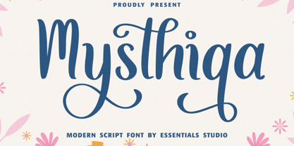
  40. Beautifull Weakness by Sarid Ezra, $15.00
    Beautiful Weakness is a free-styled handwritten font that will make all your project more unique. With brush touch, this font will make your artwork feels more natural. Comes with ligatures and underline that you can access it from opentype feature. Also support multi language!
Looking for more fonts? Check out our New, Sans, Script, Handwriting fonts or Categories
abstract fontscontact usprivacy policyweb font generator
Processing