10,000 search results
(0.03 seconds)
- Busteball by Ditatype,
$29.00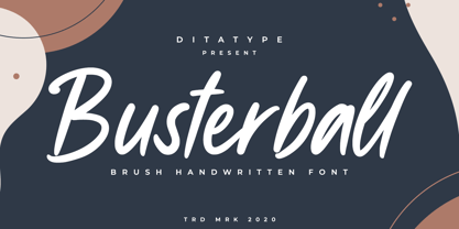 Busterball is a classy script font. Made for any professional project branding. It is the best for logos, branding and quotes. Every letter has a unique and beautiful touch. Includes: Busterball (OTF) Features: Beautiful Ligatures Multilingual Support PUA Encoded Numerals and Punctuation Thank you for downloading premium fonts from Dita Type
 - Black Indie by Din Studio,
$29.00 Black Indie is a bold and authentic display font. The font is suitable for any branding project like logo, t-shirt printing and many more. outstanding in a wide range of contexts. Featured : Accents (Multilingual characters) PUA encoded Numerals and Punctuation (OpenType Standard) Thanks for downloading premium font from Din Studio
 - Ayalena by Din Studio,
$29.00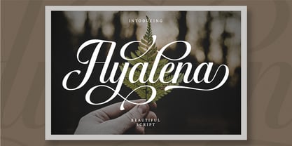 Ayalena is a modern calligraphy font. It brings a beautiful and attractive typeface. Made for any professional project branding. It is the best for logos, branding, wedding and quotes. Features: Stylistic Set Beautiful Ligatures Multilingual Support PUA Encoded Numerals and Punctuation Thank you for downloading premium fonts from Din Studio
 - Garetha by Din Studio,
$29.00 Garetha is modern sans serif font. Made for any professional project branding. It is the best for branding, printing, wedding and quotes. Every letter has a unique and beautiful touch. Features: Swashes Stylistic Sets PUA Encoded Multilingual Support Numerals and Punctuation Thank you for downloading premium fonts from Din Studio
 - Soage by Din Studio,
$29.00 Soage is modern sans serif font. Made for any professional project branding. It is the best for branding, printing, wedding and quotes. Every letter has a unique and beautiful touch. Features: Alternates Stylistic Set PUA Encoded Multilingual Support Numerals and Punctuation Thank you for downloading premium fonts from Din Studio
 - Mertalion by Din Studio,
$29.00 Mertalion is a Vintage Serif Font. Create inspiring from the vintage logotype. the fonts are suitable for any vintage project like branding, vintage logotype, quote, and t-shirt print. Included : - Mertalion (OTF) Featured : - Accents (Multilingual characters) - PUA encoded - Numerals and Punctuation (OpenType Standard) Thanks for visiting and downloading my font!
 - Allust Italic by Halfmoon Type,
$20.00 Allust Italic is an Upright italic font that is inspired by italic version some old-style serif typefaces specimen and an from my own flawed italic letterforms back in 2016. Download the cheat sheet for Allust Italic Ornament here: https://www.dropbox.com/s/yz1rvdopxm6mwva/Allust%20Italic%20Ornament%20Cheat%20Sheet.pdf?dl=0
 - Watterbite by Ditatype,
$29.00 Watterbite is a classy script font. Made for any professional project branding. It is the best for logos, branding and quotes. Every letter has a unique and beautiful touch. Includes: Watterbite (OTF) Features: Beautiful Ligatures Multilingual Support PUA Encoded Numerals and Punctuation Thank you for downloading premium fonts from Dita Type
 - Finest Butter by Din Studio,
$29.00 Finest Butter is a modern script font. Made for any professional project branding. It is the best for logos, branding and of quotes. Every letter has a unique and beautiful touch. Features: Beautiful Ligatures Multilingual Support PUA Encoded Numerals and Punctuation Thank you for downloading premium fonts from Din Studio
 - Andrei - 100% free

- DINk - 100% free

- Denne Angel - Personal use only

- Frutiger Capitalis by Linotype,
$29.00Frutiger Capitalis Regular and Outline belong to the group of typefaces for the Linotype’s Type Before Gutenberg project. However, they are not based on direct historical sources. At first glance, they may seem related to the roman type Capitalis Monumentalis, but upon closer examination, the fonts reveal a vitality unknown to the characters the Romans etched in stone. Frutiger confesses that creating Capitalis was “a liberation”. After working on so many sophisticated and meticulously designed typefaces, Frutiger Capitalis was a breath of fresh air. Stylistically, Frutiger Capitalis Outline forms a bridge to Frutiger Capitalis Signs, a whole universe of its own. Frutiger Capitalis Signs is a personal cosmos of symbols, many are immediately “legible”, others leave room for interpretation. Some of the symbols are the product of Frutiger’s imagination, such as his “Life Signs” — soft, hand drawn figures whose lines have no apparent beginning or end, creating both interior and exterior spaces, new forms emerging at each glance. These contoured drawings have accompanied Frutiger throughout his professional life, a fantasy garden which has provided an important balance to his many years of disciplined typeface design. Yet he does not consider himself an artist. Frutiger says he simply “wants to tell stories, to draw thin lines, create contours of signs; that is my style”. - Caslon Black by ITC,
$29.99The Englishman William Caslon punchcut many roman, italic, and non-Latin typefaces from 1720 until his death in 1766. At that time most types were being imported to England from Dutch sources, so Caslon was influenced by the characteristics of Dutch types. He did, however, achieve a level of craft that enabled his recognition as the first great English punchcutter. Caslon's roman became so popular that it was known as the script of kings, although on the other side of the political spectrum (and the ocean), the Americans used it for their Declaration of Independence in 1776. The original Caslon specimen sheets and punches have long provided a fertile source for the range of types bearing his name. Identifying characteristics of most Caslons include a cap A with a scooped-out apex; a cap C with two full serifs; and in the italic, a swashed lowercase v and w. Caslon's types have achieved legendary status among printers and typographers, and are considered safe, solid, and dependable. A few of the many interpretations from the early twentieth century were true to the source, as well as strong enough to last into the digital era. Caslon Black was designed by Dave Farey in the ITC library. - ITC Black Tulip by ITC,
$29.00ITC Black Tulip was designed by Dudley Rees and inspired by the modular simplicity of the Greek fret band, an ancient repeating pattern formed by tracing a line at right angles between two horizontal rules to form an interlocking motif. Rees admired the discipline of the motif, I saw how that simple rigid rectangular network suggested an alphabet that would need little or no kerning," he says. He describes ITC Black Tulip as a "dramatic headline face"." - Bullets by Wiescher Design,
$6.00 BulletNumbers come in very handy for all kinds of lists that don't exceed 100 categories. I have long since been using my own Bullets in positive and negative and four styles, serif, sans, engravers and script, a fitting one for every occasion. Now I added six more designs and perfected the Bullets for all of you. The following is a »must read«! Here is how to use them: (Important! Set letterspacing to '0', otherwise the two digit numbers will have gaps!!!) The numbers 1-0 reside on the standard keys. Two digit numbers 01-99 can be composed out of left and right half circles by using (lowercase) 'abcdefghij' for the first digit (left half circle) and 'lmnopqrstu' for the second digit (right half circle). The critical pairs (all combinations with 1) can be found in various places. Type '!' for 10, '#' for 11, '$' 12, '%' for 13, '&' for 14, '(' for 15, ')' for 16, '*' for 17, '+' for 18, ',' for 19, '-' for 21, '.' for 31, '/' for 41, ':' for 51, ';' for 61, '?' for 81, '_' for 91. The two arrows are on the < and > keys. '100' can be found with shift+option+1. Last but not least, the capital letter bullets A-Z can be found on the shift+letter A-Z. Your very practical Gert Wiescher
 - Bullet Numbers by Wiescher Design,
$9.50 This is a must read!!! BulletNumbers come in very handy for all kinds of lists that don't exceed 100 categories. I have long since been using my own BulletNumbers in positive and negative and four styles, serif, sans, engravers and script, a fitting one for every occasion. Now I perfected them for all of you. Here is how to use them: (Important! Set letterspacing to '0', otherwise the two digit numbers will overlap!!!) The numbers 1-0 reside on the standard keys. Two digit numbers 01-99 can be composed out of left and right half circles by using (lowercase) 'abcdefghij' for the first digit (left half circle) and 'lmnopqrstu' for the second digit (right half circle). The critical pairs (all combinations with 1) can be found in various places. Type '!' for 10, '#' for 11, '$' 12, '%' for 13, '&' for 14, '(' for 15, ')' for 16, '*' for 17, '+' for 18, ',' for 19, '-' for 21, '.' for 31, '/' for 41, ':' for 51, ';' for 61, '?' for 81, '_' for 91. The two arrows are on the < and > keys. '100' can be found with shift+option+1. Last but not least, the capital letter bullets A-Z can be found on the shift+letter A-Z. Yours very practical Gert Wiescher
 - AW Conqueror Std Inline by Typofonderie,
$59.00 30s inspired geometric inline display typeface Several titling typefaces made their appearance at the start of the 20th century, notably Acier and Bifur, both created by French poster artist Cassandre. Later, in the Netherlands, S.H. de Roos designed a version of Inline for its Nobel family called, naturally, Nobel Inline. AW Conqueror Inline pays homage to this beautiful version. AW Conqueror superfamily AW Conqueror Didot is part of a larger family, who include 4 others subfamilies with great potential: They’re but based on same structure, with some connection between them (width for example), to offer a great & easy titling toolbox to any designers, from skillful to beginner. Each of the members try their best to be different from the others because of their features. They should work harmoniously in contrast. Club des directeurs artistiques Prix 2010 European Design Awards 2011
 - National First Font Dotted - Unknown license

- HaydenPanettiereBats demo - Unknown license

- Confetti - Unknown license

- Annie - Unknown license

- Delgado by Gaslight,
$30.00 Delgado is a narrow elegant serif font with drops. Delgado is a good choice for large journal titles and small amounts of text. This font was made for one of the independent magazine - but it all went wrong and Delgado was freed from the shackles and went to the free swimming. A large number of both Latin and Cyrillic ligatures makes Delgado playful and at the same time it remains faithful. Delgado received a citation for excellence in type design the in international competition "Modern cyrillic 2014".
 - Blumen by Kaer,
$21.00 This font family based on vintage German book called “Der Raupen wunderbare Verwandlung und sonderbare Blumennahrung.” by Merian, Maria Sibylla and printed in Frankfurt am Mayn in 1683. I manually redesign initials and regular style fonts from this folio. Also, I’ve added some modern symbols. I'm happy to present to you my new font family. Blumen font family has Initials and Regular styles. It's all you need to precisely imitate medieval style text. Use Drop cap style as a decorative element at the beginning of a paragraph or section, other part of the paragraph should be in Regular style. You’ll get: * Initials & Regular styles * Uppercase and lowercase * Multilingual support * Numbers * Symbols * Punctuation * Ligatures Please feel free to request any help you need: kaer.pro@gmail.com Best, Roman. Thank you!
 - Cornelius by Artcity,
$19.00 Cornelius is a playful hand-drawn font family designed by Daniel Bak (Artcity). It is available in three handy weights: regular, bold and screaming. It contains international language accent marks and diacriticals, including Greek and Cyrillic in both OTF and TTF formats. Font family name is inspired by the main male ape character from the 1968 science fiction film Planet of the Apes and Pierre Boulle novel of the same name. Boulle published his La Planète des singes in 1963, which was originally translated in 1964 as Monkey Planet by Xan Fielding, and later re-issued as Planet of the Apes . Dr. Cornelius is a chimpanzee archaeologist and historian who appears in the original novel, and also the first three installments of the classic movie series, from the 1960s and 1970s. He was portrayed mainly by actor Roddy McDowall, but also by David Watson.
 - Spirit Board by Gleb Guralnyk,
$14.00 Hi, presenting a vintage "Spirit board" font set. It has decorative old-school look with four font layers (one font file for each layer). This combination allows easily to recolor lettering and create an interesting effects. Also one font file is availeble with all shapes in one. Thank you & have a great day!
 - Palm Honey by PeachCreme,
$19.00 We were quite often asked to create heart font with modern letters, stepping back a little from a calligraphic look (Hi, Sophia Ronald!) Palm Honey beautifully works for modern wedding stationery projects. Palm Honey has beginning lowercase, ending lowercase, connecting heart lowercase alternates. You can test your custom text in the box above!
 - Nirvanium NB by No Bodoni,
$39.00 If John Baskerville had been born in Seattle in the 1960s his type would have looked like Nirvanium: a wide, extended body with chunky Dr. Martin serifs, an assertive inelegance and a sense of rebelliousness. It�s a display face, too big, too chunky and too rambunctious for text, but always friendly.
 - Sweet Ponch by Gleb Guralnyk,
$12.00 Hi, introducing a bold smooth font Sweet Ponch. It has a rounded simple shape in a childish funny style. It's perfect for various food packaging, logo design and lettering compositions. Ponch font has a west european multilingual support, check out a screenshot with all available characters. Thank you and have a nice day!
 - Aristide by Jonahfonts,
$29.95 There are many fonts inspired by Toulouse-Lautrec. I felt this one was needed and tried to get that loose brush-stroke appearance typical of Toulouse’s style of his famous French Cabaret posters. Aristide Bruant a dancer and comedian made famous by Lautrec’s posters can now be further immortalized with this font.
 - Harpsichord by Jonahfonts,
$35.00 Harpsichord (as I have named it) is from the late 1940s and was designed at Lucian Bernhard Studios in New York for Bernhard's Magnetype Collection. It was originally published as 'Community Low' along with 'Community Condensed'. Many of his Magnetype Fonts have been dormant which I hope to revive in the near future.
 - LP Harmonia by URW Type Foundry,
$35.99 LP Harmonia arose from its designer’s private life. As a type designer, Peter Langpeter was often asked by friends or relatives to write a greeting on a birthday card or create a good looking invitation. Over the years, he used ink and a soft feather to form his personal handwriting: LP Harmonia.
 - Weedy Beasties NF by Nick's Fonts,
$10.00In Issue Number 84 of Push Pin Graphic, Seymour Chwast offered up this rather odd variant of his own extrablack, superbold in-your-(type)face, Blimp. Not recommended for body copy, but makes interesting and unusual headlines. Both versions of the font include 1252 Latin, 1250 CE (with localization for Romanian and Moldovan). - Natural Born Designer by Fonts of Chaos,
$10.00 True bold font, only available in uppercase but with different styles. This font of 106 characters is really easy to use in your design and takes his inspiration from the old school post graffiti. The name comes from the movie "Natural Born Killers" by Oliver Stone. UPPERCASE lowercase Numerals Punctuation 106 characters
 - Jeanneret NF by Nick's Fonts,
$10.00This elegant stencil face is based on lettering used by Charles-Edouard Jeanneret, popularly known as Le Corbusier, on his architectural drawings. Big, bold and beautiful, it's the perfect choice for commanding headlines or subheads. Both versions of this font include the complete Latin 1252, Central European 1250 and Turkish 1254 character sets. - Mentor by Ultramarin,
$40.00 Mentor is a font made for professor Bruno K. Wiese 85th birthday. I made it especially for the birthday card I sent him as friendly comment to his always present ideas on clarity, purity, exactness and "less is more". He taught us the importance of carefully managing the spaces between elements in typography.
 - Ordinary Gothic JNL by Jeff Levine,
$29.00 Ordinary Gothic JNL is a simple, thin "stovepipe" style of hand lettering found on the cover of a piece of sheet music for 1937's "You Can't Stop Me from Dreaming", and is available in both regular and oblique versions. The song was introduced and featured by Guy Lombardo and His Royal Canadians.
 - Moody by Sealoung,
$12.00 Hello Moody is a fun and pretty handwritten font. This font has two forms. Fall in love with his very versatile style which has an up and down style with each letter. Use it to create gorgeous wedding invitations, beautiful stationery art, great social media posts, logos, posters, comics, funny stories and more!
 - Whirled Peas NF by Nick's Fonts,
$10.00In his book Showcard Alphabets, Dan X. Solo called this little gem "Whitestone Scrawl". This version is beefed up slightly and the letter proportions have been altered somewhat, but it's still LOADS of fun. The Opentype version of this font supports Unicode 1250 (Central European) languages, as well as Unicode 1252 (Latin) languages. - Slapsie Maxi NF by Nick's Fonts,
$10.00Our old friend Carl Holmes, in another offering from his ABC of Lettering, takes the blacks to the max with this commanding face. A perfect choice for can't-miss headlines. Both versions of this font contain the Unicode 1252 (Latin) and Unicode 1250 (Central European) character sets, with localization for Romanian and Moldovan.


