10,000 search results
(0.015 seconds)
- Convex DT by DTP Types,
$49.00Based on custom design work by DTP Types Limited in 1999. - Pamela DT by DTP Types,
$49.00 - Hastrico DT by DTP Types,
$46.00 Sans serif grotesque with a rounded feel that makes it suitable for text or display.
 - Garamond DT by DTP Types,
$49.00Based on custom design work by DTP Types Limited in 1992. - Metal DD by Doffdog,
$14.00 METAL is a hand-lettered modern serif font. This all caps font includes punctuation and numerals. It is perfect for: Logos Posters Headlines Apparel & more Multilingual support Stay true! Stay metal!
 - Newhouse DT by DTP Types,
$89.00Based on custom design work by DTP Types Limited in 1992. - Pelham DT by DTP Types,
$49.00Based on custom design work by DTP Types Limited in 1992. - Solaire DT by DTP Types,
$49.00Based on custom design work by DTP Types Limited in 1992 with associated Small Capitals and Old Style Figures. - DT Enigmystic by Dragon Tongue Foundry,
$9.00 When reading text, the most informative parts of the written word for a human brain to identify, are the top and bottom edges of each word, and to a lesser degree, the leading and trailing edges. The overall shape has more useful info than the inner workings of each word. DT Enigmystic, is a display font family that gives you just that. The outer edge. At first glance, these letters don't look like standard letters, and yet, they are perfectly readable. And it is a 'somewhat' smart text, in that it will automatically complete the trailing edge of every word, whenever it sees a comma, period or space. Similarly, it will automatically complete the leading edge of every word following a space. When used as display test or as a heading, the first letter will need to be preceeded by a space, to achieve a full enclosed word outline. As with most of my fonts, do use Contextual Ligatures. This allows the letters to come alive. When generated here on this webpage, contextual ligatures are not turned on, and so the words do not appear completely closed at their beginnings and ends. But as can be seen in the poster images, these outlined words do automatically complete themselves when contextual ligatures are active.
 - DT Paperside by Dragon Tongue Foundry,
$15.00 Paperside: Neither Papyrus nor SSI Countryside. Inspired in some ways by the Papyrus form, but untextured and smoother, with the dimensions and proportions more open, like that of Countryside SSi, with its larger easily readable lowercase body, and more consistent, shorter stems. Paperside has an open scripted feel which is pleasing on the eye and easy to read. Paperside can enhance the first letter of most sentences automatically, and changes other letters to suit their position within words, and the letters they appear beside. Now comes in 5 weights plus italic. For best results, use this ‘smart font’ with Contextual Ligatures turned on. Mulitiple Stylistic Alternatives are included. Inspiration for this font came from two other fonts. Papyrus: was designed by Chris Costello and created in 1982, it is a hand-drawn textured typeface, emulating texts written in biblical times. One of the most used (and misused) fonts of all times. Owned by Letraset, and currently published by the Internation Typeface Corporating (ITC). Countryside SSi: The serif font of an unknown designer, is currently licensed by Southern Software Inc. Feel free to preview some of the Dragon Tongue fonts that are yet to be released, at https://www.dragon-tongue.com/fonts
 - Elisar DT by DTP Types,
$49.00An original design by Malcolm Wooden and Lisa Wooden of DTP Types Limited. - Macarena DT by DTP Types,
$49.00Based on custom design work by DTP Types Limited in 1999. - Mustang DD by Doffdog,
$14.00 Mustang is a vintage handmade all caps font. It is perfect for: logos, posters, labels, headlines, apparel & more. It comes with characters, numbers, marks and punctuation. Enjoy!
 - DT Meman by DT Foundry,
$25.00 Meman is a practical sans serif that was enthusiastic about adding details to have more personality compared to a neo-grotesque typeface. The typeface was crafted between the concepts of mechanical oval forms and serpentine curves, with the help from open terminals, contrast joints. These 2 concepts are very different, but they balanced each other to help remain the neutral feeling as a whole. Many details are optimized so that on small scales, Meman has nothing special. But when use on bigger scales, letters are revealed to have been dived in visual flourishes, such as the "e". Also, to avoid broken fragments and remain neutral, some details were converted to alternatives. Meman has 9 upright weights (from Thin to Black), and some OpenType features like fractions, ligatures, custom decorative icons, and alternatives for "A", "E", "V", "Z", ... or "a". There are more than 660 glyphs, which support a wide range of Latin languages, including Vietnamese. For usability, the typeface was balanced and versatile, it can be pinned up as a headline or logo, and can still blend in a small paragraph.
 - Kardanal DT by DTP Types,
$49.00 - Rustikalis DT by DTP Types,
$49.00 - Monster DD by Doffdog,
$14.00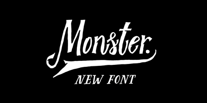 Monster DD is a decorative vintage font in modern performance. It is perfect for: Logos Posters Labels Headlines Apparel Tattoo & more Monster DD comes with upper and lowercase characters, numbers, marks and punctuation. Multilingual support Enjoy!
 - dT Jakob by dooType,
$30.00 dT Jakob started as a revival by Gustavo Soares for Paul van der Laan’s class at the Type and Media Masters, in The Hague, NL – back in 2007. There are quite a few excellent geometric sans typefaces available, but we did want to make our contribution and have a fine geometric face to offer. dT Jakob was born out of Erbar, by Jakob Erbar, one of the very first geometric sans, released in metal around 1926. Our goal was to make a versatile typeface, that handles display and text typography beautifully. To achieve that we designed a complete range of weights, matching italics and lots of OpenType Features. Hope you enjoy it :D
 - Engravers DT by DTP Types,
$49.00Based on custom design work by DTP Types Limited in 1990. - dT Delicatta by dooType,
$40.00 Easy to use, but hard to miss. That’s dT Delicatta. An elegant script face that adds a special touch to any message. Script typefaces usually come packed with endless features and, more often then not, all those possibilities take their toll on the designer or art director. With usability in mind, we kept dT Delicatta simple and straightforward to use while delivering refined shapes that enhance your or your client’s communication. dT Delicatta is a revised, improved and virtually new font of our old classic Delicatta
 - Birac DT by DTP Types,
$49.00This design is based on custom design work by DTP Types Limited in 1990. - DT Lythmore by Dragon Tongue Foundry,
$9.00 Lythmore This font is called Lythmore and is inspired by Lithos. Lithos was originally designed for Adobe by Carol Twombly in 1990, based it on the lettering from ancient Greek inscriptions. The Capitals are similar in feel and design, but is totally original and built from scratch. It is designed to be similar intentionally, but it is not a clone or rip off. Lithos is an example of a simple blocky san serif font style, with subtly concave sides, angled ends, and off centred curves. Lythmore is also an example of that same style. But is also different in places where I felt it could be improved. And it has a complete lower case set, which Lithos doesn't. I built Lythmore with 8 different weights. Lythmore can be very effective when used in advertising and general display work, but it can also be used for much more. Although it was never designed to be body copy, when used as such, it is still perfectly readable and adds its own version of sans serif style and flavour. I have included two versions of the Lythmore family. Lythmore A and Lythmore B. In the Lythmore A family, the lighter 4 weights all vary in weight in both the horizontal and vertical axis. The heavier 4 weights all vary in the horizontal axis only. In the Lythmore B family, the transition is even in both directions across the entire family. The result of this difference is that the A and B versions difference is most noticeable between the Regular and Medium weights. While the extreme ends of each family version are virtually identical.
 - Triest DT by DTP Types,
$49.00Based on custom design work by DTP Types Limited in 1990. - DT Skiart by Dragon Tongue Foundry,
$30.00 Looking for something between a Serif and Sans Serif font? Try the DT Skiart font. This high quality, versatile font has the professional feel of a Serif, but has the open readability of a Sans Serif. A smart crisp font with smooth simple lines. It has a medium to strong stroke contrast, with the vertical line being heavier than the horizontal line, and no serifs. The DT Skiart family is made up of 5 weights in both italic and normal.
 - Berstrom DT by DTP Types,
$49.00This design is based on custom design work by DTP Types Limited in 1990 with associated Small Capitals and Old Style Figures. - DT Partel by Dragon Tongue Foundry,
$9.00 DT Portal: This stylised, partially serifed font, made with a slightly rounded square form, may have been inspired initially by old cathode ray tubes and computer screens. Although not intended to be purely a ‘tech’ font, it can have a strong tech feel to it. More suited to being a headline font than body text. It also appears to have a monospaced look to it, since most letters, (other than letters like ‘i, l and t’), do have the same width. There is some automatic contextual shape adjustment happening in places, to avoid taking up too much space, so contextual ligatures should be turned on. As is the case with most of my fonts, when given the choice, ‘metric’ spacing should be used in preference to ‘optical’. Initially this font was going to be called ‘DT Portal’, because its form was similar to that of a window or doorway. But due to other fonts already having that name, I chose to rename it as ‘DT Partel’, for no reason other than it is only a very small change visually.
 - EvilGenius BB - Personal use only

- BAHAMAS TWO PERSONAL USE - Personal use only

- National First Font Dotted - Unknown license

- Modern Dot Digital-7 - Personal use only

- Advanced Dot Digital-7 - Personal use only

- Small Dot Digital-7 - Personal use only

- Iron Lounge Smart Dot - Unknown license

- Iron Lounge Dots 2 - Unknown license

- Display Dots Two Serif by Gerald Gallo,
$20.00 Display Dots Two Serif is a display font not intended for text use. It, along with its sans counterpart were designed specifically for display, headline, logotype, branding, and similar applications. Display Dots Two Serif has an uppercase alphabet, numbers, and punctuation.
 - Display Dots Three Sans by Gerald Gallo,
$20.00 Display Dots Three Sans and Serif are display fonts not intended for text use. They were designed specifically for display, headline, logotype, branding, and similar applications. Display Dots Three Sans and Serif include an uppercase alphabet, numbers, and punctuation.
 - Display Dots Three Serif by Gerald Gallo,
$20.00 Display Dots Three Sans and Serif are display fonts not intended for text use. They were designed specifically for display, headline, logotype, branding, and similar applications. Display Dots Three Sans and Serif include an uppercase alphabet, numbers, and punctuation.
 - Display Dots Four Sans by Gerald Gallo,
$20.00 Display Dots Four Sans and Serif are display fonts not intended for text use. They were designed specifically for display, headline, logotype, branding, and similar applications. Display Dots Four Sans and Serif include an uppercase alphabet, numbers, and punctuation.
 - Display Dots Four Serif by Gerald Gallo,
$20.00 Display Dots Four Sans and Serif are display fonts not intended for text use. They were designed specifically for display, headline, logotype, branding, and similar applications. Display Dots Four Sans and Serif include an uppercase alphabet, numbers, and punctuation.
 - Display Dots Two Sans by Gerald Gallo,
$20.00 Display Dots Two Sans is a display font not intended for text use. It, along with its serif counterpart were designed specifically for display, headline, logotype, branding, and similar applications. Display Dots Two Sans has an uppercase alphabet, numbers, and punctuation.


