6,800 search results
(0.022 seconds)
- Castanea by Hanoded,
$20.00 The chestnut ("castanea") is one of my favorite trees. I used to collect the chestnuts and made chestnut-figurines out of them, using bamboo sate skewers. Castanea font is a calligraphic typeface with an uneven baseline and some messy characters - not unlike the tree. It is a highly legible, highly enjoyable font and could be used for children's books and postcards. Castanea comes with various alternate glyphs and speaks most Roman-based languages!
 - TT Ricordi Allegria by TypeType,
$29.00 Please note! If you need OTF versions of the fonts, just email us at commercial@typetype.org TT Ricordi Allegria useful links: Specimen | Graphic presentation | Customization options TT Ricordi Allegria is a sleek and intelligent contemporary Florentine grotesque inspired by the half-erased lettering in Basilica di Santa Croce, Florence. TT Ricordi Allegria was drawn by Antonina Zhulkova and reflects in its graphics the transitional stage between the classic serif with varying proportions, gravitating towards the Roman capital type, and the Florentine sans serif. The font is characterized by variability in the proportions of characters, contrast between strokes, wedge-shaped triangular characters, and the absence of traditional serifs. The main visual feature of the typeface is its diversity and the ability, using different stylistic sets, to completely change the character and perception of the typeface. The drawing of the characters from the main set is strict, thanks to which the font looks stern, as if the inscription in the font was really carved out of stone. And with the help of another set, we can add roundness, or even smoothness, to the font. This is due to the fact that the letters (E R K Q J Y in Latin, and Л К Ж Э in Cyrillic) from the second set have either very noticeable "curls" or smooth, rounded "legs". In addition, the typeface includes a set of beautiful ligatures for use in display inscriptions, such as large headlines. An interesting moment when working on the typeface was the creation of the Cyrillic typeset, since the Cyrillic alphabet does not so easily fit into the concept of the Florentine grotesque and stressed semi-serif. The most difficult thing in working on the Cyrillic alphabet was to create a system of spacing for characters, as it was done in the Latin alphabet, and to make sure that when typing in Cyrillic, the drawing of the text remained beautiful. That is why the letters Д Л У Ы appearing in the font family are somewhat unusual to the eye, and the proportions of other characters in Cyrillic are not quite “classic” either. In general, the Cyrillic set looks more display than its Latin prototype, but at the same time it lacks the sense of historicity or legacy of the Soviet past, which often comes to the foreground when working on the design of the Cyrillic alphabet in this type of serifs. TT Ricordi Allegria consists of two weights (Regular and Bold) and one variable font. Each style includes over 750 characters, as well as 19 OpenType features. Interesting features of the typeface include three stylistic sets that greatly change the perception of the font, a set of bright display ligatures, a few neat icons that are suitable for breaking text and will emphasize the visual language of the font. Please note! If you need OTF versions of the fonts, just email us at commercial@typetype.org FOLLOW US: Instagram | Facebook | Website
 - Lydian by Bitstream,
$29.99Lydian is Warren Chappell’s almost calligraphic sanserif, designed for ATF in 1938. Lydian Cursive, done by Chappell in 1940, is much freer and more calligraphic. - Garish by Sylvestre Studios,
$10.00 Garish was inspired by how trees curl and twist their roots into the ground. At how they stretch up desperate to scratch up into heaven.
 - Punten by LucasFonts,
$19.00 Type designer Luc(as) de Groot has a large archive of lettering he drew by hand, often to accompany the quirky cartoons which he made in his visual diaries. Only a few of these alpahabets have been digitized into full-fledged typefaces. Punten (Dutch for "points" or "spikes") is one of them. It comes in three styles of varying legibility: Punten Straight, Punten Extremo, and Punten Rondom (Dutch for "all around").
 - Juvenis by Storm Type Foundry,
$32.00Designs of characters that are almost forty years old can be already restored like a historical alphabet – by transferring them exactly into the computer with all their details. But, of course, it would not be Josef Tyfa, if he did not redesign the entire alphabet, and to such an extent that all that has remained from the original was practically the name. Tyfa published a sans-serif alphabet under the title Juvenis already in the second half of the past century. The type face had a large x-height of lower-case letters, a rather economizing design and one-sided serifs which were very daring for their time. In 1979 Tyfa returned to the idea of Juvenis, modified the letter “g” into a one-storey form, narrowed the design of the characters even further and added a bold and an inclined variant. This type face also shows the influence of Jaroslav Benda, evident in the open forms of the crotches of the diagonal strokes. Towards the end of 2001 the author presented a pile of tracing paper with dozens of variants of letter forms, but mainly with a new, more contemporary approach: the design is more open, the details softer, the figures and non-alphabetical characters in the entire set are more integral. The original intention to create a type face for printing children’s books thus became even more emphasized. Nevertheless, Juvenis with its new proportions far exceeds its original purpose. In the summer of 2002 we inserted all of this “into the machine” and designed new italics. The final computer form was completed in November 2002. All the twelve designs are divided into six variants of differing boldness with the corresponding italics. The darkness of the individual sizes does not increase linearly, but follows a curve which rises more steeply towards the boldest extreme. The human eye, on the contrary, perceives the darkening as a more fluent process, and the neighbouring designs are better graded. The x-height of lower-case letters is extraordinarily large, so that the printed type face in the size of nine points is perceived rather as “ten points” and at the same time the line spacing is not too dense. A further ingenious optical trick of Josef Tyfa is the figures, which are designed as moderately non-aligning ones. Thus an imaginary third horizontal is created in the proportional scheme of the entire type face family, which supports legibility and suitably supplements the original intention to create a children’s type face with elements of playfulness. The same applies to the overall soft expression of the alphabet. The serifs are varied; their balancing, however, is well-considered: the ascender of the lower-case “d” has no serif and the letter appears poor, while, for example, the letter “y”, or “x”, looks complicated. The only serif to be found in upper-case letters is in “J”, where it is used exclusively for the purpose of balancing the rounded descender. These anomalies, however, fit perfectly into the structure of any smoothly running text and shift Juvenis towards an original, contemporary expression. Tyfa also offers three alternative lower-case letters *. In the case of the letter “g” the designer follows the one-storey form he had contemplated in the eighties, while in “k” he returns to the Benda inspiration and in “u” adds a lower serif as a reminder of the calligraphic principle. It is above all the italics that are faithful to the tradition of handwritten lettering. The fairly complicated “k” is probably the strongest characteristic feature of Juvenis; all the diagonals in “z”, “v”, “w”, “y” are slightly flamboyant, and this also applies to the upper-case letters A, V, W, Y. Juvenis blends excellently with drawn illustrations, for it itself is modelled in a very creative way. Due to its unmistakable optical effect, however, it will find application not only in children’s literature, but also in orientation systems, on posters, in magazines and long short-stories. - Cantarell - 100% free

- Sure! The New Alphabet font is an intriguing and avant-garde typeface with a fascinating history and purpose behind its design. Created in 1967 by Wim Crouwel, a notable figure in the Dutch graphic d...
- TT Tsars by TypeType,
$39.00 TT Tsars useful links: Specimen | Graphic presentation | Customization options The TT Tsars font family is a collection of serif display titling fonts that are stylized to resemble the fonts of the beginning, the middle and the end of the XVIII century. The project is based on title fonts, that is, the fonts that were used to design book title pages. The idea for the project TT Tsars was born after a small study of the historical development of the Cyrillic type and is also based on Abram Shchitsgal’s book "Russian Civil Type". At the very beginning of the project, we had developed a basic universal skeleton for the forms of all characters in all subfamilies of the family, and later on, we added styles, visual features, artifacts and other nuances typical of the given period onto the skeleton. Yes, from the historical accuracy point of view it might be that such an approach is not always justified, but we have achieved our goal and as a result, we have created perfectly combinable serifs that can be used to style an inscription for a certain time period. The TT Tsars font family consists of 20 fonts: 5 separate subfamilies, each of which consists of 4 fonts. Each font contains 580 glyphs, except for the TT Tsars E subfamily, in which each font consists of 464 characters. Instead of lowercase characters in the typeface, small capitals are used, which also suggests that the typeface is rather a display than text one. In TT Tsars you can find a large number of ligatures (for Latin and Cyrillic alphabets), arrows and many useful OpenType features, such as: frac, ordn, sinf, sups, numr, dnom, case, onum, tnum, pnum, lnum, salt (ss01), dlig. Time-related characteristics of the subfamilies are distributed as follows: • TT Tsars A—the beginning of the 18th century (Latin and Cyrillic) • TT Tsars B—the beginning of the 18th century (Latin and Cyrillic) • TT Tsars C—the middle of the 18th century (Latin and Cyrillic) • TT Tsars D—the end of the 18th century (Latin and Cyrillic) • TT Tsars E—conditionally the beginning of the 18th century (only Latin) TT Tsars A and TT Tsars B families (both the beginning of the 18th century) have different starting points: for TT Tsars A it is Latin, for TT Tsars B it is Cyrillic. The development of the TT Tsars A family began in Latin, the font is based on the royal serif Romain du Roi. The Cyrillic alphabet is harmoniously matched to the Latin. The development of the TT Tsars B family began in Cyrillic, which is based on a Russian civil type. Characteristic elements are the curved one-sided serifs of triangular characters (A, X, Y), drops appear in the letter ?, the middle strokes ? and P are adjacent to the main stroke. Latin was drawn to pair with Cyrillic. It is still based on the royal serif, but somewhat changed: the letters B and P are closed and the upper bar of the letter A rose. This was done for the visual combination of Cyrillic and Latin and at the same time to make a distinction between TT Tsars A and TT Tsars B. TT Tsars C is now the middle of the 18th century. Cyrillic alphabet itself did not stand still and evolved, and by the middle of the 18th century, its forms have changed and become to look the way they are shown in this font family. Latin forms are following the Cyrillic. The figures are also slightly modified and adapted to the type design. In TT Tsars C, Cyrillic and Latin characters are created in parallel. A distinctive feature of the Cyrillic alphabet in TT Tsars C is the residual influence of the flat pen. This is noticeable in such signs as ?, ?, K. The shape of the letters ?, ?, ?, ? is very characteristic of the period. In the Latin alphabet, a characteristic leg appears at the letter R. For both languages, there is a typical C characterized by an upper serif and the appearance of large, even somewhat bolding serifs on horizontals (T, E, ?, L). TT Tsars D is already the end of the 18th century when with the development of printing, the forms of some Cyrillic characters had changed and turned into new skeletons of letters that we transposed into Latin. The figures were also stylized. In this font, both Cyrillic and Latin are stylistically executed with different serifs and are thus logically separated. The end of the century is characterized by the reduction of decorative elements. Straight, blueprint-like legs of the letters ?, R, K, ?. Serifs are very pronounced and triangular. E and ? are one-sided on the middle horizontal line. A very characteristic C with two serifs appears in the Latin alphabet. TT Tsars E is a steampunk fantasy typeface, its theme is a Latinized Russian ?ivil type (also referred to as Grazhdansky type which emerged after Peter the Great’s language reform), which includes only the Latin alphabet. There is no historical analog to this typeface, it is exclusively our reflections on the topic of what would have happened if the civil font had developed further and received a Latin counterpart. We imagined such a situation in which the civil type was exported to Europe and began to live its own life.
 - Merry Bauble Letters by Greater Albion Typefounders,
$6.00 Merry Bauble Letters is designed to complement our 'Merry Baubles' fleuron typeface. Quite simply, it's a set of Christmas Tree ornaments with letters painted on them…
 - Janda Manatee Solid - Personal use only

- MINECRAFT PE - Personal use only

- KG Shadow of the Night - Personal use only

- KG God Gave Me You - Personal use only

- Blessings through Raindrops - Personal use only

- Airport Cyr - Unknown license

- A Truly Hook by Javanice Studio,
$16.00 Introducing Truly Hook by Javanice Studio a Truly Hook is A Handwritting Font a Truly Hook is perfect for branding project, apparel, labels, magazines, books, greeting / wedding cards, packaging, fashion, make up, stationery, and any type of advertising purpose or just used to express words above the background. This font includes a Truly Hook also multilingual support. Enjoy the font, feel free to comment or feedback, send me PM or email.
 - Willow Eden by Balpirick,
$15.00 Willow Eden is a Modern Handwritten Font. Willow Eden is a magical script font carefully created with a touch of elegance. Whether you’re looking for fonts for Instagram or calligraphy scripts for DIY projects, this font will turn any creative idea into a true piece of art! Willow Eden also multilingual support. Enjoy the font, feel free to comment or feedback, send me PM or email. Thank you!
 - Ballum by Luxfont,
$38.00 Get ready for a font revolution with the Bllum SVG script color font family. This is a unique calligraphic color font. Writing immediately with 3D realistic letters is now real. Create a stunning visual effect. Features: - Real Plastic effect - Extras & ligatures - Alternates characters - Kerning IMPORTANT: - Check the glyphs in the font before buying! - SVG fonts contain raster letters. - Check it www.colorfonts.wtf - Try a FREE DEMO version before buying. ld.luxfont@gmail.com
 - Kristian Paradise by Timurtype,
$14.00 Introduced by Timurtype Studio! Kristian Paradise is a Handwritten Script Font This font is mesmerizing handwritten script that adds a touch of elegance to your design, complete with enchanting swashes and a graceful underline. Elevate your creations with the perfect blend of style and sophistication Kristian Paradise Font also supports multilingualism. Enhance your designs with our original fonts, feel free to comment or provide feedback, Enjoy the fonts 😊
 - IC Grand Melton by Ironbird Creative,
$15.00 IC Grand Melton is a powerful display typeface inspired by vintage type with carefully crafted. This typeface is perfect for people looking for vintage aesthetics. Suitable for any graphic designs such as branding materials, shirts, print, logos, poster, t-shirt, quotes .etc We hope you enjoy the font, please feel free to comment if you have any thoughts or feedback. Thanks for purchasing and have fun! Regards, Ironbird Creative
 - Classic Fairy by Timurtype,
$14.00 Introduced by Timurtype Studio! Classic Fairy is a Monoline Handwriting Font This font showcases the art of monoline handwritten fonts – a symphony of elegance and charm. Let charming threads weave a tale of elegance in your designs, where every curve whispers sophistication and timeless appeal Classic Fairy Font also supports multilingualism. Enhance your designs with our original fonts, feel free to comment or provide feedback, Enjoy the fonts 😊 Thank You
 - Charriot Deluxe by Jelloween,
$-Charriot Deluxe was released in early 2006 at deviantArt.com - where it received a Daily Deviation frontpage feature - and daFont.com. It has already been downloaded over 20.000 times and now it's your turn to try this sexy pixelfont, absolutely free of charge! Charriot Deluxe has all letters, numbers, punctuation and (currency) symbols to suit your needs and is best used at (any multiple) of size 10pt without anti-aliasing. - Realistic Harvest by Timurtype,
$14.00 Introduced by Timurtype Studio! Realistic Harvest is a Handwritten Script Font this font Captivates with elegance Handwritten font, where every curve reveals a story of elegance and every detail is a brushstroke of luxury. A visual symphony for those who appreciate the art of beauty. Realistic Harvest Font also supports multilingualism. Enhance your designs with our original fonts, feel free to comment or provide feedback, Enjoy the fonts Thank You
 - Cupid Hearts by OzType.,
$16.00 Cupid Hearts is a hand written script, first drawn on paper and then remastered on the computer to give a smooth free flowing script,that looks perfect over the top of photos or as a logo. With 20 alternate style sets this lovely and friendly typeface take the stress out of finding fonts that match together so you can focus on what you want to do which is designing beauty work.
 - Jorell Lieven by Javanice Studio,
$16.00 Introducing Jorell Lieven by Javanice Studio Jorell Lieven is A Playful Handwritten Font Jorell Lieven is perfect for branding project, apparel, labels, magazines, books, greeting / wedding cards, packaging, fashion, make up, stationery, and any type of advertising purpose or just used to express words above the background. This font includes, Jorell Lieven also multilingual support. Enjoy the font, feel free to comment or feedback, send me PM or email.
 - Bebas Neue Semi Rounded by Dharma Type,
$4.99 Bebas Neue SemiRounded is the Bebas Neue with rounded corners. As you know, Bebas Neue is the most widely used free font recently. This semi-rounded version is the new style for more widely use. The basic theory and proportion are same as Bebas Neue but rounded shape gives a warm, soft and natural impression. A bit more rigid than Bebas Neue Rounded. Available at an affordable price.
 - Nirma by madeDeduk,
$15.00 Introducing Nirma Display Typeface, use this font for any branding, product packaging, invitation, quotes, t-shirt, label, poster, logo etc. Feature Uppercase & Lowercase Number & Symbol International Glyphs Multilingual support Feel free to drop us a message any time and follow my shop for upcoming updates Shoot me on email at: dedukvic@gmail.com and find more previews on my Instagram here : https://www.instagram.com/acekelgondolayu/?hl=en Hope you enjoy it.
 - Buckey Petty by Javanice Studio,
$16.00 Introducing Buckey Petty by Javanice Studio Buckey Petty is A Handwritten Script Font Buckey Petty is perfect for branding project, apparel, labels, magazines, books, greeting / wedding cards, packaging, fashion, make up, stationery, and any type of advertising purpose or just used to express words above the background. This font includes Buckey Petty also multilingual support. Enjoy the font, feel free to comment or feedback, send me PM or email.
 - Rayleigh by Allouse Studio,
$16.00 Rayleigh a Handwritten font. Rayleigh come along with Stylistic Alternate, Swash, Underline Style and Multi-Lingual Support which will give you many choices to play around. We highly recommend using a program that supports OpenType features and Glyphs panels like many of Adobe apps and Corel Draw, so you can see and access all Glyph variations. Enjoy the font, feel free to comment or feedback, send me PM or email.
 - Aron Wergel by madeDeduk,
$12.00 Aron Wergel is a Futuristic sans come with two style regular and rough. You can explore and combine creating rhythm and texture for comfortable reading. Use this font for any branding, product packaging, invitation, quotes, headline, label, poster, logo etc. Feature Uppercase & Lowercase Number & Symbol International Glyphs Multilingual support Alternative Ligature Feel free to drop us a message any time and follow my shop for upcoming updates Hope you enjoy it.
 - Sadila by Khoir,
$15.00 Sadila is a simple serif. Supported by alternatives that make it look luxurious so it is suitable for all types of projects such as branding, quotes, cover design, films, web design, packaging, social media, logo design and many more, what are you waiting for! What's included? Uppercase Characters Lowercase Characters Support 75+ Language So what are you waiting for? immediately purchase this font, feel free to email at khoirtypework@gmail.com
 - Rock Concert JNL by Jeff Levine,
$29.00 Rock Concert JNL is a playful free form type design inspired by the opening title and credits for the 1964 motion picture comedy “Send Me No Flowers” starring Rock Hudson, Doris Day, and Tony Randall. Strongly resembling hippie movement poster lettering of the mid-1960s, this fonts fits well with any retro project emulating the “Peace and Love” movement or (as its name implies) re-creating period piece rock concert posters.
 - Landsknecht by Kaer,
$21.00 Hey! I'm happy to introduce to you my new font. Landsknecht is a blackletter style calligraphy font. Do you need to design perfect alcohol labels, retro style logos, music album covers, circus posters, luxury packaging identity, etc.? If you want dark and strong medieval style concepts, please try it. You’ll get: * Uppercase and lowercase * Multilingual support * Numbers * Symbols * Punctuation * Ligatures Please feel free to request any help you need. Best, Roman.
 - Cannoli by Eurotypo,
$36.00 Cannoli is a brush lettering style font, designed specially for use in logotypes, advertising and packaging. It is interesting to note the use of free-flowing lettering to perform its own eye-catching. This vintage typeface is a reminiscent of the posters of the 50s, painted with a brush in enamel advertising signs. Cannoli was inspired by the delicacy of the Sicilian pastry, and the robust charm of its landscape.
 - Prime Style by Hatftype,
$15.00 Prime Style - Graffiti Display Font is a free style font that has the characteristics of street art that shows freedom and is filled with unique characters. Features : • Character Set A-Z • Numerals & Punctuations (OpenType Standard) • Accents (Multilingual characters) • Ligature • Alternate There it is. I really hope you enjoy it. Comments & likes are always welcome and accepted. More importantly, don't hesitate to send a message if you have a problem or question.
 - Bubbly by Gatype,
$16.00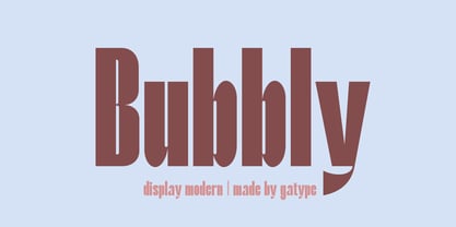 Stylish Bubbly Display with bold looking letters and Harmonious Impact to form a unique & elegant typography design. Perfect for branding projects, logos, wedding designs, social media posts, advertising, product packaging, product design, labels, photography, watermarks, invitations, stationery and any project. . uppercase and lowercase . multilingual symbol . number . punctuation . What will you get? Hope you enjoy our fonts and if you have any questions feel free to message & I'm happy to help
 - Chirpy by Letterhend,
$10.00 Chirpy is a playful yet casual typeface which is suitable to use in fun and playful design. This font is comes in uppercase, lowercase, punctuations, symbols & numerals, stylistic set alternate, ligatures, etc. We hope you enjoy the font, please feel free to comment if you have any thoughts or feedback. Or simply send me a PM or email me at letterhend@gmail.com. Thanks for purchasing and have fun!
 - XXII Centar by Doubletwo Studios,
$19.00 Centar Sans is a simple, modern, universal, powerful, invisible but not characterless, sans serif family. The family is designed for identities & corporate projects. Its wide range of styles covers lots of possibilities of use, from headlines to texts. It supports a lot of languages including cyrillic and comes along with 19 OpenType features - Small Caps, ligatures, alternates and many more. Regular styles are FREE! Extended detail here. or here.
 - North Avellion by Letterhend,
$16.00 North Avellion has a classic style yet still looks great for modern design. It works perfectly for headlines, logotypes, apparel, invitations, branding, packaging, advertising, and more. Features : uppercase & lowercase numbers and punctuation multilingual ligatures alternates swashes PUA encoded We hope you enjoy the font, please feel free to comment if you have any thoughts or feedback. Or simply send me a PM or email me at letterhend@gmail.com


