10,000 search results
(0.045 seconds)
- Total Black by Resistenza,
$39.00 Say hello to our first Sans Serif, a modern font family inspired by classic grotesk typefaces. It features 9 weights, including Italics and a formidable Display version. It has a clean, neutral look that is perfect for all types of graphic design projects. Its ample character set, including Standard and Contextual Alternate, ensures excellent typesetting performance. Sans Serif offers good readability and a strong, serious tone, perfect for logos, magazines and more.
 - Sublima by Punchform,
$29.00 Sublima is meticulously designed to adapt its personality to any project. With 302 alternative characters and 18 stylistic sets, you get unlimited power to take your creativity to the next level. Sublima is the smartest choice for any creative project. With a single click, you can change its typographic personality and adapt it to your desired style. Choose between 3 predefined styles or create your own style by combining the hundreds of alternate characters available.
 - Rodfat by Rizki Permana,
$15.00 Rodfat is a gorgeous, old-timey display font with a modern feel! Inspired by the industrial revolution, It will bring back the early days of the 20th century. This collection comes in two styles: One and Two. It is possible to be paired perfectly when used together. Perfectly suited for any display use. It could easily work for design product names, posters, signage, packages, logos, labels, and eye-pleasing typographic designs and more.
 - Black Crow by Fractal Font Factory,
$12.00 Black Crow is a display sans-serif type family includes eight weights. It is influenced by the geometric-style sans-serif faces that were popular during the 1920s and 30s. The styles are based on geometric forms that have been optically corrected for better legibility. Black Crow has a functional look with a hard touch. It is manually hinted and optimized for screens, so it will be a good choice for Websites, eBooks or Apps.
 - Sorbet by Adriprints,
$5.00 Sorbet was designed with freshness and youth in mind. Sorbet is a casual, sans-serif font perfect for scrapbooking, teaching, and everyday notes in mind. It is a modest type with lots of potential. What was the inspiration for designing the font? Sorbet was inspired by fresh, casual, handwriting. What are its main characteristics and features? It is legible, sans serif, includes standard encoding (umlauts, etc) Usage recommendations - teaching, everyday, invitations, novelty, scrapbooking
 - Technical Forest by Maciej Świerczek,
$- Design style ready to use in headlines, tags and quotes refering to technology, sci-fi, modern economy and more recent themes. The name of this font is connected to its simplicity and combination of its soft and sharp style in lines - just like tree branches and leaves. Also inspired by block form of runes - related to nature in its full floral character. However kept in clear and precisely designed form of technical font.
 - Kinder by 1871 Project,
$15.00 Introducing Kinder, our first serif font featuring both upper and lowercase characters! Featuring unique beautiful curves and a modern feel (look at that K!) Inspired by old records and packaging designs, with an 1871 spin. It has a beautiful range of stylistic alternates with unique characters making it a versatile powerhouse for logos, headlines, posters, shirts, you name it! Pick up Kinder today and make the world more beautiful with your creations!
 - Turis by Punchform,
$29.00 Turis is meticulously designed to adapt its personality to any project. With 241 alternative characters and 20 stylistic sets, you get unlimited power to take your creativity to the next level. Turis is the smartest choice for any creative project. With a single click, you can change its typographic personality and adapt it to your desired style. Choose between 3 predefined styles or create your own style by combining the hundreds of alternate characters available.
 - Cosmata by MauldinType,
$15.00 Cosmata is geometric sans serif family of 10 fonts suitable for both display and reading use. Inspired by Futura, Cosmata developed its own complex, unique life. To that end, I've included alternate letterforms for a finely-tailored typographic experience. The rhythm, kerning, and spacing have been lovingly crafted for an elegant reading experience. I'm excited to share this release with you and hope you enjoy using it as much as I did creating it.
 - Vecmetry by Velvele,
$10.99 This font is more than just letters, it’s inspired by VECTOR ART. It’s name, VECMETRY' comes from the combination of vector and geometry, that’s why it keeps the most basic elements of design: circle, square and triangle. Vecmetry family has 4 LAYER ABLE FONTS and offers endless combinations; and this makes it especially perfect for headlines and logos. Besides, it supports 5 different languages: ENGLISH, ESPAÑOL, FRANÇAIS, ITALIANO and TÜRKÇE. _(189 glyphs)_
 - Morpheus Dream by Artisticandunique,
$15.00 Morpheus Dream - Serif font family - Multilingual - 12 Styles This font family help you develop your creative projects with its 12 styles and multilingual supports. It was inspiration from Greek mythology. The characters that make up its structure were influenced by the carved letters in the old stone inscriptions. Ideal for books and magazines, editorials, headlines, websites, logos, branding, advertising and more. This font family can meet your needs in all creative projects, modern and classic.
 - Sphera by Lorenzo Vecchiotti,
$17.00 Sphera is the second font designed by Lorenzo Vecchiotti in 2022. It is composed entirely of circles or portions of a circle. Each capital letter touches the four sides of a square. It is a thin, elegant and geometric display font that is at its best in large sizes. 2 styles 185 glyphs for each style 14 ligatures Italian, english, french, spanish, german, danish Bigger images here: https://www.behance.net/gallery/162117209/Sphera-Display-Font
 - Better Smile by Heinzel Std,
$19.00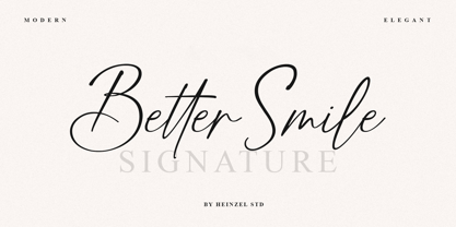 Better Smile Signature is a flowing handwritten font, described by an elegant touch, perfect for your favorite projects. It looks stunning on wedding invitations, thank you cards, quotes, greeting cards, logos, business cards and every other design which needs a handwritten touch. Fall in love with its incredibly distinct and timeless style and use it to create spectacular designs! Better Smile Features : Uppercase and Lowercase Numerical and Punctuation Ligatures PUA Encoded Multilingual Support
 - Jenriv by Linh Nguyen,
$25.00 Inspired by designs of the early Renaissance, Jenriv brings out a sedate atmosphere and generous inner spaces. Starting with the idea of mixing straightforward strokes and curves, it results in kind masculine figures, but calm and humble. It reminds some archaic air but a simplified one. Jenriv embraces text flows, multiple languages, and various styles with standard OpenType features. It is well adapted to various applications, from medium body text to large headlines, or logotypes.
 - Mozziano by Mostardesign,
$15.00 Created in 2010 by Olivier Gourvat, Mozziano is an elegant cross between geometric and round shapes. Its post-retro style opposes also fine and thick lines. This font can be used for very short texts however it is particularly effective for headlines in larger point sizes so that its details are emphasized. Mozziano best used in experimental designs. Mozziano contain an extensive character set that includes support for Central and Eastern European languages.
 - Flamingo by URW Type Foundry,
$35.99 The design of the typeface Flamingo by Dior Sirous was inspired by this beautiful bird, creating long slim lines with soft curves at the ends. It is best suited for display use in Art Deco style.
 - Handy Cut by Los Andes,
$34.00 Handy Cut is an experimental project inspired by paper cutting only using fingers, designed by Paty Bean from south Chilean farm. It includes dingbats and alternate characters to play with in expressive and irregular short texts.
 - Walkingblue by LetterStock,
$25.00 Walkingblue This pair was inspired by old motorcycle poster design that i saw on some gellery, It was crafted by hand specially to add natural handmade feeling in its brand identity than i make it clean with pentool. We add some rough to make it retro feel, this font is bold so it can look strong if you use it for branding or even title for your retro poster design. Opentype features Walkingblue font has 204 character set included Walkingblue Font is very good looking in retro rough logotype, labels, t-shirt prints, product packaging, invitations, advertising and others. This fonts works with folowing languages: Afrikaans, Albanian, Asu, Basque, Bemba, Bena, Chiga, Cornish, Danish, English, Estonian, Filipino, Finnish, French, Friulian, Galician, German, Gusii, Indonesian, Irish, Italian, Kabuverdianu, Kalenjin, Kinyarwanda, Low German, Luo, Luxembourgish, Luyia, Machame, Makhuwa-Meetto, Makonde, Malagasy, Malay, Manx, Morisyen, North Ndebele, Norwegian Bokmål, Norwegian Nynorsk, Nyankole, Oromo, Portuguese, Romansh, Rombo, Rundi, Rwa, Samburu, Sango, Sangu, Scottish Gaelic, Sena, Shambala, Shona, Soga, Somali, Spanish, Swahili, Swedish, Swiss German, Taita, Teso, Vunjo, Zulu Thank you for using this font. LS
 - Flinders by Eko Bimantara,
$24.00 Flinders is a modern humanist sans serif font family designed by Eko Bimantara in 2023. This typeface is intended to be used for various reading purposes and has letterforms optimized for legibility and ease of reading. The styles of Flinders are a sans serif interpretation of classical roman proportions, characterized by a low x-height, subtle calligraphic strokes, angled stroke ends, and open counters and apertures. Flinders is a versatile typeface that is readable in both large and small sizes. Its legibility makes it an excellent choice for body text in books, magazines, and newspapers, while its modern design and open counters make it well-suited for digital screens and web design. Flinders can also be used for branding and identity design, as well as packaging and signage. Overall, Flinders is a contemporary and readable typeface that is suitable for a wide range of design projects. Its humanist characteristics and modern design make it a unique and versatile option for designers looking for a typeface that combines classical proportions with contemporary style.
 - Croftler by LetterStock,
$23.00 Croftler This pair was inspired by old motorcycle poster design that i saw on some gellery, It was crafted by hand specially to add natural handmade feeling in its brand identity than i make it clean with pentool. We add some rough to make it retro feel, this font is bold so it can look strong if you use it for branding or even title for your retro poster design. Opentype features Croftler font has 201 character set included Walkingblue Font is very good looking in retro rough logotype, labels, t-shirt prints, product packaging, invitations, advertising and others. This fonts works with folowing languages: Afrikaans, Albanian, Asu, Basque, Bemba, Bena, Chiga, Cornish, Danish, English, Estonian, Filipino, Finnish, French, Friulian, Galician, German, Gusii, Indonesian, Irish, Italian, Kabuverdianu, Kalenjin, Kinyarwanda, Low German, Luo, Luxembourgish, Luyia, Machame, Makhuwa-Meetto, Makonde, Malagasy, Malay, Manx, Morisyen, North Ndebele, Norwegian Bokmål, Norwegian Nynorsk, Nyankole, Oromo, Portuguese, Romansh, Rombo, Rundi, Rwa, Samburu, Sango, Sangu, Scottish Gaelic, Sena, Shambala, Shona, Soga, Somali, Spanish, Swahili, Swedish, Swiss German, Taita, Teso, Vunjo, Zulu Thank you for using this font. LS
 - Risotto Script by Estudio Calderon,
$69.00 Risotto Script is a sexy font designed by Felipe Calderón, it represents the texture, sound, smell and flavor of food that come in those interesting packages with different concepts. This font makes you want to eat it because it is designed with a unique texture like a lot of vegetables, it has flourishes that suggest herbs and country roots. Calligraphy with folded pen and food packaging were two of the inspirations to develop this project that will work well wherever it is applied. Risotto Script Pro has 672 glyphs that have the purpose of covering a lot of writing options with different results, by applying OpenType programming as: - Standard ligatures - Stylistics alternatives - Contextual alternates - Discretionary ligatures - Swashes - Terminal forms - Stylistic Set 1, 2, 3 and 4 - Initials (it includes leaves in some endings) NOTE: The X height is generous, in order to design signs to 8 and low size. You`d better get the “extras” for a more complete experience. Most of the Standard ligatures include Stylistics alternatives with detailed endings Multiple language options.
 - Buddy jim - Unknown license

- Imperio by Juan I. Siwak,
$40.00 Imperio is a font inspired by old posters, especially those related to constructivism and futurism. It reflects both the rationalism of Bauhaus as a propagandist and revolutionary spirit of an era. On the other hand it is not nostalgic, but instead looks for its own way to get diagonals where there was rigidity. The poster itself is the language of graphic design, and geometry is its ally. This font aims for that goal. It has two variants that derive from its source. Imperio Giga Black attempts to be a negative typography, starting with the black and then searching for small windows in which they begin to uncover the morph. This is an extreme and modern font. Imperio West is a metamorphosis of the original one, with decorative details which transform it into a typeface of wood and saloon font. In all cases we recommend its use in large sizes (up to 20pt) and main titles. Imperio UltraBlack can work in smaller sizes than Imperio Regular.
 - Gojali by Sabrcreative,
$15.00 Gojali is a sleek and modern geometric sans serif font family. It offers a range of 5 weights, from Thin to Thick, combining contemporary style with its distinct softness. The design of Gojali is characterized by its minimalistic, elegant, and versatile nature, providing a unique feel and ensuring ease of reading. Gojali was specifically created to deliver an easy-to-read text display. It is suitable for both text and display purposes, making it a perfect choice for headers, titles, posters, websites, branding, apps, and a wide range of other creative designs or projects. Gojali features various OpenType functionalities, including standard ligatures and number variations such as old-style numerals, fractions, numerators, and denominators. It also offers extensive support for the Latin language. With Gojali, you can effortlessly create captivating text displays with a special touch. Its soft yet strong design makes it an ideal option for crafting extraordinary and charming designs.
 - SG Larchett by Studio Gulden,
$20.00 SG Larchett is a stunning new sans serif font perfect for display. It features clean, elegant lines and a modern, minimalist design that is stylish and versatile. The font is characterized by its balanced proportions, uniform stroke width, and subtle variations in letterform, giving it a distinctive and sophisticated appearance. The unique features of SG Larchett make it ideal for use in a wide range of design applications, including branding, advertising, packaging, and web design. The font's clean, uncluttered lines and legibility make it easy to read even at small sizes, while its bold, striking appearance ensures that it stands out in any design. SG Larchett is a font that commands attention, yet remains understated and refined. It is the perfect choice for designers looking to make a bold statement with their typography while maintaining a sense of elegance and sophistication. Whether used in headlines, logos, or body copy, SG Larchett is a font that will impress.
 - YR Basma by Alrefaiy,
$20.00 YR Basma is a slab serif font that is renowned for its bold and distinctive appearance, which is designed to create a powerful impact. It is characterized by its strong and striking letterforms, with bold and thick strokes that give it an intense and impactful look. The font is also highly legible, with a focus on clear and easy-to-read letterforms that are meticulously crafted to balance visual weight and vertical alignment. YR Basma is ideal for a broad range of design projects that require a robust and striking visual presence, such as headlines, posters, packaging, and branding. It boasts a comprehensive set of glyphs, including both upper and lowercase letters, numerals, and symbols, making it highly versatile and adaptable to diverse design needs. YR Basma font offers a bold and commanding aesthetic, while maintaining excellent legibility and clarity of letterforms. Its powerful design makes it an excellent choice for various design projects where a strong and dominant visual presence is desired.
 - Utopia by Adobe,
$29.00Utopia, created by Robert Slimbach and presented by Adobe in 1992, was intended to solve a number of typographic problems related to office correspondence. This demanded versatility, so Slimbach created a font family with cuts for text, for titles, extra bold for headlines, small caps, all caps with numerals, old face numerals, fractions, ligatures and scientific markings. Not just its forms, but also its aesthetics make the balanced, elegant Utopia suitable for any use. - Leighton by Red Rooster Collection,
$45.00 Leighton is a four-weight serif font family that was created in 1993 by Paul Hickson (P&P Hickson) and Steve Jackaman (ITF) exclusively for ITF’s Red Rooster Collection. Its designs are loosely based on the typeface Lectura, which was designed in 1966 by Dick Dooijes for the Amsterdam Foundry. Leighton is a conservative, demi-serif font in a Dutch style. It is ideal for upscale corporate projects and excels at any size.
 - Defect Scam by PizzaDude.dk,
$12.00 Defect Scam could easily have been a name for a punk band. But it's not - it's the name of my stencil wannabe font. But, it was inspired by a combination of some punkband's LP cover and the vibes of that genre of music - but not overdoing it by making an obvious punk font! Well, you get 4 different versions of each letter in the Regular, Black and Fill versions, as well as multilingual support!
 - Monotype Scotch by Monotype,
$29.00Scottish typefounders exerted a strong influence on the development of "transitional" typefaces, the bridge from "oldstyle" (Jenson, Garamond) to "modern" (Bodoni, Didot) designs. Scotch Roman designs were first cut by Englishman Richard Austin and cast by the Scottish typefounder Alexander Wilson and Son in Glasgow. Scotch Roman font has wide proportions, short descenders, bracketed serifs, and large, strong capitals. Its subtle charm makes it suitable for any text setting, particularly books and magazines. - Janson Text by Linotype,
$29.99 The Janson font was based on the matrices made for the typeface in the 17th century. It originated from the Dutch typeface designer Anton Janson and was cut by Nicholas Kis. The strong main strokes and fine hair strokes were influenced by the art of copper engraving. In 1983, Prof. Horst Heiderhoff led the expansion of the Janson into a font family with various stroke contrasts and gave it the name Janson Text.
 - Sugar Medley by Scrowleyfonts,
$16.00 Sugar Medley was originally inspired by piped icing writing on celebratory cakes. It lends itself to any project requiring a ‘controlled messy’, fun feel. It has a total of 885 glyphs, every letter has 5 alternates to create that hand lettered look. Sugar Medley also includes a full set of stylistic alternates which really goes wild with curls and swirls. These are complemented by a total of 38 ornaments including reflections and rotations.
 - Ganelon by Scriptorium,
$12.00Ganelon is a new, original design by Dave Nalle in the style of the Arts and Crafts movement of the late 1800s. It draws on some of the design characteristics of lettering by artists from English and American branches of the movement, with additional original features. Ganelon Lower Case features the main upper case character set of Ganelon, but instead of small caps it has a full set of lower case letters. - Freude by Typejockeys,
$25.00 Freude was originally developed for the album artwork of the Austrian musician Tombeck. The word Freude means “joy” in German. Supplemented by the addition of lowercase letters and refined by various OpenType features, the Freude typeface is charmingly playful. Created for everything fun, its design is relaxed and amiable – perfect for mama’s boys, chocolate freaks and pranksters alike. Thanks to its balanced letterforms, Freude is equally entertaining in both large and small sizes.
 - Man Ray by Andinistas,
$29.00 ManRay is a photogenic typefamily of 6 fonts designed by @andinistas, with more than 2600 glyphs distributed in 3 Scripts and 3 Caps. Its shapes are ideal for attention-grabbing and for its eloquent character set, each style is presented with three levels of erosion planned with meticulous dotted texture bézier drawing, diagonal texture, and vertical texture pattern. ManRay Script, Script2, Script3 is based on calligraphy made with a fine tip brush and therefore communicates pleasant and attractive ideas. Its capital letters measure three times the height of the lower case and stand out for its artistic curved lines ideal for writing on photos, logos, labels, packaging, posters, covers of food products, spirits, organic teas, etc. In that order, it also offers other expressive alternate letters that activate spontaneously, and each of the three styles is case-infinite with and without Swash, Stylistic, and Titling Alternates. ManRay Caps, Caps2, Caps3 are inspired by calligraphic Roman letters drawn with a brush with a square tip and are equipped with descending flourishes for word start and end. The core of ManRay mixes the ideas of Ed Benguiat and Ross F. George and its name is a tribute to the Dada hero who changed history a century ago by working against the conventions of art and photography.
 - The Stonecross font, designed by David F. Nalle, emanates an evocative and antiquated charm that seems to bridge the past with the present in the realm of typography. It is a creation that leans heav...
- Vampetica, crafted by the creative minds at Jambo!, is a font that masterfully conveys a mysterious and intriguing aura, perfect for projects that require a touch of the gothic or the vampiric. Its d...
- Covergirl by Trine Rask,
$25.00 Warning: works with contextual alternate-feature, which is not showing here. Covergirl is a script typeface that works all by itself. It has a very high contrast, but works also in smaller sizes. It is a display typeface. Covergirl is based on handwriting. The basic shapes are transformed to a very high contrast strict form and the hairline runs through the words in an amusing lively way that simulates the writing by hand. Its scandinavian designed handwriting, decorated, but also very minimalistic. While writing the letters will be substituted by one of the variations of the letter, that will make sure that the letters connect well. When writing in only UPPERCASE a much more simple letter shape will substitute the default.
 - Vertical by Alias,
$60.00 Alias Vertical is a sans serif typeface with a vertical cut-off point for letter endings. The vertical cut-offs bend round characters (b, c, o, etc) into a squarish, high-shouldered shape, suggesting Roger Excoffon’s Antique Olive. In mid-weights, the typeface mixes Antique Olive with typefaces such as Gill or Johnston, for example the shape of the t, the l borrowing Johnston’s flick. Vertical has the same minimal difference in weight between verticals and horizontals as Gill and Johnston, and the same sharp connection point where curves meet straight lines. Like Antique Olive, Vertical has a narrow connection point here, adding contrast and definition. The overall effect feels austere at lighter weights and strident and graphic at bolder weights, and sharp and incised throughout. In the Bold and Black weights, the squarish and top heavy shape of Antique Olive is most noticeable. For example the wide uppercase, with the B having almost-even width between top and bottom curves, and the almost-overhang of the top curve of the G. But Vertical does not have as extreme an aesthetic or square shape as Antique Olive. As well as its wide design, the upper case is given extra authority by being a slightly heavier weight than the lower case. This is a device borrowed from Gill, and other ‘old’ typefaces, where the upper case is presented as a titling design. Modern sensibilities are more focussed on an even colour between upper and lower case. Vertical was originally intended as a sister typeface to Ano, like AnoAngular or AnoStencil. Vertical developed into a similar but separate design. Ano was designed for use in Another Man — in its modular, circle-base design, and the way there aren’t the amendments usually made in bolder weights to ensure letter clarity. This is for layouts where different weights are used together in different sizes so that the overall letter weight is the same, a feature of the magazine. Where Ano is simple and graphic, Vertical has nuance and texture. It is a pragmatic, utility design. In the balance between graphic and typographic, its focus is the latter.
 - Origen by Alex Camacho Studio,
$35.00 Origen is a typeface inspired by the illuminated manuscripts whereby the text is accompanied by a decorative capital letter at the start of the text. The family is formed by three different weights (light, regular, bold) and an additional decorative set of capital letters. Each of the four styles has characters to write in all Latin-based languages. It is an Open Type font. The Origen family is a hybrid between Textura and Rotunda fonts, characterized by a dynamic calligraphic flow. Origen is also playful as it can be use in editorial, advertising and packaging designs to capture viewers' attention through refined details.
