10,000 search results
(0.044 seconds)
- Daisy Girl by Subectype,
$18.00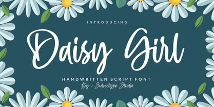 Daisy Girl is a flowing handwritten font, described by an elegant touch, perfect for your favorite projects. Fall in love with its incredibly distinct and timeless style and use it to create spectacular designs! Enjoy the font, feel free to comment or feedback, send me PM or email. Thank you!
 - Glypha by Linotype,
$29.99 Glypha was designed by Adrian Frutiger and appeared with D. Stempel AG in 1977. The font consists of ten cuts and is formally based on its predecessor, Serifa, although its lower case letters are a bit larger. Like Serifa, Glypha is also based on the general scheme used to design Univers.
 - Circus Stars by Vladislav Ivanov,
$20.00 Circus stars is Vladislav Ivanov font with a retro touch, inspired by the look of old circus and movie posters. It works well with normal size text, but it works even better for large displays, short words, or even just to incorporate a few or single characters in a design.
 - Frakturus by MAC Rhino Fonts,
$49.00 A modern fraktur briefly based on the typeface Deutschmeister originally designed by Berthold Wolpe in 1934. With a lot of blackness and playful style it is well suited for posters, signage on windows or a book cover. Only one wight for now, but it may be expanded in the future.
 - ITC Anna by ITC,
$29.99ITC Anna is a labor of love by Daniel Pelavin. He designed the font for his wedding invitation and reused it on the birth announcement of his first child, Anna, whose namesake it is. The simple geometric forms and their proportions create a unique font appropriate for any special occasion. - November Script by Fenotype,
$29.95 November Script is a continuously flowing and spinning font family. It was originally designed for an award winning art calendar published by TAIK (University of Industrial Art & Design) In 2007. Afterwards the font has been waiting for its second coming. November Script is well suitable for headlines, posters, flyers and schoolbooks.
 - Teknik by ITC,
$29.99Teknik font is the work of British designer David Quay and was inspired by the powerful geometric styles of the 1920s Soviet Constructivist movement. It is typographically categorized as an Egyptian style due to its slab serifs. Teknik is a strong, precise font suitable for a wide variety of headline applications. - Sintesi Serif by FSdesign-Salmina,
$- Sans meets serif. Would you like to express tradition by using a contemporary font? Sintesi might be exactly what you are looking for. Sintesi stands for synthesis: the unification of serif and sans-serif into a contemporary font, which surprises with different facets depending on its application. In copy size Sintesi performs like a sans-serif. It is a compact and well readable font that fulfills all requirements of modern digital media. In larger sizes, Sintesi unfolds its traditional character. Now, its strong contrast and the perceptible feather-ductus stand out clearly, as we appreciate it in a historical old style face. Sintesi is completed by a suitable italic. Its cursive character has more to do with writing-speed than to moderate inclination. Therefore Sintesi may be well-suited for many other purposes, not only for emphasis. The whole font family consists of 20 styles and offers a wide range of Western and Eastern European special characters, typographical ligatures, uppercase, oldstyle and fraction figures. Sintesi (Serif) builds together with Sintesi Semi and Sintesi Sans an extended family. Start combining antiquity with modernity! Download a free trial version of Sintesi with a reduced character set. Check it out!
 - Selfie Neue Sharp by Lián Types,
$29.00 INTRODUCTION When I started the first Selfie back in 2014 I was aware that I was designing something innovative at some point, because at that time there were not too many, (if any) fonts which rescued so many calligraphy features being at the same time a monolinear sans. I took inspiration from the galerías’ neon signs of my home city, Buenos Aires, and incorporated the logic and ductus of the spencerian style. The result was a very versatile font with many ligatures, swashes and a friendly look. But… I wasn’t cognizant of how successful the font would become! Selfie is maybe the font of my library that I see the most when I finally go out, (type-designers tend to be their entire lives glued to a screen), when I travel, and also the font that I mostly get emails about, asking for little tweaks, new capitals, new swashes. Selfie was used by several renowned clients, became part of many ‘top fonts of the year’ lists and was published in many magazines and books about type-design. These recognitions were, at the same time, cuddles for me and my Selfie and functioned as a driving force in 2020 to start this project which I called Selfie Neue. THE FONT "Selfie for everything" Selfie Neue, because it’s totally new: All its glyphs were re-drawn, all the proportions changed for better, and the old and somehow naive forms of the first Selfie were redesigned. Selfie Neue is now a family of many members (you can choose between a Rounded or a Sharp look), from Thin to Black, and from Short to Tall (because I noticed the feel of the font changed notoriously when altering its proportions). It also includes swashy Caps, which will serve as a perfect match for the lowercase and some incredibly cute icons/dingbats (designed by the talented Melissa Cronenbold, see also Selfie Neue Rounded for more!) which, as you see in the posters, make the font even more attractive and easy to use. You'll find tons of alternates per glyph. It's impossible to get tired with Selfie! Like it happened with the old Selfie, Selfie Neue Sharp was thought for a really wide range of uses. Magazines, Book-covers, digital media, restaurants, logos, clothing, etc. Hey! The font is also a VF (Variable Font)! So you can have fun with its two axes: x-height and weight, in applications that support them. Let me take a New Sharp Selfie! TECHNICAL If you plan to print Selfie Neue VF (Rounded or Sharp), please remember to convert it to outlines first. The majority of the posters above have the "contextual" alternates activated, and this makes the capitals a little smaller. I'd recommend deactivating it if you plan to use Selfie for just one word. Use the font always with the "fi" feature activated so everything ligatures properly. The slant of the font is 24,7 degrees, so if you plan to have its stems vertical, you may use Selfie with that rotation in mind. THANKS FOR READING
 - ITC Zipper by ITC,
$40.99Zipper is a striking font designed in 1970 by Phillip Kelly for the Letraset dry transfer sheets and it shows itself as a true child of the 1970s. The most distinguishing characteristic is the markedly robust horizontal stroke, heavier by far than the verticals. In a line of text, the figures present a close, stripe-like line, strongly dominated by the horizontal. Zipper is meant exclusively as a headline font and should be used in larger point sizes to highlight its unique, eye-catching characteristics. - Magenos Soft by Graphite,
$18.00 Magenos Soft is the rounded version of Magenos typeface family. It is a modern geometric sans serif family characterized by its simplicity and extensive functionality. With its open apertures, geometric architecture and low contrast strokes, it expresses a sincere tone with a modernistic, neutral, yet friendly personality. It has been designed to work well for a wide range of applications and is a reliable workhorse. Equally suitable for print and screen usage, it works well for both text and display at a wide range of point sizes. The addition of true italics gives the whole family a dynamic edge and flexibility. Magenos Soft comes with many OpenType features including stylistic alternates, standard ligatures, oldstyle and lining (proportional and tabular) numerals, slashed zero and a variety of symbols, making it a perfect choice for contemporary and professional typography.
 - Stretto by Canada Type,
$29.95 Stretto (Italian for narrow) is a revival, correction and expansive update of an Aldo Novarese reverse-stress font called Sintex, which he did for VGC in 1973. Openly idiosyncratic and playfully rebellious in its design, this alphabet fuses the straights and rounds in an unusual manner, riffing on the idea of hand-made sign and wood type forms while adhering to its odd grid’s parameters. In spite of its counter-stress, its legibility is high and even, helped by its unicase forms and very distinct counters. First released in 2007, it became quite popular with film studios and nostalgia designers (Sintex was the font used for David Bowie’s Hunky Dory album and Life on Mars? single). A dozen years later we revisited it for an update. Stretto now comes with over 660 characters and includes Pan European language support.
 - Vagebond by Characters Font Foundry,
$17.50 Vagebond is a monoline family in three widths, Condensed (C), Normal (N), and Extended (XT). With Vagebond I was inspired by a very old television I once saw on a junkyard. I wanted to create a typeface with round edges that would fit within the 4 x 3 proportion of the screen. It had to be monoline, because that gives it a very simplistic and minimalistic look. Having created the XT width I felt it needed the both complementing widths to make it complete. The Condensed version, for me, is the funky rounded version of the DIN. I love DIN, but it sometimes feels just a bit to ‘normed’ for me. Vagebond C brings in a bit more personality. Although Vagebond looks kinda ‘oldstyle’, it works very well in futuristic designs. It feels best in combination with a super futuristic 3d object.
 - Brinar by Hackberry Font Foundry,
$24.95 I've been working on a usable sans serif for body copy since the mid-1990s (though I certainly did not know it at the time). This one works well. It started life back in the mists of time as a scan of an old German font by Carl Fahrenwaldt. It was developed fully as a synergized serif with strong traditional roots and released as Bergsland Pro. Now it finally makes it to where I was headed all along as a sans text font. This is a well modulated humanist, sans serif font family with many OpenType features and over 600 characters: Caps, lower case, small caps, ligatures, swashes, small cap figures, old style figures, numerators, denominators, accents characters, ordinal numbers, and so on. It is designed for text use in body copy. But it also works very well for elegantly stylized display.
 - Old Borders And Lines by RMU,
$15.00 A special offer by RMU Typedesign for those who like it old-style. Now finally with the possibility to create a Greek Meander frame.
 - Biotech by Arendxstudio,
$20.00 Biotech is hand painted typeface with a messy, rough and strong feel, perfectly suited for any design occasions. Get inspired by its bold charm!
 - Shenzhen Industrial by Device,
$29.00 With its contours roughened by ink spread on porous cardboard, Shenzhen Industrial evokes packing crates, stamped documents and urban grit with high-impact urgency.
 - Ramshackle JNL by Jeff Levine,
$29.00Ramshackle JNL was modeled from a 1940s lettering stencil and takes its place amongst the many vintage stencil font designs redrawn by Jeff Levine. - Rody by Discourse Type,
$5.00 Rody is the inspired by early russian typographic designs and works well with Lazar . It comes with small caps and a range of ligatures.
 - Scholle by Tour De Force,
$25.00 Characterized as inline display font family with childish manners, Scholle offers positive (Shadow) and negative (Regular) weights grouped by bouncing rhythm of its characters.
 - Hexenhammer by Hanoded,
$15.00 The ‘Hammer of Witches’, ‘Malleus Maleficarum’ or ‘Hexenhammer’ in German is the best know and most important treatise on witchcraft. It was composed by Heinrich Kramer in 1487. I thought it was a rather apt name for my latest fairytale font! Hexenhammer is a rough, handwritten typeface with an attitude. It can be used for book covers, posters and even spells. Comes with a bunch of end ligatures and a pandemonium of diacritics.
 - Disco Display by Cabeza Dura,
$40.00 Composed of compositional groups, with optical adjustments in the curves, Disco Display has been designed with special attention to kerning and tracking, allowing its use in both large and medium sizes, starring in large titles or filling entire covers with color. Inspired by the hippie movement, Disco Display provides sensuality, visual richness and compositional splendor, giving rise to the use of multiple colors or patterns in its forms, or rediscovering its counterforms.
 - Deusa by Multiformis,
$19.99 Deusa was designed with branding and advertising in mind. It was inspired by the perfume and fashion industries and intended to be an elegant and “clean” display typeface; characteristics which determined its sans-serif and significant contrast style attributes. The typeface includes multilingual support as well as standard ligatures and stylistic alternates. It also includes an “estimated” and Euro glyphs (the Euro as an alternate), both designed according to the official EU specifications.
 - Casablanca by Red Rooster Collection,
$45.00Casablanca is a decorative sans serif font family. It was designed and produced in 1997 by Steve Jackaman (International TypeFounders). Jackaman loosely based the designs on the Carlos Winkow typeface ‘Electra’ from the Spanish foundry, Nacional, circa early 1940’s. Casablanca has a clean, Art Deco, jazz, and/or noir film feel. It sets nicely at any size, and brings an air of bold mystery to the projects it is applied in. - Opulence by Ogle Studio,
$14.00 Opulence is a font designed to show the world you mean business. Inspired by Times New Roman, this contemporary serif typeface is perfect for business cards, logos, presentations and web. Crafted to promote a modern, clean and elegant solution for your projects. Not only is it a solid, bold choice for a title, it also shows its strength a subtitling and body text. Opulence contains 187 beautiful characters with latin and western language support.
 - Sorren by Reserves,
$49.00 Sorren is a definitive bold condensed sans influenced by neo-grotesque designs. A relatively low stroke contrast complimented with sharp, horizontal stroke ends lend an unyielding appearance, while it’s rounded forms and refined curves juxtapose its inherent strength with grace. Stylistically, Sorren has a classic, timeless feel with a contemporary finish and attention to detail. It is characteristically more elegant and considerably sturdier than the typical condensed sans, lending to its singular disposition.
 - Tassista by MAC Rhino Fonts,
$59.00 Tassista means taxi in Italian. It suits this typeface well as the source of inspiration is the closing credits from the film Taxi driver, directed by Martin Scorsese in 1976. The typeface is designed to perform especially well in smaller sizes and makes it suitable for various credit copy, footnotes etcetera, nearly always presented in minor sizes. During the designs process it seemed more logical to make small caps instead of traditional lowercases.
 - Beaucoup PB by Pink Broccoli,
$14.00 A totally off the wall crazy sans serif display type, Beaucoup started as a digitization of a film typeface called “Bippie” by Facsimile Fonts. From there, it was taken and built out to an extensive character set ready to take you for a wild ride. Completely loco, yet somehow still easily legible, this typographic wildchild is dying for you to get your grubby little hands on it and take it for a spin!
 - Wide Texas by Mvmet,
$12.00 Wide Texas is a cool and playful informal font, inspired by western cowboy cartoons and comics. It will elevate a wide range of design projects to the highest level. You can use this font for many design ideas such as stickers, t-shirt designs, amazing logo designs, magazine or book covers, comics, cartoon drawings, and many more. Fall in love with its incredibly versatile style, and use it to create lovely designs!
 - Estricta by Graviton,
$24.00 Estricta font family has been designed for Graviton Font Foundry by Pablo Balcells in 2017. It is a sans serif typeface with a geometrical and mechanic appearence, its sharp, angular edges provide a strong and solid design. It has been conceived to be most suitable for short and middle length text blocks, as well as on all sized headlines. Estricta consists of 12 styles. Each containing small caps and glyph coverage for several languages.
 - Candide by Hoftype,
$49.00 Candide is a neoclassical face for editorial, magazine and newspaper applications. It reflects classical archetypes and is distinguished by its elegant and sophisticated appearance. The Candide family consists of 16 styles. It comes in OpenType format and provides an extended language support. All weights contain standard and discretionary ligatures, proportional lining figures, tabular lining figures, proportional old style figures, lining old style figures, matching currency symbols, fraction- and scientific numerals, matching arrows and alternative characters.
 - ITC Ziggy by ITC,
$29.99ITC Ziggy was designed by Bob Alonso, who says it started out as phone doodles in the early 1970s." Alonso rediscovered the sketches years later, thought they revived the feel of the 70s, and decided to digitize the typeface. He liked the form of the letter Z best, so named the font Ziggy. ITC Ziggy reminds its designer of "elephant bellbottoms" and its style as a display face instantly evokes a nostalgia for the 1970s. - Fleurious by Proportional Lime,
$9.95 This font was inspired by the many changes in printing habits over the last half millennium. Every book has a story and sometimes the printing itself can be its own story. Every era has its own tendencies in decorative elements and these practices were observed and included such that the font contains over 200 hundred glyphs with which to add variety to your documents. It is provided with a complete character map.
 - Challans by Heinzel Std,
$19.00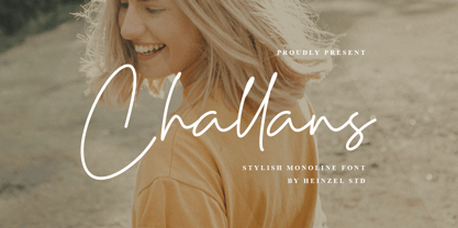 Challans is a flowing handwritten font, described by an elegant touch, perfect for your favorite projects. It looks stunning on wedding invitations, thank you cards, quotes, greeting cards, logos, business cards and every other design which needs a handwritten touch. Fall in love with its incredibly distinct and timeless style and use it to create spectacular designs! Challans Features : Uppercase and Lowercase Numerical and Punctuation PUA Encoded Multilingual Language Easy To Use
 - Tuerca by Graviton,
$24.00 Tuerca font family has been designed for Graviton Font Foundry by Pablo Balcells in 2021. It is a slightly extended sans serif typeface with a strong technical appearence. Its squared, angular shapes provide a futuristic and robust aesthetics. It has been conceived to be most suitable for logos, headlines and display design pieces as well as short length text blocks. Tuerca consists of 8 styles, each containing small caps and glyph coverage for several languages.
 - Sky Fire by Yock Mercado,
$14.00 Skyfire is a Sans Serif font inspired by digital interfaces, spaceships, and galaxies, embodying cosmic adventure and progress. Its sleek design is perfect for branding and tech projects, promising a future full of possibilities. Ideal for space-related work, it immerses viewers in a universe of wonders. With Skyfire, each stroke is a cosmic journey, merging imagination with design. A guiding light for bold projects, it leads to new horizons and innovates in typography.
 - Binaria by Graviton,
$24.00 Binaria font family has been designed for Graviton Font Foundry by Pablo Balcells in 2018. It is a sans serif typeface with a mechanic appearence. Its squared, angular shapes provide a futuristic and robust design. It has been conceived to be most suitable for logos, headlines and display design pieces as well as short length text blocks. Binaria consists of 12 styles, each containing small caps and glyph coverage for several languages.
 - Fiorentina by Wiescher Design,
$69.50 Fiorentina is a ecstatic, abundant, embellished script in the Renaissance tradition. It could have been made for the Medicis or Sforzas. But I designed it completely new after being inspired by colorful Florentine wrapping papers. I gave it many different swashes and understrokes, alternate upper- and lowercase characters, 659 characters in all! The font has all accents for the European languages, Baltic, Roumanian and Turkish. Yours very versatile designer of beautiful typefaces Gert Wiescher
 - Fabriga by LuxTypo,
$50.00 Fabriga speaks a familiar language in a distinctive voice. Ideas around clarity and tone informed all emblematic decisions. Fabriga’s structure and warmth are influenced by how its character set is approached as an ensemble while exploring individual ‘creative’ opportunities as they pose themselves throughout the process. Fabriga sets out to take a supportive role as a font family, understanding that one of its great strengths is its diversity in application and composition.
 - Plena by Arodora Type,
$40.00 The Plena font offers a modern all-caps experience. All glyphs have incision and unified alternatives and can be shaped for your intended use. This font is crafted for different design trends and would look great for your large print banner headers. It can be preferred by the designer in accordance with its intended use and can be used impressively and strikingly with its large family on different platforms. Plena also offers multilingual support.