10,000 search results
(0.072 seconds)
- SK Mutka by Shriftovik,
$32.00 SK Mutka is a geometric sans serif made in the style of Art Deco. Its graceful forms are emphasized by the arched structure typical for the style and spirit of Art Deco. The typeface is suitable both for decorative work and for typing because it includes uppercase and lowercase. Moreover, it supports a wide language range. SK Mutka typeface supports extended Cyrillic, Latin, as well as an extensive character set. SK Mutka is perfect for bold and classic designs, for print and web works.
 - Dosky by takoliko,
$10.00 Dosky is a groovy, retro, bubble font. It have a big and bubbly anatomy. Inspired by 70s vibe and culture. The font is perfect to create a project that have a retro feeling but have a little bit modern and modest on it. Dosky support multilingual language also came with 6 font style : Reguler, Condensed, Expanded and Oblique styles. Dosky can be used as a fun or a formal kind of project. It can easily be matched to your projects, and good for communicating your brands.
 - DT Skiart Lexiconic by Dragon Tongue Foundry,
$10.00 Apparently, Lexicon is the most expensive font in the world. ‘Skiart Lexiconic’ has been on a long growing path getting to where it is now. This font family was originally inspired by the san serif font ‘Skia’, by Mathew Carter for Apple. ‘Skiart’ was designed to feel more like a serifed font, but without any actual serifs. It took a small step between sans serif and serif fonts. Next on the path towards a serif font came Skiart Serif Mini, with tiny serifs added. This was a true serif font, although they were subtle. Then came ‘Skiart Serif Leaf’. and now... We present to you... DT Skiart Lexiconic. Having evolved from the Skiart family, we chose to give it the serifed styling of Lexicon. This is no way a copy or clone of Lexicon. It still has the basic bones of the original Skiart font, but the position, shape and size of the serifs were very much influenced by the world famous Lexicon font. DT Skiart Lexiconic is not the most expensive font in the world.
 - Rapsodia by Andinistas,
$59.00 @andinistas presents Rapsodia, an uncommon roman caps font with serif and high contrast, designed by #carlosfabiancg. Rapsodia was inspired by Stunt Roman, Speedball Textbook for Pen & Brush Lettering by Ross F. George. Rapsodia has a high and sweetened amount of contrast between thin and thick with drop-shaped finishes, reminiscent of Didot, Baskerville and Bodoni. Its artistic accent translates into Tuscan letters drawn with a flexible tip pen. In that order, Rapsodia combines the visual theatricality of an art nouveau corset, with creative historical classics such as Liza Minnelli, Gene Simmons and Freddie Mercury. Its calligraphic curlers full of Mannerist virtuosity are unnatural in Roman caps typefaces with serif. That is why its internal vein in ascending and descending flourishes protrudes with Chicano circus details like triangular diamonds located in vertical strokes. Rapsodia serves to design words and phrases in fine publications, for this reason most of its upper and lower case letters communicate feelings with classic and luxurious sensation through substitutes, ligatures and alternatives for beginning, middle or end of word, functioning as initials and terminals.
 - PF DIN Mono by Parachute,
$45.00 PF DIN Mono is the latest addition to the ever-growing set of DIN super-families by Parachute. It was based on its proportional counterpart DIN Text Pro but was completely redesigned to reflect its new identity. DIN Mono is a monospace typeface which is comprised of characters with fixed width. Traditionally, monospaced fonts have been used to create forms, tables and documents that require exact text line lengths and precise character alignment. DIN Mono, on the other hand, can prove to be more than a useful typeface for technical applications. In the world of proportionality, DIN Mono stands out as a fresh new alternative to the popular standard, particularly for publishing and branding applications. Additional care was given to the aesthetic form and its pleasing characteristics. The spacing attributes of the glyphs were redefined and legibility was further improved by revising or changing the shape of the letterforms. Furthermore, kerning was not included in order to preserve the monospace nature of this typeface. The family consists of 12 weights including true-italics. Currently, it supports Latin, Eastern European, Turkish and Baltic.
 - CoolKids by SevenType,
$29.99 CoolKids was inspired by the song “Signs of Life” by Arcade Fire. Since the lyrics talk about some cool kids we wondered what a typeface with the name cool kids would look like. We immediately knew it had to be laid back yet bold and to stand out from the crowd. After designing the bold script we decided to include a light, regular and medium weight to offer you more options for your designs. It comes with initial and final alternates, that show up automatically, to make it feel more natural and similar to handwriting. Every character was carefully drawn and connections are real smooth. This casual font-family speaks most Latin languages, both in their basic and alternate forms. CoolKids is great for creating logos, packaging, posters and much more. More important than to create a font is to use it… so now it’s up to you to create something awesome with it. Feel free to share your designs with us via email to hi@seventype.com We would love to see and share them with the world!
 - Wolpe Fanfare by Monotype,
$50.99 “Fanfare is such a fun typeface,” says Toshi Omagari, who revived the design for The Wolpe Collection. “It was my happiest discovery when I was digging through the Monotype archive. I came across it and had to check the designer’s name.” No wonder: Fanfare is modern, light and playful – not what you’d expect from an 80-year old design. From the original, very heavy weight design, Omagari started by creating a black weight, followed by four lighter weights for Wolpe Fanfare, preserving the character of the letterforms all the way down to a thin version. “I wanted to do more than digitize the original weight,” he says. “It’s surprisingly modern, and its skeleton, its basic structure, is so beautiful.” The new design packs more into a small space than most typefaces. It’s a natural for publication and advertising design. With displays capable of revealing fine details such as Fanfare’s subtly slanted baseline, its lovely forms will easily translate to mobile devices. With an extended European character set that includes Greek and Cyrillic language support, Wolpe Fanfare can speak in many languages.
 - Ragazza Script by Latinotype,
$79.00 Ragazza Script isn’t just another display typeface. It honors the greatest handwriting skills but in a different way. Although It doesn't represent any traditional calligraphy style, it is still part of that expressive world. With more than 1000 glyphs, and taking advantage of the Opentype features, Ragazza is full of personality. When in use, it gives a feel very close to ornamental Copperplate mixed with some kind of modern 'high-contrast' typeface. Lots of alternates, swashes and initial capitals are the spine of this face, assuring almost infinite combination possibilities. The early forms that would eventually lead to what Ragazza is today, began as a college project –around 2006– in the context of the 'Hyperfuente' exercise developed during Typography 2, chair E. Longinotti, at the University of Buenos Aires. But that seed would never stop growing. Since then a lot of work had been made to take that initial project to a professional quality level. Ragazza Script is perfect for headlines and short phrases. It is the brand new modern script, designed by Guille Vizzari and published by Latinotype.
 - Structia by Typodermic,
$11.95 As you consider the words you need to convey, it’s clear that you’re looking for something that feels just as precise and intentional as the message you’re promoting. Structia is a typeface that does not shy away from its influence—it leans into the hard edges and geometries that are typically associated with brutalist architecture. And yet, even as it draws inspiration from an austere and somewhat daunting aesthetic, Structia also possesses a sense of control and discipline that is undeniably alluring. At the core of Structia’s appeal is its mechanical precision. Every line, every curve, is carefully calculated and crafted to create a sense of mathematical accuracy that is difficult to resist. There is no room for error or imperfection in Structia—every stroke is sharp and precise, with chamfered corners that add an extra layer of texture and visual interest. This is not a typeface that allows for ambiguity—it demands clarity and specificity, and it delivers both with remarkable consistency. But Structia is more than just a collection of angular shapes and precise lines. It is a typeface that conveys a sense of scientific accuracy and chilly logic—a kind of elegance and refinement that is unexpected. There is a beauty in the way that Structia balances the hard-edged geometries of brutalism with a sense of control and finesse that is undeniably modern. It is a typeface that feels at once futuristic and timeless—a design that can be used in a wide variety of contexts and still feel fresh and relevant. And then there are the two effect styles—Structia Panel and Structia War—which take the basic geometry of the typeface and push it even further into the realm of science fiction. Structia Panel feels like something you might see on a spacecraft or in the architecture of an alien planet, with thin, laser-like struts that give it a futuristic edge. Structia War, meanwhile, takes the concept of Structia Panel and adds a layer of battle damage, as if the letters have been through a cosmic conflict and emerged victorious. In the end, Structia is a typeface that demands attention and respect. It is not a typeface that will fade into the background or blend in with the crowd—it is a design that is meant to be noticed and admired. And yet, even as it draws your eye with its hard-edged geometries and precise lines, it also possesses a sense of elegance and refinement that is undeniably alluring. Structia is a typeface that balances the old and the new, the hard and the soft, the mechanical and the human—and the result is something truly remarkable. Most Latin-based European, and some Cyrillic-based writing systems are supported, including the following languages. A Afaan Oromo, Afar, Afrikaans, Albanian, Alsatian, Aromanian, Aymara, Bashkir (Latin), Basque, Belarusian (Latin), Bemba, Bikol, Bosnian, Breton, Bulgarian, Cape Verdean, Creole, Catalan, Cebuano, Chamorro, Chavacano, Chichewa, Crimean Tatar (Latin), Croatian, Czech, Danish, Dawan, Dholuo, Dutch, English, Estonian, Faroese, Fijian, Filipino, Finnish, French, Frisian, Friulian, Gagauz (Latin), Galician, Ganda, Genoese, German, Greenlandic, Guadeloupean Creole, Haitian Creole, Hawaiian, Hiligaynon, Hungarian, Icelandic, Ilocano, Indonesian, Irish, Italian, Jamaican, Kaqchikel, Karakalpak (Latin), Kashubian, Kikongo, Kinyarwanda, Kirundi, Komi-Permyak, Kurdish (Latin), Latvian, Lithuanian, Lombard, Low Saxon, Luxembourgish, Maasai, Macedonian, Makhuwa, Malay, Maltese, Māori, Moldovan, Montenegrin, Ndebele, Neapolitan, Norwegian, Novial, Occitan, Ossetian, Ossetian (Latin), Papiamento, Piedmontese, Polish, Portuguese, Quechua, Rarotongan, Romanian, Romansh, Russian, Sami, Sango, Saramaccan, Sardinian, Scottish Gaelic, Serbian, Serbian (Latin), Shona, Sicilian, Silesian, Slovak, Slovenian, Somali, Sorbian, Sotho, Spanish, Swahili, Swazi, Swedish, Tagalog, Tahitian, Tetum, Tongan, Tshiluba, Tsonga, Tswana, Tumbuka, Turkish, Turkmen (Latin), Tuvaluan, Uzbek (Latin), Venetian, Vepsian, Võro, Walloon, Waray-Waray, Wayuu, Welsh, Wolof, Xhosa, Yapese, Zapotec Zulu and Zuni.
 - Rijk by Wilton Foundry,
$39.00 The font name comes from the Dutch word "Rijk" meaning "rich". I'd like you to consider Rijk as a good Pinot Noir: medium bodied, offering succulent juicy berry flavors, accentuated by delicate aromas of coffee and vanilla oak. Ruby red in color, it boasts of velvety tannins and a long fulfilling fruity aftertaste. Rijk has a structure that is delicate and fresh. The aromatics are very fruity like cherry, strawberry, and plum, often with notes of tea-leaf, damp earth, or worn leather… My intent was to create a script that is rich, while not overbearing. It will serve many noble and useful purposes because of its fresh and lively texture. It is also very legible because it has a slightly more upright angle. Use Rijk for headlines, packaging, identities, advertising and online. Available in OpenType, it includes a range of ligatures as well as a full range of class kerning.
 - Lucyna by K94 Studio,
$9.00 The Lucyna serif font is a stylish and sophisticated typeface that exudes elegance and refinement. The font's unique design, inspired by the natural beauty and fluidity of the sea, features clean and well-defined serifs that give it a distinctive and timeless character. One of the most popular styles in the Lucyna family is the regular weight, which has a balanced and harmonious look that is easy on the eyes. This makes it perfect for use in long-form text such as books, magazines, and newspapers. The regular style's clean lines and legibility also make it an excellent choice for branding and advertising, where it can add a touch of sophistication and class. With its versatility and expressive nature, the Lucyna regular style is a font that can adapt to a wide range of design needs, while still maintaining its distinctive character and personality.
 - Margaretha by Mozatype,
$13.00 Margaretha is an elegant script font with a contemporary atmosphere and impeccable form, inspired by timeless classic calligraphy. It is an incredibly unique handwritten font. This font is ideal for crafting, branding, and decorates your any project. This font is perfect for wedding invitations or your blog. Also with their help, you can create a logo or beautiful frame for your home. Or use it for your business, book covers, stationery, marketing, magazines, and more. It is PUA encoded which means you can access all of the glyphs and swashes with ease! Fall in love with its incredibly versatile style and use it to create spectacular designs! Use this font for any crafting project that requires a personalized look! What’s Included : - Easy to use ( Installations ) - Compatibility Windows, Apple, Linux, Cricut, Silhouette, and Other cutting machines Thank you for purchasing this font. Please appreciate, if you like this. ENJOY it :)
 - Bilokos Pro by AukimVisuel,
$14.00 Bilokos Pro is a cool and modern display font. Designed by experts to make your design look out of this world, this font has the potential to take your creative ideas far. This is a condensed sans serif display font. On the one hand, it has rounded curves with very open terminals that make this font family elegant, user-friendly and contemporary and on the other hand very useful for writing titles in any medium. It also comes with stylistic variations of 0-9, A-Z and a-z to satisfy the most demanding professionals. It has OpenType features like full ligatures, tabular figures for tables, old style figures to elegantly insert numbers into your sentences. With its large character set, it meets the needs of professionals because it will support several languages of Western Europe, Eastern Europe, Central Europe, Greek and Cyrillic for international communication.
 - Leaf by Journey's End,
$12.00This "Leaf" font has been swirling in my head for years - I remember my sister and I making letter formations like these when I was young. It was exciting to see the lettering look even better on paper than it did in my mind! "Leaf" surprised me by having two distinct looks: in size 24 or smaller, the look is delicate, because your eye doesn't see any space in the letters. In size 28 or larger, the eye can discern spaces, which gives a different facet to its personality. As much as I like this font when viewed on a monitor screen, it really shines when printed. The "Leaf" font is a perfect blend of quaint hand-written style mixed with crisp letter formations. This font has a very "happy" quality to it. May using it bring a little more happiness to your day! - Maxwell Sans by Kimmy Design,
$12.00 Maxwell is a clean condensed san serif typeface inspired by similar retro fonts from the 1950's. It comes in regular and small caps versions, includes stylistic alternatives and via the glyph panel you can access scientific inferiors, fractions, oldstyle numerals, Cyrillic, Greek, Latin and other Western and Central European languages. It can be used as a headline font or paragraph text.
 - Ghost Grim by Mvmet,
$15.00 Ghost Grim is a cool font inspired by vintage slasher horror movies and horror comics. It will be perfect for your horror and Halloween themed needs! You can use it for anything ranging from merchandise like t-shirts and clothing, for your scary book designs, Halloween party needs, greeting cards, stickers, posters, banners, or anything that needs a horror touch.
 - Evil Spin by PizzaDude.dk,
$20.00 Evil Spin is inspired by some old horror poster. It has this eerie feeling to it, which leaves you with terror...no matter what you write!!! I've made 4 different versions of each letter, and they automatically changes as you type. And that goes for every layer if Evil Spin - mix and match the layers for even more creepy effects!
 - Balian by Alit Design,
$24.00 The BALIAN font is inspired by Balinese style carvings, because it is made in Bali and the Balinese also make it. The unique and beautiful engraving forms create a display font with character. The Balian font is perfect for classic and unique themed designs, besides that this font is perfect for t-shirt designs, poster titles, text headers or logotype designs.
 - Hastynga by Golden Wraith Fonts,
$10.00 Golden Wraith Fonts designed the digital typeface Hastynga It began as an effort to find a solution to the digital aesthetic. By distorting digital fonts into a fluid style of writing with a variation in direction between strokes from one letter to the next, Hastynga allows for simulated text imperfection. Its layout creates textual tension, energetic movement, and vibrant vitality.
 - Stop by Linotype,
$29.99Stop is a heavy futuristic sans serif display font, designed by the famed Italian type designer Aldo Novarese. Stop's forms are vaguely stencil-like, and some of them only read as letters when used in combination with each other. Nevertheless, Stop has a real computer-technology" feel to its design. It should be used exclusively for headlines or logo work." - Oceanfront Property JNL by Jeff Levine,
$29.00 Oceanfront Property JNL was modeled from the hand lettered title on the cover of the 1932 sheet music for "There's Oceans of Love by the Beautiful Sea". A simple sans, it still reflects the beginnings of the Art Deco Era with its approach to letter forms and varying widths. This type design is available in both regular and oblique versions.
 - Shadow Party by Balpirick,
$15.00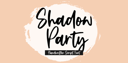 Shadow Party is a Handwritten Script Font. Shadow Party is a flowing handwritten font, described by an elegant touch, perfect for your favorite projects. Fall in love with its incredibly distinct and timeless style and use it to create spectacular designs! Shadow Party also multilingual support. Enjoy the font, feel free to comment or feedback, send me PM or email. Thank you!
 - Rileno Sans by Degarism Studio,
$40.00 Rileno Sans is sharp with geometric forms and strong personality. It is constructed in a geometric manner and inspired by the constructivist typefaces of the 1920s with a humanistic quality. It comes in 6 weights, 6 uprights and their matching italics. Rileno Sans is equipped with opentype features like Alternate charates, Fractions, Monospace Numbers, Superscript/subscript, Arrow, Roman Numbers, Ligatures and More.
 - Amper Sans NF by Nick's Fonts,
$10.00In 1956, Schriftgeißerei Genzsch & Heyse released the pattern for this typeface, designed by Werner Rebhuhn, under the name "Hobby". Despite its Eisenhower-era origins, the face retains its casual charm, spontaneity and freshness even after half a century. Both versions of the font contain the complete Unicode 1252 (Latin) and Unicode 1250 (Central European) character sets, with localization for Romanian and Moldovan. - Cursive Signa Script Variable by Pedro Teixeira,
$670.00 Cursive Signa Script Variable, quite possibly the first true cursive and signature variable font. It has 90 styles that range between weight, slant and alternates. It can be use in a lot of projects, like logos, end of a statement, pairing with a beautiful sans serif like Aleante, in a title, invites and so on. Designed by Pedro Alexandre Teixeira
 - PiS Konzert by PiS,
$36.00 PiS Konzert is a bulky quirky all caps headline sans, inspired by letters found on a hand drawn polish poster from the 1960s. Its slightly shaky mid-century style makes it perfect for concert posters, movie intros or any other applications that need to evoke that bold, loud and still a little classy feeling of staggering inebriatedly through a murky jazz club.
 - Balthasar by Fine Fonts,
$29.00 Balthasar is a very distinctive, stencil-type display font. Its letterforms originally appeared on a lettered book jacket by Michael Harvey. Its highly condensed letterforms being very economic in the use of space. The augmented, Balthasar Plus version has many alternative characters and ligatures, together with Opentype features for their automatic substitution where the application in which they are used permits.
 - HenHouse AOE by Astigmatic,
$19.95 HenHouse is an offbeat comic sans-serif typestyle full of wonky bounce. Inspired by the 1962 Merrie Melodies cartoon titled “Mother was a Rooster”, this typeface has all of the spunk of its source. The end result, a lively tribute to its origin, easy to read and fun to look at, a perfect typeface for childrens' books, advertisements, and playful designs!
 - Emilia Fraktur by RMU,
$35.00 Based upon Emil Rudolf Weiss’ Fraktur, first released in 1913, Emilia Fraktur was redrawn and extended not only with its engraved initial caps but also with various ornaments and border elements. To get access to all ligatures, it is recommended to activate both Standard and Discretionary Ligatures. The quickest way to the long s is by typing the integral sign.
 - Magicline by Balpirick,
$15.00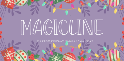 MAGICLINE is a Modern Display Handdrawn Font. Magicline is a trendy display font, described by an unique touch, perfect for your favorite projects. Fall in love with its incredibly distinct and timeless style and use it to create spectacular designs! MAGICLINE also multilingual support. Enjoy the font, feel free to comment or feedback, send me PM or email. Thank you!
 - Roleyfox by Balpirick,
$15.00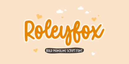 Roleyfox is a Bold Monoline Script Font. Roleyfox is a cute and frail handwritten font, described by an elegant touch, perfect for your favorite projects. Fall in love with its incredibly distinct and timeless style and use it to create spectacular designs! Roleyfox also multilingual support. Enjoy the font, feel free to comment or feedback, send me PM or email. Thank you!
 - Dino Park by Yoga Letter,
$14.00 "Dino Park" is the most amazing font I've ever made. This font was carefully crafted by incorporating dinosaur into its writing. Very suitable for your projects. This font is also very easy to apply because it has been specially designed. You can create movie titles, book titles, magazine covers, animals, design logos, t-shirt logos, quotes, traveling, research, and more.
 - Avayo by Fontop,
$11.00 Avayo is a modern sans serif typeface. It is perfect for creating alphabet logos, branding, titles, headlines, but also looks great when being used casually, in copies and texts. Avayo looks simple but special and distinct and is defined by its round cut design. Avayo font family comes in five weights to help you choose the best option depending on your purpose.
 - Occidental by Ryan Corey,
$35.00 The Occidental family is a geometric, sans-serif text face marked by its angular construction. Occidental is suitable and economical enough to set large blocks of copy, but at display sizes Occidental's inherent character takes over making it useful for headline setting as well. The family includes four weights, each with corresponding italics (excepting Display) for a total of seven fonts.
 - Cristal Ttris by Johannes Krenner,
$7.00 This Font is inspired by the Nintendo game: Tetris® It has 2 styles: BOLD and THIN. They both have simulated greyscale and can be used out of the box like you see them on the pictures. It comes with more than 450 glyphs per style. More than capable of supporting all european languages, small caps and different numeral figures.
 - Rockets Battle by Rochart,
$10.00 Rockets Battle is my hand drawn brush font, and makes with original brush paint, by using high resolution brush stroke images with incredible definition. Its look natural. It will be great for Logotypes, Posters, Digital Lettering Arts, Clean Design, Branding Design, Sign, Merchandise and Social Media Posts. This font contain of Uppercase, Lowercase, Number, Symbol, Punctuation, also support multilingual and already PUA encoded.
 - Block by Stefan Stoychev,
$29.88 Block Font Family is display font inspired by the forms of communist mass housing architecture (called blocks - resembling straight geometric shapes arranged symmetrically) started in the mid 70's in the 20th century. It comes in 4 weights and its matching italics and rounded options. The Light weight is a free of charge, so you can used to your projects.
 - CRM American Horror by CRMFontCo,
$35.00 The Classic Charles Rennie Mackintosh Font has been a massive seller over the years. Its use in the Hollywood motion picture "Spider Man 2", has now been emulated by the branding of the the new Fox TV series "American Horror Story". Very unusual for the horror genre, this slightly tweaked version of the classic original mirrors how the show's producers have used it.
 - Christmas Tree by Trim Studio,
$12.00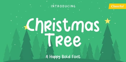 Christmas Tree is fun display font created to help spread holiday cheer. Get inspired by its charming appearance! Its perfectly suited for crafter and graphic artist to complete their design such as invitation, advertisement, poster, logo, birthday, product sign, and many more! Christmas Tree Font is also Lightweight and contains All Standard glyphs and punctuations and can be used beside any font.
 - Soylent Blu by Tail Spin Studio,
$20.00 Soylent Blu is an original wedge serif, single font designed by Steve Zafarana. Its high contrast character style and bouncy baseline create a visual impact that makes it a good candidate for Signs, headlines, logos and advertisements. The full lowercase set with balanced white space also functions quite well in text. Soylent Blu, with OpenType features, is clearly an attention-getter!