10,000 search results
(0.104 seconds)
- Theater Lobby JNL by Jeff Levine,
$29.00 A vintage photo (circa 1950s) taken outside one of the movie houses owned at the time by Miami-based Wometco Theaters showed a small hand lettered sign with the word “Wometco” painted in a stylized Art Deco alphabet. This inspired Theater Lobby JNL, which is available in both regular and oblique versions.
 - Serif Formal Oblique JNL by Jeff Levine,
$29.00 An advertisement in a 1936 issue of “The Film Daily” for the movie “Mr. Deeds Goes to Town” had much of its copy set in an extrabold typeface similar to the Beton/Stymie/Karnac group of slabserif designs. This is now available digitally as Serif Formal JNL in both regular and oblique versions.
 - Cal Fraktur Brush by Posterizer KG,
$19.00 Cal Fraktur Brush is one more font from the PKG “Cal” (Calligraphic) group. This time, we used a wide brush instead of the calligraphic pen for the sketches. This font is widely used in the typographic creation of shorter text forms such as headlines, tattoo and graffiti quotes, book covers, t-shirt designs, logos, posters, movie spots, banners, labels... Enjoy!
 - Stenographer JNL by Jeff Levine,
$29.00 Sheet music for the song “The Little Thing You Used to Do” (from the 1935 motion picture “Go into your Dance” starring Al Jolson and Ruby Keeler) had its title set in what closely resembled Bank Gothic Condensed. [Bank Gothic was originally designed by Morris Fuller Benton for American Type Founders circa 1930.] This reinterpreted version is now known as Stenographer JNL, and is available in both regular and oblique versions.
 - Dix by Just My Type,
$20.00 An offbeat not-quite-slab, not-quite-bracketed serif. And its extreme weight and width. Richard Dix started as a surgeon and turned out an actor, one of the lucky few who made a successful transition from silent film to talkies. In 1929 he made the movie western, “Redskins,” and his name appeared on a brilliant poster promoting the film. “Richard DIX”; four upper case and six lower case letters. The font Dix is derived and extrapolated from impressions of those 10 letters. Inspired by the poster for the 1929 film, “Redskin,” and a desire to create a black Edwardian font with an offbeat serif. Usage recommendations Western movie or 19th century-style advertising posters.
 - Serious Damage by PizzaDude.dk,
$15.00 It came from a distant solar system, beyond any space we know. With superior knowledge and the ability to totally destroy the world as we know it...unless we act now...and find the strength to...arghhh... Naaah, I am just pulling your leg. The Serious Damage font could be used for something dramatic as the font for a movie poster, featuring the next "earth will be destroyed by aliens" movie. But it is suitable for more than that! With its straight lines and chunky letters, dramatic or not, Serious Damage could be a good choice!
 - Frontline by TypeArt Foundry,
$45.00 Thrilling titler for grade-B movie poster.
 - BlackBeast Typeface by Linkor Digital,
$13.00 BlackBeast Typeface v1 is a dapper handwritten font with a personal charm. With hard strokes and a signature style, Black Beast is perfect for branding projects, labeling, clothing, movie sceen, poster, movie title, album covers, logos, etc.
 - Soma by Funk King,
$10.00Soma is inspired by the Soma cube and the work of MC Escher. The font uses geometric patterns to create “impossible” glyphs. Some can be easily imagined; others bend the mind. Many alternate versions of glyphs have been provided for additional design possibilities. This is my 2nd most popular font at Dafont with over 50,000 downloads. The original set was 26 basic characters (A-Z), repeated for uppercase and lowercase. Now the set is almost 300 glyphs. - Alt Exodus by ALT,
$20.00 Exodus is one of my favorite fonts so far inspired by old manuscripts and sci fi movies. Its a decorative display font. See the whole presentation here: Behance.net
 - ITC Cheltenham Handtooled by ITC,
$29.99ITC Cheltenham font in its present form is the work of designer Tony Stan. Originally designed by architect Bertram Goodhue, it was expanded by Morris Fuller Benton and completed by Stan in 1975 with a larger x-height and improved italic details. ITC Cheltenham font is an example of an up-to-date yet classic typeface. In 1993 Ed Benguiat added the Handtooled weights to this family. - Bodoni FB by Font Bureau,
$40.00 Working at American Type Founders from a Bruce Foundry recutting, Morris Fuller Benton worked out the dramatics of the English Fat Face, and in 1928 produced Ultra Bodoni, a headline spectacular. Using Benton’s 1933 Ultra Bodoni Extra Condensed, Richard Lipton digitized Bodoni FB Bold Condensed, then took compression even further and designed Bodoni FB Bold Compressed, a real technical tour de force; FB 1992
 - PiS LIETZ Berlham by PiS,
$38.00 Need a perfect typeface for your post-apocalyptic shooting game? A documentary about suffragettes? Your vintage themed coffeeshop? PiS Lietz Berlham! Boom! Just as his straighter brother LIETZ Lindham, Lietz Berlham evokes the spirit of the 1920s and 30s. Hand-drawn and rough, it is perfect for large scale use in all things retro, but legibility is given also in smaller sizes. It features over 370 glyphs, ligatures and special characters. Have fun!
 - Burdigala Semi Serif by Asgeir Pedersen,
$19.99Burdigala is a clean-cut, modern yet classic typeface inspired by Didones and Aicher’s Rotis family. The Semi Serif is ideal for larger amounts of (printed) texts in brochures, magazines and books. It is slighty narrow in order to conserve space, but spacious enough to faciliate reading and overall clarity. The expanded versions of the semi serif, being wider and more open, works equally well in media intended both for print and on-screen reading, e.g. in Pdf-documents etc. Burdigala is the ancient Roman name of the city of Bordeaux France. - P22 Civilite by P22 Type Foundry,
$24.95 P22 Civilite is a historic font revival. The font is a non-connecting upright handwriting script based on 16th century sources with a lineage going back to Robert Granjon in France and from early Dutch type specimens from the Enschede and Sons Foundry. The P22 Civilite suite of fonts includes the 6 basic Dutch versions of Civilite in both "historical" and "modern" styles in basic OpenType format and Pro versions that combine the historical, modern & sorts into one OpenType font with alternates, expanded language coverage and pro features.
 - Dalglish by Tanziladd,
$10.00 Dalglish is a serif family with clean curves that gives the typeface a refined touch that give any headline an elegant appearance, with both modern and vintage curves. Dalglish represents luxury, glamour, exuberance, and faith in social and technological progress. Dalglish is inspired by the art deco design style and poster design at France in the 19th Century. Dalglish has pretty alternatives glyphs choice in the pack as well. Beside those alternatives, the pack also includes three different stylistic alternatives which are Regular, Italic, Bold annd multilingual support.
 - New Century Schoolbook LT by Linotype,
$29.99Under the commission of the American Century Magazine"", Linn Boyd Benton designed a new text typeface in 1894 with a design typical of the Neorenaissance movement in typography. Morris Fuller Benton produced various interpretations of this font for American Typefounders and the companies Linotype, Intertype and Monotype quickly took up the typeface. New Century Schoolbook font is a very legible font, fairly narrow and with relatively little stroke contrast. This font is from Morris F. Benton and appeared in 1915. - Verbatim by Monotype,
$25.99 This extensive 60-font type family was inspired by the best (and worst) of 1970s science fiction TV shows and movies. Verbatim aims to extract the essence of futuristic type from that era, add a dash of modern style and conjure a cinematic typeface for the 21st century. From the extremes of the thin condensed, all the way through to the black extended, Verbatim has the scope to add drama to your titles and headings, and finesse to your logo and branding projects. Distinguishing features include a large x-height and open counters that aid legibility. This typeface crosses a few boundaries of type specification in that it is both rounded and square, it is part geometric in construction with a touch of humanistic flair and stroke contrast – giving Verbatim a distinctive and confident air. Key features: • 6 weights in Roman and Oblique • 5 Styles – Condensed, Narrow, Regular, Wide, Extended • Small Caps and 7 Alternates • European Language Support (Latin) • 600 glyphs per font. See more detailed examples at the Verbatim microsite.
 - Groovy Tuesday JNL by Jeff Levine,
$29.00 Hand lettering from the 1965 movie poster for “The Loved One” – a classic 1960s spurred serif design with added curly-tailed terminals was the working model for Groovy Tuesday JNL – available in both regular and oblique versions.
 - Pickfair JNL by Jeff Levine,
$29.00Pickfair JNL is based on the vintage wood type Vandenburgh Tuscan (circa 1867), and gets its name from the mansion owned by Douglas Fairbanks and Mary Pickford—two of the founding partners of United Artists movie studios. - Artistic Venture by Storictype,
$19.00 Artistic Venture Typeface, Inspirated those bold wide letters you see on. computer screen, movie futureistic with combine classic , Well, some of them have these strong or hooks on the ends of the letters. But, there's also this new style of font that's super cool and futuristic. It's called a Artistic Venture Typeface. There Include : All Caps Opentype Feature Alternate Character Ligature Multilanguage Thank You
 - Bartleby by AdultHumanMale,
$20.00 Bartleby is a hand-drawn all caps display font. It has over 300 glyphs and several variations on the standard alphabet with all those €xtra pesk¥ foreign characters too. It is available in 3 weights regular, bold, black and as a family of all three.
 - 1492 Quadrata by GLC,
$38.00 Font designed from that used in France in 1492 to print the peace treaty between French and Enqlish Kings in Etaples, French town in Normandy. This font include "long s", naturally, as typically medieval, and only a few special characters as there were not very often used in the text, no more than abbreviations. Added, a lot of accented characters no longer existing on this time. A render sheet, joined with the font file, makes it easy to identify on a keyboard. This font is used as variously as web-site titles, posters and fliers design, editing ancient texts, greetings... This font supports as easily enlargement as small size, remaining a readable and beautiful regular gothic.
 - Front Row JNL by Jeff Levine,
$29.00 Front Row JNL is an all-caps reinterpretation of Morris Fuller Benton's 1937 type design "Empire", and is available in both regular and oblique versions. As is often the case when a digital type font is based on a few letter examples found on a printed sample [in this case, the sheet music of the 1946 Guy Lombardo hit "What More Can I Ask For"], the missing characters were drawn from scratch.
 - Crisis by SIAS,
$29.90 Crisis is a child of the dictatorship of economics. Since time is money the time budget of its production has been rigidly limited. Crisis was designed and generated completely on one single day. The target was to make a useful font while investing nothing more than absolutely indispensable. The component-based glyph construction scheme of another font has been utilized, further detailing work has been strictly limited. Due to those restrictions some letters have rather unusual shapes. This straightforward and contemporary sans (320 glyphs) is of compact proportions and very legible even when set in small sizes. In printing you get more text on one page and thus save up to 30% of paper.
 - Eastport JNL by Jeff Levine,
$29.00 Eastport JNL is the interpretation by Jeff Levine Fonts’ of the classic Stymie Extra Bold (a/k/a Stymie Black), designed in 1931 for American Type Founders by Morris Fuller Benton. Stymie and the somewhat similar Beton were both derivations of the popular European typeface Memphis. Eastport JNL is available in both regular and oblique versions.
 - Fast Rewind by Wing's Art Studio,
$20.00 Fast Rewind: A Timeless Handwritten Script Font A handwritten brush script with a versatile, relaxed and nostalgic feel. This illustrative brush script owes its inspiration to the 1950s art direction typical of mainstream magazines and book covers. A relaxed hand-lettered title was often paired with illustrations of handsome couples or escapist scenes, encouraging readers to settle into the latest gripping story from authors such as Ray Bradbury, Donald Westlake or Arthur Miller. Fast Rewind aims to repurpose this vintage look for contemporary designers with two handwritten fonts, drawn in ink and brush, and then digitally mastered to maintain those all-important human imperfections. Included are the Regular and Alternative designs, with a complete set of uppercase and lowercase characters, along with numbers, symbols and language support. Also included are a variety of underlines and illustrations as seen in these visuals. Each style also comes with its own selection of extra glyphs to helps you achieve the perfect flow between characters and avoid tell-tale repetition. Thanks to all the great photographers who provided images for these visuals.
 - Colmar JNL by Jeff Levine,
$29.00 French Art Deco lettering found within the pages of the 1934 publication L'Art du Tracé Rationnel de la Lettre (roughly translated to “The Rational Path Art of the Letter”) have provided a number of designs well-suited for digital revival. A hand lettered sans with varying character widths was the basis for Colmar JNL, which is available in both regular and oblique versions. As the source of the lettering design was a French publication, the typeface is named for the city of Colmar, which (according to Wikipedia) is the third-largest commune of the Alsace region in north-eastern France.
 - Chratos by Gassstype,
$23.00 Introducing of our new product CHRATOS is a Black Metal Display Font is handmade Rough Brush Font with Alternates and Multilanguage support. Can make it easier to convey the message in your design. use for awesome display, labeling, movie sceen, poster, movie title,quotes, posters, DIY projects, branding, packaging, greeting cards, websites, photos, photography overlays, signs, window art, tags and so much more! Best for project that need horror vibes , horror poster, childrenbook, cartoon, comic etc This font CHRATOS is PUA encoded which means you can access all of alternate glyphs.
 - "Frank Knows" is a captivating and versatile font designed by Chris Hansen, which exudes both personality and practicality. At first glance, it is the kind of typeface that greets you like an old fri...
- Hollywood Hills by Studio K,
$45.00 Inspired by that iconic sign in the Hollywood Hills, this font is a must for film buffs, movie lovers and designers who want to bring a bit of big screen glamour to their projects. It’s a caps only face, but by using the upper and lower case keys type can be set above or below the base line, thus creating the signature stagger effect. See also Jazz Age and Tea Dance by Studio K
 - Art Director JNL by Jeff Levine,
$29.00 Free-form hand lettering on a 1979 poster for the Washington, D.C. exhibition of watercolors and etchings by the Elie Abrahami inspired Art Director JNL, which is available in both regular and oblique versions. This type of lettering was most popular in the late 50s through the mid-60s for movie titles, greeting cards and poster text.
 - Harmonster by Forberas Club,
$16.00 Try to create this Harmonster font for horror style like scary movie, Halloween, ghost, scream, monster and many more about scary theme.
 - Dastardly Deeds SRF by Stella Roberts Fonts,
$25.00 This design from Ray Larabie (and adapted by Jeff Levine) is so unusual. The lettering lends itself to messages of sinister intent or horror movie titles. The net profits from my font sales help defer medical expenses for my siblings, who both suffer with Cystic Fibrosis and diabetes. Thank you.
 - Jetlab by Swell Type,
$15.00 Jetlab is a typographic time machine that drops you squarely into the techno-futuristic optimism of the 1960s, 1970s and 1980s! While certain weights may conjure familiar space race-era logos from the sci-fi movies, board games, sports teams, new wave bands and sneaker brands of the late 20th century, the complete 45-weight Jetlab font family is loaded with modern features to power your retro-futuristic designs with near-infinite versatility. Features: 45 weights provide widths from squeezed to stretched and weights from light to heavy, plus reverse-stress (that's thick horizontal strokes with thin verticals) high, medium and low crossbar options upper and lowercase letters provide two distinct styles a four-axis variable font provides precise control of width, vertical & horizontal weight, and crossbar height 500 glyphs support 223 languages, including Western & Central Europe and Vietnamese
 - Mersin by Hurufatfont,
$29.00 Mersin is a modern sans serif font family. The asymmetrical structure of the beginning and ending shapes of letters such as "Cc, Ss" is its most distinguishing feature. Mersin has a total of 20 fonts, includings 10 weights and their appropriate italics. With its 2-axis (Weight & Italic) Variable Version, Mersin offers the advantage of using a very rich weight between 100-900. It includes detailed ligatures such as "Th, Tl, Ti, Tä, Tä, Tü, Tö, iï, fä, fä, fö fü" for very wide and different accents. “Mersin Book” and “Mersin Book Italic” are specially designed for body texts and small fonts usages. Ideal for corporate identity, posters, brochures, guidance signages and all other kinds of graphic design works.
 - Lions Den by Jesse Tilley,
$19.95 A font inspired by 40s movie posters. Enjoy!
 - MoanLisa by JOEBOB graphics,
$9.00 MoanLisa, a font for monster movies. Caps only...
 - Starring by Jesse Tilley,
$19.95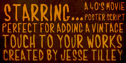 Another font inspired by 40s movie posters. Enjoy!
 - Curly Lava Bubble by TypoGraphicDesign,
$15.00 CONCEPT/ CHARACTERISTICS The lava/soap/pudding character of the font reminds us of a modern bitmap pixel font. »Curly lava bubble« goes even further. The rectangular hard edges expands to soft and almost organic forms. APPLICATION AREA The fancy, modern & decorative font »curly lava bubble« would look good at display size for party flyer & movie poster, music covers or headlines in magazines or websites… TECHNICAL SPECIFICATIONS Headline Font | Display Font | Decorative Font »curly lava bubble« with 3 stlyes (light, regular, bold) & 305 glyphs inkl. accents & € KONZEPT/BESONDERHEITEN Der Lava/Seifenblasen/Pudding Charakter der Schrift lässt an eine moderne Bitmap Pixel Schrift erinnern. Wobei »curly lava bubble« noch weiter geht und die harten rechteckigen Kanten zu weichen und fast schon organischen Formen ausbaut. EINSATZGEBIETE Der Font würde sich über folgende Gebiete sehr freuen und sich dort wohl fühlen: Logos/Wortmarken aller Art, Flyer für fast jede Party, PlattenCover, CD-Cover, PlakatDesign, Game- und Videospiel-Design aller Genres, als Headlineschrift für print und digitale Magazine, Bücher, Webseiten… TECHNISCHE INFORMATIONEN Headline Font | Display Font | Deko Font »curly lava bubble« OpenType Font mit 3 Schriftschnitten (light, regular, bold) & 305 Glyphen inkl. diakritisches Zeichen & €