10,000 search results
(0.035 seconds)
- Angry Ronin by Artcity,
$16.00
- Rancho Grande by BA Graphics,
$45.00 - ADD by Sea Types,
$20.00
- Bernhard Tango by Bitstream,
$29.99 - Buddy Lotion by PizzaDude.dk,
$15.00 - Key West by BA Graphics,
$45.00 - GirderSuper by Wooden Type Fonts,
$15.00
- Hello Arson by Dismantle Destroy,
$19.00
- Antique 7 by Wooden Type Fonts,
$15.00
- Triron by Fontron,
$35.00 - Glossy by Volcano Type,
$19.00 - Nuptial by Bitstream,
$29.99 - DNA by Emboss,
$9.95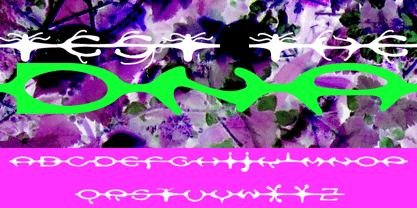
- Droporado 4F by 4th february,
$30.00
- Afarkeset MF by Masterfont,
$59.00
- Fatality by Artcity,
$9.00
- Maslul MF by Masterfont,
$59.00
- Sheli MF by Masterfont,
$59.00
- Anel by La Boîte Graphique,
$15.00
- The font "KG Somebody That I Used to Know" is designed by Kimberly Geswein, a renowned typeface designer known for her extensive collection of fonts that span a wide range of styles, from whimsical a...
- CircuitBoredNF is a distinctive font created by Nick Curtis, a designer known for his prolific work in the world of typography. This font stands out due to its unique inspiration and design, which cl...
- The Herrliches Script font is a captivating blend of classic calligraphy and modern flair, designed to bring an air of sophistication and personal touch to any project it graces. With its smooth, flo...
- The Schwabacher font, revitalized by Dieter Steffmann, is a captivating blend of history and artistry, standing as a tribute to the rich heritage of German typography. Originating from the 15th and 1...
- Font in a Red Suit by Utopiafonts is an intriguing and uniquely named typeface that instantly catches attention not just for its name but for its distinctive design qualities as well. This font embod...
- Maternellecolor creuse is a delightful and whimsically designed font that seems to carry the innocence and creativity of a child's world right into the realm of typography. Crafted with a keen eye fo...
- Alpha Sentry, a font crafted by Iconian Fonts, a prolific font foundry known for its diverse and extensive range of typography styles, emerges as a unique addition to their lineup. This font embodies...
- Alright, let's talk about Cocaine Sans by Chris Hansen. Imagine a font that not only captures your attention but also holds it hostage with its bold, unapologetic style. That's Cocaine Sans for you. ...
- Alright, let me paint a picture for you about Brock Script by Dieter Steffmann. Imagine a world where the elegance and panache of the past are captured in the curves and flourishes of a font. This is...
- DrumagStudioNF, a font crafted by Nick Curtis, is a true representation of vintage charm meeting modern design sensibilities. This typeface stands out for its bold and distinctive character shapes th...
- FS Conrad by Fontsmith,
$50.00
- Cooper Nouveau by House Industries,
$33.00
- The "Princess" font by Blue Vinyl Fonts is a whimsical and enchanting typeface that seems to have been plucked right out of a fairy tale. Designed with a playful elegance, it encapsulates the charm a...
- The Earwig Factory font, created by Ray Larabie, is a unique blend of whimsicality and industrial charm, making it stand out in the crowded world of typography. With its origins deeply rooted in the ...
- By Starlight is a captivating font that seems to have been delicately woven from the whispers of evening dreams and the shimmering light of distant stars. It embodies a graceful blend of elegance and...
- The Rickon, a unique and expressive font created by Dav Studio, epitomizes creativity and individuality in typography. Characterized by its playful yet sophisticated structure, The Rickon font infuse...
- CuprumFFU is a captivating typeface created by the talented designer Jovanny Lemonad, who has made a notable contribution to the world of typography with this creation. The font is characterized by i...
- Dust Serif by Galdino Otten is a font that captures the essence of sophisticated elegance and aged grace, making it a unique addition to the realm of typography. With its roots firmly planted in the ...
- Gemina is a distinctive and innovative font created by Iconian Fonts, a design entity renowned for crafting a wide array of unique and eye-catching typefaces. This font is characterized by its futuri...
- The VTCSundayKomixTall typeface, a creation of Vigilante Typeface Corporation, exudes a distinct charm that harks back to the lively and animated feel of classic Sunday comic strips. This font is des...
- The Quixotic font, designed by the renowned type designer Ray Larabie, stands out as an epitome of modernity meshed with whimsical flair. This font is characterized by its unique blend of contemporar...