6,758 search results
(0.381 seconds)
- Kickoff by Din Studio,
$29.00 Introducing Backyard - A Display Font This awesome typeface with amusing style looks very interesting for loads of different projects and promotions. It is perfect to be used on your website, for your social media branding, Pinterest banners, printed products, and more! Features: Multilingual Support PUA Encoded Numerals and Punctuation Thank you for downloading premium fonts from Din Studio
 - Silvergates by Gienlee,
$15.00 Yo! Welcome to gienlee cartoon, design, and other artworks Silvermoon is Medieval Font. Commonly used for middle ages those combined with the beauty of crystal and silver stone. Item Description Standard Glyphs (Uppercase, Lowercase, Numeral & Punctions) Works on PC & Mac No Special Software is required File Description Silvergates-Regular OTF file Silvergates-Line OTF file enjoy your download
 - Qistilla by Ditatype,
$29.00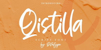 Qistilla is a casual handwritten font. Made for any professional project branding that need a modern and attractive typeface. It is the best for logos, branding and quotes. Every letter has a unique and beautiful touch. Includes: Qistilla (OTF) Features: Standart Ligatures Multilingual Support PUA Encoded Numerals and Punctuation Thank you for downloading premium fonts from Dita Type
 - ATC Timberline by Avondale Type Co.,
$20.00 ATC Timberline, is an ultra wide-set sans-serif typeface. With its sharp points and extended curves, ATC Timberline feels just at home in mid-century modern as it does in forward-looking modern settings. Contains 370+ glyphs, full alphabet, ligatures, numberals, accents and punctuation. File type included in download is .otf. ATC Timberline was released in 2016.
 - BonvenoCF - 100% free

- Adams by Canada Type,
$24.95 Adams is a revival and major expansion of Dolf Overbeek's Studio typeface and Flambard, its bold counterpart, originally published by the Amsterdam Type Foundry in 1946 and 1954. This digital version adds small caps and a new light weight. Adams is a simple upright, flat brush script, with stroke angles carefully designed to give the same color in all sizes. It is reminiscent of the sign lettering commonly found in the 1930s and 1940s. The Adams fonts are available in all popular font formats, and the character sets cover a wide range of codepages, including Central and Eastern European languages, Esperanto, Turkish, Baltic, Celtic/Welsh.
 - P22 Slogan by IHOF,
$24.95 P22 Slogan is a non-connecting script font that captures the essence of the lettering used in 1950s European advertising. Bold strokes of this brush-drawn face make this design a great choice for both retro design and contemporary work. The font is based on the 1957 design Slogan by Aldo Novarese for the Italian Nebiolo Type Foundry. At the time of its original release, it was touted for "striking publicity work". This new digitization accurately reproduces the outlines of the original not found in previous digital versions of this design. P22 Slogan is a non-Pro Opentype font that includes Central European characters.
 - HWT Geometric by Hamilton Wood Type Collection,
$24.94 This late 19th century design conjures up early 20th century Dutch DeStijl lettering with a mostly strict adherence to right angles and minimal stroke modulation. Geometric began its life as a metal typeface from the Central Type Foundry, circa 1884. Soon after, this design was officially licensed to Morgans & Wilcox and was shown in their 1890 catalog in Regular, Light and Condensed Light variations. After acquiring Morgans & Wilcox, Hamilton Manufacturing offered Geometric Light Face Condensed as their own No 3020 and the Geometric Light Face as No 3021. HWT Geometric has been expanded digitally to include a Regular Condensed version. A heavier wood type specimen was found from an unknown manufacturer and digitized as it was found, resulting in the HWT Geometric Shopworn and Shopworn Inked variations. These digital versions all include a full Western and Central European character set of over 380 glyphs.
 - Dust Serif - Personal use only

- Old Softy NF by Nick's Fonts,
$10.00The pattern for this friendly face was found within the Keystone Type Foundry's 1884 specimen book, under the rather prosaic name of Round Gothic. This version retains all of the original's warmth and charm, while updating it to twenty-first century standards. Both versions of this font include the complete Latin 1252, Central European 1250 and Turkish 1254 character sets, along with localization for Lithuanian, Moldovan, Romanian and Turkish. - Fredericksburg by Nick's Fonts,
$10.00In his book of 100 Wood Type Alphabets, Rob Roy Kelly called this face "Teutonic". This version adds lowercase letters, missing in the original, plus a few woodcut dingbats in the brackets, bar, section and florin positions. Named for a charming town in the Texas Hill Country, founded by German settlers in the mid-1850s. Both versions of the font include 1252 Latin, 1250 CE (with localization for Romanian and Moldovan). - BulletBalls AOE - Unknown license

- Athena by Solotype,
$19.95This beautiful old design was originated at the Connor Foundry, New York, about 1888. Ideal for the small "in between" lines in modern versions of Victorian job printing. - Amati Pro by RMU,
$40.00 A revived and updated version of Georg Trump's Amati which was first released by C. Weber Foundry, Stuttgart, in 1951. A compressed multilingual serif font for many purposes.
 - Cuantica by Graviton,
$12.00 Cuantica font family has been designed for Graviton Font Foundry by Pablo Balcells in 2012. It is display typeface with a geometric look. Cuantica consists of 4 styles.
 - Subikto One by Subtitude,
$22.00 Subikto One is the first of a series of pictograms from Subtitude foundry. We've create a multitude of hand positions and combinations. Each hand express a unique gesture.
 - RMU Gloria by RMU,
$30.00 RMU Gloria is a family of two stylish fin-de-siècle fonts, formerly released by the Gursch Foundry, Berlin, which additionally were spiced with elements for frame making.
 - Cartesius by T4 Foundry,
$21.00Veteran designer Bo Berndal has created Cartesius, an oldstyle serif typeface with roots in the 16th and 17th centuries, France and Venice. Bo Berndal: "Rene Decartes, the great French philosopher, was invited to Sweden in the 17th century, when the country was at the height of its power. In the university city of Uppsala he used the Latin name form Cartesius. The typeface that carries his name is inspired by letterforms from the 1600s, but upper case letters are of pure Roman type". Cartesius holds up well even under less than perfect circumstances, and is suitable for magazine and book design. It comes with a full range of styles, including small caps. Swedish type foundry T4 premiere new fonts every month. Cartesius is our fifth introduction. - Steelplate Gothic Pro by Red Rooster Collection,
$60.00 Steelplate Gothic Pro is a sans serif font family with traditional and drop shadow weights. It shares letterform similarities to conventional Copperplate Gothic families, but has no spur serif endings. Most of the original designs came from the Western Type Foundry when BB&S acquired it in 1918; all were cut by Robert Wiebking. It was recast in 1954 by American Type Founders (ATF). Steve Jackaman (ITF) designed and produced a digital version of the original single weight in 1997. In 2017, Jackaman completely redrew and expanded the family, adding entirely new condensed variants and true small caps. Steelplate Gothic Pro has a masculine, industrial feel, and works effortlessly at display and subhead sizes. It shares letterforms with its sans serif sister family, Barnsley Gothic.
 - Qualettee by Ingrimayne Type,
$9.95 Qualettee is a decorative sans face with a high x-height that works surprisingly well for text. The lightest weight is almost moonline but as the styles get bolder, the contrast increases, becoming very pronounced. The family has ten members: five weights with italics for each weight.
 - News Copy JNL by Jeff Levine,
$29.00 Found within the pages of the 1934 edition of the American Type Foundry’s “Book of American Type” is a sans serif design with rounded terminals that emulates a typewriter face. “Jumbo Typewriter” is reminiscent of the type of lettering formerly found on teletype news copy. “Teletype” was a division of Western Electric (part of AT&T), and the machines utilized telephone lines to electronically type and send (as well as receive) messages worldwide. Many folks will remember the sound of teletype machines in the background when radio stations had their news breaks. Now available digitally as News Copy JNL, it is available in both regular and oblique versions.
 - !Sketchy Times - Unknown license

- Xylo Sans by PintassilgoPrints,
$19.00 Xylo Sans letterforms are based on a typeface from Miller & Richard type foundry, from circa 1911. They are presented here with a rough wood texture, in two xylographic flavors.
 - Solida by Graviton,
$4.00 Solida font family has been designed for Graviton Font Foundry by Pablo Balcells in 2012. It is display typeface with a geometric angular look. Solida consists of 10 styles.
 - Hearst Italic by Solotype,
$19.95Carl Schraubstadter of the Inland Type Foundry probably had more to do with the design of this italic than he did with the roman. Great for Craftsman Era projects. - Ptolemei by Kaer,
$21.00 These initials set I collected from Early 15th century manuscript called Claudii Ptolemei Cosmographia, created by the famous Greek scholar Claudius Ptolemaeus in the middle of the 2nd century. The origins of this style called White Vine with interlaced patterns and vine should be found in Ottonian Renaissance manuscripts. The highest level of porthole craftsmanship points to the Florentine workshop, headed by Francesco d'Antonio del Chierico, as the most likely place of execution. --- *You can use color fonts in PS CC 2017+, AI CC 2018+, ID CC 2019+, macOS 10.14 Mojave+ * *Please note that the Canva & Corel doesn't support color fonts!* *Please download this test file with only A letter ( https://www.dropbox.com/s/u3novoj7mm2vrth/Ptolemei-Test.otf?dl=0 ) to check your app & system.* --- Please feel free to request any help you need: kaer.pro@gmail.com Best, Roman. Thank you!
 - Santoro Script by Jukebox Collection,
$36.99 Santoro Script is a fun, happy script font created in the style of handpainted sign lettering. The first brand-new font added to the Jukebox library since 2011, it displays a jubilant attitude which will add a spontaneous, warm and friendly look to any design. The typeface contains three versions of every letter found under the Swash and Stylistic Alternates OpenType features as well as a few additional letter versions and ligatures under the Titling and Discretionary Ligatures OpenType features. These extra alternates help give the font a hand painted feeling. Jukebox fonts are available in OpenType format and download packages contain both .otf and .ttf versions of the font. They are compatible on both Mac and Windows. All fonts contain basic OpenType features as well as support for Latin-based and most Eastern European languages.
 - American Advertise 013 by Intellecta Design,
$9.00inspired in classic wood type heritage fonts from old America's foundryes - Rose Mask by Viswell,
$19.00 RoseMask is a capvitating combination font with three distinct style that seamlessly complement each other. The uppercase style featured elegant serif for a timeless appeal, the lowercase style offers a playful monoline approach, and the alternates presented in a bubbly gravity font, infuse creativity and dynamism. Mix and macth this versalite font effortlessly transitions between elegance and playfulness, making it a must have for diverse design project, from branding to editorial layout.
 - The Beautyline by Putracetol,
$14.00 The Beautyline is a modern monoline typeface. Like the font name, this font is made of beautiful lines with additional lines in some characters which makes this font more beautiful. It’s perfect for branding, logos, wedding designs, social media posts, advertisements, invitations, stationery and any projects. The Beautyline comes with uppercase, lowercase, numerals, punctuation and many variations on each character, including OpenType alternates and common ligatures to let you customize your designs.
 - Abigail Script by Roland Hüse Design,
$15.00 Abigail Script is a handwritten, monoline cursive font. All the uppercase letters has stylistic alternates and some lowercase letters as well, ligatures and positional forms. Also have a few ornaments in place of numbers 1-9 best fit under words up to 5-6 characters long. See the gallery for preview. It contains Eastern and Western European accented characters. I hope you like this font, good luck with your project and let the creativity flow!
 - Headskirt by Maulana Creative,
$14.00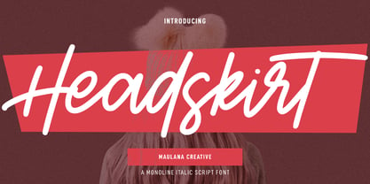 Headskirt is a casual modern script font. With monoline stroke, fun character with a bit of ligatures and alternates. To give you an extra creative work. Headskirt font support multilingual more than 100+ language. This font is good for logo design, Social media, Movie Titles, Books Titles, a short text even a long text letter and good for your secondary text font with sans or serif. Make a stunning work with Headskirt font. Cheers, MaulanaCreative
 - Hello Christmas by Zetafonts,
$39.00 Hello Christmas is the christmas-themed version of Zetafonts' Hello Script family including a set of Icons (designed by Cristiana Pezzatini), both featuring multilayer color fill. An high contrast calligraphic script designed by Cosimo Lorenzo Pancini, featuring monoline swashes and terminals and strong, round body shapes designed with a parallel nib. It covers over 40 languages that use the Latin alphabet, with full range of accents and diacritics, and comes with over ten different swashes.
 - Celdum by The Northern Block,
$39.00 Celdum, a modern geometric type family, constructed from a rectangular grid. Smooth, precise curves meet horizontal and vertical lines to create a monoline design with no apparent contrast. Each letter shape has unique subtleties creating a purposeful type family suited to text and branding scenarios within mobile applications, video games and other interactive software. Details include six weights with italics, 460 characters, five variations of numerals, manually edited kerning and Opentype features.
 - Faubourg by Positype,
$39.00 Faubourg marks the first professional typeface release by Marie Boulanger. As much traditional as it is unconventional in its celebration of letterforms, this typeface dances on the page and screen as it moves from a more conventional appearance to monoline and back again. The flowing silk-like undulation only accentuates this distinguishing feature and produces one opportunity after the next for headline settings where the word is as important as the content supporting it.
 - Thunder Heat by Letterhend,
$14.00 Thunder Heat is a monoline font duo with classic looks. You can play around to fit the form using sans serif and script mode. This font perfectly made to be applied especially in logo, and the other various formal forms such as invitations, labels, logos, magazines, books, greeting / wedding cards, packaging, fashion, make up, stationery, novels, labels or any type of advertising purpose. Features : Uppercase & lowercase Numbers and punctuation Alternates/Ligatures Multilingual PUA encoded
 - Strongs Draughtsman by Nick's Fonts,
$10.00One in the series of fonts celebrating the Halcyon Days of Handlettering. Strongs Draughtsman is a monoline font that evokes the sensibilities of the early twentieth century. Based on a font called "architects' pen strokes" as delineated by Lawrence and Charles Strong in their The Art of Show Card Writing from 1922. Both versions of this font contain the Unicode 1252 (Latin) and Unicode 1250 (Central European) character sets, with localization for Romanian and Moldovan. - Rothwell Signature by XdCreative,
$19.00 Experience the beauty of "Rothwell Signature," a monoline, organically hand-written script font. With its complete A-Z, and complete set of alternates from A-Z, including both uppercase and lowercase, this font allows you to add a unique and personalized touch to your designs. Additionally, "Rothwell Signature" offers an extensive selection of ligatures, enhancing the fluidity and elegance of your typography. Elevate your projects with this versatile and stylish script font.
 - Black Brownies by Violatype,
$14.00 Introducing “Black Brownies,” a font that serves as a canvas for the artistry of monoline handcrafted strokes. “Black Brownies” is your key to unlocking a world of creative possibilities. Perfect for curating captivating magazine layouts, infusing quotes with an irresistible and distinctive charm, carving out a memorable and influential brand identity through logos, and embarking on a multitude of imaginative design projects. If you have any questions, don’t hesitate to contact us
 - UT Marmalade by Uniontype,
$20.00 Marmalade Script by Uniontype is a modern multilingual type family inspired by vintage monoline fonts. The family consists of light, regular, bold and printed styles. Choose сolor and offset according to your taste. Marmalade Script provides advanced typographical support with contextual alternates, ligatures and swashes. That way, you’ll have automatic access to the dozens extra glyphs in each of the fonts. Marmalade Script is good for menu, signs, packaging, posters, letterings and logos.


