10,000 search results
(0.336 seconds)
- Nula by Tour De Force,
$25.00 Nula is humanist sans serif family equipped with 22 font files - 11 weights and italics - from Thin to Heavy. It is modern, functional and distinctive, ideal for multiple purposes. Curvy diagonal stems and endings characterize Nula as typeface with lively elegant and soft touch, but stable, well structured typeface at same time. Nula font family is fully legible in any size and with it's variety of weights recommends itself for publishing or online magazine. Nula includes stylistic alternate letters, tabular and old style numerals, fractions, numerators and denominators, alternate forms of numerals and bunch of applicable symbols with arrows that are exchangeable in all weights, following weight thickens.
 - Knedle by Sudetype,
$50.00 A tasteful sans-serif with a delicate italics, ideal for branding and packaging design. Knedle [dumplings] are characterized by carefully balanced proportions and soft stroke endings, which gives the typeface credible yet friendly expression. Italics are not just slanted versions of roman styles, but with their delicate letter shapes and narrower proportions they form a taste-balanced counterpoint. With 14 styles (Latin & Cyrillic) more than 1460 glyphs per font and rich OpenType features (including many stylistic sets) Knedle are perfectly suited for the needs of branding or packaging design. Thanks to their excellent legibility and smart contextual alternates, they can also work surprisingly well as a signage font. Bon appetite!
 - Linotype Finerliner by Linotype,
$29.99Linotype Finerliner is part of the Take Type Library, chosen from the contestants of Linotype’s International Digital Type Design Contest. The American artist Gary Munch, from whom we also have Linotype Ergo and Ergo Sketch, designed Linotype Finerliner as a handwriting font with calligraphic influences. The small, regularly formed lower case letters contrast nicely with the generous, sweeping capitals. The font is available in a light and medium weight and displays no stroke contrast. The lighter weight, micro, is best used for shorter texts in point sizes 18 or larger and the medium weight, macro, is mainly intended for headlines in larger point sizes. - Nauman Neue by The Northern Block,
$39.95 Nauman Neue is a modern humanist sans serif typeface made for the screen. Broad open letter forms are combined with precise geometry to create a functional and legible font that’s ideal for web and on-screen applications. In 2021 Nauman was expanded to sixty styles, including two helpful widths condensed and semi-condensed. Included in the font are 900 characters per style, ten weights and three widths with matching italics. Opentype features consist of seven numerals variations, including inferiors, superiors, fractions, tabular, lining, and old style. It also has alternate lowercase a, e, I, M, small caps, arrows and language support covering Western, South, Central Europe and Vietnamese.
 - Bayamo by Monotype,
$29.99 Emil Bertell's Bayamo is a contemporary, digital take on the brush script tradition. It echoes the loose forms and energetic personality of sign painted letters, tapping into the current nostalgia for hand-drawn type. “I think most script fonts nowadays are either some kind of modern calligraphy, or synthetic/mechanical scripts,” says Bertell. “This one leans more towards a classic American sign painting tradition.” Contextual alternates ensure that lowercase characters change depending what's next to them, mimicking the more varied word shapes created by sign writers. Well suited for branding projects, packaging and headlines, Bayamo also pairs well with strong sans serif, and other typefaces with angular forms.
 - Cambria Math by Microsoft Corporation,
$49.00OpenType Layout features: smallcaps, stylistic alternates, localized forms, standard ligatures, uppercase-sensitive forms and spacing, oldstyle figures, lining figures, smallcap figures, arbitrary fractions, superscript, subscript. Cambria has been designed for on-screen reading and to look good when printed at small sizes. It has very even spacing and proportions. Diagonal and vertical hairlines and serifs are relatively strong, while horizontal serifs are small and intended to emphasize stroke endings rather than stand out themselves. This principle is most noticeable in the italics, where the lowercase characters are subdued in style, to be at their best as elements of word-images. This font is suitable for business documents, email, web design. - MFC Hills Medieval by Monogram Fonts Co.,
$24.95 MFC Hills Medieval was developed from a unique historical Blackletter type specimen in the 1882 Hills Manual of Social and Business Forms. While you could use its ornate capitals to construct a monogram, this is not a monogram font, but a fully functional typeface for invitations and period lettering. From stylish and ornate capitals to a soft lowercase resembling bled ink, this period lettering style is a true eye-catcher. Because of some of the unique medieval letterforms, standardized letterforms were created as the default typeable letters while the true historical forms were setup as Stylistic Alternates. A sophisticated Blackletter for manuscripts and invitations alike.
 - Kunex by Twinletter,
$15.00 The display font Kunex was created for outdoor sporting events and many other contemporary sports. A manly aesthetic with a sense of strength and speed may be brought to life with this modern slab shape and graceful tilt. It is perfect for contemporary logos and monograms for vehicles, sports, and other occasions. Kunex has a distinctive vitality in its concise form that, when written, has a rough and bold impression. At the same time, the typeface has been developed to adhere to precise letter-design principles to have a more natural feel than digital textures. What’s Included : - File font - All glyphs Iso Latin 1 - Alternate, Ligature - Simple installations - We highly recommend using a program that supports OpenType features and Glyphs panels like many Adobe apps and Corel Draw, so you can see and access all Glyph variations. - PUA Encoded Characters – Fully accessible without additional design software. - Fonts include Multilingual support
 - Snatched by Cititype,
$16.00 'Snatched' is a spontaneous handwriting. This name is taken from the slang term in the 2022 era to describe someone or something in a positive manner. This font consists of the same uppercase and lowercase, often referred to as 'all capital letterform', complete with numerals and punctuation. Composed in tends to widen form which is more like the typical handwriting of architects. This font looks like it was written with a marker or technical pen, very bold stylish and legible. For designers this is an interesting thing, the design looks very natural and rhythmic to beautify presentations and blue prints. Can be installed for CAD programs, Sekthup and other applications. This font is very suitable for various media related to handmade, craft businesses, logos, quotes, prints, social media posts, indie business, outdoor sports and other applications to strengthen the impression of handwriting and demand attention.
 - Golane by Craft Supply Co,
$20.00 Introduction to Golane Introducing Golane, a Geometric Sans Serif font, it exemplifies a sleek, modern design. Firstly, its geometric styling enhances visual appeal. Importantly, this font is perfect for lengthy texts, offering remarkable readability. Additionally, its simplicity appeals to a broad audience, from novices to seasoned professionals. Design and Aesthetics Focusing on design, Golane is deeply rooted in geometric principles. Each character is meticulously crafted, ensuring a balanced and harmonious appearance. Furthermore, its clean lines and shapes exude a contemporary vibe. Consequently, the font masterfully combines form and function, making it highly versatile for diverse applications. User-Friendly Features Regarding user experience, Golane stands out for its user-friendly qualities. It’s notably easy to read, which greatly enhances the legibility of extended texts. Moreover, the font’s adaptability is evident, as it fits seamlessly in various contexts. Whether used in print or digital formats, Golane consistently maintains its clarity and effectiveness.
 - Dust Serif - Personal use only

- Aerovias Brasil NF - 100% free

- Sesquipedalian NF - Unknown license

- Celebrity by Canada Type,
$24.95 Celebrity is a new execution of a film type concept put forth by Willy Wirtz in 1971. The original idea, called Latus, had many irregularities and unfit characters that are now fixed and expanded in this digital version. Celebrity's construct combines extreme thicks with hairline thins to build forms that contribute to a type totality that is at once modern and techno, as well as retro-deco. Eye catching and memorable, Celebrity is ideal for use on posters, book covers, media sleeves and packaging. It also has enough geometric appeal to inspire unique logos and set attractive titling. Celebrity comes in all popular font formats, and includes a very expanded Latin character set.
 - Seeking Brush by Java Pep,
$15.00 Introducing Fresh from the Oven, a casual handwritten brush font with a signature style called Seeking font. This font comes with ligature and swash, Seeking font is perfect for logotype, display text, headline, branding, advertising, social media posts, etc. Seeking font available for multilingual support that more than 25 languages. What's include Seeking font Seeking Swash PUA encoded Multilingual Support Thanks, and have a nice day
 - Flying Saucer by Hanoded,
$15.00 My 7 year old son is reading a book called ‘Spees De Ruimtewees’ (Spees, the Galactic Orphan), so when I needed a name for this font family, I didn’t have to think a lot! Flying Saucer is a family of 2 fonts: a rough(ish) sans serif and a script font. Both fonts come with Italics. Use Flying Saucer for anything space related (or whatever you feel like using it for).
 - Bandy by NamelaType,
$19.00 Rounded and bended slab that's why we named this font "Bandy" This font is great for you to use as a display font and is suitable for body text. cool anyway if you use it for your design and printing needs. Available in many languages, and open type features, supported with Latin and standard Cyrillic. Build with 14 fonts with 7 sizes with matching Oblique and 2 Variables
 - Jorick by NREY,
$19.00 Jorick is a vintage feeling serif font inspired by retro fonts. It perfectly represents modern and vintage esthetics. The font includes both uppercase and smallcase letters. The font is perfect for wedding elegant invitation cards, beauty and fashion package design, very suitable for books design, magazines typography, packaging, branding and more other creative project. It have supporting for many european languages and perfect cyrillic! Thank you and have a great day!
 - Quirky Notes by Insan Perkasya,
$12.00 Introducing the "Quirky Notes" font, which is a handwriting font made specifically for notes, but even though it is specifically for notes, this font is also very suitable for other things, such as quotes, lesson schedules, branding, logos and others. Quirky Notes font is made by handwriting so it produces natural strokes but is still beautiful to use. If you have any questions, don't hesitate to contact us. Thank You
 - Deaffont by Kustomtype,
$25.00 Deaffont is an experimental font specially designed for a music video and album concept by the metal band Deafcon. The font is entirely hand-drawn and digitized. It means that Deaffont is a very user-friendly, complete and modern font, which you can use for all your graphic applications. Deaffont is a subculture font that blows you away, ideal for an eye-catching design. Trust me, Deaffont rocks!
 - Buddy Slender by Hackberry Font Foundry,
$24.95 Buddy Slender is the narrower version of the companion sans for Contenu, the book font family designed for a book on book family design called Practical Font Design. It's a loose, free, easy to read sans, so when my wife suggested Buddy, it clicked. This is the 2-font Buddy Slender family of Regular & Bold. I made a new more limited feature set for these fonts due to their designed usage.
 - Soul Leo by Otto Maurer,
$16.00 Soul Leo ist a special Version of my font „Soul“ (soul ultra black). For a long Time i want to make a Font like this. Before FL6 that was impossible. I know it is a big File Size for a Font with all the Graphics but i need a Font like this for a LadyProjekt. And so i did it myself. I hope you like it as i do!
 - Asyatu by Twinletter,
$15.00 Asyatu Arabic style font. These fonts are not only useful and beautiful. They are also well made. Our designers work hard to ensure the quality of each font is similar to that of a professional calligrapher. This font is perfect for you whether you are designing Islamic greeting cards for your friends’ weddings. Invitations for big events like engagement parties or birthday parties, as well as your various special projects.
 - Honest Punch by Sarid Ezra,
$15.00 Honest Punch is a bold and strong quotable font that you can use for any purposes. This font is very suitable for tagline and branding. With readability and clear looks, this font is perfect for quote. Honest Punch contains unique lowercase and uppercase that you can use at the same times in a word that will make your design more attractive. This font also contains ligature, underline, and support multilingual.
 - Varidox by insigne,
$35.00 Varidox, a variable typeface design, allows users to connect with specific design combinations with slightly varied differences in style. These variations in design enable the user to reach a wider scope of audiences. As the name suggests, Varidox is a paradox of sorts--that is, a combination of two disparate forms with two major driving influences. In the case of type design, the conflict lies in the age-old conundrum of artistic expression versus marketplace demand. Should the focus center primarily on functionality for the customer or err on the side of advancing creativity? If both are required, where does the proper balance lie? Viewed as an art, type design selections are often guided by the pulse of the industry, usually emphasizing unique and contemporary shapes. Critics are often leading indicators of where the marketplace will move. Currently, many design mavens have an eye favoring reverse stress. However, these forms have largely failed to penetrate the marketplace, another major driving factor influencing the font world. Clients now (as well as presumably for the foreseeable future) demand the more conservative forms of monoline sans serifs. Typeface designers are left with a predicament. Variable typefaces hand a great deal of creative control to the consumers of type. The demands of type design critics, personal influences of the typeface designer and the demands of the marketplace can all now be inserted into a single font and adjusted to best suit the end user. Varidox tries to blend the extremes of critical feature demands and the bleeding edge of fashionable type with perceptive usability on a scalable spectrum. The consumer of the typeface can choose a number between one and one-thousand. Using a more conservative style would mean staying between zero and five hundred, while gradually moving higher toward one thousand at the high end of the spectrum would produce increasingly contemporary results. Essentially, variable fonts offer the ability to satisfy the needs of the many versus the needs of the few along an axis with a thousand articulations, stabilizing this delicate balance with a single number that represents a specific form between the two masters, a form specifically targeted towards the end user. Practically, a user in some cases may wish to use more conservative slab form of Varidox for a more conservative clientele. Alternatively, the same user may then choose an intermediate instance much closer to the other extreme in order to make a more emphatic statement with a non-traditional form. Parametric type offers a new options for both designers and the end users of type. In the future, type will be able to morph to target the reader, based on factors including demographics, mood or cultural influences. In the future, the ability to adjust parameters will be common. With Varidox, the level of experimentality can be gauged and then entered into the typeface. In the future, machine learning, for example, could determine the mood of an individual, their level of experimentality or their interest and then adjust the typeface to meet these calculated parameters. This ability to customize and tailor the experience exists for both for the designer and the reader. With the advent of new marketing technologies, typefaces could adjust themselves on web pages to target consumers and their desires. A large conglomerate brand could shift and adapt to appeal to a specific target customer. A typeface facing a consumer would be more friendly and approachable, whereas a typeface facing a business to business (B2B) customer would be more businesslike in its appearance. Through both experience, however, the type would still be recognizable as belonging to the conglomerate brand. The font industry has only begun to realize such potential of variable fonts beyond simple visual appearance. As variable font continues to target the user, the technology will continue to reveal new capabilities, which allow identities and layouts to adjust to the ultimate user of type: the reader.
 - Rough Sketch by Java Pep,
$13.00 Introducing Rough Sketch fonts duo. This font has character like the name "rough" but yet elegant. Rough Sketch is suitable use for stand out and contradiction themes. This font also elegant for logo, web titles, poster, quote, book or magazine cover, poster and more. Benefit of Rough Sketch Packages Perfect collaboration of Rough Sketch and Roug Duo. You can get two fonts that always well-suited to collaborate in your design or project so this font complete each other. Multilingual Support and ligature set. This font is already for multilingual support for Italian, French, Spain, Danish, Czech, Portuguese, Hungarian, Irish, English, Finnish, Norwegian, Polish etc or contact me if you need to add your language. Ligatures is two or more of letters are joined as a single font like or, sr, pr, and etc. I hope you enjoy using Rough Sketch - fonts duo, if you have anything question about this font please let me know with your comments. Thanks for reading and have a nice day:)
 - Ahoura by Naghi Naghachian,
$58.00 The Ahoura font family, designed by Naghi Naghashian, was developed considering specific research and analysis on Arabic characters and definition of their structure. The Ahoura innovation is a contribution to modernisation of Arabic typography; gives the Arabic font letters real typographic arrangement and provides for more typographic flexibility. This step was necessary after more than two hundred years of relative stagnation in Arabic font design. Ahoura supports Arabic, Persian, and Urdu and includes proportional and tabular numerals for the supported languages. The Ahoura Font family is available in three weights; Light, Regular and Bold. Each has two different styles-- normal and italic. Ahoura is the first real italic Arabic typeface known until now and its intuitive design arrangement fulfils the following needs: - It is precisely crafted for use in electronic media and it fulfils the demands of electronic communication. Ahoura is not based on any pre-digital typefaces and it is not a revival. Rather, its forms were created with today’s ever-changing technology in mind. - Ahoura is suitable for multiple applications, and gives the widest potential for acceptability. - It is extremely legible not only in its small sizes, but also when the type is filtered or skewed, e.g., in Photoshop or Illustrator. Ahoura's simplified forms may be artificially obliqued with In Design or Illustrator, without any degradation of its quality for the effected text. - Ahoura is an eye-catching and classy typographic image that developed for multiple languages and writing conventions. - Ahoura uses the very highest degree of geometric clarity along with the necessary amount of calligraphic references. The Ahoura typeface is of a high vibration that is finely balance between calligraphic tradition and the contemporary sans serif aesthetic commonly seen in Latin typography.
 - Paletone by Bale Type,
$15.00 Paletone is hand lettered sans in two style, Regular & Bold. With the organic and handmade feels, you can use this font for any project. This minimalist font also suitable for the project with earth tone color. Also good for quotes.
 - Wishper Script by Nurf Designs,
$16.00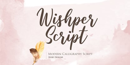 Wishper Script is a cute and casual handwritten font with an incredibly friendly feel. Whether you’re looking for fonts for Instagram or calligraphy scripts for DIY projects, Wishper Script will turn any creative idea into a true piece of art!
 - Valemon by Balpirick,
$15.00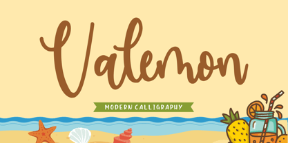 Valemon is a fancy handwritten fonts. It features gorgeous ligatures that make this script incredibly versatile. Whether you’re looking for fonts for Instagram or calligraphy scripts for DIY projects, Valemon will turn any creative idea into a true piece of art!
 - Summer Magic by Nirmana Visual,
$25.00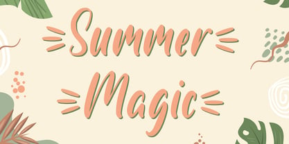 Introducing Summer Magic, Perfect for everything from branding to crafting. This versatile font is great for merchandise, products, quotes, editorial, posters or whatever design you have in mind. This is a great font for crafters. Thank you and Happy Crafting!
 - Dear Nathan by Arendxstudio,
$12.00 Introducing my latest font is Dear Nathan, a handwritten font which is very elegant and modern for you to use and your design interests be it for logos, branding names, posters, podcasts and so on. This is perfect for you all.
 - Flamante Serif by deFharo,
$8.00 Flamante Serif is a family of 8 typographies with thick square serifs of the slab type, also known by the Egyptians, which are released with four weights: Light, Book, Medium and Bold and their corresponding italic versions. They are heiress fonts of the Egyptian types arisen at the beginning of the S. XIX and descendants of the fonts "Flamante Sans" Special corporate typographies to design resounding titles on any advertising medium, also for any type of publication like magazines or newspapers. They include the Bitcoin symbol. ================================== OpenType Features: Standard Ligatures, Additional languages, All Alternates, Alternate Annotation Forms, Superscript, Kerning, Superiors, Capital Spacing, Localized Forms, Superior letters, Discretionary Ligatures, Subscript, Fractions, Slashed Zero, Inferiors, Extended Fractions, Scientific Inferiors, Ordinals, Denominators, Oldstyle Figures, Numerators, Historical Forms, Historical Ligatures. - 500 glyphs. Latin Extended-A • OTF & TTF.
 - DT Partel by Dragon Tongue Foundry,
$9.00 DT Portal: This stylised, partially serifed font, made with a slightly rounded square form, may have been inspired initially by old cathode ray tubes and computer screens. Although not intended to be purely a ‘tech’ font, it can have a strong tech feel to it. More suited to being a headline font than body text. It also appears to have a monospaced look to it, since most letters, (other than letters like ‘i, l and t’), do have the same width. There is some automatic contextual shape adjustment happening in places, to avoid taking up too much space, so contextual ligatures should be turned on. As is the case with most of my fonts, when given the choice, ‘metric’ spacing should be used in preference to ‘optical’. Initially this font was going to be called ‘DT Portal’, because its form was similar to that of a window or doorway. But due to other fonts already having that name, I chose to rename it as ‘DT Partel’, for no reason other than it is only a very small change visually.
 - Novin by Naghi Naghachian,
$85.00 Novin Font family is designed by Naghi Naghashian. This Font is developed on the basis of specific research and analysis on Arabic characters and definition of their structure. This innovation is a contribution to modernisation of Arabic typography, gives the font design of Arabic letters real typographic arrangement and provides more typographic flexibility. This step was necessary after more than two hundred years of relative stagnation in Arabic font design. Novin supports Arabic, Persian, and Urdu. It also includes proportional and tabular numerals for the supported languages. Novin Font is available in Light, Regular and Bold. Novin design fulfills the following needs: A Explicitly crafted for use in electronic media fulfills the demands of electronic communication. Novin is based on Aldo Novareses Eurostile Extended. B Suitability for multiple applications. Gives the widest potential acceptability. C Extreme legibility not only in small sizes, but also when the type is filtered or skewed, e.g., in Photoshop or Illustrator. Novin’s simplified forms may be artificial obliqued in InDesign or Illustrator, without any loss in quality for the effected text. D An attractive typographic image. Novin was developed for multiple languages and writing conventions. E The highest degree of geometric clarity and the necessary amount of calligraphic references. This typeface offers a fine balance between calligraphic tradition and the contemporary sans serif aesthetic now common in Latin typography.
 - HS Alwajd by Hiba Studio,
$50.00 Hs Alwajd is an Arabic display typeface, under “titles” category. It is useful for book titles, creative designs and modern logos. Also, it is used when a contemporary and simple look is desired that can fit with the characteristics of Kufi fatmic where horizontal parts are equal than vertical ones. It is a new style based on HS Almajd but without swirling round forms terminating in ball. The font is based on Kufi Fatmic calligraphy along with some derived ideas of decorative fonts, maintaining the beauty of the Arabic font and its fixed rates. Undoubtedly, the insertion of curved ornament in some parts adds more beauty and fascinating diversity in the flow line between sharp, soft and curved parts. This font supports Arabic, Persian, Pashtu, Kurdish Sorani, Kurdish Kirmanji and Urdu, consisting only one weight which can add to the library of Arabic Kufic fonts contemporary models that meet with the purposes of various designs for all purposes and all tastes.
 - Glory Signature by Din Studio,
$29.00 Is your branding missing something that makes people amaze? Have you thought about how you can add that touch of magic to your branding and projects? What if we told you, you only need to change one element to engage and convert your clients? Introducing Glory Signature-A Modern Script Font Giving you a simple, yet gorgeous solution to your branding. This font is more than just another script font. It encapsulates the essence of elegance and modernity. With its clean script-type design and curved indentations, this font will take your projects to the next level! Use it for headings, logos, business cards, printed quotes, invitations of all sorts, cards, packaging, and your website or social media branding. Glory Signature includes Multilingual Options to make your branding globally acceptable. Features: Standard Ligatures Stylistic Sets Swashes Multilingual Support PUA Encoded Numerals and Punctuation Thank you for downloading premium fonts from Din Studio
 - Rostrum by Canada Type,
$24.95The Rostrum fonts are a revival and expansion of a type called Oleander, designed in 1938 by Julius Kirn for the Genzsch & Heyse foundry in Hamburg. Many of the original uppercase letters had some blackletter remnants tacked onto them, so in this digital version they were relegated to the Rostrum Two font, while more contemporary forms were designed for the Rostrum One font. Characters from both fonts are interchangeable via software programs' font menus and glyph palettes in the Postscript and True Type versions, while the OpenType version takes advantage of the Ligatures, Contextual Alternates and Stylistic Alternates features to perform character substitutions. Rostrum finds the middle ground between italic and brush script, which makes it quite usable in all-caps settings. Its majuscules have a very distinct curl that makes the typeface effect-ready and very appealing in packaging design. Plenty of alternates and ligatures are sprinkled throughout the character set. - 1565 Venetian by GLC,
$20.00 This set of initial decorated letters is an entirely original creation, drawn inspired by Italian renaissance engraver Vespasiano Amphiareo's paterns published in Venice circa 1568. It contains two roman alphabets : the first of large Initials, the second of small caps. Both containing thorn, eth, L & l slash, O & o slash. It can be used as variously as web-site titles, posters and flyers design, publishing texts looking like ancient ones, or greeting cards, all various sorts of presentations, as a very decorative, elegant and luxurious additional font... This font is conceived for enlargements remaining very smart and fine. The original height of the initials is at least about one inch equivalent to about four lines of characters, small caps may have the same height than the caps of the font used with, but cover two lines is better. This font may be used with all GLC blackletter fonts, but preferably with "1543 Humane Jenson", "1557 Italic", "1742 Civilite", "1776 Independence" without any fear for doing anachronism.
 - Angustina by Diego Massaro,
$30.00 Angustina is an elegant display typeface, it takes inspiration from classic letter styles. I chose the font name after reading the classic Italian novel “The Tartar Steppe”. I was inspired by the sickly, stoic and mysterious man who differs for his willingness to stay at Fort Bastiani. Angustina conveys distress and stinging sensation with extreme contrasts between thick and thin strokes and exasperated serifs. The alternate of hairline and bracketed serifs gives Angustina a modern and military appearance.


