10,000 search results
(0.012 seconds)
- Foria by Chromatype Studio,
$20.00 foria is a Neo-classic serif inspired by a combination of Baskerville and Bodoni with round corners to give a soft impression, looks feminine and classy so it is perfect for fashion, branding, menus, cooking, and female inspiration and is also suitable for neutral typography
 - Norma by Linotype,
$29.99Norma was my second sans serif. You can find a few details in common with Dialog, but the graphic impression of Norma is totally different.Every typeface has some characters that are the favourites. In Norma I simply love the lowercase roman a. Don't you, too, think that it is perfection itself? Norma was released in 1994. - Form by T-26,
$19.00 - Formative by Studio Few,
$24.00 Sharp angular terminals, squared off bowls, and a balance of curved paths with straight. Formative is a grotesk with charm. Includes a stylistic set featuring standard 'text' style terminals.
 - Formas geometricas 2 - Unknown license

- Formas germetricas 1 - Unknown license

- Throrian Formal - 100% free

- Vital Formations - Unknown license

- Terra Firma - Unknown license

- Lost Format by T-26,
$19.00 - Agatized Formal by ULGA Type,
$25.00 Agatized Formal is a chunky stencil typeface with slightly condensed letterforms and tight spacing. Designed primarily for display use, it’s ideal for posters, logos, advertising, book cover designs or small chunks of text such as pull-out quotes. It exudes authority without taking itself seriously, like a plump jolly uncle in charge of a brass band. Agatized Formal is a big, bold typeface with a charismatic presence that commands attention – in a friendly way, of course. But what really makes this typeface come alive is its arsenal of alternative characters and ligatures. There is a saying: Use sparingly. Whoa! Not here, no, no, no. Make your Glyphs palette earn its money. Flex your OpenType muscles: get stylized, contextualized, indulge in some ligaddiction. This typeface is a peacock that likes to put on a show, spread its plumage and strut around in all its blazing glory. Agatized, according to Wiktionary, means: A living thing converted into the form of agate; fossilized. I felt the name suited the solid, almost rock-like letterforms, but most of all I just wanted a typeface name that began with the letter A. Although Agatized Formal is a single-weight typeface it has a sibling, Agatized Informal, an older, more casual brother, rougher round the edges with craggy good looks and an altogether more jaunty style.
 - Formal 436 by Bitstream,
$29.99 - Pic Format by Device,
$29.00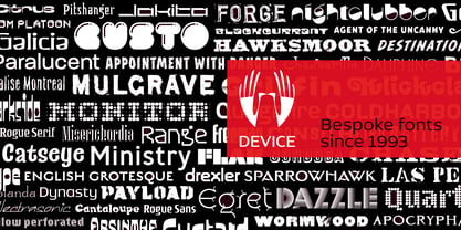
- Crivar Formal by Scriptorium,
$12.00 - Formal 436 by Tilde,
$39.75 - Shaircut Forman by Maulana Creative,
$14.00 Shaircut Forman handmade display font, fun character with a bit of ligatures. To give you an extra creative work. Shaircut Forman handmade display font support multilingual more than 100+ language. -Uppercase Many Thanks, Maulana Creative
 - Provan Formal by Matteson Typographics,
$19.95 Provan is a contemporary humanist sans serif with roots in calligraphy and incised letters. These timeless inspirations result in a typeface family that transcends fashion and adds a strong sense of authenticity to brands. The regular version of Provan has angled stem endings and oblique stress in curved shapes which add to its friendly and legible warmth. Provan Formal straightens these stroke endings to bring a more refined alignment of letters. The typefaces include swash capitals, small capitals, old style figures and special Celtic capital variants. The Inline version of Provan is useful for drop capitals, book covers and posters. Provan bucks the ubiquitous neutrality of geometric typefaces and exudes a sense of humanity, craftsmanship and warmth.
 - Grunge Formal by Scholtz Fonts,
$15.00 Grunge Formal started out as a more upright, formal version of one of my fonts, Figment. A most versatile contemporary typeface, Grunge Formal works equally well from funky to formal, from giant size headers to pint size body text, from movie posters to wedding invitations. If you've ever needed a font that has a grungy, deconstructed look but works well for all sizes, a font that you can use for funky, gritty designs, and also for formal wedding stationery, Grunge Formal is a perfect choice. From the formal viewpoint, the font presents as a regular serif typeface with deconstructed edges, giving the antique look popular in wedding stationery design. Here it can be used from header to body size. For in-your-face design, Grunge Formal, when oversized, is really powerful and its deconstructed outline provides a raw, rough contrast to your background images. Grunge Formal has all the features usually included in a fully professional font. Language support includes all European character sets, Greek symbols and all punctuation.
 - BR Firma by Brink,
$30.00 BR Firma is a geometric sans serif consisting of 8 weights ranging from Thin to Black with matching italics. It supports an ‘Extended Latin’ character set that covers over 200 latin based languages. BR Firma provides advanced typographic support with features such as case sensitive forms, fractions and slashed zeros. It comes with multiple figure sets and is ideal for print, advertising, publishing, branding, software and gaming as well as being optimised for web and screen design.
 - MC Forka by Maulana Creative,
$18.00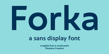 Forka is a minimal modern fun sans serif font. With medium low contrast stroke, fun character with a bit of ligatures and alternates. To give you an extra creative work. Forka font support multilingual more than 100+ language. This font is good for logo design, Social media, Movie Titles, Books Titles, a short text even a long text letter and good for your secondary text font with script or serif. Make a stunning work with Forka font. Cheers, Maulana Creative
 - Mosquito Formal by Monotype,
$29.00Mosquito Formal, by Éric de Berranger, takes the original jaunty design of Mosquito and dresses it in a tuxedo. The stressed character strokes, simple, straightforward shapes, relatively large x-height, open counters and hint of Peignot are still there, but the cursive strokes and lively terminals have been replaced with traditional designs. The result is a more serious-and more sophisticated typeface. The idea," says Éric de Berranger, "was to assuage the drawing of Mosquito. To 'calm' it; and eliminate its idiosyncrasies while preserving character structure and general appearance." Although still distinctive, as Éric de Berranger puts it, "Mosquito Formal is more to be read than seen, it is more invisible and thus, more readable than my earlier design." He does, however, use both typefaces in his graphic design projects: Mosquito for headlines and in applications where the lively design is appropriate, and Mosquito Formal for those instances that require a quieter more sophisticated look. Mosquito Formal is available in three weights with complementary italic designs in addition to a suite of small caps and old style figures. " - OL Hebrew Formal Script by Dennis Ortiz-Lopez,
$30.00 This font contains every variant found in the Hebrew Bible such as the “mutilated” Waw in Numbers 25: verse 12, the small Heh in Genesis 2: verse 4 and the Nun Inversum before Numbers 10: verse 35 and after verse 36 and elsewhere as well as oversized consonants and various double-wide consonants used in inscriptions.
 - Totem Forms by LMD,
$20.00Totem Forms is based on a series of aluminum and rubber wall constructions currently showing in Europe and the United States. Mirek's work has been shown internationally for many years and this is his first foray into type development. - URW Form by URW Type Foundry,
$35.99 URW Form by Volker Schnebel is the quintessence of a modern sans. Originally inspired by the timeless classic Futura, URW Form is a mix of classic and modern geometric typefaces, yet still incorporates the fundamental rules of design and looks and functions like a contemporary sans. In addition to its strong identity, URW Form has all the quality characteristics we come to expect from a Schnebel typeface. Available in 80 styles and four widths, there is also a much sought-after semi-condensed extension to broaden its creative spectrum. Weights range from the filigree Thin to the forceful Poster, making it a truly versatile sans serif typeface.
 - ND Form by NeueDeutsche,
$55.00 An innovative font merging the essence of schablonen lineal with modern design. Composed of carefully shaped rectangles and semi circles, this typeface encapsulates geometric precision and contemporary aesthetics. "ND Form" breathes life into your creations, infusing each character with a fusion of structure and creativity. Elevate your projects with the sleek, distinctive allure of "ND Form," where geometry meets artistic expression.
 - OL Marla Bold by Dennis Ortiz-Lopez,
$30.00 - Dingbatz Formz DSG - Unknown license

- Formal Notice JNL by Jeff Levine,
$29.00 Samuel Welo’s “Studio Handbook for Artists and Advertisers” was a popular book of inspiration for sign painters, graphic artists and designers from the 1920s through the 1960s. Many digital revivals of Welo’s hand lettered typography have been made available. Formal Notice JNL is one such revival, and is available in both regular and oblique versions.
 - Cross Stitch Formal by Gerald Gallo,
$20.00 Cross Stitch Formal is based on upper case characters 20 stitches tall and contains upper case characters A-Z. All characters are linked by at least one stitch.
 - Nouveau Formal JNL by Jeff Levine,
$29.00 Lettering found on the cover of 1915 textbook pamphlets from the Woman’s Institute of Domestic Arts and Sciences, Inc. [of Scranton, PA] inspired the creation of Nouveau Formal JNL. This attractive serif typeface is available in both regular and oblique versions.
 - Formal Dance JNL by Jeff Levine,
$29.00 A vintage Canadian-published music book circa the 1940s had the title "Strauss Waltzes" hand lettered in a bold Art Deco sans serif that featured block style letters with rounded corners. This was the working model for Formal Dance JNL, which is available in both regular and oblique versions.
 - Formal Invite JNL by Jeff Levine,
$29.00 The thin, condensed serif lettering found in a 1937 magazine ad for Chris Craft boats inspired Formal Invite JNL, which is available in both regular and oblique versions.
 - David Hadash Formal by Monotype,
$50.99Monotype Imaging is pleased to present David Hadash (New" David), the full family of typefaces by Ismar David, in its intended authentic form. The Estate of Ismar David has sought to revive this jewel of Twentieth-Century design by granting an exclusive license to Monotype Imaging to implement it in industry-standard format. Never before has the typeface in its full set of sub-styles been made available to the design community. David Hadash consists of three style families, Formal, Script, and Sans. Each of these appears in three weigths: regular, medium, and bold. Originally devised as a companion to the upright Formal style, the Script style has a beauty and grace all its own that allows it to be used for full-page settings also. While it is forward-leaning and dynamic, it does not match any of the existing cursive styles of Hebrew script. Ismar David created an eminently readable hybrid style which is like no other by inclining the forms of the upright while blending in some features of Rashi style softened with gentle curves. One can say that the Script style is the first truly italic, not just oblique, typeface for Hebrew script. Although the proportions of the Sans style are very similar to those of the Formal style, its visual impression is stunningly different. If the Formal style is believably written with a broad-point pen, the Sans is chiseled in stone. Rounded angles turn angular and stark. The end result is an informal style that evokes both ancient and contemporary impressions. David Hadash (Modern) supports the writing conventions of Modern Hebrew (including fully vocalized text) in addition to Yiddish and Ladino. David Hadash Biblical is a version of the Formal style that supports all the complexities of Biblical Hebrew, including vocalization and cantillation marks. " - Formal Event JNL by Jeff Levine,
$29.00 The hand lettered actors’ credits on a title card from the 1937 film “Shall We Dance” served as the model for Formal Event JNL – an Art Deco sans serif font available in both regular and oblique versions.
 - Foundry Form Serif by The Foundry,
$90.00 Foundry Form Serif was drawn concurrently as a sans and a serif, with matching capital and x-height proportions for harmonious use. The Foundry Form Serif design has a strong horizontal emphasis, slightly condensed proportions for economic use of space, and open counters ensuring legibility at small sizes. Both families function independently. Foundry Form Serif includes a true italic; the angularity and sharp serifs help to retain maximum clarity, with the contrasting stroke widths adding refinement.
 - Order Form JNL by Jeff Levine,
$29.00 In the MacKellar, Smiths & Jordan type specimen book of 1892 are examples of Lining Gothic Extended, a wide sans serif typeface. A lining font has the numerals aligned with the capital letter height, rather than following the “Old Style” method of smaller figures that could also descend below the baseline. Order Form JNL is the digital version of this design, and is available in both regular and oblique versions.
 - Free Form Deco by Jeff Levine,
$29.00 Toward the end of the 1920s, Art Deco influences were starting to creep into modern design. The hand lettered title on the cover of the1928 sheet music for “Fascinatin’ Vamp” not only embraced the new Deco movement, but sent it on a wild typographic ride. Letters of mixed thicknesses and stylings made up the two word title, and this unusual group of letter shapes became the inspiration for Free Form Deco JNL, which is available in both regular and oblique versions.
 - Foundry Form Sans by The Foundry,
$90.00 Foundry Form Sans and Serif were drawn concurrently with matching proportions for harmonious use. Although designed to complement each other both families function independently. The Foundry Form Sans characters have a strong horizontal emphasis for readability; open counters to improve legibility at small sizes; and slightly condensed proportions to ensure economic use of space. Foundry Form Sans has a simplicity of design approach balanced with just enough character to achieve a unique, timeless look.
 - OL Hebrew Formal Script With Tagin by Dennis Ortiz-Lopez,
$30.00 This font contains every variant found in the Hebrew Bible such as the “mutilated” Waw in Numbers 25: verse 12, the small Heh in Genesis 2: verse 4 and the Nun Inversum before Numbers 10: verse 35 and after verse 36 and elsewhere as well as oversized consonants and various double-wide consonants used in inscriptions.
 - LOL! - Personal use only


Page 1 of 250Next page