10,000 search results
(0.036 seconds)
- Parallax by Gleb Guralnyk,
$13.00 Parallax is a modern, creative, geometric typeface with random contrast changes in the characters. It includes 26 contextual alternates that will help you to avoid similar letters in most cases. You can always exchange the letters using stylistic alternates feature. Parallax font have a multilingual support of west european languages, please check out all available characters on screenshot. Thank you and have a nice day!
 - PF Handbook Pro by Parachute,
$79.00 This typeface incorporates round smooth corners and distinct design elements in several characters like 'a, g, k, m', without compromising legibility. In order to retain its sharpness, inner corners as well as junction points were left steep. This is a balanced typeface which works very well in long texts at small point sizes. Since its first release it has been used in numerous magazines, advertising campaigns and corporate applications. Handbook Pro comes loaded with a number of special features. The family consists of 14 fonts -from black to extra thin- including true italics. It supports 21 special OpenType features like small caps, fractions, ordinals, etc. and offers multilingual support for all European languages including Greek and Cyrillic. There is also a set of very interesting stylistic alternates which can be used to add a refreshing flair to your designs. Finally, every font in this family has been completed with 270 copyright-free symbols, some of which have been proposed by several international organizations for packaging, public areas, environment, transportation, computers, fabric care and urban life.
 - JHand - Unknown license

- Dos De Tres by Volcano Type,
$19.00 This is an idea to reproduce the masks of the Mexican wrestlers of the late 60s and 70s. The typography is based in keeping the shape of the face in the wrestler's masks.
 - Nana by Autographis,
$39.50 Nana is a classic joining script with long ascenders and descenders, that is based on a set of unique but forgotten initials that were designed in the roaring 20s and 30s in Paris.
 - Poespa Indah by IKIIKOWRK,
$17.00 Introducing Poespa Indah - Old Type, created by ikiiko. Poespa Indah was inspired by vintage store signs in the classic era of indonesia around the 60s. In particular, this typeface is designed to give a formal yet old style look. Poespa Indah has a sans serif typeface with bold to light contrast. This typeface is perfect for an formal layout, newspaper, magazine cover, and also good for vintage product, quotes, or simply as a stylish text overlay to any background image. What's included? Uppercase & Lowercase Number & Punctuation Multilingual Support Works on PC & Mac Enjoy our font and if you have any questions, you can contact us by email : ikiikowrk@gmail.com
 - Asteric Vintage by BlackLotus,
$12.00 Asteric Vintage is a retro-vintage font family with an amazing set of ornaments. It comes in 3 different styles: Regular, Rough, Display, and also presents 26 beautiful and luxurious ornaments . The Rough Style has a characteristic that resembles rust on each character, thus creating results that seem strong and hard. The Display Style is very suitable for display, every work created with it becomes luxurious, wrapped in a classic atmosphere. The Regular Style is a style that has a clean character but still carries a classic scent that is thick and unique. This style is very suitable for use in magazines, books, newspapers, etc.
 - Big by Walking Fearless,
$20.00 BIG is an elegant condensed display font created for strong and impactful headlines. It comes from a series of hand printed specimens taken from wood type found in Andrew Howard’s Studio in Porto (Portugal). A wooden type that reassembles the industrial victorian style which has now been expanded to 20 cuts, ranging from ExtraLight to Bold, with Italics and a stencil version, covering all your needs for a striking visual effect just with plain type with distinctive features and personality, standing out from the crowded world of display sans serif. The font was engineered with essential OpenType features, that allows the user to compose the headlines in two different heights, with case-sensitive punctuation, symbols and special ligatures such as “the”, “of” and “le”.
 - An Electronic Display LED LCD LED7 Seg 3 by Fortune Fonts Ltd.,
$15.00 * For when you need the most realistic looking electronic display. * See User Manuals Main advantages: - Spacing between characters does not change when entering a decimal point or colon between them. - Custom characters can be produced by selecting any combination of segments to be displayed. Low cost electronic displays have a fixed number of segments that can be turned on or off to represent different symbols. A digital watch would be the most common example. Fonts typically available for depicting electronic displays are often in the artistic style of these common LED or LCD displays. They provide the look-and-feel, but fall short when technical accuracy is required. Failure to represent an accurate and consistent representation of the real thing can be a cringe-worthy experience for the product design and marketing team, or even the hobbyist for that matter. To solve this problem, Fortune Fonts has released a range of fonts that accurately depict the displays typically found on low cost electronic devices: watches, answering machines, car stereos, alarm clocks, microwaves and toys. These fonts come with numbers, letters and symbols predefined. However, they also allow you to create your own segment combinations for the custom symbols you need. When producing manuals, marketing material and user interfaces, accuracy is an all-or-nothing concept. Instructions in the user manual describe how to turn these fonts into realistic displays according to your own design, in the manner of the images above. If you cannot see a license option for your specific application, such a license may be purchased from here. By purchasing &/or using &/or distributing the fonts the buyer user and distributor (including Monotype Imaging Inc. & Monotype Imaging Hong Kong) agree to (1) indemnify & hold harmless the foundry, for any consequential, incidental, punitive or other damages of any kind resulting from the use of the deliverables including, but not limited to, loss of revenues, profits, goodwill, savings, due to; including, but not limited to, failure of the deliverables to perform it’s described function, or the deliverable’s infringement of patents, copyrights, trademarks, design rights, contract claims, trade secrets, or other proprietary rights of the foundry, distributor, buyer or other parties (2) not use the fonts to assist in design of, or be incorporated into, non-software displays
 - An Electronic Display LED LCD LED7 Seg 2 by Fortune Fonts Ltd.,
$15.00 * For when you need the most realistic looking electronic display. * See User Manuals Main advantages: - Spacing between characters does not change when entering a decimal point or colon between them. - Custom characters can be produced by selecting any combination of segments to be displayed. Low cost electronic displays have a fixed number of segments that can be turned on or off to represent different symbols. A digital watch would be the most common example. Fonts typically available for depicting electronic displays are often in the artistic style of these common LED or LCD displays. They provide the look-and-feel, but fall short when technical accuracy is required. Failure to represent an accurate and consistent representation of the real thing can be a cringe-worthy experience for the product design and marketing team, or even the hobbyist for that matter. To solve this problem, Fortune Fonts has released a range of fonts that accurately depict the displays typically found on low cost electronic devices: watches, answering machines, car stereos, alarm clocks, microwaves and toys. These fonts come with numbers, letters and symbols predefined. However, they also allow you to create your own segment combinations for the custom symbols you need. When producing manuals, marketing material and user interfaces, accuracy is an all-or-nothing concept. Instructions in the user manual describe how to turn these fonts into realistic displays according to your own design, in the manner of the images above. If you cannot see a license option for your specific application, such a license may be purchased from here. By purchasing &/or using &/or distributing the fonts the buyer user and distributor (including Monotype Imaging Inc. & Monotype Imaging Hong Kong) agree to (1) indemnify & hold harmless the foundry, for any consequential, incidental, punitive or other damages of any kind resulting from the use of the deliverables including, but not limited to, loss of revenues, profits, goodwill, savings, due to; including, but not limited to, failure of the deliverables to perform it’s described function, or the deliverable’s infringement of patents, copyrights, trademarks, design rights, contract claims, trade secrets, or other proprietary rights of the foundry, distributor, buyer or other parties (2) not use the fonts to assist in design of, or be incorporated into, non-software displays
 - An Electronic Display LED LCD LED7 Seg Platz by Fortune Fonts Ltd.,
$15.00 * For when you need the most realistic looking electronic display. * See User Manuals Main advantages: - Spacing between characters does not change when entering a decimal point or colon between them. - Custom characters can be produced by selecting any combination of segments to be displayed. Low cost electronic displays have a fixed number of segments that can be turned on or off to represent different symbols. A digital watch would be the most common example. Fonts typically available for depicting electronic displays are often in the artistic style of these common LED or LCD displays. They provide the look-and-feel, but fall short when technical accuracy is required. Failure to represent an accurate and consistent representation of the real thing can be a cringe-worthy experience for the product design and marketing team, or even the hobbyist for that matter. To solve this problem, Fortune Fonts has released a range of fonts that accurately depict the displays typically found on low cost electronic devices: watches, answering machines, car stereos, alarm clocks, microwaves and toys. These fonts come with numbers, letters and symbols predefined. However, they also allow you to create your own segment combinations for the custom symbols you need. When producing manuals, marketing material and user interfaces, accuracy is an all-or-nothing concept. Instructions in the user manual describe how to turn these fonts into realistic displays according to your own design, in the manner of the images above. If you cannot see a license option for your specific application, such a license may be purchased from here. By purchasing &/or using &/or distributing the fonts the buyer user and distributor (including Monotype Imaging Inc. & Monotype Imaging Hong Kong) agree to (1) indemnify & hold harmless the foundry, for any consequential, incidental, punitive or other damages of any kind resulting from the use of the deliverables including, but not limited to, loss of revenues, profits, goodwill, savings, due to; including, but not limited to, failure of the deliverables to perform it’s described function, or the deliverable’s infringement of patents, copyrights, trademarks, design rights, contract claims, trade secrets, or other proprietary rights of the foundry, distributor, buyer or other parties (2) not use the fonts to assist in design of, or be incorporated into, non-software displays
 - An Electronic Display LED LCD LED7 Seg dots 2 by Fortune Fonts Ltd.,
$15.00 * For when you need the most realistic looking electronic display. * See User Manuals Main advantages: - Spacing between characters does not change when entering a decimal point or colon between them. - Custom characters can be produced by selecting any combination of segments to be displayed. Low cost electronic displays have a fixed number of segments that can be turned on or off to represent different symbols. A digital watch would be the most common example. Fonts typically available for depicting electronic displays are often in the artistic style of these common LED or LCD displays. They provide the look-and-feel, but fall short when technical accuracy is required. Failure to represent an accurate and consistent representation of the real thing can be a cringe-worthy experience for the product design and marketing team, or even the hobbyist for that matter. To solve this problem, Fortune Fonts has released a range of fonts that accurately depict the displays typically found on low cost electronic devices: watches, answering machines, car stereos, alarm clocks, microwaves and toys. These fonts come with numbers, letters and symbols predefined. However, they also allow you to create your own segment combinations for the custom symbols you need. When producing manuals, marketing material and user interfaces, accuracy is an all-or-nothing concept. Instructions in the user manual describe how to turn these fonts into realistic displays according to your own design, in the manner of the images above. If you cannot see a license option for your specific application, such a license may be purchased from here. By purchasing &/or using &/or distributing the fonts the buyer user and distributor (including Monotype Imaging Inc. & Monotype Imaging Hong Kong) agree to (1) indemnify & hold harmless the foundry, for any consequential, incidental, punitive or other damages of any kind resulting from the use of the deliverables including, but not limited to, loss of revenues, profits, goodwill, savings, due to; including, but not limited to, failure of the deliverables to perform it’s described function, or the deliverable’s infringement of patents, copyrights, trademarks, design rights, contract claims, trade secrets, or other proprietary rights of the foundry, distributor, buyer or other parties (2) not use the fonts to assist in design of, or be incorporated into, non-software displays
 - An Electronic Display LED LCD LED7 Seg dots1 by Fortune Fonts Ltd.,
$15.00 * For when you need the most realistic looking electronic display. * See User Manuals Main advantages: - Spacing between characters does not change when entering a decimal point or colon between them. - Custom characters can be produced by selecting any combination of segments to be displayed. Low cost electronic displays have a fixed number of segments that can be turned on or off to represent different symbols. A digital watch would be the most common example. Fonts typically available for depicting electronic displays are often in the artistic style of these common LED or LCD displays. They provide the look-and-feel, but fall short when technical accuracy is required. Failure to represent an accurate and consistent representation of the real thing can be a cringe-worthy experience for the product design and marketing team, or even the hobbyist for that matter. To solve this problem, Fortune Fonts has released a range of fonts that accurately depict the displays typically found on low cost electronic devices: watches, answering machines, car stereos, alarm clocks, microwaves and toys. These fonts come with numbers, letters and symbols predefined. However, they also allow you to create your own segment combinations for the custom symbols you need. When producing manuals, marketing material and user interfaces, accuracy is an all-or-nothing concept. Instructions in the user manual describe how to turn these fonts into realistic displays according to your own design, in the manner of the images above. If you cannot see a license option for your specific application, such a license may be purchased from here. By purchasing &/or using &/or distributing the fonts the buyer user and distributor (including Monotype Imaging Inc. & Monotype Imaging Hong Kong) agree to (1) indemnify & hold harmless the foundry, for any consequential, incidental, punitive or other damages of any kind resulting from the use of the deliverables including, but not limited to, loss of revenues, profits, goodwill, savings, due to; including, but not limited to, failure of the deliverables to perform it’s described function, or the deliverable’s infringement of patents, copyrights, trademarks, design rights, contract claims, trade secrets, or other proprietary rights of the foundry, distributor, buyer or other parties (2) not use the fonts to assist in design of, or be incorporated into, non-software displays.
 - An Electronic Display LED LCD LED14 Seg 1 by Fortune Fonts Ltd.,
$15.00 * For when you need the most realistic looking electronic display. * See User Manuals Main advantages: - Spacing between characters does not change when entering a decimal point or colon between them. - Custom characters can be produced by selecting any combination of segments to be displayed. Low cost electronic displays have a fixed number of segments that can be turned on or off to represent different symbols. A digital watch would be the most common example. Fonts typically available for depicting electronic displays are often in the artistic style of these common LED or LCD displays. They provide the look-and-feel, but fall short when technical accuracy is required. Failure to represent an accurate and consistent representation of the real thing can be a cringe-worthy experience for the product design and marketing team, or even the hobbyist for that matter. To solve this problem, Fortune Fonts has released a range of fonts that accurately depict the displays typically found on low cost electronic devices: watches, answering machines, car stereos, alarm clocks, microwaves and toys. These fonts come with numbers, letters and symbols predefined. However, they also allow you to create your own segment combinations for the custom symbols you need. When producing manuals, marketing material and user interfaces, accuracy is an all-or-nothing concept. Instructions in the user manual describe how to turn these fonts into realistic displays according to your own design, in the manner of the images above. If you cannot see a license option for your specific application, such a license may be purchased from here. By purchasing &/or using &/or distributing the fonts the buyer user and distributor (including Monotype Imaging Inc. & Monotype Imaging Hong Kong) agree to (1) indemnify & hold harmless the foundry, for any consequential, incidental, punitive or other damages of any kind resulting from the use of the deliverables including, but not limited to, loss of revenues, profits, goodwill, savings, due to; including, but not limited to, failure of the deliverables to perform it’s described function, or the deliverable’s infringement of patents, copyrights, trademarks, design rights, contract claims, trade secrets, or other proprietary rights of the foundry, distributor, buyer or other parties (2) not use the fonts to assist in design of, or be incorporated into, non-software displays
 - The Kanderlic by Ekahermawan,
$15.00 Kanderlic is a retro bold script for any display use. Kanderlic also includes a bunch of alternate characters (PUA Encoded) and ligatures to give you a wide range for create an unique typographic design results. Kanderlic is versatile font for many different projects which will bring you back in late 60's untill 70's such as logo, branding, poster, magazines, labels, merchandise, invitation, presentation, advertising, quotes and so much more! FEATURES: OpenType support Playfull to use (with ligatures and alternates options) Multilingual support PUA Encoded If you need support or more information about this item please kindly contact me : ekahermawanputu@gmail.com Thank you so much I really hope you enjoy when using it!
 - Caprizant by Laura Worthington,
$29.00 Caprizant is a lively, upright script based on letters inked with a pointed pen. For display settings, titles, and identity work, Caprizant shines with even more energy and elegance. Customize it using one of the 337 swashes, three sets of capitals, and 20 ornaments. Alternates of every letter create a fully connected or unconnected look, plus dozens of ligatures, and contextual alternates provide a convincingly human variation. See what’s included! http://bit.ly/1RGYIl1 *NOTE* Basic versions DO NOT include swashes, alternates or ornaments These fonts have been specially coded for access of all the swashes, alternates and ornaments without the need for professional design software! Info and instructions here: http://lauraworthingtontype.com/faqs/
 - Areon Flux by DePlictis Types,
$33.00 The future is right here, today, and Areon Flux comes to point that out. It’s a font family consisting in three weights that makes it a notable choice for designers that have to do with techy, futuristic layouts or printing materials. The lettering design appeal as sharp, powerful, distinctive and kind of modular, remembering the upcoming space exploration opportunities that are ready to enlarge our horizons in the next years. Areon Flux family is designed and published in late ‘20/ early ’21 and has an established discount for more that 30% for all the weights buyed together that makes it a versatile fresh and modern display not to be missed by edgy designers.
 - VVDS Big Tickle by Vintage Voyage Design Supply,
$15.00 To the sound of smooth jazz 50's and incendiary Rock'n'Roll dance of 60's Im glad to Introduce you the new product in my Vintage Voyage — The Big Tickle Font Family! Absolute useful collection! Firstly is playful serif. The range of weights can be used to maintain an even colour across different sizes. Use it normally or all caps and play with baseline, give more bounce to composition. Or try to use Caps alternates and get really bouncing letters. Alternates has every uppercase letter. Also, for more variety I add a few versions for decoration: Inner hatched and Offset with Shadow. Okay, folks! The second one is Script. I really love them, they look like was signed with true brush. It can be perfectly used both independently and in tandem with the serifs. And the last one is Retro Graphic! Authentic collection of typical design elements of 50's and 60's style of Poster, Books or Ads. You can create awesome retro patterns or use them individually. 124 graphic elements total. A-Z; a-z; 0-9. Multilingual. Grab this stuff and have a good time with Mid Century Modern Adventure!
 - Broadster by IKIIKOWRK,
$19.00 Introducing Broadster - Classic Brush Type, created by ikiiko. Broadster is a decorative sans serif typeface, inspired by typography from classic 60s American advertising & automotive visual styles of the time. This typeface is designed to give the appearance of a formal yet expressive style. The Broadster has bold, contrasting strokes. A style commonly used in print, magazine, and sign advertisements of the era. This typeface is perfect for an formal layout, poster, newspaper, magazine ads, and also good for vintage product, food & beverages, quotes, or simply as a stylish text overlay to any background image. What's included? Uppercase & Lowercase Number & Punctuation Multilingual Support Works on PC & Mac
 - Brains Courage by Letterhend,
$19.00 Brains Courage is a victorian serif with classy and classic look with vintage feel, inspired by 60s and 70s signages. This font perfectly made to be applied especially in logo, and the other various formal forms such as invitations, labels, logos, magazines, books, greeting / wedding cards, packaging, fashion, make up, stationery, novels, labels or any type of advertising purpose. Features : numbers and punctuation multilingual & alternate PUA encoded We highly recommend using a program that supports OpenType features and Glyphs panels like many of Adobe apps and Corel Draw, so you can see and access all Glyph variations.
 - GOR by Dima Pole,
$23.00 GOR type was born from a one letter: GOR has gracefully form lines and pleasant proportions. The special charm of this font comes from a combination of narrow and wide letters, rounded letters, which is creating a lively and original character. A particularly interesting solution is the ligatures composed by the characteristic letters makes the text looks gorgeous, giving a special flavor (contextual ligatures). GOR includes all letters of Europeans and Slavonic alphabets, standard and oldstyle numbers, small capitals, just about 1000 characters, and more than 20 Opentype features, so that it can be used in completely different situations.
 - Hulberk by Letterhend,
$19.00 Introducing, Hulberk, a slab serif typeface with nostalgic look and feel. Inspired from 60s and 70s signages, labels, and ads. This type of font perfectly made to be applied especially in logo, headline, signage and the other various formal forms such as invitations, labels, logos, magazines, books, greeting / wedding cards, packaging, fashion, make up, stationery, novels, labels or any type of advertising purpose. Features : uppercase & lowercase numbers and punctuation multilingual PUA encoded We highly recommend using a program that supports OpenType features and Glyphs panels like many of Adobe apps and Corel Draw, so you can see and access all Glyph variations.
 - Confetti TP by Tipo Pèpel,
$22.00 The Confetti is a typeface created about 1930 by the defunct José Iranzo foundry in Barcelona, and imitates the forms and gestures of handwriting created with a round nib as “Speedball”Series B. The original typefaces were a pair, called “Escritura Energica ” and “Escritura maravilla”. The typography has a dynamic air, caused partially by irregular alignment of the characters respect to the baseline and aesthetics takes us to the proposed commercial lettering or advertising of years 20-30. Confetti was one of the fonts selected by the website Typographica.org in its prestigious list of “Our Favorite Typefaces” in 2006.
 - Shelbie Roger by Letterhend,
$19.00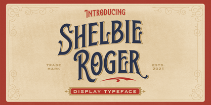 Shelbie Roger is a ornamental serif with classy and classic look with vintage feel, inspired by 60s and 70s signages. This font perfectly made to be applied especially in logo, and the other various formal forms such as invitations, labels, logos, magazines, books, greeting / wedding cards, packaging, fashion, make up, stationery, novels, labels or any type of advertising purpose. Features : uppercase and lowercase numbers and punctuation multilingual & alternate PUA encoded We highly recommend using a program that supports OpenType features and Glyphs panels like many of Adobe apps and Corel Draw, so you can see and access all Glyph variations.
 - Hullstain by Letterhend,
$19.00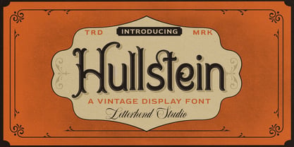 Hullstein is a ornamental serif with classy and classic look with vintage feel, inspired by 60s and 70s signages. This font perfectly made to be applied especially in logo, and the other various formal forms such as invitations, labels, logos, magazines, books, greeting / wedding cards, packaging, fashion, make up, stationery, novels, labels or any type of advertising purpose. Features : uppercase and lowercase numbers and punctuation multilingual & alternate PUA encoded We highly recommend using a program that supports OpenType features and Glyphs panels like many of Adobe apps and Corel Draw, so you can see and access all Glyph variations.
 - Let's Jazz by Unio Creative Solutions,
$9.00 Introducing “Let’s Jazz” - a playful typeface which is inspired by iconic mid-century American advertising and lettering. With this project we wanted to homage the dazzling graphics of those booming years and the result is a jazzy typeface that provides a condensed aspect with a bouncy rhythm. As previously said, Let’s Jazz gives the spontaneous vibe of this sensational music genre but it has been also designed with a strong focus to the very distinct look of Saul Bass graphics, which are honestly still fresh and convincing, even nowadays. Let’s Jazz offers two versions, Regular and Stamp. Each version contains more than 450 glyphs and covers several languages based on the Latin alphabet; the jazzy experience is enhanced with OpenType (OTF) support for small caps and includes some neat ligatures and alternates plus the oldstyle bouncy numerals*. This package is a powerful tool in a wide variety of design purposes: headlines, packaging, logotypes, badges, posters and much more. *Let’s Jazz has built-in OpenType features enabled for Adobe® Creative Suite® and any other opentype capable software. All the extra characters has been additionally coded with “PUA Unicode”, which basically means that this font duo is totally accessible without any additional design software. All the extra characters can now be copied straight out the FontBook (Mac) or CharacterMap (Win) and pasted into your favorite text editor. Official mini-tutorials available here: - How to access alternates, ligatures and swashes in Font Book®: https://youtu.be/mGKlvKr0ReI - How to use alternates, ligatures and swashes in Photoshop®: https://youtu.be/46ZtDbHwUAc Specifications: - Multi-language Support (Central, Eastern, Western European languages) - OpenType features (Standard and Discretionary Ligatures, Alternates, Small Caps, OldStyle Numerals) - PUA Coded Extra Characters Thanks for viewing, Unio.
 - Metropole by Greater Albion Typefounders,
$12.00 Metropole is an exercise in combing the curvaceous lines of the Art Nouveau with the solid character and simplicity of Art Deco. The resulting three display faces combine the spirit of the 20s and of the thirties, creating lively fun display faces for headings, signage and banners. These characterful faces with clear simple outlines are also ideal to lend a distinctive air to your web pages, or to create a distinctive 'house-style' for lettering.
 - Bardi by ParaType,
$30.00 An original typeface designed for ParaType in 2004 by Armenian designer Manvel Shmavonyan. Based on the lettering created in 1970s by outstanding Armenian type designer Henrik Mnatsakanyan (1923-2001) of the same name. In Armenian 'Bardi' means 'Poplar'. Extra compressed decorative stenciled typeface. Its letterforms resemble many Neo-Classicism extra compressed faces and magazine lettering of the 1950s-60s. For use in advertising and display typography especially in magazine headlines and logos.
 - Zdarx Hardcore - Unknown license

- BONES - Unknown license

- Futhark AOE - Unknown license

- Seaweed Fire AOE - Unknown license

- Vintage Badges by Decade Typefoundry,
$28.00 An awesome premium quality set of 26 layered badges. It’s a very versatile, “old timey” look, vintage and that can be used as logos, member badges, company badges, stamps, price reductions and much more.
 - ITC Chivalry by ITC,
$29.99ITC Chivalry is a calligraphic hybrid that honors the tradition of combining Roman capitals with italic lowercase letters. Drawn by Missouri lettering artist Rob Leuschke, who used a flat-nib pen on textured watercolor stock and then converted the drawings into a digital font, the design combines an old world" feel with "new world" legibility. A companion set of black letter caps completes the suite of characters. "I've loved drawing letters for as long as I can remember," says Leuschke. "Even in kindergarten, I tried to draw letters like my teacher." After graduating from college, Leuschke worked for a short time at a sign company in St. Louis, and in the early 1980s began working at Hallmark Cards in Kansas City. His talent as a calligrapher and lettering artist eventually brought him back to St. Louis to begin a freelance career. Since then Leuschke has created over 250 fonts, primarily for the greeting card industry, that are now being used on work for his clients all over the world. Leuschke first conceived of the face as just the black letter caps; he later added the Roman letters to give the design more versatility. The Roman caps of ITC Chivalry combined with the lowercase are well suited to blocks of copy, while the more decorative black letter caps are ideal for showcasing short text of just a few words. Both sets of capitals also make great initial letters." - ITC Styleboy by ITC,
$29.99 Although ITC Styleboy has a retro feel, it isn't based on any earlier typeface. As far as inspiration goes," says designer Chester Wajda, "I'd have to say comic strips of the '20s and '30s, and silent-film marquee lettering from the '20s - with a hint of a Chinese brush?" He originally created the typeface for a children's book he was working on. "I wanted it to be fun, but still somewhat formal in its underlying structure," he says. "It's largely based on right and 45-degree angles, with slight tucks inward on the stems and bowls, and a few flourishes here and there." Styleboy's top-heavy look is most noticeable in the caps, but it's exaggerated too in the "8" and the lowercase "g." Styleboy is Wajda's first typeface design."
 - Fregiselle Brush by Lucky Type,
$20.00 Let me introduce my newest font Fregiselle. Fregiselle is a modern brush font, organic, dynamic, and energetic. This font can be used for various purposes such as signatures, titles, logos, correspondence, wedding invitations, letterheads, signages, labels, badges, posters, bulletins, and more. I made this font using a brush pen very thoroughly. Fregiselle also has 26 swashes that look very unique and are very suitable for use in a variety of designs. To activate the OpenType Stylistic alternative, you need a program that supports OpenType features such as Adobe Illustrator CS, Adobe Indesign & CorelDraw X6-X7, Microsoft Word 2010 or newer versions. How to access all alternative characters, using Windows Character Map with Photoshop: https://www.youtube.com/watch?v=Go9vacoYmBw How to access all alternative characters using Adobe Illustrator: https://www.youtube.com/watch?v=XzwjMkbB-wQ Fregiselle is coded with Unicode PUA, which allows full access to all additional characters without having special design software. Mac users can use the Font Book, and Windows users can use the Character Map to view and copy one of the additional characters to paste into your favorite text editor / application.
 - Marco by TypeTogether,
$49.00 Marco is a lively text face, with an informal touch, inspired by 15th century Italian letter-forms with strong calligraphic traces and intended to be used primarily in continuous and intensive reading conditions. Marco is full of features required for high-quality book typography, including: strong language-support in extended Latin, Cyrillic and polytonic Greek, a multitude of swashes in the italic styles of Latin and Cyrillic, stylistic alternates to obtain the best possible solutions and other typographic niceties. Inspiration for Marco goes back to Italian humanist typography such as those of Nicholas Jenson or Aldus Manutius, and general influences from calligraphy. As a result, Marco has matured into a personal and unique text face where its lively and somewhat informal style is an ideal counterpart to its careful and ingenious crafting. Toshi Omagari’s Marco features a huge set of over 1900 characters per style —and almost 2600 in the italics— and is available in Regular, SemiBold, Bold with matching Italics.
 - Sparrowhawk Script by Max.co Studio,
$14.00 Sparrowhawk Script is retro signage font, bold and clean. There are so many variations on each character. Include Opentype stylistic alternates. You are able to create so many different typographical layouts easily and quickly. Make sure you use OpenType savvy program and simply open Glyph Palette to access all of the glyphs. This font is suitable for t-shirts, signage, logos, headlines, branding, packaging, etc. Sparrowhawk Script features 460+ glyphs and alternate characters. including initial and terminal letters, alternates, ornament, swash, ligatures and multiple language support. To enable the OpenType Stylistic alternates, you need a program that supports OpenType features such as Adobe Illustrator CS, Adobe Indesign & CorelDraw X6-X7, Microsoft Word 2010 or later versions. How to access all alternative characters using Adobe Illustrator: http://youtu.be/iptSFA7feQ0 Sparrowhawk Script is coded with PUA Unicode, which allows full access to all the extra characters without having special designing software. Mac users can use Font Book , and Windows users can use Character Map to view and copy any of the extra characters to paste into your favourite text editor/app. How to access all alternative characters, using Windows Character Map with Photoshop: https://www.youtube.com/watch?v=Go9vacoYmBw If you need help or advice, please contact me by e-mail "maximal.fonts@gmail.com"
 - PF DIN Text by Parachute,
$79.00 The purpose of the original DIN 1451 standard was to lay down a style of lettering which is timeless and easily legible. Unfortunately, these early letters lacked elegance and were not properly designed for typographic applications. Ever since its first publication in the 1930’s, several type foundries adopted the original designs for digital photocomposition. By early 2000, it became apparent that the existing DIN-based fonts did not fulfil the ever-increasing demand for a diverse set of weights and additional support for non-Latin languages. Parachute® was set out to fill this gap by introducing the PF DIN series which has become ever since the most comprehensive and sophisticated set of DIN typefaces. It was based on the original standards but was specifically designed to fit typographic requirements. Its letterforms divert from the stiff geometric structure of the original and introduce instead elements which are familiar, softer and easier to read. The first set of fonts was completed in 2002 as a group of 3 families which included condensed and compressed versions. With its vast array of weights, the extended language support, but most of all its meticulous and elaborate design, it has proved itself valuable to numerous design agencies around the world. Ever since its first release, it has been used in diverse editorials, packaging, branding and advertising campaigns as well as a great number of websites. It was quoted by Publish magazine as being “an overkill series for complex corporate identity projects”. The whole PF DIN Text type system (with normal, condensed and compressed styles) includes 45 weights from Hairline to Extra Black including true-italics. Additionally, every font in the Pro series is powered by 270 very useful symbols for packaging, environmental graphics, signage, transportation, computing, fabric care. There are 2 versions to choose from: The PRO version is the most powerful. All weights support Latin, Cyrillic, Greek, Central/Eastern European, Romanian, Baltic and Turkish, with 20 advanced opentype features including small caps. The standard STD version is more economic. All weights support Latin, Central/Eastern European, Romanian, Baltic and Turkish, with 18 advanced opentype features including small caps. In 2010 Parachute® released 4 new families DIN Monospace, DIN Stencil, DIN Text Arabic and DIN Text Universal. All these are complemented by the popular DIN Display version. Altogether the Parachute DIN series is a set of 8 superfamilies with a total of 96 weights.
 - Amderais by Sealoung,
$15.00 Give your typographic designs a touch of retro style with Amderais! Amderais is one of our 2022 fonts inspired by the famous retro typographic designs of the late 60s to 70s. This font has an extruded version so you can easily create retro effect fonts. This typeface is very suitable to be applied especially to logos, and various other formal forms such as invitations, labels, logos, magazines, books, greeting/wedding cards, packaging, fashion, make-up, stationery, novels, and labels or other types of fonts. advertising purposes. Feature : - upper & lower case - numbers and punctuation - multilingual - ligature - alternative - swashes - PUA encoded We highly recommend using a program that supports the OpenType feature and the Glyphs pane like many Adobe and Corel Draw applications, so that you can view and access all variations of Glyphs.


