10,000 search results
(0.015 seconds)
- ThreeDee by URW Type Foundry,
$99.99The idea for this completely new font design with overlapping characters came when Axel Stoltenberg, longtime IKARUS program developer at URW + +, visited a restaurant. As it can be seen quite often , the daily specials were offered handwritten with chalk on a blackboard applying a writing technique never been available before for digital fonts: each character is partly covered by its predecessor creating a three-dimensional effect. The implementation of this unusual notation for digital setting required a lot of programming and testing until all necessary character variants were produced and set properly always using the correct form. In order to achieve this, the OpenType Pro font ThreeDee contains about 12,400 characters and all the necessary OpenType features (GSUB ) for the automatic setting in OTF savvy application programs. The slightly playful basic design for ThreeDee was created by Anna Stoltenberg , the daughter of Axel, specially devised for the innovative representation and support of its special nature. The shadow generated with IKARUS even intensifies the 3D effect. As is well-known, making use of the embedded OTF features, i.e. the automatic access to all the 12,400 character variants , a corresponding text / layout program ( InDesign, Quark Xpress, current Open / LibreOffice or MS Word etc. ) is required. ThreeDee is a headline font that will unveil all its charisma and exceptional quality at appropriate, larger sizes. - Pricing Labels JNL by Jeff Levine,
$29.00Pricing Labels JNL gives you a set of digital price gun labels in fifty-one of the most common store departments, plus an untitled title label on the lower case ‘z’ key. Additionally, numbers for creating prices are on the standard keystrokes (for dollar amounts), and smaller numbers/underscores (for cents amounts) are on the shift key groupings for the number keys. The dollar and cents sign are on the left and right brackets, the decimal point is on the period key and the words “each” and “for” [set sideways] are on the greater and lesser keys. - OBO Classic by Juri Zaech,
$19.00 OBO Classic is the second installment of the OBO series, a type collection based on a square. Every character is mapped on a 1x1 ratio which allows for horizontal and vertical settings alike. Or mixed, like crosswords. OBO Classic is a display interpretation of a traditional Old-style Serif. The “distortion” which maps each character to a square creates unusual proportions to what we are used to from classic serif typefaces. The result is a monospaced font. While each individual letter feels conventional on its own, when brought together in words the result feels contemporary. Thanks to the square base vertical and horizontal – and mixed – settings are possible and easy to apply. There are a few exceptions for certain punctuation and special characters that are half the width for better spacing; and the word space’s width can easily be adjusted through OpenType stylistic sets. Talking about spacing, for strictly horizontal typesetting there is the option to turn on kerning for a number of characters to create a cleaner texture across words and phrases. OBO Classic is best set in large sizes and is most comfortable in editorial and display settings. A series of icons complete the character set. A selection comes as pixel graphics which adds further contrast to the traditional legacy of the typeface.
 - LT Chickenhawk - Personal use only

- Macarons by Latinotype,
$35.00 The Macarons font family consists of a monoline version, regular and bold weights, and a set of gestural catchwords, which reflects the use of the ruling pen as a freestyle tool. Ornaments and dingbats are also included. Macarons is a display type based on the classic Garamond typeface. It’s inspired by the foodie culture and the slow food movement, which began as a rebellion against fast food and has now grown to a global scale. Every day, thousands of people around the world take pictures of their food, look for new recipes to try and recover old ones, enjoy wine-pairing, and value locally produced food. Macarons is a fresh and spontaneous looking typeface that has been designed by Coto Mendoza, who also has developed a hand-made product line (Ride my Bike, Ride my Bike Serif, Four Seasons, D.I.Y. Time, Dans le Cuisine and In a Jar). This font is not constructed out of modules: each character is drawn by hand. Macarons is ideal for cookbooks, menus, liquor bottle labels, food packaging, wedding invitations, greeting cards, tea boxes, food blogs, small shops, cupcake bakeries and so on. Try! A freshly-baked homemade macaron!
 - Lektorat by TypeTogether,
$35.00 Florian Fecher’s Lektorat font family is one for the books, and for the screens, and for the magazines. While an editorial’s main goals are to entertain, inform, and persuade, more should be considered. For example, clear divisions are necessary, not just from one article to the next, but in how each is positioned as op-ed or fact-based, infographic or table, vilifying or uplifting. From masthead to colophon, Lektorat has six concise text styles and 21 display styles to captivate, educate, and motivate within any editorial purpose. Magazines and related publications are notoriously difficult to brand and then to format accordingly. The research behind Lektorat focused on expression versus communication and what it takes for a great typeface to accomplish both tasks. In the changeover from the 19th to 20th century, German type foundry Schelter & Giesecke published several grotesque families that would become Lektorat’s partial inspiration. Experimentation with concepts from different exemplars gave birth to Lektorat’s manifest character traits: raised shoulders, deep incisions within highly contrasted junctions, and asymmetrical counters in a sans family. After thoroughly analysing magazine publishing and editorial designs, Florian discovered that a concise setup is sufficient for general paragraph text. So Lektorat’s text offering is concentrated into six total styles: regular, semibold, and bold with their obliques. Stylistic sets are equally minimal; an alternate ‘k, K’ and tail-less ‘a’ appear in text only. No fluff, no wasted “good intentions”, just a laser-like suite to focus the reader on the words. The display styles were another matter. They aim to attract attention in banners, as oversized type filling small spaces, photo knockouts, and in subsidiary headings like decks, callouts, sections, and more. For these reasons, three dialed-in widths — Narrow, Condensed, and Compressed — complete the display offerings in seven upright weights each, flaunting 21 headlining fonts in total. If being on font technology’s cutting edge is more your goal, the Lektorat type family is optionally available in three small variable font files for ultimate control and data savings. The Lektorat typeface was forged with a steel spine for pixel and print publishing. It unwaveringly informs, convincingly persuades, and aesthetically entertains when the tone calls for it. Its sans serif forms expand in methodical ways until the heaviest two weights close in, highlighting its irrepressible usefulness to the very end. Lektorat is an example of how much we relish entering into an agreed battle of persuasion — one which both sides actually enjoy.
 - Autumn Stories by Tlatous Type,
$19.00 Introducing Autumn Stories by Tlatous Type. Autumn Stories is a Modern Script Handwritten Font. This font is perfect for product packaging, branding project, megazine, social media, wedding, or just used to express words above the background.
 - Sans Original by Thaddeus Typographic Center,
$25.00The name says it all. Sans Original is indeed a unique sans serif display type form with very original curves and bold characteristics. Its distinct design offers a great potential for advertising, publications and package design. - Makel by La Boîte Graphique,
$13.00 Makel is a fanciful typography. Ideal for areas such as food, catering, packaging, youth publishing ... Thanks to its curves and the movement of letters, Makel wishes to bring good humor and dynamism to your communication media.
 - Vivala Coffee House Icons by Johannes Hoffmann,
$19.00 73 icons on the topic »coffee house.« The extensive kit includes the category’s coffee, drinks, food, coffee makers, roasted coffee and tea. The clear design is adapted to mobile interfaces and suitable for print, as well.
 - Joyline Notes by Essentials Studio,
$16.00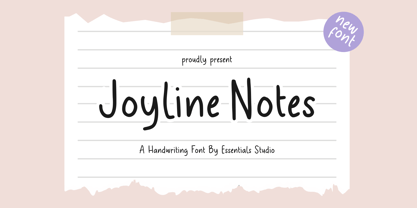 introducing by Essentials Studio Proudly Present, Joyline Notes Delmonte Is a A Cute Handwritten Font Delmonte is perfect for product packaging, branding project, megazine, social media, wedding, or just used to express words above the background.
 - Babydance by Aestherica Studio,
$12.00 Introducing the new Handwritten Script Font by Aestherica Studio. Babydance is perfect for product packaging, branding project, megazine, social media, wedding, or just used to express words above the background. Babydance also multilingual support. Thank You
 - Stencil Plate JNL by Jeff Levine,
$29.00 A brass stencil hand cut to mark the tops of oil drums yielded the lettering for Stencil Plate JNL. The font emulates the retro feel of the unique letter forms found in the original antique design.
 - Syahilla by Essentials Studio,
$16.00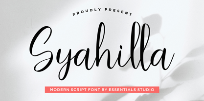 Introducing by Essentials Studio Proudly Present, Syahilla Syahilla Is a A Modern Handwritten Script Font Syahilla is perfect for product packaging, branding project, megazine, social media, wedding, or just used to express words above the background.
 - Shopkeeper JNL by Jeff Levine,
$29.00Shopkeeper JNL derives its unusual letter forms from impressions made from a vintage rubber stamp sign and chart printing set. Originally an outline font, the letters are rendered solid in the digital version for more versatility. - Frinch Cobeans by Essentials Studio,
$16.00 Introducing by Essentials Studio Frinch cobeans Is a Modern monoline Font Include 50+ stylish Alternate minadine is perfect for product packaging, branding project, megazine, social media, wedding, or just used to express words above the background.
 - NOh Green Raven by OhType!,
$28.00 Green Raven is a typeface that speaks for itself, with personality and impact, wide lowercase and imposing uppercase. Generous counter forms make it highly readable in small sizes but always defending their strength, aggression and character.
 - Wavely JNL by Jeff Levine,
$29.00Wavely JNL is a font that could have been made by a child or a nervous writer. Squiggly, handmade lines form the characters and this font can also be used for spooky or horror-oriented themes. - Aperture Display by Mi Chen,
$5.99 Aperture Display is a san-serif typeface which combines the “standard” forms of grotesks and the modern takes on the use of ink traps. It is a display typeface designed mainly for branding and printed matter.
 - Sophima by insigne,
$10.00 What's Included : • Ligatures • Works for PC and Mac • Simple installation • 7 styles: 1 undistressed, 6 distressed • 500+ glyphs in each type • More than 75 languages are supported, including extended Latin. • Each style includes 12 OpenType features, including stylistic alternatives, ligatures, old-fashioned figures, and other helpful elements. • Two different swash ending varieties. • Non connected forms • All connected forms, including caps • Randomly selected character forms for organic looking textures. Sophima exudes languorous luxury. The writing glides around, changing elevation above and below the standard x-height, giving it a lively and raucous vibe. Sophima is designed for 3D printing. I required a contemporary script with technical elements that could be printed using a 3D printer. This necessitates the use of quite thick linking characters. Another result of this technology was the need that all letters, including caps, be linked. Such letters are included in optional Opentype style sets. The unusual technological limitation gave the design a new and distinct vibe. Sophima may be used for a variety of purposes, including headlines, weddings, social media, logos, posters, packaging, T-shirts, coffee shops, restaurants, magazine headers, signage, gift/post cards, cafés, and weddings. Designers have a plethora of alternatives from which to pick, giving them greater variety, power, and creative flexibility. Automatic ligatures for best character connections are supplied, as are alternate ending characters that appear at the end of words that lack connectors or have lengthy swash endings. Sophima is made up of five fonts: one standard and five texture variants that change the tone of the typeface. Each design has 500 characters and is available in more than 75 languages. The typeface has 15 OpenType features, such as stylistic alternates that change the look of characters, ligatures, and more. Constraints and a desire to solve challenges breed the finest creativity. And there's no question that Sophima came up with a solution to the situation. Now use Sophima to create your own designs.
 - Elisetta by Sudtipos,
$39.00 Musical notes and letterforms, silences and white spaces, pentagrams and lines, music and writing have much in common and go beyond time, cultures, styles and locations. This new typeface emerges from the blend between the lyrics and the harmony, rhythm, femininity and luminosity of the traditional musical forms. It`s not about blues or rock, tango or salsa, instead it recovers the neoclassical characteristics of the current musical notation system and revitalize the essence of its signs. Taking care of both the function and the form, Elisetta has been specially designed for the writing of texts and musical sheets considering all its elements and communication needs. This source of inspiration also makes the font really good for extensive texts, since its design is based on situations that require high line performance, great readability and high aesthetic coherence. With 5 variables that vary in weight and style, the typography gathers asymmetry and organic nature in vertical structure, narrow horizontal proportions, high x height and extreme contrast between black and white. Elisetta Book has been created for the writing of clear texts and long lines composed in small sizes inside and outside the pentagram; Elisetta Italic intensifies the organic nature of the musical keys by offering softer signs, contextual alternates and initial caps; finally, Elisetta Display increase and emphasize the contrast between vertical stems and horizontal lines to highlight short texts and titles. For those who love music and for those who like romantic forms, this typography has a lot to offer: Elisetta is the best option to write light words with style, compose clear and rhythmic lines and read comfortable paragraphs with high performance. You can tell everybody this is your font, how wonderful life is while you're in the world! * This typeface was originally designed and supervised as «Elisa», the main project of the Master in Typography at University of Buenos Aires, Argentina.
 - Astrid Grotesk by Eclectotype,
$40.00 Astrid Grotesk is a normalized version of Schizotype Grotesk. Normalized; not neutralized. Where many neo-grotesks appear cold with their harsh neutrality, Astrid has a warmth, eminating from its (for want of a better word) clunkiness. With the latest update, it becomes a true workhorse, with a range of widths and italics for the normal widths. Astrid Grotesk, while being clearly a neo-grotesk in appearance, has a personality all of its own. Standout characters include the f and t, and the default binocular g, unusual in neo-grotesks. And the right angled terminals on c, e and s. Stylistic sets offer up alternate forms of a, g, y, I, @, dutch IJ, german eszett and l. A full complement of numerals is included: proportional and tabular, lining and oldstyle, plus fractions, subscript and superscript. Note also that the tabular figures are duplexed across weights - very useful when highlighting specific entries in tables. The tabular figures feature also substitutes in fixed width (across all weights) comma and period, so your decimals line up perfectly always. Lastly, case sensitive forms of certain glyphs are included for all-cap settings. This typeface will be useful for corporate identities and branding work. It’s spaced more for text settings in the normal width, and gets more display-optimized as the width decreases, but with careful tracking, all styles can sing at display sizes. Bored of those other Swiss style typefaces? Astrid Grotesk could be the face you need to breathe new life into your designs. Coupled with Schizotype Grotesk, its more eccentric cousin, you've got an unorthodox branding system ready to use straight out of the box.
 - FHA Condensed French by Fontry West,
$25.00 FHA Condensed French One could speculate that FHA Condensed French probably started life as wood type for displays, headlines and posters. The exaggerated sharp serifs and condensed forms were not uncommon for that period. At some point, sign painters picked up Condensed French added their own character. At the end of the nineteenth century, Frank H. Atkinson included Condensed French in his samples of lettering for his book, ”Sign Painting, A Complete Manual.” This book became one of the definitive guides for signwriting and hand lettering. In 1999, Mike Adkins digitized Condensed to add to our Atkinson collection. For its re-release, Condensed French has been updated with more language support, ligatures, and OpenType alternates. It has true vintage character but still plays well in more modern designs. A font for all seasons, the condensed forms and sharp serifs fit in every layout from wildwest days posters and creepy film credits to Christmas ads and Mother’s Day cards. While I can’t really see FHA Condensed French as the font for phone aps or video game text, it will provide impact to logos, branding, and product labeling.
 - Bromolek by Almarkha Type,
$35.00 Hello Introducing, Bromolek - Luxury & Elegant Ligatures Serif is unique font that uses 27 Alternate 9 ligatures to smoothly link letters. inspired by the famous minimalist logo, perfect for the purposes of designing templates, brochures, videos, advertising branding, logos and more. Perfect for adding a unique twist to word-mark logos, monograms or pull quotes. What's Included : + Standard glyphs + Ligatures glyphs + Alternate glyphs + Web Font + International Accent + Works on PC & Mac + Simple installations Accessible in the Adobe Illustrator, Adobe Photoshop, Adobe InDesign, even work on Microsoft Word. PUA Encoded Characters - Fully accessible without additional design software. Fonts include multilingual support + Image used : All photographs/pictures/vector used in the preview are not included, they are intended for illustration purpose only. Thank You
 - Kavaloora by Mokatype Studio,
$18.00 Hello Introducing, Kavaloora - Stylish Ligatures Serif is an elegant, unique font that uses ligatures to smoothly link letters. inspired by the famous minimalist logo, perfect for the purposes of designing templates, brochures, videos, advertising branding, logos and more. Perfect for adding a unique twist to word-mark logos, monograms or pull quotes. Kavaloora has 2 style Regular and Line, 22 ligatures and 8 Alternate Glyphs as well as numbers and punctuation making it super fantastic. Accessible in the Adobe Illustrator, Adobe Photoshop, Adobe InDesign, even work on Microsoft Word. PUA Encoded Characters - Fully accessible without additional design software. Fonts include multilingual support. Image used : All photographs/pictures/vector used in the preview are not included, they are intended for illustration purpose only. Thank You
 - Occam by Veil of Perception,
$20.00 Occam is an informal calligraphic script face. The letter forms were drawn and constructed rather than penned or brushed but reflect a definite flat pen influence. The ascenders and descenders incorporate an abstract implied loop form. Some curves that would normally be round are pointed and some transitions that would normally be sharp and pointed have been made round. A few exit strokes curve back instead of moving up and out for a little different look. This font could be put to good use as a contrasting style combined with sans and serif faces in applications such as newsletters, brochures, invitations and annual reports. It could be used for heads, subheads, pull quotes, drop caps and as a title font for covers.
 - Bourne by Greater Albion Typefounders,
$12.00 Bourne is a comprehensive text and display sans-serif family consisting of 21 typefaces, all with a range of features including stylistic alternates, discretionary ligatures, as well as old-style and tabular numeral forms and fractions. The 21 typefaces include two widths and three weights of type as well as square and round terminal forms and oblique faces. Three specialised display faces are also included. The face is ideal for establishing a consistent 'look' across a range of projects and could readily become the basis of an organisation's house publication style. Bourne works well in poster and large scale design work, as well as for the setting of large amounts of text. Individual faces are priced economically and substantial discounts are offered for packs of multiple typefaces.
 - Egal by Koral Creative,
$30.00 Introducing EGAL, the highly sophisticated and premium font inspired by the symbol of equality, the equals sign (=). Meticulously crafted with the utmost attention to detail, EGAL is the epitome of luxury typography, perfect for elevating your brand's image. Egal is a contemporary display font inspired by old sans fonts, designed to provide a premium feel to any project. It is designed to fit any logo or branding project and supports over 70 languages, including Cyrillic. With 395 glyphs, Egal is the perfect choice for anyone looking to add a stylish and sophisticated touch to their project. The word "egal" itself is derived from the French word for "equal", emphasizing the font's intent to provide a sense of balance and harmony to any project.
 - Emperatriz by Latinotype,
$19.00 Emperatriz—with deep roots in the Roman tradition—is an elegant font and, above all, firmly situated in the present, featuring monumental forms and a classical design yet with a contemporary twist. It is a refreshing, clean, modern display font, perfect for the editorial design of magazines and catalogs, for the creation of titles and short texts, on book covers and large format publications, or as part of a corporate identity, logos, packaging and labels. Every variant in the family has generous counter forms, with ligatures and alternative capitals (Q, R, P, O), as well as oldstyle and Roman numerals, manicules, and monetary and mathematical symbols, providing a complete set with language support for more than 200 Latin script languages.
 - MFC Semicirculus Monogram by Monogram Fonts Co.,
$19.95 The inspiration source for Semicirculus Monogram is a stylish sans serif letterset from a vintage embroidery publication which combines to create a semi-circular form monogram. Originally intended to adorn handkerchiefs, it has so many other possibilities. Ornaments from numerous antique specimen books were combined with the letter set to accent and complete its form. This is one of many monogram designs for the early 1900s which fall into a two letter format that is either adorned or interwoven with ornamentation. Download and view the MFC Semicirculus Monogram Guidebook if you would like to learn a little more.
 - Kuunari by Melvastype,
$16.00 Kuunari is structured square sans type family of 42 fonts. It has three widths and 7 weights in both upright and italic versions. The base form is a round cornered rectangle and this form constructs the glyphs throughout the fonts. Kuunari is a straightforward sans serif. It doesn't make any fuss about itself, it just does the job proudly and with confidence. It is very versatile; it can be used for titles and logos to make a statement or more delicately for body text and lead paragraphs. All in all you can achieve diverse and rich typography with the Kuunari type family.
 - Choco Bold by Ardyanatypes,
$19.00 Chocolate is a lovely and delicious food; many people almost love chocolate. As well as sweet, pleasing to the eye fonts, making all designs look elegant and fun. To introduce it, there is Choco Bold, a typeface designed for sweet and cheerful design needs. Choco Bold has a firm impression that makes it easy to use for all conditions, such as business cards, book covers, branding, food packaging, and much more that Choco Bold can do. Choco Bold also comes with various ligatures and alternatives to give different styles and supports all languages. So feel free to use it.
 - Etoxina by FSdesign-Salmina,
$39.00 Etoxina is designed especially for the burgeoning market of starships and other space cruisers. Etoxina has been developed with the contribution of experts in navigation through space and time. The fonts are ideal for internal and external use (including zero-g and occasional bursts of cosmic rays), and with their simplified forms are expected to survive well in non-linear galaxies. With their unusual diagonal half-pixels the fonts are striking as abstract designs at astronomical sizes, where small text may be placed within the black holes formed inside the letters. On explicit suggestion of Mr. Spock true capital letters have been added.
 - Itoxina by FSdesign-Salmina,
$39.00 Itoxina is designed especially for the burgeoning market of starships and other space cruisers. Itoxina has been developed with the contribution of experts in navigation through space and time. The fonts are ideal for internal and external use (including zero-g and occasional bursts of cosmic rays), and with their simplified forms are expected to survive well in non-linear galaxies. With their unusual diagonal half-pixels the fonts are striking as abstract designs at astronomical sizes, where small text may be placed within the black holes formed inside the letters. On explicit suggestion of Mr. Spock true capital letters have been added.
 - Mello by J Foundry,
$25.00 Mello is a bold, easy going Grotesque. It was designed for display, branding, advertising, packaging or anywhere a strong but friendly voice is needed. Mello features soft curves and rounded corners; set in 4 widths and 8 weights. The character set is robust, covering extended Latin. The default forms are contemporary with alternates including: single-story a, two-story g, rounded top A, traditional G, rounded leg R, rounded K, and rounded form y in both uppercase and lowercase, all separated into individual style sets for control and customization. A set of icons rounds out the character set, with hand signs and shapes.
 - Bonning by Greater Albion Typefounders,
$8.95 Bonning is a Roman face full of the spirit of the 1920s. It was inspired by a (real)estate agent's For Sale board seen in an old sepia photograph from that era and combines visual flair and period with good clear legibility. A range of Opentype features including alternate forms, old style numbers and fractions, as well as discretionary and standard ligatures are included. Three weights are offered, including a shadowed black form are offered, all in a choice of three widths. It's the ideal face for signage with a period feel, as well as posters, headings and feature paragraphs.
 - Linotype Scott by Linotype,
$29.99Linotype Scott Mars, from German designer Hellmut Bomm, is part of the TakeType Library, chosen from the entries of the Linotype-sponsored International Digital Type Design Contest 1999 for inclusion on the TakeType 3 CD. Bomm constructed this typeface from a consciously limited repertoire of forms, producing a strictly constructed font with a cool, technical look. Worthy of note are also the exalted numeral forms and the unusual size relation of the lower case and capital letters. Scott Mars is best used for headlines and short to middle length texts in point sizes of 10 or larger. - Cambridge by AVP,
$29.00 Cambridge seeks to build on the popularity of Fiendstar amongst educational publishers and advertisers who need easy-to-read text in a classic sans serif format. Cambridge is an elegant typestyle that is equally at home in a schoolbook or an annual report. Feedback from users has resulted in a handful of changed letterforms which remove any ambiguities between similar letter forms. The family contains four weights in three widths and now benefits from matching italic form for all variants. Cambridge Round provides a rounded version of all styles, useful for headings and more informal texts.
 - Magasin by Type-Ø-Tones,
$50.00 Magasin is a high contrast display typeface inspired by the pointed pen calligraphy, yet with a retro-chic twist. It combines a sense of script with geometric and slightly condensed structure resulting in idiosyncratic curves softly connecting the vertical elegance of its forms, ideally suited to use at large sizes in headlines for magazines, posters or packaging. Magasin boasts a rich set of OpenType features that provide a better flow such as Ligatures, Stylistic Alternates, Contextual Alternates, and Final Forms. It also includes a set of capital Swashes. Please check the ‘Read me’ file located in the gallery for more specifications.
 - Chipperly by Greater Albion Typefounders,
$16.95 Chipperly is a brand new face inspired by the art of the Edwardian poster, especially travel posters. It’s good for clear ad legible headings which need a gentle and unobtrusive period touch, and is the latest is Greater Albion’s line of faces to explore the ‘small capitals’ idea. In its regular weight, Chipperly’s glyphs are semi-shaded within an outer outline giving a distinctive look, while the Heavy weight maintains the separate outline but is completely filled. The Light form is an outline alone. All forms unite period elegance with the modern need for clear readiility.
