10,000 search results
(0.031 seconds)
- Music Sheets by Aah Yes,
$3.50 Music Sheets is a font that will produce blank music manuscript sheets, giving the main Clefs, Time Signatures, Stafflines, Guitar Tab, plus other useful symbols - in fact all you need to make simple manuscript of your own design, so you can put in the notation yourself. You can use it with ordinary Word Processors or top-end graphics programs equally easily. Using it is extremely simple - for instance into the text-box below type TBA for Treble Bass Alto Clefs, or 234567 for the basic Time Signatures from 2/4 up to 7/4, or L for the Lines. Essentially it’s a cut-down and slightly modified version of our Blank Manuscript font, (which is fairly comprehensive for more advanced scoresheets but obviously a bit more complex) and uses a similar intuitive method for inputting characters. There’s plenty of examples provided, plus a short guide explaining the character layout, which is extremely easy. Download the zip to get the guide and examples, and only install one version - either OTF or TTF, but not both.
 - House Easter by Gilar Studio,
$16.00 House Easte a Handwritten Display Font With 3 Style (Regular,Outline and Shadow) You Can Mix And Match for Your Awesome Project This fonts is ideal for crafting, branding and decorate your any project. This fonts are perfect for wedding invitation or your blog. Also with their help, you can create a logo or beautiful frame for your home. Or just use for your business, book covers, stationery, marketing, magazines and more. FEATURES : Uppercase & Lowercase Number & Punctuation More than 244 of glyphs PUA Encode 10 Ligatures Alternate 8 OpenType features were detected in the font (aalt dlig frac liga ordn salt sups kern) Support for 67 languages detected The alternative characters were divided into several Open Type features can be accessed by using Open Type savvy programs such as Adobe Illustrator, Adobe InDesign, Adobe Photoshop Corel Draw X version, And Microsoft Word. And this Font has given PUA unicode (specially coded fonts). so that all the alternate characters can easily be accessed in full by a craftsman or designer. Check my other Font here https://gilarstudio.com/
 - Magical Story by Gilar Studio,
$16.00 Magical Story a Handwritten Display Font With 3 Style (Regular,Outline and Shadow) You Can Mix And Match for Your Awesome Project This fonts is ideal for crafting, branding and decorate your any project. This fonts are perfect for wedding invitation or your blog. Also with their help, you can create a logo or beautiful frame for your home. Or just use for your business, book covers, stationery, marketing, magazines and more. FEATURES : Uppercase & Lowercase Number & Punctuation More than 240 of glyphs PUA Encode 14 Ligatures Alternate 8 OpenType features were detected in the font (aalt dlig frac liga ordn salt sups kern) Support for 67 languages detected The alternative characters were divided into several Open Type features can be accessed by using Open Type savvy programs such as Adobe Illustrator, Adobe InDesign, Adobe Photoshop Corel Draw X version, And Microsoft Word. And this Font has given PUA unicode (specially coded fonts). so that all the alternate characters can easily be accessed in full by a craftsman or designer. Check my other Font here https://gilarstudio.com/
 - Nona Manis by Gilar Studio,
$16.00 Nona Manis is a Handwritten Display Font With 3 Style (Regular,Outline and Shadow) You Can Mix And Match for Your Awesome Project This fonts is ideal for crafting, branding and decorate your any project. This fonts are perfect for wedding invitation or your blog. Also with their help, you can create a logo or beautiful frame for your home. Or just use for your business, book covers, stationery, marketing, magazines and more. FEATURES : Uppercase & Lowercase Number & Punctuation More than 244 of glyphs Support for 60+ Multilingual languages PUA Encode 12 Ligatures Alternate 7 OpenType features ( aalt dlig frac liga ordn sups kern ) The font Nona Manis contains 18 ligatures in 3 OpenType features The alternative characters were divided into several Open Type features can be accessed by using Open Type savvy programs such as Adobe Illustrator, Adobe InDesign, Adobe Photoshop Corel Draw X version, And Microsoft Word. And this Font has given PUA unicode (specially coded fonts). so that all the alternate characters can easily be accessed in full by a craftsman or designer. Check my other Font here https://gilarstudio.com/
 - Mr Palker by Letterhead Studio-YG,
$35.00 A slab serif Mr Palker and grotesque Mr Palkerson build one superfamily together. These are blank types. In a way even the display ones. Typefaces for newspapers, announcements, cheap advertising and police posters. Mr Palker and Mr Palkerson will turn every language into a fence. And due to six types of faces one can choose what material should the fence be made from — from Thin steel rods to the Black stone blocks. In their simplest appearance Mrs P&P are intended for the solid blank composition in victorian or industrial style. They are quite decent, a bit old-fashioned slab serif and grotesque with closed aperture. All my types have layers. Walker and Palkerson also do. Besides the standard set of symbols, they have 4 add-ons. 1. Alternate glyphs, including unicase ones. 2. Ligatures with A letter. 3. Extra tall small caps. 4. Two-storey ligatures. All this options are intended for the complex composition. The additional letters are rather eccentric as their main function here is to imitate the victorian oddities. Imitate, parody, just not repeat. There are lower-case As and Es in the set in height of small caps and uppercases. They can turn every writing into the unicase. The lower-case A (as well as uppercase and small caps version of it) has deliberately by my taste grown a ludicrous tail. To compensate it I’ve built all the possible ligatures - ад, ал, ая. There are 35 of this ligatures all together. Take a closer look at the Russian letters D, L, K, Ya from the main set as well as their alternates. The additional glyphs are one more comic than the other — on purpose to imitate (not to repeat!) the victorian set. This sets have lowercase numbers. And small caps numbers as well. What a modern typeface without them. They also have an У-letter with a generously curvy tail. As if before the WWI. The Latin of course has alternates as well. It has letters to make the perfect French sound more like the russian provincial version of it. The tails of Js and Ts can be made a little bit more open — or a little bit closed. My favorite feature here, an invention of a kind - extra tall small caps. It allows to compose logos with the small caped uppercases directly from the keyboard. The small caps of this typefaces are usually much taller than the customary ones. This is the kind of small caps that Palker and Palkerson have. More to that, the strokes’ weight and the letters width are corresponded to the uppercases. Just a ready set for making a logo a la 1913 style. With a unicase, one has to mind! One more trick with the tall small caps is a possibility to make them work like lower uppercases. Their height is just in between of lower- and uppercases. Isn’t it great to have an additional set of uppercase working ponies in stock for the case of emergency. And finally — the trademark of Palkers family, two-storey ligatures. They are made in the height of uppercases and turn every writing into an ornament or a puzzle of a kind, while at the same time making them much shorter. Each face has 90 of them. Mainly those are twins: CC, BB, DD and so on. ll this things are for the unhasty compositing, even for lettering. Which means that for the things which are not there you always should have Command+Option+O and some patience. Also — among the two storey ligatures one also can find some belvedere villas. All my types are glasses from the one kaleidoscope. The P&Ps family was preliminary part of the victorian set, which already has 1 Cents and Clarendorf - optionally one can add Costro, Gordoni, Handy, Guardy, Surplus, Red Ring, Red Square, Babaev to the list. And also Sklad, Odessa, Dreamland, Romb, Platinum - here, at Letterhead’s, every second one is victorian. All together our typefaces can allow one to set advertisement of any kind, even the trickiest one, and compose everything, from the coffee place’s menu to the antiquarian magazine.
 - Mr Palkerson by Letterhead Studio-YG,
$35.00 A grotesque Mr Palkerson and slab serif Mr Palker build one superfamily together. These are blank types. In a way even the display ones. Typefaces for newspapers, announcements, cheap advertising and police posters. Mr Palker and Mr Palkerson will turn every language into a fence. And due to six types of faces one can choose what material should the fence be made from — from Thin steel rods to the Black stone blocks. In their simplest appearance Mrs P&P are intended for the solid blank composition in victorian or industrial style. They are quite decent, a bit old-fashioned slab serif and grotesque with closed aperture. All my types have layers. Walker and Palkerson also do. Besides the standard set of symbols, they have 4 add-ons. 1. Alternate glyphs, including unicase ones. 2. Ligatures with A letter. 3. Extra tall small caps. 4. Two-storey ligatures. All this options are intended for the complex composition. The additional letters are rather eccentric as their main function here is to imitate the victorian oddities. Imitate, parody, just not repeat. There are lower-case As and Es in the set in height of small caps and uppercases. They can turn every writing into the unicase. The lower-case A (as well as uppercase and small caps version of it) has deliberately by my taste grown a ludicrous tail. To compensate it I’ve built all the possible ligatures - ад, ал, ая. There are 35 of this ligatures all together. Take a closer look at the Russian letters D, L, K, Ya from the main set as well as their alternates. The additional glyphs are one more comic than the other — on purpose to imitate (not to repeat!) the victorian set. This sets have lowercase numbers. And small caps numbers as well. What a modern typeface without them. They also have an У-letter with a generously curvy tail. As if before the WWI. The Latin of course has alternates as well. It has letters to make the perfect French sound more like the russian provincial version of it. The tails of Js and Ts can be made a little bit more open — or a little bit closed. My favorite feature here, an invention of a kind - extra tall small caps. It allows to compose logos with the small caped uppercases directly from the keyboard. The small caps of this typefaces are usually much taller than the customary ones. This is the kind of small caps that Palker and Palkerson have. More to that, the strokes’ weight and the letters width are corresponded to the uppercases. Just a ready set for making a logo a la 1913 style. With a unicase, one has to mind! One more trick with the tall small caps is a possibility to make them work like lower uppercases. Their height is just in between of lower- and uppercases. Isn’t it great to have an additional set of uppercase working ponies in stock for the case of emergency. And finally — the trademark of Palkerson family, two-storey ligatures. They are made in the height of uppercases and turn every writing into an ornament or a puzzle of a kind, while at the same time making them much shorter. Each face has 90 of them. Mainly those are twins: CC, BB, DD and so on. ll this things are for the unhasty compositing, even for lettering. Which means that for the things which are not there you always should have Command+Option+O and some patience. Also — among the two storey ligatures one also can find some belvedere villas. All my types are glasses from the one kaleidoscope. The P&Ps family was preliminary part of the victorian set, which already has 21 Cents and Clarendorf - optionally one can add Costro, Gordoni, Handy, Guardy, Surplus, Red Ring, Red Square, Babaev to the list. And also Sklad, Odessa, Dreamland, Romb, Platinum - here, at Letterhead’s, every second one is victorian. All together our typefaces can allow one to set advertisement of any kind, even the trickiest one, and compose everything, from the coffee place’s menu to the antiquarian magazine.
 - Grandecort by Ingrimayne Type,
$9.95Grandecort is derived from the OakPark family. It has lost the serifs, and has moved to a more traditional look. The upper case letters are a bit heavier than the lower case letters, but overall the letter shapes are fairly conventional for a bold, display face. In later 2018 the family was expanded to 9 fonts. GrancMitStripes was reworked to make four new faces: GrancAllStripes, GrancTopStripes, GrancBottomStripes, and GrancCaps. The last can be used as a background layer for the others. Also, The interior of GrandecortShadow was separated out to form GrandecortShadowInside. It has the same shapes as Grandecort-Regular but the spacing of GrandecortShadow and can be layered with the shadowed style to easily create bi-colored letters. - Frenchute by Tipo Pèpel,
$22.00 France 1727, the book Le chemin Royal de la Croix is published. Centuries later the historical publication comes into the hands of Josep Patau, who uses its printed pages as a reference for a new digital typeface. Previously created for printing, those shapes adapt now to the screen and show the sophistication and authenticity of true Garalde types. Frenchute is a multipurpose typeface with 3 optical sizes. All the shapes were modified to cover different typographic needs. The diagonal axis and the moderate stroke contrast are taken further in the italics letterforms, where the design is far more expressive. The character set includes decorative forms and italic capitals with swashes, so the text looks prettier.
 - Runway by Canada Type,
$24.95 Runway is the font that will satisfy the need for speed in your design. Simple lines and curves, a commanding slant, and big sturdy shapes made to cruise at any speed or altitude, through summer breeze or horrible snowstorms. Runway was designed to be tight like an engine chain, powerful like the hum of the engine itself, and simply the best choice when it comes to strength and velocity in design. Initially Runway was meant to be a single font. But during the spacing and kerning stages, Patrick noticed that most of the letters, especially the vowels and the s, can clasp stylishly with the L or the T to make some really funky combinations. That's how the Alternates font was born. After building a few alternates and about 40 "clasped" combinations around the L and the T, the decision was made to take Runway to the next level: OpenType. The OpenType version of Runway is a single font that contains some serious font magic. Some of the many features the font includes: Over 430 characters for that great character map utility you have, automatic to-and-fro small-capping, discretionary ligatures that call up some pretty funky combinations automatically as you type, and a lot of stylistic and contextual alternates for many characters, ligatures and composites. If your design program of choice supports the features of OpenType fonts (Illustrator CS, Photoshop CS, InDesign CS), then you're in for a lot of enjoyment playing with Runway. For those who don't fancy OpenType or can't handle it, Runway is also available (in Regular, Caps and Alt styles) in the usual font formats for both Mac and PC.
 - Upton by Halbfett,
$30.00Upton is a modern and condensed sans serif. The initial inspiration for its design came from lettering Wim Crouwel created for a poster design. It also takes some cues from neutral grotesks like Helvetica and Akzidenz. Because of its narrow letterforms, Upton is best applied to headlines and poster-sized typography. Upton’s italics were designed with high-quality compensation for all circles and strokes. Upton ships in two different formats. Depending on your preference, you can install the typeface as two Variable Fonts or use the family’s 14 static OpenType font files instead. Those weights run from Extralight to Extrabold. While the static-format fonts offer a good intermediary-step selection, users who install the Variable Font have vastly greater control over their text’s stroke width. The weight axes in Upton’s Variable Fonts allow users to differentiate between almost 1,000 possible font weights. That enables you to fine-tune your text’s exact appearance on-screen or in print. In its fonts, Upton has several ligatures. That includes optional “discretionary ligatures,” which bring a unique tone to display usage. For instance, the fonts include optional ligatures for the letter combinations “E-T”, “F-l”, “L-E-T-T-E”, “L-E-T-T”, “L-E-T”, “L-E-L-O”, “L-U”, “i-j”. and “m-m”. There are also many alternate glyphs. Stylistic Set 1 substitutes in new forms for “G”, “R”, “a”, “f”, “g”, “i”, “r”, “t”, and “y”. Six more Stylistic Sets have alternates for the “æ”, “g”, “k”, “o”, “K”, “O”, and “Q”. Additional OpenType features activate other useful features, such as fractions, numbers in circles, or symbols. - Diverda Serif by Linotype,
$29.99Diverda Serif is a contemporary typeface that is free from ornament. Created by Swiss designer Daniel Lanz, Diverda Serif is optimized for maximum legibility. In contrast to many other modern typefaces, which try to squeeze the traditional rounder forms of the alphabet into square designs, and which often attempt to equalize the widths of the capital letters, Diverda Serif remains true to the proper proportions of the Roman alphabet. The x-heights of Diverda Serif's characters are low, and the differences between curved, square, and triangular elements are very clear. Like the more calligraphic typefaces of the past, Diverda Serif's strokes exhibit contrast that is inspired by movements of the pen on paper; down strokes are heavier than up strokes. Possible applications for the Diverda Serif include magazine design, as well as advertising for fashion, design, or architectural products. Diverda Serif is also a good fit for Corporate Identity solutions. - The Sun And Flower by Tigade Std,
$15.00 The Sun and Flower is a precise display font yet a good looking crafting font. It is created by precise and combined building blocks that form a unique shape for each characters. The font is suitable for Crafting of course but as well for widely creative ideas. Add this beautiful display font to each of your creative ideas and notice how it makes them stand out! Whether it’s for web, print, moving images or anything else – The Sun and Flower will give a spectacular look to your design. Below what’s included in this product: The Sun and Flower • A unique crafting font. It contains upper & lowercase characters, all punctuation and numerals. Language Support; It does support basic International Characters That's a wrap! I do really hope you like this font, and please don't hesitate to contact me if you have any questions. Also, drop by to our instagram! Tigadestd | Doli Harahap
 - Chellin by Nk Studio,
$14.00 Chellin is a calligraphic script font that comes with exquisite character changes, a kind of classic decorative copper script with a modern twist, designed with high detail for an elegant style. Chellin is attractive because it is smooth, clean, feminine, sensual, glamorous, simple and very easy to read, because there are many fancy letter joints. I also offer a number of decent stylistic alternatives for multiple letters. Classic styles are very suitable to be applied in various formal forms such as invitations, labels, restaurant menus, logos, fashion, make up, stationery, novels, magazines, books, greeting / wedding cards, packaging, labels or all kinds of advertising purposes. . . Chellin has 380+ Glyph alternative characters, including multiple language support. With OpenType features with alternative styles and elegant binding. The OpenType feature works automatically, but you can access it manually and for the best results necessary for your creativity in combining these variations of the Glyph.
 - Andmesh by Rhd Studio,
$18.00 Andmesh Script is a calligraphic script font that comes with exquisite character changes, a kind of classic decorative copper script with a modern twist, designed with high detail for an elegant style. Andmesh Script is interesting because it is smooth, clean, feminine, sensual, glamorous, simple and very easy to read, because there are many fancy letter joints. I also offer a number of decent stylistic alternatives for multiple letters. Classic styles are very suitable to be applied in various formal forms such as invitations, labels, restaurant menus, logos, fashion, make up, stationery, novels, magazines, books, greeting / wedding cards, packaging, labels or all kinds of advertising purposes. . Andmesh Script has , including multiple language support. With OpenType features with alternative styles and elegant binding. The OpenType feature works automatically, but you can access it manually and for the best results required for your creativity in combining these Glyph variations.
 - Ghosting by Rhd Studio,
$18.00 Ghosting Script is a calligraphic script font that comes with exquisite character changes, a kind of classic decorative copper script with a modern twist, designed with high detail for an elegant style. Ghosting Script is interesting because it is smooth, clean, feminine, sensual, glamorous, simple and very easy to read, because there are many fancy letter joints. I also offer a number of decent stylistic alternatives for multiple letters. Classic styles are very suitable to be applied in various formal forms such as invitations, labels, restaurant menus, logos, fashion, make up, stationery, novels, magazines, books, greeting / wedding cards, packaging, labels or all kinds of advertising purposes. . Ghosting Script has , including multiple language support. With OpenType features with alternative styles and elegant binding. The OpenType feature works automatically, but you can access it manually and for the best results required for your creativity in combining these Glyph variations.
 - Gerdingan by Twinletter,
$14.00 Introducing our newest Font, the name Gerdingan fonts are made with a script model that is intended to write beautiful names, and beautiful words and sentences of course with typography harmony. This font also offers beautiful abstract typography harmony for a wide variety of design projects, including natural handwriting in digital form for designs, quote designs, for social media business designs, advertisements, trademarks, promotional banners, posts, posters, signatures, and all designs require handwriting or whatever design you want. This font is equipped with uppercase, lowercase, numbers, punctuation marks, swhases and several variations on each character including multi-language. ================================================== This font is best suited for open type friendly applications. How to get alternative glyphs from open type fonts: http://adobe.ly/1m1fn4Y PUA Character Code - Fully accessible without additional design software. do not hesitate anymore start using this font. and Feel free to send any message you want to convey.
 - Giotto Handwriting - Personal use only

- Menhart by Monotype,
$29.99Czech designer Oldrich Menhart (1897-1962) devoted his life to making letters. He was a calligrapher, lettering artist, and typeface designer with over twenty faces to his credit. The Monotype typeface, Menhart, was the second of his designs. Menhart began work on the design in the early 1930s and turned over his final artwork to the Monotype Drawing Office in 1934. The first size cut was 14 Didot (Didot points are the traditional European system of type measure, and are roughly equivalent to the point system commonly used by today's digital fonts). The 14D font was followed by 18D and 24D, indicating that the design was considered most suitable for display work. However, a 10D size was later cut from the same master drawings at the request of a Monotype customer. Menhart's design was light and open, with an even color and a slight squareness" to its round shapes. Because the Czech alphabet has 15 accented letters, Menhart included these diacritics as an integral part of his design, not as an afterthought. As a result, accented copy set in Menhart has a cohesive quality rarely seen in other typefaces. Monotype's new digital release of Menhart is the first revival since the hot metal fonts were cut. Menhart Display is based on the original Monotype drawings, while a slightly heavier, re-spaced version has been created for text sizes. Both versions offer the full capabilities of the OpenType format, such as the automatic insertion of old style figures, ligatures and small caps. In addition to English, the extended character set supports most Central European and many Eastern European languages. One of Menhart's lifelong goals was to share the richness of his Czech culture by drawing typefaces that uniquely served Czechoslovakia literature. In his words: "I believe that a Czech style of type comes above all from the spirit in which it was designed, which gives it its 'signature,' and not so much from decorative composition, and even less from the geographic location of its creation." The typeface Menhart is a tribute to his values. Now, Menhart Pro and Menhart Display Pro capture the unique personality of this timeless design while greatly extending its range of use. " - Stupid War by PizzaDude.dk,
$17.00 This font is not a rebel or a political font, but a simple and grungy stencil font. Use it for anything that needs a clear and catchy headline. The font is even suitable for massive text - perhaps for that skateboarding poster you have plans to do? Maybe a heavy metal concert flyer? Please don't use it for any war business, because war is stupid!
 - ResotYc by Glukfonts,
$6.00 Decorative, extra bold font ResotYc with which you can work in three ways: with Uppercase, with lowercase as Unicase and with mixed uppercase & lowercase for best result. Automatic contextual alternates and ligatures built into the font compensate for whitespace area differences. Geometric strokes and simplicity makes ResotYc Uppercase excellent for headers, banners or advertising slogans and MixedCase is perfect for fun headlines and outstanding logos.
 - Billionary by Din Studio,
$25.00 If you’re looking for a gorgeous font to attract your audiences or customers then we’ve got the font for you! Introducing Billionary - A Serif Font This handmade font typeface with modern style looks very interesting for loads of different projects and promotions. It is perfect to be used on your website, for your social media branding, Pinterest banners, printed products, and more! Features: Multilingual Support PUA Encoded Numerals and Punctuation Thank you for downloading premium fonts from Din Studio
 - Hustle Bright by Letterena Studios,
$10.00 If you’re looking for a gorgeous font to attract your audiences or customers then we’ve got the font for you! Hustle Bright - A Serif Font This handmade font typeface with modern style looks very interesting for loads of different projects and promotions. It is perfect to be used on your website, for your social media branding, Pinterest banners, printed products, and more! Features: Multilingual Support PUA Encoded Numerals and Punctuation Thank you for downloading premium fonts from Letterena Studios
 - The Chaffy by XdCreative,
$25.00 About The Chaffy The creation of the chaffy is inspired by classic and vintage fonts, with a touch of Slightly calligraphic, with variable stress angle and high contrast. The Chaffy is a display font type, so it is perfectly suited for graphic design and any display use ( for the logos, t-shirts, the web as well as for print, and also great for headings), The Chaffy is perfect pairing for Giane Gothic sans or Giane Serif Thank You _xdCreative
 - Agent by Canada Type,
$24.95 Agent was inspired by the classic fun lettering of 1930s Dutch alphabetician Martin Meijer. Casual and playful, Agent is a carefully considered amalgam of the art brush's organic forms and the easily read, ironic forms of the comic book. Ideal for signs as well as packaging of products aiming to be memorable and fun. Agent ships in all common formats, and contains plenty of alternates, as we all as support for a wide range of Latin-based languages.
 - Industria by Linotype,
$40.99Brody’s fonts borrow elements from both Art Deco and non-Western styles. His designs received international recognition for their innovative, computer-oriented style, reaching almost cult status. Four original Brody fonts are available from Linotype Library GmbH: Insignia, Industria-Solid, Industria Inline and Arcadia. For your convenience, we have gathered all four into one package. Industria is a font which speaks of mechanical exactness, cool and reserved. Industria Inline is a lighter version of Industria Solid. - Hagedi MF by Masterfont,
$59.00 Tattoo? Crazy look? this naughty, works best for wild and crazy headlines or signage.
 - Sharp Stroke by Kaer,
$15.00 Hand drawn felt pen font. Vector grunge style design for your posters or prints.
 - Demented Avenger by Phat Phonts,
$20.00A splattery grunge font with ink blobs suitable for horror movies or Halloween use - Jaguarundi by Dharma Type,
$9.99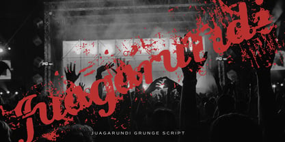 This extremely scratched and decadent font is suitable for posters of rock or grunge.
 - Kauhuaatos by Morganismi,
$12.00 Kauhuaatos is a writable picture font, ideal for scaring anybody by text or prints.
 - Janda Quirkygirl by Kimberly Geswein,
$5.00 Curly dotted and serifed alphabet perfect for adding a touch of quirk or whimsy.
 - ForTheBirds by Ingrimayne Type,
$14.95 In For The Birds, the letters are made by bird feet or bird tracks.
 - Leo by Canada Type,
$29.95 Leo is an economic magazine and book face meant for use in sizes suitable for immersive reading, with different cuts optimized for different body copy size ranges, like footnotes and legal text. Designed with the explicit intent of relaying information without calling attention to itself, this typeface places itself squarely on the "function" side of the eternal debate about form versus content. The roman Leo fonts were built with as little ornamentation as possible, with wedge serifs, a high x-height and a skeleton somehwat rooted in the designers' reflections on the modern, post-war Dutch archetype. Rather than follow traditional models with entirely different forms, contracted widths and steep slants, the Leo italics deliver naturally subtle emphasis in reading by closely relating to the forms, stance and rhythm of their roman counterparts. The 12 Leo fonts contain over 700 glyphs each, and include support for the vast majority of Latin languages. Included OpenType features are built-in small caps, lining and oldstyle figures in both proportional and tabular sets, superiors, numerators, denominators inferiors, ordinals, automatic fractions, ligatures, and optional long descenders for optimal counterspace management in book and magazine text layout. For more information on Leo's character set, features and some print tests, please consult the PDF in the gallery section of this page.
 - Back In The USSR DL - Personal use only

- Neo Osaka by Bejeletter,
$12.00 Neo Osaka is a lovely neo script with stylistic features. Neo Osaka is perfect for product packaging, branding project, megazine, social media, wedding, sport jersey design number or just used to express words above the background (interior). Built with OpenType features and includes beginning and ending swashes, alternate characters for both lowercase and uppercase letters, loads of different swash alternates for lowercase letters, numbers, punctuation, alternates, ligatures and it also supports other languages. Enjoy the font, feel free to comment or feedback, send me PM or email. Thank you!
 - Sunshine Formula by PizzaDude.dk,
$17.00 Imagine having a formula for sunshine. I mean, in a way to make the sun shine when you want it, or really need it. That could be for a day at the beach, or for the plants in your garden - or even better: make someone happy with a little bit of sunshine! I made this font on the first day of summer in Denmark 2020 - the rounded corners and the soft and easy look of Sunshine Formula, really got me into the "this-is-going-to-be-a-great-summer" mode! :)
 - Anjani Script by Letterhend,
$14.00 Anjani is a modern calligraphy script with a romantic feel. The natural hand writing script is suitable for you who needs a typeface for headline, logotype, apparel, invitation, branding, packaging, advertising etc. This typeface is comes in uppercase, lowercase, punctuations, symbols and numerals, stylistic set alternate, ligatures, etc also support multilingual and already PUA encoded. We hope you enjoy the font, please feel free to comment if you have any thoughts or feedback. Or simply send me a PM or email me at letterhend@gmail.com Thanks for purchasing and have fun!
 - Glagio by Ergibi Studio,
$19.00 Glagio is a Signature font for handwritten logotype with alternative characters. perfect font for creating photography studios or personal photography logos, best for initial logo or brand signatures. Glagio includes a full set of beautiful handwritten upper and lower case letters, numbers, assorted punctuation marks. All lowercase letters include end strokes, providing a cool handwriting style. What's Included : Standard glyphs Ligatures International Accent Works on PC & Mac Simple installations If there is a problem, question, or anything about my fonts, don't hesitate to ask! Big Thanks ~ Ergibi Studio
 - Sangkane Sanscript by Differentialtype,
$12.00 Sangkane sanscript is a modern bold script font. This font is a combination of uppercase and lowercase which can stand alone or as a unit. For example, sans serif uppercase can be used for titles, headlines, logos, branding or others. Lowercase that can be used for wedding invitations, greeting cards, or as complementary text in each of your designs. Of course, the uppercase and lowercase combination will stand out even more if combined. Masterfully designed to become a true favorite, this font has the potential to take your every creative idea to the highest level!
 - Omni Serif by ArtyType,
$29.00 Typefaces don't simply appear fully formed to a designer, even with a clear concept in mind, they evolve naturally during the design & development process. Out of the current 'Artytype' collection, Omni has evolved the most, being a stripped back off-spring from several exploratory exercises. At first glance and particularly at small scale, you'd be forgiven for thinking the basic characteristics have a conventional outlook; but on closer inspection, it's own distinctive, clean cut, subtle styling becomes apparent, revealing enough personality to stand alone or complement a wide variety of projects; subsequently, it's a font that won't go out of style quickly and may even become a modern classic in time. The Omni family has 2 distinct styles, sans and serif, each style being available in 4 weights; all 8 fonts have slanted options to match making a total of 16 fonts. Dictionary definition of OMNI: Combining form - Of all things, in all ways or places. Quite an apt name for a font with ubiquitous aspirations.

