10,000 search results
(0.035 seconds)
- Grosser by Leo Colalillo,
$35.00 The design of Grosser* is inspired by the northern european modern architecture with it's rational shapes. The font was born for posters and to be used on large formats, the geometric shapes and the solid structure makes it a very good choice to do posters and graphics where you need an extra bold font with sharp lines. *Grosser (Größer) is a german word, which means "bigger/larger".
 - Reloaded by Almarkha Type,
$25.00 Reloaded - Military Serif Font, first conceptualize was inspired by the classic vintage military stencil design . I wanted a typeface that could be a solid base for any military inspired project Reloaded Fonts can be used for wallpaper, pattern fills, web page background, surface textures. Perfect for making army posters , scrapbooking,invitation cards, stationary, gift wrap, packaging, buttons, pendants, holiday gifts, print on fabrics and so much more.
 - Bermula by Typehill Studio,
$25.00 Bermula is a Contemporary, Classy, and Warm Serif typeface. Bermula has a Clean and Smooth details. The design was intended to improve upon the Legibility. Bermula included 16 Fonts. Regular and matching Italic, from Light to Black weight. Also included Variable Font support. OpenType features allow for the implementation of typographic such as Ligatures. and added Latin Language support. It’s a perfect choice for Branding, Magazines, Posters, Advertising, Print, Packaging, Headlines, Logos, Web Design etc.
 - Headlines Core Edition by TypeThis!Studio,
$45.00Headlines font family was designed for optimised headline settings. The condensed letters are designed for clear and straight headlines and also allow longer words and headlines to find the space they need for a well-composed headline. Typeface Features 265 Characters 8 Styles, including Italics Western European Language Support Numbers Symbols Punctuation www.typethis.studio Thank you for checking out Headlines Font Family. If you have any questions, please send an email to hello@typethis.studio - Anguita Sans by Latinotype,
$29.00 Anguita Sans is a condensed sans serif font family of 8 weights with matching italics- 16 styles in all. The font is characterized by rounded terminals, a large x-height and a condensed structure, which allows you to create a good vertical rhythm. Anguita Sans is a stylish and versatile typeface perfectly suitable for a wide range of applications- especially titles and short lines of text, in both print and digital media.
 - Baradig by Asenbayu,
$15.00 Baradig is a versatile grotesque sans serif font family. Baradig provides a unique collection of glyphs with wide spacing and strong yet subtle geometric outlines. Baradig will give you an extraordinary modern visual experience. These fonts also have alternate and ligature features which are perfect for completing various projects such as logos, brands, products, labels, websites, posters, and many more. Baradig fonts feature Open Type Format, kerning, ligature and alternate packed in 10 styles: Light, Light Italic, Regular, Italic, Medium, Medium Italic, SemiBold, Semibold Italic, Bold and Bold Italic. Baradig fonts include uppercase letters, lowercase letters, numeral, punctuation and multilingual support.
 - Elio & Oliver v2 by SilverStag,
$19.00 Embark on a journey of refined typography with the Elio & Oliver Font Family v2, an exquisite upgrade that seamlessly integrates italics into its nine meticulously crafted weights, so you will get 18 fonts, 9 weights - from Thin to Black, and an italics version for each of them. Inspired by the timeless elegance and undeniable allure of Italy, this sans serif typeface captures the essence of sophistication and refinement, now enhanced with a touch of expressive flair. Italic Magnificence - A Symphony of Style The new italics bring a captivating dimension to the Elio & Oliver family, adding a graceful fluidity and dynamic rhythm to your designs. Each italic weight complements its corresponding roman counterpart, creating a cohesive and harmonious visual aesthetic. Unveiling the Full Spectrum of Elegance From the delicate Ultra Light to the bold intensity of Black, Elio & Oliver v2 offers an expansive range of weights, allowing you to tailor your designs to any project or mood. Whether you're crafting elegant editorial layouts, crafting impactful branding materials, or crafting sophisticated digital interfaces, this font family seamlessly adapts to your creative vision. Language Versatility for Global Impact Recognizing the power of language diversity, Elio & Oliver v2 boasts full language support, enabling you to communicate your message effectively to a global audience. With seamless compatibility across English, Italian, French, Spanish, and beyond, this font embraces the richness and cultural nuances of diverse languages. Captivate Attention, Leave a Lasting Impression Elio & Oliver v2 elevates your creative projects to new heights of sophistication, infusing them with an aura of refined elegance. Its graceful curves, captivating italics, and versatile weights will effortlessly capture attention and leave a lasting impression on viewers. Step into the Realm of Timeless Design Immerse yourself in the world of Elio & Oliver v2, where every letter narrates a story and every curve embodies the essence of impeccable design. Let the spirit of Italian chicness and timeless elegance guide your creative endeavors. Unleash the Power of Elio & Oliver v2 and Elevate Your Designs Discover Elio & Oliver v2 and transform your creative projects into masterpieces of timeless elegance. Join the ranks of designers who elevate their work with this exquisite typeface and unleash the power of sophisticated typography. Happy creating everyone!
 - Crasher Gear by Mofr24,
$10.00 Introducing "Crasher Gear," a captivating handwritten font with a monospaced, grunge-inspired design. Its multilingual support ensures global communication. With Regular, Italic, Oblique Italic, Bold, Bold Italic, and Bold Oblique Italic styles, it's ideal for posters, marketing, T-shirts, YouTube, games, and more. Embodying a bold, dystopian spirit, this versatile font leaves a lasting impression. Pair it seamlessly with various typefaces. Unleash creativity with "Crasher Gear" today.
 - Univia Pro by Mostardesign,
$25.00 Designed by Olivier Gourvat in December 2015, Univia Pro is a new contemporary OpenType font family with modernity and versatility in mind. Distinctive with its pleasant look and extremely modern, Univia Pro has a lot of personality mostly achieved by smooth curves and round corners that forms a very identical style of the entire family. Univia Pro is perfect both for display and text use and due to its ultra modern look, it is more than excellent for e-books, web-sites, user interface font, mobile apps etc. The Univia Pro font family is heavily equipped with OpenType features: case sensitive, scientific superiors and inferiors, standard ligatures, old style, lining figures, proportional and tabular figures, slashed zeros, stylistic sets. It also provides broad language support. The font family offers 18 variations (9 weights plus italics): Thin, Thin Italic, Ultra Light, Ultra Light Italic, Light, Light Italic Book, Book Italic, Regular, Regular Italic, Bold, Bold Italic, Black, Black Italic, Ultra and Ultra Italic. Univia Pro supports Latin, Extended latin and Cyrillic languages.
 - Dahliana by Luhop Creative,
$10.00 Dahliana is a humanist serif type family that has the heritage of classic Old Style and Transitional type while having the crisp lines and functionality of contemporary fonts. Its defining features include a high-contrast combined with diagonal stress, along with pinched stems and horizontals. There are 18 fonts altogether over 9 weights in roman and italic, you can also avail of one variable fonts which allow you to fine tune the weight to your exact liking.
 - Goga Zhane by Piece of Cake Typework,
$15.00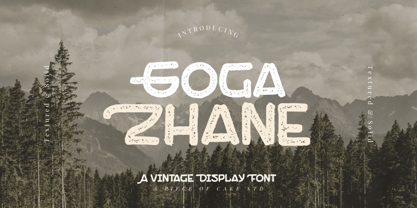 Hello World, Introducing, Goga Zhane is a textured display font suitable for your design project needs, such as; social media posts, quotes, overlays on images, taglines, logos, posters, print needs, website banners, and more. Features A set of uppercase and lowercase glyphs Number, symbol, and punctuation Multilingual Support Solid version Thank you a million times for downloading and using this font for your projects. Enjoy this font and happy creating!
 - Ozymandias NF by Nick's Fonts,
$10.00One in the series of fonts called Whiz-Bang Wood Type, intended to be set large and tight. Suitable for any occasion, Ozymandias is a caps and small caps font, available in solid and outline versions. The name is taken from a poem by Shelley. Both versions of this font contain the Unicode 1252 (Latin) and Unicode 1250 (Central European) character sets, with localization for Romanian and Moldovan. - Sailing Heart by Din Studio,
$22.00 Say hello to Saling Heart Script... Saling Heart is a beautiful script font, made to look naturally brushed. The texture from the brush font will make your design more beautiful and powerful. This font is suitable for any design like branding, quotes, wedding invitation, lettering project and etc. Included: - Sailing Heart Regular - Sailing Heart Solid Features: - Many Alternates (lowercase) - Accents (Multilingual Characters) - Ligatures - PUA encoded - Numerals and Punctuation (OpenType Standard)
 - Rapidone by Nurf Designs,
$19.00 Rapidone is a display font with a sporty style. This font is perfect for Logotype, branding and all things sports related. This font comes with 2 types variations, namely Solid and Rough, both of which have their respective advantages. Works on PC & Mac Simple installations Accessible in the Adobe Illustrator, Adobe Photoshop, Adobe InDesign, even work on Microsoft Word. PUA Encoded Characters – Fully accessible without additional design software.
 - BF Girando Pro by BrassFonts,
$39.99 Girando is the traditional book typeface with distinctive personality and a contemporary twist! Inspired by the everlasting ideas of Claude Garamond, it impresses with many fine details and an elegant shape – viable not only in small sizes. The family includes 2 harmonic weights, true italics, small caps, old style and lining figures and pretty as well as useful ligatures.
 - Helsinki by Ludwig Type,
$45.00 Helsinki 2.0 is a completely updated version of our popular Helsinki typeface. We expanded the character set, changed the weight structure, and also added italics. Helsinki is inspired by the Finnish traffic sign typeface. It is based on geometric shapes, with technical and masculine forms. Helsinki is rather narrow, which makes it well suited to headlines and short text.
 - Yassitf by Ingrimayne Type,
$6.00 Yet another san serif typeface, Yassitf is a generic sans, a font meant to blend in rather than stand out. It has little contrast and is almost monoline. It includes three widths: condensed, narrow, and regular. The widths have four to six weights: ultra thin, thin, light, plain, bold, and extra bold. Further, each width and weight combination has both upright and italics styles. The thirty fonts in the family contain several open-type features, including both proportional and tabular (monospaced) numbers.
 - Sujeta - Unknown license

- Catenary by Active Depth,
$6.00 The Catenary typeface was designed with the goal of creating an extremely-readable sans-serif font that could weather the future. Inspired by the beauty of the catenary curve, it's a blend of the transitional and the geometric that allows it to be readable while keeping its forms precise and consistent. Every character in its set is unique, leaving no confusion between similar letter forms. Sixes and nines can be distinguished even when they're upside down or sideways. The number one, the lowercase-L, and the uppercase-I can never be confused with one another, even without context. Throw b, d, g, p, and q into a jumble and the challenge of distinguishing the characters can easily be overcome. The Catenary family consists of eight fonts, six of which, the standard light/italic, regular/italic, and bold/italic, work as both excellent text fonts and exceptional display fonts. The two bonus fonts, a stencil and a guerrilla grunge style, make for great additional display font choices. The Catenary family is extremely versatile and ready for your toughest design work.
 - Khayla Almira by Studio Hello Good,
$12.00 Khayla Almira is a clean and elegant sans serif font, this font also provides ligature and alternate letters, this font itself has 6 families, namely regular, line, bold, regular italic, line italic and bold italic. for use as logos, display designs, and also for other purposes, make sure you have this font collection on your device.
 - Node Display by Spilled Ink,
$9.00 Designed in The Hague amongst the canals and flowering lime trees, Node Display represents the best of organic curves with sharp modern edges. Sophisticated and edgy, it's everything you want out of a display font. It looks amazing at large sizes and, also, small sizes. 16 Fonts. Extra Light, Extra Light Italic, Light, Light Italic, Regular, Regular Italic, Medium, Medium Italic, Semi Bold, Semi Bold Italic, Bold, Bold Italic, Extra Bold, Extra Bold Italic, Outline, Outline Italic. 17 Languages. Basque, Catalan, Danish, Dutch, English, Estonian, Finnish, French, Frisian, Galician, German, Irish, Italian, Norwegian, Portuguese, Spanish and Swedish. 185 Glyphs. 36 Punctuation Marks, 57 Uppercase Letters, 60 Lowercase Letters, Full Number Set. Looks great packaged on wrapping, bottles and jars or digitally on websites, social and apps or printed on newspapers, magazines and flyers.
 - Pulp Display by Spilled Ink,
$9.00 Designed in Spain amongst the orange trees, Pulp Display represents the best of modern circular aesthetic with an air of friendliness. Wholesome, full and juicy, it's everything you want out of a display font. It looks amazing at large sizes and, also, small sizes. 16 Fonts. Extra Light, Extra Light Italic, Light, Light Italic, Regular, Regular Italic, Medium, Medium Italic, Semi Bold, Semi Bold Italic, Bold, Bold Italic, Extra Bold, Extra Bold Italic, Outline, Outline Italic. 17 Languages. Basque, Catalan, Danish, Dutch, English, Estonian, Finnish, French, Frisian, Galician, German, Irish, Italian, Norwegian, Portuguese, Spanish and Swedish. 185 Glyphs. 36 Punctuation Marks, 57 Uppercase Letters, 60 Lowercase Letters, Full Number Set. Looks great packaged on wrapping, bottles and jars or digitally on websites, social and apps or printed on newspapers, magazines and flyers.
 - Getty Dubay by Handwriting Success,
$9.00 The Getty-Dubay® family of fonts has been 500 years in the making — so that you can make your handwriting worksheets in seconds. These fonts are modern descendants of the chancery handwriting style (now called “Italic”) from the Italian Renaissance, when master scribes designed a fluid and graceful hand, inspired by the proportions of the golden rectangle and Roman capitals. The Italic style has been in constant use since then. In modern times, it has been celebrated by Alfred Fairbank, Lloyd Reynolds and many others including authors Barbara Getty and Inga Dubay in their Getty-Dubay® Italic method. The Getty-Dubay® monoline handwriting fonts provide a replete resource to effectively model the highly-legible and beautiful Italic handwriting style. These are the official fonts of Getty-Dubay® Italic. Download the Getty-Dubay® Font Guide for everything you need to know about the Getty-Dubay® fonts. The Getty-Dubay® Joined fonts produce a clean cursive handwriting with join-as-you-type ease. Four join options are included: Standard, Pointed (altered joins into m, n and r), e k (utilizing the two-stroke e and one-stroke k), and Beginning (easiest joins only). The Getty-Dubay® Basic fonts provide sans-sarif clarity suitable for young writers. The Getty-Dubay® Precursive fonts add serifs to the lowercase letters, while retaining the pure Roman capitals of Basic Italic. The Getty-Dubay® Smallcaps fonts make mixed capitals easy to use. All Getty-Dubay® fonts come with scaffolds such as dashed contours, ruled lines, directional arrow and starting dots (for Basic and Smallcaps). They support multiple Latin-based languages from around the world. Getty-Dubay® is a registered trademark in the United States.
 - Nakara by Kreuk Type Foundry,
$12.00 Nakara Serif is All-Caps Modern Serif Typeface with solid heavy impressions. Available in 3 styles: Regular Outline Rough Nakara Serif ideally suited for headline title, badges lockup, logo, branding, posters etc. Supports Multi-language, Stylistic Ligatures & PUA encoded for alternates styles.
 - Lino by Kmaz,
$10.00 Lino is a unique typeface with elegant modern edge, designed by Khalid Al-Mazrouei and published by Kmaz. Lino packs a complete set of uppercase and lowercase letters, numbers and punctuation, it comes in 5 weights: Regular, Thin, Extra Thin, Bold and Solid.
 - Mineral by bb-bureau,
$60.00 Glittering writing, fractured into multiple tetragonal splinters, rectangular modules slightly spaced, like quartz and pixels. A Kapla style construction, with stencil properties (except Border and Outline version ) designed by Benoît Bodhuin . Mineral Solid has 4 stylistic titling alternatives (Border, Outline, Blunt and Smooth).
 - Humanex by Sébastien Truchet,
$40.00 Humanex is the first text typeface of Sébastien Truchet. He created it during the year of postgraduation ‘Systèmes graphiques, typographique & language' in Amiens. The beginning stages of the font development involved calligraphic research based on humanistic ductus. Sébastien’s goal was to introduce modules in a lineal structure. Downstrokes and upstrokes are homogeneous. Links between stem and curve are straight. It gives solidity and thickness to the typographical composition. The first version was a Semi Bold version and its italic. This typeface gave a blackest text. You can see the first display typeface, Humanex Ultralight. Sébastien kept the Semibold structure in order to make a thin typeface. Its goal is to give support to the Semibold version. It is a good typeface in big sizes. In order to add a better legibility, Sébastien built a Book version to have a brightest grey of text. The reading is more comfortable.
 - Garibaldi by Harbor Type,
$50.00 🏆 Selected for Tipos Latinos 6. 🏆 Selected for the 12th Biennial of Brazilian Graphic Design. 🏆 Typographica Favorite Typefaces of 2015. Garibaldi is a text typeface based on humanist calligraphy. It has an organic look and feel, while preserves the traditional construction of roman typography. It all started with a desire to learn more about the origin of the strokes on humanist typefaces. To accomplish that, Garibaldi features a 20° axis, medium contrast based on translation and expansion, asymmetric serifs, and terminals related to the broad nib stroke. Garibaldi Regular was nominated for Tipos Latinos 2014. Since then, the family was expanded with more weights and matching italics, making it a solid choice for setting books, magazines and documents. Among many OpenType features, each font contains small caps, ligatures and contextual alternates, totalling more than 750 glyphs and supporting at least 80 languages.
 - Rothorn by ROHH,
$35.00 Rothorn™ is a modern, minimalist geometric sans with its own personality derived for subtle design details, such as cut diagonal corners, pointed t, very small contrast and closed aperture. The letterforms give the typeface a lot of charisma, keeping a very minimal, clear and well balanced look at the same time. Its powerful and sharp shapes together with the variety of weights from Hairline to Black make it a perfect choice for headlines and branding. Generous x-height, careful spacing and distribution of weights give it a color and legibility great for long paragraphs of text. Rothorn is a geometric member of a large type system including such families as Montreux Grotesk (Swiss-style grotesk), Lütschine (narrow headline family) and Conthey (narrow headline unicase family). The Rothorn family consists of 10 weights with corresponding italic styles, giving a total of 20 styles. Italic styles were hand drawn to get sharp and fine letter shapes. It includes a 2-axis variable font letting you adjust the weight and italic slant to your exact needs. The family has extended latin language support, as well as broad number of OpenType features, such as, case sensitive forms, ligatures, contextual alternates, lining, oldstyle, tabular and circled figures, slashed zero, fractions, superscript and subscript, ordinals, currencies and symbols.
 - Barcis by insigne,
$24.75 Take your reader far away to a tropical morning, where the inviting aroma of a fresh roast introduces them to a gentle breeze and the first, warm light of day. Take them there with Barcis. This organic face with its tall x-height and neo-humanist attributes shows its free spirit through unique terminals, calligraphy-inspired strokes, and a rich variety of OpenType alternates All insigne fonts are loaded with OpenType options. Barcis is geared up for pro typography. The font features many numeral sets, with fractions, old-style figures, superiors and inferiors. OpenType-capable programs like Quark or the Adobe suite allow you to quickly change ligatures and alternates. You can see these options shown in the .pdf brochure. Barcis also features the glyphs to aid a variety of languages, together with Central, Eastern and Western European languages. In all, Barcis supports around forty languages that utilize the Latin script, earning Barcis the pick for for multi-lingual publications and packaging. Barcis features three different widths and seven weights from exceptional Light-weight to dense Black. Each of these individual fonts offers its own authentic italics and alternate glyphs as well. With its high versatility, Barcis is without a doubt an amazing titling font, a great choice for journals, a solid option for web use, or even for clearly defining your mark in logotype. Bring Barcis into your library, and use it to carry your audience away.
 - Apolline Std by Typofonderie,
$59.00 A Venetian serif in 6 styles The Apolline typeface family was created by Jean François Porchez as a means to study the transition from Renaissance writing into the first printing types. Rather than sticking to the method commonly used these days for the creation of revivals of Jenson or Bembo types, it seemed more interesting to try and get in the same mindset as those exceptional designers during this pivotal period in the history of typography. Thus Apolline is an exploration of the design methods used by people like Nicolas Jenson and his contemporaries for adapting handwriting with its multiple occurrences (a, a, a, b, b, b…) into single, unique signs (a, b…). Initially Jean François made drawings modelled after his own calligraphy. They were done at a very small size on tracing paper (2 cm high for the capitals) to preserve the irregularity of human handwriting. Besides emphasising the horizontal parts of the letter forms, the serifs were designed asymmetrically to reinforce the rhythm of the writing. The final drawings were produced at a large size (10 cm high for the capitals) to allow for subtle optimisation of specific details. The very narrow and fluid Apolline italic Influenced by various concepts for an ideal italic by Van Krimpen, Gill, etc. Apolline italic was designed at 8° degrees. Although the structure of the letterforms were informed by chancery scripts, the italic has full serifs like the roman. Very narrow and fluid, its unique design creates a good contrast when used in combination with its upright counterparts. Thanks to the presence of the serifs similar to roman typefaces it sets very neatly in large sizes. The next step was digitising the drawings with Ikarus (the pre-Bézier-curves era) to create the final roman and italic fonts. Two years later, when the family was expanded to six series the same method was used, this time with Fontographer. This was necessary for correcting a few problems caused by the conversion to Bézier outlines, and to add intermediate weights. Before the advent of feature-rich OpenType, quality type families consisted of several separate fonts for each weight to provide users with various sets of numerals, an extended ligature set and alternates, ornaments, and so on. Introducing Apolline Morisawa Awards 1993
 - Obcecada Serif - Personal use only

- Kwikspeed by Alphabet Agency,
$17.50 Kwikspeed is a italic display font that was developed from typography used in e sport themed design work. The font is designed so that the capital letters link together in a cool way. The font includes lots of alternative capital letters to provide many different options allowing you more versatility. The same goes for the ligatures - they also present cool ways of displaying letter combinations. The font includes uppercase, lowercase, numbers, alternative capitals, discretionary ligatures, basic Latin international and punctuation characters.
 - Sometype Mono by Dharma Type,
$- Sometype Mono is a free monospaced font family for coding and tabular layout which can be used for commercial purpose for free. So far, Sometype Mono consists of 6 style. Regular, Italic, Medium, Medium Italic, Bold and Bold Italic.
 - Samplex by Tipo Pèpel,
$22.00 Neutral and universal are two words that could describe a kind of perfection. The search for neutrality and universality is part of history in type design; it was specially important in the so-called Swiss Style. Samplex is a typeface that joins this particular search. The design gets rid of unnecessary elements and stays away from style conflicts. The large and slightly condensed body of lowercase letters makes Samplex a good choice for long paragraphs, and especially appropriate for screen devices. Letters with a blocky appearance give shape to a text in perfect order, ideal for grid lovers and layouts with a strict structure. The design of Samplex is clean and efficient. The diagonal cuts are reserved to the italic letterforms, setting some distance between the solid upright characters and the dynamic oblique forms.
 - Nostalgia Vibes by Java Pep,
$17.00 Proudly present a classic font style called Nostalgia Vibes, to add to that impression, the Nostalgia Vibes font comes with engraved strokes in every letter and shadow feature. Nostalgia Vibes font also has a lot of alternate glyphs and supports multilingual languages, This font is perfect for logos, advertising, publishing, headlines, posters, etc. What you’ll get Nostalgia Vibes Nostalgia Vibes Shadow Free Nostalgia Vibes Solid non-engraved Multilingual Support Opentype features with PUA-encoded
 - Sword Art by Sipanji21,
$10.00 Sword Art is a cute display font that has 2 different styles, namely the slice look and the solid look. Sword Art is a good font to use for various graphic designs, such as poster titles, banners, advertisements, logotypes, and is good for combining various types of icons. This font is also good for packaging, crafting, children's and adult clothing. apply this font for your various designs to make it more powerful
 - DT Hand Draft by Dragon Tongue Foundry,
$9.00 Hand Draft is hand crafted to emulate both the early printer’s serif font and/or a hand-drawn version of an early Serif font, using either a felt or round nibbed pen. Carefully designed to recreate a sturdy Sans Serif font with just the right amount of artistic imperfection, in three styles: outlined, hatched, and solid. A little funky and slightly grungy, this hand-drawn font is intentionally not quite perfectly rendered.
 - Quintaras Signature Script by Maulana Creative,
$14.00 Quintaras is a complete script and sans font duo. With expressive signature mono-line stroke and condensed sans solid and outline stroke, fun character with some of ligatures. To give you an extra creative work. Quintaras font support multilingual more than 100+ language. This font is good for logo design, Social media, Movie Titles, Books Titles, a short text even a long text letter. Make a stunning work with Quintaras font. Cheers, MaulanaCreative
 - DuPlay by Dutype Foundry,
$39.00 Duplay is a sans-serif designed and developed by darman kadir in this late 2023, influenced by famous Swiss-style typefaces like Helvetica and others. This sans-serif typeface will become an alternative solution to enhance your sports and apparel presence. It has a solid and fast appearance, harder in certain font families, and stronger characteristics that will make your image more prominent.

