10,000 search results
(0.018 seconds)
- Forjada by Latinotype,
$26.00
- Portada by TypeTogether,
$35.00
- Corrida by ParaType,
$25.00 - Otrada by AKTF,
$36.00
- Borda by The Northern Block,
$39.00
- Costa Dorada by Letterhead Studio-YG,
$15.00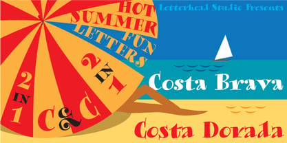
- Font - Unknown license

- Cortada Dos Std by Type-Ø-Tones,
$60.00
- Lifetime Font - Personal use only

- Sucker Font - Personal use only

- Charming Font - Unknown license

- HEX Font - Personal use only

- Glitter Font - Unknown license

- #44 Font - Personal use only

- Babylon Font - Unknown license

- barcode font - Unknown license

- moon font - Unknown license

- Dot Font - Unknown license

- Schindler’s Font - Personal use only

- Jacks Font - Unknown license

- Ticky font - Unknown license

- Oblivious font - Unknown license

- Still Font - Unknown license

- ADIstiLleRS Font - Personal use only

- Lucky Font - Unknown license

- Jim’s Font - Unknown license

- El&Font - Unknown license

- sai Font - Unknown license

- Cher Font - Unknown license

- kero Font - Unknown license

- Bharatic-Font - Unknown license

- font twelve - Personal use only

- Smiley Font - Unknown license

- cup Font - Unknown license

- Font TUMIKI - Unknown license

- Spotty Font - Unknown license

- Baby Font - Unknown license

- mi3 Font - Unknown license

- Joshs Font - Unknown license

- usa Font - Unknown license


Page 1 of 250Next page