10,000 search results
(0.018 seconds)
- Georude by Letterhend,
$17.00 Introducing, Georude, a quick geometry font. This font is perfectly made for branding, packaging, headline, logos, magazines, books, greeting / wedding cards, packaging, fashion, make up, stationery, novels, labels or any type of advertising purpose. Features : uppercase & lowercase numbers and punctuation multilingual PUA encoded We highly recommend using a program that supports OpenType features and Glyphs panels like many of Adobe apps and Corel Draw, so you can see and access all Glyph variations.
 - Mayrisand by Allouse Studio,
$16.00 Mayrisand comes with many stylistic alternates, ligatures, and Multi-Lingual Support to give you much choices to play around. We highly recommend using a program that supports OpenType features and Glyphs panels like many of Adobe apps and Corel Draw, so you can see and access all Glyph variations. Mayrisand is perfect for any tittles, logo, product packaging, branding project, megazine, social media, wedding, or just used to express words above the background.
 - URW DIN by URW Type Foundry,
$49.99 The digital outline fonts, DIN 1451 Fette Engschrift and Fette Mittelschrift were created by URW in 1984 and are the basis for all DIN font families. Both typefaces were designed for the URW SIGNUS system and were mainly used for the production of traffic signs. They have since become so popular in other areas that we have developed a complete DIN font family with 48 styles in OpenType Pro: URW DIN. It is semi-condensed, which is unique among the DIN fonts, so it has a broad spectrum of typographic uses. Its large x-height makes it perfect for use in e-publishing (web, apps, e-Books etc) and its adjusted stroke width between the regular and bold weights enhances its quality and distinguishability in print.
 - Quickline by Jonahfonts,
$35.00 Quickline OpenType font family in four weights supporting Central-European languages, containing ligatures, fractions and an abundance of alternates for upper and lower case glyphs. Quickline also comes in a matching Quickline-SLAB version containing four weights as well. Quickline works well as a text and display font.
 - Divina Proportione by Intellecta Design,
$29.00 Divina Proportione is based from the original studies from Luca Pacioli. Luca Pacioli was born in 1446 or 1447 in Sansepolcro (Tuscany) where he received an abbaco education. Luca Pacioli was born in 1446 or 1447 in Sansepolcro (Tuscany) where he received an abbaco education. [This was education in the vernacular (i.e. the local tongue) rather than Latin and focused on the knowledge required of merchants.] He moved to Venice around 1464 where he continued his own education while working as a tutor to the three sons of a merchant. It was during this period that he wrote his first book -- a treatise on arithmetic for the three boys he was tutoring. Between 1472 and 1475, he became a Franciscan friar. In 1475, he started teaching in Perugia and wrote a comprehensive abbaco textbook in the vernacular for his students during 1477 and 1478. It is thought that he then started teaching university mathematics (rather than abbaco) and he did so in a number of Italian universities, including Perugia, holding the first chair in mathematics in two of them. He also continued to work as a private abbaco tutor of mathematics and was, in fact, instructed to stop teaching at this level in Sansepolcro in 1491. In 1494, his first book to be printed, Summa de arithmetica, geometria, proportioni et proportionalita, was published in Venice. In 1497, he accepted an invitation from Lodovico Sforza ("Il Moro") to work in Milan. There he met, collaborated with, lived with, and taught mathematics to Leonardo da Vinci. In 1499, Pacioli and Leonardo were forced to flee Milan when Louis XII of France seized the city and drove their patron out. Their paths appear to have finally separated around 1506. Pacioli died aged 70 in 1517, most likely in Sansepolcro where it is thought he had spent much of his final years. De divina proportione (written in Milan in 1496–98, published in Venice in 1509). Two versions of the original manuscript are extant, one in the Biblioteca Ambrosiana in Milan, the other in the Bibliothèque Publique et Universitaire in Geneva. The subject was mathematical and artistic proportion, especially the mathematics of the golden ratio and its application in architecture. Leonardo da Vinci drew the illustrations of the regular solids in De divina proportione while he lived with and took mathematics lessons from Pacioli. Leonardo's drawings are probably the first illustrations of skeletonic solids, an easy distinction between front and back. The work also discusses the use of perspective by painters such as Piero della Francesca, Melozzo da Forlì, and Marco Palmezzano. As a side note, the "M" logo used by the Metropolitan Museum of Art in New York City is taken from De divina proportione. “ The Ancients, having taken into consideration the rigorous construction of the human body, elaborated all their works, as especially their holy temples, according to these proportions; for they found here the two principal figures without which no project is possible: the perfection of the circle, the principle of all regular bodies, and the equilateral square. ” —De divina proportione
 - Lizie Slab by Poul Allan Studio,
$26.00 Lizie Slab is a slab serif, where the geometric construction is inspired by the 1930s design icons De Stijl, Gerrit Rietveld and others. Lizie Slab is designed for both print and digital use, and you will find it ideal for packaging, poster design, catalogs and exhibition design. The font supports a wide range of languages. This OpenType contains features such as fractions, proportional and tabular shapes.
 - Century Expanded by Bitstream,
$29.99Shortly after the preparation of the original Century, the two Bentons (father Linn Boyd and son Morris Fuller) prepared a wider version for De Vinne’s press and called it Century Broadface. In 1900 ATF released the design for general use as Century Expanded, one of the most popular and effective of typefaces, to this day the text face of the New York Daily News. - Olaus by Monotype,
$29.99The Olaus Magnus and Olaus Bandus alphabets are inspired by the letterforms cut in the pictures and wood-cuts of Olaus Magnus great book Historia de Gentibus Septentrionalibus. This great history of the Nordic Peoples was printed in Rome in 1555 in his own printing shop there. Olaus Magnus, Catholic priest and appointed archbishop by the Pope, never returned to the now Lutheran Sweden. - Tme by bb-bureau,
$65.00 Tme, new lineal — Tme is an update of Sl (T = S + 1, m = l + 1 and e for natural logarithm), drawn in 2006 for the University of Arts Saint-Luc de Tournai. Its geometrical drawing is based on the directions of the hexagon, a scrupulously followed constraint which confers on some glyphs a very particular drawing. in light, regular and bold language: all latin glyphs
 - Bodoni FB by Font Bureau,
$40.00 Working at American Type Founders from a Bruce Foundry recutting, Morris Fuller Benton worked out the dramatics of the English Fat Face, and in 1928 produced Ultra Bodoni, a headline spectacular. Using Benton’s 1933 Ultra Bodoni Extra Condensed, Richard Lipton digitized Bodoni FB Bold Condensed, then took compression even further and designed Bodoni FB Bold Compressed, a real technical tour de force; FB 1992
 - Flame On by Comicraft,
$19.00 The Heat is On! Comicraft's ace lettering artists Richard Starkings and John 'JG' Roshell created this font for Marvel's Fantastic Four title. Now, you don't have to be Johnny Storm to light up, but we would like to remind you that The Human Torch is a comic book character and you are not! Also, smoking is bad for your health.
 - Scaffoldini by Funk King,
$10.00 The Scaffoldini Family provides four different isometric perspectives and is suitable in use in science, engineering and sci-fi themed projects or however you see fit. The lines are formed by bubbles (or circle bricks in Fontstruct) and appear smoother the smaller the size of the type. These are not straight line segments and the gylphs will appear bubbly (scalloped edges) at larger size. Please be aware of this feature of the font before you purchase.
 - Modesto by Parkinson,
$25.00 Modesto is a loose-knit family based on a signpainters lettering style popular in the late-19th and early-20th centuries. It evolved from the lettering I used for the Ringling Bros. and Barnum & Bailey Circus Logo. The Modesto family was not planned. It just happened, a few fonts at a time over about fifteen years. In 2014 four new Italic fonts were added. There is a downloadable MODESTO USER MANUAL PDF in the Gallery section for this family.
 - Intouch by Fontysia,
$19.00 Intouch is a cool, and display font that has a cool and funny, street art vibe. A playful all-caps Display font that includes four versions font of each letter which can be used separately or on top of each other to achieve a different look. This font is PUA encoded which means you can access all of the glyphs and alternates with ease! (please type the preview to see if I have what you need!)
 - Parisette NB by No Bodoni,
$39.00 These four typefaces, Berlinette NB, Lyonette NB, Marseillette NB and Parisette NB, were designed from the same basic shape, a geometric form that avoids strict horizontals and uses more offbeat triangular shapes. Parisette is a fanciful type that is both bouncy and biting. The frivolity and quirk of the narrow width is offset by the razor-sharp, hatchet horizontals, which require protective gloves when type setting. This is a good typeface for enigmatic signs at postmodern student demonstrations.
 - Mouvere by Fikryal,
$18.00 Mouvere – Old Style Serif Family, comes with four types of typefaces, Regular, Italic, Bold, and Bold Italic. This font is very suitable to be applied in various aspects of design, and your branding. It’s perfect for logos, branding, title, social media posts, advertisements, product packaging, product designs, label, photography, watermark, special event, magazine, web designs, etc. Features : Multilingual Support If you have any questions please don’t hesitate to contact me follow my Instagram: @fkryall Thank you
 - Tita Script by Latinotype,
$59.00 Tita is dedicated to my grandmother Hebe, witty and arrabalera 1. The font is inspired by Milonga 2 music and the fileteado porteño 3. I picture it at The Moulin Rouge, sparkling, provocative, loving. It evokes Tita Merello and my grandmum singing her music. Tita is Argentinean to its very core. A font to shout goal and dulce de leche 4 with passion! Its curves originate from polirhythmic calligraphy, which I learnt from my mentor Silvia Cordero Vega. Tita is a pedigree script that is based on hand lettering and Sandra Biondi’s calligraphy works. Font digitalisation by Daniel Hernández. Edited by Javier Quintana / Programmed by Manuel Corradine. 1. A person from the arrabal (a working class neighborhood on the outskirts of the city of Buenos Aires) 2. Musical genre originated in the Río de la Plata areas of Argentina and Uruguay 3. Decorative hand lettering and artistic style that is frequently spotted in Buenos Aires 4. Sweet milk sauce
 - Roos ST by Canada Type,
$39.95 Roos ST is a special version of the Roos family, engineered specifically for science writing. It is equipped with SciType, a combination of additional characters and OpenType programming included in the fonts to help with typesetting science text. For more information about SciType, please consult the SciType FAQ available in the Gallery section of this page. The Roos design is the Dutch classic made by S. H. de Roos during the years of the second World War, and subsequently used for a special edition of the Dutch Constitution on which Juliana took the oath during her inauguration as the Queen of the Netherlands. This design is widely regarded as de Roos's finest, and has one of the most beautiful italics ever drawn. Aside from the SciType additions, all the Roos ST fonts contain OpenType features for ligatures, ordinals, automatic fractions, and seven kinds of figures. For details about the functionality of Roos ST, please consult its Access Chart PDF available in the Gallery section of this page.
 - 1543 Humane Petreius by GLC,
$42.00 The regular style of this family was inspired from the typeface used in Nuremberg, Germany, by Johannes Petreius in 1543 to print the famous “De Revolutionibus Orbium Coelestium,” the well-known mathematical and astronomical essay by Nicolaus Copernicus. Petreius was also using an original italic style, as he did for the “De Sculptura” by Gaurico Pomponio, in 1542. Unfortunately, nobody seems to know who was the punchcutter of this Jenson-style font. Also included is a title file, containing initials (without diacritics) and small caps (with diacritics). In our three styles (Regular & Italic + Titling), font faces, kerning and spacing are as closely as possible identical to the original. This Pro font is covering Western, Eastern and Central European, Baltic and Turkish languages, with standard and long-s ligatures in regular and italic styles. Both have twin-letter ligatures, but the italic style has extra (genuine) ligatures for f and t with vowels.
 - Scroll by Canada Type,
$24.95Earlier this year, my eyes fell upon a discarded wedding invitation on the sidewalk. A closer look at it revealed that it had at one point been victimized by rain. Some of the fancy script letters were not quite broken, but sort of melted and run-down, while the rest were still somewhat intact. That's how Scroll was conceived, as an idea for a script where thicks and thins blend to produce a wet appearance. Unlike most available broken scripts, the Scroll script was originally drawn in its own juiced context, and not based on any existing script. This font is great for atmospheric antiquity, deep natural poetry, still life captioning, gothic music posters and collateral, or horror literature and poetry covers. - A Cuchillada - Personal use only

- AW Conqueror Std Carved by Typofonderie,
$59.00 Engraving inspired typeface The AW Conqueror Carved encapsulates perfectly the lettering styles in fashion during the 19th century quite often in the frontispieces of books. It wasn’t rare to see these kinds of typefaces, with their variations in depth and relief effects, adorning boxes and other forms of packaging of the time. AW Conqueror superfamily AW Conqueror Didot is part of a larger family, who include 4 others subfamilies with great potential: They’re but based on same structure, with some connection between them (width for example), to offer a great & easy titling toolbox to any designers, from skilful to beginner. Each of the members try their best to be different from the others because of their features. They should work harmoniously in contrast. Club des directeurs artistiques Prix 2010 European Design Awards 2011
 - Quickline Slab by Jonahfonts,
$35.00 Quickline-SLAB OpenType font family in four weights supporting Central-European languages, containing ligatures, fractions and an abundance of alternates for upper and lower case glyphs. Quickline-SLAB also comes in a matching Quickline ”SANS” version containing four weights as well. Quickline-Slab works well as a text and display font.
 - FlagDay by Ingrimayne Type,
$8.00 These four variations on letters designed as flags are almost unreadable, but may be of some use as a patriotic display font. The four are all transformations of fonts from the FourJuly group. The solid and outline styles can be layered with the main fonts to easily create multiple-colored letters.
 - Biscuit Recipe by Forberas Club,
$16.00 Biscuit Recipe is handwritten font with pressure style. This font is good to application for wedding, tees, simple letter, notes, invitation, celebration, cute moment and many more.
 - Shelldon - Personal use only

- Fiducia by Typogama,
$19.00 Inspired by the first Swiss banknotes, Fiducia is a four weight display typeface. Linked through a common theme, this family is a collection of four styles of typography, Serif, Modern, Slab and Sans. Connected through common vertical proportions, the styles can be combined and mixed to create diverse layouts. These four styles include a range of Opentype features, they all share a range of numerals and each weight equally features its own additional option, for example adding a titling style in the Serif weight or Small capitals in the Sans.
 - Butter Slices by Letterhend,
$19.00 Introducing, Butter Slices - Brush Script. A beautiful modern calligraphy script based on manual hand writing. The natural flow with the swashes make this font looks even more prettier. This type of font perfectly made to be applied especially in wedding invitation, labels, logos, magazines, books, greeting / wedding cards, packaging, fashion, make up, stationery, novels, labels or any type of advertising purpose. Features : uppercase & lowercase numbers and punctuation multilingual swash and ligature alternates PUA encoded We highly recommend using a program that supports OpenType features and Glyphs panels like many of Adobe apps and Corel Draw, so you can see and access all Glyph variations
 - Glosa Headline by DSType,
$55.00Glosa is a type family designed for editorial purposes. Glosa is delicate and highly readable at very small sizes but reveals all it’s strength and personality when used at big sizes. The contrast of the sharped serifs and ball terminals, provide a fresh and very contemporary look. Glosa Text is a bracketed serif, softer, smooth and less idiosyncratic, suitable for text settings. Both styles have four weights and italics, in a workhorse typeface, full of OpenType features such as Small Caps, Tabular Figures, Central Europe characters and Historical Figures, among others. Glosa Headline is ideally suited for nameplates and headline typography, with four weights and with lowercase matching the small caps. In Glosa most of the diacritics were designed to fit the gap between the x-height and the caps height, avoiding some common problems with the accented characters. - Glosa by DSType,
$55.00Glosa is a type family designed for editorial purposes. Glosa is delicate and highly readable at very small sizes but reveals all its strength and personality when used at big sizes. The contrast of the sharped serifs and ball terminals, provide a fresh and very contemporary look. Glosa Text is a bracketed serif, softer, smooth and less idiosyncratic, suitable for text settings. Both styles have four weights and italics, in a workhorse typeface, full of OpenType features such as Small Caps, Tabular Figures, Central Europe characters and Historical Figures, among others. Glosa Headline is ideally suited for nameplates and headline typography, with four weights and with lowercase matching the small caps. In Glosa most of the diacritics were designed to fit the gap between the x-height and the caps height, avoiding some common problems with the accented characters. - Glosa Text by DSType,
$55.00Glosa is a type family designed for editorial purposes. Glosa is delicate and highly readable at very small sizes but reveals all its strength and personality when used at big sizes. The contrast of the sharped serifs and ball terminals provides a fresh and very contemporary look. Glosa Text is a bracketed serif, softer, smooth and less idiosyncratic, suitable for text settings. Both styles have four weights and italics in a workhorse typeface, full of OpenType features such as Small Caps, Tabular Figures, Central European characters and Historical Figures, among others. Glosa Headline is ideally suited for nameplates and headline typography, with four weights and with lowercase matching the small caps. In Glosa most of the diacritics were designed to fit the gap between the x-height and the caps height, avoiding some common problems with the accented characters. - Oh, "Heartfont," the name alone conjures images of love letters penned in the wee hours, secret admirers typing away on their vintage typewriters, and the digital equivalent of a heart-shaped box of ...
- Lemy Butter by Forberas Club,
$16.00 Lemy Butter is handwritten font with monoline style. This font is good to application for christmas wedding, tees, simple letter, notes, invitation, celebration, cute moment and many more.
 - Brumery by Letterhend,
$14.00 Brumery Condensed is a sleek condensedfont. Perfect to be applied to the other various formal forms such as invitations, labels, logos, magazines, books, greeting / wedding cards, packaging, fashion, make up, stationery, novels, labels or any type of advertising purpose. Features : numbers and punctuation multilingual PUA encoded We highly recommend using a program that supports OpenType features and Glyphs panels like many of Adobe apps and Corel Draw, so you can see and access all Glyph variations.
 - Blighted Brush by Letterhend,
$15.00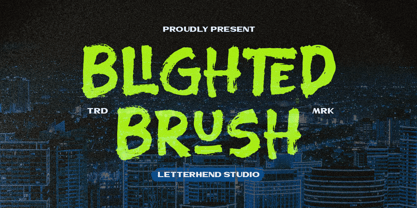 Blighted Brush is a hand drawn brush font. This font with organic freestyle textured which is purposely made for headline, display or logotype, magazines, books, greeting / wedding cards, packaging and signature which need a standout appearing. Features : Uppercase & lowercase Numbers and punctuation Alternates & Ligatures Multilingual PUA encoded We highly recommend using a program that supports OpenType features and Glyphs panels like many of Adobe apps and Corel Draw, so you can see and access all Glyph variations.
 - Marlina by RahagitaType,
$16.00 Marlina is a modern handwritten font suitable for wedding invitations, branding, store names, and more. You will love to use it because there are 250 glyphs and swashes that add to make your designs more elegant. Features : -Uppercase & lowercase -Numbers and punctuation -Multilingual support -Ligatures -Swashes We highly recommend using a program that supports OpenType features and Glyphs panels like many of Adobe apps and Corel Draw, so you can see and access all Glyph variations.
 - South Paris by Allouse Studio,
$16.00 South Paris a Signature Font that will bring an luxury impression for you. South Paris is perfect for product packaging, branding project, megazine, social media, wedding, or just used to express words above the background. South Paris come with many underline styles, also come with Multi-Lingual Support. We highly recommend using a program that supports OpenType features and Glyphs panels like many of Adobe apps and Corel Draw, so you can see and access all Glyph variations.
 - Edberd by Juliawan90,
$15.00 Edberd is a beautiful font. This font perfectly made to be applied especially in logo, and the other various formal forms such as invitations, labels, logos, magazines, books, greeting / wedding cards, packaging, fashion, make up, stationery, novels, labels or any type of advertising purpose. We highly recommend using a program that supports OpenType features and Glyphs panels like many of Adobe apps and Corel Draw, so you can see and access all Glyph variations. Happy Designing!
 - Shaliya by Juliawan90,
$15.00 Shaliya is a beautiful font. This font perfectly made to be applied especially in logo, and the other various formal forms such as invitations, labels, logos, magazines, books, greeting / wedding cards, packaging, fashion, make up, stationery, novels, labels or any type of advertising purpose. We highly recommend using a program that supports OpenType features and Glyphs panels like many of Adobe apps and Corel Draw, so you can see and access all Glyph variations. Happy Designing!
 - "Tour de Font" is a captivating creation by Andreas Johansson, a homage to the elegant interplay of form and function in typographic design. At first glance, this font emerges as a bold statement pie...

