10,000 search results
(0.044 seconds)
- 1742 Civilite by GLC,
$38.00 In the late medieval period appeared a "semi-cursive" writing, the French "écriture de civilité". Quickly, it is carved and melted down in lead for printing. It is a very elegant running font, with numerous variants, both final than initial characters, many of the accented small characters were present in the model I was inspired by, after “Fournier Le jeune ”, in his catalogue "Modèles des caractères de l'imprimerie et des autres choses nécessaires au dit art nouvellement gravés par Simon-Pierre Fournier le jeune" published in 1742 in Paris. A render sheet, included in the font file, makes all characters easy to identify on keyboard. This font, very attractive and decorative may be used for web-site titles, posters and flyer designs, editing ancient texts, labels, greeting cards... and anything you want! It supports as easily enlargement as small size, remaining elegant and pretty.
 - Victory Rose by Maulana Creative,
$15.00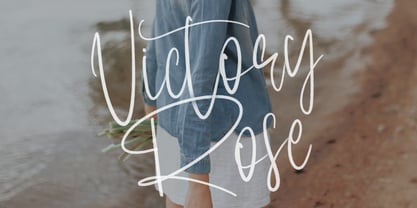 Give your designs an authentic brush handcrafted feel. "Victory Rose" is perfectly suited to signature, stationery, logo, typography quotes, magazine or book cover, website header, flyer, clothing, branding, packaging design and more.
 - Bazilic by Tkachev,
$25.00 Bazilic is an informal decorative typeface. It would look nice in greeting cards, children’s books and magazines, on candy and food packages, holiday posters and flyers. Bazilic was based on informal lettering.
 - Godehyda by Anomieka,
$13.00 It's smooth, it's cute, it's fun, and it's mighty tasty: it's Godehyda! It is perfect for headings, flyer, greeting cards, product packaging, book cover, printed quotes, logotype, apparel design, album covers, etc.
 - The Monster by Maulana Creative,
$10.00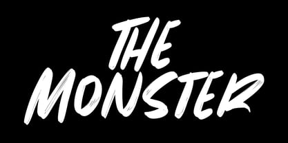 Give your designs an authentic brush handcrafted feel. The Monster is perfectly suited to signature, stationery, logo, typography quotes, magazine or book cover, website header, flyer, clothing, branding, packaging design and more.
 - Blackduck by Eurotypo,
$60.00 “Blackduck” font is a typical Gothic, usually named “Blackletter” . This typeface was born with the name of “Textur” and developed from Carolingian cursive. It was used in the middle age as sacred script, became increasingly narrower, his vertical lines were emphasized and his strokes very compacted to save space. Along the time the early German print typefaces derived in others styles that were more readable such as Schwabacher and Fraktur, very popular in Germany and sometimes associated to the identity of the country. The font "Blackduck" was inspired mixing carefully the last two “Blackletters”. We try to joine some characteristics of both to reach good legibility without loosing the strong impact and powerfulness of the shapes. Some minuscules like the “o” “c” “e” “d” are rounded on both sides, while both strokes join in an angle at the top and at the bottom. Some other lower cases are formed by an angular and rounded stroke. This font contains a full set of OpenType features; swashes, stylistics alternates, old style figures (Arabic numeral were carefully shape integrated), ligatures and some extras ornaments were added to help in your design. "Blackduck" includes diacritic signs for Central European languages.
 - Boister Black Pro by CheapProFonts,
$10.00 I loved the look of this font so much that I couldn't resist reworking it - although it probably had the most basic character set I've ever used as a starting point. But here it is in its complete, professional, multilingual state. I hope this wonderful swashbuckling font now finds many new users and uses. Celebrate! ALL fonts from CheapProFonts have very extensive language support: They contain some unusual diacritic letters (some of which are contained in the Latin Extended-B Unicode block) supporting: Cornish, Filipino (Tagalog), Guarani, Luxembourgian, Malagasy, Romanian, Ulithian and Welsh. They also contain all glyphs in the Latin Extended-A Unicode block (which among others cover the Central European and Baltic areas) supporting: Afrikaans, Belarusian (Lacinka), Bosnian, Catalan, Chichewa, Croatian, Czech, Dutch, Esperanto, Greenlandic, Hungarian, Kashubian, Kurdish (Kurmanji), Latvian, Lithuanian, Maltese, Maori, Polish, Saami (Inari), Saami (North), Serbian (latin), Slovak(ian), Slovene, Sorbian (Lower), Sorbian (Upper), Turkish and Turkmen. And they of course contain all the usual "western" glyphs supporting: Albanian, Basque, Breton, Chamorro, Danish, Estonian, Faroese, Finnish, French, Frisian, Galican, German, Icelandic, Indonesian, Irish (Gaelic), Italian, Northern Sotho, Norwegian, Occitan, Portuguese, Rhaeto-Romance, Sami (Lule), Sami (South), Scots (Gaelic), Spanish, Swedish, Tswana, Walloon and Yapese.
 - Calicanto by Sudtipos,
$39.00 Alejandro Freitez’s first commercial typeface is inspired by contemporary serifs and newspaper typography. Calicanto is a compact typeface with strong serifs, symmetrical curves and a vertical axis. It has open counters and a generous x-height with slightly condensed characters and low contrast strokes. The design of its letters are simple (with a precise rationale), and it is ideal for combining different variables and typographic bodies, for digital and printed media. Each of the 12 variables has 750 glyphs (supporting more than 90 languages), with small caps, ligatures, lining figures by default, OldStyle and tabular, mathematical and currency symbols for each set of numerals, intelligent fractions, lower and upper numerals, glyphs sensitive to capital letters and circular numerals, among other OpenType functions that make it ideal for composing demanding texts for books, magazines, newspapers, annual reports, and much more.
 - Cursed Stone by Ditatype,
$29.00 Cursed Stone is a spine-chilling display font that will transport your designs to a realm of dark enchantment. Designed in large letters and with a bold weight, this typeface demands attention and exudes an aura of haunting mystery. Each letter is meticulously crafted with eerie stone texture details, adding an ominous and cursed touch to the font. The large size of the letters enhances the font's imposing presence, making it impossible to ignore. The stone texture details in each letter of this font bring an authentic and sinister feel, as if the font was chiseled from the depths of an ancient cursed monument. These haunting details add an element of mystique and darkness, immersing the viewer into a world of malevolent enchantment. The combination of bold weight and stone texture gives Cursed Stone a rugged and formidable look, evoking images of cursed relics and forbidden ruins. The letters appear to hold secrets from the past, carrying a haunting energy that captures the imagination. For the best legibility you can use this font in the bigger text sizes. Enjoy the available features here. Features: Alternates Multilingual Supports PUA Encoded Numerals and Punctuations Cursed Stone fits in headlines, logos, movie posters, flyers, invitations, branding materials, print media, editorial layouts, headers, and any horror-themed project. Find out more ways to use this font by taking a look at the font preview. Thanks for purchasing our fonts. Hopefully, you have a great time using our font. Feel free to contact us anytime for further information or when you have trouble with the font. Thanks a lot and happy designing.
 - Spooktacular by Aiyari,
$20.00 Spooktacular font family is the fusion of beatnik movement on 1950's, vintage horror movie, and vintage comics. The typeface offer the magics of open type features such contextual alternate and stylistic alternate which make the typeface looks more playful. Spooktacular comes with extra doddle dingbats to make your design looks perfect. Spooktacular Font Family best uses for headings, Logo type, quotes, apparel design, invitations, flyer, poster, greeting cards, product packaging, book cover, printed quotes, cover album, movie, etc
 - Thurkle by Grontype,
$15.00 Thurkle is bold new serif font, look tough and playable. Comes with sharp edges, inspired by sword making dynasty in British History. This display typeface is semi condensed and included some extra unique ligatures. Thurkle is perfect for any project such as magazine header, flyer header, logotype, invitation card name, and some any other design. Features: All Caps and Small Caps Character Numbers and Punctuation Special Characters Ligatures. Multilingual Support Thankyou For Picking The Font, Enjoy. Grontype
 - Linotype Mailbox by Linotype,
$29.99Linotype Mailbox is part of the Take Type Library, chosen from the entries of the Linotype-sponsored International Digital Type Design Contests of 1994 and 1997. The typefaces was created by German designer Andreas Karl. An entire alphabet, only lower case letters, with the look of @ -- who doesn’t think of the Internet? If you want to give your headlines or short texts an unmistakable feel of the Internet, you could not do better than Linotype MailBox. - Spitzkant by Julien Fincker,
$29.00 About the design Spitzkant is a serif typeface family that is characterized by strong contrasts. Pointed, sharp serifs and edges contrast with round and fine forms, making it very individual and expressive. This makes it particularly suitable for branding, editorial, packaging and advertising. The high-contrast display version has been complemented by a lower-contrast text version, making Spitzkant in combination suitable for both strong headlines and extensive body text. An allrounder that can be used for many purposes. Features The Spitzkant Head and Text family has a total of 2 optical sizes, 5 weights and 20 styles, from thin to bold and matching italics. With over 850 characters, it covers over 200 Latin-based languages. It also has an extended set of currency symbols and a whole range of open type features. For example, there are alternative characters as Stylistic Sets, Small Caps, automatic fractions and many other features. Ligatures Especially the extensive selection of ligatures (standard and optional) is a special feature which was an important part during the design process. With over 95 different ligatures there are many possibilities to give headlines and logos an individual touch. Get the Variable Font here: https://www.myfonts.com/fonts/julien-fincker/spitzkant-variable/
 - Hazim by Arabetics,
$39.00 Hazim is a display font designed with isolated letters. It uses thin white slits positioned within extra bold black space glyphs emphasizing the main visual characteristics of the Arabetic letters in two positions: initial/medial and final/isolated. The spacing widths between glyphs match that of the slits to give a virtual cursive look and feel. The name Hazim was chosen to honor a friend of the designer, Hazim al-Khafaji. Hazim supports all Arabetic scripts covered by Unicode 6.1, and the latest Arabic Supplement and Extended-A Unicode blocks, including support for Quranic texts. It comes with one weight and a left-slanted “italic”. The script design of this font family follows the Arabetics Mutamathil Taqlidi style and utilizes varying x-heights. The Mutamathil Taqlidi type style uses one glyph per every basic Arabic Unicode character or letter, as defined by the Unicode Standards, and one additional final form glyph, for each freely-connecting letter in an Arabic text. Hazim includes the required Lam-Alif ligatures in addition to all vowel diacritic ligatures. Hazims’s soft-vowel diacritic marks (harakat) are only selectively positioned with most of them appearing on similar lower or upper positions to make sure they do not interfere with the letters. Kashida is enabled.
 - Baudi by MKGD,
$13.00 Bauhaus is a style of art that was born in Weimar Germany in the early part of the 20th century. The font that bears the bauhaus name was constructed in accordance with this style by making use of spheres and squares with little or no added flourishes. Since this typeface was already minimalistic in appearance, it was difficult to produce a similarly styled font. So I went back to bauhaus’ architectural roots for inspiration. The result contains a more detailed composition, but is still focused on the basic aesthetics that continue to make bauhaus a popular art form. Baudi has a glyph count of 388 and supports the following languages Afrikaans, Albanian, Asu, Basque, Bemba, Bena, Bosnian, Catalan, Chiga, Colognian, Cornish, Croatian, Czech, Danish, Embu, English, Esperanto, Estonian, Faroese, Filipino, Finnish, French, Friulian, Galician, German, Gusii, Hungarian, Icelandic, Indonesian, Irish, Italian, Kabuverdianu, Kalaallisut, Kalenjin, Kamba, Kikuyu, Kinyarwanda, Latvian, Lithuanian, Low German, Lower Sorbian, Luo, Luxembourgish, Luyia, Machame, Makhuwa-Meetto, Makonde, Malagasy, Malay, Maltese, Manx, Meru, Morisyen, North Ndebele, Norwegian Bokmål, Norwegian Nynorsk, Nyankole, Oromo, Polish, Portuguese, Romanian, Romansh, Rombo, Rundi, Rwa, Samburu, Sango, Sangu, Scottish Gaelic, Sena, Shambala, Shona, Slovak, Slovenian, Soga, Somali, Spanish, Swahili, Swedish, Swiss German, Taita, Teso, Turkmen, Upper Sorbian, Vunjo, Walser, Zulu
 - Wooden Nickel NF Pro by CheapProFonts,
$10.00 A nice, black display face - for a retro/western poster look. I have kept the quirky “t”, increased the dot above “i” and “j” slightly, improved the spacing/kerning and modified/added all the usual diacritics. A pretty easy reworking of a good quality font. Nick Curtis says: "An old favorite, Bernhard Antique Bold Condensed, cleaned up and fattened up. Warm, charming, personable … suitable for any occasion." ALL fonts from CheapProFonts have very extensive language support: They contain some unusual diacritic letters (some of which are contained in the Latin Extended-B Unicode block) supporting: Cornish, Filipino (Tagalog), Guarani, Luxembourgian, Malagasy, Romanian, Ulithian and Welsh. They also contain all glyphs in the Latin Extended-A Unicode block (which among others cover the Central European and Baltic areas) supporting: Afrikaans, Belarusian (Lacinka), Bosnian, Catalan, Chichewa, Croatian, Czech, Dutch, Esperanto, Greenlandic, Hungarian, Kashubian, Kurdish (Kurmanji), Latvian, Lithuanian, Maltese, Maori, Polish, Saami (Inari), Saami (North), Serbian (latin), Slovak(ian), Slovene, Sorbian (Lower), Sorbian (Upper), Turkish and Turkmen. And they of course contain all the usual “western” glyphs supporting: Albanian, Basque, Breton, Chamorro, Danish, Estonian, Faroese, Finnish, French, Frisian, Galican, German, Icelandic, Indonesian, Irish (Gaelic), Italian, Northern Sotho, Norwegian, Occitan, Portuguese, Rhaeto-Romance, Sami (Lule), Sami (South), Scots (Gaelic), Spanish, Swedish, Tswana, Walloon and Yapese.
 - Stone Hinge Pro by CheapProFonts,
$10.00 This font has sort of a rustic an ancient look, like stone carvings... The lowercase j has been redesigned to better fit with the other letters, and I've also made an alternate f (as an OpenType contextual alternate) to make a tighter fit with following tall letters. ALL fonts from CheapProFonts have very extensive language support: They contain some unusual diacritic letters (some of which are contained in the Latin Extended-B Unicode block) supporting: Cornish, Filipino (Tagalog), Guarani, Luxembourgian, Malagasy, Romanian, Ulithian and Welsh. They also contain all glyphs in the Latin Extended-A Unicode block (which among others cover the Central European and Baltic areas) supporting: Afrikaans, Belarusian (Lacinka), Bosnian, Catalan, Chichewa, Croatian, Czech, Dutch, Esperanto, Greenlandic, Hungarian, Kashubian, Kurdish (Kurmanji), Latvian, Lithuanian, Maltese, Maori, Polish, Saami (Inari), Saami (North), Serbian (latin), Slovak(ian), Slovene, Sorbian (Lower), Sorbian (Upper), Turkish and Turkmen. And they of course contain all the usual "western" glyphs supporting: Albanian, Basque, Breton, Chamorro, Danish, Estonian, Faroese, Finnish, French, Frisian, Galican, German, Icelandic, Indonesian, Irish (Gaelic), Italian, Northern Sotho, Norwegian, Occitan, Portuguese, Rhaeto-Romance, Sami (Lule), Sami (South), Scots (Gaelic), Spanish, Swedish, Tswana, Walloon and Yapese.
 - Helldorado Pro by CheapProFonts,
$10.00 A classic "wild west" or circus type font - perfect for oldstyle posters and anything needing an antiquated look. I have switched a few letters around, and made the uppercase M narrower - and then kerned it and expanded the character set. "Howdy pardiner!" ALL fonts from CheapProFonts have very extensive language support: They contain some unusual diacritic letters (some of which are contained in the Latin Extended-B Unicode block) supporting: Cornish, Filipino (Tagalog), Guarani, Luxembourgian, Malagasy, Romanian, Ulithian and Welsh. They also contain all glyphs in the Latin Extended-A Unicode block (which among others cover the Central European and Baltic areas) supporting: Afrikaans, Belarusian (Lacinka), Bosnian, Catalan, Chichewa, Croatian, Czech, Dutch, Esperanto, Greenlandic, Hungarian, Kashubian, Kurdish (Kurmanji), Latvian, Lithuanian, Maltese, Maori, Polish, Saami (Inari), Saami (North), Serbian (latin), Slovak(ian), Slovene, Sorbian (Lower), Sorbian (Upper), Turkish and Turkmen. And they of course contain all the usual "western" glyphs supporting: Albanian, Basque, Breton, Chamorro, Danish, Estonian, Faroese, Finnish, French, Frisian, Galican, German, Icelandic, Indonesian, Irish (Gaelic), Italian, Northern Sotho, Norwegian, Occitan, Portuguese, Rhaeto-Romance, Sami (Lule), Sami (South), Scots (Gaelic), Spanish, Swedish, Tswana, Walloon and Yapese.
 - Real Dreams by Gie Studio,
$12.00 Hello Everybody Hurry up and take handwritten works with natural scribble effects to design your product to make it look more memorable & attract everyone's first glance ! Real Dreams is a stylish and brushed handwritten font. This gentle font will look gorgeous on a variety of design ideas. It will add a joyful and romantic touch to each of your projects! Features: – Swash Collection – Unique Ligatures – Special Underline – Multilingual Support 83 Country – PUA Encoded – Numerals and Punctuation Language Support : Afrikaans, Albanian, Asu, Basque, Bemba, Bena, Breton, Catalan, Chiga, Colognian, Cornish, Croatian, Czech, Danish, Dutch, Embu, English, Esperanto, Estonian, Faroese, Filipino, Finnish, French, Friulian, Galician, Ganda, German, Gusii, Hungarian, Inari Sami, Indonesian, Irish, Italian, Jola-Fonyi, Kabuverdianu, Kalaallisut, Kalenjin, Kamba, Kikuyu, Kinyarwanda, Latvian, Lithuanian, Lower Sorbian, Luo, Luxembourgish, Luyia, Machame, Makhuwa-Meetto, Makonde, Malagasy, Maltese, Manx, Meru, Morisyen, Northern Sami, North Ndebele, Norwegian Bokmål, Norwegian Nynorsk, Nyankole, Oromo, Polish, Portuguese, Quechua, Romansh, Rombo, Rundi, Rwa, Samburu, Sango, Sangu, Scottish Gaelic, Sena, Serbian, Shambala, Shona, Slovak, Soga, Somali, Spanish, Swahili, Swedish, Swiss German, Tait, Teso, Turkish, Upper Sorbian, Uzbek (Latin), Volapük, Vunjo, Walser, Zulu. Thank you and happy design !
 - Shinobu by Lurinzu Studios,
$15.75 "Shinobu" is an elegant psychedelic display font that combines characteristics of Art Nouveau and Modren San serif types. The name "Shinobu" comes from the anime character " Shinobu Kocho" from an anime called "Demon Slayer". Like "Shinobu's" characteristics, This exudes elegance and poshness while still having that quirkiness. This display font is intended to be used in big-scale designs such as headlines, posters, flyers, apparel, quotes, greeting cards, product packaging, album covers, movies, and more. *This font includes letters, numbers, alternates, and all essential marks needed.
 - South East by Girinesia,
$17.00 South East is stylish handwritten font. South East looks original and can be used for all your project needs. South East would perfect for Youtube Cover or Thumbnails, sports flyers, mockup , tote bags, kids books, scrapbooks, logos, icons, phrases or quotes for winter greeting cards (Halloween, Christmas or New Year holidays), photo overlay, short phrases, gift shops tags, presentation in social media Pinterest, Instagram, Facebook and more.
 - Sakura by MKGD,
$13.00 Early in my career as a graphic designer I purchased a book on Japanese packaging. With it, I came to notice that Japanese characters used mostly a modicum of strokes. This font was my attempt at trying to balance the familiarity of a Latin alphabet with the unfamiliarity of Kanji and Kana. It was more of a typographical challenge than usual; since going too much in either direction would defeat the purpose. I would like to think that, for the most part, I got the balance right. Sakura has a glyph count of 389 and supports the following languages Afrikaans, Albanian, Asu, Basque, Bemba, Bena, Bosnian, Catalan, Chiga, Colognian, Cornish, Croatian, Czech, Danish, Embu, English, Esperanto, Estonian, Faroese, Filipino, Finnish, French, Friulian, Galician, German, Gusii, Hungarian, Icelandic, Indonesian, Irish, Italian, Kabuverdianu, Kalaallisut, Kalenjin, Kamba, Kikuyu, Kinyarwanda, Latvian, Lithuanian, Low German, Lower Sorbian, Luo, Luxembourgish, Luyia, Machame, Makhuwa-Meetto, Makonde, Malagasy, Malay, Maltese, Manx, Meru, Morisyen, North Ndebele, Norwegian Bokmål, Norwegian Nynorsk, Nyankole, Oromo, Polish, Portuguese, Romanian, Romansh, Rombo, Rundi, Rwa, Samburu, Sango, Sangu, Scottish Gaelic, Sena, Shambala, Shona, Slovak, Slovenian, Soga, Somali, Spanish, Swahili, Swedish, Swiss German, Taita, Teso, Turkmen, Upper Sorbian, Vunjo, Walser, Zulu
 - Matwin by Eyad Al-Samman,
$10.00 The idea behind designing ‘Matwin’ font was related to the youngest children of the designer namely the M-A fraternal twin. The name of the typeface (i.e., Matwin or M-A-Twin) was composed by merging three linguistic small syllables. The ‘-Twin’ syllable refers to the non-identical twin of the designer. The ‘M-’ and ‘A-’ syllables refer to the initial letters of the twin’s first names (i.e., Muhammad and Abdul-Wli) respectively. The typeface ‘Matwin’ has a personal trait which makes it as one of the most favorite fonts for the designer among his humble collection of fonts. Modestly, it is the designer’s handwriting and it has been designed to be added to the script font family known as brush un-joined. The brief process for having this typeface alive was done by firstly scanning the real script for each Latin letter, digit, symbol which were handwritten earlier by the designer himself. Then, the combination of these many scanned characters was manipulated using digital programs to produce at the end the complete typeface. The typeface has the essential glyphs comprising the character set required for most of the Latin, Western, and Eastern European languages including the Irish language. It combines +605 characters and this makes it as a pro font. It also entitles it to be applicable for usage in many languages of different communities and nations worldwide. ‘Matwin’ is dedicated for those who search for a genuine handwriting typeface with a natural touch and informal style to be added on their different published and produced products and services. It is more preferable when it is used in artistic, typographic, and other works using the lowercase letters or by mixing both upper- and lower-case letters. Moreover, the typeface is appropriate for any type of typographic and graphic designs in web, print, and other media such as boards and walls. It is also preferable to be used in the wide fields related to publications especially children-related ones, comics, printed or handwritten menus of cafeterias and restaurants at universities and public places, as well as other prints related to services and production industries. It also can create a very personal and friendly impact when used in headlines, books and novels’ covers, posters, titles, messages, envelopes addresses, grocery lists, postcards, ads, fliers, journals, paper arts, public notices, invitations, scrapbooks, notations, products’ surfaces for organic foods and juices, logos, medical packages related to children, Android applications, as well as products and corporates branding and the like. In a nutshell, ‘Matwin’ typeface fits without a glitch those (i.e., designers, typographers, publishers, artists, packagers, service providers, and so on) who have drastic and strong tendency towards imprinting their works with spontaneous and outlandish touches made by this typeface. Please, enjoy it extremely.
 - Black Scream by Ditatype,
$29.00 Black Scream is a spine-chilling serif display font designed to send shivers down your spine. Set in uppercase, each letter is meticulously crafted with a haunting ink dripping effect, adding an eerie and nightmarish vibe to your horror-themed designs. The letters of this font exude an unsettling aura, as if they were dipped in darkness and let ink slowly bleed down the page. The ink dripping effect adds a touch of realism and dread to the font, as if it were forged from the depths of a chilling nightmare. On the other side, the serif details of Black Scream add a sense of elegance to the font, contrasting with its nightmarish appearance. The fine lines and precise curves create a mesmerizing yet unsettling effect, making it a unique and captivating choice for horror-themed designs. For the best legibility you can use this font in the bigger text sizes. Enjoy the available features here. Features: Multilingual Supports PUA Encoded Numerals and Punctuations Black Scream fits in headlines, logos, horror movie posters, haunted house flyers, Halloween party invitations, any spine-tingling project, branding materials, print media, editorial layouts, website headers, and many more. Find out more ways to use this font by taking a look at the font preview. Thanks for purchasing our fonts. Hopefully, you have a great time using our font. Feel free to contact us anytime for further information or when you have trouble with the font. Thanks a lot and happy designing.
 - Josefov by Ingo,
$28.00 A narrow, modern Slab Serif. JOSEFOV is directly derived from the sans serif text font ”Hedwig“. Therefore, of course, it pairs best with “Hedwig”. The basic thought was to create a font with heavy rounded serifs in the style of ”Clarendon“ but which hardly reminds one of that particular font. The form principle of rounded serifs is applied whenever possible — for example at the points where the individual strokes of the characters join one another. JOSEFOV seems very technical, very constructed (and truly is). In order to soften up the rigid impression, the serifs are applied at some points contrary to the tradition handed down, as with the upper case A C G K M V W and the lower case a b d h i j k l s t. Historically there is no example of the laterally oriented serifs of capital and small s (S) and C G. On the other hand, the double-sided serifs on the stems of b d h k l appear at the beginning of modern times in the very first serif types from five hundred years ago. The double-sided serifs of A M V W were also customary in the first decades of printing. JOSEVOV is particularly suitable for topics such as nature, folklore, culture, music, nutrition.
 - Newston by Arterfak Project,
$11.00 Newston is a minimalist, elegant serif font. It is beautiful and playful with 4 styles available. It is made with a medium contrast of the strokes that allow you to create more than a headline. The spacing is adjusted a bit tight that possible to fill empty space on your modern or typographic design. Newston also complete with some stylistic alternates that allow you to create the more beautiful design. Inspired by minimalist and decorative style, Newston has expanded to 4 styles : - Regular : Recommended for magazine cover, poster, flyer or website header. - Italic : Looks good to maximize the foreign language, verbal or motion effect. - Outline : Very good to combine with Regular to get some joyful effect. - Inline : The strong strokes and empty space, gives the art deco style. Good for a logo. Overall, Newston is flexible to apply in many styles such as minimalist, decorative, hipster, luxury, vintage and editorial. You can use this font for a t-shirt, corporate identity, magazine, banner, billboard, or storefront.
 - Genera Grotesk by Wahyu and Sani Co.,
$25.00 Genera Grotesk is a strong & clean modern sans serif font family. It is total rework of Genera typeface which was released in late 2019. This totally new version of its predecessor has closer aperture, some new letterforms, new italic style and new weight distribution ranging from Thin to Extra Black. Genera Grotesk also available in variable fonts for more flexibility in choosing the right weight. This typeface also equipped with useful OpenType features such as Ordinal, Superior, Stylistic Alternates, Proportional Figure, Fraction, Numerator & Denominator. Each font file covers Western & Eastern Europe Latin language, as well as other Latin based languages – over 200 languages supported! This is a new real multi-purpose typeface that will be perfect for logo, packaging, greeting cards, presentations, headlines, lettering, posters, branding, quotes, titles, magazines, headings, web layouts, mobile applications, art quote, typography, advertising, invitations, packaging design, books, book title, & nearly any other type of creative design you’re working on.
 - Barista - Personal use only

- LT Oksana - Personal use only

- LT Oksana - Personal use only

- Sculptors Hand - Personal use only

- Hitalica - Personal use only

- Calla Personal Use Only - Personal use only

- Prakrta - Unknown license

- Crimson Petal - Personal use only

- Oriental View - Unknown license

- By Starlight - Unknown license

- Home Decor by Goodigital13,
$20.00 great for any projects including : branding, logo, stationery, business card, signage, flyer, brochure etc. Almost all industries will be match for this typeface: comic, events, florist, gardening, makeup artist, travel, cartoon, musician etc
 - 1584 Rinceau by GLC,
$20.00 This set of initial letters is an entirely original creation, inspired by French renaissance patterns used by Bordeaux printers circa 1580-1590. It contains two roman alphabets : the first of decorated letters, the second of single large capitals, all with Garamond style, and a few fleurons using the same background pattern style. Both containing Thorn, Eth, L slash and O slash. It can be used as variously as website titles, posters and flyers design, publishing texts looking like ancient ones, or greeting cards, all various sorts of presentations, as a very decorative, elegant and luxurious additional font... This font is conceived for enlargements, possibly strong ones, remaining very smart and very fine (especially decorated initials). This font may be used with all GLC Foundry blackletter fonts, but preferably with 1543 Humane Jenson, 1557 Italique, 1589 Humane Bordeaux, 1742 Civilite, 1776 Independence without any fear of anachronism.
 - Transport New by K-Type,
$20.00 Transport New is a redrawing of the typeface designed for British road signs. In addition to the familiar Heavy and Medium weights, Transport New extrapolates and adds a previously unreleased Light weight font originally planned for back-lit signage but never actually applied. Version 3.0 of Transport New features significant improvements including numerous outline and spacing refinements, and a full complement of Latin Extended-A characters. Also, to align Transport New with the 2015 release of Motorway, the other typeface used for UK road signage, Italic fonts for all three weights have been added. Originally designed by Jock Kinneir and Margaret Calvert beginning in 1957 and first published on the Preston bypass in 1958, the original Transport font has subtle eccentricities which add to its distinctiveness, and drawing the New version involved walking a tightrope between impertinently eliminating awkwardness and maintaining idiosyncrasy. The Grotesk roots of the glyphs were investigated and cheekily fine-tuned – uncomfortably close terminals of characters such as 5, 6, C, G, and e were shortened, the S and s were given a more upright aspect and their protruding lower terminals tucked in, overly wide glyphs like the number 4 were narrowed, and some claustrophobic counters were slightly opened up. The question mark was redesigned and parentheses given some stroke contrast. The x height was edged fractionally even taller. The Heavy font is actually more of a Bold, and the Light is pretty much a regular weight, but the original nomenclature has been retained for old times’ sake.


