10,000 search results
(0.02 seconds)
- Casagrande by Italiantype,
$39.00 Casagrande Collection has been designed in 2020 by the Italiantype Team (Manuel Alvaro, Valentino Coppi and Mario De Libero), working in close collaboration with Italian lettering artist, illustrator and calligrapher Alberto Casagrande, with help from the Zetafonts Team (Francesco Canovaro, Andrea Tartarelli and Cosimo Lorenzo Pancini). The goal of the project was to use as inspiration Alberto's colorful, vintage themed digital illustration style to develop a suite of closely related typefaces that, used together, would allow designers to replicate the nostalgic charme of Italian poster and product design from the thirties and the forties. Two color overprints, coarse dithering, handmade calligraphy, reminiscences of art deco, hints of modernism and pop culture references: all this and more mixed in a exuberant and playful collection, created with illustrators, poster artists and book cover designers in mind. The final product is 24-font package with six display families with styles varying from the thirties-inspired Antifascista (3 weights + 3 dithering weights) and Deco (3 weights + 3 inline weights), to the modernist Casabau (5 weights), to the geometric Grind (4 widths), to the vintage elegance of the two script families, Reclame and Casatiello. The collection is complemented by a two-color icon set font, Casagrande Ornaments, allowing any designer to easily explore the creative possibilities of this incredibly powerful creative collection. Please Note: Casagrande Antifascista Ombra simulates fine dithering and may be processor intensive for some older computers. Use Casagrande Antifascista if it slows down your system.
 - Neue Frutiger by Linotype,
$71.99 The original Frutiger typeface was designed in the early 1970s by Adrian Frutiger and his studio for the way finding system of the Roissy Charles de Gaulle airport in Paris. Soon after the airport was opened, a huge demand for the typeface arose from companies wanting to employ it in other signage systems, as well as in printed matter. The Frutiger typeface came out as part of the Linotype library in 1977. Epitomizing functionality and clarity both in signage and as a bread-and-butter typeface in print, Frutiger became a modern classic. Neue Frutiger® is the 2009 version of the Frutiger typeface family. It was revised and improved by Akira Kobayashi in close collaboration with Adrian Frutiger. While Frutiger Next, the 1999 revision, introduced a new concept (including a larger x-height, a more pronounced ascender height, narrower letter-spacing and, most notably, an italic with calligraphic traits), Neue Frutiger returns to the original 1977 design. The result is a well-balanced range of 10 finely-graded weights. Despite the various changes, the ‘New Frutiger’ still fits perfectly with Frutiger and serves to harmoniously enhance the styles already in existence. Neue Frutiger Variable are font files which are featuring two axis and have a preset instance from UltraLight to ExtraBlack and Condensed to Extended. Featured in: Best Fonts for Resumes, Best Fonts for Websites, Best Fonts for PowerPoints, Best Fonts for Tattoos
 - Metro New One by JAB'M,
$15.00The main inspiration is from Art Nouveau which flourished in Europe at the end of the 19th and beginning of the 20th centuries. This design included furniture (Majorelle, Lalique) and architecture (Victor Horta, Henry Van de Velde, Gaudi, Alfons Mucha). But Hector Guimard remains the favorite for all aspects of its art and, of course, its typefaces used on the Parisian Metropolitan posters. In particular, the various kerning of the various letters he used to make the poster a whole design from singular designs, leading to numerous variations. As a designer, I first worked with the individual glyphs Hector Guimard designed and I discovered that they vary constantly from a poster to another, depending on the overall result he was looking for. Another difficulty in transferring his design to printing is that there was no lower case. I was excited to create the whole font from the original designs of Hector Guimard, incorporating its variations and "crazy kerning". After several attempts, it appeared to be impossible to include all variations and I slightly moved to my own new design as a complete font, upper and lower case, with kerning. I voluntarily limited the ascenders and descenders to the usual typography so that it can be used from 10 / 12 points. This version can be used to edit letters and books in the context of Art, specially Art Nouveau and Art Deco of course, posters of any kind. - Salad by Zetafonts,
$39.00 The island of Fuerteventura is more known for its white sand beaches and windsurf-friendly constant winds than for its typographic marvels. Still, it's on the walls of a ballroom next to its white-sand beaches that Debora Manetti found the hand-painted letterforms that she took as inspiration for her typeface Sala de Fiestas. The resulting font was a condensed sans serif full of curious details and a jumpy latino vibe that many years after still keeps its freshness and vernacular charme. Francesco Canovaro took the original typeface as a starting point for a grand tour into sign-painter aesthetics, developing a reboot of the original into a new type family: Salad. While being faithful to the original proportions and feeling, Salad provides extreme versatility through its five-weights range, its extended charset and its set of Open Type features including stylistic sets, alternates, positional numerals, small capitals and case sensitive forms. While the roman family with its italic counterpart provide a good workhorse tool for informal branding, packaging and editorial projects, the interlocking and the inline weights add additional possibilities for display purposes. This is enriched by the inclusion in the typeface of a set hand-drawn decorative dingbats that further complement the sign painting vibe of the family. All Zetafonts expertise in handmade lettering, typographic design and water sports has been put to test to assure Salad is the best typographical alternative to a a trip to Canary Islands!
 - Mi Negra by Letritas,
$25.00 Mi negra is a funny and hilarious typography designed especially for children, thought and created by Isabel de Gregorio. It could be described as an original combination between a semi-handwright and semi sans-serif font. Thanks to its structure and nice endings "Mi Negra" is recommended for composing short texts (logotypes, packing, posters, etc.). It may similarly be used for illustrations and comics, as well as in printing press works for children from 6 to 13 years old for instance. Mi Negra has been conceived to be a useful support in all kinds of illustrations works (please note that Isabel, the type designer, considers herself primarily an illustrator). The font designer of Mi Negra tells that every time she needed to provide some text data (i.e. in children infographies) and needed to make them more understandable and suitable for children, she used this typography. The former idea was than to create a font who could be a second option to comic sans, but as the project started to reveal its forms, it was clear that it was revealing another connotation and its own character. In this way, Mi Negra went on modifying its forms and the more it developed, the more it was showing its new characteristics and concepts. The family is composed of three weighs: Light, regular and black. It provides also interesting functional ligatures. It also includes a dingbat with nice doggies. It has 434 characters and can work with 208 languages.
 - Miedinger by Canada Type,
$24.95 Helvetica’s 50-year anniversary celebrations in 2007 were overwhelming and contagious. We saw the movie. Twice. We bought the shirts and the buttons. We dug out the homage books and re-read the hate articles. We mourned the fading non-color of an old black shirt proudly exclaiming that “HELVETICA IS NOT AN ADOBE FONT”. We took part in long conversations discussing the merits of the Swiss classic, that most sacred of typographic dreamboats, outlasting its builder and tenants to go on alone and saturate the world with the fundamental truth of its perfect logarithm. We swooned again over its subtleties (“Ah, that mermaid of an R!”). We rehashed decades-old debates about “Hakzidenz,” “improvement in mind” and “less is more.” We dutifully cursed every single one of Helvetica’s knockoffs. We breathed deeply and closed our eyes on perfect Shakti Gawain-style visualizations of David Carson hack'n'slashing Arial — using a Swiss Army knife, no less — with all the infernal post-brutality of his creative disturbance and disturbed creativity. We then sailed without hesitation into the absurdities of analyzing Helvetica’s role in globalization and upcoming world blandness (China beware! Helvetica will invade you as silently and transparently as a sheet of rice paper!). And at the end of a perfect celebratory day, we positively affirmed à la Shakti, and solemnly whispered the energy of our affirmation unto the universal mind: “We appreciate Helvetica for getting us this far. We are now ready for release and await the arrival of the next head snatcher.” The great hype of Swisspalooza '07 prompted a look at Max Miedinger, the designer of Neue Haas Grotesk (later renamed to Helvetica). Surprisingly, what little biographical information available about Miedinger indicates that he was a typography consultant and type sales rep for the Haas foundry until 1956, after which time he was a freelance graphic designer — rather than the full-time type designer most Helvetica enthusiasts presume him to have been. It was under that freelance capacity that he was commissioned to design the regular and bold weights of Neue Haas Grotesk typeface. His role in designing Helvetica was never really trumpeted until long after the typeface attained global popularity. And, again surprisingly, Miedinger designed two more typefaces that seem to have been lost to the dust of film type history. One is called Pro Arte (1954), a very condensed Playbill-like slab serif that is similar to many of its genre. The other, made in 1964, is much more interesting. Its original name was Horizontal. Here it is, lest it becomes a Haas-been, presented to you in digital form by Canada Type under the name of its original designer, Miedinger, the Helvetica King. The original film face was a simple set of bold, panoramically wide caps and figures that give off a first impression of being an ultra wide Gothic incarnation of Microgramma. Upon a second look, they are clearly more than that. This face is a quirky, very non-Akzidental take on the vernacular, mostly an exercise in geometric modularity, but also includes some unconventional solutions to typical problems (like thinning the midline strokes across the board to minimize clogging in three-storey forms). This digital version introduces four new weights, ranging from Thin to Medium, alongside the bold original. The Miedinger package comes in all popular font formats, and supports Western, Central and Eastern European languages, as well as Esperanto, Maltese, Turkish and Celtic/Welsh. A few counter-less alternates are included in the fonts.
 - Station 232 - Unknown license

- EctoBlaster - Unknown license

- Panther - Unknown license

- PineLintGerm - Unknown license

- Cheetah - Unknown license

- Dreamspeak - Unknown license

- Lisboa Sans Hebrew by Vanarchiv,
$55.00 Lisboa Sans Hebrew is humanist sans-serif typeface, the design approach is much more simple and neutral than Lisboa Hebrew font family. Latin transliteration characters were also included.
 - Slankie by Forberas Club,
$16.00 Slankie is modern handwritten with signature style. Recommended to use this font for signature, farmhouse, wedding party, invitation, memorable moment, love story and many more with special moment.
 - Lesham by Saxofont,
$18.00 Lesham fonts include uppercase, lowercase, numbers, alternative, and puch. This modern look typeface is made for posters, web design, branding, illustrations, badges, shirt designs and several other works.
 - Alt Exodus by ALT,
$20.00 Exodus is one of my favorite fonts so far inspired by old manuscripts and sci fi movies. Its a decorative display font. See the whole presentation here: Behance.net
 - Lisboa Sans Tamil by Vanarchiv,
$75.00 The design approach from this humanist sans-serif is much more simple and neutral than Lisboa Tamil (lacks the hook-head terminals). Latin transliteration characters were also included.
 - Alt Vxt11 by ALT,
$- Vxtr11 is a experimental typeface for use on logos and titles this typeface is not for text! see the presentation here http://www.behance.net/gallery/Vxtr11-Experimental-Typeface/818127
 - Cubic by Fontfabric,
$35.00 Cubic is a custom font which is applicable for any type of graphic design - web, print, motion graphics etc. It is perfect for t-shirts and other items.
 - Bordershine by CBRTEXT Studio,
$15.00 Bordershine Monoline is a modern calligraphy font with mono-line, hand-written and enchanting feel. It's perfect for branding, wedding invitations, photography, bloggers, logos, greeting cards and more.
 - Shoebop by Stephen Rapp,
$49.00 Shoebop is a playful, rhythmic brush script with a delightful retro flair. Its joyful presence is ideal for web and print headlines, posters, signage, logos, and greeting cards.
 - Zag by Fontfabric,
$25.00 Zag is a custom sans font which is applicable for any type of graphic design - web, print, motion graphics etc and perfect for t-shirts and other items.
 - Victorian Triplets by Dingbatcave,
$15.00Elegant settings perfect for framing gems, words, quotes and pictures in groups of three. These were created to go well with Gingerbread Borders and Victorian Frames. 76 characters. - Quakeland by ARToni,
$24.00 Quakeland is a cool, modern and stylish display font. Add this trendy font to your web designs, logos or pretty much anything that requires a smart, cool touch.
 - Dan Pro by Fontfabric,
$30.00 Dan Pro is a custom sans font which is applicable for any type of graphic design - web, print, motion graphics, and perfect for t-shirts and other items.
 - Golden Moment by MJB Letters,
$17.00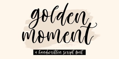 ‘Golden Moment’ a handwritten script font that has multilanguage and PUA encoded, this font is perfect for t-shirt designs, quotes, logos, display, branding, wedding invitations, and more.
 - Reader by Fontfabric,
$30.00 Reader is a custom sans font which is applicable for any type of graphic design - web, print, motion graphics etc and perfect for t-shirts and other items.
 - Ongunkan Fantastic Latin by Runic World Tamgacı,
$50.00 A fantastic font that I came up with after 3 weeks of work. It was a nice and attractive version of the Latin alphabet. Use it with pleasure.
 - Moonshire by KA Designs,
$12.00 Moonshire is a script font with an authentic, handwritten look! This font is perfect for logos, branding, shirts, invitations, signs, home decor, wedding decor and more! Thank you!
 - Rogue by Umka Type,
$19.00 Rogue - A Display Font : Rogue is a carefully crafted display font. It has Extended Latin and Cyrillic characters. It created for poster, web, brand and social media designs.
 - Jelantik by Patria Ari,
$15.00 Jelantik is a beauty script typeface with adorable cursive alternative glyphs. Jelantik is suitable for wedding invitation, product packaging, product designs, label, photography, watermark, invitation, stationery and more.
 - Richard Miller Rounded by Miller Type Foundry,
$19.00 Richard Miller Rounded started out as just a logo for a website/business card. It is a modular sans that works well in both print and web design.
 - Robuck by Martype co,
$15.00 ROBUCK is a family Sans Serif font designed with carefully handcrafted. Also suitable for branding, T-shirt, Wedding Invitation, Classic Design, Logotype, and any project. All caps fonnts.
 - Balkerious by Kaptype,
$14.00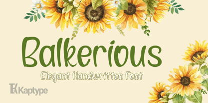 Balkerious is a modern elegant font. Font with a touch of classy elements. Perfect for logos, headlines, cards, invites, paragraphs, cover photos, web design, lettering, and other designs.
 - Optimus by Letterafandi Studio,
$12.00 Optimus is a cool and modern display font. This font is ideal for writing web designs, business cards, or pretty much anything else that requires a unique touch.
 - Nina by ParaType,
$25.00 Based on informal pen handwriting. A set of Western characters and two bold weights were added in 2011 by Gennady Fridman. For use in advertising and display typography.
 - Window Sign JNL by Jeff Levine,
$29.00 Window Sign JNL is a solidified re-working of Sign Stencil JNL; originally modeled from some vintage lettering stencils that were part of a store sign making kit.
 - Underconstructionism by Dharma Type,
$14.99 This font based on and inspired by stencil signage in construction site. As you can see, heavy and rugged glyph is very eye-grabbing for headline and titling.
 - Oval by Fontfabric,
$19.00 Oval is a custom sans font which is applicable for any type of graphic design - web, print, motion graphics etc and perfect for t-shirts and other items.
 - Ringo by typoland,
$9.00 Whassup y’all! Me and my bros got this li’l gang together: we is Ringo, and we got da bling, yo! We is da typeface family for ya all! We got some real sweet stuff for ya, some nice characters. We got all ’em OpenType features like fractions and proportional figgers, we even got da cubic root, man! And check out da question mark, man, is real sweet. And the ampersand, yeah! I luv ’em ampersands. Now my brothers over here got some light action for ya, and they got some real bold action for ya. We got some nice foxy curves goin’ on, some nice tension, and some nice relaxation. My bro Light over here is kind of like the subtle guy, ya know. He’s in for the female fans, ya know. Heh! Hell, yeah! And man, we speak like 84 languages: we speak the German, and the French, and the Spanish, and we speak the Polish, and the Czech, and the Hungarian, and we even speak Shambala and Swahili and Rundi, and we got some Esperanto thing as well for ya. And check out my bro Black right over here, he’s like the action superhero, man! He’s got impact, man! Yeah yeah, but you know, my bros Regular and Bold are the real deal. Them is like da word of da street, man! Like da word of you, and you. And we got a message for y’all: life is hard, life is real, but you should work your mojo, be smooth, be nice, chill. We got all them kerning pairs, and all them weights, and we got ’em alternate letters. So check us out, yo!


