10,000 search results
(0.014 seconds)
- Starlette by Jonahfonts,
$49.00 Usage recommendations: Captions, fliers, packaging, cards, posters, ads, book jackets, manuals, menus, bulletins, magazines, greetings, announcements. Not suitable for MSWord.
 - Primot by Plau,
$49.00 Primot is an upright script heavily influenced by italian gelaterias . After releasing 3 sans serifs , we were looking for an opportunity to design a display type with less constraints for legibility and expression. We started playing with brush lettering and looking into vintage scripts from different eras. Some cool things that made it into Primot were some unusual vertical connections and the sweet brush flairs in the letter endings. From that point on, we set out to create a beautiful looking vertical script – something we don’t see that often – in which each word set could would make a nice piece of graphic design (think logos, video game titles, shop windows etc.). We also made it smart by including hand-lettering inspired features such as initial and final forms for letters, contextual alternates and swashes. The result is a versatile 900+ glyphs display typeface, suitable for a wide range of applications. We hope you have as much fun with it as we had designing it! And while we’re here, you may like that it also pairs beautifully with our sturdy sans-serif family Motiva Sans .
 - Ambroise Std by Typofonderie,
$59.00 An exquisite Didot font in 18 series Ambroise is a contemporary interpretation of various typefaces belonging to Didot’s late style, conceived circa 1830, including the original forms of g, y, &; and to a lesser extent, k. These unique glyphs are found in Gras Vibert, cut by Michel Vibert. Vibert was the appointed punchcutter of the Didot family during this period. It is the Heavy, whom sources were surest that Jean François Porchez has been used as the basis for the design of the typeface family. In the second half of the 19th century, it was usual to find fat Didots in several widths in the catalogs of French type foundries. These same typefaces continued to be offered until the demise of the big French foundries in the 1960s. Ambroise attempts to reproduce more of what we see printed on paper in the 19th century; a more accurate representation of Didot punches. So, the unbracketed serifs are not truly square straight-line forms but use tiny transitional curves instead. The result on the page appears softer and less straight, particularly in larger sizes. The illustrious Didot family of type founders and printers Every variation of the typeface carries a name in homage to a member of the illustrious Didot family of type founders and printers. The condensed variant is called Ambroise Firmin. The extra-condensed is called Ambroise François. Ambroise Pro brought back to life: fifteen years in the making! Club des directeurs artistiques, 48e palmarès Bukva:raz 2001
 - Tanach - Personal use only

- Tannenberg Fett - Personal use only

- Party Doodles by Outside the Line,
$19.00 Party Doodles: the perfect font for that quickie party flyer. Six party words in script and hand printing as well as 24 party drawings of gifts, party hats and party crowns, a sundae, a cupcake, fancy cakes, drinks, party horn and noisemakers, candles and a gift tag. One font, many possible party flyers. It can also be found in the book "1000 Fonts" by Bob Gordon.
 - Flox Rounded by ParaType,
$30.00 Flex Rounded display typeface was designed in 2000 by Vladimir Pavlikov as alternative 'soft' variant to the original Flox face. In contrast to Flox there are rounded stroke ends and curved shapes in most of Flex characters. The project was aimed to create a decorative vivid alphabet of geometric shapes. Cyrillic was developed in 2005. For use in advertising and display typography. Licensed by ParaType in 2005.
 - Orion MD by Alphabet Soup,
$45.00 A font where "each word that's set approaches becoming its own logo" is how some have described this unique typeface. Originally inspired by an enamel sign he picked up at a Paris flea market, Michael Doret says that the seven letters contained in the sign were enough to suggest to him that here were letterforms put together in a way that he had never seen in a contemporary digital font. Always eager to create something a little out of the ordinary, he took up the challenge to flesh out the forms into a complete font. Orion can be defined as a geometric, connecting script that is at once contemporary, yet classic and timeless.
 - Monterra by ActiveSphere,
$30.00 Monterra is a font family ideal for flyers, label, logos, magazine, product branding, corporate branding, signage, posters and especially in advertising.
 - RMU Neptun by RMU,
$25.00 A turn-of-the-century Art Nouveau display font, originally from the Aktiengesellschaft fuer Schriftgiesserei und Maschinenbau, Offenbach, revived and extended.
 - Wandhen by RahagitaType,
$16.00 Wandhen is handwritten brush font suitable for a lot of projects. such as flyers, crafting, logo, banner, packaging, design product, etc.
 - Pliego by Huy!Fonts,
$35.00 Pliego is a textface designed to offer a comfortable continuous reading, with humanist proportions, an even texture, and informal calligraphic details noticeable only at big sizes, that gives it a contemporary feeling. Pliego has been named after Pliegos de Cordel, the Spanish word for the popular books that were common during the XVI, XVII and XVIII centuries. These were rough, cheap books that basically consisted in a folded sheet attached to a string, hence the name. Their content was varied, from popular tales to ballads and songs, but also crimes and mysteries. They were cheaply made, roughly printed and bound. The name Pliego evokes the idea of a rough look, angular edges, informal taste, but classical look. To cover today’s needs, Pliego includes five weights with matching italics. Designed and engineered for continuous reading, the Book, Regular and Medium weights will perform at their best under 14 points. However, don’t be scared to use for headlines and titles: because of its quirky details and calligraphic flavour, Pliego’s personality is accentuated when enlarged. With an extensive Latin character set, Pliego covers a wide amount of Latin-based languages, including Latin Plus encoding and Vietnamese support.
 - Happy Sparkle by Letterhend,
$15.00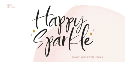 Introducing, Happy sparkle! a happy handwritten font that will bring your design into a happy and fun mood. this font is perfect for branding, packaging, logotype, headline, wedding invitation, etc. Features : - uppercase & lowercase - numbers and punctuation - multilingual - alternates and ligatures - swash - PUA encoded We highly recommend using a program that supports OpenType features and Glyphs panels like many of Adobe apps and Corel Draw, so you can see and access all Glyph variations.
 - Holymore by Letterhend,
$19.00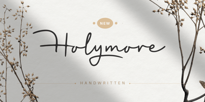 Introducing, Holymore! a handwritten font that will bring your design into a natural looking with its handwritten touch. this font is perfect for branding, packaging, logotype, headline, wedding invitation, etc. Features : uppercase & lowercase numbers and punctuation multilingual alternates and ligatures swash PUA encoded We highly recommend using a program that supports OpenType features and Glyphs panels like many of Adobe apps and Corel Draw, so you can see and access all Glyph variations.
 - Metro Capitals by Letterhend,
$19.00 Introducing, Metro Capitals, a fun handwritten typeface. This font is perfectly made for branding, packaging, headline, logos, magazines, books, greeting / wedding cards, packaging, fashion, make up, stationery, novels, labels or any type of advertising purpose. Features : uppercase & lowercase numbers and punctuation multilingual alternates PUA encoded We highly recommend using a program that supports OpenType features and Glyphs panels like many of Adobe apps and Corel Draw, so you can see and access all Glyph variations.
 - Georude by Letterhend,
$17.00 Introducing, Georude, a quick geometry font. This font is perfectly made for branding, packaging, headline, logos, magazines, books, greeting / wedding cards, packaging, fashion, make up, stationery, novels, labels or any type of advertising purpose. Features : uppercase & lowercase numbers and punctuation multilingual PUA encoded We highly recommend using a program that supports OpenType features and Glyphs panels like many of Adobe apps and Corel Draw, so you can see and access all Glyph variations.
 - Mayrisand by Allouse Studio,
$16.00 Mayrisand comes with many stylistic alternates, ligatures, and Multi-Lingual Support to give you much choices to play around. We highly recommend using a program that supports OpenType features and Glyphs panels like many of Adobe apps and Corel Draw, so you can see and access all Glyph variations. Mayrisand is perfect for any tittles, logo, product packaging, branding project, megazine, social media, wedding, or just used to express words above the background.
 - Non Block by Liartgraphic,
$15.00 Hi guys! How are you guys? I bet it's great! Introducing our latest product, we call this product the Non Blok font Non Blok hight is a display type font With a unique and firm touch Non Blok hight font is great to use on: fashion magazines, logos, photography, landing pages, flyers, social media and so on What's included - multilingual support - alternatives - ligatures Thank you, best regards Liarttyype
 - Convero Hight Inline by Liartgraphic,
$15.00 Hi guys! How are you guys? I bet it's great! Introducing our latest product, we call this product the convero hight display font convero hight is a monoline display type font With a unique and firm touch convero hight font is great to use on: fashion magazines, logos, photography, landing pages, flyers, social media and so on What's included - multilingual support - alternatives - ligatures Thank you, best regards Liarttyype
 - Blora by Liartgraphic,
$25.00 Hello guys! How are you guys? I bet it's great! Introducing our newest product, we call this product the Blora font. The Blora font is a serif font that has unique and interesting ligatures and alternatives With a unique and firm touch The Blora font is great for: fashion magazines, logos, photography, landing pages, flyers, What's included - multilingual support - alternative - fastener Thank you, best regards Ali Sifak Muftari
 - Ashagi Signature by Liartgraphic,
$20.00 Hello guys! How are you guys? I bet it's great! Introducing our latest product, we call this product the Ashagi signature font Ashagi signature is a monoline script type font With a unique and firm touch Ashagi signature font is great to use on: fashion magazines, logos, photography, landing pages, flyers, social media and so on What's included - Ashagi signature - multilingual support - alternative - ligatures Thank you, best regards Liarttyype
 - Rhosalia Signature by Liartgraphic,
$20.00 Hi guys! How are you guys? I bet it's great! Introducing our latest product, we call this product the Rhosalia Signature font Rhosalia Signature hight is a script monoline type font With a unique and firm touch Rhosalia Signature font is great to use on: fashion magazines, logos, photography, landing pages, flyers, social media and so on What's included - multilingual support - alternatives - ligatures Thank you, best regards Liarttyype
 - Karmany by Scratch Design,
$8.00 Karmany is a hand drew font made with original brush shapes which make this font look beautiful and will match for your logo designs, flyers, brochures, signature, quote texts and also menu design for food and beverage. Karmany contains Uppercase & Lowercase, Numbers, Punctuation. It offers Multilingual Support, works on Mac and Windows OS and is easy to install. We hope you like it and thank you so much for your purchase.
 - URW DIN by URW Type Foundry,
$49.99 The digital outline fonts, DIN 1451 Fette Engschrift and Fette Mittelschrift were created by URW in 1984 and are the basis for all DIN font families. Both typefaces were designed for the URW SIGNUS system and were mainly used for the production of traffic signs. They have since become so popular in other areas that we have developed a complete DIN font family with 48 styles in OpenType Pro: URW DIN. It is semi-condensed, which is unique among the DIN fonts, so it has a broad spectrum of typographic uses. Its large x-height makes it perfect for use in e-publishing (web, apps, e-Books etc) and its adjusted stroke width between the regular and bold weights enhances its quality and distinguishability in print.
 - Safford by MysticalType,
$12.00 Safford is a family font with a sports style. I made it with a very mature calculation so as to produce the best visual view. This font is suitable for you to use for making flyers, advertisements, books, magazines, and others. Safford has 18 styles with different thickness sizes, each curve is dynamic and I will show you how serious I am in making it, you can see in the font presentation, how do I input designer values. Safford has 385 Glyphs with ligatures having 24.
 - Maulida by Goodigital13,
$20.00 This font perfect for signature logo, handwritten quotes, product packaging, fashion magazine, photography, merchandise, branding projects, poster, social media post, book cover, flyer, and advertising. You can create easily and make it as if you wrote it yourself. handmade calligraphy style, decorative characters and a dancing baseline! So beautiful on invitation like greeting cards, branding materials, business cards, quotes, posters, and more!! Best match for logo, badge, packaging, headline, poster, t-shirt/apparel, greeting card, and wedding invitation. The flowing characters are ideal to make attractive messages
 - Metairie by insigne,
$24.99 Get in the swing with Metairie. This high-contrast script from Jeremy Dooley sets the rhythm for your next headline or short phrase with its fresh, expressive forms. Metairie’s (sometimes exaggerated) scrawled letterforms play on the colorful world of calligraphy to bring you a fully developed personality of its own. Inspired by elixirs and pharmaceuticals of the 1800s, this design has forms that dig down deep to the soul. It brings a unique, vibrant feel for your next message. The typeface supports all major Latin languages, and the expanded OpenType capabilities let you slide elements easily and quickly into your design. Metairie also includes a number of distressed options. Improv a bit, too, with Metairie’s decorative ornaments, variations on the fleur de lis. Ornaments and tails are accessed through the glyph palette or using the Swash function. An extensive set of ligatures gives you more options for humanizing the handwriting on the page. Then take it up a notch by using the glyph palette to find the perfect solution for project. You have full access to this amazing capability with InDesign, Illustrator, QuarkXpress and similar software. We recommend that you explore what this font can offer by using the glyph palette. Get a glimpse of the font’s strength by looking over the brochure in PDF format in the "Gallery" section. Ready to step in? Take a stab at your next design with Metairie. It could be just the color you need.
 - Legionary by Tkachev,
$25.00 Legionary is a new sans-serif with six font styles. It would look nice in magazines, on food packages, posters and flyers.
 - P22 Freely by IHOF,
$24.95 A loosely-written, slightly irregular but very legible handwriting style. Useful for the personal touch on menus, advertisements, greeting cards, flyers etc.
 - Lizie Slab by Poul Allan Studio,
$26.00 Lizie Slab is a slab serif, where the geometric construction is inspired by the 1930s design icons De Stijl, Gerrit Rietveld and others. Lizie Slab is designed for both print and digital use, and you will find it ideal for packaging, poster design, catalogs and exhibition design. The font supports a wide range of languages. This OpenType contains features such as fractions, proportional and tabular shapes.
 - Century Expanded by Bitstream,
$29.99Shortly after the preparation of the original Century, the two Bentons (father Linn Boyd and son Morris Fuller) prepared a wider version for De Vinne’s press and called it Century Broadface. In 1900 ATF released the design for general use as Century Expanded, one of the most popular and effective of typefaces, to this day the text face of the New York Daily News. - Olaus by Monotype,
$29.99The Olaus Magnus and Olaus Bandus alphabets are inspired by the letterforms cut in the pictures and wood-cuts of Olaus Magnus great book Historia de Gentibus Septentrionalibus. This great history of the Nordic Peoples was printed in Rome in 1555 in his own printing shop there. Olaus Magnus, Catholic priest and appointed archbishop by the Pope, never returned to the now Lutheran Sweden. - Tme by bb-bureau,
$65.00 Tme, new lineal — Tme is an update of Sl (T = S + 1, m = l + 1 and e for natural logarithm), drawn in 2006 for the University of Arts Saint-Luc de Tournai. Its geometrical drawing is based on the directions of the hexagon, a scrupulously followed constraint which confers on some glyphs a very particular drawing. in light, regular and bold language: all latin glyphs
 - Bodoni FB by Font Bureau,
$40.00 Working at American Type Founders from a Bruce Foundry recutting, Morris Fuller Benton worked out the dramatics of the English Fat Face, and in 1928 produced Ultra Bodoni, a headline spectacular. Using Benton’s 1933 Ultra Bodoni Extra Condensed, Richard Lipton digitized Bodoni FB Bold Condensed, then took compression even further and designed Bodoni FB Bold Compressed, a real technical tour de force; FB 1992
 - Tita Script by Latinotype,
$59.00 Tita is dedicated to my grandmother Hebe, witty and arrabalera 1. The font is inspired by Milonga 2 music and the fileteado porteño 3. I picture it at The Moulin Rouge, sparkling, provocative, loving. It evokes Tita Merello and my grandmum singing her music. Tita is Argentinean to its very core. A font to shout goal and dulce de leche 4 with passion! Its curves originate from polirhythmic calligraphy, which I learnt from my mentor Silvia Cordero Vega. Tita is a pedigree script that is based on hand lettering and Sandra Biondi’s calligraphy works. Font digitalisation by Daniel Hernández. Edited by Javier Quintana / Programmed by Manuel Corradine. 1. A person from the arrabal (a working class neighborhood on the outskirts of the city of Buenos Aires) 2. Musical genre originated in the Río de la Plata areas of Argentina and Uruguay 3. Decorative hand lettering and artistic style that is frequently spotted in Buenos Aires 4. Sweet milk sauce
 - Roos ST by Canada Type,
$39.95 Roos ST is a special version of the Roos family, engineered specifically for science writing. It is equipped with SciType, a combination of additional characters and OpenType programming included in the fonts to help with typesetting science text. For more information about SciType, please consult the SciType FAQ available in the Gallery section of this page. The Roos design is the Dutch classic made by S. H. de Roos during the years of the second World War, and subsequently used for a special edition of the Dutch Constitution on which Juliana took the oath during her inauguration as the Queen of the Netherlands. This design is widely regarded as de Roos's finest, and has one of the most beautiful italics ever drawn. Aside from the SciType additions, all the Roos ST fonts contain OpenType features for ligatures, ordinals, automatic fractions, and seven kinds of figures. For details about the functionality of Roos ST, please consult its Access Chart PDF available in the Gallery section of this page.
 - 1543 Humane Petreius by GLC,
$42.00 The regular style of this family was inspired from the typeface used in Nuremberg, Germany, by Johannes Petreius in 1543 to print the famous “De Revolutionibus Orbium Coelestium,” the well-known mathematical and astronomical essay by Nicolaus Copernicus. Petreius was also using an original italic style, as he did for the “De Sculptura” by Gaurico Pomponio, in 1542. Unfortunately, nobody seems to know who was the punchcutter of this Jenson-style font. Also included is a title file, containing initials (without diacritics) and small caps (with diacritics). In our three styles (Regular & Italic + Titling), font faces, kerning and spacing are as closely as possible identical to the original. This Pro font is covering Western, Eastern and Central European, Baltic and Turkish languages, with standard and long-s ligatures in regular and italic styles. Both have twin-letter ligatures, but the italic style has extra (genuine) ligatures for f and t with vowels.
 - Scroll by Canada Type,
$24.95Earlier this year, my eyes fell upon a discarded wedding invitation on the sidewalk. A closer look at it revealed that it had at one point been victimized by rain. Some of the fancy script letters were not quite broken, but sort of melted and run-down, while the rest were still somewhat intact. That's how Scroll was conceived, as an idea for a script where thicks and thins blend to produce a wet appearance. Unlike most available broken scripts, the Scroll script was originally drawn in its own juiced context, and not based on any existing script. This font is great for atmospheric antiquity, deep natural poetry, still life captioning, gothic music posters and collateral, or horror literature and poetry covers. - A Cuchillada - Personal use only

- AW Conqueror Std Carved by Typofonderie,
$59.00 Engraving inspired typeface The AW Conqueror Carved encapsulates perfectly the lettering styles in fashion during the 19th century quite often in the frontispieces of books. It wasn’t rare to see these kinds of typefaces, with their variations in depth and relief effects, adorning boxes and other forms of packaging of the time. AW Conqueror superfamily AW Conqueror Didot is part of a larger family, who include 4 others subfamilies with great potential: They’re but based on same structure, with some connection between them (width for example), to offer a great & easy titling toolbox to any designers, from skilful to beginner. Each of the members try their best to be different from the others because of their features. They should work harmoniously in contrast. Club des directeurs artistiques Prix 2010 European Design Awards 2011


