6,630 search results
(0.019 seconds)
- Marvelouz DSG - Unknown license

- Dingos by Antipixel,
$18.00 Dingos is a display typeface specially handcrafted for potent usage. It is compact, solid, and dense, with a heavy-built structure, tight internal space, and a versatile touch. Dingos is perfect for large settings due to its precise shapes. The 'Display' and 'Display Outline' styles have sharp and clean paths with angular ink traps, while 'Stamp' and 'Stamp Outline' have round ink traps and irregular, soft, curvy outlines optimized to ensure high-quality contours. Stamp textured styles have three sets of alphabets that slightly differ from one another. Thanks to the Contextual Alternates, these alphabets are automatically alternated to avoid repeating the same curvy textures. Some of Dingos' features are ligatures, discretionary ligatures, stylistic sets, numerators, fractions for any number combinations, arrows, special decorative characters, and a glyph coverage that ensures extended language support.
 - Ponderosa by Adobe,
$29.00Ponderosa font is a joint work of the typeface designers K.B. Chansler, C. Crossgrove and C. Twombly, who also created Rosewood, Zebrawood and Pepperwood together. As the name suggests, it is so-called wood type. The origins of this kind of typeface can be found in the early 19th century. Called Italian or Italienne, these typefaces quickly became very popular. They are distinguished by square serifs whose width is larger than the stroke width of the characters. When the letters are set together, the heavy serifs build dark horizontal bands. The distinguishing characteristic of Ponderosa lies in its extremely fine figures between heavy serifs. The designers approached the boundaries of the impossible with this contrast. The typeface is reminiscent of the Wild West with its shootouts and heroes as well as of the 1970s with their platform shoes and wild hair-dos. When used carefully in headlines, Ponderosa font will surely attract attention. - ITC Modern No. 216 by ITC,
$40.99 Modern typefaces refer to designs that bear similarities to Bodoni and other Didone faces, which were first created during the late 1700s. Ed Benguiat developed ITC Modern No. 216 in 1982 for the International Typeface Corporation (ITC). Showing a high degree of contrast between thick and thin strokes, as well as a large x-height, this revival is more suited to advertising display purposes than the setting of long running text, or books. Many traits in Benguiat's design are worth further notice. The thick stems of the roman weights have a very stately, solid presence. Their thin serifs have been finely grafted on, a masterful solution to the challenge of bracketing presented by Modernist designs. The italic weights have a very flowing, script-like feel to them, and the letters take the form of true italics, not obliques. The ITC Modern No. 216 family contains the following font styles: Light, Light Italic, Medium, Medium Italic, Bold, Bold Italic, Heavy, and Heavy Italic.
 - Cynapse OT by Positype,
$29.00 Several years ago I was faced with a project that required very small type to be used in a directory. In general, there was a need for a lot of 'fine print'. Faced with this, all of the tests I was making with existing faces were producing too much bleed of the individual glyphs...Cynapse was born. It evolved into this pseduo-techy looking type that standardized and glorified the ink trap (the small, tiny allowances of white space that reduces the amount of ink hitting the page, and in effect, reducing the appearance of bleed). The results was promising. The new OT version contains additional OpenType features that include expanded ligature sets, fractions, 5 sets of numerals as well as small caps and Central European diacritics.
 - Xtera by Bogusky 2,
$20.00Heavy contemporary font - ABC Idea by Alphabets by Chileans (A.B.C.),
$18.00 ABC Idea is a contemporary geometric sans full of opentype features in Regular, Bold and very "fast" Italic. The design is an experimental fusion or mix between Humanist, Geometric and Grotesque models. The fine drawing in all letters and signs has precise ink traps to highlight contrast jus like lettering and calligraphy does, then ABC Idea re-creates this exquisite graphic details into the digital world. Designed by Miguel H. Montoya Fonts in Use Images by letargo.cl Magazine. Art Direction by studioprado.cl
 - Rebnick by Mr Studio,
$29.00 Rebnick is a sans serif typeface where in the early design process, the adjacent stems and bars weren’t weld seamlessly and perfectly. You can actually find glitches which were carefully transformed into a custom language in it’s own and later became the coherent generic rule that keeps everything together. In display sizes, the ink traps give the font’s own character, while in small text sizes they create a good legibility and a well-balanced ratio between the black and white spaces.
 - A Bebedera - Personal use only

- Zart by DSType,
$40.00 Zart is a heavy yet delicately sensitive display typeface filled with character, a free interpretation of the classical French styles from the late eighteenth century, reimagined for modern use. While it’s vertical strokes carry the typical weight of this style, the thinness of the horizontal strokes is further extended into the characters with the introduction of large vertical ink traps. This allowed us to design slightly narrower letters which, coupled with shorter serifs, result in a overall darker expression, creating really impactful headlines. Zart is available in three versions: Regular, Italic and Script.
 - Samhain by Hanoded,
$15.00 Samhain is a Gaelic festival marking the end of the harvest season and the beginning of winter. There is no set date, but normally it is held around the end of October and beginning of November. Samhain font was made with a bamboo pen and Chinese ink on rough paper - hence the grungy look. It is quite a heavy font, so I wouldn't set a complete text in it, but it is ideal to create headlines, posters, postcards and invitations. Of course, Halloween comes to mind! Samhain comes with extensive language support.
 - Klex Plus by Ingo,
$42.00 A calligraphic alphabet in bold/light brushstrokes Actually, a typeface like this one should be written with a wide brush; this one was written with a thick, pointed brush. Thus were created the round or misshapen ends of the stems, and the sometimes excessively pointed ends of the hairlines. For each character of KLEX, the large brush was dipped in the ink anew. Using this method, the forms turned out very soft, in spite of their geometrical rigidity. The individual characters are heavy, simple, and monumental, so that they are also suitable as initials.
 - Archive Black Title by Archive Type,
$19.95Heavy blackletter display typeface. - Tiny Butler by Pink Broccoli,
$14.00 A light hearted unicase typeface inspired by the titling of the 1977 Pink Panther cartoon, Therapeutic Pink.
 - Smack by ITC,
$29.99Smack, from American designer Jill Bell, is oriented toward a young generation who does not want to mind the rules. The font invites unconventional and playful use. The figures seem to be almost coincidentally shaped. Letters alternate between thin and thick strokes alternate and are accompanied by fine dots which almost look like accidental drops of ink on the paper. Smack is an illustrative font with unmistakable handwriting character and is perfect for cartoons, comics and anything else which is not supposed to take life too seriously. - Upscale JNL by Jeff Levine,
$29.00 A page from an "ideas booklet" that was copyrighted in 1939 by the Sanford Ink Company displayed a hand lettered variation on the counter-less [or solid] alphabet that so typified the Art Deco style of the times. Bold, brash and beautiful, Upscale JNL evokes high-end department stores, fine millinery shops, cafeterias, night clubs and other business establishments from the Streamline era. This type of lettering style was a workhorse, and could (and still can) tackle any message with strength, clean lines and class.
 - Serif Medium - Unknown license

- Rammstein - Unknown license

- New Cicle - Unknown license

- Signal1885 by astroluxtype,
$20.00 Signal1885 is the abbreviated name for "(Sig)nature Jour(nal)" a font that harkens back to an era, when fine handwriting filled journals with observations of science and adventure. Intimate and reflective of an individual entering his thoughts in his personal journal or a ship’s captain documenting his voyage on a daily basis. Signal1885 is penmanship that reflects hand forms from by-gone days. Its a minimal glyph set which can be used at various sizes as small as 18 points. It includes a selection of ink drips and smudges, that are the “mark” of a hand done entry. These can be placed in strategic places on the type to indicate a hand dragging through or dripping fresh ink on to the paper. Set sail- and keep a diary of your voyage.
 - Ruthless AOE by Astigmatic,
$19.95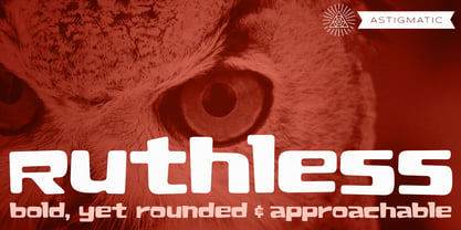 A plush and heavy unicase font.
 - Voussoir by Sylvestre Studios,
$25.00Voussoir, the perfect heavy display font. - Flyer by Linotype,
$40.99The Flyer font family consists of two very heavy condensed sans serif faces, Black Condensed and Extra Black Condensed. Excellent for headlines or packaging, Flyer font is geometric and quite similar to Tempo Heavy Condensed. - PL Modern by Monotype,
$29.99PL Modern Heavy Condensed is based on a design by R.H. Middleton (1936). It has Bodoni-style letterforms, typical of Modern Serif faces. Use the PL Modern Heavy Condensed font for headlines in narrow settings. - Tide Sans by Kyle Wayne Benson,
$6.00 Tide Sans’ fresh, carefree, look makes you almost forget that you’re staring at a monitor and not on the beach. When Tide Sans is not surfing, you’ll find it at community college parties, giving free henna tattoos, or tossing a Frisbee to the dachshund next door. The Tide Sans family includes beautiful italics and an equally affable condensed set. Tide Sans does the work for you by providing a ridiculously large stylistic alternates set, fine tuned small caps, and a whole beach of alternate (amper)sands to feel between your toes. Also check out its kid brother, Tide Sans Condensed.
 - Paralucent Slab by Device,
$39.00 Paralucent Slab is an addition to the ever-popular Paralucent family. Paralucent is versatile all-purpose modern sans and slab serif design. Available in seven weights, from Thin to Heavy, with corresponding italics, it avoids some of the more eccentric calligraphic quirks of Akzidenz or Helvetica or the cool precision of Univers for an elegant, functional, yet warm design. Several core ideas inform Paralucent’s design. Prime attention has given to the negative space between characters, giving a more even “colour”, especially in text. For example, the J, L and T have shorter arms than comparable sans typefaces, while the M and W are wider. The A has a lower bar, opening up the interior counter. An unusually high lower-case x-height again helps to give a more even colour and improve legibility. Care has been taken to rationalise repeated elements like the tails on lower-case letters, or the Q and the “ear” of the g. Typographic design solutions that are consistent across all these features add more stylistic cohesion. ‘Ink traps’ are exaggerated incisions used to open up a letter's narrower internal angles, which can become clogged with ink, especially in small point sizes. Now largely redundant due to the high quality of modern print, they are still sometimes used as a stylistic quirk or design feature. Now that digital fonts are often reversed or outlined, or enlarged to enormous sizes, these can also lead to unexpected or obtrusive results. Paralucent takes these inevitable digital manipulations into account, and adds optical corrections without resort to ink traps. The family has been picked up by many UK and US publishers, featuring heavily in magazines like Loaded, Heat and TV Quick, as well as high-end coffee-table photography books and gallery websites. The addition of the Slab family adds even more options for running text and headline.
 - Mollas by Alit Design,
$15.00 Introducing Mollas Typeface Thank you for clicking this page and finding Mollas Typeface, one of the best font collections I've made. Mollas typeface is formal, elegant and can be applied to any design concept. For branding design, header text, online shop, logo design, social media and so on. Mollas typeface has 14 total families from Thin to Heavy, besides that there are many amazing and unique alternative glyphs for your design creation. Its use is very easy and simple. It can be run in design or non-design programs because the Mollas typeface has PUA unicode support. Besides that, the Mollas typeface also has multilingual support. Thank you and enjoy
 - Baskerville Old Face KTKM by KTKM,
$55.00 “So-called Baskerville Old Face of the type foundry Stephenson Blake & Co. of Sheffield. The Script is probably not immediately linked to Baskerville, but it is very much influenced by it. It is one of the most beautiful types of which the mats still exist; it has an incomparably different spirit than the ‘streamlined’ re-cuts of today’s Baskerville. Even keeping the general restraint extremely expressive. According to Berthold Wolpe (‘Signatures’ No. 18), the punches were cut and shown in samples in 1776 by Isaac Moore, who came from Birmingham to Bristol.” – Jan Tschichold, “Meisterbuch der Schrift”, Notes On The Plates, Page 231 Publisher note: I wanted to improve the contrast between thick and thin, reduce some ink-traps and give stems, serifs and links a smoother overall feel. I have also added some alternative letters and old style numerals.
 - Front Page Pro by Jonahfonts,
$45.00 A heavy slab face for many applications.
 - Elefont Emboss by Emboss,
$13.45 Designed to be fat, loud and heavy.
 - Noir by Mindburger Studio,
$39.00 Noir is a sans serif font family of 12 fonts with contemporary aesthetics heavily influenced by early 20th century geometric typefaces. While having its geometric structure it carries organic personality with touch of warmth injected to each form. Noir font family ranges from light and elegant weights perfect for small text, to extremely heavy and masculine weights suited for large display sizes. Noir has a rich arsenal of Open Type features for highly professional use and extended Latin, Cyrillic and Greek language support. Noir is delivered as Std and Pro version. Cyrillic and Greek are available in Pro package only.
 - Austin Pen by Three Islands Press,
$29.00 Empresario Stephen F. Austin (1793-1836) is considered by many the “Father of Texas” for leading the first Anglo-American colony into the then-Mexican territory back in the 1820s. A few years later, while on a diplomatic mission to Mexico City, Austin was arrested on suspicion of plotting Texas independence and imprisoned for virtually all of 1834. During this time he kept a secret diary of his thoughts and musings—much of it written in Spanish. Austin Pen is my interpretation of Austin’s scribblings in this miniature prison journal (now in the collection of the wonderful Dolph Briscoe Center for American History, in the Texas city that bears his name). The little leather-bound book is filled with notes in ink and pencil—some of the faded penciled pages traced in ink years later by Austin’s nephew Moses Bryan. A genuine replication of 19th century cursive, Austin Pen has two styles: a fine regular weight, along with a bold style that replicates passages written with an over-inked pen. Each is legible and evocative of commonplace American penmanship of two centuries ago.
 - Starboard by Hanoded,
$15.00 The term starboard derives from the Old English steorbord, meaning the side on which the ship is steered. Before the steering wheel, boats were steered by an oar at the stern of the ship. Since most sailors were right handed, this is where you would find your steering oar! Starboard font is a rough, handmade, brushy kinda font. It was, of coarse, made with my favourite cheep brush and Chinese ink - resulting in a slightly eroded looking font. Starboard comes with all the trimmings, including double letter ligatures for the lower case.
 - Chalofa by Realtype,
$12.00 Chalofa consist of a sophisticated, elegant, classy and modern handwriting style. With a little dirty curvature and made from the typography of new trends, Chalofa has a smooth wet ink look suitable for adding a modern and classy touch to your project. Perfect for branding, weddings, social media, product design, stationery, etc. Calofa can add to all projects where hand touch is needed. Try mixing your design with this font. Don't hesitate to pair with serif or serif in your work idea. Find interesting layouts to complement your project. This font has include multilingual support.
 - Magnify PRO by XdCreative,
$32.00 About Magnify Pro Magnify Pro Geometric sans 2 Style in 1. Magnify PRO Geometric sans is the latest version of "Magnify" by. Faldykudo. Comes up with more complete language support and features, including ink-trap and reverse contrast will add more different taste & style to the art of modern typography. Magnify PRO has two style in one font, normal & inverse contrast. If you are like normal: just type with regular letters, if you are like reverse contrast: just access your opentype features to find the alternate letters. Thank You.
 - Rappica by Aah Yes,
$4.95Rappica is a degraded and distorted heavy font. - GirderSuper by Wooden Type Fonts,
$15.00 A heavy slab serif font very useful for display.
 - Antique 7 by Wooden Type Fonts,
$15.00 An Egyptian unbracketed heavy serif font, largely for display.
 - Librium - Unknown license

- Libritabs - Unknown license


