10,000 search results
(0.034 seconds)
- Mila Script Pro by FaceType,
$79.00 Proud to introduce: The all hand-drawn Mila Script Pro Family Mila Script is a handmade brush script with round and soft letterforms, a low x-height and jumping baseline. Smart OpenType features care about all letterforms and choose between connected and non-connected styles. AutomaticSwashControl adjusts the swashy letters to the available white space. It’s installed within Mila’s main features OpenType Contextual-Alternates, Swashes and Titling-Alternates. Switch one on and let Mila do the rest. · Please read over the manual. It describes the family in detail. · Of course there’s a little more know about Mila Script Pro: 2600+ characters offer four different initial styles, capital swash and titling alternates, connected words, 17 different initial and terminal swashes and much more. All of course with full ISO latin 1 & 2 language support. · Mila Script Basic (900+ characters) offers all single features contained in OpenType Contextual-Alternates: subtle contextual swash alternates, positional forms, ligatures, connecting and non-connecting characters … · Mila Script Sans: Mila Script Sans is a hand-drawn/handwritten “all caps” in three different weights. Mila Script and Mila Script Sans go well together: combine them and equal the line weights by choosing Light, Regular or Bold. Always keep it way smaller than Mila Script. Mila Script Sans also works well as a standalone. It offers negative typesetting, bicolor typesetting by layering two styles and even alternates without counters. Please see the manual for instructions. · Mila Script Ornaments: Change the size and keep the line weight: activate Contextual Alternates, type a letter and add + to enlarge all swashes according to your likings. Mila Script Ornaments contains 69 different swashes and symbols, all of them available in seven different sizes, which makes a total of 483 characters. All ornaments are within easy reach and there’s no need to access certain symbols manually via your glyph palette. · Have fun! · View other fonts from Georg Herold-Wildfellner: Sofa Serif | Sofa Sans | Mila Script Pro | Pinto | Supernett | Mr Moustache | Aeronaut | Ivory | Weingut · Language Report for Mila Script / 195 languages supported: Abenaki, Afaan Oromo, Afar, Afrikaans, Albanian, Alsatian, Amis, Anuta, Aragonese, Aranese, Aromanian, Arrernte, Arvanitic, Asturian, Aymara, Bashkir, Basque, Bikol, Bislama, Bosnian, Breton, Cape Verdean, Catalan, Cebuano, Chamorro, Chavacano, Chickasaw, Cimbrian, Cofan, Corsican, Creek, Crimean Tatar, Croatian, Czech, Danish, Dawan, Delaware, Dholuo, Drehu, Dutch, English, Estonian, Faroese, Fijian, Filipino, Finnish, Folkspraak, French, Frisian, Friulian, Gagauz, Galician, Genoese, German, Gooniyandi, Greenlandic, Guadeloupean, Gwichin, Haitian Creole, Han, Hawaiian, Hiligaynon, Hopi, Hotcak, Hungarian, Icelandic, Ido, Ilocano, Indonesian, Interglossa, Interlingua, Irish, Istroromanian, Italian, Jamaican, Javanese, Jerriais, Kala Lagaw Ya, Kapampangan, Kaqchikel, Karakalpak, Karelian, Kashubian, Kikongo, Kinyarwanda, Kiribati, Kirundi, Klingon, Ladin, Latin, Latino Sine, Latvian, Lithuanian, Lojban, Lombard, Low Saxon, Luxembourgish, Makhuwa, Malay, Maltese, Manx, Maori, Marquesan, Meglenoromanian, Meriam Mir, Mohawk, Moldovan, Montagnais, Montenegrin, Murrinhpatha, Nagamese Creole, Ndebele, Neapolitan, Ngiyambaa, Niuean, Noongar, Norwegian, Novial, Occidental, Occitan, Oshiwambo, Ossetian, Palauan, Papiamento, Piedmontese, Polish, Portuguese, Potawatomi, Qeqchi, Quechua, Rarotongan, Romanian, Romansh, Rotokas, Sami Lule, Sami Southern, Samoan, Sango, Saramaccan, Sardinian, Scottish Gaelic, Serbian, Seri, Seychellois, Shawnee, Shona, Sicilian, Silesian, Slovak, Slovenian, Slovio, Somali, Sorbian Lower, Sorbian Upper, Sotho Northern, Sotho Southern, Spanish, Sranan, Sundanese, Swahili, Swazi, Swedish, Tagalog, Tahitian, Tetum, Tok Pisin, Tokelauan, Tongan, Tshiluba, Tsonga, Tswana, Tumbuka, Turkish, Turkmen, Tuvaluan, Tzotzil, Uzbek, Venetian, Vepsian, Volapuk, Voro, Wallisian, Walloon, Waraywaray, Warlpiri, Wayuu, Welsh, Wikmungkan, Wiradjuri, Xhosa, Yapese, Yindjibarndi, Zapotec, Zulu, Zuni
 - Golden Stanbury by HansCo,
$15.00 Golden Stanbury is an elegant and classy font duo with a modern touch. The signature ballpoint style gives you a sleek, elegant look for your logos, business card, wedding invitations, quotes, advertisements, and more. I made this Golden Stanbury Font Duo for the needs of the logo and branding market where fonts that are combined with modern and clean concepts are still very rare and hard to find. Hopefully Golden Standbury can provide choices for designers. Highly recommended to use it in OpenType capable software - there are plenty out there nowadays as technology catches up with design. The OpenType features can be accessed by using programs such as Adobe Illustrator, Adobe InDesign, Adobe Photoshop Corel Draw X version, Afinity and more. Let's create something beautiful today with Golden Stanbury. Enjoy!
 - Shington Script by Solidtype,
$18.00 Shington Script is modern script font that features a varying baseline, smooth line, classic and elegant touch. Shington Script features 950+ glyphs. It comes with a handy set of opentype stylistic, use the beautiful ligatures, alternates and swashes. You need a program that supports OpenType features such as Adobe Illustrator CS, Adobe Photoshop CC, Adobe Indesign, Microsoft Word 2010. It is perfect for logo, greetings, branding, quotes, prints, invitations and crafting. All lowercase letters include alternates, beginning & end swashes, that makes the font look fabulous! These are all coded with PUA Unicode. Mac users can use Font Book and Windows users can use Character Map to view and copy any of the extra characters to paste into your favourite text editor/app. Thanks and have a wonderful day :)
 - Battle Scarred by Comicraft,
$19.00 We know what you're thinking... This is not a new font, just an old one with a few bullet holes in its helmet, dirt on its shins and some carbon scoring on its breastplate. You're thinking this is like a variant cover by Joe Madureira or J. Scott Campbell -- handsome and rugged on the outside but weak and effete on the inside. Well, my fine, font-finagling friend, you'd be Dead Wrong! This really is an All-New, All-Different, All Star, Ultimate Collectable, from the Comicraft House of Ideas! Our Dynamic Duo -- Johnny Comicraft and Ferran 'Nuff Said have brought you another winner from the Silver Age of comic book lettering. It’s a little worse for wear, we admit it, but wouldn't you be after three rounds with the Justice League of Avengers Assembled?!? See the families related to Battle Scarred: Battle Cry & Battle Damaged .
 - Annlie by ITC,
$29.99Annlie™ Extra Bold and Annlie Extra Bold Italic are two display faces designed by Fred Lambert in 1966 for the Annlie type family. These two samples from the Annlie family are both fat faces. Fat faces were offshoots of the modern, or Didone, typefaces that were de rigueur during the early 1800s. These fat faces were among the first typefaces to be used solely for advertising purposes. Naturally, they were always used in larger point sizes, in display functions. Annlie could be called an optimization of these old advertising typefaces. With high x-heights, ultra contrast between thick and thin strokes, and perfectly engineered drawing techniques, Annlie is a highly crafted typeface. Give it a spin in your next advertising campaign! Annlie’s fine thin strokes are very graceful in their appearance, and lend a strong, yet soft, feminine feeling to anything they touch. - Adagio Slab by Borutta Group,
$25.00 The Adagio Family is a part of Mateusz Machalski’s, Warsaw Academy of fine arts Master Degree Diploma in multimedia studio, conducted by Professor Stanisław Wieczorek and his brave PhD student Jakub Wróblewski. Adagio is a modern type family. It consists of 3 main varieties: sans, serif and slab. Each has its own “true italic” set. All of the styles together have over 400 characters in 9 different thicknesses. The Adagio family was created mostly for company identities. The idea was to create a wide range of different varieties that are stylistically consistent. Adagio Slab - Slab variety combines qualities of the Sans and Serif varieties. It has the same contrast as Sans. As distinct from Serif, Adagio Slab contains strong, beamy and symmetrical serifs in the form of pillows. Thanks to large X height, and highly stretched descenders, it also works correctly in longer text, while its strong detail is good for headlines. Slab version is a great complement for Adagio Serif and Adagio Sans.
 - Nima by Naghi Naghachian,
$64.00 I dedicate this font family to Nima Yooshij (1896-1960), the great poet and innovator of Persian poetry. Nima is a new creation of Naghi Naghashian. Nima design fulfills the following needs: A. Explicitly crafted for use in electronic media fulfills the demands of electronic communication. B. Suitability for multiple applications. Gives the widest potential acceptability. C. Extreme legibility not only in small sizes, but also when the type is filtered or skewed, e.g., in Photoshop or Illustrator. Nima's simplified forms may be artificial obliqued in InDesign or Illustrator, without any loss in quality for the effected text. D. An attractive typographic image. Nima was developed for multiple languages and writing conventions. Nima supports Arabic, Persian and Urdu. It also includes proportional and tabular numerals for the supported languages. E. The highest degree of calligraphic grace and the clarity of geometric typography. This typeface offers a fine balance between calligraphic tradition and the Roman aesthetic common in Latin typography.
 - LCT Palissade by LCT,
$19.90 Started during 2012, LCT Palissade is a letter type belonging to the Didone classification. It takes over the Italian characters from the XVII century. Century affected by a huge artistic and industrial mutation, we assist to the eruption of the railroad network and Turner’s paintings. In typography, the Didones(XVIIe) begins to concede the place to the Egyptians XIXe. We noticed an evolution to rectangular drawings, that were heavier and darker. LCT Palissade is in fact the study of a history flow, crossing through the industrial revolution and romanticism; the result of a strong letter type, solid, strict the drawing is orientated towards very dark, reminiscent of the characters beginning XIXe. The serifs are the summary between the British characters from the end of (XVIe) and the Italian ones beginning of (XVIIe). In order to spread out the romanticism, they are very fine to allow a largest contrast and keep the elegance of the global shape.
 - Monocle by Reserves,
$39.99 Monocle is a clean and contemporary monospaced geometric sans that excels in titling, data and numerical settings due to its clear and systematic design. The capitals-only format increases the harmony between letter pairings, opposing the irregularity of mixed case fixed-width typefaces. Stylistically, Monocle has the feel of a neutral sans, yet its underlying structural finish exudes a strong sense of order and authority. Its geometric foundation is especially pronounced in the constructed round forms. With multiple stylistic sets, individual letters can be exchanged to fine-tune text settings for a unique custom type solution. Features include: -Basic Ligature set including ‘f’ ligatures (ae, oe, fi, fl, ff, fh, fj, ft, tt, th, ct, st) -Alternate characters (O, I, S, G, R, Q, _, $, ©, #, •, %) -Slashed zero -Full set of numerators/denominators -Automatic fraction feature (supports any fraction combination) -Extended language support (Latin-1 and Latin Extended-A) *Requires an application with OpenType and/or Unicode support.
 - Di Barros by Di Barros,
$5.00 I'm Roberto Teixeira, a Brazilian graphic designer. After looking for a form quite different from the existing types, created in 2019, Di Barros Fonts Family is composed by Di Barros Regular...for while. This,form covers the following, according to the Windows character map: Basic Latin, Latin Supplement 1, Extended Latin A, Extended Latin B, Additional Latin, Cyrillic, Greek, Greek Extended, Armenian and several other special types, such as currency symbols, numbers, fractions, Roman numerals, arrows, symbol of electricity, hearts and vector images, of own authorship and more. Di Barros, with a good length, serves several languages. I think Di Barros applies to fine environments, such as jewelry stores, fashion stores, cultural events and others, where a beautiful and non-aggressive look is required. But there is no better application than the one chosen for its inspiration and creativity. Di Barros Fonts Family was made for you. Thank you for using it.
 - Cornhusker by Section Type,
$22.00 Standing tall as an Illinois cornfield in September, Cornhusker Regular is a strapping condensed sans designed by a champion cornhusker. Inspired by 1940s Midwestern signage, it's warm & charming characters are perfectly at home in logos, beverage bottles and food packaging, restaurant menus, travel advertisements, websites, stationery, handmade product packaging and so much more. If you're looking for a hand-crafted typeface with punch (who can fit into tight spaces!) then Cornhusker Regular is the font for you. This inspired revival excels in both retro & modern designs. Cornhusker Regular includes capital letters, small caps, and alternate cuts (with diacritics) of A, E, F, J, X, Y, ᴀ, ᴇ, ғ, ᴊ, x, ʏ, 0, 1, 2, 3, 4, 5, 7 and a sharp German double s in both cap and smallcap. This font is not affiliated with or endorsed by the University of Nebraska. WHAT'S INCLUDED Cornhusker Regular includes an installable digital Opentype Font file in a single weight. This file contains a basic Latin character set with a full set of uppercase and small caps, multilingual diacritics, numbers, international currency figures, punctuation and pagination symbols. The font also includes alternate cuts for select uppercase and smallcap letters (located in stylistic sets). It is compatible with Adobe CS and CC, Microsoft Word and other type editing apps. SUPPORTED LANGUAGES Afrikaans, Alsatian, Basque, Bislama, Breton, Catalan, Chamorro, Danish, Dutch, English, Faroese, Finnish, Flemish, Franco-Provencal, French, Frisian, Friulian, Galician, German, Greenlandic, Icelandic, Indonesian, Irish, Italian, Ladin, Latin, Luxembourgish, Malay, Manx Gaelic, Northern Sotho, Norwegian (Bokmål), Norwegian (Nynorsk), Occitan, Portuguese, Rhaeto-Romance, Romansh, Sami (Inari), Sami (Lule), Sami (Northern), Sami (Skolt), Sami (Southern), Scottish Gaelic, Spanish, Swahili, Swedish, Tagalog, Walloon and Welsh.
 - Medieval Borders by Aah Yes,
$5.00 This is a large group of typefaces inspired by those borders and patterns you see going across documents from the Middle Ages and Medieval times, eventually becoming this collection of fonts where you can scroll various repeating patterns across a page, for example. You can get a repeating pattern that scrolls seamlessly by repeating the same letter. The default text displaying on the web-page is bbbbbbbb, for example. There's over 2 dozen basic styles, and each style has 52 designs within it, using the characters Upper Case A - Z and lower case a - z, with the lower case being the negative/reverse colour of the Upper Case version, it will be the corresponding design just reverse coloured and with an edging strip. There's also a space - but nothing else. The styles in these fonts usually have groups of six characters (A to F, G to L, M to R, S to X), and where the second group is a variation on the first - usually thicker lines - and the third grouping is another variation on that, usually thicker lines again, making the first 24 letters. (Sometimes there's three groups of eight characters). The pattern within a group normally starts off plain then gets busier as it progresses - such as there'd be a more complex pattern of circles and diamonds as you go through the letters. Then the letters Y & Z are somewhat different to the rest. There's four versions starting with Z, and they're a little bit different, and they're grouped in fives - getting bolder as you progress through the letters, but with similar patterns within each group of 5, and that makes the first 25 characters. The letter Z character is extra busy. Again, lower case is the reverse colour of the Upper Case. Mostly you can get patterns and borders that combine seamlessly by using letters within the same group of 6 or 8 (like maybe abdcedcb). There are a few occasions when that doesn't work out, because there may be circles or diamonds at the sides of the letters that don't match up with another letter that has a different pattern at the side. But you can create a pattern with the exact level of complexity you want perfectly easily. You can see examples of this in the poster images. Neighbouring letters without embellishments at the sides of the letters will usually fit together. Have fun with it, that's what it's there for. aah yes fonts
 - Blythe by Scholtz Fonts,
$19.92 Blythe is a stylish and contemporary handwriting font that captures the elegant hand of the 50s with the immediacy of handwriting fonts such as Affable. There are many handwriting fonts out there, many of which border on being grungy and irregular. This font combines beauty with individuality and panache. Blythe is characterized by dramatic ascenders and descenders (found on characters such as f, g, h, j etc) and it may be necessary to increase the line-spacing a little in some applications to accommodate these features. Suggestions for use: -- wedding stationery -- greeting cards -- valentines day mediaa -- beauty product media -- lingerie tags -- women's magazine pages -- classical music media -- award certificates The font is fully professional: carefully letterspaced and kerned. It contains over 235 characters - (upper and lower case characters, punctuation, numerals, symbols and accented characters are present). (It has all the accented characters used in the major European languages).
 - Costanera by W Type Foundry,
$29.00 Costanera is a neohumanist typeface with both soft strokes and endings, which is inspired by 90s typefaces. It has an organic aspect and curved finials associated to the early calligraphy, while its straight angles give Costanera a technological and futuristic impression. Costanera weights go from thin to black, thus it can be used in short-impact phrases ideally using Black or Thin weight and extensive texts selecting the Book version. On the other hand, due to its calligraphic-futuristic features Costanera is perfectly suitable for different fields, such as vanguard technology, architecture, and signage topics. This typeface is composed of a Normal and Alternative version, adding 32 weights in total. Stylistic sets, small caps, ligatures, lining and old style numbers, fractions, circle numbers and arrows are part of the Opentype features. Moreover, this project comes with 790 glyphs that allows to write in 219 languages.
 - Quigglesmith by Comicraft,
$19.00 It's just downed a Cortado in one gulp, it's shaved the sides of its head and its grown a magnificent beard groomed with the very best beard oils. Turn around and you'll find that it has illustrated today's specials in chalk on the wall sized blackboard behind the espresso machines it's Quigglesmith! Penned by Comicraft's very own Chattanooga Barista, Sarah Hedrick, with a foam art finale by Swell John Roshell, it's sure to dye its hair purple by the weekend. Quigglesmith is as variable in its weights as your soy/almond/oat/hazelnut milk choices at the coffee bar, and is sure to bring customers back for more. Have a Biscotti on us. Quigglesmith contains an alternate version of each upper and lowercase letter which automatically cycle for a natural, hand-drawn appearance. Each weight contains 538 glyphs and supports 220 languages.
 - Police JNL by Jeff Levine,
$29.00Police JNL was modeled from one of the many fonts created by the late Alf Becker exclusively for Signs of the Times magazine during the 1930s through the 1950s. This was a bit of a difficult design to translate into a digital font file, because the individual characters did not follow a formal structure as to the width and length of the cast shadows or the letter shapes—such is the way of the hand-lettered alphabet. Special thanks to Tod Swormstedt of ST Publications (and curator of the American Sign Museum in Cincinnati) for providing the archival material to work from in creating this font. Police JNL has a limited character set. The basic A-Z character is on the upper and lower case keys, along with numbers, some punctuation and the dollar and cents signs. - Rolling Pen by Sudtipos,
$79.00 After doing this for so many years, one would think my fascination with the old history of writing would have mellowed out by now. The truth is that alongside being a calligraphy history buff, I'm a pop technology freak. Maybe even keener on the tech thing, since I just can't seem to get enough new gadgets. And after working with type technologies for so many years, I'm starting to think that writing and design technologies as we now know them, being about 2.5 post-computer generations, keep becoming more and more detached from what the very old humanity arts/tasks they essentially want to facilitate. In a world where command-z is a frequently used key combination, it’s difficult to justify expecting a Morris-made book or a Zaner-drawn sentence, but accidental artistic “mutations” become welcome, marketable features. When fluid pens were introduced, their liquid saturation influenced type design to a great extent almost overnight an influence professional designers tend to play down. Now round stroke endings are a common sight, and the saturation is so clean and measured, unlike any liquid-paper relationship possible in reality. Some designers even illustrate their work by overlaying perfect circles at stroke ends, in order to illustrate how “geometric” their work was. Because if it’s measured with precise geometry, it’s got to be meaningful design. And once in a while, by a total freak accident, the now-cherished mutations prove to have existed long before the technology that caused them. Rolling Pen was cued by just such a thing: A rounded, circular, roll-flowing calligraphy from the late nineteenth century seemingly one of those experimental takes on what inspired Business Penmanship, another font of mine. Looking at it now it certainly seems to be friendlier, more legible, and maybe even more practical and easier to execute than the standard business penmanship of those days, but I guess friendliness and simplicity were at odds with the stiff manner business liked to present itself back then, so that kind of thing remained buried in the professional penman’s oddities drawer. It would be quite a few years before all this curviness and rounding were thought of as symbolic of graceful movement, which brought such a flow closer to the idea of fine art. Even though in this case the accidental mutation just happens to not be a mutation after all, the whole technology-transforms-application argument still applies here. I'm almost sure “business” will be the last thing on people’s minds when they use this font today. One extreme example of that level of disconnect between origin and current application is shown here, with the so-called business penmanship strutting around in gloss and neon. Rolling Pen is another cup of mine that runneth over with alternates, swashes, ligatures, and other techy perks. To explore its full potential, please use it in a program that supports OpenType features for advanced typography. Enjoy the new Rolling Pen designed by Ale Paul with Neon’s visual poetry by Tomás García.
 - Happy Serif - Personal use only

- Happy Sans - Personal use only

- Futurex - Unknown license

- Futurex Arthur - Unknown license

- Futurex Arthur - Unknown license

- Futurex - Unknown license

- Futurex Parts - Unknown license

- Lina Serif by Caroline Herr,
$18.00 Lina Serif is an antiqua balanced between classic and modern. The design focused on the combination of flowing shapes and partially edged transitions, that give Lina her character. The font plays with a high line contrast in combination with dynamic shapes. This makes Lina a casually elegant display font. The terminals remind on floral shapes. Lina gives your design a human, natural touch. Lina Serif is available in 4 weights or as variable font with infinitely variable interpolation of weight.
 - Avram Sans by Tour De Force,
$25.00 Avram Sans is modern, legible and universal sans serif family designed to accomplish best performances in very wide range of situations. By it's design, it flirts with traditional Geometrical and Humanist typefaces, but also contain contemporary characteristics that joined together results simple, elegant, unique sans serif family in 5 weights. Avram Sans performs well in very small sizes. Beside Tabular Lining Numerals, contains SmallCap letters for basic Latin characters. All together, Avram Sans comes with 425 glyphs, fully covering Latin written languages.
 - Medieval Times by Celebrity Fontz,
$24.99 Medieval Times is a digital revival of an illuminated alphabet dating back to a text from the medieval period. Each letter is made up of several different human or mythological animal figures engaged in activities that reflect the beliefs and myths of that enchanted era. Some examples of the beings that you will find in this font are: griffins, dragons, chimeras, lions, gargoyles, unknown mythical winged creatures, peasants, priests, saints, and warriors battling with spears. Comes with a full set of accented letters.
 - Elfin by Lindstrom Design,
$29.00 A fanciful reinterpretation of the elvish type found inside the ring in J. R. Tolkien's "Lord of the Rings". Elfin has a very small x height with large ascenders and descenders. Unlike most scripts, Elfin characters connect from the x height, not the base line. If you're looking for a magical, Disneyesque, fairies-prancing-about type, you need Elfin. Elfin contains upper and lower case letters, old style figures (numbers), punctuation, foreign accents. Indulge the Peter Pan that lurks within!
 - Winter Airs by Maulana Creative,
$13.00 Winter Airs is a natural feel script font. With rough stroke, fun character with a bit of ligatures and has a two files lowercase alternates. To give you an extra creative work. Winter Airs font support multilingual more than 100+ language. This font is good for logo design, Social media, Movie Titles, Books Titles, a short text even a long text letter and good for your secondary text font with sans or serif. Make a stunning work with Winter Airs font. Cheers, MaulanaCreative
 - Creamy Smiley by Maulana Creative,
$12.00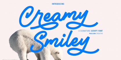 Creamy Smiley is a casual handwritten script font. With medium mono-line consist stroke, fun character with a bit of ligatures and alternates. To give you an extra creative work. Creamy Smiley font support multilingual more than 100+ language. This font is good for logo design, Social media, Movie Titles, Books Titles, a short text even a long text letter and good for your secondary text font with sans or serif. Make a stunning work with Creamy Smiley font. Cheers, Maulana Creative
 - Melvio Play by Maulana Creative,
$15.00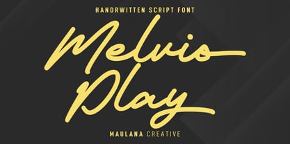 Melvio Play is a fancy handwritten script font. With bold consist mono-line stroke, fun character with a bit of ligatures and alternates. To give you an extra creative work. Melvio Play font support multilingual more than 100+ language. This font is good for logo design, Social media, Movie Titles, Books Titles, a short text even a long text letter and good for your secondary text font with sans or serif. Make a stunning work with Melvio Play font. Cheers, Maulana Creative
 - Whichit by Ingrimayne Type,
$5.00 Whichit contains typefaces designed with a hexagonal motif. The opposite sides of the hexagon are parallel but two of them are longer than the other four. It does not have reflective symmetry so flipping it over a vertical line returns a different appearance. One of these appearances is the basis for WhichIt and the other for WhichItTwo. Each has three weights and each weight has an italic style. The result is a quirky sans-serif family of a dozen faces.
 - The Archies Typeface by IKIIKOWRK,
$17.00 Proudly present The Archies Typeface, created by ikiiko. A summer mood typeface that has a vintage style & holiday vibes. This typeface is perfect for an holiday greeting, summer camp poster, vacation title, beach & tropical design, and so much more. What's Included? Uppercase & Lowercase Number & Punctuation Ligature Multilingual support Format File : TTF & OTF Works on PC & Mac Get also a good offer & FREEBIE at our site : www.ikiiko.com Enjoy our font and if you have any questions, you can contact us by email : ikiikowrk@gmail.com
 - Braderia by Aldedesign,
$25.00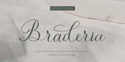 Braderia // Modern Calligraphy is a stylish script font that features a varying baseline, smooth line, modern, and depth of love. For those of you who need a touch of love and modernity for your designs or branding, it can be used for various purposes such as headings, weddings, invitations, signatures, logos, branding, t-shirt, letterhead, signage, labels, news, posters, badges, etc. Each Font Has: Stylish modern handwritten script Beautiful Swash (Ending tail) Beautiful Titling (Beginning tail) Special Ligatures Multilingual Support
 - LTC Goudy Modern by Lanston Type Co.,
$39.95Goudy Modern/Open was designed by Frederic Goudy, who was inspired by the caption of a French engraving. It is Goudy's first attempt at a "modern" face, but with less contrast and rigidity normally found in Bodoni style Modern faces. Goudy Modern was designed later in 1918 after viewing a proof of Goudy Open with the line filled in. Not a true modern face, but still a Goudy classic. The Pro versions include ligatures, varieties of numerals and Central European character sets. - BM Breitfette Unziale by Biliktu Foundry,
$42.00 I was immediately fascinated with the font, Breitfette Unziale, used for Erol Büyükburç's Hop Dedik album cover when I discovered this album. I designed a completely brand new typeface that is inspired by it called Erol Unziale but I also wanted to digitize and revive this typeface since I couldn’t find a digital version of it anywhere online. I took some liberties with the original font and customized it to my liking. Here is my interpretation of Walter Haettenschweiler's font through digitization.
 - Hello Hiltown by Good Java Studio,
$20.00 Introducing Hello Hiltown - Playfull Condensed Hello Hiltown is the perfect font for all your fun and minimalism designs. The main font file is equipped with ordinary characters. Everything is made with the funny brush. So you can be sure they will work well together! It is suitable for you to use in making t-shirt design, quote, label, packaging, logo type, or long writing. Because we have compiled kerning and matrices that are tailored to your needs. Caps Only Fonts.
 - MB Empire by Ben Burford Fonts,
$30.00 MB Empire is a font that like MB vintage has its roots in early 20th century design, It has a distinctly english feel with its style references to the classic Gill Sans. It has a very traditional look whilst still maintaining its own modernist individuality. It comes in six weights with italics and has extended language support. With many opentype features including oldstlye & lining figures, automatic fractions and more its a font family that will work for almost any application.
 - Dunny Fuller by Maulana Creative,
$11.00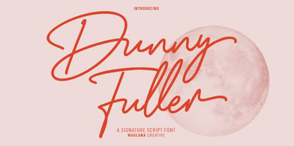 Danny Fuller is an expressive freestyle signature script font. With regular mono-line consist stroke, fun character with a bit of ligatures and alternates. To give you an extra creative work. Danny Fuller font support multilingual more than 100+ language. This font is good for logo design, Social media, Movie Titles, Books Titles, a short text even a long text letter and good for your secondary text font with sans or serif. Make a stunning work with Danny Fuller font. Cheers, Maulana Creative
 - LTC Goudy Open by Lanston Type Co.,
$39.95Goudy Modern/Open was designed by Frederic Goudy, who was inspired by the caption of a French engraving. It is Goudy's first attempt at a "modern" face, but with less contrast and rigidity normally found in Bodoni style Modern faces. Goudy Modern was designed later in 1918 after viewing a proof of Goudy Open with the line filled in. Not a true modern face, but still a Goudy classic. The Pro versions include ligatures, varieties of numerals and Central European character sets.


