3,961 search results
(0.017 seconds)
- MFC Phonograph Monogram by Monogram Fonts Co.,
$19.00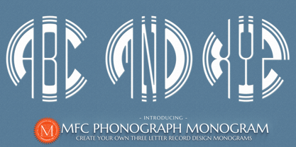 The inspiration source for MFC Phonograph Monogram is a vintage monogram specimen named “Kent” showing only a CBA sample. It was a style I could find no other reference for, but was desperate to recreate this record like styling of monogram. Finally, it all comes to life in MFC Phonograph Monogram. I even threw in a little dog and phonograph icons hidden in the font as decorative icons reminicent of old Victrola records. Phonograph Monogram supports two and three letter monograms, although the two letter style break from the circular record design and creates a zulu style shield design. MFC Phonograph Monogram uses the Ligatures feature, available in most OpenType savvy applications, such as Adobe Illustrator CS (see Fig. 1). The Ligatures feature is typically enabled automatically, but you may need to confirm this in your program if you are not certain. If any second lowercase letter typed does not automatically switch to form the right side of the rounded form, you do not have Ligatures enabled.
 - Save The Date by Latinotype,
$40.00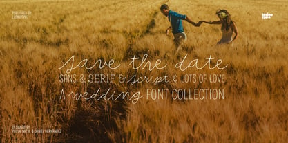 A wedding begins long before the "I Do's" on the big day—everyone works together throughout the process to make sure that everything happens as planned: details, color combinations, decorations, the way we convey the magic of the visual elements and deliver our message of love. Through this beautiful font, we would like to deliver to you that very message, you make it your own and express yourself in your own way—through the perfect invitation on your wedding day. No matter how sweet or wild your invitation looks, try to be yourself. Save the Date is a font collection consisting of 9 styles and 4 variants: Script, Sans, Serif and Small. The font set is intended to provide users with a wide range of choices for any design project. Save the Date was designed by Paula Nazal and Daniel Hernández. Digital editing by Rodrigo Fuenzalida. Photos by Mónica Muñoz. Mónica specializes in wedding photography. You can find more of her work here: www.thewildbrides.com
 - Endless Sunrise by Wing's Art Studio,
$10.00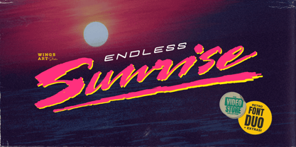 A hand-made retro script font duo inspired by 80s action movies! This hand-made, retro styled script font was born from a childhood watching countless 80s action movies. Stories of inspirational heroism and competition, all set against impossibly beautiful Summer sunsets. And no self-respecting 80s movie would be without the coolest title design, setting the stage with a seemingly spontaneous glide of the designer’s brush. Endless Sunrise aims to capture this spirit through it’s loose, hand-drawn design and complimentary sans-serif. It comes with a complete set of alternatives and underlines for true customisation, meaning you’ll never have to repeat an E or an I; the tale-tell signs that give away other script fonts. It also features uppercase and lowercase characters, along with numerals, punctuation and language support. An awesome font that will work equally well across film, sports, music, merch and more! Find more from The Video Store Collection at Wingsart Studio
 - Lemony by Din Studio,
$29.00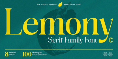 Lemony is a serif font family in 8 different volume options expressing formality and elegance in your designs. Its family character is that it has small lines in horizontal or vertical forms on the letter body, easing readers to read the letter as the lines guide readers’ attention to the reading directions. As a result, you may use this font on any text sizes. In addition to the font weight variations, you will have freedom of how and where you should use the font. Enjoy the available features here. Features: Ligatures Multilingual Supports PUA Encoded Numerals and Punctuations Lemony fits for various design projects, such as posters, banners, logos, magazine covers, quotes, invitations, greeting cards, merchandise social media, etc. Find out more ways to use this font by taking a look at the font preview. Hopefully, you have a great experience using our font. Feel free to contact us if you require more information when you are dealing with a problem. Thank you. Happy designing.
 - Myflora by Nathatype,
$29.00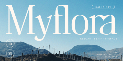 Myflora is a high level serif font in simple styles to create formal, modern, elegant impressions on your designs. Like the other serif font, its main characteristic is the small hooks on the letters’ edges. Besides, its morphological letter forms are simply presented with high contrasts and wide spaces to be legible enough to use in any text sizes. Furthermore, you can enjoy the available features in this font. Features: Ligatures Multilingual Supports PUA Encoded Numerals and Punctuations Myflora fits for various design projects, such as posters, banners, logos, magazine covers, quotes, headings, printed products, invitations, name cards, merchandise, social media, etc. Find out more ways to use this font by taking a look at the font preview. Thanks for purchasing our fonts. Hopefully, you have a great experience using our font. Feel free to contact us for further information when you have a problem using the font. Thank you. Happy designing.
 - Bix Bats by Linotype,
$29.99The Bix Bats symbol family was developed in 2003 by Argentinean designer Victor Garcia to complement his display text font Bix Plain. Bix Bats contains four different symbol fonts. Most of the characters in these fonts have their lower halves reversed out. Typing a line of text in these symbol fonts, or mixing these symbol fonts with Bix Plain, will create a very interesting text effect: the bottom half of your lines of text will be reversed out, on top of a colored bar. Bix Bats Arrows contains numerous possible arrow combinations, from archery references to the American recycling symbol. Bix Bats Funny includes all of the symbols needed for a party, from beer steins to bunny rabbits! Bix Bats Shiny has enough starbursts to light up a night sky, and in Bix Bats Wired you will find all of the technological accessories needed to be in the now. All four fonts are included in the Take Type 5 collection from Linotype GmbH." - Mafins by Nathatype,
$29.00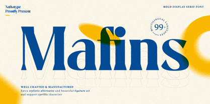 Mafins is a combination font of thick display and serif fonts which is simply designed in formal, modern, elegant impressions like other serif fonts. The differences between the thick and thin lines on each character is dramatic and the letters' edges have small hooks for a legibility reason. Due to the great legibility, you can use this font for any text sizes. Make your every design perfect with Mafins font to create the best impressions on your designs. Features: Stylistic Sets Ligatures Multilingual Supports PUA Encoded Numerals and Punctuations Mafins fits for various design projects, such as posters, banners, logos, magazine covers, quotes, name cards, invitations, headings, printed products, merchandise, social media, etc. Find out more ways to use this font by taking a look at the font preview. Thanks for purchasing our fonts. Hopefully, you have a great experience using our font. Feel free to contact us if you require more information when you are dealing with a problem. Thank you. Happy designing.
 - Mc Lemore by Galapagos,
$39.00Back when OpenType hadn't yet opened and Apple was developing the Line Layout Manager called GX Typography I created a test font that I name after my stepdaughter, Kristen (now ITC Kristen). Not wanting to offend my wife I started on a font project and gave her name to this new set of glyphs, Roberta. Unfortunately, the name was already in use so I needed to find another name for the fonts. After September 11th I decided that there were people I'd met during my life who were truly cut from the cloth of the hero. Master Sargent McLemore of the 75th Ranger Battalion was one of these people. I met the Sarge when I was in basic training at Fort Gordon. I saw him 2 weeks before he died in 1970. All of the heroes we see on the silver screen pale in comparison to this man. John Wayne and Clint Eastwood both have played the type well, both could have taken lessons from the Sarge. - Muller by Fontfabric,
$47.00 Muller Specimen: http://bit.ly/mullers Muller Narrow Specimen: http://bit.ly/mullerns The very first sketches of Muller were made about four years ago. In the process they changed to the point where they had nothing in common with the original idea. As it is with most work we do, when we seek perfection, changes are inevitable. It was specifically designed with a wider structure for better appearance in small sizes and the extra attention to the detail was needed for the big sizes. We managed to find the right balance for the perfect universal font family. The family consists of 20 weights, ranging from Thin to Heavy with matching Italics. This font family is suited for everything, ranging from advertising, packaging, editorial and branding, to web and screen projects. Muller comes with a complete range of figure options, including proportional and old style figures, each in its tabular version. It also includes advanced typographic features such as ligatures, fractions, alternate characters, case-sensitive forms, superscripts and subscripts.
 - Honey Cages by Nathatype,
$29.00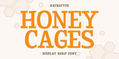 Honey Cages is a lovely display serif font in thick weights to show friendly, expressive, motional, balanced nuances between functionality and creativity. Generally, the letter shapes are round with consistent heights and wide spaces. There are also curved wipes on some of the letters’ edges to add decorative styles. Use Honey Cages for big-sized texts for a legibility reason. This font comes with some lovely features for you to enjoy. Features: Stylistic Sets Ligatures Multilingual Supports PUA Encoded Numerals and Punctuations Honey Cages font fits for various design projects, such as posters, banners, logos, magazine covers, quotes, headings, printed products, merchandise, social media, etc. Find out more ways to use this font by taking a look at the font preview. Thanks for purchasing our fonts. Hopefully, you have a great experience using our font. Feel free to contact us for further information when you have a problem using the font. Thank you. Happy designing.
 - Omega Pixel by João Henrique Lopes,
$-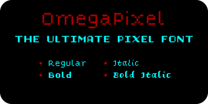 OmegaPixel Font Description I created this font for the game Hyper Ninja Blast (but made it useful to all kinds of games!). While creating the game, I searched for pixel fonts, but could not find a suitable one. The fonts were generally ugly and lacking the basic variations (italic and bold). So I decided to create my own pixel font. Just as pixel art can be better than a high-resolution painting, so pixel fonts don’t need to be always worse than traditional fonts. In OmegaPixel I tried to achieve elegance, readability and flexibility within the limitations of a 6 pixel x-height. With 4 versions (regular, italic, bold and bold italic), and a neutral feel, OmegaPixel can be used in any genre of games. Considering the general lack of money among indie game devs, I’m giving the regular version for free! For inspiration, I often remebered Minion’s lowercase ‘a’, Galliard italic lowercase ‘g’, and the calligraphy of Chinese emperor Huizong.
 - Humato Broken - Personal use only

- HiH Firmin Didot by HiH,
$10.00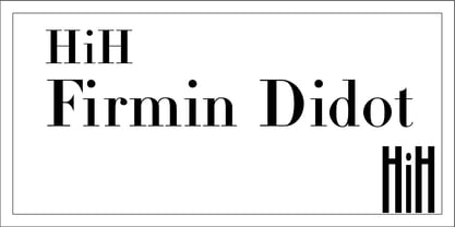 Before Bodoni, there was Didot. With the publication by Francois Ambroise Didot of Paris in 1784 of his prospectus for Tasso’s La Gerusalemme Liberata, the rococo typographical style of Fournier de Jeune was replaced with a spartan, neo-classical style that John Baskerville pioneered. The typeface Didot used for this work was of Didot’s own creation and is considered by both G. Dowding and P. Meggs to be the first modern face. Three years later, Bodoni of Parma is using a very similar face. Just as Bodoni’s typeface evolved over time, so did that of the Didot family. The eldest son of Francois Ambroise Didot, Pierre, ran the printing office; and Firmin ran the typefoundry. Pierre used the flattened, wove paper, again pioneered by Baskerville, to permit a more accurate impression and allow the use of more delicate letterforms. Firmin took full advantage of the improved paper by further refining the typeface introduced by his father. The printing of Racine’s Oeuvres in 1801 (seen in our gallery image #2) shows the symbiotic results of their efforts, especially in the marked increase in the sharpness of the serifs when compared to their owns works of only six years earlier. It has been suggested that one reason Bodoni achieved greater popularity than Didot is the thinner hairlines of Didot were more fragile when cast in metal type and thus more expensive for printers to use than Bodoni. This ceased to be a problem with the advent of phototypesetting, opening the door for a renewed interest in the work of the Didot family and especially that of Firmin Didot. Although further refinements in the Didot typeface were to come (notably the lower case ‘g’ shown in 1819), we have chosen 1801 as the nominal basis for our presentation of HiH Firmin Didot. We like the thick-thin circumflex that replaced the evenly-stroked version of 1795, possible only with the flatter wove paper. We like the unusual coat-hanger cedilla. We like the organic, leaf-like tail of the ‘Q.’ We like the strange, little number ‘2’ and the wonderfully assertive ‘4.’ And we like the distinctive and delightful awkwardness of the double-v (w). Please note that we have provided alternative versions of the upper and lower case w that are slightly more conventional than the original designs. Personally, I find the moderns (often called Didones) hard on the eyes in extended blocks of text. That does not stop me from enjoying their cold, crisp clarity. They represent the Age of Reason and the power of man’s intellect, while reflecting also its limitations. In the title pages set by Bodoni, Bulmer and Didot, I see the spare beauty of a winter landscape. That appeals to a New Englander like myself. Another aspect that appeals to me is setting a page in HiH Firmin Didot and watching people try to figure out what typeface it is. It looks a lot like Bodoni, but it isn't!
 - Evans by Zetafonts,
$39.00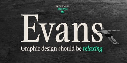 Evans was named after Walker Evans, an american photojournalist whose photographs often featured unassuming subjects – ordinary people, roadside scenes, and the subtle details of the American landscape. His ability to find beauty in simplicity and appreciate the mundane inspired Cosimo Lorenzo Pancini and Andrea Tartarelli to create this typographic family that aims to convey the ideals of journalistic storytelling: simplicity, clarity, and unpretentious honesty. Looking for a soothing, relaxed visual flow in body text, Evans was designed by gently narrowing classical proportions to answer the designers' need of maximizing the arrangement of lengthy text within confined spaces. Combining the vintage appeal of a semi-condensed old-style structure with a very slight transitional slanted axis resulted in text-oriented typeface with visual charm on both printed and digital pages. Subtly reducing the size of majuscules allowed the effect of an increased x-height, balancing space saving with increased readability at same point size. Using soft, semi-calligraphic shapes and keeping a generous letter spacing, the designers embraced a minimalist approach, aiming at a smooth reading experience. For maximum versatility, Evans provides two distinct variations tailored to different purposes: the Regular and the Narrow subfamilies. While both are fine-tuned for body text applications , the second is suited also for display-oriented contexts, where attention-grabbing headlines take center stage. Each subfamily is developed in a range of 8 weights from Extralight to Heavy, and includes over 700 glyphs with full coverage of language using extened latin glyphs. True italics are designed for all weights, providing additional typographic control through the design of Swash Alternates, available through Open Type features that also include Standard and Discretionary Ligatures, Positional Numerals, Case Sensitive Forms and Stylistic Alternates. The family is complemented also by a rich set of Ornaments, available both as special glyphs or in a separate font. With its retro-inspired design and unwavering commitment to form and function, Evans effortlessly extends its versatility from editorial design to digital interfaces and logo creation, inviting users to appreciate the beauty in simplicity, find joy in the ordinary, and embrace a relaxed and unhurried mindset.
 - Monarqy by Alit Design,
$20.00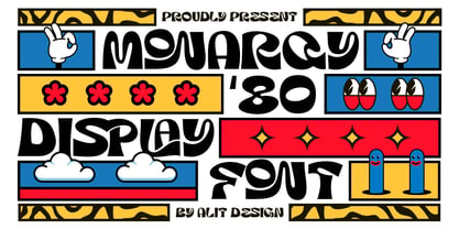 Discover Monarqy - The Funky Retro Font with Dynamic Flair Get ready to transport your projects back to the rad era of the 1980s with Monarqy, a font that encapsulates the funky, retro style of the era while adding a contemporary twist. This font will infuse your designs with a vibrant, nostalgic energy that captures the essence of the 80s like no other. Why Monarqy Stands Out: Cool Dynamic Characteristics: Monarqy oozes character with its funky, dynamic design. Each letter exudes a sense of movement and excitement, making it the perfect choice for projects that demand a playful and energetic vibe. Ligatures for That Perfect Flow: Monarqy offers an extensive range of ligatures, ensuring that your text flows seamlessly, delivering a polished and professional appearance. This feature is a game-changer for designers who demand precision in their typography. Rich Character Set: With an impressive repertoire of 610 characters, Monarqy accommodates a wide array of design applications. Whether you're crafting headlines, branding, or body text, you'll find all the characters you need to bring your vision to life. Alternatives for Creative Freedom: Monarqy doesn't hold back when it comes to creative freedom. The font provides alternative characters that let you experiment and find the perfect fit for your design. Customize your text to match your unique style and vision effortlessly. Multilingual Support: Monarqy is your passport to the global design landscape. With comprehensive multilingual support, it effortlessly adapts to various languages and ensures your message resonates across borders. PUA Unicode: Monarqy is PUA (Private Use Area) encoded, allowing you to unlock even more creative potential. Access special characters and ornaments that will set your designs apart from the rest. Monarqy is Perfect for: Retro-themed designs 80s-inspired branding Party invitations and posters Apparel design Album covers Packaging and labels Editorial layouts And so much more! Reignite the spirit of the 80s with Monarqy and let your creativity shine. Whether you're working on a fun project or a professional design, this font will add that extra touch of style and nostalgia. Get your copy of Monarqy today and embark on a typographic journey back to the funky, retro world of the 80s!
 - Quire Sans by Monotype,
$155.99 My goal was to make a design that might fit in anywhere,” says Jim Ford about his Quire Sans™ typeface. “I wanted it to be highly functional and sexy at the same time.” With one foot comfortably in the realm of oldstyle design and traditional book typography, and the other in evolving electronic media, the Quire Sans family does, indeed, fit in just about anywhere. As for sexy, someone once quotably wrote, “A great figure or physique is nice, but it's self-confidence that makes someone really sexy.” Yes, Quire Sans is sexy, performing confidently in virtually any setting. 2014-06-26 00:00:00.000 57.9900 F43063-S193385 42831 Neue Frutiger World Monotype https://www.myfonts.com/collections/neue-frutiger-world-font-monotype-imaging https://cdn.myfonts.net/cdn-cgi/image/width=417,height=208,fit=contain,format=auto/images/pim/10000/279026_ed8c8093fe1ac59ebe9e3ee1d9262c8e.png Neue Frutiger World is designed for global use with an impressive range of 10 weights, from Ultra Light to Extra Black, with matching italics. It embodies the same warmth and clarity as Adrian Frutiger’s original design, but allows brands to maintain their visual identity, and communicate with a consistent tone of voice, regardless of the language. Neue Frutiger World supports more than 150 languages and scripts including Latin, Greek, Cyrillic, Georgian, Armenian, Hebrew, Arabic, Thai and Vietnamese. “Before Neue Frutiger World it was not an easy task for western brands to find families in Arabic, Hebrew, Thai and Vietnamese which match with their Latin,” says Monotype type director Akira Kobayashi, who led the Neue Frutiger World project. “They may find a type with closer expression, but there was no guarantee if the bold version in the non-Latin family matches the bold in their Latin. Neue Frutiger World offers a better solution.” In addition to Neue Frutiger World’s linguistic versatility, it works hard across environments – suited to branding and corporate identity, advertising, signage, wayfinding, print, and digital environments. The Neue Frutiger World fonts can be paired with Monotype’s CJK fonts: M XiangHe Hei (Chinese), Tazugane Gothic (Japanese), Tazugane Info (Japanese), and Seol Sans (Korean). These were all designed to address brands’ needs to expand into Asian cultures and solve for global typographic challenges.
 - Ottine Slab by Ardyanatypes,
$15.00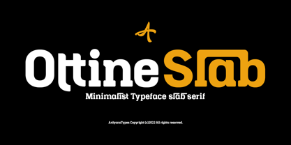 Ottine Slab Comes with a Slab Serif style typical of the 80s typeface, which gives a retro and classic style but has a unique and elegant style that gives an extraordinary impression. It is equipped with features to add a kind that makes the project impressionable. Ottine Slab is also equipped with various languages so that it allows Ottine Slab to be used in all your projects. Ottine Slab is very suitable for use in multiple purposes or projects, including Sport, Poster, Product, Logo, Branding, and many more that you can apply with this Ottine Slab Typeface. Supports languages: Afrikaans, Albanian, Asu, Azerbaijani, Basque, Bemba, Bena, Bosnian, Breton, Catalan, Chiga, Colognian, Cornish, Croatian, Czech, Danish, Dutch, Embu, English, Estonian, Faroese, Filipino, Finnish, French, Friulian, Galician, Ganda, German, Gusii, Hungarian, Icelandic, Igbo, Inari Sami, Indonesian, Irish, Italian, Jola-Fonyi, Kabuverdianu, Kalaallisut, Kalenjin, Kamba, Kikuyu, Kinyarwanda, Latvian, Lithuanian, Low German, Lower Sorbian, Luo, Luxembourgish, Luyia, Machame, Makhuwa-Meetto, Makonde, Malagasy, Malay, Maltese, Manx, Meru, Metaʼ, Morisyen, North Ndebele, Northern Sami, Norwegian Bokmål, Norwegian Nynorsk, Nyankole, Oromo, Polish, Portuguese, Quechua, Romanian, Romansh, Rombo, Rundi, Rwa, Samburu, Sango, Sangu, Scottish Gaelic, Sena, Shambala, Shona, Slovak, Slovenian, Soga, Somali, Spanish, Swahili, Swedish, Swiss German, Taita, Teso, Thai, Turkish, Turkmen, Upper Sorbian, Vietnamese, Vunjo, Walser, Welsh, Western Frisian, Wolof, Yoruba, Zulu A guide to accessing all alternatives can be read at http://adobe.ly/1m1fn4Y. Adobe Photoshop goes to Window - glyphs Adobe Illustrator go to Type - glyphs. Features: A – Z Character Set a – z Characters set Numerals & Punctuations (OpenType Standard) Multilingual Thank you and have a nice day
 - Glamona by Gold Type,
$16.00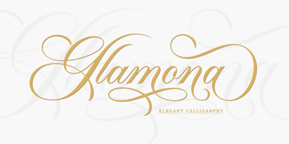 Glamona Script is one of the Elegant script fonts that comes with a very beautiful character change, a kind of classic copper decorative script with a modern touch, designed with high detail to present an elegant style. You will get: Glamona Font Files Glamona Script is interesting because the typeface is pleasing to the eye, clean, feminine, sensual, glamorous, simple and very easy to read, because of the many luxurious letter connections. I also offer a number of decent stylistic alternatives for some of the letters. Classic style is very suitable to be applied in various formal forms such as invitations, labels, restaurant menus, logos, fashion, make up, stationery, novels, magazines, books, greeting/wedding cards, packaging, labels or all kinds of advertisements. destination. . .. Glamona has 428+ glyphs and 401 alternate characters, including multiple language support. With OpenType features with alternative styles and elegant ligatures. The OpenType features don't work automatically, but you can access them manually and for best results your creativity will be required in combining variations of these Glyphs. I highly recommend using a program that supports OpenType features and the Glyphs panel such as Adobe Illustrator, Adobe Photoshop CC, Adobe InDesign, or CorelDraw, so that you can view and access all variations of Glyphs. How to access all alternative characters using Adobe Illustrator: https://www.youtube.com/watch?v=XzwjMkbB-wQ How to access all alternative characters, using the Windows Character Map with Photoshop: https://www.youtube.com/watch?v=Go9vacoYmBw If you need help or have any questions, let me know. I'm happy to help. Thanks & Happy Designing
 - Symply by TripleHely,
$16.00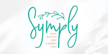 Hi there! Let me introduce Symply – a handwritten signature-style font. Symply is perfect for logos, branding, quotes, blog headlines, magazine and book design, product packaging, web design – or for any text on postcards and your favorite photos. Symply contains: a standard set of characters with wide multilingual support: Western-, Central- and Eastern-European, Baltic, Turkish, Latin-type Africans, and Asian (94 languages in total) 2 additional sets of alternative characters for lowercase letters 8 alternative characters for some initial letters 28 ligatures for double letters and frequent combinations a bonus font with 62 swashes and doodles Symply has two types of embedded auto-replacements: lowercase letters without connecting strokes (for a case of the last character of the word), and ligatures (for a case of two letters that do not pair well together). These features work well in many apps (even simple ones like Notepad/TextEdit), and if you need to customize their application – you could use programs that support OpenType features (for example, Adobe apps or CorelDraw). All these additional glyphs are PUA-encoded, so if your software does not support OpenType — you could access them through Character Map (Windows) or Font Book (Mac) Swashes and doodles come in a bonus font, Symply Swashes. To type them, please press keys with letters A – X, a – x, and numbers 0 – 9 I hope you will like Symply and create great designs with it! And if you have any questions, feel free to contact me via e-mail: triple.hely@gmail.com
 - Wedding by HiH,
$10.00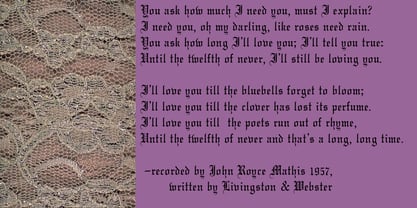 Wedding Regular was originally designed by Morris Fuller Benton for ATF and released as Wedding Text in 1901. It is a lighter version of his ENGRAVER'S OLD ENGLISH of the same period. Wedding Regular is based on the Textura style of blackletter that continued in popularity in England into the 16th century, long after the Dutch, French and Italians had moved to a Roman model that expressed the Renaissance humanism of the period. Wedding Headline is a still lighter version of the regular text face, suitable for setting larger sizes while still preserving the delicacy of the decorative hairlines. Textura continues in use in England and the United States for newspaper mastheads, gift shop signs, wedding invitations and programs and other applications where a feeling of tradition is desired. I recently saw an 1980ish photo of a “Tubby Isaac” sign in London using textura. I believe Benton’s design captures that feeling without being heavy-handed and still remaining quite readable for eyes accustomed to Roman lettering. Both Wedding Regular and Wedding Headline convey a comfortable familiarity. These two fonts may be purchased together at an attractive discount or they may be purchased separately. The full character set may be found in the pdf file that you can download from the gallery section. The two monks (alt-0172 and alt-0177) are from a set of sixteenth century decorative initial letters by Gering and Renbolt. Please note that there are two different eszetts, the blackletter style at alt-0126 and the antiqua style at the alt-0223.
 - HD Colton by HyperDeluxe,
$35.00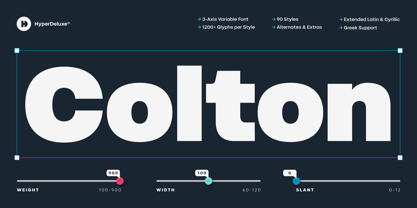 HD Colton is a 90-style super-sans from London Design Studio HyperDeluxe®. Using a combination of horizontal & vertical terminals along with squarish ovals, it is built with a confident structure that feels so much more than a neutral sans, it feels iconic. Engineered in 5 widths, compressed to extra wide, and in nine weights, HD Colton features a huge 90 styles that will offer your brand ultimate flexibility and variation in one font family. The black weights will help bring prominence to your brand while the light to mid weights will help you tell your story at a smaller size. HD Colton includes 1200+ glyphs per style, providing you with a workhorse sans that supports 200+ languages including extended Latin, extended Cyrillic and basic Greek. Also included are 5 stylistic sets, 2 arrow sets & numerous OpenType features (see last poster for complete list). The HD Colton complete family package comes with a single, 3-axis variable font so you'll have an infinite amount of combinations and uses for you to experiment with and add that touch of finesse to your visuals. Variable fonts are tech friendly providing smaller sizes for developers to work with, while also being responsive and used for motion design on the web. HD Colton key features: 3-Axis Variable Font. 90 Styles. 1200+ Glyphs Per Style. 5 Widths (Compressed, Condensed, Regular, Wide, Extra Wide). 200+ Languages Supported. Extended Latin, Extended Cyrillic, Greek Support. Stylistic Alternates for some key glyphs (J, Q, G, l, &, Arrows). Extensive OpenType features.
 - Loraine by Homelessfonts,
$49.00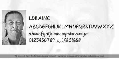 Homelessfonts is an initiative by the Arrels foundation to support, raise awareness and bring some dignity to the life of homeless people in Barcelona Spain. Each of the fonts was carefully digitized from the handwriting of different homeless people who agreed to participate in this initiative. MyFonts is pleased to donate all revenue from the sales of Homelessfonts to the Arrels foundation in support of their mission to provide the homeless people in Barcelona with a path to independence with accommodations, food, social and health care. Loraine was born in London. She was an ordinary, hardworking family person, with nothing to worry about beyond paying the rent at the end of the month or keeping the fridge full. Until in 2009 she came to Barcelona on holiday. Soon after she arrived her passport was stolen from her and she had a series of problems with the British embassy. Somebody had made illegal use of her passport. So Loraine found herself in a strange place, unable to get home. She didn’t know anyone there and her circumstances meant she couldn’t ask for help from England, either. She had to sell all her possessions and, in time, learn to speak Spanish. “Living in the street is a wonderful adventure,” she says. In the street she discovered a new city, a new country and a new culture. “There are lots of people who prefer to sleep under the stars.” She also made lots of friends who helped her in a completely unfamiliar world.
 - Chordette for Guitar by Ukefarm,
$10.00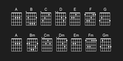 Description Chordette for Guitar Chord Fonts are tuned EADGBE. Create a guitar chord chart or chord sheets quickly and easily. Guitar Chord Fonts Chordette contains high quality guitar chord fonts. Each guitar chord is mapped to a specific key on the keyboard, so you can type out chords. It’s a lot easier than dealing with images to create a guitar chord chart or song sheet. It’s a favorite tool for teachers, music therapists, and musicians. What instruments are supported? Chordette for Guitar is tuned EADGBE and supports Guitar. Chordette is available in multiple tunings for most stringed instruments. Most versions of Chordette support multiple instruments. App / Instruments Supported / Tuning Chordette for Guitalele / Guitalele, Baritone Guitar / ADGCEA Chordette for Ukulele / Concert Ukulele, Banjolele / GCEA Chordette for Soprano Uke Soprano Ukulele ADF#B Chordette for Baritone Uke / Baritone Ukulele / DGBE Chordette for Mandolin / Mandolin, Irish Tenor Banjo, Irish Bouzouki / GDAE Chordette for Banjo / Banjo /gDGBD Chordette for Tenor Banjo / Tenor Banjo, Tenor Guitar, Mandola / CGDA Chordette for Guitar / Guitar / EADGBE Each version of the Chordette font uses the same chord sets and keyboard mappings. If you play multiple instruments, you can create a chord sheet for one, then use another Chordette font to transpose the song to another. For example, you can create a song for Mandolin, then instantly transpose it for Guitar and Ukulele - just by changing fonts! Chordette for Guitar is priced at $10, which includes the guitar chord font sets for both Mac and Windows. For help and support, please visit http://ukefarm.com/chordette/help.html
 - Mountogen by Ardyanatypes,
$17.00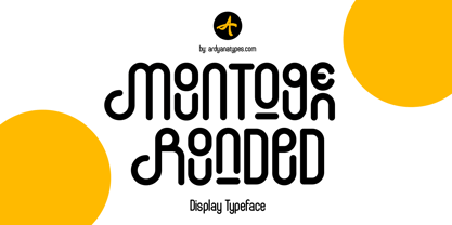 Introducing Mountogen Rounded Typeface Style which has a unique and very strong characteristic that makes all designs look unique and have a modern feel. Mountogen Rounded has its own charm, so it will be very suitable to be combined with any style. Has Lots of Alternatives and ligatures to add a great interactive feel to every design. Mountogen Rounded also comes with multilingual support and is very easy to use. Mountogen Rounded is interesting to use in designs such as books, movie posters, logos, branding, business cards, and more that can be combined with Mountogen Rounded. Supports languages: Afrikaans, Albanian, Asu, Azerbaijani, Basque, Bemba, Bena, Bosnian, Breton, Catalan, Chiga, Colognian, Cornish, Croatian, Czech, Danish, Dutch, Embu, English, Estonian, Faroese, Filipino, Finnish, French, Friulian, Galician, Ganda, German, Gusii, Hungarian, Icelandic, Igbo, Inari Sami, Indonesian, Irish, Italian, Jola-Fonyi, Kabuverdianu, Kalaallisut, Kalenjin, Kamba, Kikuyu, Kinyarwanda, Latvian, Lithuanian, Low German, Lower Sorbian, Luo, Luxembourgish, Luyia, Machame, Makhuwa-Meetto, Makonde, Malagasy, Malay, Maltese, Manx, Meru, Metaʼ, Morisyen, North Ndebele, Northern Sami, Norwegian Bokmål, Norwegian Nynorsk, Nyankole, Oromo, Polish, Portuguese, Quechua, Romanian, Romansh, Rombo, Rundi, Rwa, Samburu, Sango, Sangu, Scottish Gaelic, Sena, Shambala, Shona, Slovak, Slovenian, Soga, Somali, Spanish, Swahili, Swedish, Swiss German, Taita, Teso, Thai, Turkish, Turkmen, Upper Sorbian, Vietnamese, Vunjo, Walser, Welsh, Western Frisian, Wolof, Yoruba, Zulu A guide to accessing all alternatives can be read at http://adobe.ly/1m1fn4Y Adobe Photoshop go to Window – glyphs Adobe Illustrator go to Type – glyphs Features: A – Z Character Set a – z Characters set Numerals & Punctuations (OpenType Standard) Multilingual Thank you and have a nice day
 - Garden Hidaleya by Kartiny Type,
$12.00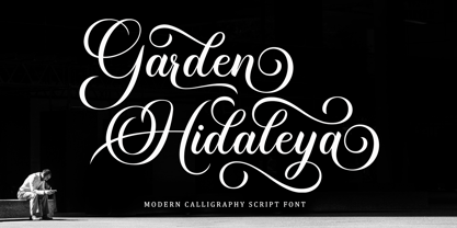 Garden Hidaleya Script is one of the Elegant script fonts that comes with a very beautiful character change, a kind of classic copper decorative script with a modern touch, designed with high detail to present an elegant style. You will get: Garden Hidaleya Garden Hidaleya Bold Garden Hidaleya Script is interesting because the typeface is pleasing to the eye, clean, feminine, sensual, glamorous, simple and very easy to read, because of the many luxurious letter connections. I also offer a number of decent stylistic alternatives for some of the letters. The classic style is very suitable to be applied in various formal forms such as invitations, labels, restaurant menus, logos, fashion, make up, stationery, novels, magazines, books, greeting / wedding cards, packaging, labels or all kinds of advertising purposes. . . Garden Hidaleya has alternate characters, including multiple language support. With OpenType features with alternative styles and elegant ligatures. The OpenType features don't work automatically, but you can access them manually and for best results your creativity will be required in combining variations of these Glyphs. I highly recommend using a program that supports OpenType features and the Glyphs panel such as Adobe Illustrator, Adobe Photoshop CC, Adobe InDesign, or CorelDraw, so that you can view and access all variations of Glyphs. How to access all alternative characters using Adobe Illustrator: https://www.youtube.com/watch?v=XzwjMkbB-wQ How to access all alternative characters, using the Windows Character Map with Photoshop: https://www.youtube.com/watch?v=Go9vacoYmBw If you need help or have any questions, let me know. I'm happy to help. Thanks & Happy Designing.
 - 112 Hours by Device,
$9.00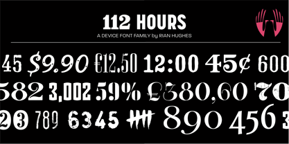 Rian Hughes’ 15th collection of fonts, “112 Hours”, is entirely dedicated to numbers. Culled from a myriad of sources – clock faces, tickets, watches house numbers – it is an eclectic and wide-ranging set. Each font contains only numerals and related punctuation – no letters. A new book has been designed by Hughes to show the collection, and includes sample settings, complete character sets, source material and an introduction. This is available print-to-order on Blurb in paperback and hardback: http://www.blurb.com/b/5539073-112-hours-hardback http://www.blurb.com/b/5539045-112-hours-paperback From the introduction: The idea for this, the fifteenth Device Fonts collection, began when I came across an online auction site dedicated to antique clocks. I was mesmerized by the inventive and bizarre numerals on their faces. Shorn of the need to extend the internal logic of a typeface through the entire alphabet, the designers of these treasures were free to explore interesting forms and shapes that would otherwise be denied them. Given this horological starting point, I decided to produce 12 fonts, each featuring just the numbers from 1 to 12 and, where appropriate, a small set of supporting characters — in most cases, the international currency symbols, a colon, full stop, hyphen, slash and the number sign. 10, 11 and 12 I opted to place in the capital A, B and C slots. Each font is shown in its entirety here. I soon passed 12, so the next logical finish line was 24. Like a typographic Jack Bauer, I soon passed that too -— the more I researched, the more I came across interesting and unique examples that insisted on digitization, or that inspired me to explore some new design direction. The sources broadened to include tickets, numbering machines, ecclesiastical brass plates and more. Though not derived from clock faces, I opted to keep the 1-12 conceit for consistency, which allowed me to design what are effectively numerical ligatures. I finally concluded one hundred fonts over my original estimate at 112. Even though it’s not strictly divisible by 12, the number has a certain symmetry, I reasoned, and was as good a place as any to round off the project. An overview reveals a broad range that nonetheless fall into several loose categories. There are fairly faithful revivals, only diverging from their source material to even out inconsistencies and regularize weighting or shape to make them more functional in a modern context; designs taken directly from the source material, preserving all the inky grit and character of the original; designs that are loosely based on a couple of numbers from the source material but diverge dramatically for reasons of improved aesthetics or mere whim; and entirely new designs with no historical precedent. As projects like this evolve (and, to be frank, get out of hand), they can take you in directions and to places you didn’t envisage when you first set out. Along the way, I corresponded with experts in railway livery, and now know about the history of cab side and smokebox plates; I travelled to the Musée de l’imprimerie in Nantes, France, to examine their numbering machines; I photographed house numbers in Paris, Florence, Venice, Amsterdam and here in the UK; I delved into my collection of tickets, passes and printed ephemera; I visited the Science Museum in London, the Royal Signals Museum in Dorset, and the Museum of London to source early adding machines, war-time telegraphs and post-war ration books. I photographed watches at Worthing Museum, weighing scales large enough to stand on in a Brick Lane pub, and digital station clocks at Baker Street tube station. I went to the London Under-ground archive at Acton Depot, where you can see all manner of vintage enamel signs and woodblock type; I photographed grocer’s stalls in East End street markets; I dug out old clocks I recalled from childhood at my parents’ place, examined old manual typewriters and cash tills, and crouched down with a torch to look at my electricity meter. I found out that Jane Fonda kicked a policeman, and unusually for someone with a lifelong aversion to sport, picked up some horse-racing jargon. I share some of that research here. In many cases I have not been slavish about staying close to the source material if I didn’t think it warranted it, so a close comparison will reveal differences. These changes could be made for aesthetic reasons, functional reasons (the originals didn’t need to be set in any combination, for example), or just reasons of personal taste. Where reference for the additional characters were not available — which was always the case with fonts derived from clock faces — I have endeavored to design them in a sympathetic style. I may even extend some of these to the full alphabet in the future. If I do, these number-only fonts could be considered as experimental design exercises: forays into form to probe interesting new graphic possibilities.
 - PS Fournier Std by Typofonderie,
$59.00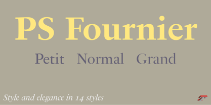 Style and elegance in 14 styles PS Fournier, created by Stéphane Elbaz, is designed in tribute to Pierre Simon Fournier. Fournier was the prolific Parisian type designer whose work is best known for its iconic representation of French transitional style. PS Fournier elegantly represents the transition to the modern era of typography. Featuring three optical sizes, PS Fournier is designed to perform in any context. The Pierre Simon Fournier heritage Pierre Simon Fournier (1712—1768) was a leading innovative type designer of the mid-18th century. Early in his career, the young Pierre Simon developed a strong aesthetic that he cultivated throughout his life. His art is representative of the pre-revolutionary “Age of Enlightenment” (Siècle des Lumières). Precursor of the Modern style, Fournier’s body of work deeply influenced his times, and created the fertile ground from which the Didot family and Giambattista Bodoni developed their own styles. During the historical period of the 18th century, Fournier exemplified the intellectual pursuits of the times with his own research on type, documenting in detail the typefounding process. He also offered a unique vision: he is the first to clearly comprehend the concept of “type family,” sorting a set of similarly styled alphabets by sizes, width, and by x-heights. In addition, Fournier is one of the earliest advocates of the point system to organize the practice of typography, the point system that contemporary typographers continue to use to this day. The refined and discreet elegance of PS Fournier With a close look at the family, one finds you’ll find that the difference between the optical sizes (Petit, standard and Grand) is more than a contrast variation between the thin and the thick; the eye can also denote a palette of distinct tones: More streamlined and robust in the smaller sizes (Petit), more refined and detailed in the larger sizes (Grand). The PS Fournier standard family is designed to adapt to any situation with its intermediate optical size, from body copy to headlines. With a bit of tracking, PS Fournier Petit will make the smallest captions perfectly readable. However, Petit family is not limited to body and captions — its “slabby robustness” will make a relevant headline choice as well. PS Fournier Grand presents a higher contrast adapted to large text sizes, displays or banners. Its refined elegance makes it a perfect choice for Design, Fashion or Luxury publications. As a “modern” type PS Fournier Grand features a larger x-height than the preexistent old style typefaces such as Garamond or Jenson. These proportions provide any basic text set in PS Fournier Grand a strong typographic texture. As a result, the PS Fournier global family is a versatile alternative to the Modern typefaces commonly used in the publishing industry. The optical sizes, the large range of weights, and the design variations make this family adaptable to captions, paragraphs, and pages, as well as to large texts and displays. A leading-edge typography in the 18th century In the spirit of modernity, Pierre Simon Fournier did not find any use for the conventional swashes still produced by peers such as Caslon or Baskerville. Nevertheless the French designer created many inventive elements to decorate the page and set delightful variations in the text itself. To this regard PS Fournier includes a large set of glyphs variations, ligatures and more than one hundred glyphs for borders, rules and ornaments or — as called in French — “vignettes.” PS Fournier: A tribute to the French modern typography era by Stéphane Elbaz
 - Vanitas by Reserves,
$49.00Vanitas is an elegant high contrast contemporary sans. It is rooted in the style of a classic didone, excluding the typical serifs and ball terminals as well as being designed with a cleaner, more reductionist appearance. Strict attention was given to the cohesiveness and balance between letterforms as well as the careful refinement of all curves. Stylistically, Vanitas’ alluring, sophisticated sensibility is directly inspired by high fashion. The upright styles are complimented by a pairing of optically adjusted true italics, which were purposefully adapted to retain the sharpness of their counterparts. Abandoning traditionally executed cursive italic letterforms retains Vanitas’ sharp characteristic through each style. Features include: Precision kerning Standard Ligatures set including ‘f’ ligatures (fb, ff, fh, fi, fj, fk, fl ffb, ffh, ffi, ffj, ffk, ffl, ffy, ae, oe, AE, OE) Discretionary Ligatures set including (st, ct, No) Alternate characters (H, A, AE, Q, $, h circumflex, ¶ and numero sign) Case forms (shifts various punctuation marks up to a position that works better with all-capital sequences) Capital Spacing (globally adjusts inter-glyph spacing for all-capital text) Slashed zero Full set of numerators/denominators Tabular Lining, Proportional Lining, Tabular Oldstyle and Proportional Oldstyle Figures Automatic fraction feature (supports any fraction combination) Extended language support (Latin-1 and Latin Extended-A) *Requires an application with OpenType and/or Unicode support. - Volta by Linotype,
$29.99Volta is a robust typeface from the 1950s. A revisit to styles that were en vogue at the turn of the century, Bauer type foundry designers Walter Baum and Konrad Bauer designed this type family in1955. The form of Volta's letters are similar to those in New Transitional Serif typefaces, like Cheltenham and Century. Developed after the Didone (i.e., Bodoni) style types, New Transitional Serifs speak more to the zeitgeist of the late 19th Cntury, and were typographic adaptations to it's newer technologies. Already in the period of mass production, typographers and printers at the dawn of the 20th Century had to cope with larger print runs on cheaper materials. The robust letterforms of New Transitional Serifs were designed to compensate for this, but they were also ingenious little inventions in their own right. Form the beginning, the new, peculiar forms of New Transitional Serif letters were adopted for use by advertisers. Their robustness also allowed them to be used in virtually all sizes. Volta was designed especially with advertising display usage in mind. The x-height of Volta's letters is higher than average for serif faces. It is recommended that Volta be used exclusively for shorter tracks of text, above 12 point. Headlines look dashing set in Volta. Four different font styles are available for the Volta typeface: Regular, Medium, Medium Italic, and Bold." - Cabrito Flare by insigne,
$35.00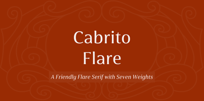 Cabrito Flare joins the Cabrito font family, a family designed to help younglings with the recognition of letter shapes. The original fonts are part of the development of a children's book, The Clothes Letters Wear. Cabrito Flare combines the simplicity and readability of the original Cabrito with an elegant flare serif. Now, this latest addition brings a new flavor to the table. Cabrito Flare brings fluid, carefree, medium contrast fun. It takes a more calligraphic direction than most. Cabrito combines structure and handwriting. There's a fluid balance of both characteristics, and Flare is no exception. It’s a unique combination of functional elegance with a little spice and a dollop of friendly. Fifty-four well-designed fonts give you many readable options to work with while developing your design. Cabrito Flare includes a suite of OpenType features. Alternative forms, ligatures, figures, and titling caps are all here. Preview these functions in the interactive PDF manual. There are glyphs for 72 languages; more than 600 glyphs await you. Cabrito Flare is an excellent choice for websites, as well as for brochures and packaging. Like Cabrito, used by several visible brands, Cabrito Flare is also an excellent option to define your logo. Try the taste of Cabrito Flare and be sure to dip in and sample some of the other Cabrito members: Original flavor, Didone, Sans, Serif, Semi, Contrast, and Inverto.
 - Cabrito Contrast by insigne,
$29.99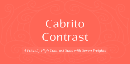 The Cabrito family is back again to make a statement. Released as a complement to the children's book, The Clothes Letters Wear, the original Cabrito is light-hearted, fun, and easy to read. Now, balancing this friendliness with a new elegance, Cabrito Contrast steps forward--a handsome typeface with an extra-sophisticated sensibility injected into the design. Still bright and playful in its Cabrito ancestry, this new Cabrito member approaches the field with a cleaner, more reductionist form, ensuring that its polished look retains the readability. Regular features and Italic forms of the 54 fonts include upright alternates, ligatures, and old figures. A range of weights include extended and condensed variants. To preview any of these interactive features, see the PDF manual. The family also includes language support for 72 Latin-based languages, and there are over 600 glyphs for further refining your work. Cabrito Contrast is best used for logos and packaging as well as flyers and websites, though its readability makes it a great option across a wide variety of works. In short, it’s well-designed just for you. Take a stroll with Cabrito Contrast, and see how much fun refinement can be. Along the way, take a look at a few other members of Cabrito, too and see how well the likes of Original, Inverto or Didone can pair with the new Contrast.
 - As of my last update, the font "Aircloud" by Fontone may not have been widely recognized or described in sources accessible to me, so I can't give a specific description of "Aircloud." However, I can...
- ABTS Day Of The Dead by Albatross,
$19.95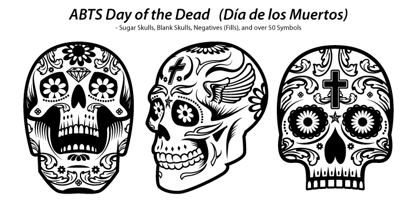 ABTS day of the dead is a highly detailed and meticulously designed symbol font. It’s design is inspired by the Day of the Dead celebration, honoring the deceased. I think The Day of the Dead is one of the greatest reasons anyone should celebrate life, so I decided to make a font honoring that tradition. I'm not even sure If I got all of it right, (traditional symbols and such) but it was a joy to create. There are 2 fonts. The first is the Skulls. This includes uppercase and lowercase A-Z, a-z. There you will find the decorated skulls, blank skulls, and negatives. The second font is the symbols. If you wish to design your own Day of the Dead skull, you should purchase the symbols, as they are designed specifically for adorning the blanks. Purchasing both fonts will give you a discount. Please note, the symbol font will show up in your application of choice as “ABTS Day of the Dead Bold.” This is to avoid software problems with naming the font itself "Symbols." Skulls are awesome!!!
 - Signatires by Din Studio,
$29.00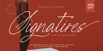 Are you looking for a unique signature font to show your style? We have the right signature font for you. This is the Signatires, our signature font to help you create a visually amazing signature. This font is carefully designed to express elegant, dazzling characters which also helps you deliver your messages easily. Signatires’ contrast is high with swinging end wipes. Furthermore, its legibility is so great that it is suitable to apply for any text sizes. You can enjoy the available features here as well. Features: Stylistic Sets Ligatures Multilingual Supports PUA Encoded Numerals and Punctuations Signatires fits best for various design projects, such as brandings, posters, banners, greeting cards, magazine covers, quotes, printed products, merchandise, social media, etc. Find out more ways to use this font by taking a look at the font preview. Thanks for purchasing our fonts. Hopefully, you have a great time using our font. Feel free to contact us anytime for further information or when you have trouble with the font. Thanks a lot and happy designing.
 - Baltra by Galapagos,
$39.00After researching the type styles contemporary graphic designers have been using over the past few years, I noticed a consistent use of Copperplate Gothic, and its derivative designs, for various corporate advertising campaigns. That level of usage gave me the inspiration to design a display font possessing subtle characteristics of Copperplate Gothic, and various Latin Condensed designs. The font I ended up designing was semi-condensed, with more contrast between thicks and thins than in Copperplate. Baltra also has a subtle flair in its otherwise traditional lowercase, while possessing a larger than average lowercase x-height. Copperplate Gothic, on the other hand, has minimal contrast and uses small capitals for its lowercase. After examining extensive type specimens from wood type, metal type, phototype and digital type, I was not able to find a single design possessing a majority of Baltra's characteristics. Consequently, I consider Baltra to be a truly unique design, sharing with Copperplate Gothic only its flairs on stems, and having only subtle characteristics in common with traditional Latin designs. - Cotford by Monotype,
$49.99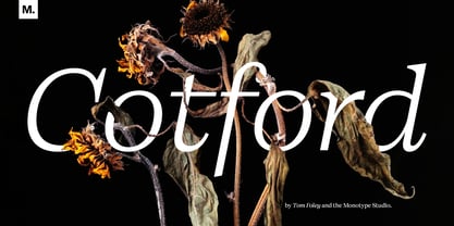 New from the Monotype Studio, Cotford is a contemporary serif from Creative Type Director, Tom Foley. Dynamic, adaptable, and surprising—Cotford is a languid serif that ranges from delicate thins, bending and reaching like flower stems, to bold heavy weights that command the page and screen with confidence and vintage charm. And as a variable font, Cotford allows designers to explore and refine the design almost endlessly, unearthing its many visual tones and hidden secrets. Foley set out to design a soulful, contemporary serif typeface that delivers all the versatility and robustness today's designers expect. The variable font unlocks an expandsive spectrum of visual expression that allows designers to explore, tweak, and adjust the typeface until they find the perfect weight, contrast, and optical size for their project. At the same time, Cotford’s static weights follow a traditional model of 3 text and 5 display weights, making it a strong choice for brands looking for simple implementation. A pop serif for the digital age, Cotford takes you places. Cotford font field guide including best practices, font pairings and alternatives.
 - Happy Ramadan by Nathatype,
$25.00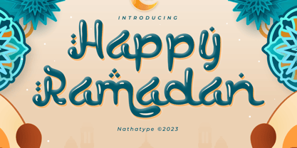 Happy Ramadan is a delightful display font that captures the spirit of the sacred month with a touch of playfulness and warmth. Happy Ramadan is not just a font; it's a celebration of the Ramadan spirit with a playful twist. It's a versatile choice to convey cultural richness, joy, and a welcoming atmosphere. The characters in Happy Ramadan are crafted with soft, rounded shapes that evoke a sense of joy and friendliness. The font's letterforms resemble bubbles, creating a unique and whimsical appearance that adds an element of fun to your text. In addition, you can also enjoy the features here. Features: Alternates Multilingual Supports PUA Encoded Numerals and Punctuations Happy Ramadan fits in headlines, logos, posters, flyers, branding materials, greeting cards, print media, editorial layouts, and many more designs. Find out more ways to use this font by taking a look at the font preview. Thanks for purchasing our fonts. Hopefully, you have a great time using our font. Feel free to contact us anytime for further information or when you have trouble with the font. Thanks a lot and happy designing.
 - Sassoon Primary Cond by Sassoon-Williams,
$48.00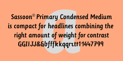 Those who design books for young children should consider the different needs of their readers. When laying out pages for young readers, particular care should be taken over word spacing. Don't forget that justifying short lines disrupts spacing. Justification should be used only when absolutely necessary. In the research undertaken with young readers the importance of consistent spacing was clear. It also appeared that the poorer readers profited from wider word spacing, while spacing that suited the poorest readers, positively annoyed the better readers. These typefaces have built-in letter spacing because of their exit strokes, as well as extra clarity designed into them. Sassoon Primary Medium Condensed is a compact style for headlines combining the right amount of weight, yet in a friendly style. When used at large sizes the friendliness of Sassoon types really shines. Why not use it for headings throughout a book. You can find many other new ways to use this typeface. Ideal perhaps for the masthead or a magazine? Free to download resources: How to access Stylistic Sets of alternative letters in these fonts
 - Heinemann by Heinemann Collection,
$39.00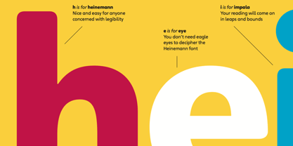 The Heinemann fonts were initially developed by the in-house design team at Heinemann educational publishing out of the necessity to find the perfect font for use in early primary reading books and literacy products. Basic Heinemann is defined by longer ascenders and descenders which help children to distinguish between letters; rounded edges on all letterforms help focus the reader on the individual letter shape; and modified characters (eg. a, g,) ensure instant recognition of letterforms. Heinemann Special offers further modified characters and kerning pairs ideal for dyslexic or special needs use (eg a, d, b). The Heinemann fonts were developed in partnership with children, literacy advisors, teachers of special needs/dyslexia and primary school teachers, and are now released in response to hundreds of requests from publishers, designers and teachers to purchase them. They have been trialled in schools and learning institutions over an 8 year period, and are a favorite for use in both print and electronic product. The modern, clean aesthetic of the fonts ensures that their use can span beyond educational application.
 - Annyeong by Ditatype,
$29.00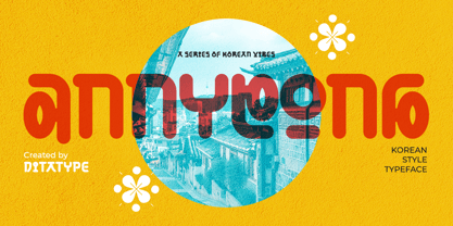 Annyeong welcomes you with a display font that captures the essence of Korean vibes. This display is a celebration of the dynamic and inviting nature of Korean design. It's a versatile tool that allows you to infuse your projects with a sense of cultural richness and visual impact. The characters in Annyeong are generously sized, ensuring a powerful and visually striking impact. The bold weight adds a sense of solidity, embodying the strength and confidence found in Korean aesthetics. Infused with Korean vibes, Annyeong brings a touch of cultural richness to every letter. In addition, enjoy the features here. Features: Stylistic Sets Multilingual Supports PUA Encoded Numerals and Punctuations Annyeong fits in headlines, logos, posters, flyers, branding materials, greeting cards, print media, editorial layouts, and many more designs. Find out more ways to use this font by taking a look at the font preview. Thanks for purchasing our fonts. Hopefully, you have a great time using our font. Feel free to contact us anytime for further information or when you have trouble with the font. Thanks a lot and happy designing.
