5,956 search results
(0.009 seconds)
- SavingsBond - Unknown license

- Better Land by Nurf Designs,
$16.00
- Summer Ink by Seemly Fonts,
$12.00
- Almond Cake by Epiclinez,
$14.00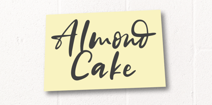
- FF Stealth by FontFont,
$41.99
- Credititle by Jonahfonts,
$29.95
- Jumping Unicorn by Subectype,
$15.00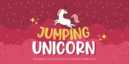
- Amoonk by Product Type,
$18.00
- Crimestopper JNL by Jeff Levine,
$29.00 - Konstantin Forte by Wiescher Design,
$39.50 - Blue Dino by Sakha Design,
$10.00
- Delighted Panda by Seemly Fonts,
$12.00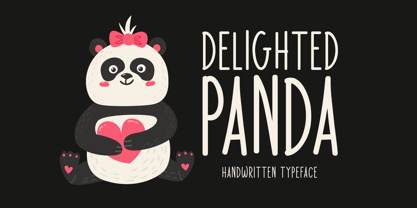
- Ulissia by Autographis,
$39.50
- Fruity Cake by Epiclinez,
$14.00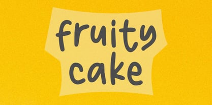
- Midnite Movie JNL by Jeff Levine,
$29.00
- Ongunkan Wakanda Runic by Runic World Tamgacı,
$50.00
- FALLING SKIES - Personal use only

- Nuixyber Glow Next - Personal use only

- Trek - Unknown license

- Sector 017 - 100% free

- Oramac - Personal use only

- Distant Galaxy Condensed - Unknown license

- Jupiter Mission by Wing's Art Studio,
$10.00
- Latitude Sans by Stiggy & Sands,
$24.00
- Chico by Type-Ø-Tones,
$49.00
- Polli Sans by Will Albin-Clark,
$-
- Desert Sands JNL by Jeff Levine,
$29.00
- Jazz Beat Stencil JNL by Jeff Levine,
$29.00
- Entitled JNL by Jeff Levine,
$29.00 - KR Silly Art Holiday - Unknown license

- KR Silly Art People - Unknown license

- KR Silly Art Dings - Unknown license

- Reznor - Unknown license

- Cuivrerie by JBFoundry,
$19.98
- I Love Summer by Seemly Fonts,
$12.00
- Glamori by Balpirick,
$15.00
- Harmony by Solotype,
$19.95 - Shaimus by Larin Type Co,
$12.00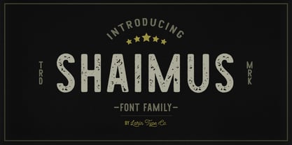
- Legal Brief JNL by Jeff Levine,
$29.00
- Cordial by Elemeno,
$25.00


