10,000 search results (0.019 seconds)
  1. Wynwood JNL by Jeff Levine, $29.00
    Wynwood JNL is a wider treatment of the same vintage wood type source used for Broadletter JNL.
  2. Bindle by Elemeno, $25.00
    Rounded, tapered and bold, Bindle was designed as an alternative to overused or outdated informal sans serifs.
  3. Clarendon Condensed by Wooden Type Fonts, $15.00
    A revival of one of the popular wooden type fonts of the 19th century; suitable for text.
  4. Number 154 by Wooden Type Fonts, $15.00
    A revival of one of the popular wooden type fonts of the 19th century. Suitable for display.
  5. Gothic by Wooden Type Fonts, $15.00
    Gothic Bold Condensed, first shown in 1889 by Hamilton wooden type founders. With lowercase. Gothic Bold Expanded.
  6. Northfork JNL by Jeff Levine, $29.00
    Northfork JNL is based on a William H. Page wood type alphabet called Parisian, circa 1857-58.
  7. Clarendon Heavy by Wooden Type Fonts, $15.00
    A revival of one of the popular wooden type fonts of the 19th century, suitable for display.
  8. Gargoyle by Red Rooster Collection, $45.00
    Based on an Adrian Williams design, circa 1976 and Brook Type in 1903 designed by Lucien Pissaro.
  9. Mayville JNL by Jeff Levine, $29.00
    Mayville JNL is a re-drawing of an all-caps Clarendon Wood Type font from the 1800s.
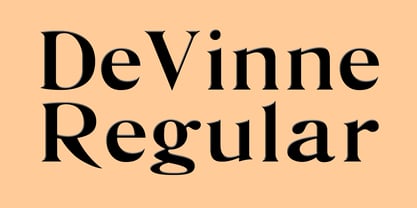
  10. De Vinne by Wooden Type Fonts, $15.00
    A revival of one of the popular wooden type fonts of the 19th century; suitable for text.
  11. Columbian Slab by Wooden Type Fonts, $20.00
    One of the classic display types of the 19th century, an Egyptian with slab serifs. Quite bold.
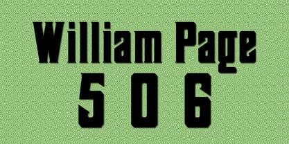
  12. William Page 506 by Wooden Type Fonts, $15.00
    A revival of one of the popular wooden type fonts of the 19th century, somewhat condensed, square.
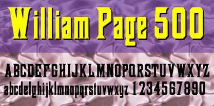
  13. William Page 500 by Wooden Type Fonts, $15.00
    A revival of one of the popular wooden type fonts of the 19th century, somewhat condensed, square.
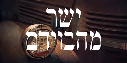
  14. Shtetl MF by Masterfont, $59.00
    Inspired by traditional old Biblical type, this font has a rich and unique style, with modern touch.
  15. Antique Three by Wooden Type Fonts, $15.00
    A revival of one of the popular wooden type fonts of the 19th century, suitable for text.
  16. Columbian by Wooden Type Fonts, $20.00
    One of the classic display types of the 19th century, an Egyptian with bracketed serifs. Quite bold.
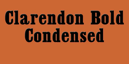
  17. Clarendon Condensed Bold by Wooden Type Fonts, $15.00
    A revival of one of the popular wooden type fonts of the 19th century, suitable for display.
  18. Motorway by K-Type, $20.00
    MOTORWAY is the companion typeface to TRANSPORT, the British road sign lettering. The Motorway alphabet was created for the route numbers on motorway signage, and is taller and narrower than the accompanying place names and distances which are printed in Transport. However, for Motorway Jock Kinneir and Margaret Calvert created only the numbers 0 to 9, the capitals A, B, E, M, N, S and W, ampersand, slash, parentheses and a comma. So, although the lettering made its first appearance on the Preston bypass in 1958, K-Type Motorway is the first complete typeface and contains all upper and lower case letters, plus a full complement of punctuation, symbols and Latin Extended-A accented characters. As with the Transport alphabet the starting point was Akzidenz Grotesk, Motorway taking inspiration from condensed versions. Changes were mainly driven by a quest for legibility, resulting in some reduced contrast between horizontal and vertical strokes, and Gill-esque straight diagonal limbs on the 6 and 9, and high vertex for the M. Kinneir and Calvert designed the limited range of characters in two weights; a SemiBold 'Permanent' weight for use as white letters on blue motorway signs, and a Bold 'Temporary' weight for heavier black letters on yellow non-permanent signage. In addition to creating full fonts in both original weights, the K-Type family adds a new Regular weight, plus a set of italics, completing a highly usable condensed typeface which, while rooted in history, is fully functional for both print and web usage. The K-Type fonts are spaced and kerned normally, simply increase the tracking to recapture the generous spacing of motorway signage.
  19. DeDisplay by Ingo, $24.99
    A type designed in a grid, like on display panels Type is not only printed. There were always and still are a number of forms of type versions which function completely differently. Even very early in the history of script there were attempts to combine a few single elements into the diverse forms of individual characters and also efforts to construct the forms of letters within a geometric grid system. The “instructions” of Albrecht Dürer are probably most well-known. But although designers of past centuries assumed the ideal to basically be an artist’s handwritten script, the idea which developed in the course of mechanization was to “build” characters in a building block system only by stringing together one basic element — the so-called grid type was discovered, represented most commonly today by »pixel types.« But even before computers, there were display systems which presented types with the help of a mechanical grid display, like the display panels in public transportation (bus, train) or at airports and train stations. In a streetcar, I met up with a modern variation of this display which reveals the name of each tram stop as it is approached. This system was based on a customary coarse square grid, but the individual squares were also divided again diagonally in four triangles. In this way it is possible to display slants and to simulate round forms more accurately as with only squares. The displayed characters still aren’t comparable to a decent typeface — on the contrary, the lower case letters are surprisingly ugly — but they form a much more legible type than that of ordinary [quadrate] grid types. DeDisplay from ingoFonts is this kind of type, constructed from tiny triangles which are in turn grouped in small squares. The stem widths are formed by two squares; the height of upper case characters is 10, the x-height 7 squares. DeDisplay is available in three versions: DeDisplay 1 is the complex original with spaces between the triangles, DeDisplay 2 forgoes dividing the triangles and thus appears somewhat darker or “bold,” and DeDisplay 3 is to some extent the “black” and doesn’t even include spaces between the individual squares.
  20. Speech Bubbles by Harald Geisler, $68.00
    The font Speech Bubbles offers a convenient way to integrate text and image. While the font can be used to design comics, it also gives the typographer a tool to make text speak – to give words conversational dynamics and to emphasize visually the sound of the message. The font includes a total of seventy outlines and seventy bubble backgrounds selected from a survey of historic forms. What follows is a discussion of my process researching and developing the font, as well as a few user suggestions. My work on the Speech Bubbles font began with historic research. My first resource was a close friend who is a successful German comic artist. I had previously worked with him to transform his lettering art into an OpenType font. This allowed his publishing house to easily translate cartoons from German to other languages without the need to use another font, like Helvetica rounded. My friend showed me the most exciting, outstanding and graphically appealing speech bubbles from his library. I looked at early strips from Schulz (Peanuts), Bill Waterson (Calvin & Hobes), Hergé (TinTin), Franquin, as well as Walt Disney. The most inspiring was the early Krazy Kat and Ignatz (around 1915) from George Herriman. I also studied 1980’s classics Dave Gibbon’s Watchmen, Frank Miller’s Ronin and Alan Moore and David Lloyd’s V for Vandetta. Contemporary work was also a part of my research—like Liniers from Macanudo and work of Ralf König. With this overview in mind I began to work from scratch. I tried to distill the typical essence of each author’s or era’s speech bubbles style into my font. In the end I limited my work down to the seventy strongest images. An important aspect of the design process was examining each artist’s speech bubble outlines. In some cases they are carefully inked, as in most of the 80’s work. In others, such as with Herriman, they are fast drawn with a rough impetus. The form can be dynamic and round (Schultz) with a variable stroke width, or straight inked with no form contrast (Hergé). Since most outlines also carry the character of the tool that they are made with, I chose to separate the outline from the speech bubble fill-in or background. 
This technical decision offers interesting creative possibilities. For example, the font user can apply a slight offset from fill-in to outline, as it is typical to early comic strips, in which there are often print misalignments. Also, rather than work in the classic white background with black outline, one can work with colors. Many tonal outcomes are possible by contrasting the fill-in and outline color. The Speech Bubbles font offers a dynamic and quick way to flavor information while conveying a message. How is something said? Loudly? With a tint of shyness? Does a rather small message take up a lot of space? The font’s extensive survey of historic comic designs in an assembly that is useful for both pure comic purposes or more complex typographic projects. Use Speech Bubbles to give your message the right impact in your poster, ad or composition.
  21. Caslon #540 by ITC, $29.00
    The Englishman William Caslon punchcut many roman, italic, and non-Latin typefaces from 1720 until his death in 1766. At that time most types were being imported to England from Dutch sources, so Caslon was influenced by the characteristics of Dutch types. He did, however, achieve a level of craft that enabled his recognition as the first great English punchcutter. Caslon's roman became so popular that it was known as the script of kings, although on the other side of the political spectrum (and the ocean), the Americans used it for their Declaration of Independence in 1776. The original Caslon specimen sheets and punches have long provided a fertile source for the range of types bearing his name. Identifying characteristics of most Caslons include a cap A with a scooped-out apex; a cap C with two full serifs; and in the italic, a swashed lowercase v and w. Caslon's types have achieved legendary status among printers and typographers, and are considered safe, solid, and dependable. A few of the many interpretations from the early twentieth century were true to the source, as well as strong enough to last into the digital era. These include two from the American Type Founders Company, Caslon 540 and the slightly heavier Caslon #3. Both fonts are relatively wide, and come complete with small caps, Old style Figures, and italics. Caslon Open Face first appeared in 1915 from the Barnhart Bros & Spindler Foundry, and is not anything like the true Caslon types despite the name. It is intended exclusively for titles, headlines and initials, and looks elegant whether used with the more authentic Caslon types or by itself.
  22. Bauer Bodoni by Linotype, $45.99
    Giambattista Bodoni (1740-1813) was called the King of Printers; he was a prolific type designer, a masterful engraver of punches and the most widely admired printer of his time. His books and typefaces were created during the 45 years he was the director of the fine press and publishing house of the Duke of Parma in Italy. He produced the best of what are known as "modern" style types, basing them on the finest writing of his time. Modern types represented the ultimate typographic development of the late eighteenth and early nineteenth centuries. They have characteristics quite different from the types that preceded them; such as extreme vertical stress, fine hairlines contrasted by bold main strokes, and very subtle, almost non-existent bracketing of sharply defined hairline serifs. Bodoni saw this style as beautiful and harmonious-the natural result of writing done with a well-cut pen, and the look was fashionable and admired. Other punchcutters, such as the Didot family (1689-1853) in France, and J. E. Walbaum (1768-1839) in Germany made their own versions of the modern faces. Even though some nineteenth century critics turned up their noses and called such types shattering and chilly, today the Bodoni moderns are seen in much the same light as they were in his own time. When used with care, the Bodoni types are both romantic and elegant, with a presence that adds tasteful sparkle to headlines and advertising. The Bauer Bodoni was done by Heinrich Jost for Bauer Typefoundry in 1927. This version has finer details of the original Bodoni types. It works well for headlines, logos, advertising.
  23. FloraDings - Unknown license
  24. Corleone - 100% free
  25. ImperatorBronzeSmallCaps - Unknown license
  26. My Puma Outlined - Unknown license
  27. AfterYear - Personal use only
  28. Creation - Unknown license
  29. My Puma Oblique - Unknown license
  30. KiddoTR - Unknown license
  31. ZoinkFat - Unknown license
  32. SF Cartoonist Hand SC - Unknown license
  33. Zoloft - Unknown license
  34. SF Foxboro Script Extended - Unknown license
  35. ZoloftSideffex - Unknown license
  36. Estrogen - Unknown license
  37. Sweden Funkis Outlined - Unknown license
  38. Sweden Funkis Regular - Unknown license
  39. Packet - Unknown license
Looking for more fonts? Check out our New, Sans, Script, Handwriting fonts or Categories
abstract fontscontact usprivacy policyweb font generator
Processing