10,000 search results
(0.227 seconds)
- MGN Marcelino by Morgana Studio,
$18.00 MGN Marcelino, crafted by Morgana Studio in 2024, is a captivating serif font that exudes timeless elegance. The distinctive serifs, characterized by their generous and slightly rounded contours, lend a unique charm to the typeface. This vintage-inspired font carries a sense of sophistication and nostalgia, making it a perfect choice for projects that seek to evoke a classic and refined aesthetic. MGN Marcelino seamlessly combines modern design sensibilities with a touch of the past, creating a versatile and visually appealing typeface that stands out with its bold and gracefully rounded serifs.
 - Chimpsdale by Maculinc,
$15.00 Chimpsdale name was inspired by the Fairly Odd Parents cartoon series, which tells about the parody world of Planet Of The Apes. Chimpsdale is an alternate version of Dimsdale from the ape-dominated world created by Bippy the Monkey’s wish, after he bit into a magic muffin that allowed him one rule-free wish in Abra-Catastrophe. Chimpsdale is a font that is inspired by the theme of past kingdoms, we wrap it in such a way to make it look suitable for many jobs Especially.You can use it as a logo, badge, insignia, packaging, headline, poster, t-shirt/apparel, greeting card, business card, and wedding invitation and more. The flowing characters are ideal to make an attractive messages to your taste. mix and match with a bunch of alternative characters to fit your project.It will be more interesting if you add swash / alternative swash. The alternative characters in this font were divided into several OpenType features such as Stylistic Alternates, Ligature and Ligature Alternates. Mail support : maculinc@gmail.com Thank you! Maculinc
 - Siseriff by Linotype,
$29.99 The Siseriff family of types contains nine different styles, which were developed by the master Swedish typographer Bo Berndal in 2002. Siseriff is a contemporary slab serif face. Except for the Siseriff Black weight, all of the letters display a slightly condensed appearance that is coupled with a relatively uniform width throughout the alphabet. Siseriff's nine styles are distributed across five weights (Light, Regular, Semi Bold, Bold and Black). The Italic companions for these styles (Siseriff Black does not have an italic companion) are true italics. These redrawn italics add a higher degree of differentiation from the Roman weights than could be achieved with obliques alone. Many common Slab Serif families (e.g., Serifa) do not offer this degree of differentiation. This variety makes Siseriff the perfect choice for journalistic and editorial work, where a good hierarchy may be achieved solely by relying on the various weights available, and their italics. All nine styles of the Siseriff family are part of the Take Type 5 collection from Linotype GmbH."
 - The Julayna by Reyrey Blue Std,
$19.00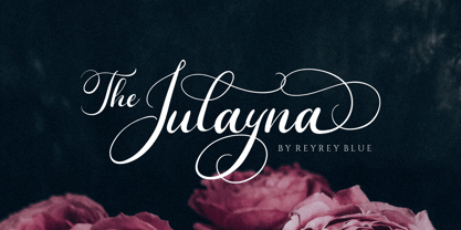 Introduce - The Julayna a luxurious wedding calligraphy font. It will add a luxury spark to any design project that you wish to create! The Julayna script font can be used for your next design, such as wedding invitations and wedding suites, stationery, packaging, feminine branding, logos, quotes, and prints. Includes: Uppercase and Lowercase, numbers, symbols, and punctuation Stylistic Alternate Ligatures Multilingual Characters
 - Behavior Indihome by Aldedesign,
$15.00 Behavior Indihome is a font with awesome and classy taste, it has a natural touch and many ligatures. We feel this font looks classy, readable, elegant, stylish, catchy and absolutely easy to use. Behavior Indihome is the great choice for a watermark on branding, design, wedding, photography, signature, logo design, album cover, business card, quotes, and many other design projects. This font is for those who want to show something smooth and modern. You may use this font if you want to attract modern buyers. The font design seems to show that you have a passion in the business and give your love to the products and services offered to your customers. Because it is an eye-catching signature font, you can use it for a variety of purposes including wedding invitations, signature, logo, branding, poster, and many more.
 - Latter Slant by Aldedesign,
$15.00 Latter Slant is a font with awesome and classy taste, comes with natural touch, and many ligatures. We hope this font looks classy, readable, elegant, stylish, catchy and absolutely easy to use. Latter Slant is the great choice for watermark on branding, design, wedding, photography, signature, logo design, album cover, business card, quotes, and many other design project. This font is for those who want to show something smooth and modern. You may use this font if you want to attract modern buyers. The font design seems to show that you have a passion in the business and give your love to the products and services you are offered to customers. Because it is an eye-catching signature font, you can use it for a variety of purposes including wedding invitation, signature, logo, branding, poster, and many more.
 - Deflexure by Ony Studio,
$14.00 Features: Characters: Uppercase letters, Lowercase letters, numbers & extended punctuation Ligatures and Stylistic Alternates Non-English support for the international designer Deflexure is a luxury modern script font. This font is perfect for wedding event design, such as wedding invitations, wedding event organizer logo, and any design related to weddings. This font is also perfect for writing quotes, print-on-demand design like t-shirts and mugs. Each lowercase font also has alternates for each letter, so when you type lowercase for each font, the letters will have other style options.
 - Ongunkan Phrygian by Runic World Tamgacı,
$50.00 Phrygia is the Greek name of an ancient state in western-central Anatolia (modern Turkey), extending from the Eskişehir area east to (perhaps) Boğazköy and Alishar Hüyük within the Halys River bend. The Assyrians, a powerful state in northern Mesopotamia to the south, called the state Mushki; what its own people called it is unknown. We know from their inscriptions that the Phrygians spoke an Indo-European language. Judging from historical records supported by ceramic evidence, settlers migrating from the Balkans in Europe first settled here a hundred or more years following the destruction of the Hittite empire (ca. 1200 B.C.). Most of what is known about Phrygian archaeology and its language derives from excavations at the capital city Gordion, located about 60 miles southwest of the modern Turkish capital of Ankara (also a Phrygian site). Gustav and Alfred Körte first excavated Gordion in 1900. The excavators did not reach Phrygian levels, but they did reveal burials dated to the late eighth century B.C. with Phrygian ceramic, metal, and wooden artifacts. From 1950 to 1973, Rodney S. Young of the University of Pennsylvania led excavations at Gordion. Archaeological work at the site resumed in 1988 and continues to the present.
 - Archive Garamond by Archive Type,
$59.99Archive Garamond is a typeface roughly based on the designs of Claude Garamond (ca. 1480 – 1561), a French publisher and a leading typeface designer of that period. Garamond’s influence on type design is reflected in many typefaces that are today known under different commercial names. While the majority of contemporary digital interpretations of the “Garamond types” are cleaner and more polished versions of that genre, Archive Garamond tries to keep the rough nature which was typical in the early days of printing. Archive Garamond has a rather unique, distinctive temperament which is even more emphasised with the preserved non-uniformity, such as irregular glyph shapes or a variable baseline. Although Archive Garamond was clearly made to be used for display sizes it works surprisingly well in text. Archive Garamond is availale in three versions, each containing approximately 600 glyphs (in Pro versions). Archive Garamond Pro A Professional version of the typeface contains all glyphs, including the advanced typographic forms, such as different sets of figures, small caps, swashes, historical forms, etc. The font also enables full use of the OpenType features. It fully supports the languages listed in the language list. Archive Garamond Std A Standard version of the typeface is meant to be used for the basic typographic work. It typically contains the most common glyphs. The standard figures are proportional lining. Besides kerning this version does not contain any advanced OpenType features. A Standard file type fully supports the languages listed in the Language list. Archive Garamond Exp An Expert version contains glyphs that are supposed to be used in advanced typographic works. This type of file contains uppercase and small cap glyphs with the proportional oldstyle figures as the default set. Besides kerning this version does not contain any advanced OpenType features (all OTF features have to be replaced manually). An Expert file type fully supports the languages listed in the Language list. - URLOP by Mikołaj Grabowski,
$9.00 Colour is more fun than black, but multicolour is even better. Let me introduce URLOP, a wide type family suitable for your fancy posters, headlines, covers, illustrations, websites, initials, blackmails, chronicles, signboards, poems and many others. Twelve basic styles, which make the overall construction, give a wide range of opportunities. All of them, being able to mix with each other, vary from a thin INSIDE, through a medium FILL, to a double-stem PLUS styles. And then comes a range of colour fonts, so you don’t have to waste any of your precious time for experiments, because I’ve already done it for you! URLOP is an all-caps display collection consisting of three sub-families of fonts, divided by the usage they are designed for. First of all, there is a wide range of alphabets made in the new OpenType-SVG colour fonts format. This is quite a novelty and a very promising technology at the same time. It allows designers to store colour information inside the font. Due to my experience with layered colour thinking that I explored in my first family - Epilepsja , I decided to make several preset layer combinations in this auspicious format. This sub-group is tagged RGB. Make sure that your field of usage and software support OT-SVG format. However, if you feel a need to experiment in the old-fashioned way, you may buy separate layers under the DIY tag. The last group is very similar to the DIY, but it was optimized to look better when standing without other layers. It’s called PRO*. All styles cover Latin alphabets of Europe, basic Cyrillic and Greek sets. Have fun! Before using the font, read the instructions and specimen attached to font files in the purchased package or download them from the Gallery tab on this site. This will help you avoid making unexpected mistakes when combining layers. *PRO subfamily release planned in 2019.
 - Birthday by Canada Type,
$34.95What do you imagine the ideal casual invitation font would look like? It has to be cheerful, inviting, legible, creative, and loads of fun. But first and foremost, it has to look like real handwriting. Fonts seeming like real handwriting are always a major task, and although Canada Type already has plenty of fonts that solve the “looks like handwriting” issue in a variety of ways, we're once again raising the bar a little higher with this one. Birthday is a massive package that crosses the traditional font/handwriting solution of 2-letter ligatures and waltzes into the land of 3-letter combinations. Plenty of them, too! The complete Postscript and True Type versions of Birthday ship with no less than five separate fonts full of nothing but ligatures. And for even more realism, an alternates font is also included in the package, for a total of seven fonts of happy handwriting that can be used anywhere and everywhere personalization is of importance to a layout. For layout artists with advanced typography tools that take advantage of the power of OpenType, Birthday Pro is a wunderkind. All the individual letter alternates are accessible through the Stylistic Alternates feature, the 2-letter ligatures through the standard Ligatures feature, and the 3-letter ligatures via the Discretionary Ligatures feature (for the technically inclined: this includes a nice liga-to-dlig crossover, where the maximum number of possible ligated letters is automatically chosen at the push of a button). If you enjoy using OpenType, Birthday Pro is definitely for you. If on the other hand you like your fonts in Postsript or True Type, it is advisable to keep a character map handy while using Birthday. You will need it to take advantage of the many, many alternates and ligatures distributed over the fonts. The next time someone asks you for the perfect casual invitation font is, look no further. And as usually is with Canada Type, quality fonts are more affordable than ever. - HWT Republic Gothic by Hamilton Wood Type Collection,
$24.95 The Republic Gothic series was among the last original wood type designs manufactured by Hamilton Manufacturing Co. It was first shown in Hamilton's New Gothic Faces in Wood Type (c. 1920). The design features a sans-serif style reminiscent of brush-formed letters popular with sign painters of the era. Originally issued in 6 different widths and in both outline and solid versions, this digital release features the "Extended" width known as Hamilton Republic Gothic series 775 & 776. The pair of outline and solid is designed as 'chromatics' that can be printed one over the other to achieve multiple color effects or individually as stylistic alternatives. This release features the first ever digitization of Republic Gothic. The two fonts are carefully aligned and kerned to allow for multicolor overlayment in any digital design program. It features a full Western and Central European Character set.
 - Nerine by Studioways,
$33.00 Nerine is a modern brush lettering and handwritten font duo designed by hand lettering artist Eliza Gwendalyn. Both scripts were drawn completely by hand and digitally perfected to bring you these unique script fonts. Nerine is a bold, connecting brush script, with lots of swashes and loops, while Nerine Deux is a lighter, straight stroke semi-connecting script, with a little less flair. Both scripts are ideal for use in a wide range of projects, from branding & advertising to wedding stationery & birth announcements! They also pair well with sans serif and serif typefaces! Each font is packed with ligatures and some alternate letterforms that help text runs appear more natural. The OpenType ligature feature will automatically insert ligatures when certain glyph combinations are typed, and the swash feature in Nerine will replace some beginning and ending letters with nice gentle swash alternatives. Nerinet also boasts five Style Sets that let you swap out groups of letters with interesting alternatives. Both fonts support the extended European character set so language support is extensive. Pick up Nerine or Nerine Deux, or the Nerine Duo Family today, and watch your creativity blossom!
 - Elkoga by Prioritype,
$15.00 Introducing Elkoga - Round Serif Typeface A modern serif font with a rounded style that makes this font stylish and eye-catching. Comes with 8 families, from regular to bold and italic. You can apply it to your various design projects such as logos, packaging, covers, posters, social media posts, youtube thumbnails, wedding invitations, quotes and much more you can make with this great item for any design! Features: -Uppercase -Lowercase -Numeral -Punctuation -Multilingual -Opentype Features & PUA Encoded Multilingual contained: Afrikaans, Albanian, Asu, Basque, Bemba, Bena, Breton, Catalan, Chiga, Cornish, Danish, Dutch, English, Estonian, Faroese, Filipino, Finnish, French, Friulian, Galician, German, Gusii, Indonesian, Irish,Italian, Kabuverdianu, Kalenjin, Kinyarwanda, Luo, Luxembourgish, Luyia, Machame, Makhuwa-Meetto, Makonde, Malagasy, Manx, Morisyen, North Ndebele, Norwegian Bokmål, Norwegian Nynorsk, Nyankole, Oromo, Portuguese, Quechua, Romansh, Rombo, Rundi, Rwa, Samburu, Sango, Sangu, Scottish Gaelic, Sena, Shambala, Shona, Soga, Somali, Spanish, Swahili, Swedish, Swiss German, Taita, Teso, Uzbek (Latin), Volapük, Vunjo, Zulu. Note: Use a program that supports the Opentype features and the glyph panel is available, so you can see the various alternative characters available. Examples of programs such as Adobe Illustrator, Corel Draw or Affinity Designer. Thanks.
 - Signature Mango by Shakira Studio,
$19.00 Introducing Signature Mango - The Epitome of Modern Retro Serif Elegance! Signature Mango is the font that's redefining modern retro serif typography and setting the design world on fire. This font is the epitome of sophistication, seamlessly blending timeless retro aesthetics with the contemporary chic that's all the rage in today's design trends. With its versatility and wide range of stylistic options, Signature Mango is your passport to creating stunning designs that stand out in today's competitive landscape. Whether you're designing a high-end fashion brand's logo, an upscale menu, or a luxurious wedding invitation, this font adds a touch of refined glamour that's in high demand right now. Here's what you get: Regular and Italic All Multilingual symbol Opentype features ( ligature, alternate ) Accessible in the Adobe Illustrator, Adobe Photoshop, Adobe InDesign, even work on Microsoft Word. PUA Encoded Characters - Fully accessible without additional design software. Multilingual character supports : (Afrikaans, Albanian, Catalan, Croatian, Czech, Danish, Dutch, English, Estonian, Finnish, French, German, Hungarian, Icelandic, Italian, Lithuanian, Maltese, Norwegian, Polish, Portuguese, Slovenian, Spanish, Swedish, Turkish, Zulu) Follow my shop for upcoming updates, and for more of my work, Thank you!
 - The Lastone by Black Studio,
$20.00 Introducing, The Lastone is a serif typeface crafted with elegance and luxury, exuding femininity and glamor but also a side of beauty with plenty of alternatives and ties to help you create endless variations for your creative needs. Its striking contrasts and subtle details, along with luxurious strokes and voluptuous curves, create a beautiful and powerful statement for any typographic composition, blending glamor with contemporary aesthetics. The Lastone elegant serifs really help you create unlimited variations for your creative needs in creating your project titles: such as fashion, magazines, logos, branding, photography, invitations, wedding invitations, quotes, blog headers, posters, advertisements, postcards, books, websites, etc. Feature • Full set of uppercase, lowercase • 111 Ligatures • 28 Alternatives • Numbers, symbols & punctuation • Characters with accents • Support Multiple Languages • PUA encoded WHAT IS INCLUDED • The Lastone – Regular • The Lastone – Italic This type of family has become the work of true love, making it as easy and fun as possible. I can't wait to see what you do with The Lastone! Feel free to use the #Black Studio tag and the #The Lastone font to show what you've been up to, I really hope you enjoy it! Thank you!
 - ITC Stone Humanist by ITC,
$40.99 Type designers have been integrating the design of sans serifs with serifed forms since the 1920s. Early examples are Edward Johnston's design for the London Underground, and Eric Gill's Gill Sans. These were followed by Jan van Krimpen's Romulus Sans, Frederic Goudy's ITC Goudy Sans, Hermann Zapf's Optima, Hans Meier's Syntax and Adrian Frutiger's Frutiger. Now, ITC Stone Humanist joins this tradition. It is a careful blend of traditional sans serif shapes and classical serifed letterforms. ITC Stone Humanist grew out an experiment with the medium weight of ITC Stone Sans, a design that already showed a relationship to these sans serif-serif hybrids. ITC Stone Sans has proportions based on those of ITC Stone Serif, and its thick-and-thin stroke contrast suggests the bloodline of humanistic sans serif typefaces. But other aspects of ITC Stone Sans are more closely aligned to the gothics and grotesques, a tradition that accounts for the largest portion of sans serif designs. Enter ITC Stone Humanist. During his experiments with the earlier design, Sumner Stone recalls, I was actually quite surprised at how seemingly subtle changes transformed the face," moving the design firmly into the humanist tradition. "The form of the 'g,' 'l,' 'M,' 'W,' and more subtly the 'a' and 'e' are part of the restructuring of the family," he explains. The top endings of vertical lower case strokes have been cropped on an angle, as have the ascender and descender stroke endings. ITC Stone Humanist is a full-fledged member of the ITC Stone family. It has been produced with the same complement of weights, and the x-heights, proportions, and underlying character shapes are completely compatible with the three original designs. The original ITC Stone Sans is a popular typeface, in part because of its notable versatility. ITC Stone Humanist shares this virtue, and can be used successfully at very small sizes, in long passages of text copy, and even as billboard-sized display type."
 - Type Master by VP Creative Shop,
$39.00 NOTE : If you want any specific ligature included, just write me a message and I will add it with next update :) Type Master is a sophisticated and delicate serif font that exudes elegance in every aspect. With its extensive collection of over 100 ligatures and alternate glyphs, this font offers endless possibilities for creative expression. Additionally, its support for 87 languages ensures that it is versatile enough to meet the needs of any project. Whether you are designing a logo, creating marketing materials, or crafting an editorial layout, Type Master is the perfect choice for adding a touch of refinement to your work. Language Support : Afrikaans, Albanian, Asu, Basque, Bemba, Bena, Breton, Chiga, Colognian, Cornish, Czech, Danish, Dutch, Embu, English, Estonian, Faroese, Filipino, Finnish, French, Friulian, Galician, Ganda, German, Gusi,i Hungarian, Indonesian, Irish, Italian, Jola-Fonyi, Kabuverdianu, Kalenjin, Kamba, Kikuyu, Kinyarwanda, Latvian, Lithuanian, Lower Sorbian, Luo, Luxembourgish, Luyia, Machame, Makhuwa-Meetto, Makonde, Malagasy, Maltese, Manx, Meru, Morisyen, North Ndebele, Norwegian, Bokmål, Norwegian, Nynorsk, Nyankole, Oromo, Polish, Portuguese, Quechua, Romanian, Romansh, Rombo, Rundi, Rwa, Samburu, Sango, Sangu, Scottish, Gaelic, Sena, Shambala, Shona, Slovak, Soga, Somali, Spanish, Swahili, Swedish, Swiss, German, Taita, Teso, Turkish, Upper, Sorbian, Uzbek (Latin), Volapük, Vunjo, Walser, Welsh, Western Frisian, Zulu Ligatures : IS, FO, OD, FA, TY, EX, NN, PI, EY, AY, SS, LL, FU, US, UT, AS, AN, AM, CI, LO, ES, RO, ET, TE, CK, OH, OO, OE, OC, KO, KE, KC, CH, SE, EA, UR, RS, KS, TH, TU, TT, TK, TL, HE, RG, EP, ER, RE, RC, LE, ND, ED, OF, HA, EN, CT, ST, NT, ON, ME, MO, NG, NC, UG, UC, OU, GH, OR, OP, EE, YO, VE, IT, WE, TI, FAS, FAST, CKS, OOD, FOOD, FOO, THEY, HEY, HYP, TYP, OUT, UST, URS, WAS, THE, WES, EST, WEST, ERS, EAST, EAS, LES, ENT, FOR, OUG, OUGH, ERE, TER, YOU, VER, HER, THER, THA, AND, ITH, THI, MENT, WERE, WER, ROM, THE How to access alternate glyphs? To access alternate glyphs in Adobe InDesign or Illustrator, choose Window Type & Tables Glyphs In Photoshop, choose Window Glyphs. In the panel that opens, click the Show menu and choose Alternates for Selection. Double-click an alternate's thumbnail to swap them out. UPDATES : COMING SOON Mock ups and backgrounds used are not included. Thank you! Enjoy!
 - AJ Quadrata by Adam Jagosz,
$25.00 Once, Blackletter was a calligraphy style. Full of ligatures, with letters bumping into each other to create an unapologetic picket-fence pattern. Some even claimed that the regularity improved legibility! But then Blackletter was cast into metal, and only a handful of established ligatures survived, while most interletter connections were disentangled. Everyone since followed suit, and hundreds of years later, digital Blackletter fonts were modelled mostly on the metal fonts that prevailed rather than the original handwriting. Up until now! AJ Quadrata is an authentic revival of the textura quadrata hand, and its major inspiration is a 15th-century Latin manuscript of the Bible from Zwolle, the Netherlands. The typeface is delivered in two flavors. The default cut is a modern take on textura quadrata that can be useful for today and tomorrow. The standard ligatures feature employs nearly all letters. The tittle of i retains its original, hasty squiggle form (except for the Turkish localization). Discretionary ligatures include medieval ligatures da, de, do, pa, pe, po (and their mixed-case counterparts!). Stylistic sets allow to use historic letter variants such as long s and rotunda r, closed-counter a, and alternate capitals. AJ Quadrata Medieval is perfect for setting Latin. Default forms of capital F, H and O are swapped with the alternates. The squiggles above i only appear for disamibiguation nearby m, n or u, as in original manuscripts. Discretionary ligatures and historic variants are promoted to the standard ligatures feature to make room in the discretionary ligatures feature for a variety of scribal abbreviations. Dedicated stylistic sets include medieval punctuation and justification alternates — glyphs with elongated terminals used for lengthening lines that end up too short. The Rubrum styles can be layered and colored to create the illuminated effect on the capital letters. Besides a faithful rendition of extended Latin including Vietnamese, numerous synthetic additions are included: polytonic Greek, Armenian, and Cyrillic (with Bulgarian and Serbian/Macedonian localizations). Both flavors of the typeface can be considered a starting point that can be further customized using OpenType features, including Stylistic Sets (some features differ between AJ Quadrata and AJ Quadrata Medieval): ss01 Alt E ss02 Descending F / Roman F ss03 Uncial H / Roman H ss04 Angular O / Round O ss05 Contextual closed-counter a ss06 Diamond-dot i j / Always dotted i, j ss07 Contextual rotunda r / No r rotunda ss08 Contextual long s / No long s ss09 Dotless y ss10 Serbian Cyrillic ss11 Alt Cyrillic de ss12 Alt Cyrillic zhe ss13 Alt Cyrillic sha ss14-ss17 [reserved for future use] ss18 Scribal punctuation ss19 Alt linking hyphen ss20 Justification alternates
 - Modjola by Hasta Type,
$20.00 Modjola is an elegant brushed handwritten font. It looks beautiful on a variety of designs requiring a personalized style, such as wedding invitations, thank you cards, weddings, greeting cards, logos and so on.
 - Legendum, designed by Rogier van Dalen, is a unique and vibrant font that captures the attention of its viewers through its distinctive characteristics and versatile usability. The font embodies a mo...
- Fondly Yourz by Outside the Line,
$19.00 Fondly Yourz is a less than serious, hand drawn serif font. This headline font has nice thick and thin lines. Pair it with a sans serif font for body copy for a fresh contemporary look. Fondly Yourz can be seen in the 2012 Typodarium Page-A-Day Calendar on 8-13-2012.
 - Italia by ITC,
$29.00Italia is the work of Colin Brignall, a refreshingly different serif typeface. At first glance, Italia might seem comparable to any other square serif typeface, but it has a distinctive pattern all its own. Italia can be used as either a display or text typeface and will give any text a unique look. - Figaro by Monotype,
$29.99Figaro is a very condensed slab serif design of the kind associated with nineteenth century advertising. The Figaro font has considerable weight contrast in the strokes, with a marked weight emphasis on the horizontal elements, including the serifs. Use the Figaro font for display and advertising and for 'Wild West' style posters. - Cinque by Adrianna Bilas,
$18.99 CINQUE is a new Slab Serif Display Font inspired by Avant-Garde, Art Deco & the aesthetics of ‘The Grand Budapest Hotel’. It gives a new meaning to slab serif with a fresh and authentic touch. This playful and contemporary font incorporates various character alternates allowing flexibility and more creative possibilities. Geometric, fun & fancy!
 - Nightsans by URW Type Foundry,
$19.99 The family Night by Nicolai Gogoll includes 10 styles – five serifs and five sans. Both variants harmonize well with each other and each come in five weights, which allows for good use in CI. Combining the Serif and Sans also enables versatile and hierarchical design, which is great for interfaces and infomedia.
 - Rolleston by Pepper Type,
$40.00 Rolleston is a rigid 42-style serif font family with peculiar spiky serifs. It comes in three optical sizes: Text, Title, and Display. Rolleston features extensive language support including Cyrillic, contains a variety of Opentype features, and an abundance of ligatures and alternative to choose from – for fancy headlines and elegant body copy.
 - Rundo by Tour De Force,
$30.00 Rundo is all-caps decorative font family available in 5 styles: Fill, Inline, Decline, Stencil and Partenon. With wide proportions and serifs characteristics for slab serif fonts, Rundo is lively family intended to be used for product names on packages, big titles and outdoor graphics. Comes with standard ligatures as OpenType features.
 - DG Zanardini by DubbioGusto,
$35.00 Zanardini it’s a bold serif display font with a high contrast between the stem width and between sharp and curvy terminals and slab / egyptian serifs. All the glyphs was freehand drawn so the curves are strong and they create more interesting shapes in the negative space between the letters. Use it irresponsibly!
 - Begova by Mevstory Studio,
$40.00 Introducing BegovaStylish Classic Serif. Begova is a classic and stylis display serif with rich stylistic alternates, best used as a display for headings, logos, branding, magazines, product packaging and invitations. Begova equipped with Ligature and many Alternates and come with clean lines and smooth curves give any project an extra touch of class.
 - 210 Jamak by Design210, Korean Fonts,
$300.00 It is a font designed in a balanced manner by optimizing the width and spacing of letters to make use of readability. Serif was treated as a curve to emphasize a soft and comfortable feeling. The serifs of the letters gave a distinct impression and gave it a natural look by adding inclination.
 - Nature Keystone by Wildan Type,
$15.00 Nature Keystone is a modern sans serif font with a unique ligature and aletrnate style. A simple sans serif with special impression. Combaine with high contrast and slat style perfect for classy logo signs, fashion heads & editorial designs, branding projects, Clothing Branding, packaging, magazine headings, advertising, T-shirts, postcards and much more.
 - Garyford by Martype co,
$20.00 GARYFORD VINTAGE SERIF FONT --- Garyford is a Serif font designed with carefully handcrafted. Also suitable for branding, T-shirt, Classic Design, Logotype, and any project. Comes with a tons of ligature and alternates make your life more than comofortable, easier to design and free stress. Multilingual Support, support many different languages 20+ .
 - Angele by Angele Kamp,
$24.00 Angele is an elegant serif font with stylish curves. This beautiful serif is timeless and can not be missed in your font collection. This font collection will give your design projects that instant touch of class. Once you download this collection you will be able to start designing straight away. Have fun creating!
 - Blue Goblet Drawn by insigne,
$5.00 This best selling series has now been extended to include a new member, Blue Goblet Drawn. Blue Goblet is hand-drawn by the artist, Cory Godbey, and is organic, charming and exuberant. Characters bounce and dance above and below the baseline and x-height, making this a whimsical and fun script. Not only is Blue Goblet Drawn a excellent choice, it also is also a versatile member of a wide family of different fonts. You can use it side by side with the original Blue Goblet fonts, and there are a wide range of ornaments available in the supplemental ornament sets--over 370 illustrations! These illustrations include doodley frames, lovely florals and other text ornaments that can be inserted into your text and resized at will. This makes the Blue Goblet series a great pick when you want a type system for a very unique and consistent look. The Blue Goblet series also continues to expand, making any of these family members a valuable investment for the future. Blue Goblet Drawn comes in three weights and three widths in each weight, with complementary italics for maximum impact for a total of eighteen pro fonts. The compact thin weights are delicate and tall, while the Regular has just enough heft for those situations where subtlety doesn't work. If you don't need the professional features, there are three stripped down fonts that include only the basic character set! Blue Goblet Drawn also includes auto-replacing ligatures that make it appear that the script was drawn by the artistís own hand--just for you! Blue Goblet Drawn also includes a wide variety of alternates that can be accessed in any OpenType enabled application. Blue Goblet includes over 190 additional glyphs and is loaded with features including an even more unique alternate alphabet. Included are swash alternates, style sets, old style figures and small caps. Please see the informative PDF brochure to see these features in action. OpenType enabled applications such as the Adobe suite or Quark can take full advantage of the automatic replacing ligatures and alternates. This family also includes the glyphs to support a wide range of languages. Blue Goblet Drawn is a great choice for friendly display type in children's books, packaging, organic packaging or other unique applications. Use Blue Goblet whenever you want to inject a handmade sense of fun and whimsy to your designs. Give the Blue Goblet series a whirl today!
 - Contribute by Fontscafe,
$39.00 The Contribute font is one that takes you back to the days of the fountain pen. To those who are old enough to remember, fountain pens were tiresome to fill and use – but also a pleasure to own, something to cherish that became so much a part of your daily life, a symbol of etiquette and sometimes even a style statement! Our Contribute fonts will definitely remind you of that, and everything else to do with a touch of vintage class. This 30s-like font is sure to become one of your favorite cursive fonts, be it for use on a poster or a web page. This font is ideal for those situations where you need your viewer to connect on a more personal level than formal. Think ‘writing a letter rather than typing it out’, and you will know what we mean!
 - DIRT2 DEATH - Personal use only

- Besley Clarendon by HiH,
$12.00 Besley Clarendon ML is our version of the Clarendon registered by Robert Besley and the Fann Street Foundry in 1845. Besley Clarendon ML represents a significant change from the slab-serif Antiques & Egyptians that had become so popular in the prior three decades. Like Caslon’s Ionic of 1844, it brackets the serifs and strongly differentiates between the thick and thin strokes. Besley Clarendon is also what today is considered a condensed face, as a comparison to the various contemporary Clarendons will show. Robert Besley’s Clarendon was so popular that many foundries quickly copied it, a fact that caused him to complain vigorously. The reason it was so widely copied is simple ó it was extremely useful. It provided the attention-getting boldness to highlight a word or phrase, yet at the same time was compact and easier to read than the fat faces and antiques of the period. It wasn't until sixty years later that the concept of a typeface family of different weights was developed with DeVinne and Cheltenham. Until then, Clarendon served as everyone’s all-purpose bold face. It can be used for ads, flyers, headers or even short text. Don't leave home without it. Besley Clarendon ML includes the following features: 1. Glyphs for the 1250 Central Europe, the 1252 Turkish and the 1257 Baltic Code Pages. Added glyphs to complete standard 1252 Western Europe Code Page. Special glyphs relocated and assigned Unicode codepoints, some in Private Use area. Total of 353 glyphs. 158 kerning pairs. 2. OpenType GSUB layout features: pnum, salt, liga, dlig, hist and ornm. 3. Inclusion of tabular (std) and proportional (opt) numbers. 4. Kreska-accented letters.
 - Gelion by Halbfett,
$30.00 Gelion is a large family of geometric sans serif fonts. It ships both as two Variable Fonts or as 16 traditional fonts. Those static fonts span eight different weights, ranging from Extralight to Black. Each has an upright and an italic font on offer. The italics are carefully crafted, with an 8° slope. Gelion is inspired by 20th-century geometric sans serifs and classic neo-grotesque designs from the late 19th century and the middle of the 20th century. Its forms remain true to the gracefully geometric look of its classic predecessors, which will surely tick off any client’s long list of branding requirements. Letters in all of Gelion’s weights are drawn with virtually monolinear strokes. Its lowercase letters have a tall x-height. Yet, that still leaves enough room for the fonts’ diacritical marks. Gelion’s default “a” and “g” each have single-storey forms by default. The dots on the ‘i’, ‘j’, and diacritics are round, as are the punctuation marks. Gelion is an excellent choice for both corporate design and editorial design projects, thanks to its range of weights and its legibility in text. The fonts include a lot of ligatures, some monochromatic emoji, a set of arrows, lovely Roman Numerals, and more. Thanks to Gelion’s stylistic alternates, if a project comes up where you do not need a geometric vibe, you can activate Stylistic Set 1. That will replace many of the fonts’ letters with more humanistic-sans alternates, giving your text the feeling of a whole other type design with just one click. Last but not least, the descending “f” available in Gelion’s italics is a nice typographic trait.
 - VLNL Bonen by VetteLetters,
$30.00 While sketching for a music project logo, Donald DBXL Beekman looked at several wood type alphabets as a starting poing. One of these was No.120, patented in 1880 by William Hamilton Page. With its distinct diagonally cut serifs and round shapes cut off at top and bottom, it bore just the right feel for the project. DBXL digitized the alphabet, adding all characters needed for a full set. During this process all shapes were widened, tweaked and streamlined to enhance consistency and rhythm along the whole font. VLNL Bonen is an all-caps display font with a very specific western cowboy or circus look. For instance burger or barbecue grill restaurants would do well with this one. We can easily see it shine on a festival flyer or poster as well, and not just country & western festivals. VLNL Bonen is suitable for any ‘big’ use that needs to stand out of the crowd. Bonen is the Dutch word for beans, a world wide source of nutrition and proteins it comes in a multitude of shapes, colours and sizes. Beans are also the most eaten foods in a cowboy’s diet along the trail. Available in abundance and easily preserved and transported, many recipes on the cattle drives in the American Wild West used beans. Think of chili, mashed beans with biscuits and bean soups. “Keep them doggies movin’, cowboy!”
