6,718 search results
(0.012 seconds)
- Artica Pro by Green Type,
$46.00 Artica is an elegant sans serif typeface, offered in five weights. It was inspired by classic Roman letterforms. Artica Pro supports Latin, Cyrillic and modern Greek scripts, and includes swash initial & final forms, stylistic alternates and ligatures.
 - Austin Antique by HiH,
$10.00 “More is better” may have been the motto of Richard Austin of Austin and Son’s Imperial Letter-Foundry on Worship Street at Finsbury Square in London when he designed and cut his Antique typeface. The year it was created is uncertain, but it is known to have appeared in a specimen book produced in 1827. At first glance, the upper case letters of Austin Antique look very much like Figgins Antique. But, upon examination, one will note that the Austin face is much darker. In general, the letters designed and cut by Richard Austin have fatter strokes, larger serifs and smaller counters -- more metal and less daylight. The premise was that the darker the letter, the more attention an ad using the typeface would receive. In old pictures of London and Paris one may see walls crowded with posters and “bills” -- competing for the attention of the passerby. Morris and Updike aside, the early nineteenth century marked the beginning of a commercial as well as industrial revolution. Patterns of commerce were changing. With new methods of marketing came the need for new typefaces to support the new methods. Foundries found the display types were very profitable and competed most energetically and creatively for the trade. There was a lot of trial-and-error. Some ideas faded away. Others, like the Antiques or Egyptians, were refined and developed. From them came the Clarendons that were to prove both popular and long lasting -- because they worked. Their job was to sell goods, not please the aesthetic sensibilities of the critics. They did their job well. Austin Antique has a full Western European character set, plus the following ligatures: ct, st, fi, fl, ff, ffi and ffl. Tabular numbers. Surprisingly readable.
 - Whisk by Jonahfonts,
$39.00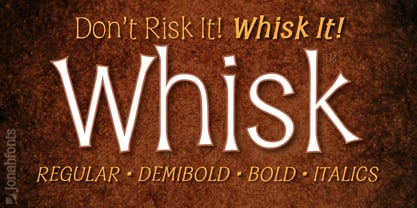 A whimsical font for packaging, logos, captions and greeting cards.
 - Akshar Unicode - Unknown license

- Deco Signage JNL by Jeff Levine,
$29.00 Deco Signage JNL was inspired by the cast metal letters of a German wall sign “Kaspar Stanggasinger-Haus” in an online display of European signage photography - and is available in both regular and oblique versions. Although the original age of the sign is unknown, the tall, thin monoline font it’s based on evokes a definite 1940s Art Deco design influence.
 - UNDERSTOOD by Studio Hello Good,
$12.00 Understood is a cool alternative for you to easily create a logo for your underground metal band. Using alternate front and ending letters brings the font to life, It comes with a basic character set and a small group of symbols and signs often used in the extreme music sector – the classics of Death- and Blackmetal like pentagram drops, roots, spikes and more.
 - Bubble Bloods by Hatftype,
$17.00 This is a blackletter display font with additional ornaments inspired by gothic and horror metal styles because its shape is very unique and very suitable for any project you will use with this theme. Features : Uppercase & Lowercase Multilingual support Number Symbol Ornament Punctuation Support in Mac and Windows OS Support in design application (photoshop, illustrator, and more) I really hope you enjoy it.
 - Old Chisholm JNL by Jeff Levine,
$29.00 An old brass stencil of the word 'large' was spotted for sale in an online auction. What set it apart from many other vintage stencil items was the beautiful, hand-punched Western letters with a diamond-shape center. Those five letters served as the basis for Old Chisholm JNL, which retains the look and hand-made charm of the original metal stencil.
 - Sub Train by Olivetype,
$18.00 Inspired by the punk and metal scene in the ’80s, this one-of-a-kind brush typeface is suitable for apparel, YouTube thumbnails, movies, album cover and so much more. Features : Basic Latin A-Z, a-z, numbers, symbols, and punctuations Sub Train is supporting 66 Languages: from Afrikaans Albanian Catalan Danish to Dutch English Spanish Swedish Zulu. Accented Characters : ÀÁÂÃÄÅÆÇÈÉÊËÌÍÎÏÑÒÓÔÕÖØŒŠÙÚÛÜŸÝŽàáâãäåæçèéêëìíîïñòóôõöøœšùúûüýÿžß Thank you
 - Talisman Warrior by Hatftype,
$17.00 This is a blackletter display font with additional ornaments inspired by gothic and horror metal styles because its shape is very unique and very suitable for any project you will use with this theme. Features : * Symbol * Number * Alternate * Punctuation * Multilingual support * Support in Mac and Windows OS * Support in design application (photoshop, illustrator, and more) I really hope you enjoy it.
 - Cycles by Stone Type Foundry,
$49.00 Cycles was designed for use in books and other publications with lengthy texts and/or complex typography using different sizes of type. Different versions of Cycles have been designed which are optimized for setting at specific point sizes as was the practice in the days of metal type. Together with Stone Print, SFPL, and Arepo it makes up a superfamily of typefaces.
 - Wounds by Dawnland,
$29.00 Horror/Metal/Punk upper case only font with varied double letters (open type feature). Open type Latin Pro with alternate upper case using the lower case, and varied double letters for an even more genuine handwritten look. (Open type feature.) Ink on paper, carefully and meticulously touched up digitally so that all letters will look good printed in bigger sizes.
 - Virus by Phat Phonts,
$20.00It began as a series of photographs of the rusty metal brand names on old tractors in a museum. When I scanned the photos and began to trace the letters, I found the rust and deterioration created a level of detail which gave my letters a psychotic anger which, as an art director in an advertising agency, I closely identified with. - FranTique NF by Nick's Fonts,
$10.00The 1905 Barnhart Brothers & Spindler catalog featured an ultrawide face called "French Antique Extended". The letterforms have been faithfully rendered here, but this font’s kerning calls for a lot of overlapping and interlocking that the original cast-metal face wouldn't have been able to duplicate. Both versions of the font include 1252 Latin, 1250 CE (with localization for Romanian and Moldovan). - Zuboni Stencil by CastleType,
$59.00 Zuboni Stencil is a bold, uppercase typeface based on a Russian design from around 1920 (original designer unknown). Its extensive character set supports most European languages that use the Latin or Cyrillic alphabets as well as modern Greek.
 - LTC Athena by Lanston Type Co.,
$29.95 LTC Athena brings a somewhat “lost” hot-metal typeface back from obscurity into digital Opentype format. In fall 2012, printing historian Rich Hopkins contacted P22 type foundry regarding some inked type drawings he had just uncovered from his acquisition of the Baltimore-based “Baltotype” company some 20 years ago. It is a rare face whose original matrices were destroyed and thought fully lost. The drawings included a full upper and lower case set, numerals, basic punctuation, and alternate forms of some letters. The design is a narrow deco-flavored design from the 1950s with a curious avoidance of straight lines in the stems and main strokes. The face has been expanded to over 340 characters by Miranda Roth and includes ligatures as well as a full Pan-European character set. It is released through the Lanston division of P22 in consideration of its earlier incarnation as a metal typeface.
 - Deadwax by Prioritype,
$166.00 Deadwax - Death Metal Fonts This is it, the death metal font you are looking for with a brutal impression on each character. There are 3 styles where each letter is drawn one by one accompanied by loud music to get the feel. Very cool and suitable for design projects such as logos, clothing brands, posters, horror movies, album covers and many more and ready to be typed. Features: Uppercase, Lowercase, Numeral, Punctuation, Multilingual. Multilingual contained: Afrikaans, Albanian, Asu, Basque, Bemba, Bena, Breton, Catalan, Chiga, Cornish, Danish, Dutch, English, Estonian, Filipino, Finnish, French, Friulian, Galician, German, Gusii, Indonesian, Irish, Italian, Kabuverdianu, Kalenjin, Kinyarwanda, Luo, Luxembourgish, Luyia, Machame, Makhuwa-Meetto, Makonde, Malagasy, Manx, Morisyen, North Ndebele, Norwegian Bokmål, Norwegian Nynorsk, Nyankole, Oromo, Portuguese, Quechua, Romansh, Rombo, Rundi, Rwa, Samburu, Sango, Sangu, Scottish Gaelic, Sena, Shambala, Shona, Soga, Somali, Spanish, Swahili, Swedish, Swiss German, Taita, Teso, Uzbek (Latin), Volapük, Vunjo, Zulu. Thanks.
 - Metalista by Suitcase Type Foundry,
$39.00 The Metalista font was created as a sign of undying admiration for the persistence of heavy metal culture. The angled font of almost fixed width proportions combines capitals with small letters for more variety and better definition of individual letters. Stressing the horizontal strokes subdued the historical Gothic character and emphasized a more modern signature, which is far different from the majority of current attempts at a modern adaptation of Fraktur fonts. We offer Metalista in three styles, or rather widths to be exact: Speed is inspired by the whiplash pace of 70s and 80s speed metal, and can tell and perform a lot even in a very small space; uncompromising Death balances on the fine line between expression and readability; and Metalista Black is the universal go-to, whether as megalomaniacal titles sprawled across the entire LP cover or as tiny texts for glam rock CD booklets.
 - Happy Holidays by Comicraft,
$19.00 Back in 2006 when we first released our Happy Holidays font, we thought the War on Christmas was over! We'd taken down our Menorahs, our Christmas trees, reclining Buddhas and red, black and green Kwanzaa decorations, and were prepared to sprinkle nothing more than a little Season's Greetings over our end of year celebrations. When we saw our friends and neighbors at department stores, we'd greet them with a simple, cordial, non-denominational “Happy Holidays.” But the font showed up at our company party this year having learned over 200 new languages (and, it must be said, a little bit loaded on Stylistic Alternates) in a mood to celebrate EVERYTHING. It was wishing people happy Bodhi Day, Solstice, Festivus, you name it! It even brought (count 'em) THREE new outfits based on the colors of Christmas, Hanukkah and Kwanzaa. So may the designs on the cups of the hot beverages that take you through the long dark coffee break of the soul that stretches from Halloween to Thanksgiving to New Year's Day be a little more festive this year with the refreshed, Remastered, all-inclusive spirit of Happy Holidays!
 - Cyan by Wilton Foundry,
$29.00The design of Cyan was inspired by features found in classic Roman and styles like Trajan and Bodebeck. It shows the designer's personal preference for geometric Roman proportions while incorporating open centers (B,P,R) and compact serifs. Unlike Trajan, Cyan has lowercase characters in the regular version. The characters stay true to the same features as the capitals, resulting in an unusually distinctive style. The Regular Capitals version contains Roman numerals. Cyan's weight is similar to Trajan's but the horizontal strokes are slightly bolder resulting in better legibility for small sizes, especially for lowercase characters. There are many subtle details in Cyan that become more interesting in larger sizes, for instance the subtle curves in the serifs and the overall smoothness as a result of the mostly rounded angles. Cyan is a robust font that will exceed expectations in areas never explored before. The name is inspired by the Greek word cyan, meaning "blue". The color cyan can have many different variations. One definition is a color made by mixing equal amounts of green and blue light (it also is a pure spectral color). As such, cyan is the complement of red: cyan pigments absorb red light. Cyan is sometimes called blue-green or turquoise and often goes undistinguished from light blue. Obviously the Cyan family is a perfect companion to the Cyan Sans family. - Care Bear Family - Unknown license

- Charmelade by Bogstav,
$17.00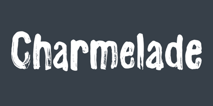 Another handmade brush font with that lovely green and organic feeling! :)
 - Leisurely by Bogstav,
$17.00 Think green and help save the planet - start using this font!
 - Fairbank by Monotype,
$29.99Monotype Bembo is generally regarded as one of the most handsome revivals of Aldus Manutius' 15th century roman type, but the original had no italic counterpart. The story is told that Stanley Morison commissioned Alfred Fairbank, a renowned calligrapher, to create the first italic for Bembo, which was released as metal fonts in 1929. Alfred Fairbank, however, claimed that he drew the design as an independent project and then sold his drawings to Monotype. According to him, the statement has been made that I was asked to design an italic for the Bembo roman. This is not so. Had the request been made, the italic type produced would have been different." Whichever version you believe, it was obvious that Fairbank's design - while undeniably beautiful - was not harmonious with Bembo roman. A second, more conventional italic was eventually drawn and added to the Bembo family. Fairbank's first design, which was based on the work of sixteenth-century writing master Ludovico degli Arrighi, managed to have a modest life of its own as a standalone font of metal type. It never made the leap into phototype fonts, however, and the face could have been lost, were it not for Robin Nicholas, Monotype Imaging's Head of Typography in the United Kingdom, and Carl Crossgrove, a senior designer for Monotype Imaging in the US. Nicholas and Crossgrove used the original drawings for Fairbank as the starting point for a new digital design, but this was only the beginning. They improved spacing, added subtle kerning and optimized the design for digital imaging. In addition, Nicholas created an alternative set of lowercase letters, fancy and swash capitals and enough alternate characters to personalize virtually any design project. By the time his work was complete, Nicholas and Crossgrove had created a small type family that included Fairbank, a revived version of the earlier metal font, and Fairbank Chancery, a more calligraphic rendition of the design. An additional suite of ornate caps, elegant ligatures, and beginning and ending letters accompanies both fonts, as does a full complement of lowercase swash characters. Now, instead of a failed Bembo italic, Fairbank emerges in its true glory: a sumptuous, elegant design that will lend a note of grace to holiday greetings, invitations, and any application where its Italianate beauty is called for." - Hydrargyrum by Type Minds,
$15.00 Hydrargyrum is the Latin form of a Greek word meaning "liquid silver" - mercury. The Hydrargyrum typefaces are designed with characteristics both of a metal and a liquid. The basic shapes of the letters are generally rigid and rectangular (particularly in style C), but the forms are enhanced by fluid curves and gently rounded corners. Hydrargyrum is not recommended for use at small sizes or in lengthy passages of text. It performs best in display-sized settings. Hydrargyrum consists of three styles, each in medium and semibold weights with matching obliques. The A style features solid, standard letterforms including the two-story a and g. Style B substitutes the a, g, M, and N (and related glyphs including numero and trademark symbols) for alternate shapes. The third subfamily takes the rectangular theme to an extreme, eliminating as many slanted strokes as possible from the letterforms. This makes some C-style letters ambiguous with one another, such as the U's and V's. As such, the C style is best used carefully even at larger sizes. The Hydrargyrum fonts are style linked within each style subfamily with, for example, Hydrargyrum A Medium as the regular style, Hydrargyrum A Medium Oblique as the italic, Hydrargyrum A SemiBold as the bold option, etc.
 - Ongunkan Phrygian by Runic World Tamgacı,
$50.00 Phrygia is the Greek name of an ancient state in western-central Anatolia (modern Turkey), extending from the Eskişehir area east to (perhaps) Boğazköy and Alishar Hüyük within the Halys River bend. The Assyrians, a powerful state in northern Mesopotamia to the south, called the state Mushki; what its own people called it is unknown. We know from their inscriptions that the Phrygians spoke an Indo-European language. Judging from historical records supported by ceramic evidence, settlers migrating from the Balkans in Europe first settled here a hundred or more years following the destruction of the Hittite empire (ca. 1200 B.C.). Most of what is known about Phrygian archaeology and its language derives from excavations at the capital city Gordion, located about 60 miles southwest of the modern Turkish capital of Ankara (also a Phrygian site). Gustav and Alfred Körte first excavated Gordion in 1900. The excavators did not reach Phrygian levels, but they did reveal burials dated to the late eighth century B.C. with Phrygian ceramic, metal, and wooden artifacts. From 1950 to 1973, Rodney S. Young of the University of Pennsylvania led excavations at Gordion. Archaeological work at the site resumed in 1988 and continues to the present.
 - Press Gothic by Canada Type,
$24.95 Press Gothic is a revival of Aldo Novarese's Metropol typeface, released by Nebiolo in 1967 as a competitor to Stephenson Blake's Impact (designed by Goeffrey Lee). Though Metropol enjoyed a few short months of popularity and use in Italy, Germany and France, Impact won the technological outlasting battle by moving on to film type then to computer outlines bundled with mainstream software, while Metropol never made it past the metal state until now. Too bad really, since this is one of the few faces that could have played well with all the horrendous stretch'n'squeezing of the 1970s. Just like its inspiration, Press Gothic aims to be a fresh alternative to big economical poster fonts with clear sans serif forms and an urgent, strong, yet elegant design appeal. In the summer of 2008, Press Gothic underwent a major linguistic and aesthetic reworking for an international publishing company. The result of this on the retail side are new small capitals and biform/unicase additions to the main font, as well as expanded language support that includes Cyrillic, Greek, Turkish, Baltic, Central and Eastern European, Maltese, and Esperanto. Press Gothic Pro, the OpenType version, combines all three fonts into one, taking advantage of the small caps feature, and the stylistic alternate feature for the biform shapes.
 - Flanker Tanagra by Flanker,
$12.00 In order to give new imput to the art of typeface design in Italy, Nebiolo Company held, in March 1910, an artistic competition for a new alphabet conception, so the best-ranked design would be transformed into a real new typeface. 42 competitors participated and, although the first prize was not technically awarded, "Ancora" resulted as the best typeface, created by the designer-typographer Natale Varetti of Turin. Nonetheless, the new alphabet was transformed into a full-fledged metal typeface in 1924, renamed "Tanagra" in honor of the Greek city in the center of Boeotia. The new font, although not significantly detached from the classical Roman form, introduced decorative elements that allowed its use in both rational and artistic compositions. This font appears very clear and easy to read, with very high ascenders and some decorations that make it distinctly retrò. Finally, after almost 100 years, this peculiar character has been digitized taking it as a model the shapes of the 16 points size (other dimensions have significantly different contrasts and proportions). To adapt it to modern use, some glyphs have been modified, but all the originals are available as Stylistic Alternate OTF, as well as all the swashed variants while the missing ones were added.
 - Lithos by Adobe,
$35.00Old Greek inscriptions were Carol Twombly's inspiration when she created Lithos, which appeared with Adobe in 1990. The alphabet is composed exclusively of capital letters, which can also be used as initials combined with other fonts, such as Caslon. - The Crew Pro by The Type Fetish,
$25.00 The Crew Pro is based on the logo of the seminal punk band 7 Seconds. It was expanded to include extended Latin, extended Cyrillic and Greek alphabets so it will work with most languages in Europe and the Americas.
 - G&G by Woodside Graphics,
$19.95G&G is the only authorized digitized version of the original handlettering of early 20th Century architects Charles and Henry Greene. This font is both accurate and authentic -- it was adapted directly from the Greenes' original plans for The Gamble House in Pasadena, California, and others. G&G contains both Upper and Lower-case characters, consistent with the Greenes' use of lower-case to explain fine construction details on their plans. G&G is very successful in creating the illusion of hand lettering. - Paula Fluiton by Raditya Type,
$12.00 Paula Fluiton is a font in an elegant signature style. This typeface is suitable when used for writing a brand name, as a logo or naming a product. When used for an invitation or greeting card, it will make the greeting you write more beautiful and luxurious.
 - Annabel Lee by Jonahfonts,
$25.00 A rounded-joined-script font, well suited for invitations and greeting cards.
 - Esquina by Green Type,
$37.00 Esquina is a family of octagonal slab serif fonts. Designed for use in outdoor advertising, branding, packaging. Esquina is also ideal for sports related materials such as team logos, flyers, posters and more. Esquina contains Latin, Cyrillic and Greek glyphs.
 - Akakios by Nantia.co,
$12.00 Akakios uppercase font is an adorable hand-made typeface with a lot of charisma. From “hand-written” quotes to product packaging, merchandise, and branding projects, this font is so versatile that it can cover them all. Greek character set included.
 - Dez Weimar Plakat Pro by Dezcom,
$20.00 Dez Weimar Plakat Pro was inspired by a 1923 Weimar Bauhaus exhibition poster. It is in strict keeping with Constructivist rectilinear thought of that time. Dez Weimar Plakat Pro includes multiple language support including Greek and Cyrillic-- contains nearly 800 glyphs.
 - Submarine Beach by Brittney Murphy Design,
$12.00 Submarine Beach is a funloving & carefree mono height font with alternates and ligatures. Mix and match between upper and lowercase and alternates for a custom look! With over 500+ characters, the font includes extended Latin as well as Greek and Cyrillic.
 - Kaaos Pro by The Type Fetish,
$25.00 Kaaos Pro is based on the logo of the Finnish hardcore band of the same name. It was expanded to include extended Latin, extended Cyrillic and Greek alphabets so it will work with most languages in Europe and the Americas.
 - Franklin Gothic by ITC,
$57.99This version of ITC Franklin Gothic contains a PanEuropean character set supporting Greek and Cyrillic languages, in addition to Western, Central and Eastern European languages. Customers seeking a Franklin Gothic that matches the Microsoft Windows version should select this version. - Chalky Letters by DimitriAna,
$22.00 Chalky Letters is a multilayered font collection, created for the chalk-lettering lovers. Letters and ornaments are carefully hand-drawn to resemble the authentic chalk effect. 4 different vintage typographic styles along with a variety of decorations and shadow effects make endless combinations. The collection gives the designer the freedom to use it in any typographic project he can imagine: greeting cards, labels, large scale prints, branding, packaging, signage, editorial design. Typographic styles: Chalky Letters Heading: All caps, old fashioned, serif, with 2 styles of decoration and shadow effects Chalky Letters Label: All caps, heavy, serif, vintage, solid and outline, with 4 styles of decoration and a shadow effect Chalky Letters Script: Simple modern calligraphic with terminal forms and 2 alternate styles of descenders. Combined with a shadow effect. Chalky Letters Note: All caps, simple, thin, old fashioned, with a shadow effect Chalky Letters Extras: 2 styles of ribbons, frames and ornaments. The font collection supports Central, Eastern, Western European, Baltic, Turkish and Greek languages.

