10,000 search results
(0.032 seconds)
- Tuna and Hot Dogs on Rye - Personal use only

- Anderson Dings 2 - Unknown license

- It Ain't Rocket Science - Personal use only

- Antique Borders & Corners 2 by Aerotype,
$29.00
- Joyscript Two by Jonahfonts,
$35.00
- Funtasy by Mirror Types,
$20.00
- Binia by Agnieszka Ewa Olszewska,
$15.00
- Antique Borders & Corners 1 by Aerotype,
$29.00
- GHEA Ayb by Edik Ghabuzyan,
$40.00
- Curator by Etewut,
$40.00
- RM New Albion by Ray Meadows,
$19.00
- GHEA Shooter by Edik Ghabuzyan,
$40.00
- Roemisch by Linotype,
$29.99 - Chubbet Distended by Emboss,
$25.00
- Apres RE by Font Bureau,
$40.00
- Modesto by Parkinson,
$25.00
- Ruling Script by Linotype,
$29.99 - Ongunkan Rhaetian Script by Runic World Tamgacı,
$60.00
- PAG Demokratie by Prop-a-ganda,
$19.99 - PAG Norm by Prop-a-ganda,
$19.99 - Cocaine Nosejob - 100% free

- Movie Star - Unknown license

- Frequency Mod - Unknown license

- SquircleCirquare - Unknown license

- Victim - Unknown license

- Beauty Luxury by Nirmana Visual,
$24.00
- Amphibia by Storm Type Foundry,
$53.00
- Invoice by MADType,
$21.00
- RM Victoriana by Ray Meadows,
$19.00
- Amore by ParaType,
$30.00
- Submarine Beach by Brittney Murphy Design,
$12.00
- Katydid JNL by Jeff Levine,
$29.00
- Aeron by District,
$15.00
- Seleniak by Crestaco,
$19.00
- Inked Classic by Adam Ladd,
$25.00
- 4 Point Greek Fret by Deniart Systems,
$20.00
- Just Realize by Kimberly Geswein,
$5.00
- Shenandoah Clarendon by Megami Studios,
$7.50
- Hellshock by Comicraft,
$19.00
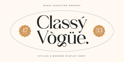
- Classy Vogue by Variatype,
$25.00