10,000 search results (0.027 seconds)
  1. SF Pale Bottom Extended - Unknown license
  2. SF Square Root Extended - Unknown license
  3. SF Port McKenzie Extended - Unknown license
  4. SF Chrome Fenders Extended - Unknown license
  5. SF Port McKenzie Extended - Unknown license
  6. SF Minced Meat Extended - Unknown license
  7. SF Chrome Fenders Extended - Unknown license
  8. SF Groove Machine Extended - Unknown license
  9. SF Arch Rival Extended - Unknown license
  10. SF Atarian System Extended - Unknown license
  11. SF Solar Sailer Extended - Unknown license
  12. SF Groove Machine Extended - Unknown license
  13. SF Square Root Extended - Unknown license
  14. SF Fortune Wheel Extended - Unknown license
  15. SF Pale Bottom Extended - Unknown license
  16. SF Solar Sailer Extended - Unknown license
  17. SF Shai Fontai Extended - Unknown license
  18. SF Atarian System Extended - Unknown license
  19. SF Atarian System Extended - Unknown license
  20. SF Outer Limits Extended - Unknown license
  21. SF Shai Fontai Extended - Unknown license
  22. PF Tempesta Five Extended - Unknown license
  23. PF Tempesta Seven Extended - Unknown license
  24. SF Minced Meat Extended - Unknown license
  25. SF Comic Script Extended - Unknown license
  26. 20th Century ExtraBold Extended by Wooden Type Fonts, $20.00
    A version of Futura, but very bold, ideal for modern advertising.
  27. Monotype Egyptian 72 Extended by Monotype, $29.99
  28. HWT Roman Extended Fatface by Hamilton Wood Type Collection, $24.95
    The design of the first "Fat Face" is credited to Robert Thorne just after 1800 in England. It is considered to be the first type style designed specifically for display or jobbing, rather than for book work. The first instance of Fat Face in wood type is found in the first wood type specimen book ever produced: Darius Wells, Letter Cutter 1828. This style was produced by all early wood type manufacturers. The style is derived from the high contrast, thick and thin Modern style of Bodoni and Didot developed only decades previously. The extended variation makes the face even more of a display type and not at all suitable for text. This type of display type was used to compete with the new Lithographic process which allowed for the development of the poster as an artform unto itself. This new digitization by Jim Lyles most closely follows the Wm Page cut. The crisp outlines hold up at the largest point sizes you can imagine. This font contains a full CE character set.
  29. HWT Roman Extended Lightface by Hamilton Wood Type Collection, $24.95
    The Roman alphabet has seen endless variations in interpretations of its classical form, and various wood type styles managed to explore everything from XXX condensed to hyper extended and expanded. This delicate and handsomely proportioned extended Roman was issued by Page Manufacturing Co. in 1872 and released as simply “No. 251” after Page was acquired by Hamilton. It is a rare font to find in print shops, most likely due to the very fine lines that would no doubt be less durable that bolder gothic jobbing fonts. While being quite wide, it still holds the elegant grace of wide Romans such as Craw Modern. This new digitization features a full Western and Eastern European Character set as well as ligatures and alternate characters.
  30. Faqro Extended Wide Trial - Personal use only
  31. Ame Chan Pop Maru by Norio Kanisawa, $40.00
    I make this font imaging rounded candy, this theme is cute and round but you can use scenes less often. Because the circle is interrupted in places such as voiced points and parts of kanji(chinese characters), it may be fun to look for it. It corresponds to Hiragana · Katakana · Alphabet · Numerals · Symbols · Kanji(chinese characters). You can also write vertically. You can use it easily, because it contains JIS first · second level, and IBM extended Kanji(about 6700chinese characters). This font is bold, recommended to use it for headlines and prominent places. It might be good for shop pop etc. Because it is soft, pop and cheerful impression, I recommend it for contents for children. About the name, I like Osaka, and I thought "This font's name that is loved by everyone", and since the sound is also cute, I attached the word "Amechan". I heard they called candy as "Amechan" in Osaka, and some madam in Osaka always have candy, and give it to people. I think this font gives happy feeling to you and people look it, like madam in Osaka gives "Amechan". <「あめちゃんポップ まる」紹介文> ころころ丸っこい飴玉をイメージして、「丸くてかわいいけどシーンをあまり選ばずに使えるフォント」をテーマに作りました。 濁点や漢字の一部など、所々に丸がまぎれてますので、探してみるのも楽しいかもしれません。 ひらがな・カタカナ・アルファベット・数字・記号類・漢字に対応。縦書きもできます。 漢字はJIS第一水準・第二水準・IBM拡張漢字(約6700文字)に対応しているので、使いやすいかと思います。 太めのフォントなので、見出しや目立つ場所に使うのがオススメです。お店のポップなどにもいいかもしれません。 柔らかくポップで元気な印象なので、子供向けのコンテンツにもオススメします。 名称については、大阪が好きなのと「皆に愛されるような名前を」と思って、響きも可愛いので「あめちゃん」という単語を名前につけました。 大阪では飴のことを「あめちゃん」と言うらしく、大阪のおばちゃんの中にはいつも飴を持っている方もいるそうで、色んな人にその飴をあげるそうです。 大阪のおばちゃんが「あめちゃん」をくれる時みたいに、使ったり見てくださる方の心があったかくなるようなフォントになればいいなぁ、と思います。 <スタイルカテゴリー> ファンシー、装飾
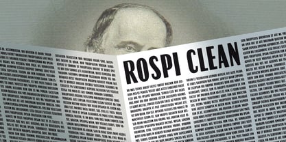
  32. Rospi Clean and Retro by Typoforge Studio, $20.00
    Rospi Clean and Retro Family is two-element font inspired by the weekly "Tygodnik Ilustrowany” from the 1933.
  33. WATERCOLORS CLEAN PERSONAL USE - Personal use only
  34. Robotaur Expanded - Unknown license
  35. MKaputt-Expanded - Personal use only
  36. Pixeldust Expanded - 100% free
  37. Uberhölme Expanded - Personal use only
  38. Engebrechtre Expanded - Unknown license
Looking for more fonts? Check out our New, Sans, Script, Handwriting fonts or Categories
abstract fontscontact usprivacy policyweb font generator
Processing