10,000 search results
(0.03 seconds)
- Celebrity by Canada Type,
$24.95 Celebrity is a new execution of a film type concept put forth by Willy Wirtz in 1971. The original idea, called Latus, had many irregularities and unfit characters that are now fixed and expanded in this digital version. Celebrity's construct combines extreme thicks with hairline thins to build forms that contribute to a type totality that is at once modern and techno, as well as retro-deco. Eye catching and memorable, Celebrity is ideal for use on posters, book covers, media sleeves and packaging. It also has enough geometric appeal to inspire unique logos and set attractive titling. Celebrity comes in all popular font formats, and includes a very expanded Latin character set.
 - Hertical by Edignwn Type,
$12.00 Hi everyone, how are you today? We hope you are good. And don’t forget to stay safe. Today we release a crafted display font again, it's called Hertical. Hope you are enjoy the design of font. Hertical come with two typefaces, serif and sans serif. Every typeface contains four styles (regular, smooth, rough and texture). This matches applies in some designs such as the logotype, poster, label, badge, packaging, branding, quotes and more custom design. Hertical includes : 2 typefaces (serif and sans serif) 4 style typefaces (regular, smooth, rough and texture) All-caps, numeral, symbol and punctuation 2 sets alternates on serif font Multilingual PUA Encoded Thank you for your support and choosing us.
 - Franklin Gothic Raw Semi Serif by Wiescher Design,
$19.50 When drawing a new font, there is a time when the final form is found – almost – but the curves are not slick and clean yet, that's what I call the "raw" form. Raw – no sweeteners added! In this family I redefined this moment in type development for the eternally beautiful "Franklin Gothic". I call the design "Franklin Gothic Raw". This packet is the semi-serif addition. There never was a Franklin-Gothic with serifs but actually the font lends itself perfectly to a slab-serif. I started with adding a half serif and eventually add a full slab-serif later on.
 - Biscuits And Spam by Kitchen Table Type Foundry,
$10.00 I remember that my auntie once made a dish called ‘Macaroni and Smac’. It consisted of little ‘elbow’ macaroni, Spam (which in Holland was called Smac), cheese and ketchup. I am sure it didn’t contain on of your five a day, but it was delicious. As far as I know, I have eaten it only once, but it did make a lasting impression! Biscuits & Spam is a handmade ‘Western’ style font, which I found in my ‘unfinished fonts’ folder. It comes with multilingual support, a full set of alternates for the lower case letters and a really happy vibe.
 - Chateau by Wilton Foundry,
$29.00 On the one hand Chateau is almost palatial but at the same time it has a quite earthy personality as represented by the stenciled strokes. However, this stencil effect serves to refine the strokes by creating the illusion of a completed thin stroke. Chateau is more of a hybrid roundhand script with its contrasting ornate capitals. Originally a fortified residence in France was called a Chateau. Today there are many estates with true Chateaux on them in Bordeaux, but it is customary for any wine-producing estate, no matter how humble, to prefix its name with "Chateau". This is true whether the building itself is a magnificent palace or a shack. The distinctive chateau architecture was in inspiration for the name of this script. Chateau is ideal for packaging design, invitations, announcements, headlines, brochures, menus, weddings, scrapbooking, etc. Chateau is available in Opentype, Postscript and Truetype for Macs and PCs.
 - Shàngó Gothic by CastleType,
$59.00 Shàngó is CastleType’s beautifully-rendered interpretation of Professor F.H.E. Schneidler's elegant titling typeface released in 1936 with the name 'Schneidler-Mediaeval mit Initialen'. This latter design is usually referred to as Schneidler Initials. Although early on Medium and Bold weights were added to the somewhat delicate design of Shàngó, it seemed there were other possibilities that might be useful for display use. So, for the last couple of years I have been working on and off on a monoline version of Shàngó. This new design maintains the classic letterforms of the original, but its relatively even strokes gives it a more solid appearance, making it useful where a more modern, masculine look is needed. This new family is called Shango Gothic and is available in four weights: Regular, Medium, Bold, and Extra Bold. Shàngó Gothic is a member of the extended Shàngó family (Classic, Chiseled, Sans, Gothic).
 - Geographica by Three Islands Press,
$29.00 Thomas Jefferys (ca. 1710–1771) was the best-known map maker in 18th-century England, chiefly because he won (and hyped) the title “Geographer to King George III.” Jefferys was really more an engraver/publisher than a geographer, since he mostly relied on the cartographic materials of others. Still, his maps of the North American colonies were well known. Geographica is a legible, four-style serif family modeled after the neat hand-lettered place names and peripheral text on Jefferys’s maps. With its long serifs, tall x-height, and robust curves, Geographica somehow combines classic elegance with a whiff of coastline and sea. The italic styles have the slant and warmth of the hand-drawn source materials. And the typeface comes with a slew of distinctive map-based ornaments—including compass wheels and sailing ships. This evocative serif works well in both display situations and long blocks of text, whether on paper or screen. OpenType features include small capitals, numerous ligatures, and two stylistic sets of titling caps. Geographica offers full support for Central and Eastern European languages—more than 1,200 glyphs in all.
 - Tertius by Scholtz Fonts,
$21.00 Tertius, with its high ascenders and clubbed serifs, is a modern interpretation of the classic Carolingian style (7th - 9th centuries AD). There was no capital form in the Carolinian hand and Roman square capitals were originally used with it. The Carolingian hand began, after a while, to develop more cursive tendencies as people looked for a way to speed up the writing process. I have “capitalized” on this trend and have devised an appropriate and dramatic set of flowing capitals for this family. With its elegant swashes and bold letter shapes, Tertius embodies the romance of medieval life, of knights, castles, and chivalry. Tertius comes in four styles:- -- Regular: with elegant, smoothly penned characters; -- Crenellated: written with a scratchy pen over rough parchment -- many drops of ink and blotches have been left on the parchment (“Crenellated” means battlements -- the rough protrusions on the top of castle walls); and -- Romantic: the capitals have been loosely overwritten generating a contemporary version of illuminated capitals. -- Illuminated: richly decorated illuminated capitals for use with Tertius Regular (28 characters) All fonts have been carefully crafted, letterspaced and kerned and contain full character sets of 237 characters.
 - Jute Basket by Yumna Type,
$12.00 A beautiful and easy-to-style font duo to elevate your design, Jute Basket. What sets this font duo is the display font that is made all in caps characters. This design choice is sure to give title and header text a big presence on any pages. Unlike the display style, the script font less domineering though you can use it to express a feeling of joy, cute, and serene You also get 15 illustrations as special extra that you can use as you wish. Features: Multilingual Supports Uppercase and lowercase PUA Encoded Numerals and Punctuation This font would looks great on your branding, logos, social media quotes, stickers, posters, wall art, merchandise, social media, and many more. Get more inspiration about how to use it by seeing the font preview. Thank you for purchasing our fonts. If you have any further questions, don't hesitate to contact us. Happy Designing.
 - Drug by Fatchair,
$9.95Drug is based on the distressed type found on a till receipt. - Bannetters by Ingrimayne Type,
$10.00 Bannetters (Banner Letters) was designed to alternate two letter sets. Both sets are formed on parallelograms, with one set of parallelograms sloped upward to the right and the other sloped downward to the right. When alternated, the result is a zigzaggy line of text. In applications that support the OpenType feature contextual alternatives (calt), the two sets of letters are automatically alternated. The Bannetters family has two styles, one with straight outer edges and the other that rounds these shapes for letters that have curved exteriors. Both styles are largely monospaced and monoline (not to mention weird, strange, and unusual). The tiling pattern of text created by Bannetters makes it attention-grabbing and appropriate for signage, posters, advertising, and other uses where eye-catching text is desired.
 - Weiss by Linotype,
$29.99The German poet, painter, calligrapher and type designer Emil Rudolf Weiß originally created this eponymous typeface for the Bauer Foundry of Frankfurt. Long known and loved by metal type enthusiasts under the name "Weiss Antiqua," this design was inspired by typefaces from the Italian Renaissance while still distinctly reflecting the artistic and poetic personality of its twentieth-century designer. Weiss has tall ascenders, sharp apex points, and a low-slung midsection on the caps. The italic moves like a classical ballerina. Weiss is one of the earliest contemporary serif types to have italics based on the chancery style of writing. The Weiss family works well for warmly legible text typography; and it's also an original choice for refined headline and display graphics." - ITC Vino Bianco by ITC,
$29.99ITC Vino Bianco was created by German designer Jochen Schuss. He drew his inspiration from the handwriting of the waiter in his favorite local pub, especially the form of the capital Q. Based on this one character Schuss developed the entire alphabet. The figures are sketchy and generous and look as though they were written on paper with a ball point pen. Vino Bianco is an alphabet of capital letters, each of which also has an alternative form, making it very flexible and true to the tendency of true handwriting. In spite of its fine strokes, the overall look is open and light due to the large amount of space each character occupies. The cheerful, carefree ITC Vino Bianco is best used for headlines and short texts. - Pavement - Unknown license

- Shelter Me - Personal use only

- LT Nutshell Library - Personal use only

- La Belle Aurore - Personal use only

- Ten Million Fireflies - Personal use only

- Sunshine In My Soul - Personal use only

- Contrary Mary - Personal use only

- Never Let Go - Personal use only

- P22 Canterbury by IHOF,
$49.95 Canterbury is a late Medieval Gothic font with a rough edge. This blackletter face is available with four different types of Capital initial letters or combined into one Opentype Pro font with all variations plus historic ligatures, alternates and even a few ornaments.
 - Crayon Crumble by Hanoded,
$15.00 Crayon Crumble is exactly what it reads on the package: it was made using cheap crayons, since the cheapies crumble a lot. It is a fun, kiddie font, with a grown-up look to it. Of course it comes with all the accents.
 - Sweet Mia by Angele Kamp,
$24.00 Sweet Mia is a playful modern calligraphy font with a dancing baseline. This sweet font has nice smooth lines and is perfect for crafters and cutting machines. Sweet Mia will look gorgeous on cards, mugs, quotes, logos and all your other lovely projects.
 - Estz by Jadatype,
$10.00 Estz is an All-Caps Font with a Modern feel. suitable for branding, logotype, technology stuff, modern & futuristic vibe, social media, products, and so on. contains standard English letters, numbers, punctuation, ligature, Italic version, and several accents that support multilingualism. Thank you!.
 - Eagle by Monotype,
$29.99Eagle Bold was designed by M.F. Benton in 1933. It is a heavy geometric Sans Serif font with unusual spurs on Capital G and Q. An all-Capitals design, the Eagle Bold font is perfect for magazine and book covers, posters and packaging. - Stellator JNL by Jeff Levine,
$29.00The future is now with Stellator JNL! With all the clean lines and styling one would expect of a futuristic or space age font, your design projects will have a simple, yet effective type design that conveys modern technology and interplanetary travel. - Lindore by Irina Vascovet,
$16.00 Lindore is a handwritten pointed pen calligraphy script that has a fun and whimsical personality. Perfect for posters, wedding invitations, and all of your favorite quotes! We would love to see how you use the font! Use #lindorefont to tag us on Instagram!
 - Allez Hop by Hanoded,
$15.00 Allez Hop is a very useful font: it comes with all accents, bells and whistles and has been created using scans of handwritten text. It has a certain 'quickness' to it, not unlike someone jotted down a couple of lines on a notepad.
 - Yenda by Deniart Systems,
$20.00 Yenda is a bold angular font with just a bit of swoosh. Great for short text and headlines! Don't leave this one out of your next sci-fi or bold designs! This typeface includes all the special diacritics required for European languages.
 - Oksana Text Swash Cyrillic by AndrijType,
$25.00 These Oksana Text Swash Cyrillic fonts have swashed initials and ampersand for Oksana Text italics in six weights from Thin to Black. They support basic Latin and European Cyrillic. For all-in-one fonts please look at that OpenType version of Oksana Text.
 - Headlock by Hanoded,
$15.00 Headlock is a handmade serif. My 6 year old son just had his first real Judo exam and the one thing he excels at is the headlock. Headlock comes with double letter ligatures and all the diacritics you need, plus basic Cyrillic!
 - Pink Chicken by Scratch Design,
$9.00Pink Chicken is a cute handwritten font, this font is complete all punctuations and multi-languages support. Pink chicken has an authentic casual shape so this design will applicable on any occasion design. Enjoy this font, its also support for mac and windows. - Crown Heights JNL by Jeff Levine,
$29.00Named for his childhood neighborhood in Brooklyn, NY, Jeff Levine's Crown Heights JNL is a lightline all-caps titling font excellent for short words or phrases. Its inspiration is remotely based on the symmetry of earlier designs such as Beton and Stymie. - Lightover by Sakha Design,
$12.00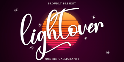 Lightover is a modern handwritten font. Lightover will look outstanding in any context, whether it’s being used on busy backgrounds or as a standalone headline! This font is PUA encoded which means you can access all of the glyphs and swashes with ease!
 - Dash Grid by Gleb Guralnyk,
$13.00 Hi there, introducing an abstract font named Dash Grid. At's a geometric display typeface made of square dashed blocks. Dash Grid font supports most of the european latin languages and includes ukrainian cyrillic alphabet (check out all available characters on the last screenshot).
 - Carot Sans by Storm Type Foundry,
$39.00 Carot Sans is designed on the basis of three elements - square, circle and triangle. Simple and fresh typeface for visual identities, book covers, magazines and advertisement. The whole Carot system of 64 members offers a modern alternative for all types of design work.
 - Diaper Money by Fonthead Design,
$19.00On October 15, 2006 we became proud parents of three babies. To commemorate (and help pay for diapers) I decided to release this baby-themed dingbat set. All proceeds for the next few years goes to pay for lots and lots of diapers. - Ollie by Eclectotype,
$40.00 Meet Ollie, a casual signage script whose friendly, bouncy exterior belies a heart of sophisticated OpenType programming. This font is designed to make the most of OpenType savvy applications, and as such is recommended for professional design use. Or to put it another way: Make sure that contextual alternates and ligatures are always turned on! Ollie includes about 900 glyphs, many of which are automagical substitutions to keep the text flowing smoothly, and to pseudo-randomly pick different glyphs to avoid repetition. With contextual alternates turned on (as they should be by default), most lowercase letters will alternate between at least two different forms. The powerful OpenType programming makes the font itself ‘look back’ (up to eight characters) on previously used letters; typing “banana” will give you three different a’s and two different n’s (the last a is a special ‘end form’ character). The calt feature controls many other ‘special effects’ which all add together to give a smooth-flowing, hand-lettered look. These effects include start and end forms (and indeed, ‘loner’ forms) of many letters, which are automatically substituted in at beginnings or ends of words, or when the previous or next letter doesn't connect. Another special feature tests to see if there is room for the crossbar of t (or tt ligature) to extend further over the previous or next letter, or both, as is often the case. The last main effect of the calt feature is to substitute certain letters typed before any ‘e’ character, to make for a more natural connection (see the pe combination in ‘Eclectotype’ in the first poster). Ligatures should be on by default, for a much nicer looking tt combination, and a few others besides. The swash feature should be used sparingly (one glyph at a time, really) to apply a more extravagant look to g,j and y in the lower case, and quite a few of the upper case too. Oldstyle figures are included, as well as the lining defaults. Now to delve into the stylistic alternates... These are all included in the salt feature, or for uses of applications that support them, separated into stylistic sets thus: ss01 - (with swash feature on) L and G swashes get even swashier. ss02 - standard s changes to a connected script s form. ss03 - r takes on a script form. ss04 - z also gets a scriptier look. [the previous three sets also change any versions of s, r or z with diacritics] ss05 - a useful underline function. When enabled, typing two or more underscores will extend a cool underline under the previous letters. More underscores = longer underline. ss06 - the Polish script lslash changes to its more standard form. ss07 - E, S and B change to a more top-heavy alternate form. ss08 - An alternate form for A characters. ss09 - Alterative rounder forms of M and N. ss10 - An alternate ampersand. That about wraps up the features. Now all that’s left is for you to license the font and get experimenting!
 - Apollyon™ - Unknown license


