10,000 search results
(0.04 seconds)
- Globet - Personal use only

- Gyroscope by Milan Pleva,
$18.00 Gyroscope is an all caps display font duo consisting of two styles - Serif and Sans Serif. Both of them can also be bought separately. Gyroscope has elegant and well balanced curves of letters perfect for logos, headlines, magazines, or even longer texts. There are selected ligatures you can use for a better look. Features: 2 Styles: Gyroscope Sans & Gyroscope Serif Basic latin alphabet A-Z 43 Ligatures & Alternates 56 Accented characters Numbers, Punctuation, Currency, Symbols, Math symbols & Diacritics Old style figures Case sensitive glyph Enjoy Gyroscope!
 - P22 Brass Script by IHOF,
$39.95 P22 Brass Script is a new font from an old source. This script font was discovered in a booklet from Dornemann & Co. of Magdeburg Germany, circa 1910. The book was titled Messingschriften fur Handvergoldung, which roughly translates to “Brass types for hand foil stamping.” The mini catalog called this type simply “Script.” It has not been previously digitized or seen in standard metal type form. The antique specimen book featured most of the characters needed for a full alphabet, but a number of letters were not shown. Since no other examples of this style could be found, P22 enlisted the assistance of master calligrapher Michael Clark to draw the missing characters in the same style as the original. The style is very loosely based on the secretarial hands and reminiscent of “French Hand” with a very early 20th century, pre-modern feel. It has an unusual flow that is neither too casual nor too formal. The font would be useful for wedding invitations or packaging and advertising. P22 Brass Script Pro features include: automatic ligatures for common pairs such as ll, tt, qu and a variety of f ligatures, full CE language support including Turkish and Romanian and a variety of swash underscores for different length words that can be added manually in OpenType ready applications with the glyph palette or with the contextual alternates. The length of the word will automatically select the best length of swash for the work.
 - Fathir Script by Abo Daniel,
$15.00 Fathir is made with a true real handwritten style. The font comes with three style of titling and ending swash. It is very easy to access the swash characters even if you don't use pro software. The sample images show you the possibilities. Fathir is perfect for branding, quotes, logo, invitation, packaging, business card, and more. I hope you love this lovely font. Regards, Abo Daniel
 - CamingoDos Condensed by Jan Fromm,
$45.00 CamingoDos Condensed was designed to achieve a more powerful impact for the use in headlines. The compact appearance and the tight letter spacing makes it an ideal solution for display settings on a limited space. CamingoDos Condensed comes with a Pro version that offers a rich set of expert typographic features like small caps, ligatures, stylistic alternates, different figure sets, arrows, fractions and ordinals.
 - Arethusa by AVP,
$14.99 Arethusa is a versatile font after the 'transitional' style – a style that has been evolving for 250 years. The balanced design of familiar letter forms blends form with function to create highly readable text. Twelve fonts organised in three sub-families provide a range of weights and styles. The standard character set covers many roman-based languages. For extended language support, see Arethusa Pro.
 - PF Fusion Slab by Parachute,
$40.00 Fusion Slab was developed based on Fusion Sans Pro, as an amalgamation of traditional early nineteenth-century letters. Fusion Slab is a family of 3 weights with very tall x-height which is suitable for long headlines. On the other hand, its ascenders and descenders are extremely short so text lines can be set with a very low leading value. It provides support for Latin and Greek.
 - Pragmata by FSD,
$59.00 2001 description: No monospaced typeface I used for coding development or just plain e-mail correspondance satisfied me in aliased mode. All common monospaced fonts have hinting imperfections from 9 to 12 points and above. All but Pragmata. 2021 description: Pragmata is still a good font for graphic design. Take a look at Pragmata Pro if you looking for a perfect and complete antialiasing coding font
 - TT Nooks by TypeType,
$39.00 TT Nooks useful links: Specimen | Graphic presentation | Customization options TT Nooks is an experimental font family that includes a high contrast serif, TT Nooks, and an upright italic, TT Nooks Script. Despite the difference in style, both subfamilies get along well, which is partially thanks to their similar proportions. Each of the subfamilies includes 4 weights: Light, Regular, Bold and Black. The main subfamily is TT Nooks—a stylish high-contrast serif with a light touch of self-centeredness. If TT Nooks were a person, it would be an elegant lady with an independent and firm personality. In the original sketches of TT Nooks there were traces of a broad pen, but in the course of further evolution the typeface moved away from this style, retaining only the high contrast of strokes. In addition, in the process of design searches TT Nooks has obtained a touch of geometricity. The serifs in TT Nooks stand out especially visibly thanks to their geometric shape that resembles slippers. In addition to their peculiarity, such serifs add stability to the font and allow better compensation of the black and white ratio within the letters. TT Nooks has small capitals for Latin and Cyrillic alphabets, as well as a set of stylistic alternates (including some figures) that makes the typeface a bit more geometric. In addition, we have drawn more than 25 ligatures, including ligatures for capital letters, slashed zero and many other useful OpenType features. TT Nooks Script is a complementary family designed to harmoniously extend the main family and expand its scope. The forms of the characters in bold and light fonts of TT Nooks Script are quite different. For example, Black & Bold have high contrast strokes and an open aperture, and in Regular & Light the aperture of the characters is closed. TT Nooks also has small capitals for Latin and Cyrillic alphabets, ligatures, oldstyle figures and other OpenType features. In light faces, TT Nooks Script is more humanist and has artifacts inherent to the continuous movement of a flat pen. In bold faces, TT Nooks Script has a very dense and dynamic typing rhythm, and the shape of the letters begins to geometrize. We had had the difficult task of preserving the continuity of forms between bold and light faces, and we have managed to solve it thanks to the found rhythm, which united different fonts, and proximate stylistic solutions.
 - Galonia by Milan Pleva,
$18.00 Galonia is an elegant display typeface with flared serif. It has harmonic and classical look thanks to high contrast stroke. Includes ligatures, special alternative glyphs, old style figures and case sensitive glyphs. Features: Basic latin alphabet A-Z 77 Ligatures & Alternates 112 Accented characters Numbers, Punctuation, Currency, Symbols, Math symbols & Diacritics Old style figures Case sensitive glyphs Enjoy Galonia!
 - Chocolatier by Milan Pleva,
$18.00 Chocolatier is an all caps display serif typeface with soft edges. Includes ligatures, special alternative glyphs and old style figures. Chocolatier is ideal for headlines, headers, logos, labels, packaging, postcards, presentations, magazines, invitations, etc. Features: Basic latin alphabet A-Z 36 Ligatures & Alternates 56 Accented characters Numbers, Punctuation, Currency, Symbols, Math symbols & Diacritics Old style figures Enjoy Chocolatier!
 - FS Sally by Fontsmith,
$80.00 Bookish A little bit bookish, but quietly elegant and well-proportioned, FS Sally is a graceful font family. It’s a refreshingly uncomplicated design that brings sophistication to text and display type, and a distinctive aplomb to both large and small volumes of text. Hidden talents There’s more to FS Sally than meets the eye. Choose Standard for the Latin alphabet or Pro if you work with Cyrillic and Greek typography. There’s a large range of special features, including elegant small caps and a set of discretionary ligatures to add a traditional flavour to figures and fraction sets. Rhythmic There’s a rhythm and flow to FS Sally – the result of the classic but asymmetric design of its serifed feet and shoulders. The inward curve of the serif at the shoulder and the outward curve at the foot subliminally guide the eye through each letterform, and the flicked feet of the “a”, “d” and “u” add an extra kick of energy to the rhythm. The italic forms have their own flow, too, with a pen-like fluency that retains the formal discipline required for a text type. Regular to heavy FS Sally’s five weights, all with italics, cover every kind of print application. The regular weight is elegant in display and an easy read in longer texts. A subtle step up from the regular is the medium, which was created to deliver a stronger colour and finish in poorer printing conditions. The semibold offers a strong alternative to the regular at smaller sizes, and its intermediate feel suits it to sub-headings, title pages and calmer designs. The bold works excellently in book and title headings, and FS Sally Heavy lends weight and punch to poster headlines and logotypes.
 - FS Sally Paneuropean by Fontsmith,
$90.00Bookish A little bit bookish, but quietly elegant and well-proportioned, FS Sally is a graceful font family. It’s a refreshingly uncomplicated design that brings sophistication to text and display type, and a distinctive aplomb to both large and small volumes of text. Hidden talents There’s more to FS Sally than meets the eye. Choose Standard for the Latin alphabet or Pro if you work with Cyrillic and Greek typography. There’s a large range of special features, including elegant small caps and a set of discretionary ligatures to add a traditional flavour to figures and fraction sets. Rhythmic There’s a rhythm and flow to FS Sally – the result of the classic but asymmetric design of its serifed feet and shoulders. The inward curve of the serif at the shoulder and the outward curve at the foot subliminally guide the eye through each letterform, and the flicked feet of the “a”, “d” and “u” add an extra kick of energy to the rhythm. The italic forms have their own flow, too, with a pen-like fluency that retains the formal discipline required for a text type. Regular to heavy FS Sally’s five weights, all with italics, cover every kind of print application. The regular weight is elegant in display and an easy read in longer texts. A subtle step up from the regular is the medium, which was created to deliver a stronger colour and finish in poorer printing conditions. The semibold offers a strong alternative to the regular at smaller sizes, and its intermediate feel suits it to sub-headings, title pages and calmer designs. The bold works excellently in book and title headings, and FS Sally Heavy lends weight and punch to poster headlines and logotypes. - Mislab Std by Typofonderie,
$59.00 A brighter slab n’ sans in 18 styles Referred to as Egyptian’s in the early years of the nineteenth century, today slab serifs are primarily used in display sizes but seldom used in body text. With Mislab, Xavier Dupré has designed a brighter and more legible slab serif than most. Mislab aptly combines the strength of a slab serif with the lightness of a sans serif. Bold and thick serifs make for strong impact in display uses while performing extremely well under the most stressful body text conditions. A slight cursive feel adds spice to the text while its delicate rounded rectangular structure is naturally adapted to screen displays. The capitals have fully assumed serifs while the lowercases have more discreet versions. Notable features include sanserif endings on the lowercase a, c, e & s, inducing fluidity and enhanced readability. This highly versatile typeface brings clarity to headlines. Mislab will provide foolproof stability to your layouts. Mislab, a new design by Xavier Dupré Type Directors Club 2014 Tokyo TDC 2014 Communication Arts Typography Awards 2014 Club des directeurs artistiques, 45e palmarès Slanted: Contemporary Typefaces #25
 - LOVE-BOX - Personal use only

- Gabardina - Personal use only

- bowellberalta - Personal use only

- Fh_Ink - Personal use only

- Silom - Unknown license

- HV Cedarwood by Harmonais Visual,
$18.00 Cedarwood is a classic serif with a regal, elegant touch. Inspired by the work of the old masters, Cedarwood is perfectly suitable for creating classy yet still elegant designs such as logos, packaging, editorial, and more.
 - Poppin by Kustomtype,
$20.00 Poppin is a playful font-type that you can comfortably use in all kinds of styles, from modern to old school. A combination of a few names on an old movie poster is what triggered the creation of this font type. Because it had such a strong rock and roll character, I decided to dedicate a font-type to it. The Poppin font is completely hand-drawn and then digitized. It results in being an extremely user-friendly, complete and modern font that you can use in all your graphic applications. Poppin is a font from the subculture that has been updated to a hip and classy font, ideal for eye-catching designs. Poppin comes in 4 styles, regular, bold , round & bold round. Poppin makes everyone smile!
 - Castle Rocks by Java Pep,
$17.00 Introducing ligature serif font called CASTLE ROCKS duo fonts, these fonts have more than 50 ligatures include full set in uppercase and lowercase. This package consists of CASTLE ROCKS is the ligature font and CASTLE ROCKS DUO is the regular font so you can combine it to mix and match with switch on ligature font (CASTLE ROCKS) or regular font (Castle Rock). CASTLE ROCKS duo fonts are pretty and elegant fonts that perfect for title, headline, logotype, personal branding, branding invitations, quote, magazine, text font, etc. The package including CASTLE ROCKS (Ligature Font), this full set ligature font in uppercase and lowercase and have 4 weight style regular, italic, bold, and bold italic. CASTLE ROCKS DUO (Regular Font), this regular font without ligature feature so you can mix and match with CASTLE ROCKS or use to text font, this has 4 weight style regular, italic, bold, and bold italic. Multilingual, support more than 30 languages PUA Encoded If you have any questions, please let me know. Thanks and have a wonderful day.
 - Big Vesta by Linotype,
$29.99Vesta™ was originally designed as an orientation and information system for the city of Rome, the birthplace of the roman alphabet. The forms are inspired by letterforms found on a frieze in the Vesta temple in Tivoli. Vesta has more contrast than the average sans serif but, like many of other designs of Gerard Unger, let in a lot of light - the letterforms are open, the counters generous. Relatively narrow and hence economical - without feeling too compressed - Vesta is an ideal solution for newspapers and magazines, and numerous other applications, including corporate identity and more. Big Vesta was intended as Vesta's display partner. However, it also performs very well at small sizes - its large x-height and short ascenders and descenders make it particularly economical, making it ideal when space is limited; for example on a mobile display. Vesta and Big Vesta are now available in seven weights - from Light to Black - and include everything necessary for setting extended texts well: italics, small caps, and a range of figures, including old style, lining, and tabular figures. All in addition, Vesta is available as a family of OpenType fonts with a very large Pro character set and supports most Central European and many Eastern European languages. - Lino Stamp - Unknown license

- P22 Counter by IHOF,
$39.95 Canadian designer Patrick Griffin made P22 Counter as an exercise in exploring the limits of counter-space and interchangeability between extremely geometric and standard calligraphic forms. Within a field of solid stems and horizontal strokes, parallel lines and curves play the role of counterparts to define square and round shapes, making what’s revealed just as interesting as what’s withheld. Each of the three basic Counter fonts stakes its own aesthetic territory, from clean basic minimalism, through the nostalgia of exuberantly pixel-based design, and on to calligraphic-cum-typographic, all within clear and precise geometric parameters. Counter Pro comes with that entire range included in a single font, giving its user the ability to move freely in a visual space and counter-space that can be defined by more than 1450 glyphs. While all the fonts come with extended Latin language support, P22 Counter Pro includes all three fonts in one font, many alternates, swashes and ending forms that are not available in the basic fonts.
 - Genesis by Canada Type,
$29.95Genesis is a digitization and expansion of a Frank Riley metal typeface called Grayda, originally published to much applause by ATF in 1939. The concept for this disconnected script is quite novel and original among cursives and calligraphic fonts: The minuscules are mostly made with slightly clubbed strokes, which becomes clearly visible in the ascenders and descenders. This alone gives the face a bubbly appearance unlike any other. The formula is completed with two sets of beautiful calligraphic majuscules and a few alternates. The character set of Genesis boasts full support for Western, Central and Eastern European languages, as well as Baltic, Celtic/Welsh, Esperanto, Maltese, Turkish and Vietnamese. Genesis is available for all platforms and in all popular formats. Genesis Pro, the OpenType version, is where the caps and a few other variations alternate stylistically at the push of a button in OT-savvy applications. Genesis Pro also contains class-based kerning. - Sneakers Max by Positype,
$22.00 Sneakers was a typeface that I originally drew all the way back in 2005, with a release in 2006. Its most recent iteration, Sneakers Pro was released in 2009. Since then, the idea of reworking the design has lingered in the back of my head, but I wanted to add additional flexibility and value to anything offered beyond the originals. Sneakers Max does just that and I am happy to see it released and available to everyone. Sneakers Max raises the bar in terms of functionality… incorporating all of the options found in Sneakers Pro (e.g. Small Caps and a biform/unicase located now in Titling Alternates), but it expands the character offering, improves on letter designs (everything was redrawn) and explores more flexible settings by providing 5 distinct counter widths to keep more uniform multi-line settings with mixed letter heights. Special thanks to Potch Auacherdkul for his additions to the original character set and for his engineering skills.
 - Ferguson by Arterfak Project,
$14.00 Ferguson is a geometric slab serif which made with a mono-line concept and versatile style. Inspired by old western and magazine designs. Ferguson has a straight and consistent line to give neat looks. Ferguson is made for editorial and formal purposes. but still flexible to use it in other typographic projects. This font family has 6 weights and 2 widths that gives you many options on your designs projects. - Regular versions: Comes from Light, Normal, Medium, Bold, Black, and Ultra Black. Very recommended for editorial use such as body text, sub-headline, and tagline. The bolder weights are goods for headline too. Strong and geometric! Suitable for sports themes, social movement, masculine and logotypes. - Condensed versions: Available in Light, Normal and Bold. Great choice for a headline, and display. This condensed designed a bit minimalist than regular version to keep the readability. Also, there is Bold Shadow style to complete the vintage movement which happening now. Suitable for a poster, magazines, and clothing project. Ferguson font family has up to 28 accents: Afrikaans, Albanian, Catalan, Croatian, Czech, Danish, Dutch, English, Estonian, Finnish, French, German, Hungarian, Icelandic, Italian, Latvian, Lithuanian, Maltese, Norwegian, Polish, Portuguese, Romanian, Slovak, Spanish, Swedish, Turkish, Zulu. Fonts featured : - Uppercase - Lowercase - Numerals - Some symbols - Diacritics Thank you. Hope you like it and enjoy!
 - Obligately by UICreative,
$23.00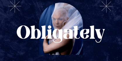 Introducing our new product the name Obligately Old Display Serif Font. Modern Serif font that beautiful classy, elegant, and modern. This font is perfectly suited for a wide variety of projects, such as signature, stationery, logo, wedding, typography quotes, magazine or book covers, website headers, clothing, branding, packaging design, and more. Also for fashion-related branding or editorial design and displays both masculine and feminine qualities.
 - CCS Neue Rinjani by Creative Corner Studio,
$29.00 Neue Rinjani is a all-caps sans serif with Wide Stretch contemporary typographic, vintage futuristic art-deco touch Streamline influence of the 1930s and 1940s. A mix from the old Euro-American signage/advertising letters and modern clean sans serif, carefully mousecrafted to bring you the genuine feel of the era. If you're into classic/vintage letter designs, then this typeface suits best for you.
 - Stratham by insigne,
$21.99Stratham is vigorous sans-serif inspired by the slab serif Clarendon. It is a heavy display face, and has a tangible modern British feel to it. The italic is especially dynamic and forward moving. Stratham includes OpenType titling and swash alternates, old style figures and small caps. Stratham is useful for headlines, highly legible signage or posters and works well in conjunction with the always popular Clarendon. - Relato Sans by Emtype Foundry,
$69.00 Relato Sans is the other face of Relato Serif (a typeface with much idiosyncrasy) nevertheless, the sans version of this typeface is more austere and aseptic. A humanistic type, with a contemporary cut, created for general use in texts and holders and with a great variety of weights, which allow enough flexibility for projects of great magnitude. Although leading with an independent family it maintains many of the characteristics of its homologous such as proportions, the “x” height, the construction based on air lines of the italic, ornaments and so on. These details show coherence with the serif version, and at the same time reinforce its personality. Being a multifunctional type, the “kerning” has been worked to function in small sizes as well as in larger ones such as holders. The contrast between weights, was optimized to be used in pairs (Light with Semibold, Regular with Bold and Medium with Black). Relato Sans is presented in 6 different weights, in Roman, Italic, Small Caps and Small Caps Italic with three different styles of numerals, Old style figures, Lining figures and Small Caps figures.
 - Argos by Hoftype,
$49.00 Argos, a type face with a strong personality. A rounded serif type family which uses exclusively modern design elements. While it possesses decorative qualities, thanks to its hearty serif weights it can be successfully used as a text type. Argos comes in 6 weights and with its extended character set it permits a wide range of applications. Each font is equipped with ligatures, small caps, proportional lining figures, tabular lining figures, proportional old style figures, lining old style figures, matching currency symbols, fraction- and scientific numerals. Argos supports Western European as well as Central and Eastern European languages.
 - Foro by Hoftype,
$39.00 Foro was designed in 2012 to be a slab serif with an appealing flow, warm, and less harsh than many slab serifs. It evinces an attachment to humanistic shapes, models and proportions. Foro’s demonstrated strength renders it excellent for texts, and its clear and distinct details are an advantage in display sizes. Foro comes in 16 styles and in OpenType format. All weights contain standard ligatures, proportional lining figures, tabular lining figures, proportional old style figures, lining old style figures, matching currency symbols, fraction- and scientific numerals and arrows. Foro supports Western European, Central and Eastern European languages.
 - Tall Tales by Comicraft,
$39.00 In a World where no stories are small stories... In a Land where words need to be Bold, Meaningful and maybe even Italic... Comes a font worthy of telling Marvelous Tales some thought Too Tall, Too Astonishing to be told... And when those Untold Stories, those Astounding Tall Tales, are finally told... THAT WORLD WILL NEVER BE THE SAME AGAIN! From Visionary Font Director John Roshell and the Studio that brought you BlahBlahBlah, you must not miss TALL TALES! In theaters and Streaming now.
 - Moldr Thai by Deltatype,
$59.00 Moldr Thai, a sans-serif with modular grid structure with Thai script, inspired from handmade letter to industrial machine mold, Moldr come with 9 weights in complete family, Support many language with standard Adobe Lain 4 glyphs, world-ready and mark2mark support, especially Thai script.
 - Bolgan. by IM Studio,
$18.00 Luxurious Bolgan serif with an elegant serif font style with a unique character by combining geometric shapes with organic curvy details. This is a unique typeface for your personal personality. Inspired by old style serifs and contemporary serif fonts. The extreme contrast between thick and thin strokes gives a harmonious and stylish look. The elegance and sensuality of serifs are enhanced by binding, alternating, and sweeping. Bolgan Features: multilingual PUA encoded alternative binder. Perfect for a variety of uses. From greeting cards to magazines, wedding invitations, logos to websites etc. To be able to access alternative fonts, make sure the software you use can support opentype features such as Microsoft Word, Paint, Adobe, Corel draw, Cricut and other applications. If you need any help please contact me :)
 - Streetwise buddy - Unknown license

- Journal Sans New by ParaType,
$40.00 The Journal Sans typeface was developed in the Type Design Department of SPA of Printing Machinery in Moscow in 1940–1956 by the group of designers under Anatoly Schukin. It was based on Erbar Grotesk by Jacob Erbar and Metro Sans by William A. Dwiggins, the geometric sans-serifs of the 1920s with the pronounced industrial spirit. Journal Sans, Rublenaya (Sans-Serif), and Textbook typefaces were the main Soviet sans-serifs. So no wonder that it was digitized quite early, in the first half of 1990s. Until recently, Journal Sans consisted of three faces and retained all the problems of early digitization, such as inaccurate curves or side-bearings copied straight from metal-type version. The years of 2013 and 2014 made «irregular» geometric sans-serifs trendy, and that fact affected Journal Sans. In the old version curves were corrected and the character set was expanded by Olexa Volochay. In the new release, besides minor improvements, a substantial work has been carried out to make the old typeface work better in digital typography and contemporary design practice. Maria Selezeneva significantly worked over the design of some glyphs, expanded the character set, added some alternatives, completely changed the side-bearings and kerning. Also, the Journal Sans New has several new faces, such as true italic (the older font had slanted version for the italic), an Inline face based on the Bold, and the Display face with proportions close to the original Erbar Grotesk. The new version of Journal Sans, while keeping all peculiarities and the industrial spirit of 1920s-1950s, is indeed fully adapted to the modern digital reality. It can be useful either for bringing historical spirit into design or for modern and trendy typography, both in print and on screen. Designed by Maria Selezeneva with the participation of Alexandra Korolkova. Released by ParaType in 2014.
 - Retro Monkey by Shakira Studio,
$17.00 Say hello to new serif font, Retro Monkey! Retro Monkey is a display serif font that delivers a classic retro feel with strength and boldness. Characterized by striking bold letters, Retro Monkey exudes elegance and uniqueness in every detail. Its retro-inspired design evokes nostalgia and conveys a strong and charming style. Retro Monkey's lettering proportions are audacious in their clarity and legibility. With bold lines and strong contours, each letter looks tough while retaining the elegance of a retro aesthetic. Consistent letter thickness provides an appealing visual appeal and is easily recognizable. Retro Monkey is suitable for use in various design projects that want a strong retro classic impression. This font makes a perfect choice for headlines, titles, posters, merchandise designs, and more. In any context, Retro Monkey carries an impressive presence, inviting the audience to feel nostalgia for a different era. Here's what you get: Retro Monkey Regular, Italic All Multilingual symbol Opentype features ( ligature, alternate ) Accessible in the Adobe Illustrator, Adobe Photoshop, Adobe InDesign, even work on Microsoft Word. PUA Encoded Characters - Fully accessible without additional design software. Multilingual character supports : (Afrikaans, Albanian, Catalan, Croatian, Czech, Danish, Dutch, English, Estonian, Finnish, French, German, Hungarian, Icelandic, Italian, Lithuanian, Maltese, Norwegian, Polish, Portuguese, Slovenian, Spanish, Swedish, Turkish, Zulu) Thank you!


